
VisualEffect 视觉特效鸿蒙HarmonyOS ArkTS原生学习
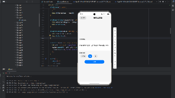
项目演示
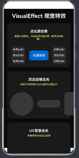
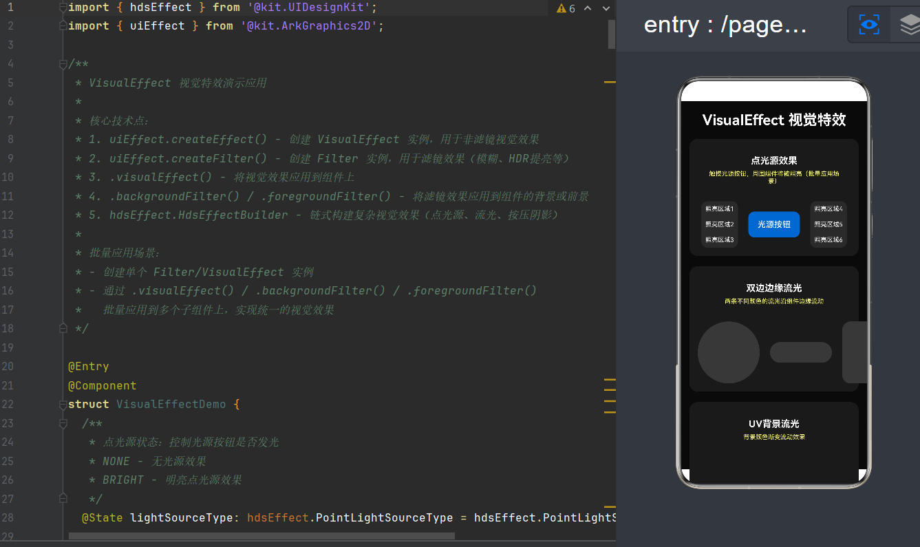
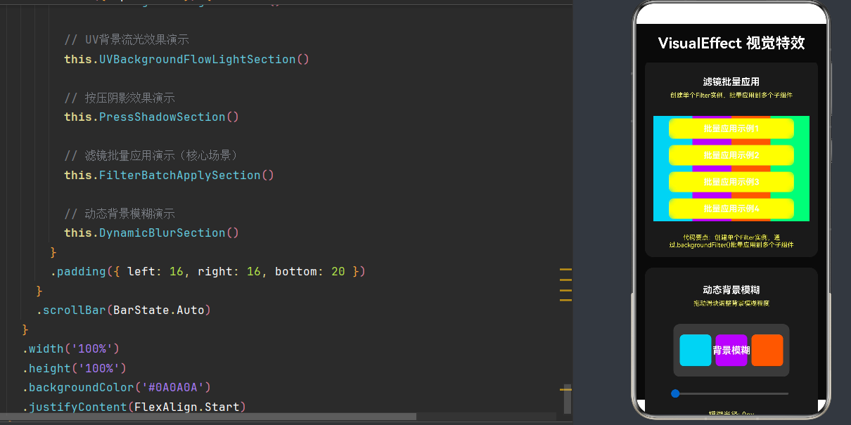
API Level 24 | HarmonyOS NEXT 6.1.1 | ArkTS 声明式开发范式
目录
- 引言
- 视觉效果技术体系架构
- ArkUI 组件级图像效果属性详解
- @ohos.graphics.uiEffect 效果级联模块
- API 24 新增特性:HDR 物理提亮
- @kit.UIDesignKit hdsEffect 高级视觉特效
- 视觉效果批量应用场景实践
- 性能优化与最佳实践
- 完整示例项目
- 常见问题排查
- 总结与展望
1. 引言
1.1 视觉效果在现代UI开发中的重要性
在移动应用开发领域,视觉效果已经成为提升用户体验的关键因素。从iOS的毛玻璃效果到Android的Material Design阴影,再到如今各大平台普遍采用的HDR高亮显示,视觉效果技术正在不断演进。
HarmonyOS作为新一代智能终端操作系统,提供了强大的视觉效果能力,让开发者能够轻松构建具有沉浸感的UI界面。无论是简单的模糊效果,还是复杂的点光源、流光动画,HarmonyOS都提供了完整的API支持。
1.2 本文学习目标
通过本文的学习,您将掌握以下核心技能:
- 理解HarmonyOS视觉效果技术体系架构
- 掌握ArkUI组件级图像效果属性的使用方法
- 精通@ohos.graphics.uiEffect模块的效果级联机制
- 深入理解API 24新增的HDR物理提亮技术
- 熟练运用hdsEffect高级视觉特效构建精美UI
- 掌握视觉效果批量应用的最佳实践
- 了解性能优化策略和常见问题排查方法
1.3 技术选型说明
本文基于HarmonyOS NEXT 6.1.1(API Level 24)进行讲解,主要涉及以下核心模块:
| 模块 | 功能定位 | 核心能力 |
|---|---|---|
| ArkUI 通用属性 | 组件级图像效果 | blur、shadow、grayscale、brightness等 |
| @ohos.graphics.uiEffect | 效果级联 | Filter(模糊、HDR提亮)、VisualEffect |
| @kit.UIDesignKit hdsEffect | 高级视觉特效 | 点光源、流光、按压阴影 |
2. 视觉效果技术体系架构
2.1 整体架构概览
HarmonyOS的视觉效果技术体系分为三个层次:
┌─────────────────────────────────────────────────────────────────┐
│                        应用层 (Application)                      │
│    ArkUI 组件声明式调用 → .blur() .shadow() .visualEffect()     │
├─────────────────────────────────────────────────────────────────┤
│                        框架层 (Framework)                        │
│    uiEffect模块        │    hdsEffect模块       │    通用属性    │
│    ├─ Filter          │    ├─ 点光源效果       │    ├─ blur    │
│    ├─ VisualEffect    │    ├─ 流光效果         │    ├─ shadow  │
│    └─ 效果级联        │    └─ 按压阴影         │    └─ ...     │
├─────────────────────────────────────────────────────────────────┤
│                      图形服务层 (ArkGraphics)                    │
│    ArkGraphics 2D     │    HDR渲染管线         │    合成器      │
│    ├─ Drawing API     │    ├─ 物理亮度控制     │    └─ 图层合成 │
│    ├─ Filter管线      │    └─ 色彩空间映射     │               │
│    └─ 光栅化加速      │                        │               │
├─────────────────────────────────────────────────────────────────┤
│                      系统服务层 (System)                         │
│    显示驱动            │    电源管理            │    权限管理    │
│    └─ 屏幕亮度控制     │    └─ OLED峰值控制     │    └─ HDR授权 │
└─────────────────────────────────────────────────────────────────┘
2.2 各层职责说明
应用层
应用层是开发者直接接触的层面,通过ArkTS声明式语法调用各种视觉效果API。开发者无需关心底层实现细节,只需通过简单的属性链式调用即可实现复杂的视觉效果。
框架层
框架层提供了三个核心模块:
- ArkUI通用属性:直接挂载在组件上的视觉效果属性,如blur、shadow等
- uiEffect模块:提供Filter和VisualEffect两种效果容器,支持效果级联
- hdsEffect模块:提供高级视觉特效,如点光源、流光、按压阴影等
图形服务层
图形服务层是视觉效果的核心实现层:
- ArkGraphics 2D:提供2D图形绘制和滤镜处理能力
- HDR渲染管线:API 24新增,支持物理级亮度控制
- 合成器:负责多图层的混合合成
系统服务层
系统服务层提供底层硬件控制能力:
- 显示驱动:控制屏幕物理亮度
- 电源管理:管理OLED屏幕的峰值亮度
- 权限管理:控制HDR提亮权限的授予
2.3 效果应用流程
视觉效果的应用遵循以下标准流程:
- 创建效果实例:通过
uiEffect.createFilter()或uiEffect.createEffect()创建效果容器 - 添加效果类型:调用blur()、hdrBrightnessRatio()等方法添加具体效果
- 挂载到组件:通过
.backgroundFilter()、.foregroundFilter()或.visualEffect()应用到目标组件 - 渲染生效:ArkUI引擎自动处理渲染管线,将效果应用到组件上
3. ArkUI 组件级图像效果属性详解
3.1 模糊效果 (blur)
3.1.1 API说明
blur属性用于为组件添加高斯模糊效果,是最常用的视觉效果之一。
Text('模糊文字')
    .blur(10)
参数说明:
value: number:模糊半径,单位为px,取值≥0options?: BlurOptions:模糊选项(API 18+)
3.1.2 模糊选项详解 (API 18+)
interface BlurOptions {
    radius: number;
    mode: BlurMode;
    color: Color;
}

enum BlurMode {
    NORMAL_BLUR,
    FASTER_BLUR,
    BACKDROP_BLUR,
}
3.1.3 应用场景示例
场景1:毛玻璃效果
Stack() {
    Image($r('app.media.background'))
        .width('100%')
        .height('100%')
        .objectFit(ImageFit.Cover)

    Column() {
        Text('毛玻璃效果')
            .fontSize(24)
            .fontWeight(FontWeight.Bold)
            .fontColor(Color.White)
    }
    .padding(20)
    .margin(20)
    .backgroundColor('#FFFFFF20')
    .blur(20)
}
场景2:模糊文字
Text('这是一段模糊的文字')
    .fontSize(18)
    .fontColor(Color.Gray)
    .blur(3)
3.2 背景模糊 (backdropBlur)
3.2.1 API说明
backdropBlur是专门用于实现毛玻璃效果的属性,它只模糊组件背后的内容,而保持组件本身清晰。
Text('清晰文字,模糊背景')
    .backdropBlur(15)
3.2.2 与blur的区别
| 属性 | 效果范围 | 适用场景 |
|---|---|---|
| blur | 模糊组件自身内容 | 模糊文字、图标等 |
| backdropBlur | 模糊组件背后的内容 | 毛玻璃效果、浮层背景 |
3.2.3 实战示例
Stack() {
    Row() {
        Column().width('33%').height('100%').backgroundColor('#FF6B6B')
        Column().width('33%').height('100%').backgroundColor('#4ECDC4')
        Column().width('33%').height('100%').backgroundColor('#45B7D1')
    }
    .width('100%')
    .height(200)

    Column() {
        Text('毛玻璃卡片')
            .fontSize(20)
            .fontWeight(FontWeight.Bold)
            .fontColor(Color.White)
        Text('背景模糊,文字清晰')
            .fontSize(14)
            .fontColor('#FFFFFF80')
    }
    .padding(20)
    .backgroundColor('#FFFFFF15')
    .borderRadius(16)
    .backdropBlur(20)
}
3.3 线性渐变模糊 (linearGradientBlur)
3.3.1 API说明
linearGradientBlur用于创建线性渐变模糊效果,模糊程度沿指定方向渐变。
linearGradientBlur(value: number, options: LinearGradientBlurOptions)
参数说明:
value: number:最大模糊半径options.direction: Axis:渐变方向options.startPoint?: number:起始位置(0-1)options.endPoint?: number:结束位置(0-1)
3.3.2 实战示例
Text('从左到右渐变模糊')
    .fontSize(24)
    .padding(20)
    .linearGradientBlur(30, {
        direction: Axis.Horizontal,
        startPoint: 0,
        endPoint: 1
    })
3.4 阴影效果 (shadow)
3.4.1 API说明
shadow属性用于为组件添加阴影效果。
Text('带阴影的文字')
    .shadow({
        radius: 10,
        color: '#00000040',
        offsetX: 5,
        offsetY: 5
    })
参数说明:
| 参数 | 类型 | 说明 |
|---|---|---|
| radius | number | 阴影模糊半径 |
| color | Color | 阴影颜色 |
| offsetX | number | X轴偏移量 |
| offsetY | number | Y轴偏移量 |
| type | ShadowType | 阴影类型(OUTER/INNER) |
3.4.2 实战示例
Button('悬浮按钮')
    .width(120)
    .height(44)
    .backgroundColor('#0066CC')
    .fontColor(Color.White)
    .borderRadius(22)
    .shadow({
        radius: 12,
        color: '#0066CC60',
        offsetX: 0,
        offsetY: 8
    })
3.5 灰度效果 (grayscale)
3.5.1 API说明
grayscale用于将组件转换为灰度显示。
Image($r('app.media.colorful_image'))
    .width(200)
    .height(200)
    .grayscale(1)
参数说明:
value: number:灰度程度,0为原图,1为完全灰度
3.6 亮度调节 (brightness)
3.6.1 API说明
brightness用于调节组件的亮度。
Image($r('app.media.image'))
    .width(200)
    .height(200)
    .brightness(1.5)
参数说明:
value: number:亮度倍数,1为正常,<1变暗,>1变亮
3.7 饱和度调节 (saturate)
3.7.1 API说明
saturate用于调节组件的色彩饱和度。
Image($r('app.media.image'))
    .width(200)
    .height(200)
    .saturate(2)
参数说明:
value: number:饱和度倍数,1为正常,0为灰度,>1增加饱和度
3.8 对比度调节 (contrast)
3.8.1 API说明
contrast用于调节组件的对比度。
Image($r('app.media.image'))
    .width(200)
    .height(200)
    .contrast(1.5)
参数说明:
value: number:对比度倍数,1为正常,<1降低对比度,>1增加对比度
3.9 色相旋转 (hueRotate)
3.9.1 API说明
hueRotate用于旋转组件的色相。
Image($r('app.media.image'))
    .width(200)
    .height(200)
    .hueRotate(90)
参数说明:
value: number:旋转角度,单位为度
3.10 颜色反转 (invert)
3.10.1 API说明
invert用于反转组件的颜色。
Image($r('app.media.image'))
    .width(200)
    .height(200)
    .invert(1)
参数说明:
value: number:反转程度,0为原图,1为完全反转
3.11 棕褐色效果 (sepia)
3.11.1 API说明
sepia用于为组件添加棕褐色滤镜效果。
Image($r('app.media.image'))
    .width(200)
    .height(200)
    .sepia(0.8)
参数说明:
value: number:棕褐色程度,0为原图,1为完全棕褐色
4. @ohos.graphics.uiEffect 效果级联模块
4.1 模块概述
@ohos.graphics.uiEffect模块提供了效果级联能力,允许开发者创建Filter和VisualEffect实例,并在其上叠加多个效果。
4.1.1 导入模块
import { uiEffect } from '@kit.ArkGraphics2D';
4.1.2 两大效果类型
| 类型 | 用途 | 应用方式 |
|---|---|---|
| Filter | 滤镜效果(模糊、HDR提亮等) | .backgroundFilter() / .foregroundFilter() |
| VisualEffect | 视觉效果(预留扩展) | .visualEffect() |
4.2 Filter 效果类
4.2.1 创建Filter实例
let filter: uiEffect.Filter = uiEffect.createFilter();
4.2.2 核心方法
blur()
filter.blur(blurRadius: number): Filter
参数说明:
blurRadius: number:模糊半径,单位为px,≥0
返回值:返回挂载了模糊效果的Filter实例,支持链式调用
hdrBrightnessRatio() (API 24+)
filter.hdrBrightnessRatio(ratio: number): Filter
参数说明:
ratio: number:HDR提亮倍率,1.0为正常SDR亮度,>1.0为HDR高亮
返回值:返回挂载了HDR提亮效果的Filter实例
4.2.3 效果级联示例
let filter = uiEffect.createFilter();
filter.blur(10).hdrBrightnessRatio(2.0);

Text('模糊+HDR提亮')
    .backgroundFilter(filter)
4.3 VisualEffect 效果类
4.3.1 创建VisualEffect实例
let visualEffect: uiEffect.VisualEffect = uiEffect.createEffect();
4.3.2 API 24新增能力
从API 24开始,createEffect()支持在ArkTS卡片中使用:
let visualEffect = uiEffect.createEffect();
4.3.3 应用到组件
Text('应用视觉效果')
    .visualEffect(visualEffect)
4.4 效果应用位置
4.4.1 backgroundFilter
将Filter效果应用到组件的背景层:
Image($r('app.media.foreground'))
    .width(200)
    .height(200)
    .backgroundImage($r('app.media.background'))
    .backgroundFilter(filter)
4.4.2 foregroundFilter
将Filter效果应用到组件的前景内容层:
Text('模糊的文字')
    .fontSize(24)
    .foregroundFilter(filter)
4.4.3 visualEffect
将VisualEffect应用到组件:
Text('应用视觉效果')
    .visualEffect(visualEffect)
4.5 完整示例
import { uiEffect } from '@kit.ArkGraphics2D';

@Entry
@Component
struct FilterEffectDemo {
    private blurFilter: uiEffect.Filter = uiEffect.createFilter();

    aboutToAppear() {
        this.blurFilter.blur(15);
    }

    build() {
        Column({ space: 20 }) {
            Text('Filter效果演示')
                .fontSize(24)
                .fontWeight(FontWeight.Bold)
                .fontColor(Color.White)

            Stack() {
                Row() {
                    Column().width('50%').height('100%').backgroundColor('#FF6B6B')
                    Column().width('50%').height('100%').backgroundColor('#4ECDC4')
                }
                .width('100%')
                .height(150)

                Text('背景模糊效果')
                    .fontSize(18)
                    .fontColor(Color.White)
                    .padding(10)
                    .backgroundColor('#FFFFFF20')
                    .borderRadius(8)
                    .backgroundFilter(this.blurFilter)
            }
            .width('100%')
            .height(150)
            .borderRadius(12)

            Text('前景模糊效果')
                .fontSize(18)
                .fontColor(Color.Black)
                .padding(10)
                .backgroundColor('#EEEEEE')
                .borderRadius(8)
                .foregroundFilter(this.blurFilter)
        }
        .padding(20)
        .width('100%')
        .height('100%')
        .backgroundColor('#0A0A0A')
    }
}
5. API 24 新增特性:HDR 物理提亮
5.1 HDR技术概述
5.1.1 SDR vs HDR
| 特性 | SDR (标准动态范围) | HDR (高动态范围) |
|---|---|---|
| 亮度范围 | 0-100 cd/m² | 0-1000+ cd/m² |
| 对比度 | 约1000:1 | 约100000:1 |
| 颜色深度 | 8-bit | 10-bit+ |
| 视觉体验 | 普通 | 更加真实、有层次感 |
5.1.2 HDR渲染管线
在HarmonyOS中,HDR渲染管线需要满足以下条件才能开启:
- 设备硬件支持HDR显示(如OLED屏幕)
- 应用声明了
ohos.permission.HDR_BRIGHTNESS权限 - 组件使用了
hdrBrightnessRatio效果
5.2 hdrBrightnessRatio API详解
5.2.1 方法签名
hdrBrightnessRatio(ratio: number): Filter
参数说明:
ratio: number:HDR提亮倍率- 1.0:正常SDR标准白亮度
-
1.0:提升到HDR高亮域
- 上限:设备最大亮度 / SDR参考白亮度
5.2.2 物理原理
hdrBrightnessRatio不仅仅是简单的颜色值修改,它会:
- 向物理渲染核心申请峰值亮度配额
- 在OLED屏幕上,增加对应像素的激发电流
- 实现物理级的超视觉亮度效果
5.2.3 重要注意事项
- 不建议嵌套使用:强行嵌套可能造成过曝现象
- 性能开销:HDR提亮会带来一定的性能和功耗开销
- 设备兼容性:需要HDR硬件支持,否则效果不生效
- 权限要求:必须声明
ohos.permission.HDR_BRIGHTNESS权限
5.3 权限配置
5.3.1 权限声明
在module.json5中声明HDR亮度权限:
{
  "module": {
    "requestPermissions": [
      {
        "name": "ohos.permission.HDR_BRIGHTNESS"
      }
    ]
  }
}
权限说明:
- 权限名称:
ohos.permission.HDR_BRIGHTNESS - 权限级别:normal
- 授权方式:系统授权(system_grant),安装即授权
5.4 HDR提亮实战
5.4.1 基础示例
import { uiEffect } from '@kit.ArkGraphics2D';

@Entry
@Component
struct HDRBrightnessDemo {
    private hdrFilter: uiEffect.Filter = uiEffect.createFilter();

    aboutToAppear() {
        this.hdrFilter.hdrBrightnessRatio(2.0);
    }

    build() {
        Column({ space: 20 }) {
            Text('HDR提亮效果演示')
                .fontSize(24)
                .fontWeight(FontWeight.Bold)
                .fontColor(Color.White)

            Text('普通文字 - SDR亮度')
                .fontSize(18)
                .fontColor('#FFFFFF')
                .padding(15)
                .backgroundColor('#333333')
                .borderRadius(12)

            Text('HDR高亮文字 - 2倍亮度')
                .fontSize(18)
                .fontColor('#FFFFFF')
                .padding(15)
                .backgroundColor('#333333')
                .borderRadius(12)
                .foregroundFilter(this.hdrFilter)
        }
        .padding(20)
        .width('100%')
        .height('100%')
        .backgroundColor('#0A0A0A')
    }
}
5.4.2 动态调节示例
import { uiEffect } from '@kit.ArkGraphics2D';

@Entry
@Component
struct HDRDynamicDemo {
    @State brightnessRatio: number = 1.0;
    private hdrFilter: uiEffect.Filter = uiEffect.createFilter();

    build() {
        Column({ space: 20 }) {
            Text('动态HDR提亮')
                .fontSize(24)
                .fontWeight(FontWeight.Bold)
                .fontColor(Color.White)

            Text(`当前提亮倍率: ${this.brightnessRatio.toFixed(1)}x`)
                .fontSize(16)
                .fontColor('#FFFFFF80')

            Text('动态HDR高亮文字')
                .fontSize(20)
                .fontColor('#FFFFFF')
                .padding(20)
                .backgroundColor('#333333')
                .borderRadius(12)
                .foregroundFilter(this.hdrFilter)

            Slider({
                value: this.brightnessRatio,
                min: 1.0,
                max: 5.0,
                step: 0.1,
                style: SliderStyle.OutSet
            })
                .width('80%')
                .blockColor('#0066CC')
                .trackColor('#444444')
                .selectedColor('#0066CC')
                .onChange((value: number) => {
                    this.brightnessRatio = value;
                    this.hdrFilter = uiEffect.createFilter();
                    this.hdrFilter.hdrBrightnessRatio(value);
                })
        }
        .padding(20)
        .width('100%')
        .height('100%')
        .backgroundColor('#0A0A0A')
    }
}
5.5 HDR效果与其他效果的组合
5.5.1 HDR + 模糊组合
import { uiEffect } from '@kit.ArkGraphics2D';

@Entry
@Component
struct HDRBlurCombo {
    private comboFilter: uiEffect.Filter = uiEffect.createFilter();

    aboutToAppear() {
        this.comboFilter.blur(5).hdrBrightnessRatio(1.5);
    }

    build() {
        Stack() {
            Image($r('app.media.colorful_background'))
                .width('100%')
                .height(300)
                .objectFit(ImageFit.Cover)

            Column() {
                Text('HDR毛玻璃卡片')
                    .fontSize(24)
                    .fontWeight(FontWeight.Bold)
                    .fontColor(Color.White)
                Text('背景模糊 + HDR高亮文字')
                    .fontSize(14)
                    .fontColor('#FFFFFF80')
            }
            .padding(24)
            .backgroundColor('#FFFFFF15')
            .borderRadius(16)
            .backgroundFilter(this.comboFilter)
        }
        .width('100%')
        .height(300)
    }
}
6. @kit.UIDesignKit hdsEffect 高级视觉特效
6.1 模块概述
@kit.UIDesignKit中的hdsEffect模块提供了高级视觉特效能力,包括点光源、流光、按压阴影等精美的UI效果。
6.1.1 导入模块
import { hdsEffect } from '@kit.UIDesignKit';
6.1.2 核心特性
| 特效类型 | 说明 | 适用场景 |
|---|---|---|
| 点光源效果 | 模拟点光源照亮周围组件 | 交互反馈、焦点指示 |
| 双边边缘流光 | 两条流光沿组件边缘流动 | 按钮、卡片装饰 |
| UV背景流光 | 背景颜色渐变流动 | Banner、活动页面 |
| 按压阴影 | 按钮按压反馈效果 | 按钮交互 |
6.2 HdsEffectBuilder 链式构建器
6.2.1 基本用法
.visualEffect(new hdsEffect.HdsEffectBuilder()
    .pointLight({...})
    .buildEffect())
6.2.2 链式调用流程
new hdsEffect.HdsEffectBuilder()
    .pointLight({...})
    .shaderEffect({...})
    .pressShadow(type)
    .buildEffect()
6.3 点光源效果
6.3.1 API详解
.pointLight(options: PointLightOptions)
PointLightOptions参数:
| 参数 | 类型 | 说明 |
|---|---|---|
| sourceType | PointLightSourceType | 光源类型(NONE/BRIGHT) |
| illuminatedType | PointLightIlluminatedType | 被照亮类型 |
PointLightSourceType枚举:
| 值 | 说明 |
|---|---|
| NONE | 无光源效果 |
| BRIGHT | 明亮点光源效果 |
PointLightIlluminatedType枚举:
| 值 | 说明 |
|---|---|
| BORDER | 仅照亮边框 |
| CONTENT | 仅照亮内容 |
| BORDER_CONTENT | 边框和内容都照亮 |
6.3.2 实战示例
import { hdsEffect } from '@kit.UIDesignKit';

@Entry
@Component
struct PointLightDemo {
    @State lightSourceType: hdsEffect.PointLightSourceType = hdsEffect.PointLightSourceType.NONE;

    build() {
        Column({ space: 20 }) {
            Text('点光源效果')
                .fontSize(24)
                .fontWeight(FontWeight.Bold)
                .fontColor(Color.White)

            Row({ space: 20 }) {
                Column() {
                    Text('区域1').padding(8).fontColor(Color.White)
                    Text('区域2').padding(8).fontColor(Color.White)
                }
                .backgroundColor('#2A2A2A')
                .borderRadius(12)
                .visualEffect(new hdsEffect.HdsEffectBuilder()
                    .pointLight({ illuminatedType: hdsEffect.PointLightIlluminatedType.BORDER })
                    .buildEffect())

                Button('点击发光')
                    .width(100)
                    .height(50)
                    .backgroundColor('#0066CC')
                    .fontColor(Color.White)
                    .borderRadius(12)
                    .visualEffect(new hdsEffect.HdsEffectBuilder()
                        .pointLight({
                            sourceType: this.lightSourceType,
                            illuminatedType: hdsEffect.PointLightIlluminatedType.BORDER_CONTENT
                        })
                        .buildEffect())
                    .onTouch((event: TouchEvent) => {
                        if (event.type === TouchType.Down) {
                            this.lightSourceType = hdsEffect.PointLightSourceType.BRIGHT;
                        } else {
                            this.lightSourceType = hdsEffect.PointLightSourceType.NONE;
                        }
                    })

                Column() {
                    Text('区域3').padding(8).fontColor(Color.White)
                    Text('区域4').padding(8).fontColor(Color.White)
                }
                .backgroundColor('#2A2A2A')
                .borderRadius(12)
                .visualEffect(new hdsEffect.HdsEffectBuilder()
                    .pointLight({ illuminatedType: hdsEffect.PointLightIlluminatedType.BORDER })
                    .buildEffect())
            }
        }
        .padding(20)
        .width('100%')
        .height('100%')
        .backgroundColor('#0A0A0A')
    }
}
6.4 双边边缘流光效果
6.4.1 API详解
.shaderEffect(options: ShaderEffectOptions)
ShaderEffectOptions参数:
| 参数 | 类型 | 说明 |
|---|---|---|
| effectType | EffectType | 效果类型 |
| animation | AnimationOptions | 动画配置 |
| controller | ShaderEffectController | 动画控制器 |
| params | EffectParams | 效果参数 |
EffectType枚举:
| 值 | 说明 |
|---|---|
| DUAL_EDGE_FLOW_LIGHT | 双边边缘流光 |
| UV_BACKGROUND_FLOW_LIGHT | UV背景流光 |
AnimationOptions参数:
| 参数 | 类型 | 说明 |
|---|---|---|
| duration | number | 动画持续时间(毫秒) |
| iterations | number | 循环次数(-1表示无限循环) |
| autoPlay | boolean | 是否自动播放 |
EffectParams参数(双边流光):
| 参数 | 类型 | 说明 |
|---|---|---|
| firstEdgeFlowLight | EdgeFlowLight | 第一条流光配置 |
| secondEdgeFlowLight | EdgeFlowLight | 第二条流光配置 |
EdgeFlowLight参数:
| 参数 | 类型 | 说明 |
|---|---|---|
| startPos | number | 起始位置(0-1) |
| endPos | number | 结束位置(0-1) |
| color | string | 流光颜色(十六进制) |
6.4.2 实战示例
import { hdsEffect } from '@kit.UIDesignKit';

@Entry
@Component
struct DualEdgeFlowLightDemo {
    private flowLightController: hdsEffect.ShaderEffectController =
        new hdsEffect.ShaderEffectController();

    build() {
        Column({ space: 20 }) {
            Text('双边边缘流光效果')
                .fontSize(24)
                .fontWeight(FontWeight.Bold)
                .fontColor(Color.White)

            Row({ space: 20 }) {
                Stack()
                    .width(100)
                    .height(100)
                    .borderRadius(50)
                    .clip(true)
                    .backgroundColor('#383838')
                    .visualEffect(new hdsEffect.HdsEffectBuilder()
                        .shaderEffect({
                            effectType: hdsEffect.EffectType.DUAL_EDGE_FLOW_LIGHT,
                            animation: { duration: 4000, iterations: -1, autoPlay: true },
                            controller: this.flowLightController,
                            params: {
                                firstEdgeFlowLight: { startPos: 0, endPos: 1.0, color: '#1AD0F1' },
                                secondEdgeFlowLight: { startPos: 0.5, endPos: 1.5, color: '#FFA4E5' }
                            }
                        })
                        .buildEffect())
            }
        }
        .padding(20)
        .width('100%')
        .height('100%')
        .backgroundColor('#0A0A0A')
    }
}
6.5 UV背景流光效果
6.5.1 API详解
EffectParams参数(UV背景流光):
| 参数 | 类型 | 说明 |
|---|---|---|
| colorSource | string[] | 源颜色数组 |
| colorTarget | string[] | 目标颜色数组 |
6.5.2 实战示例
import { hdsEffect } from '@kit.UIDesignKit';

@Entry
@Component
struct UVBackgroundFlowLightDemo {
    private uvController: hdsEffect.ShaderEffectController =
        new hdsEffect.ShaderEffectController();

    build() {
        Column({ space: 20 }) {
            Text('UV背景流光效果')
                .fontSize(24)
                .fontWeight(FontWeight.Bold)
                .fontColor(Color.White)

            Stack() {
                Column({ space: 12 }) {
                    Text('UV流光效果')
                        .fontSize(24)
                        .fontWeight(FontWeight.Bold)
                        .fontColor(Color.White)
                    Text('背景颜色持续渐变流动')
                        .fontSize(16)
                        .fontColor('#FFFFFF80')
                }
                .justifyContent(FlexAlign.Center)
            }
            .width('100%')
            .height(200)
            .borderRadius(16)
            .clip(true)
            .visualEffect(new hdsEffect.HdsEffectBuilder()
                .shaderEffect({
                    effectType: hdsEffect.EffectType.UV_BACKGROUND_FLOW_LIGHT,
                    animation: { duration: 3000, iterations: -1, autoPlay: true },
                    controller: this.uvController,
                    params: {
                        colorSource: ['#0066CC', '#AA00FF', '#FF6600'],
                        colorTarget: ['#00CCFF', '#FF00AA', '#00FF88']
                    }
                })
                .buildEffect())
        }
        .padding(20)
        .width('100%')
        .height('100%')
        .backgroundColor('#0A0A0A')
    }
}
6.6 按压阴影效果
6.6.1 API详解
.pressShadow(type: PressShadowType)
PressShadowType枚举:
| 值 | 说明 |
|---|---|
| NONE | 无按压效果 |
| BLEND_WHITE | 白色遮罩效果 |
| BLEND_GRADIENT | 渐变阴影效果 |
6.6.2 实战示例
import { hdsEffect } from '@kit.UIDesignKit';

@Entry
@Component
struct PressShadowDemo {
    @State blendState: hdsEffect.PressShadowType = hdsEffect.PressShadowType.NONE;

    build() {
        Column({ space: 20 }) {
            Text('按压阴影效果')
                .fontSize(24)
                .fontWeight(FontWeight.Bold)
                .fontColor(Color.White)

            Button('白色遮罩')
                .width(140)
                .height(50)
                .backgroundColor('#4A4A4A')
                .fontColor(Color.White)
                .borderRadius(12)
                .visualEffect(new hdsEffect.HdsEffectBuilder()
                    .pressShadow(this.blendState)
                    .buildEffect())
                .onTouch((event: TouchEvent) => {
                    if (event.type === TouchType.Down) {
                        this.blendState = hdsEffect.PressShadowType.BLEND_WHITE;
                    } else {
                        this.blendState = hdsEffect.PressShadowType.NONE;
                    }
                })
        }
        .padding(20)
        .width('100%')
        .height('100%')
        .backgroundColor('#0A0A0A')
    }
}
7. 视觉效果批量应用场景实践
7.1 批量应用概述
在实际开发中,经常需要将相同的视觉效果应用到多个组件上。直接在每个组件上重复定义效果不仅代码冗余,而且难以维护。HarmonyOS提供了批量应用机制,可以有效解决这个问题。
7.2 批量应用模式
7.2.1 模式一:共享Filter实例
创建单个Filter实例,通过.backgroundFilter()或.foregroundFilter()批量应用到多个组件:
import { uiEffect } from '@kit.ArkGraphics2D';

@Entry
@Component
struct BatchApplyDemo {
    private sharedBlurFilter: uiEffect.Filter = uiEffect.createFilter();

    aboutToAppear() {
        this.sharedBlurFilter.blur(15);
    }

    build() {
        Column({ space: 12 }) {
            Text('批量应用示例1')
                .fontSize(16)
                .fontColor(Color.White)
                .padding(12)
                .backgroundColor('#FFFFFF20')
                .borderRadius(8)
                .width('100%')
                .textAlign(TextAlign.Center)
                .backgroundFilter(this.sharedBlurFilter)

            Text('批量应用示例2')
                .fontSize(16)
                .fontColor(Color.White)
                .padding(12)
                .backgroundColor('#FFFFFF20')
                .borderRadius(8)
                .width('100%')
                .textAlign(TextAlign.Center)
                .backgroundFilter(this.sharedBlurFilter)

            Text('批量应用示例3')
                .fontSize(16)
                .fontColor(Color.White)
                .padding(12)
                .backgroundColor('#FFFFFF20')
                .borderRadius(8)
                .width('100%')
                .textAlign(TextAlign.Center)
                .backgroundFilter(this.sharedBlurFilter)

            Text('批量应用示例4')
                .fontSize(16)
                .fontColor(Color.White)
                .padding(12)
                .backgroundColor('#FFFFFF20')
                .borderRadius(8)
                .width('100%')
                .textAlign(TextAlign.Center)
                .backgroundFilter(this.sharedBlurFilter)
        }
        .padding(20)
        .width('100%')
        .height('100%')
        .backgroundColor('#0A0A0A')
    }
}
7.2.2 模式二:共享VisualEffect实例
创建单个VisualEffect实例,通过.visualEffect()批量应用到多个组件:
import { hdsEffect } from '@kit.UIDesignKit';

@Entry
@Component
struct BatchVisualEffectDemo {
    private createSharedEffect() {
        return new hdsEffect.HdsEffectBuilder()
            .pointLight({ illuminatedType: hdsEffect.PointLightIlluminatedType.BORDER })
            .buildEffect();
    }

    build() {
        Column({ space: 12 }) {
            const sharedEffect = this.createSharedEffect();

            Column() {
                Text('卡片1').fontColor(Color.White).padding(8)
            }
            .backgroundColor('#2A2A2A')
            .borderRadius(12)
            .visualEffect(sharedEffect)

            Column() {
                Text('卡片2').fontColor(Color.White).padding(8)
            }
            .backgroundColor('#2A2A2A')
            .borderRadius(12)
            .visualEffect(sharedEffect)
        }
        .padding(20)
        .width('100%')
        .height('100%')
        .backgroundColor('#0A0A0A')
    }
}
7.2.3 模式三:@Builder封装
使用@Builder装饰器封装带有视觉效果的组件模板:
import { uiEffect } from '@kit.ArkGraphics2D';

@Entry
@Component
struct BuilderBatchDemo {
    private blurFilter: uiEffect.Filter = uiEffect.createFilter();

    aboutToAppear() {
        this.blurFilter.blur(10);
    }

    @Builder
    GlassCard(title: string, content: string) {
        Column({ space: 8 }) {
            Text(title)
                .fontSize(18)
                .fontWeight(FontWeight.Bold)
                .fontColor(Color.White)
            Text(content)
                .fontSize(14)
                .fontColor('#FFFFFF80')
        }
        .padding(16)
        .backgroundColor('#FFFFFF15')
        .borderRadius(12)
        .backgroundFilter(this.blurFilter)
    }

    build() {
        Column({ space: 12 }) {
            Text('@Builder批量应用')
                .fontSize(24)
                .fontWeight(FontWeight.Bold)
                .fontColor(Color.White)

            this.GlassCard('卡片标题1', '卡片内容1')
            this.GlassCard('卡片标题2', '卡片内容2')
            this.GlassCard('卡片标题3', '卡片内容3')
            this.GlassCard('卡片标题4', '卡片内容4')
        }
        .padding(20)
        .width('100%')
        .height('100%')
        .backgroundColor('#0A0A0A')
    }
}
7.3 批量应用优势
| 优势 | 说明 |
|---|---|
| 代码复用 | 避免重复定义效果配置 |
| 易于维护 | 修改一处,全局生效 |
| 性能优化 | 共享实例减少内存占用 |
| 一致性 | 确保视觉效果统一 |
7.4 批量应用实战:毛玻璃导航栏
import { uiEffect } from '@kit.ArkGraphics2D';

@Entry
@Component
struct GlassNavigationDemo {
    private glassFilter: uiEffect.Filter = uiEffect.createFilter();

    aboutToAppear() {
        this.glassFilter.blur(20);
    }

    build() {
        Stack() {
            Image($r('app.media.navigation_background'))
                .width('100%')
                .height('100%')
                .objectFit(ImageFit.Cover)

            Column() {
                Row({ space: 16 }) {
                    Image($r('app.media.back_icon'))
                        .width(40)
                        .height(40)
                        .backgroundColor('#FFFFFF20')
                        .borderRadius(10)
                        .backgroundFilter(this.glassFilter)

                    Text('页面标题')
                        .fontSize(20)
                        .fontWeight(FontWeight.Bold)
                        .fontColor(Color.White)
                        .backgroundColor('#FFFFFF20')
                        .padding({ left: 16, right: 16, top: 8, bottom: 8 })
                        .borderRadius(20)
                        .backgroundFilter(this.glassFilter)

                    Image($r('app.media.more_icon'))
                        .width(40)
                        .height(40)
                        .backgroundColor('#FFFFFF20')
                        .borderRadius(10)
                        .backgroundFilter(this.glassFilter)
                }
                .padding({ top: 60, left: 16, right: 16 })
                .width('100%')
            }
        }
    }
}
8. 性能优化与最佳实践
8.1 性能影响因素
视觉效果会消耗GPU资源,不当使用可能导致性能问题。主要影响因素包括:
| 因素 | 影响程度 | 说明 |
|---|---|---|
| 模糊半径 | 高 | 半径越大,计算量越大 |
| 效果数量 | 高 | 叠加效果增加渲染开销 |
| 组件数量 | 中 | 大量组件应用效果增加负担 |
| HDR提亮 | 高 | 物理级亮度控制消耗GPU |
| 动画效果 | 中 | 持续动画需要稳定的帧率 |
8.2 性能优化策略
8.2.1 合理选择模糊半径
filter.blur(10)  // ✅ 性能较好
filter.blur(50)  // ❌ 性能较差
模糊半径选择建议:
| 场景 | 推荐半径 | 说明 |
|---|---|---|
| 毛玻璃效果 | 5-15px | 轻微模糊,性能好 |
| 背景虚化 | 15-30px | 中等模糊,平衡效果与性能 |
| 占位效果 | 30-50px | 强烈模糊,用于非关键区域 |
8.2.2 减少效果叠加
filter.blur(10)  // ✅ 单一效果
filter.blur(10).hdrBrightnessRatio(2.0)  // ⚠️ 需要评估性能影响
8.2.3 限制应用范围
Text('重要内容')
    .backgroundFilter(filter)  // ✅ 必要时应用

List({ space: 10 }) {
    ForEach(items, (item) => {
        ListItem() {
            Text(item.name)
                .backgroundFilter(filter)  // ❌ 每个列表项都应用,性能差
        }
    })
}
8.2.4 使用renderGroup优化
对于包含复杂子组件的动画,使用renderGroup(true)减少渲染批次:
Stack() {
    Column() {
        // ...
    }
}
.renderGroup(true)  // ✅ 优化渲染性能
8.2.5 避免在动画中修改布局属性
animateTo({ duration: 1000 }, () => {
    this.scale = 1.2;  // ✅ 使用transform替代
})
8.3 最佳实践指南
8.3.1 效果应用时机
aboutToAppear() {
    this.filter.blur(10);  // ✅ 在aboutToAppear中初始化
}
8.3.2 效果实例复用
private filter: uiEffect.Filter = uiEffect.createFilter(); // ✅ 创建全局实例
8.3.3 条件性应用效果
@State isHighlighted: boolean = false;

build() {
    Text('内容')
        .backgroundFilter(this.isHighlighted ? this.hdrFilter : this.normalFilter)
}
8.4 性能监控
在DevEco Studio中,可以使用以下工具监控性能:
- Performance Profiler:监控帧率、CPU、内存等指标
- GPU Inspector:分析GPU渲染性能
- ArkUI Inspector:查看组件渲染状态
9. 完整示例项目
9.1 项目结构
entry/
├── src/
│   └── main/
│       ├── ets/
│       │   └── pages/
│       │       └── Index.ets
│       ├── resources/
│       │   └── base/
│       │       ├── media/
│       │       └── profile/
│       └── module.json5
└── build-profile.json5
9.2 module.json5 配置
{
  "module": {
    "name": "entry",
    "type": "entry",
    "description": "$string:module_desc",
    "mainElement": "EntryAbility",
    "deviceTypes": ["phone", "tablet"],
    "requestPermissions": [
      { "name": "ohos.permission.HDR_BRIGHTNESS" }
    ],
    "abilities": [
      {
        "name": "EntryAbility",
        "srcEntry": "./ets/entryability/EntryAbility.ets",
        "description": "$string:entry_ability_desc",
        "icon": "$media:icon",
        "label": "$string:entry_ability_label",
        "startWindowIcon": "$media:icon",
        "startWindowBackground": "$color:start_window_background"
      }
    ]
  }
}
9.3 Index.ets 完整代码
import { hdsEffect } from '@kit.UIDesignKit';
import { uiEffect } from '@kit.ArkGraphics2D';

@Entry
@Component
struct VisualEffectDemo {
  @State lightSourceType: hdsEffect.PointLightSourceType = hdsEffect.PointLightSourceType.NONE;
  @State buttonBlendState: hdsEffect.PressShadowType = hdsEffect.PressShadowType.NONE;
  @State buttonGradientState: hdsEffect.PressShadowType = hdsEffect.PressShadowType.NONE;
  @State blurRadius: number = 0;

  flowLightController1: hdsEffect.ShaderEffectController = new hdsEffect.ShaderEffectController();
  flowLightController2: hdsEffect.ShaderEffectController = new hdsEffect.ShaderEffectController();
  uvFlowLightController: hdsEffect.ShaderEffectController = new hdsEffect.ShaderEffectController();

  sharedBlurFilter: uiEffect.Filter = uiEffect.createFilter();
  hdrFilter: uiEffect.Filter = uiEffect.createFilter();

  aboutToAppear() {
    this.sharedBlurFilter.blur(15);
    this.hdrFilter.hdrBrightnessRatio(2.0);
  }

  @Builder
  EffectCard(title: string, description: string) {
    Column({ space: 8 }) {
      Text(title)
        .fontSize(18)
        .fontWeight(FontWeight.Bold)
        .fontColor('#FFFFFF')
      Text(description)
        .fontSize(12)
        .fontColor('#FFFFFF66')
        .textAlign(TextAlign.Center)
    }
    .padding(16)
    .width('100%')
  }

  @Builder
  PointLightSection() {
    Column({ space: 16 }) {
      this.EffectCard('点光源效果', '触摸光源按钮,周围组件将被照亮')

      Row({ space: 20 }) {
        Column() {
          Text('区域1').padding(8).fontColor(Color.White).fontSize(12)
          Text('区域2').padding(8).fontColor(Color.White).fontSize(12)
          Text('区域3').padding(8).fontColor(Color.White).fontSize(12)
        }
        .backgroundColor('#2A2A2A')
        .borderRadius(12)
        .visualEffect(new hdsEffect.HdsEffectBuilder()
          .pointLight({ illuminatedType: hdsEffect.PointLightIlluminatedType.BORDER })
          .buildEffect())

        Button('光源按钮')
          .width(100)
          .height(50)
          .backgroundColor('#0066CC')
          .fontColor(Color.White)
          .borderRadius(12)
          .visualEffect(new hdsEffect.HdsEffectBuilder()
            .pointLight({
              sourceType: this.lightSourceType,
              illuminatedType: hdsEffect.PointLightIlluminatedType.BORDER_CONTENT
            })
            .buildEffect())
          .onTouch((event: TouchEvent) => {
            if (event.type === TouchType.Down) {
              this.lightSourceType = hdsEffect.PointLightSourceType.BRIGHT;
            } else {
              this.lightSourceType = hdsEffect.PointLightSourceType.NONE;
            }
          })

        Column() {
          Text('区域4').padding(8).fontColor(Color.White).fontSize(12)
          Text('区域5').padding(8).fontColor(Color.White).fontSize(12)
          Text('区域6').padding(8).fontColor(Color.White).fontSize(12)
        }
        .backgroundColor('#2A2A2A')
        .borderRadius(12)
        .visualEffect(new hdsEffect.HdsEffectBuilder()
          .pointLight({ illuminatedType: hdsEffect.PointLightIlluminatedType.BORDER })
          .buildEffect())
      }
    }
    .padding(16)
    .backgroundColor('#1A1A1A')
    .borderRadius(16)
  }

  @Builder
  DualEdgeFlowLightSection() {
    Column({ space: 16 }) {
      this.EffectCard('双边边缘流光', '两条不同颜色的流光沿组件边缘流动')

      Row({ space: 20 }) {
        Stack()
          .width(120)
          .height(120)
          .borderRadius(60)
          .clip(true)
          .backgroundColor('#383838')
          .visualEffect(new hdsEffect.HdsEffectBuilder()
            .shaderEffect({
              effectType: hdsEffect.EffectType.DUAL_EDGE_FLOW_LIGHT,
              animation: { duration: 4000, iterations: -1, autoPlay: true },
              controller: this.flowLightController1,
              params: {
                firstEdgeFlowLight: { startPos: 0, endPos: 1.0, color: '#1AD0F1' },
                secondEdgeFlowLight: { startPos: 0.5, endPos: 1.5, color: '#FFA4E5' }
              }
            })
            .buildEffect())

        Stack()
          .width(120)
          .height(40)
          .borderRadius(20)
          .clip(true)
          .backgroundColor('#383838')
          .visualEffect(new hdsEffect.HdsEffectBuilder()
            .shaderEffect({
              effectType: hdsEffect.EffectType.DUAL_EDGE_FLOW_LIGHT,
              animation: { duration: 3000, iterations: -1, autoPlay: true },
              controller: this.flowLightController2,
              params: {
                firstEdgeFlowLight: { startPos: 0, endPos: 1.0, color: '#00FF88' },
                secondEdgeFlowLight: { startPos: 0.5, endPos: 1.5, color: '#FF6600' }
              }
            })
            .buildEffect())
      }
    }
    .padding(16)
    .backgroundColor('#1A1A1A')
    .borderRadius(16)
  }

  @Builder
  UVBackgroundFlowLightSection() {
    Column({ space: 16 }) {
      this.EffectCard('UV背景流光', '背景颜色渐变流动效果')

      Stack() {
        Column({ space: 12 }) {
          Text('UV流光效果')
            .fontSize(18)
            .fontWeight(FontWeight.Bold)
            .fontColor(Color.White)
          Text('背景颜色持续渐变流动')
            .fontSize(14)
            .fontColor('#FFFFFF80')
        }
        .justifyContent(FlexAlign.Center)
      }
      .width('100%')
      .height(150)
      .borderRadius(16)
      .clip(true)
      .visualEffect(new hdsEffect.HdsEffectBuilder()
        .shaderEffect({
          effectType: hdsEffect.EffectType.UV_BACKGROUND_FLOW_LIGHT,
          animation: { duration: 3000, iterations: -1, autoPlay: true },
          controller: this.uvFlowLightController,
          params: {
            colorSource: ['#0066CC', '#AA00FF', '#FF6600'],
            colorTarget: ['#00CCFF', '#FF00AA', '#00FF88']
          }
        })
        .buildEffect())
    }
    .padding(16)
    .backgroundColor('#1A1A1A')
    .borderRadius(16)
  }

  @Builder
  PressShadowSection() {
    Column({ space: 16 }) {
      this.EffectCard('按压阴影效果', '按下按钮时显示不同的按压反馈')

      Row({ space: 16 }) {
        Button('白色遮罩')
          .width(140)
          .height(50)
          .backgroundColor('#4A4A4A')
          .fontColor(Color.White)
          .fontSize(14)
          .borderRadius(12)
          .visualEffect(new hdsEffect.HdsEffectBuilder()
            .pressShadow(this.buttonBlendState)
            .buildEffect())
          .onTouch((event: TouchEvent) => {
            if (event.type === TouchType.Down) {
              this.buttonBlendState = hdsEffect.PressShadowType.BLEND_WHITE;
            } else {
              this.buttonBlendState = hdsEffect.PressShadowType.NONE;
            }
          })

        Button('渐变阴影')
          .width(140)
          .height(50)
          .backgroundColor('#0066CC')
          .fontColor(Color.White)
          .fontSize(14)
          .borderRadius(12)
          .visualEffect(new hdsEffect.HdsEffectBuilder()
            .pressShadow(this.buttonGradientState)
            .buildEffect())
          .onTouch((event: TouchEvent) => {
            if (event.type === TouchType.Down) {
              this.buttonGradientState = hdsEffect.PressShadowType.BLEND_GRADIENT;
            } else {
              this.buttonGradientState = hdsEffect.PressShadowType.NONE;
            }
          })
      }
    }
    .padding(16)
    .backgroundColor('#1A1A1A')
    .borderRadius(16)
  }

  @Builder
  FilterBatchApplySection() {
    Column({ space: 16 }) {
      this.EffectCard('滤镜批量应用', '创建单个Filter实例,批量应用到多个子组件')

      Stack() {
        Row() {
          Column().width('25%').height('100%').backgroundColor('#1AD0F1')
          Column().width('25%').height('100%').backgroundColor('#AA00FF')
          Column().width('25%').height('100%').backgroundColor('#FF6600')
          Column().width('25%').height('100%').backgroundColor('#00FF88')
        }
        .width('100%')
        .height(200)
        .borderRadius(12)

        Column({ space: 12 }) {
          Text('批量应用示例1')
            .fontSize(16)
            .fontWeight(FontWeight.Bold)
            .fontColor(Color.White)
            .padding(10)
            .backgroundColor('#FFFFFF20')
            .borderRadius(8)
            .width('80%')
            .textAlign(TextAlign.Center)
            .margin({ left: 'auto', right: 'auto' })
            .backgroundFilter(this.sharedBlurFilter)

          Text('批量应用示例2')
            .fontSize(16)
            .fontWeight(FontWeight.Bold)
            .fontColor(Color.White)
            .padding(10)
            .backgroundColor('#FFFFFF20')
            .borderRadius(8)
            .width('80%')
            .textAlign(TextAlign.Center)
            .margin({ left: 'auto', right: 'auto' })
            .backgroundFilter(this.sharedBlurFilter)
        }
      }
      .width('100%')
      .height(200)
      .borderRadius(12)
    }
    .padding(16)
    .backgroundColor('#1A1A1A')
    .borderRadius(16)
  }

  @Builder
  DynamicBlurSection() {
    Column({ space: 16 }) {
      this.EffectCard('动态背景模糊', '拖动滑块调整背景模糊程度')

      Column({ space: 12 }) {
        Stack() {
          Row() {
            Column().width(60).height(60).backgroundColor('#1AD0F1').borderRadius(8)
            Column().width(60).height(60).backgroundColor('#AA00FF').borderRadius(8).margin({ left: 8 })
            Column().width(60).height(60).backgroundColor('#FF6600').borderRadius(8).margin({ left: 8 })
          }
          .margin({ left: 'auto', right: 'auto' })
          Text('背景模糊')
            .fontSize(18)
            .fontWeight(FontWeight.Bold)
            .fontColor(Color.White)
            .backdropBlur(this.blurRadius)
        }
        .width(220)
        .height(100)
        .borderRadius(12)
        .margin({ left: 'auto', right: 'auto' })
        .backgroundColor('#3A3A3A')

        Slider({
          value: this.blurRadius,
          min: 0,
          max: 30,
          style: SliderStyle.OutSet
        })
          .width('80%')
          .blockColor('#0066CC')
          .trackColor('#4A4A4A')
          .selectedColor('#0066CC')
          .onChange((value: number) => {
            this.blurRadius = value;
          })

        Text('模糊半径: ' + this.blurRadius.toFixed(0) + 'px')
          .fontSize(14)
          .fontColor('#FFFFFF80')
      }
    }
    .padding(16)
    .backgroundColor('#1A1A1A')
    .borderRadius(16)
  }

  build() {
    Column({ space: 20 }) {
      Text('VisualEffect 视觉特效')
        .fontSize(28)
        .fontWeight(FontWeight.Bold)
        .fontColor('#FFFFFF')
        .margin({ top: 20 })

      Scroll() {
        Column({ space: 20 }) {
          this.PointLightSection()
          this.DualEdgeFlowLightSection()
          this.UVBackgroundFlowLightSection()
          this.PressShadowSection()
          this.FilterBatchApplySection()
          this.DynamicBlurSection()
        }
        .padding({ left: 16, right: 16, bottom: 20 })
      }
      .scrollBar(BarState.Auto)
    }
    .width('100%')
    .height('100%')
    .backgroundColor('#0A0A0A')
    .justifyContent(FlexAlign.Start)
  }
}
10. 常见问题排查
10.1 效果不生效
问题描述:设置了视觉效果,但运行时没有任何效果。
排查步骤:
-
检查API版本:确认使用的API是否在目标API版本中支持
// hdrBrightnessRatio需要API 24+ filter.hdrBrightnessRatio(2.0); -
检查权限配置:HDR提亮需要声明权限
{ "requestPermissions": [ { "name": "ohos.permission.HDR_BRIGHTNESS" } ] } -
检查设备兼容性:某些效果需要特定硬件支持
// HDR效果需要OLED屏幕支持 -
检查效果应用位置:确认效果应用到正确的位置
Text('内容').backgroundFilter(filter)  // ✅ 背景模糊
Text('内容').foregroundFilter(filter) // ✅ 前景模糊
10.2 性能问题
问题描述:应用视觉效果后,页面卡顿或帧率下降。
排查步骤:
-
减少模糊半径:降低模糊程度
filter.blur(10) // ✅ 较小的模糊半径 -
减少效果叠加:避免同时应用多个效果
filter.blur(10) // ✅ 单一效果 -
限制应用范围:只在必要的组件上应用效果
// ❌ 避免在列表中每个Item都应用效果 -
使用renderGroup优化:对复杂动画使用renderGroup
Stack().renderGroup(true)
10.3 效果异常
问题描述:效果显示异常,如模糊过度、颜色失真等。
排查步骤:
-
检查参数值:确认参数值在合理范围内
filter.blur(10) // ✅ 合理范围 filter.blur(100) // ❌ 过大的模糊半径 -
检查效果叠加顺序:效果按调用顺序依次生效
filter.blur(10).hdrBrightnessRatio(2.0) // 先模糊后提亮 -
检查组件层级:确保效果应用到正确的层级
Stack() { Column() { // 效果应应用到正确的层级 } } -
检查颜色空间:确保颜色值在有效范围内
Text('内容').fontColor('#FFFFFF') // ✅ 有效颜色
10.4 权限问题
问题描述:HDR提亮效果不生效,提示权限不足。
排查步骤:
-
检查权限声明:在module.json5中声明权限
{ "requestPermissions": [ { "name": "ohos.permission.HDR_BRIGHTNESS" } ] } -
检查权限级别:确认权限级别正确
// ohos.permission.HDR_BRIGHTNESS 是normal级别权限 -
检查授权方式:确认授权方式为系统授权
// system_grant权限安装即授权,无需用户确认
11. 总结与展望
11.1 学习总结
通过本文的学习,我们系统地掌握了HarmonyOS VisualEffect视觉特效的完整技术体系:
-
ArkUI组件级图像效果属性:包括blur、shadow、grayscale、brightness等11种效果,适用于快速添加简单视觉效果
-
@ohos.graphics.uiEffect效果级联模块:提供Filter和VisualEffect两种效果容器,支持效果级联,适用于复杂效果组合
-
API 24新增特性:HDR物理提亮技术,通过hdrBrightnessRatio实现物理级亮度控制,适用于高亮显示场景
-
@kit.UIDesignKit hdsEffect高级视觉特效:提供点光源、流光、按压阴影等精美UI效果,适用于提升交互体验
-
批量应用模式:共享Filter/VisualEffect实例,通过backgroundFilter/foregroundFilter/visualEffect批量应用到多个组件
-
性能优化策略:合理选择参数、减少效果叠加、限制应用范围、使用renderGroup优化
11.2 未来发展方向
随着HarmonyOS的持续演进,视觉效果技术将朝着以下方向发展:
-
更丰富的效果类型:未来可能会增加更多滤镜效果,如模糊、锐化、噪点等
-
AI赋能的视觉效果:结合AI技术,实现智能图像增强、风格转换等高级效果
-
更强大的性能优化:硬件加速、GPU计算优化,降低视觉效果的性能开销
-
跨设备一致性:确保在不同设备上视觉效果的一致性
-
更灵活的效果组合:支持更多效果的自由组合,创造无限可能
11.3 实践建议
-
从小项目开始:先在简单的页面中尝试使用视觉效果,熟悉API的使用方式
-
关注性能:在使用视觉效果时,时刻关注性能影响,避免过度使用
-
参考官方文档:及时关注HarmonyOS官方文档,了解最新的API更新
-
参与社区交流:加入HarmonyOS开发者社区,分享经验,学习他人的优秀实践
11.4 结语
VisualEffect视觉特效是HarmonyOS提供的强大能力,它让开发者能够轻松构建具有沉浸感的UI界面。通过合理运用这些技术,我们可以为用户创造更加精美、流畅的应用体验。
希望本文能够帮助您掌握HarmonyOS视觉效果技术,在实际项目中发挥其最大价值!
附录
A. API版本兼容性矩阵
| API | API Level | 说明 |
|---|---|---|
| blur | 12 | 基础模糊效果 |
| backdropBlur | 12 | 背景模糊效果 |
| shadow | 12 | 阴影效果 |
| grayscale | 12 | 灰度效果 |
| brightness | 12 | 亮度调节 |
| saturate | 12 | 饱和度调节 |
| contrast | 12 | 对比度调节 |
| hueRotate | 12 | 色相旋转 |
| invert | 12 | 颜色反转 |
| sepia | 12 | 棕褐色效果 |
| linearGradientBlur | 12 | 线性渐变模糊 |
| uiEffect.createFilter | 12 | 创建Filter实例 |
| uiEffect.createEffect | 12 | 创建VisualEffect实例 |
| hdrBrightnessRatio | 24 | HDR物理提亮(API 24+) |
| hdsEffect模块 | 20 | 高级视觉特效(API 20+) |
B. 权限配置速查表
| 权限名称 | 级别 | 授权方式 | 适用API |
|---|---|---|---|
| ohos.permission.HDR_BRIGHTNESS | normal | system_grant | hdrBrightnessRatio |
C. 效果应用位置速查表
| 方法 | 效果范围 | 适用类型 |
|---|---|---|
| .backgroundFilter(filter) | 组件背景层 | Filter |
| .foregroundFilter(filter) | 组件前景层 | Filter |
| .visualEffect(effect) | 组件整体 | VisualEffect |
D. 参考资料

作为“人工智能6S店”的官方数字引擎,为AI开发者与企业提供一个覆盖软硬件全栈、一站式门户。
更多推荐
 1
1 0
0- 0


 已为社区贡献14条内容

所有评论(0)