
鸿蒙 ArkTS 深度解析:bindPopup 气泡弹出组件的完整实践
鸿蒙 ArkTS 深度解析:bindPopup 气泡弹出组件的完整实践
一、引言
在移动端开发中,气泡弹出(Popover/Popup)是最常见的交互模式之一。无论是工具提示、上下文菜单还是信息卡片,气泡都能以轻量、非侵入的方式传递信息而不打断用户操作流。
鸿蒙 ArkTS 体系中,气泡弹出能力由 bindPopup 通用属性方法提供。本文将从零开始,深入剖析其技术原理、API 配置、实战技巧和最佳实践。
二、API 演进:从 bindPopover 到 bindPopup
2.1 命名变迁
| 阶段 | API 版本 | 方法名 | 选项类型 |
|---|---|---|---|
| 早期 | API 12 ~ 17 | bindPopover |
PopoverOptions |
| 过渡 | API 18 ~ 23 | 两者兼容 | 两者并存 |
| 稳定 | API 24+ | bindPopup |
CustomPopupOptions |
2.2 API 24 最终签名
.bindPopup(show: boolean, options: CustomPopupOptions): T
show(必填):boolean状态变量,控制气泡显示/隐藏options(必填):CustomPopupOptions配置对象,包含内容、位置、样式和行为控制
2.3 从旧版迁移
// ❌ 旧写法(API 12 ~ 17)
.bindPopover(this.isVisible, () => this.myBuilder(), {
  placement: Placement.Bottom,
  showArrow: true,
  offset: { x: 0, y: 8 }
})

// ✅ 新写法(API 24)
.bindPopup(this.isVisible, {
  builder: (): void => this.myBuilder(),
  placement: Placement.Bottom,
  enableArrow: true,
  targetSpace: 8
})
关键变更:
showArrow→enableArrow,offset→targetSpace,builder移入 options 内部。
三、核心技术概念
3.1 @Builder 装饰器
@Builder 是 ArkTS 独有的自定义构建函数装饰器,与 bindPopup 配合实现气泡内容:
@Builder
myPopoverContent() {
  Column() {
    Text('气泡内容').fontSize(14).fontColor('#FFFFFF')
  }
  .width(200)
  .backgroundColor('#CC4A90E2')
  .borderRadius(12)
  .padding(16)
}
要点:① 不通过 return 返回组件,而是直接声明 UI 结构体;② 内部可通过 this 访问 @State 变量;③ 支持任意合法 ArkTS 组件。
3.2 CustomPopupOptions 全属性解析
| 属性 | 类型 | 默认值 | 说明 |
|---|---|---|---|
builder |
CustomBuilder |
必填 | 气泡内容构建器 |
placement |
Placement |
Bottom |
气泡相对目标的位置 |
popupColor |
ResourceColor |
透明+毛玻璃 | 气泡背景色 |
enableArrow |
boolean |
true |
是否显示三角箭头 |
arrowOffset |
Length |
0 |
箭头偏移量 |
targetSpace |
Length |
0 |
气泡与目标的间距 |
offset |
Position |
{ x:0, y:0 } |
整体位置偏移 |
autoCancel |
boolean |
true |
点击外部是否关闭 |
mask |
boolean|{color} |
false |
遮罩层配置 |
onStateChange |
callback | - | 状态变化回调 |
Placement 枚举支持:Top、Bottom、Left、Right、TopLeft、TopRight、BottomLeft、BottomRight 等。
3.3 @State 驱动下的声明式控制
@State isPopoverVisible: boolean = false;

Button('点击触发')
  .onClick((): void => { this.isPopoverVisible = !this.isPopoverVisible; })
  .bindPopup(this.isPopoverVisible, { builder: (): void => this.myBuilder() })
当 isPopoverVisible 变为 true 时气泡自动弹出,false 时自动消失——单向数据流:用户交互 → 状态变更 → UI 重新渲染。
四、实战:构建气泡弹出演示应用
4.1 项目结构
entry/src/main/ets/pages/
├── Index.ets             # 首页导航
└── BindPopoverPage.ets   # 气泡演示页(377行)
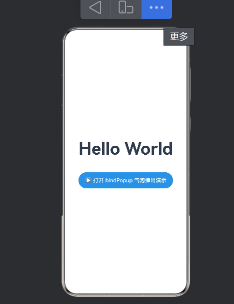
4.2 首页导航
import { router } from '@kit.ArkUI';

Button('▶ 打开 bindPopup 气泡弹出演示')
  .type(ButtonType.Capsule).width(280).height(48)
  .backgroundColor('#4A90E2')
  .onClick((): void => {
    router.pushUrl({ url: 'pages/BindPopoverPage' });
  })
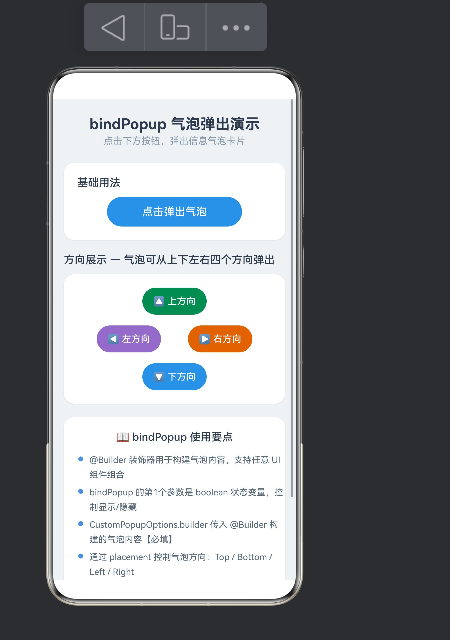
4.3 核心演示:基础气泡
完整配置演示:
Button('点击弹出气泡')
  .type(ButtonType.Capsule).width(200).height(44)
  .backgroundColor('#4A90E2')
  .onClick((): void => { this.isPopoverVisible = !this.isPopoverVisible; })
  .bindPopup(this.isPopoverVisible, {
    builder: (): void => this.popoverContentBuilder(),
    placement: Placement.Bottom,
    enableArrow: true,
    arrowOffset: 0,
    targetSpace: 0,
    autoCancel: true
  })
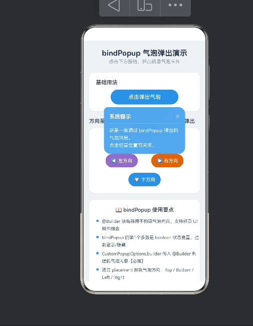
设计要点:Placement.Bottom 气泡在按钮正下方;enableArrow: true 显示三角箭头建立视觉关联;autoCancel: true 点击外部自动关闭;气泡内 ✕ 按钮提供显式关闭入口。
4.4 四方向展示
// 上
Button('🔼 上方向')
  .bindPopup(this.isTopPopover, {
    builder: (): void => this.simplePopoverBuilder(),
    placement: Placement.Top, enableArrow: true, targetSpace: 4
  })
// 左
Button('◀ 左方向')
  .bindPopup(this.isLeftPopover, {
    builder: (): void => this.simplePopoverBuilder(),
    placement: Placement.Left, enableArrow: true, targetSpace: 4
  })
// 右
Button('▶ 右方向')
  .bindPopup(this.isRightPopover, {
    builder: (): void => this.simplePopoverBuilder(),
    placement: Placement.Right, enableArrow: true, targetSpace: 4
  })
// 下
Button('🔽 下方向')
  .bindPopup(this.isBottomPopover, {
    builder: (): void => this.simplePopoverBuilder(),
    placement: Placement.Bottom, enableArrow: true, targetSpace: 4
  })
每个按钮使用独立的 @State 变量隔离控制,互不干扰。
4.5 气泡内容构建
方案一:蓝色半透明卡片
@Builder
popoverContentBuilder() {
  Column() {
    Row() {
      Text(this.popoverTitle).fontSize(16).fontWeight(FontWeight.Bold).fontColor('#FFFFFF')
      Blank()
      Text('✕').onClick((): void => { this.isPopoverVisible = false; })
    }
    Divider().height(1).color('#FFFFFF').opacity(0.3)
    Text(this.popoverContent).fontSize(14).fontColor('#FFFFFF').lineHeight(22)
  }
  .width(240).backgroundColor('#CC4A90E2')
  .borderRadius(12).padding(16)
  .shadow({ radius: 8, color: '#33000000', offsetX: 0, offsetY: 4 })
}
方案二:绿色简洁卡片
@Builder
simplePopoverBuilder() {
  Column() {
    Row() {
      Text('📌').fontSize(20).margin({ right: 8 })
      Text('提示信息').fontSize(15).fontWeight(FontWeight.Medium).fontColor('#FFFFFF')
    }
    Divider().height(1).color('#FFFFFF').opacity(0.2).margin({ top: 8, bottom: 8 })
    Text('气泡可以出现在目标元素的上下左右四个方向。').fontSize(13).fontColor('#FFFFFF').lineHeight(20)
  }
  .width(200).backgroundColor('#CC2E8B57')
  .borderRadius(10).padding(14)
  .shadow({ radius: 6, color: '#33000000', offsetX: 0, offsetY: 3 })
}
视觉设计原则:① 半透明背景(#CC = 80% 不透明度)保持轻量感;② 圆角+阴影营造立体浮层层次;③ 内置关闭按钮与 autoCancel 互补;④ 统一内边距确保内容可读性。
五、进阶技巧与最佳实践
5.1 状态管理陷阱
// ❌ 错误
let localVisible = false;

// ✅ 正确
@State isVisible: boolean = false;
bindPopup 依赖 ArkUI 响应式更新机制,只有 @State 变量变更才会触发重渲染。
5.2 多气泡互斥控制
onClick((): void => {
  this.isTopPopover = false;
  this.isBottomPopover = false;
  this.isLeftPopover = false;
  this.isRightPopover = false;
  this.isTopPopover = true; // 仅打开当前
})
5.3 气泡嵌套限制
bindPopup 在同一组件上不支持嵌套多层。即气泡的 @Builder 内再次使用 bindPopup 不会生效。替代方案:使用 bindContentCover 或 CustomDialogController。
5.4 性能优化
- 气泡内容延迟构建:只在
show = true时调用builder - 不在
builder中执行网络请求或大量计算 - 气泡内组件数量控制在 10 个以内
5.5 交互建议
- 保持
autoCancel: true(默认值),让用户点击外部可关闭 - 气泡内容中提供关闭按钮,双重保障
- 使用
onStateChange跟踪气泡状态 - 内容字体不小于 13fp
六、常见问题
Q:bindPopup 与 bindMenu 有何区别?bindMenu 专用于列表形式的上下文菜单;bindPopup 支持任意自定义 UI 内容,更灵活。
Q:气泡不显示箭头怎么办?
检查 enableArrow 是否被设为 false(默认 true)。
Q:屏幕边缘会自动调整吗?
会。bindPopup 默认在气泡超出屏幕时自动移回安全区域。
Q:builder 为什么用 (): void => 语法?
ArkTS 编译器规则(arkts-no-implicit-return-types)要求回调函数显式标注返回类型。
七、总结
bindPopup 是 HarmonyOS ArkTS 实现气泡弹出交互的标准方案。API 24 的 bindPopup + CustomPopupOptions 组合 API 设计统一、扩展性强。通过本文实践,应掌握以下核心技能:
- 正确使用
bindPopup语法:(show, { builder, placement, enableArrow, ... }) - 构建高质量气泡内容:利用
@Builder实现自定义卡片 - 控制弹出方向与行为:通过
Placement+CustomPopupOptions - 多气泡状态隔离:独立
@State变量管理 - 遵循 ArkTS 编译规范:箭头函数标注
(): void
气泡弹出虽小,却是提升用户体验的关键细节。合理运用 bindPopup,能在不打断用户操作的前提下优雅传递信息与引导操作。

作为“人工智能6S店”的官方数字引擎,为AI开发者与企业提供一个覆盖软硬件全栈、一站式门户。
更多推荐



 0
0 0
0- 0


 已为社区贡献168条内容

所有评论(0)