
鸿蒙原生 ArkTS 布局深度解析:Panel 与 Scroll 在面板内的配合实战
鸿蒙原生 ArkTS 布局深度解析:Panel 与 Scroll 在面板内的配合实战
HarmonyOS NEXT API 24 · ArkTS 声明式 UI · 2026 年 7 月
本文围绕完整的可运行示例,深入拆解 Panel 与 Scroll 在面板内的嵌套配合机制,涵盖触摸事件协调、滚动边界反馈、编程式滚动控制及 API 24 最佳实践。
一、引言
在鸿蒙原生应用开发中,Panel(面板) 是从底部滑出的重要交互容器,广泛应用于音乐播放器、控制中心、商品详情浮层等场景。当面板内部承载大量可滚动内容时,一个核心问题随之浮现:如何在 Panel 拖拽手势与内部 Scroll 滚动手势之间实现平滑协调?
两者共用垂直方向的触摸事件,处理不当则互相抢占。HarmonyOS NEXT API 24 的 ArkUI 框架通过 Panel 组件原生的事件协调机制 优雅地解决了这一问题。本文以「鸿蒙知识库」示例为线索,逐层拆解 Panel + Scroll 的配合原理与最佳实践。
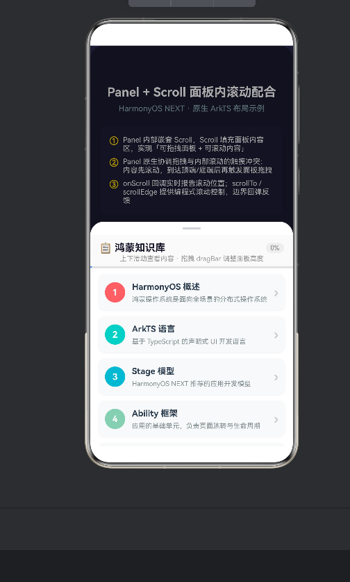
二、示例应用概述
「鸿蒙知识库」功能如下:
- 底部弹出面板,内含 15 张知识卡片;
- 面板支持 Mini / Half / Full 三档高度,通过 dragBar 拖拽切换;
- 面板内部可自由上下滚动;
- 顶部固定区域显示滚动进度条与百分比;
- 提供「滚到顶部」「滚到底部」编程式控制按钮。
核心配合场景:
| 场景 | 描述 |
|---|---|
| 半屏 + 内容滚动 | Half 模式下 Scroll 区域有限但仍可滚动查看全部卡片 |
| 全屏 + 内容滚动 | Full 模式下 Scroll 空间最大,浏览体验最佳 |
| 拖拽面板高度 | dragBar 改变高度,Scroll 自适应重排 |
| 编程式滚动控制 | 通过 Scroller API 精确控制位置 |
三、技术要点拆解
3.1 Panel 组件基础(API 24)
API 24 中 Panel 构造函数签名改为:
Panel(show: boolean)
第一个参数是布尔值控制显隐,模式通过 .mode() 设置:
Panel(this.panelVisible)
  .mode(this.panelMode)
  .type(PanelType.Foldable)
  .dragBar(true)
  .halfHeight(400).fullHeight(700)
如果误将 PanelMode 传入构造函数,编译器报错:Argument of type 'PanelMode' is not assignable to parameter of type 'boolean'。
3.2 Scroll 在 Panel 内的布局(核心难点)
关键在于 Scroll 撑满 Panel 内容区的剩余空间。布局结构:
Panel
└── Column
    ├── Column (固定头部:标题 + 进度条)  ← 固定高度
    └── Scroll (可滚动内容区)             ← layoutWeight(1) 撑满
        └── Column (15 张卡片)
Scroll 不设固定高度,用 .layoutWeight(1) 占满剩余空间:
Column() {
  Column() { /* 固定头部 */ }
  Scroll(this.scrollCtrl)
    .layoutWeight(1)              // ← 撑满剩余空间
    .scrollable(ScrollDirection.Vertical)
    .edgeEffect(EdgeEffect.Spring)
}
用户拖拽面板时,Column 高度变化,layoutWeight 自动重分配 Scroll 可用区域,无需手动计算。
3.3 触摸事件协调机制(核心亮点)
Panel 原生支持 事件优先级仲裁:
手指滑动 → Scroll 未到边界 → Scroll 滚动内容
        → Scroll 已到边界 → Panel 拖拽改变高度
无需额外编码,只需并行配置两者:
Panel(this.panelVisible).dragBar(true).type(PanelType.Foldable)
Scroll(this.scrollCtrl).enableScrollInteraction(true).edgeEffect(EdgeEffect.Spring)
Panel 框架自动完成事件仲裁与分发。
3.4 滚动监听与进度可视化
Scroll(this.scrollCtrl)
  .onScroll((_, yOffset: number) => {
    this.scrollProgress = Math.min(100, (yOffset / 800) * 100);
  })
头部进度条:
Progress({ value: this.scrollProgress, total: 100, type: ProgressType.Linear })
  .width('100%').height(3).color('#448AFF').backgroundColor('#E0E0E0')
3.5 编程式滚动控制
private scrollCtrl: Scroller = new Scroller();
this.scrollCtrl.scrollEdge(Edge.Top);      // 滚到顶部
this.scrollCtrl.scrollEdge(Edge.Bottom);   // 滚到底部
this.scrollCtrl.scrollTo({                 // 精确跳转
  xOffset: 0, yOffset: 500,
  animation: { duration: 300, curve: Curve.FastOutLinearIn }
});
3.6 边界弹簧效果
.edgeEffect(EdgeEffect.Spring) 在内容滑动到边界时产生「拉伸 — 回弹」动画。它提供明确边界反馈、缓冲过渡到面板拖拽、提升视觉品质。
四、代码结构分析
4.1 核心状态
@State panelVisible: boolean = true;
@State panelMode: PanelMode = PanelMode.Half;
@State scrollProgress: number = 0;
@State panelHeight: number = 400;
4.2 数据源
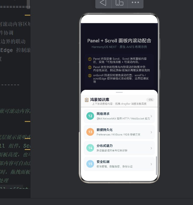
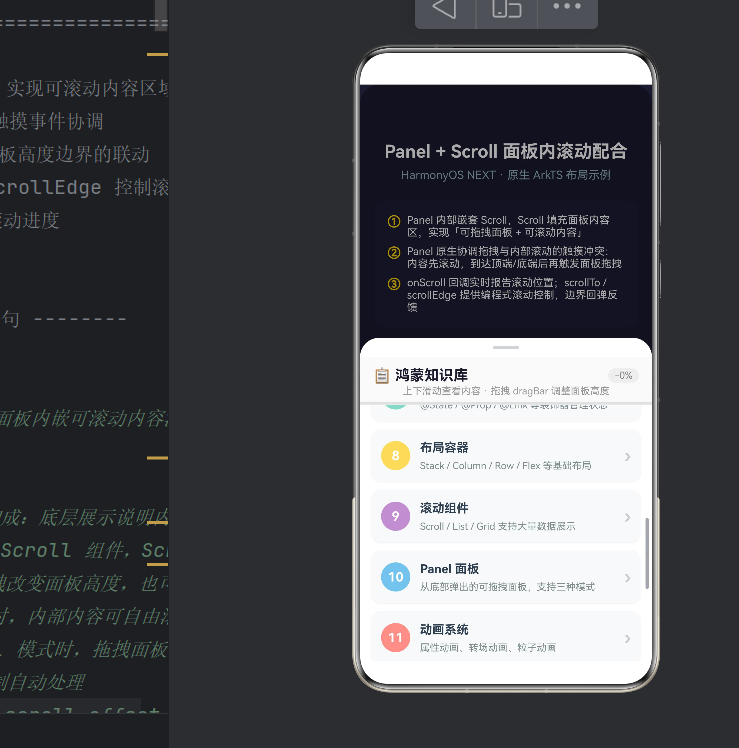
15 张卡片覆盖 HarmonyOS 核心概念:概述、ArkTS、Stage 模型、Ability、组件化、声明式 UI、状态管理、布局容器、滚动组件、Panel、动画、网络、持久化、分布式、安全。通过 ForEach + @Builder 渲染。
4.3 @Builder 卡片封装
@Builder
renderCard(item: ScrollItem, index: number) {
  Row() {
    Text((index + 1).toString()).backgroundColor(item.color).borderRadius(18)
    Column({ space: 4 }) {
      Text(item.title).fontWeight(FontWeight.Bold)
      Text(item.desc).fontColor('#7F8C8D')
    }
    Text('›')
  }
}
4.4 事件回调链
Panel:.onChange()(模式切换)→ .onHeightChange()(连续触发)
Scroll:.onScroll()(滚动中)→ .onScrollStop()(停止)
五、典型场景
半屏 + 滚动:Half 高度 400vp,固定头占 70vp,Scroll 可用 330vp。15 张卡片总高约 1050vp,用户必须滚动浏览。
全屏 + 滚动:Full 高度 700vp,Scroll 可用 630vp,约 8–9 张卡片同时可见。
拖拽 + 位置保持:从 Full 拖到 Mini,Scroll 滚动位置保留。Scroller 维护 offset,不受父容器高度影响。
编程滚动:scrollTo() 精确跳转,适用于消息面板定位未读项等场景。
六、注意事项
6.1 禁止嵌套可滚动容器
Panel 内 Scroll 已是垂直滚动容器,不要再嵌套 List、Grid 或其他 Scroll。
6.2 Scroll 必须配 layoutWeight(1)
// ❌ 错误
Scroll() {}.height(300)  // 面板变化时无法自适应
6.3 totalScrollHeight 精确计算
// onAreaChange
Column().onAreaChange((_, newValue: Area) => {
  this.totalScrollHeight = newValue.height;
})
// getItemRect
const rect = this.scrollCtrl.getItemRect(index);
6.4 API 24 兼容说明
| 特性 | API 23 | API 24 |
|---|---|---|
| Panel 构造 | Panel(mode) |
Panel(show) |
| 进度条颜色 | .valueColor() |
.color() |
| trackColor | 支持 | .backgroundColor() |
| onHeightChange | (min, max) |
(value) |
6.5 性能优化
大量数据用 LazyForEach;@Builder 保持轻量;超长列表用 EdgeEffect.None。
七、总结
本文围绕 HarmonyOS NEXT API 24,通过「鸿蒙知识库」示例,系统讲解了 Panel 与 Scroll 在面板内的配合。
关键要义:
- 布局结构:Panel → Column(固定头 + layoutWeight Scroll)是标准嵌套模式;
- 事件协调:Panel 原生处理触摸冲突,无需额外编码;
- 自适应能力:layoutWeight 让 Scroll 随面板高度自动调整;
- 可视化反馈:onScroll 获取滚动进度并展示;
- 编程控制:Scroller 提供 scrollEdge / scrollTo 等方法;
- API 版本注意:API 24 在 Panel 构造函数上有 break change。
掌握 Panel + Scroll 配合,是鸿蒙应用中构建高质量浮层面板交互的必备技能。
关于作者:示例代码已在 DevEco Studio 5.x + HarmonyOS NEXT API 24 环境下编译通过并运行验证。
附录:代码框架
@Entry
@Component
struct PanelScrollSample {
  @State panelVisible: boolean = true;
  @State panelMode: PanelMode = PanelMode.Half;
  @State scrollProgress: number = 0;
  @State panelHeight: number = 400;

  private readonly MINI_HEIGHT: number = 120;
  private readonly HALF_HEIGHT: number = 400;
  private readonly FULL_HEIGHT: number = 700;

  private readonly ITEMS: ScrollItem[] = [
    { id: 1, title: 'HarmonyOS 概述', desc: '分布式操作系统', color: '#FF6B6B' },
    { id: 2, title: 'ArkTS 语言', desc: '声明式 UI 语言', color: '#4ECDC4' },
    { id: 3, title: 'Stage 模型', desc: '推荐开发模型', color: '#45B7D1' },
    { id: 4, title: 'Ability 框架', desc: '页面生命周期', color: '#96CEB4' },
    { id: 5, title: '组件化开发', desc: '@Component 复用', color: '#FFEAA7' },
    { id: 6, title: '声明式 UI', desc: '状态驱动视图', color: '#DDA0DD' },
    { id: 7, title: '状态管理', desc: '@State / @Prop', color: '#98D8C8' },
    { id: 8, title: '布局容器', desc: 'Stack / Column', color: '#F7DC6F' },
    { id: 9, title: '滚动组件', desc: 'Scroll / List', color: '#BB8FCE' },
    { id: 10, title: 'Panel 面板', desc: '可拖拽面板', color: '#85C1E9' },
    { id: 11, title: '动画系统', desc: '属性动画', color: '#F1948A' },
    { id: 12, title: '网络请求', desc: 'HTTP / WebSocket', color: '#73C6B6' },
    { id: 13, title: '数据持久化', desc: 'Preferences / RDB', color: '#F0B27A' },
    { id: 14, title: '分布式能力', desc: '跨设备共享', color: '#A3E4D7' },
    { id: 15, title: '安全机制', desc: '权限与加密', color: '#AED6F1' },
  ];

  private scrollCtrl: Scroller = new Scroller();

  build() {
    Stack() {
      Column() {
        Text('Panel + Scroll 配合').fontSize(22).fontWeight(FontWeight.Bold)
          .fontColor(Color.White).margin({ top: 40, bottom: 8 })
        Text('HarmonyOS NEXT API 24').fontSize(14).fontColor('#AACCFFFF')
      }
      .width('100%').height('100%').backgroundColor('#1A1A2E')

      Panel(this.panelVisible) {
        Column() {
          Column() {
            Row() {
              Text('📋 鸿蒙知识库').fontSize(18).fontWeight(FontWeight.Bold)
            }
            .width('100%').padding({ left: 16, right: 16, top: 12 })
            Text('上下滑动 · 拖拽 dragBar').fontSize(12).fontColor('#999999')
              .padding({ left: 16, right: 16, bottom: 6 })
            Divider().strokeWidth(1).color('#E8E8E8')
          }
          .width('100%').backgroundColor('#FAFAFA')

          Scroll(this.scrollCtrl) {
            Column({ space: 10 }) {
              ForEach(this.ITEMS, (item: ScrollItem) => {
                // 卡片渲染
              }, (item: ScrollItem) => item.id.toString())
            }
            .width('100%').padding(14)
          }
          .layoutWeight(1)
          .scrollable(ScrollDirection.Vertical)
          .edgeEffect(EdgeEffect.Spring)
          .enableScrollInteraction(true)
          .onScroll((_, yOffset: number) => {
            this.scrollProgress = Math.min(100, (yOffset / 800) * 100);
          })
        }
        .width('100%').height('100%')
      }
      .dragBar(true).type(PanelType.Foldable).mode(this.panelMode)
      .halfHeight(400).fullHeight(700).show(this.panelVisible)
      .onChange((_, height: number, mode: PanelMode) => {
        this.panelMode = mode; this.panelHeight = height;
      })
      .onHeightChange((value: number) => { this.panelHeight = value; })
      .width('100%').height('100%')
      .backgroundMask('#55000000').backgroundColor('#FFFFFF')
      .borderRadius({ topLeft: 24, topRight: 24 })
    }
    .width('100%').height('100%')
  }
}

interface ScrollItem {
  id: number; title: string; desc: string; color: string;
}

作为“人工智能6S店”的官方数字引擎,为AI开发者与企业提供一个覆盖软硬件全栈、一站式门户。
更多推荐


 0
0 0
0- 0


 已为社区贡献157条内容

所有评论(0)