
鸿蒙HarmonyOS ArkTS原生学习:新闻列表页布局深度解析
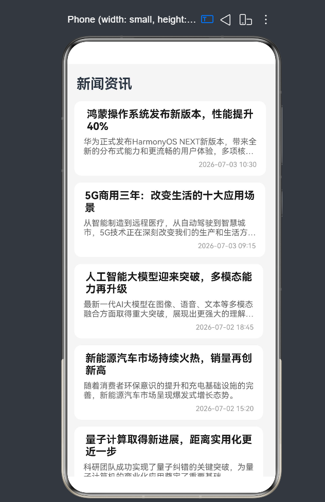
项目演示
一、引言
1.1 新闻列表页在移动应用中的地位
在当今信息爆炸的时代,新闻列表页作为内容消费的核心入口,承载着用户获取资讯的重要功能。无论是今日头条、腾讯新闻等专业资讯应用,还是微信、微博等社交平台,新闻列表页都是用户最常接触的页面之一。一个优秀的新闻列表页不仅能够提升用户的阅读效率,还能增强用户的停留时间和内容转化率。
1.2 新闻列表页的核心布局模式
经过多年的移动端设计演进,"标题 + 摘要 + 时间"的三段式布局已经成为新闻列表页的标准设计模式。这种布局模式具有以下显著优势:
- 信息层级分明:标题作为核心信息以较大字号和加粗样式呈现,摘要作为补充信息以中等字号和灰色字体呈现,时间作为辅助信息以最小字号和浅灰色字体呈现,形成清晰的视觉层次。
- 阅读效率高:用户可以快速浏览标题获取核心内容,通过摘要了解文章的大致内容,时间则帮助用户判断新闻的时效性,从而决定是否点击阅读。
- 视觉体验舒适:合理的间距和字体大小能够减轻用户的阅读疲劳,提升整体使用体验。
1.3 技术选型与学习路径
本文将基于HarmonyOS NEXT(API 24)的ArkTS语言,使用ArkUI框架进行新闻列表页的开发。学习路径如下:
- 基础布局组件:掌握Column、Row等基础布局组件的使用
- 列表组件:深入理解List组件的核心特性和最佳实践
- 数据渲染:掌握ForEach、Repeat等数据渲染API
- 交互功能:实现下拉刷新、上拉加载等交互效果
- 性能优化:学习列表渲染的性能优化策略
- API 24新特性:了解并应用API 24引入的新功能
1.4 本文学习目标
通过本文的学习,您将掌握以下技能:
- 如何定义和管理新闻数据模型
- 如何使用Column组件实现"标题 + 摘要 + 时间"的三段式布局
- 如何使用List组件构建高性能的滚动列表
- 如何使用ForEach和Repeat进行数据渲染
- 如何实现下拉刷新和上拉加载功能
- 如何处理文本溢出和布局稳定性问题
- 如何进行性能优化和常见陷阱规避
二、新闻数据建模
2.1 数据模型设计原则
在开发新闻列表页之前,首先需要定义清晰的数据模型。一个好的数据模型应该满足以下原则:
- 完整性:包含新闻展示所需的所有必要字段
- 灵活性:支持可选字段以适应不同场景
- 可扩展性:便于后续添加新字段
- 类型安全:使用TypeScript的类型系统确保数据类型的正确性
2.2 数据模型定义
基于上述原则,我们可以定义如下的新闻数据模型:
interface NewsItem {
  id: number;           // 新闻唯一标识,用于列表渲染的key值
  title: string;        // 新闻标题,核心信息
  summary: string;      // 新闻摘要,补充信息
  time: string;         // 发布时间,格式如"2026-07-03 10:30"
  category: string;     // 新闻分类,如"科技"、"财经"等
  readCount: number;    // 阅读量,展示新闻受欢迎程度
  isHot: boolean;       // 是否热门,用于UI差异化展示
  imageUrl?: string;    // 封面图片URL,可选字段
  author?: string;      // 作者信息,可选字段
  source?: string;      // 新闻来源,可选字段
}
字段详细说明:
| 字段名 | 类型 | 必填 | 说明 |
|---|---|---|---|
| id | number | 是 | 新闻唯一标识符,用于列表项的key值,帮助框架识别列表项的变化 |
| title | string | 是 | 新闻标题,通常是用户最关注的内容,建议控制在50字以内 |
| summary | string | 是 | 新闻摘要,提供标题之外的补充信息,建议控制在100字以内 |
| time | string | 是 | 发布时间,帮助用户了解新闻的时效性 |
| category | string | 是 | 新闻分类,用于分组展示或标签显示 |
| readCount | number | 是 | 阅读量,展示新闻的受欢迎程度 |
| isHot | boolean | 是 | 是否热门标识,用于UI差异化展示(如热门标签) |
| imageUrl | string | 否 | 封面图片URL,用于图文混排场景 |
| author | string | 否 | 作者信息,用于展示文章作者 |
| source | string | 否 | 新闻来源,用于展示内容出处 |
2.3 响应式数据管理
在ArkTS中,使用@State装饰器可以实现响应式数据管理。当数据发生变化时,框架会自动更新相关的UI组件:
@State newsList: NewsItem[] = [];      // 新闻列表数据
@State isLoading: boolean = false;     // 是否正在加载
@State hasMore: boolean = true;        // 是否还有更多数据
@State refreshing: boolean = false;    // 是否正在刷新
响应式数据的工作原理:
- 当
@State装饰的变量发生变化时,框架会检测到变化 - 框架会重新渲染依赖该变量的组件
- 只更新变化的部分,而不是整个页面
响应式数据的优点:
- 自动更新UI:数据变化时,相关组件自动重新渲染
- 简化状态管理:无需手动调用刷新方法
- 提升开发效率:减少样板代码
- 性能优化:只更新变化的部分,避免不必要的渲染
2.4 数据初始化
在实际开发中,新闻数据通常来自网络请求。为了便于学习和演示,我们可以使用模拟数据进行初始化:
@State newsList: NewsItem[] = [
  {
    id: 1,
    title: '鸿蒙操作系统发布新版本,性能提升40%',
    summary: '华为正式发布HarmonyOS NEXT新版本,带来全新的分布式能力和更流畅的用户体验,多项核心性能指标显著提升。',
    time: '2026-07-03 10:30',
    category: '科技',
    readCount: 12840,
    isHot: true,
    author: '科技前沿',
    source: '华为官方'
  },
  {
    id: 2,
    title: '5G商用三年:改变生活的十大应用场景',
    summary: '从智能制造到远程医疗,从自动驾驶到智慧城市,5G技术正在深刻改变我们的生产和生活方式。',
    time: '2026-07-03 09:15',
    category: '通信',
    readCount: 8920,
    isHot: false,
    author: '通信专家',
    source: '工信部'
  },
  {
    id: 3,
    title: '人工智能大模型迎来突破,多模态能力再升级',
    summary: '最新一代AI大模型在图像、语音、文本等多模态融合方面取得重大突破,展现出更强大的理解和生成能力。',
    time: '2026-07-02 18:45',
    category: 'AI',
    readCount: 15670,
    isHot: true,
    author: 'AI研究者',
    source: '学术期刊'
  }
];
2.5 数据服务封装
为了提高代码的可维护性和复用性,我们可以将数据获取逻辑封装成独立的数据服务:
class NewsService {
  private baseUrl: string = 'https://api.example.com/news';

  async fetchNews(page: number = 1, pageSize: number = 10): Promise<NewsItem[]> {
    try {
      const response = await fetch(`${this.baseUrl}?page=${page}&pageSize=${pageSize}`);
      const data = await response.json();
      return data.items;
    } catch (error) {
      console.error('Failed to fetch news:', error);
      return [];
    }
  }

  async fetchHotNews(): Promise<NewsItem[]> {
    try {
      const response = await fetch(`${this.baseUrl}/hot`);
      const data = await response.json();
      return data.items;
    } catch (error) {
      console.error('Failed to fetch hot news:', error);
      return [];
    }
  }

  getMockData(): NewsItem[] {
    return [
      {
        id: 1,
        title: '鸿蒙操作系统发布新版本,性能提升40%',
        summary: '华为正式发布HarmonyOS NEXT新版本,带来全新的分布式能力和更流畅的用户体验,多项核心性能指标显著提升。',
        time: '2026-07-03 10:30',
        category: '科技',
        readCount: 12840,
        isHot: true,
        author: '科技前沿',
        source: '华为官方'
      },
      {
        id: 2,
        title: '5G商用三年:改变生活的十大应用场景',
        summary: '从智能制造到远程医疗,从自动驾驶到智慧城市,5G技术正在深刻改变我们的生产和生活方式。',
        time: '2026-07-03 09:15',
        category: '通信',
        readCount: 8920,
        isHot: false,
        author: '通信专家',
        source: '工信部'
      },
      {
        id: 3,
        title: '人工智能大模型迎来突破,多模态能力再升级',
        summary: '最新一代AI大模型在图像、语音、文本等多模态融合方面取得重大突破,展现出更强大的理解和生成能力。',
        time: '2026-07-02 18:45',
        category: 'AI',
        readCount: 15670,
        isHot: true,
        author: 'AI研究者',
        source: '学术期刊'
      }
    ];
  }
}

const newsService = new NewsService();
export { newsService, NewsItem };
三、基础三段式布局实现
3.1 Column布局组件详解
Column组件是ArkUI中最常用的纵向布局容器。它将子组件按照垂直方向排列,是实现"标题 + 摘要 + 时间"布局的理想选择。
Column组件的核心特性:
- 垂直排列:子组件按照从上到下的顺序排列
- 间距控制:通过
space参数设置子组件之间的垂直间距 - 对齐方式:支持水平对齐(默认居中)和垂直对齐
- 尺寸自适应:默认宽度撑满父容器,高度根据子组件自适应
Column组件的基本用法:
Column({ space: 8 }) {
  Text('新闻标题')
    .fontSize(18)
    .fontWeight(FontWeight.Bold);

  Text('新闻摘要')
    .fontSize(14)
    .fontColor('#666666');

  Text('发布时间')
    .fontSize(12)
    .fontColor('#999999');
}
Column组件的参数说明:
| 参数名 | 类型 | 默认值 | 说明 |
|---|---|---|---|
| space | number | 0 | 子组件之间的垂直间距,单位为vp |
| alignItems | HorizontalAlign | HorizontalAlign.Center | 子组件在水平方向的对齐方式 |
| justifyContent | FlexAlign | FlexAlign.Start | 子组件在垂直方向的对齐方式 |
3.2 文本组件样式设计
文本组件是新闻列表页中最核心的组件,合理的样式设置能够提升阅读体验。
3.2.1 标题文本样式
标题作为新闻的核心信息,需要突出显示:
Text(item.title)
  .fontSize(18)                          // 标题字号,建议18vp
  .fontWeight(FontWeight.Bold)           // 加粗显示,增强视觉冲击力
  .fontColor('#1A1A1A')                  // 深黑色字体,确保可读性
  .maxLines(2)                           // 最多显示2行,避免占用过多空间
  .textOverflow({ overflow: TextOverflow.Ellipsis });  // 超出部分省略号处理
标题样式设计要点:
- 字体大小:18vp是标题的理想大小,既保证可读性又不会过于庞大
- 字体粗细:加粗显示能够使标题在视觉上更加突出
- 字体颜色:深黑色(#1A1A1A)比纯黑色(#000000)更加柔和,减少视觉疲劳
- 行数限制:最多2行能够在保证信息完整性的同时控制卡片高度
- 溢出处理:使用省略号处理超出部分,确保布局稳定性
3.2.2 摘要文本样式
摘要作为补充信息,需要与标题形成视觉层次:
Text(item.summary)
  .fontSize(14)                          // 摘要字号,比标题小4vp
  .fontColor('#666666')                  // 中等灰色字体,与标题形成对比
  .maxLines(2)                           // 最多显示2行
  .textOverflow({ overflow: TextOverflow.Ellipsis });  // 超出部分省略号处理
摘要样式设计要点:
- 字体大小:14vp是正文的标准大小,适合阅读
- 字体颜色:中等灰色(#666666)既保证可读性,又不会抢标题的风头
- 行数限制:最多2行能够提供足够的信息,同时控制卡片高度
3.2.3 时间文本样式
时间作为辅助信息,需要弱化显示:
Text(item.time)
  .fontSize(12)                          // 时间字号,比摘要小2vp
  .fontColor('#999999')                  // 浅灰色字体,弱化显示
  .alignSelf(ItemAlign.End);             // 右对齐,与标题形成视觉平衡
时间样式设计要点:
- 字体大小:12vp是辅助信息的标准大小
- 字体颜色:浅灰色(#999999)弱化显示,避免干扰用户阅读
- 对齐方式:右对齐能够与左侧的标题形成视觉平衡
3.3 间距控制策略
合理的间距设置是布局美观的关键。在ArkUI中,有多种方式控制间距:
3.3.1 使用Column的space参数
Column({ space: 8 }) {
  Text(item.title);
  Text(item.summary);
  Text(item.time);
}
优点:
- 代码简洁,一目了然
- 统一控制间距,避免间距混乱
- 易于维护,修改一个参数即可调整所有间距
缺点:
- 所有子组件间距相同,无法单独设置
3.3.2 使用padding属性
Column() {
  // 内容区域
}
.padding({ left: 16, right: 16, top: 12, bottom: 12 });
优点:
- 控制容器内边距,确保内容与边框有足够距离
- 可以分别设置四个方向的内边距
适用场景:
- 控制容器整体内边距
- 确保内容不会紧贴边框
3.3.3 使用margin属性
Text('标题')
  .margin({ bottom: 8 });

Text('摘要')
  .margin({ bottom: 8 });
优点:
- 可以单独设置每个组件的外边距
- 灵活性高,可以实现复杂的间距布局
缺点:
- 代码较为冗长
- 容易导致间距混乱,难以维护
最佳实践:
- 使用
space参数控制同层组件的间距,代码更简洁 - 使用
padding控制容器内边距,确保内容与边框有足够距离 - 避免过度使用
margin,尤其是在Column布局中,容易导致间距混乱
3.4 完整的新闻卡片布局
将以上知识点整合,我们可以创建一个完整的新闻卡片布局:
Column({ space: 8 }) {
  // 标题区域
  Text(item.title)
    .fontSize(18)
    .fontWeight(FontWeight.Bold)
    .fontColor('#1A1A1A')
    .maxLines(2)
    .textOverflow({ overflow: TextOverflow.Ellipsis });

  // 摘要区域
  Text(item.summary)
    .fontSize(14)
    .fontColor('#666666')
    .maxLines(2)
    .textOverflow({ overflow: TextOverflow.Ellipsis });

  // 时间区域
  Text(item.time)
    .fontSize(12)
    .fontColor('#999999')
    .alignSelf(ItemAlign.End);
}
// 卡片样式
.padding({ left: 16, right: 16, top: 12, bottom: 12 })
.backgroundColor('#FFFFFF')
.borderRadius(12)
.shadow({ radius: 4, color: '#0000001A', offsetY: 2 });
卡片样式说明:
| 属性 | 值 | 说明 |
|---|---|---|
| padding | { left: 16, right: 16, top: 12, bottom: 12 } | 卡片内边距,确保内容与边框有足够距离 |
| backgroundColor | ‘#FFFFFF’ | 白色背景,与列表背景形成对比 |
| borderRadius | 12 | 圆角半径,使卡片看起来更加柔和 |
| shadow | { radius: 4, color: ‘#0000001A’, offsetY: 2 } | 阴影效果,增加卡片的层次感 |
四、List组件深度解析
4.1 List组件概述
List组件是ArkUI中用于展示列表数据的核心组件。它具有以下特点:
- 高性能滚动:支持虚拟滚动,只渲染可见区域的列表项
- 丰富的交互:支持下拉刷新、上拉加载、滑动删除等
- 灵活的布局:支持单列、多列、瀑布流等布局方式
- 内置优化:自动回收不可见的列表项,减少内存占用
List组件的核心优势:
- 虚拟滚动:只渲染可见区域的列表项,大大减少内存占用和渲染时间
- 列表项回收:自动回收不可见的列表项,避免内存泄漏
- 流畅滚动:内置滚动优化,确保滚动过程流畅
- 丰富的API:提供丰富的属性和事件,满足各种交互需求
4.2 List组件基本用法
List({ space: 12 }) {
  ForEach(this.newsList, (item: NewsItem) => {
    ListItem() {
      // 新闻卡片布局
      Column({ space: 8 }) {
        Text(item.title)
          .fontSize(18)
          .fontWeight(FontWeight.Bold);

        Text(item.summary)
          .fontSize(14)
          .fontColor('#666666');

        Text(item.time)
          .fontSize(12)
          .fontColor('#999999');
      }
      .padding(16)
      .backgroundColor('#FFFFFF');
    }
  }, (item: NewsItem) => item.id.toString());
}
.width('100%')
.layoutWeight(1);
List组件参数说明:
| 参数名 | 类型 | 默认值 | 说明 |
|---|---|---|---|
| space | number | 0 | 列表项之间的间距,单位为vp |
| scroller | Scroller | - | 滚动控制器,用于手动控制滚动位置 |
| initialIndex | number | 0 | 初始滚动位置,即默认显示的列表项索引 |
4.3 ListItem组件详解
ListItem是List的子组件,用于定义列表项的内容和样式:
ListItem() {
  Column({ space: 8 }) {
    // 新闻内容
  }
}
.borderRadius(12)
.shadow({ radius: 4, color: '#0000001A', offsetY: 2 });
ListItem特点:
- 标准交互:提供标准的列表项交互行为(如点击效果、长按效果)
- 滑动操作:支持滑动操作(如滑动删除、滑动显示操作按钮)
- 状态样式:可以设置状态样式(如选中状态、禁用状态)
- 生命周期:支持列表项的生命周期回调
4.4 ForEach渲染机制
ForEach是ArkUI中用于循环渲染组件的核心API:
ForEach(
  this.newsList,                  // 数据源
  (item: NewsItem) => {           // 渲染函数
    ListItem() {
      // 列表项内容
    }
  },
  (item: NewsItem) => item.id.toString()  // 唯一标识函数
);
ForEach参数说明:
| 参数名 | 类型 | 说明 |
|---|---|---|
| arr | Array | 数据源,必须是数组类型 |
| itemGenerator | (item: T, index?: number) => void | 渲染函数,用于生成每个列表项的内容 |
| keyGenerator | (item: T, index?: number) => string | 唯一标识函数,用于生成每个列表项的唯一key |
唯一标识函数的重要性:
- 帮助框架识别变化:当列表数据发生变化时,框架通过key值识别哪些列表项需要更新
- 优化渲染性能:只更新变化的列表项,避免不必要的组件重建
- 避免状态丢失:正确的key值可以确保列表项的状态在数据更新时保持稳定
唯一标识函数的设计原则:
- 唯一性:每个列表项的key值必须唯一
- 稳定性:同一个列表项的key值在数据更新时应该保持不变
- 简洁性:key值应该简洁,避免使用复杂的计算逻辑
4.5 List组件核心属性
4.5.1 listDirection属性
控制列表的滚动方向:
List({ space: 12 }) {
  // 列表内容
}
.listDirection(Axis.Vertical);  // 垂直滚动(默认)
// .listDirection(Axis.Horizontal);  // 水平滚动
4.5.2 scrollBar属性
控制滚动条的显示方式:
List({ space: 12 }) {
  // 列表内容
}
.scrollBar(BarState.Auto);  // 自动显示/隐藏滚动条(默认)
// .scrollBar(BarState.On);  // 始终显示滚动条
// .scrollBar(BarState.Off);  // 始终隐藏滚动条
4.5.3 cachedCount属性
控制缓存的列表项数量:
List({ space: 12 }) {
  // 列表内容
}
.cachedCount(3);  // 缓存3个列表项
cachedCount的作用:
- 预渲染当前可见区域前后的列表项
- 减少滚动时的渲染延迟
- 提升滚动流畅度
cachedCount的设置建议:
- 默认值为3,适用于大多数场景
- 对于复杂的列表项,可以适当增大该值
- 对于简单的列表项,可以适当减小该值
4.5.4 chainAnimation属性
控制列表项的链式动画效果:
List({ space: 12 }) {
  // 列表内容
}
.chainAnimation(true);  // 启用链式动画
链式动画效果:
- 列表项依次进入屏幕时,会产生一个接一个的动画效果
- 提升列表的视觉吸引力
- 适用于列表项较少的场景
五、下拉刷新与上拉加载
5.1 下拉刷新实现
在HarmonyOS中,下拉刷新功能通过Refresh组件实现。Refresh组件需要包裹List组件:
@State refreshing: boolean = false;

build() {
  Refresh({ refreshing: this.refreshing }) {
    List({ space: 12 }) {
      ForEach(this.newsList, (item: NewsItem) => {
        ListItem() {
          // 新闻卡片
        }
      }, (item) => item.id.toString());
    }
    .width('100%')
    .layoutWeight(1);
  }
  .onRefreshing(() => {
    this.refreshing = true;
    // 模拟网络请求
    setTimeout(() => {
      this.newsList = this.getNewData();
      this.refreshing = false;
    }, 1000);
  });
}
Refresh组件参数说明:
| 参数名 | 类型 | 默认值 | 说明 |
|---|---|---|---|
| refreshing | boolean | false | 是否正在刷新 |
| refreshOffset | number | 60 | 刷新距离,单位为vp |
| maxPullDownDistance | number | 120 | 最大下拉距离,单位为vp |
Refresh组件事件说明:
| 事件名 | 参数 | 说明 |
|---|---|---|
| onRefreshing | () => void | 下拉刷新触发时的回调 |
| onStateChange | (state: RefreshStatus) => void | 刷新状态变化时的回调 |
| onOffsetChange | (offset: number) => void | 下拉偏移量变化时的回调 |
5.2 上拉加载实现
上拉加载功能通过List组件的onReachEnd事件实现:
@State hasMore: boolean = true;
@State isLoading: boolean = false;

build() {
  List({ space: 12 }) {
    ForEach(this.newsList, (item: NewsItem) => {
      ListItem() {
        // 新闻卡片
      }
    }, (item) => item.id.toString());

    // 加载更多提示
    if (this.hasMore) {
      ListItem() {
        Row() {
          if (this.isLoading) {
            Progress()
              .width(20)
              .height(20);

            Text('加载中...')
              .fontSize(14)
              .margin({ left: 8 });
          } else {
            Text('点击加载更多')
              .fontSize(14)
              .fontColor('#666666');
          }
        }
        .width('100%')
        .height(40)
        .justifyContent(FlexAlign.Center)
        .onClick(() => {
          this.loadMore();
        });
      }
    } else {
      ListItem() {
        Text('没有更多数据了')
          .fontSize(14)
          .fontColor('#999999')
          .width('100%')
          .textAlign(TextAlign.Center)
          .height(40);
      }
    }
  }
  .width('100%')
  .layoutWeight(1)
  .onReachEnd(() => {
    if (!this.isLoading && this.hasMore) {
      this.loadMore();
    }
  });
}

loadMore() {
  this.isLoading = true;
  setTimeout(() => {
    const newData = this.getMoreData();
    if (newData.length > 0) {
      this.newsList = [...this.newsList, ...newData];
    } else {
      this.hasMore = false;
    }
    this.isLoading = false;
  }, 1000);
}
上拉加载实现要点:
- 状态管理:使用
hasMore和isLoading两个状态变量管理加载状态 - 加载提示:显示加载中的进度条或提示文字
- 边界处理:当没有更多数据时,显示"没有更多数据了"提示
- 防重复加载:使用
isLoading状态防止重复触发加载
5.3 完整的下拉刷新与上拉加载实现
@Entry
@Component
struct NewsListPage {
  @State newsList: NewsItem[] = [];
  @State refreshing: boolean = false;
  @State isLoading: boolean = false;
  @State hasMore: boolean = true;

  aboutToAppear() {
    this.loadData();
  }

  build() {
    Column() {
      Refresh({ refreshing: this.refreshing }) {
        List({ space: 12 }) {
          ForEach(this.newsList, (item: NewsItem) => {
            ListItem() {
              Column({ space: 8 }) {
                Text(item.title)
                  .fontSize(18)
                  .fontWeight(FontWeight.Bold);

                Text(item.summary)
                  .fontSize(14)
                  .fontColor('#666666');

                Text(item.time)
                  .fontSize(12)
                  .fontColor('#999999');
              }
              .padding(16)
              .backgroundColor('#FFFFFF');
            }
          }, (item) => item.id.toString());

          this.buildLoadMore();
        }
        .width('100%')
        .layoutWeight(1)
        .onReachEnd(() => {
          if (!this.isLoading && this.hasMore) {
            this.loadMore();
          }
        });
      }
      .onRefreshing(() => {
        this.handleRefresh();
      });
    }
    .height('100%')
    .backgroundColor('#F5F5F5');
  }

  @Builder
  buildLoadMore() {
    if (this.hasMore) {
      ListItem() {
        Row() {
          if (this.isLoading) {
            Progress()
              .width(20)
              .height(20);

            Text('加载中...')
              .fontSize(14)
              .margin({ left: 8 });
          } else {
            Text('点击加载更多')
              .fontSize(14)
              .fontColor('#666666');
          }
        }
        .width('100%')
        .height(40)
        .justifyContent(FlexAlign.Center)
        .onClick(() => {
          if (!this.isLoading) {
            this.loadMore();
          }
        });
      }
    } else {
      ListItem() {
        Text('没有更多数据了')
          .fontSize(14)
          .fontColor('#999999')
          .width('100%')
          .textAlign(TextAlign.Center)
          .height(40);
      }
    }
  }

  loadData() {
    this.newsList = NewsDataSource.getMockData();
  }

  handleRefresh() {
    this.refreshing = true;
    setTimeout(() => {
      this.newsList = NewsDataSource.getMockData();
      this.hasMore = true;
      this.refreshing = false;
    }, 1000);
  }

  loadMore() {
    this.isLoading = true;
    setTimeout(() => {
      const newData = NewsDataSource.getMoreData();
      if (newData.length > 0) {
        this.newsList = [...this.newsList, ...newData];
      } else {
        this.hasMore = false;
      }
      this.isLoading = false;
    }, 1000);
  }
}
六、粘性分组头实现
6.1 分组数据结构设计
当新闻列表需要按分类分组展示时,我们需要设计分组数据结构:
interface NewsGroup {
  category: string;     // 分类名称
  items: NewsItem[];    // 该分类下的新闻列表
}

@State groupedNews: NewsGroup[] = [
  {
    category: '科技',
    items: [
      { id: 1, title: '鸿蒙操作系统发布新版本', /* ... */ },
      { id: 2, title: '人工智能大模型突破', /* ... */ }
    ]
  },
  {
    category: '财经',
    items: [
      { id: 3, title: '股市行情分析', /* ... */ }
    ]
  }
];
6.2 ListItemGroup组件使用
ListItemGroup组件用于实现列表分组,支持粘性头部效果:
build() {
  List({ space: 8 }) {
    ForEach(this.groupedNews, (group: NewsGroup) => {
      // 分组头
      ListItemGroup({ header: this.buildHeader(group.category) }) {
        // 分组内容
        ForEach(group.items, (item: NewsItem) => {
          ListItem() {
            Column({ space: 8 }) {
              Text(item.title)
                .fontSize(18)
                .fontWeight(FontWeight.Bold);

              Text(item.summary)
                .fontSize(14)
                .fontColor('#666666');

              Text(item.time)
                .fontSize(12)
                .fontColor('#999999');
            }
            .padding(16)
            .backgroundColor('#FFFFFF');
          }
        }, (item) => item.id.toString());
      }
    }, (group) => group.category);
  }
  .width('100%')
  .layoutWeight(1)
  .sticky(StickyStyle.Header);  // 启用粘性头部
}

@Builder
buildHeader(category: string) {
  Text(category)
    .fontSize(16)
    .fontWeight(FontWeight.Bold)
    .fontColor('#1A1A1A')
    .padding({ left: 16, top: 12, bottom: 8 })
    .width('100%')
    .backgroundColor('#F5F5F5');
}
ListItemGroup参数说明:
| 参数名 | 类型 | 说明 |
|---|---|---|
| header | BuilderNode | 分组头部内容 |
| footer | BuilderNode | 分组尾部内容(可选) |
sticky属性说明:
| 值 | 说明 |
|---|---|
| StickyStyle.None | 不启用粘性效果(默认) |
| StickyStyle.Header | 启用粘性头部 |
| StickyStyle.Footer | 启用粘性尾部 |
| StickyStyle.Both | 同时启用粘性头部和尾部 |
七、滑动操作实现
7.1 SwipeAction组件
SwipeAction组件用于实现列表项的滑动操作,如滑动删除、滑动显示操作按钮等:
build() {
  List({ space: 12 }) {
    ForEach(this.newsList, (item: NewsItem) => {
      ListItem() {
        SwipeAction({ end: this.buildSwipeButtons(item) }) {
          Column({ space: 8 }) {
            Text(item.title)
              .fontSize(18)
              .fontWeight(FontWeight.Bold);

            Text(item.summary)
              .fontSize(14)
              .fontColor('#666666');

            Text(item.time)
              .fontSize(12)
              .fontColor('#999999');
          }
          .padding(16)
          .backgroundColor('#FFFFFF');
        }
      }
    }, (item) => item.id.toString());
  }
  .width('100%')
  .layoutWeight(1);
}

@Builder
buildSwipeButtons(item: NewsItem) {
  Row() {
    Button('收藏')
      .width(80)
      .height('100%')
      .backgroundColor('#FF9800')
      .fontColor('#FFFFFF');

    Button('删除')
      .width(80)
      .height('100%')
      .backgroundColor('#F44336')
      .fontColor('#FFFFFF')
      .onClick(() => {
        this.deleteItem(item.id);
      });
  }
}

deleteItem(id: number) {
  this.newsList = this.newsList.filter(item => item.id !== id);
}
SwipeAction参数说明:
| 参数名 | 类型 | 说明 |
|---|---|---|
| start | BuilderNode | 滑动开始位置的操作按钮(左侧) |
| end | BuilderNode | 滑动结束位置的操作按钮(右侧) |
八、API 24新特性
8.1 DynamicLayout动态布局切换
API 24引入了DynamicLayout组件,支持在运行时动态切换不同的布局算法:
import { DynamicLayout, ColumnLayoutAlgorithm, RowLayoutAlgorithm } from '@kit.ArkUI';

@State currentLayout: 'list' | 'grid' = 'list';

build() {
  Column() {
    // 视图切换按钮
    Row() {
      Button('列表视图')
        .onClick(() => {
          this.currentLayout = 'list';
        });

      Button('网格视图')
        .onClick(() => {
          this.currentLayout = 'grid';
        });
    }

    // 动态布局容器
    DynamicLayout({
      algorithm: this.currentLayout === 'list'
        ? new ColumnLayoutAlgorithm()
        : new RowLayoutAlgorithm({ lanes: 2 })
    }) {
      ForEach(this.newsList, (item: NewsItem) => {
        Column({ space: 8 }) {
          Text(item.title)
            .fontSize(16)
            .fontWeight(FontWeight.Bold);

          Text(item.summary)
            .fontSize(12)
            .fontColor('#666666');
        }
        .padding(12)
        .backgroundColor('#FFFFFF')
        .borderRadius(8);
      }, (item) => item.id.toString());
    }
    .width('100%')
    .layoutWeight(1);
  }
  .height('100%');
}
DynamicLayout优势:
- 运行时切换:无需重新渲染组件,直接切换布局算法
- 状态保留:切换过程中子组件的状态保持不变
- 性能优化:避免组件重建带来的性能开销
8.2 Repeat组件增强
在API 24中,Repeat组件得到了增强,性能接近LazyForEach:
// Repeat方式(API 12+,API 24增强)
List({ space: 12 }) {
  Repeat(this.newsList, (item: NewsItem, index: number) => {
    ListItem() {
      // 列表项内容
    }
  });
}
.layoutWeight(1);
Repeat与ForEach的区别:
| 特性 | ForEach | Repeat |
|---|---|---|
| 渲染方式 | 立即渲染所有项 | 按需渲染可见项 |
| 内存占用 | 高(渲染所有项) | 低(仅渲染可见项) |
| 数据量 | 适用于小规模数据 | 适用于大规模数据 |
| 虚拟滚动 | 不支持 | 支持 |
九、性能优化策略
9.1 列表渲染优化
优化一:使用稳定的key值
ForEach(this.newsList, (item) => {
  ListItem() { /* ... */ }
}, (item) => item.id.toString());  // 使用唯一且稳定的id作为key
使用稳定key值的重要性:
- 帮助框架识别列表项的变化
- 优化渲染性能,只更新变化的列表项
- 避免不必要的组件重建
优化二:减少组件嵌套
// 不推荐:过多嵌套
ListItem() {
  Column() {
    Row() {
      Text('标题');
    }
  }
}

// 推荐:减少嵌套
ListItem() {
  Column({ space: 8 }) {
    Text('标题');
    Text('摘要');
    Text('时间');
  }
}
减少组件嵌套的好处:
- 减少渲染层级,提升渲染性能
- 简化代码结构,提高可维护性
- 避免布局计算复杂度过高
优化三:使用@Builder提取重复代码
@Builder
NewsCard(item: NewsItem) {
  Column({ space: 8 }) {
    Text(item.title)
      .fontSize(18)
      .fontWeight(FontWeight.Bold);

    Text(item.summary)
      .fontSize(14)
      .fontColor('#666666');

    Text(item.time)
      .fontSize(12)
      .fontColor('#999999');
  }
  .padding(16)
  .backgroundColor('#FFFFFF');
}

// 使用
ListItem() {
  this.NewsCard(item);
}
使用@Builder的好处:
- 代码复用,减少重复代码
- 提高代码可维护性
- 优化渲染性能
9.2 图片加载优化
如果新闻列表包含图片,需要进行图片加载优化:
Image(item.imageUrl)
  .width(100)
  .height(100)
  .objectFit(ImageFit.Cover)
  .placeholder($r('app.media.placeholder'))  // 占位图
  .interpolation(ImageInterpolation.High)    // 图片插值
  .onComplete(() => {
    // 图片加载完成回调
  });
图片加载优化策略:
- 设置占位图:在图片加载完成前显示占位图,提升用户体验
- 控制图片尺寸:避免加载过大的图片,减少内存占用
- 使用图片缓存:缓存已加载的图片,避免重复加载
- 懒加载:只加载可见区域的图片
9.3 内存管理
// 避免在循环中创建对象
@State newsList: NewsItem[] = [];

// 在适当的时机清理数据
aboutToDisappear() {
  this.newsList = [];
}
内存管理要点:
- 及时清理数据:在页面销毁时清理数据,避免内存泄漏
- 避免内存泄漏:注意事件监听的移除和定时器的清理
- 合理使用缓存:避免过度缓存导致内存占用过高
十、常见陷阱与解决方案
10.1 文本重叠问题
问题描述: 新闻标题和摘要发生重叠。
解决方案:
- 确保设置了
maxLines属性 - 使用
textOverflow处理溢出 - 避免使用Stack承载流式内容
// 错误示例:使用Stack导致重叠
Stack() {
  Text(item.title);
  Text(item.summary);
}

// 正确示例:使用Column垂直排列
Column({ space: 8 }) {
  Text(item.title)
    .maxLines(2)
    .textOverflow({ overflow: TextOverflow.Ellipsis });

  Text(item.summary)
    .maxLines(2)
    .textOverflow({ overflow: TextOverflow.Ellipsis });
}
10.2 布局间距混乱
问题描述: 列表项间距不一致,布局错乱。
解决方案:
- 使用Column的
space参数统一控制间距 - 避免在子组件上堆叠margin
- 统一使用
padding控制容器内边距
// 错误示例:堆叠margin导致间距混乱
Text(item.title)
  .margin({ bottom: 8 });

Text(item.summary)
  .margin({ top: 4, bottom: 8 });

// 正确示例:使用space统一控制
Column({ space: 8 }) {
  Text(item.title);
  Text(item.summary);
  Text(item.time);
}
10.3 滚动容器缺失
问题描述: 内容超出屏幕无法滚动。
解决方案:
- 使用List组件(自带滚动能力)
- 或使用Scroll组件包裹内容
// 错误示例:Column无法滚动
Column() {
  ForEach(this.newsList, (item) => {
    // 新闻卡片
  });
}

// 正确示例:使用List
List({ space: 12 }) {
  ForEach(this.newsList, (item) => {
    ListItem() {
      // 新闻卡片
    }
  });
}
.layoutWeight(1);
10.4 不确定的链式API
问题描述: 使用了不存在的链式API导致编译错误。
解决方案:
- 只使用已知稳定的链式API
- 避免猜测API名称
// 错误示例:不存在的marginTop方法
Text('标题')
  .marginTop(24);  // 编译错误

// 正确示例:使用margin对象
Text('标题')
  .margin({ top: 24 });
10.5 列表项状态丢失
问题描述: 列表滚动时,列表项的状态(如选中状态、输入框内容)丢失。
解决方案:
- 使用稳定的key值
- 将状态存储在数据模型中
- 避免在列表项中使用@State
// 错误示例:状态存储在组件中
@Component
struct NewsCard {
  @State isSelected: boolean = false;

  build() {
    Column() {
      Text('标题')
        .backgroundColor(this.isSelected ? '#007DFF' : '#FFFFFF');
    }
    .onClick(() => {
      this.isSelected = !this.isSelected;
    });
  }
}

// 正确示例:状态存储在数据模型中
interface NewsItem {
  id: number;
  title: string;
  isSelected: boolean;  // 状态存储在数据模型中
}

@Component
struct NewsCard {
  @Prop item: NewsItem;

  build() {
    Column() {
      Text(this.item.title)
        .backgroundColor(this.item.isSelected ? '#007DFF' : '#FFFFFF');
    }
    .onClick(() => {
      this.item.isSelected = !this.item.isSelected;
    });
  }
}
十一、完整实战代码
11.1 项目结构
entry
├── src
│   └── main
│       └── ets
│           ├── pages
│           │   └── NewsListPage.ets
│           ├── common
│           │   └── NewsModel.ets
│           └── view
│               └── NewsCard.ets
11.2 数据模型(NewsModel.ets)
export interface NewsItem {
  id: number;
  title: string;
  summary: string;
  time: string;
  category: string;
  readCount: number;
  isHot: boolean;
  imageUrl?: string;
  author?: string;
  source?: string;
  isSelected?: boolean;
}

export class NewsDataSource {
  static getMockData(): NewsItem[] {
    return [
      {
        id: 1,
        title: '鸿蒙操作系统发布新版本,性能提升40%',
        summary: '华为正式发布HarmonyOS NEXT新版本,带来全新的分布式能力和更流畅的用户体验,多项核心性能指标显著提升。',
        time: '2026-07-03 10:30',
        category: '科技',
        readCount: 12840,
        isHot: true,
        author: '科技前沿',
        source: '华为官方',
        isSelected: false
      },
      {
        id: 2,
        title: '5G商用三年:改变生活的十大应用场景',
        summary: '从智能制造到远程医疗,从自动驾驶到智慧城市,5G技术正在深刻改变我们的生产和生活方式。',
        time: '2026-07-03 09:15',
        category: '通信',
        readCount: 8920,
        isHot: false,
        author: '通信专家',
        source: '工信部',
        isSelected: false
      },
      {
        id: 3,
        title: '人工智能大模型迎来突破,多模态能力再升级',
        summary: '最新一代AI大模型在图像、语音、文本等多模态融合方面取得重大突破,展现出更强大的理解和生成能力。',
        time: '2026-07-02 18:45',
        category: 'AI',
        readCount: 15670,
        isHot: true,
        author: 'AI研究者',
        source: '学术期刊',
        isSelected: false
      },
      {
        id: 4,
        title: '新能源汽车市场持续火热,销量再创新高',
        summary: '随着消费者环保意识的提升和充电基础设施的完善,新能源汽车市场呈现爆发式增长态势。',
        time: '2026-07-02 15:20',
        category: '汽车',
        readCount: 9850,
        isHot: false,
        author: '汽车分析师',
        source: '行业报告',
        isSelected: false
      },
      {
        id: 5,
        title: '量子计算取得新进展,距离实用化更近一步',
        summary: '科研团队成功实现了量子纠错的关键突破,为量子计算机的商业化应用奠定了重要基础。',
        time: '2026-07-02 11:00',
        category: '科技',
        readCount: 6780,
        isHot: false,
        author: '量子专家',
        source: '科研机构',
        isSelected: false
      },
      {
        id: 6,
        title: '云计算产业规模突破万亿,数字化转型加速',
        summary: '随着企业数字化转型需求的持续增长,云计算市场规模不断扩大,成为推动数字经济发展的重要引擎。',
        time: '2026-07-01 20:30',
        category: '互联网',
        readCount: 7890,
        isHot: false,
        author: '云计算专家',
        source: '行业协会',
        isSelected: false
      },
      {
        id: 7,
        title: '虚拟现实技术应用场景不断拓展',
        summary: 'VR技术正在从娱乐领域向教育、医疗、工业等多个领域渗透,创造出新的应用模式和商业价值。',
        time: '2026-07-01 16:10',
        category: '科技',
        readCount: 5430,
        isHot: false,
        author: 'VR开发者',
        source: '技术社区',
        isSelected: false
      },
      {
        id: 8,
        title: '物联网连接数突破百亿,万物互联时代来临',
        summary: '全球物联网设备连接数量突破百亿大关,智能家居、智能城市等应用场景日益丰富。',
        time: '2026-07-01 09:00',
        category: '通信',
        readCount: 8230,
        isHot: true,
        author: 'IoT专家',
        source: '物联网联盟',
        isSelected: false
      }
    ];
  }

  static getMoreData(): NewsItem[] {
    return [
      {
        id: 9,
        title: '区块链技术在金融领域的创新应用',
        summary: '区块链技术正在金融领域掀起一场革命,从跨境支付到供应链金融,应用场景不断拓展。',
        time: '2026-06-30 18:00',
        category: '财经',
        readCount: 4560,
        isHot: false,
        author: '区块链专家',
        source: '金融科技',
        isSelected: false
      },
      {
        id: 10,
        title: '边缘计算助力智能终端升级',
        summary: '边缘计算技术的发展为智能终端带来了更强的本地处理能力,提升了用户体验。',
        time: '2026-06-30 14:30',
        category: '科技',
        readCount: 3210,
        isHot: false,
        author: '边缘计算专家',
        source: '技术论坛',
        isSelected: false
      }
    ];
  }
}
11.3 新闻卡片组件(NewsCard.ets)
import { NewsItem } from '../common/NewsModel';

@Component
struct NewsCard {
  @Prop item: NewsItem;
  onDelete: (id: number) => void = () => {};

  build() {
    SwipeAction({ end: this.buildSwipeButtons() }) {
      Column({ space: 8 }) {
        Row() {
          if (this.item.isHot) {
            Text('热门')
              .fontSize(10)
              .fontColor('#FFFFFF')
              .backgroundColor('#FF5722')
              .padding({ left: 4, right: 4, top: 2, bottom: 2 })
              .borderRadius(4)
              .margin({ right: 8 });
          }

          Text(this.item.title)
            .fontSize(18)
            .fontWeight(FontWeight.Bold)
            .fontColor('#1A1A1A')
            .maxLines(2)
            .textOverflow({ overflow: TextOverflow.Ellipsis })
            .layoutWeight(1);
        }

        Text(this.item.summary)
          .fontSize(14)
          .fontColor('#666666')
          .maxLines(2)
          .textOverflow({ overflow: TextOverflow.Ellipsis });

        Row() {
          Text(this.item.time)
            .fontSize(12)
            .fontColor('#999999');

          Text(`阅读 ${this.formatReadCount(this.item.readCount)}`)
            .fontSize(12)
            .fontColor('#999999')
            .margin({ left: 16 });

          if (this.item.author) {
            Text(`作者: ${this.item.author}`)
              .fontSize(12)
              .fontColor('#999999')
              .margin({ left: 16 });
          }
        }
        .alignSelf(ItemAlign.End);
      }
      .padding({ left: 16, right: 16, top: 12, bottom: 12 })
      .backgroundColor('#FFFFFF')
      .borderRadius(12)
      .shadow({ radius: 4, color: '#0000001A', offsetY: 2 });
    }
  }

  @Builder
  buildSwipeButtons() {
    Row() {
      Button('收藏')
        .width(80)
        .height('100%')
        .backgroundColor('#FF9800')
        .fontColor('#FFFFFF');

      Button('删除')
        .width(80)
        .height('100%')
        .backgroundColor('#F44336')
        .fontColor('#FFFFFF')
        .onClick(() => {
          this.onDelete(this.item.id);
        });
    }
  }

  formatReadCount(count: number): string {
    if (count >= 10000) {
      return `${(count / 10000).toFixed(1)}万`;
    } else if (count >= 1000) {
      return `${(count / 1000).toFixed(1)}k`;
    }
    return count.toString();
  }
}
11.4 新闻列表页面(NewsListPage.ets)
import { NewsItem, NewsDataSource } from '../common/NewsModel';
import { NewsCard } from '../view/NewsCard';

@Entry
@Component
struct NewsListPage {
  @State newsList: NewsItem[] = [];
  @State refreshing: boolean = false;
  @State isLoading: boolean = false;
  @State hasMore: boolean = true;
  @State currentLayout: 'list' | 'grid' = 'list';

  aboutToAppear() {
    this.loadData();
  }

  build() {
    Column() {
      this.buildHeader();
      this.buildContentView();
    }
    .height('100%')
    .backgroundColor('#F5F5F5');
  }

  @Builder
  buildHeader() {
    Column() {
      Text('新闻资讯')
        .fontSize(24)
        .fontWeight(FontWeight.Bold)
        .padding({ top: 20, left: 16, bottom: 16 })
        .width('100%');

      Row() {
        Button(this.currentLayout === 'list' ? '列表视图' : '切换列表')
          .fontSize(14)
          .padding({ left: 16, right: 16, top: 6, bottom: 6 })
          .backgroundColor(this.currentLayout === 'list' ? '#007DFF' : '#FFFFFF')
          .fontColor(this.currentLayout === 'list' ? '#FFFFFF' : '#333333')
          .borderRadius(20)
          .onClick(() => {
            this.currentLayout = 'list';
          });

        Button(this.currentLayout === 'grid' ? '网格视图' : '切换网格')
          .fontSize(14)
          .padding({ left: 16, right: 16, top: 6, bottom: 6 })
          .backgroundColor(this.currentLayout === 'grid' ? '#007DFF' : '#FFFFFF')
          .fontColor(this.currentLayout === 'grid' ? '#FFFFFF' : '#333333')
          .borderRadius(20)
          .margin({ left: 12 })
          .onClick(() => {
            this.currentLayout = 'grid';
          });
      }
      .padding({ left: 16, right: 16, bottom: 12 })
      .width('100%');
    }
    .backgroundColor('#F5F5F5');
  }

  @Builder
  buildContentView() {
    Refresh({ refreshing: this.refreshing }) {
      List({ space: 12 }) {
        ForEach(this.newsList, (item: NewsItem) => {
          ListItem() {
            NewsCard({
              item: item,
              onDelete: (id) => this.deleteItem(id)
            });
          }
          .margin({ left: 12, right: 12 });
        }, (item: NewsItem) => item.id.toString());

        this.buildLoadMore();
      }
      .width('100%')
      .layoutWeight(1)
      .onReachEnd(() => {
        if (!this.isLoading && this.hasMore) {
          this.handleLoadMore();
        }
      });
    }
    .onRefreshing(() => {
      this.handleRefresh();
    });
  }

  @Builder
  buildLoadMore() {
    if (this.hasMore) {
      ListItem() {
        Row() {
          if (this.isLoading) {
            Progress()
              .width(20)
              .height(20)
              .color('#007DFF');

            Text('加载中...')
              .fontSize(14)
              .fontColor('#666666')
              .margin({ left: 8 });
          } else {
            Text('点击加载更多')
              .fontSize(14)
              .fontColor('#666666');
          }
        }
        .width('100%')
        .height(50)
        .justifyContent(FlexAlign.Center)
        .onClick(() => {
          if (!this.isLoading) {
            this.handleLoadMore();
          }
        });
      }
      .margin({ left: 12, right: 12 });
    } else {
      ListItem() {
        Text('没有更多数据了')
          .fontSize(14)
          .fontColor('#999999')
          .width('100%')
          .textAlign(TextAlign.Center)
          .height(50);
      }
      .margin({ left: 12, right: 12 });
    }
  }

  loadData() {
    this.newsList = NewsDataSource.getMockData();
  }

  handleRefresh() {
    this.refreshing = true;
    setTimeout(() => {
      this.newsList = NewsDataSource.getMockData();
      this.hasMore = true;
      this.refreshing = false;
    }, 1000);
  }

  handleLoadMore() {
    this.isLoading = true;
    setTimeout(() => {
      const newData = NewsDataSource.getMoreData();
      if (newData.length > 0) {
        this.newsList = [...this.newsList, ...newData];
      } else {
        this.hasMore = false;
      }
      this.isLoading = false;
    }, 1000);
  }

  deleteItem(id: number) {
    this.newsList = this.newsList.filter(item => item.id !== id);
  }
}
十二、总结与展望
12.1 核心知识点回顾
通过本文的学习,您已经掌握了以下核心知识点:
- 数据建模:使用interface定义数据模型,使用@State实现响应式数据管理
- 布局组件:Column用于垂直排列,List用于滚动列表
- 文本处理:使用maxLines和textOverflow处理文本溢出
- 列表渲染:ForEach用于循环渲染,Repeat用于懒加载
- 交互功能:下拉刷新、上拉加载、滑动操作
- 性能优化:减少组件嵌套、使用稳定key值、合理使用@Builder
- API 24新特性:DynamicLayout动态布局切换、Repeat组件增强
12.2 最佳实践总结
- 使用Column的space参数:统一控制间距,代码更简洁
- 避免使用Stack承载流式内容:Stack天然是叠放布局,容易导致文本重叠
- 使用稳定的链式API:避免猜测API名称,使用已知稳定的API
- 优先使用List组件:自带滚动和优化,适合列表场景
- 合理使用@Builder:提取重复代码,提高可维护性
- 使用稳定的key值:帮助框架识别列表项变化,优化渲染性能
12.3 学习建议
- 从基础布局开始:逐步掌握Column、Row、Stack等组件的使用
- 理解List组件的虚拟滚动机制:这是高性能列表的关键
- 多实践不同的交互场景:下拉刷新、滑动删除、粘性头部等
- 关注API版本差异:做好兼容性处理,确保应用在不同版本的系统上都能正常运行
- 深入学习性能优化:了解渲染原理,掌握性能优化策略
12.4 未来展望
随着HarmonyOS NEXT的不断发展,ArkUI框架将提供更多强大的功能和更好的性能。未来,我们可以期待:
- 更强大的布局能力:更多布局组件和布局算法
- 更好的性能优化:自动优化渲染性能,减少开发者负担
- 更丰富的交互组件:更多现成的交互组件,减少重复开发
- 更好的跨平台支持:一次开发,多端部署
希望本文能够帮助您掌握新闻列表页布局的核心技术,在实际项目中开发出高质量的新闻列表页面。

作为“人工智能6S店”的官方数字引擎,为AI开发者与企业提供一个覆盖软硬件全栈、一站式门户。
更多推荐


 0
0 0
0- 0


 已为社区贡献1条内容

所有评论(0)