
鸿蒙 ArkUI 实战:Swiper 组件构建高性能轮播图
鸿蒙 ArkUI 实战:Swiper 组件构建高性能轮播图
一、引言
轮播图是移动端最高频的 UI 场景之一。从电商 Banner、新闻头条到应用引导页,轮播几乎无处不在。
在 HarmonyOS NEXT(API 24)的 ArkUI 框架中,Swiper 组件为轮播场景提供了开箱即用的解决方案。它支持自动播放、循环滚动、自定义指示器、弹性动画曲线等核心能力。
本文将从零构建一个完整轮播应用,覆盖以下技术点:
- Swiper 核心 API 与配置
@State声明式状态管理@Builder组件拆分方法论springCurve弹性动画调参DotIndicator自定义指示器设计- 常见编译陷阱自查
二、Swiper 组件总览
| 能力 | API | 描述 |
|---|---|---|
| 自动播放 | .autoPlay(enabled) |
定时自动切换 |
| 循环模式 | .loop(enabled) |
首尾无缝衔接 |
| 切换间隔 | .interval(ms) |
自动播放间隔 |
| 动画时长 | .duration(ms) |
单次切换耗时 |
| 指示器 | .indicator(obj) |
支持 DotIndicator |
| 动画曲线 | .curve(curve) |
springCurve 等 |
| 事件回调 | .onChange(cb) |
监听当前页变化 |
API 24 起,ResourceColor 类型统一了 Color 枚举值、十六进制字符串和 Resource 资源引用,避免了「枚举中找不到某颜色」的尴尬。
三、项目结构
entry/src/main/ets/pages/Index.ets  ← 主力文件
entry/src/main/module.json5         ← 模块配置
build-profile.json5                  ← SDK 版本配置
确保 build-profile.json5 中的 compatibleSdkVersion 为 "7.0.0(24)"。
四、组件树设计
Index (@Entry @Component)
├── buildHeader()          → 标题 + 进度文字
├── buildSwiper()          → Swiper + ForEach 轮播
└── buildControls()        → 控制面板
    ├── Row: ◀ 上一张 / 下一张 ▶
    └── Row: buildToggle × 2 (自动播放 / 循环模式)
三个区域各自拆分为 @Builder,保持 build() 方法整洁可读。
五、核心代码深度解析
5.1 数据模型
interface CarouselItem {
  title: string;
  desc: string;
  bgColor: ResourceColor;  // 兼容 Color 枚举 + 字符串色值
}
5.2 状态变量
@State currentIndex: number = 0;
@State isAutoPlay: boolean = true;
@State isLoop: boolean = true;
private carouselList: CarouselItem[] = [
{ title: '珊瑚橙', desc: '暖色系 · 活力热情', bgColor: Color.Orange },
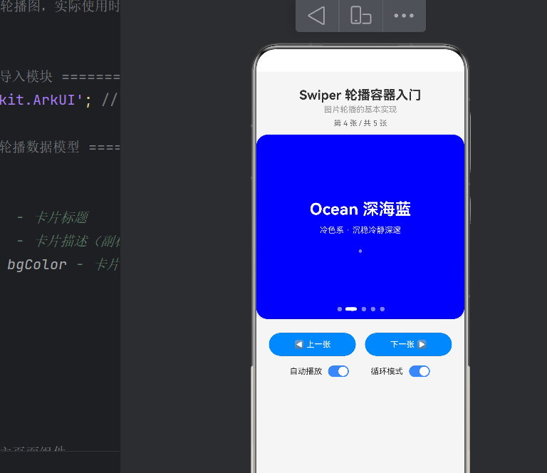
{ title: '深海蓝', desc: '冷色系 · 沉稳深邃', bgColor: Color.Blue },
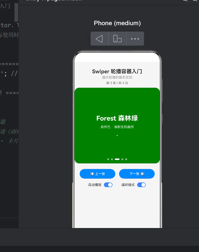
{ title: '森林绿', desc: '自然色 · 清新盎然', bgColor: Color.Green },
{ title: '日落紫', desc: '浪漫色 · 梦幻渐变', bgColor: '#8B5CF6' },
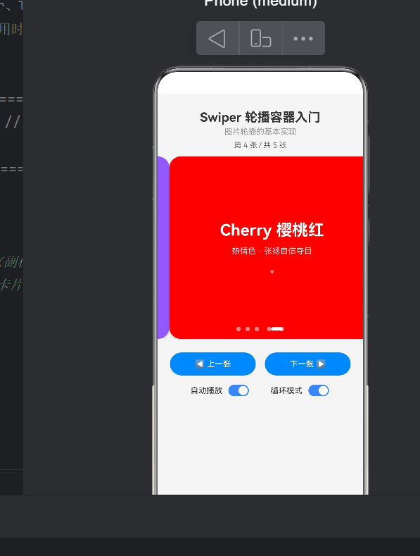
{ title: '樱桃红', desc: '热情色 · 自信夺目', bgColor: Color.Red },
];
设计要点:
@State变量变化会触发 UI 重建;不变的carouselList用private声明,避免无谓重绘。- 混合使用
Color枚举和字符串色值,验证ResourceColor的兼容性。
5.3 主布局
build() {
  Column() {
    this.buildHeader();
    this.buildSwiper();
    this.buildControls();
  }
  .width('100%').height('100%').backgroundColor('#F5F5F5')
}
Column 垂直排列,浅灰背景衬托彩色卡片。
5.4 Swiper:核心容器
@Builder
buildSwiper() {
  Swiper() {
    ForEach(this.carouselList, (item: CarouselItem) => {
      Column() {
        Text(item.title).fontSize(28).fontWeight(FontWeight.Bold)
          .fontColor(Color.White);
        Text(item.desc).fontSize(14)
          .fontColor('rgba(255, 255, 255, 0.85)').margin({ top: 12 });
        Text('●').fontSize(8)
          .fontColor('rgba(255, 255, 255, 0.5)').margin({ top: 24 });
      }
      .width('88%').height(300)
      .backgroundColor(item.bgColor)
      .borderRadius(20)
      .alignItems(HorizontalAlign.Center)
      .justifyContent(FlexAlign.Center)
      .shadow({ radius: 12, color: 'rgba(0, 0, 0, 0.15)', offsetX: 0, offsetY: 6 });
    }, (item: CarouselItem) => item.title)
  }
  .width('100%').height(320)
  .autoPlay(this.isAutoPlay)
  .loop(this.isLoop)
  .interval(3000).duration(500)
  .indicator(new DotIndicator()
    .color('#80FFFFFF').selectedColor('#FFFFFF')
    .itemWidth(8).itemHeight(8).selectedItemWidth(20))
  .curve(curves.springCurve(0.4, 1.0, 0.3, 1.0))
  .onChange((index: number) => { this.currentIndex = index; });
}
逐一拆解:
卡片宽度 88%:左右留白让相邻项边缘可见,形成「层叠视差」效果,这是主流 App 的常见手法。
autoPlay(this.isAutoPlay):接受布尔值。为 true 时按 interval 定时切换;用户手动滑动时内部计时器自动重置。
loop(this.isLoop):开启后首尾无缝衔接。手动切换按钮也通过取模运算同步实现循环逻辑:
this.currentIndex = (this.currentIndex - 1 + total) % total;  // 上一张
this.currentIndex = (this.currentIndex + 1) % total;           // 下一张
DotIndicator 定制:selectedItemWidth(20) vs itemWidth(8) 的差异化设计,使选中项被拉长为胶囊状,比单纯变色拥有更强的当前位置暗示。
springCurve 弹力曲线:
curves.springCurve(mass: 0.4, stiffness: 1.0, damping: 0.3, velocity: 1.0)
| 参数 | 值 | 效果 |
|---|---|---|
| mass | 0.4 | 值越小弹跳幅度越大 |
| stiffness | 1.0 | 值越大回归越快 |
| damping | 0.3 | 值越小振荡衰减越慢 |
| velocity | 1.0 | 起始流畅度 |
这组参数产生「轻微过冲后回弹」的效果,比默认平滑曲线更生动。
5.5 控制面板
手动切换按钮:
Button('◀ 上一张').onClick(() => {
  let total = this.carouselList.length;
  this.currentIndex = (this.currentIndex - 1 + total) % total;
});
Toggle 开关:
Row({ space: 8 }) {
  Text(label).fontSize(14).fontColor('#333333');
  Toggle({ type: ToggleType.Switch, isOn: checked })
    .selectedColor('#3A86FF').switchPointColor(Color.White)
    .onChange((value: boolean) => { onChange(value); });
}
.alignItems(VerticalAlign.Center);
六、常见编译错误与对策
6.1 Color.Purple 不存在
Error: Property 'Purple' does not exist on type 'typeof Color'.
原因:Color 枚举只含红/橙/黄/绿/蓝/棕/灰/黑/白等基础色,无 Purple、Cyan 等。
修复:使用十六进制字符串 '#8B5CF6',类型改为 ResourceColor。
6.2 Row 没有 .space()
Error: Property 'space' does not exist on type 'RowAttribute'.
原因:Row/Column 的 space 是构造器参数,不是链式属性方法。
✅ 正确:Row({ space: 8 }) { ... }
❌ 错误:Row() { ... }.space(8)
6.3 ForEach key 生成器
第三个参数是 key 标识,用于列表 diff。须确保 key 值唯一,否则可能引发渲染异常。
6.4 @Builder 中回调的 this 指向
@Builder 内的回调须用箭头函数,确保 this 指向组件实例,否则无法访问 @State 变量。
七、扩展:从 Demo 到生产
7.1 替换为真实图片
将卡片内容改为 Image 组件,数据源增加 imageUrl 字段:
Image(item.imageUrl).width('88%').height(300)
  .borderRadius(20).objectFit(ImageFit.Cover);
7.2 LazyForEach 大规模轮播
当数据量较大时,使用 LazyForEach 按需创建/销毁节点,配合 cachedCount 属性设置预加载数量,避免内存压力。
7.3 路由跳转
在卡片上绑定 .onClick() 事件,调用 router.pushUrl() 实现导航:
Column().onClick(() => {
  router.pushUrl({ url: 'pages/Detail', params: { id: item.id } });
})
7.4 垂直轮播
添加 .vertical(true) 即可切换为垂直滑动,适配竖屏产品推荐场景。
八、总结
本文从零构建了一个功能完整的 Swiper 轮播应用,覆盖了 ArkUI 声明式开发的核心知识点:
- Swiper 组件功能完善,自动播放、循环、自定义动画和指示器可覆盖绝大多数生产场景。
- @State 驱动 UI 简洁直观,但不变数据用
private声明可避免性能浪费。 - @Builder 拆分是保持代码整洁的关键工程实践,与主流声明式框架理念一致。
- API 24 的 ResourceColor 有效弥补了 Color 枚举的不足,推荐在涉及颜色的场景中优先使用。
希望本文能帮助你快速上手 HarmonyOS Swiper 开发。
。*

作为“人工智能6S店”的官方数字引擎,为AI开发者与企业提供一个覆盖软硬件全栈、一站式门户。
更多推荐


 0
0 0
0- 0


 已为社区贡献55条内容

所有评论(0)