
【共创季稿事节】鸿蒙原生 ArkTS 布局方式之 Column 垂直排列入门:从 Hello World 到纵向布局
一、引言
1.1 为什么从 Column 开始?
Column 是 ArkUI 中最基础、最常用的布局容器。如果说组件是"单词",那么布局容器就是"语法"——它决定了单词如何组合成句子。
在 HarmonyOS NEXT 的 ArkUI 框架中,Column 是一个垂直方向的 Flex 容器,它的子元素会从上到下依次排列。任何复杂的 UI 界面,拆解到底层,都是由 Column 和 Row 这两种基础容器嵌套组合而成的:
一个典型的 App 界面
├── Column(整体纵向)
│ ├── 标题栏(Row)
│ ├── 内容区(Column / Scroll)
│ │ ├── 卡片 1(Column / Row 嵌套)
│ │ ├── 卡片 2
│ │ └── 卡片 3
│ └── 底部导航(Row)
不理解 Column,就等于不理解 ArkUI 布局的基石。
1.2 本文适用人群
零基础入门者:第一次接触鸿蒙开发,想了解最基础的布局
Web 前端开发者:有 CSS Flexbox 背景,想迁移到 ArkTS
原生 Android/iOS 开发者:了解 LinearLayout / UIStackView,想对比学习
1.3 本文核心内容
知识点 说明
主轴与交叉轴 Column 的 axis 体系(垂直为主,水平为交叉)
justifyContent 6 种主轴分布模式(Start/Center/End/SpaceBetween/SpaceAround/SpaceEvenly)
alignItems 3 种交叉轴对齐模式(Start/Center/End)
实战组合 动态切换 + 增减子元素 + 调整宽度,直观理解每种属性
常见误区 Column 不滚动、子元素超出、百分比宽度理解
二、Flexbox 布局基础:主轴与交叉轴
2.1 Column 的坐标系
在理解 Column 之前,必须理解两个核心概念:
┌─────────────────────────────────────┐
│ 主轴 (Main Axis) │
│ direction: vertical │
│ ↓ │
│ ┌──────────────┐ │
│ │ 子元素 1 │←──── 交叉轴 ────→ │
│ │ │ (Cross Axis) │
│ ├──────────────┤ direction: │
│ │ 子元素 2 │ horizontal │
│ │ │ │
│ ├──────────────┤ │
│ │ 子元素 3 │ │
│ └──────────────┘ │
└─────────────────────────────────────┘
概念 Column 中 控制属性
主轴(Main Axis) 垂直方向(从上到下) justifyContent
交叉轴(Cross Axis) 水平方向(从左到右) alignItems
对于 Row,主轴和交叉轴正好相反——主轴是水平方向,交叉轴是垂直方向。
2.2 与 CSS Flexbox 的对照
CSS Flexbox ArkUI Column 说明
display: flex; flex-direction: column; Column() { } 声明垂直 Flex 容器
justify-content .justifyContent() 主轴(垂直)分布
align-items .alignItems() 交叉轴(水平)对齐
flex-start FlexAlign.Start 起点对齐
center FlexAlign.Center / HorizontalAlign.Center 居中对齐
flex-end FlexAlign.End / HorizontalAlign.End 终点对齐
space-between FlexAlign.SpaceBetween 两端对齐
space-around FlexAlign.SpaceAround 环绕均分
space-evenly FlexAlign.SpaceEvenly 等距分布
如果你熟悉 CSS Flexbox,迁移到 ArkUI 的 Column 几乎零成本——概念完全一致,只是语法从声明式 CSS 变成了链式方法调用。
三、Column 核心 API 详解
3.1 Column 构造器
Column(): ColumnAttribute
Column 本身不接收参数,所有配置都通过链式方法调用完成:
Column() {
// 子元素列表
Text(‘Hello’)
Button(‘World’)
Image({ src: ‘…’ })
}
.width(‘100%’)
.height(‘100%’)
.justifyContent(FlexAlign.Center)
.alignItems(HorizontalAlign.Center)
3.2 justifyContent — 主轴(垂直)分布
API 签名
.justifyContent(value: FlexAlign): ColumnAttribute
FlexAlign 枚举值
枚举值 效果 示意图
FlexAlign.Start 子元素从容器顶部开始排列 [■][■][■] 顶部堆叠
FlexAlign.Center 子元素整体垂直居中 顶部留空 [■][■][■] 底部留空
FlexAlign.End 子元素从容器底部开始排列 顶部留空 [■][■][■] 底部堆叠
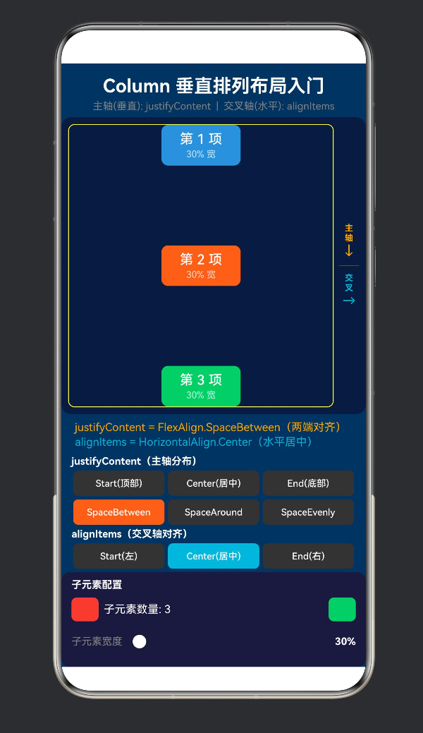
FlexAlign.SpaceBetween 首个子元素在顶部,最后一个在底部,中间等距 ■ 空白 ■ 空白 ■
FlexAlign.SpaceAround 每个子元素上下空间相等 空白 ■ 空白 ■ 空白 ■ 空白
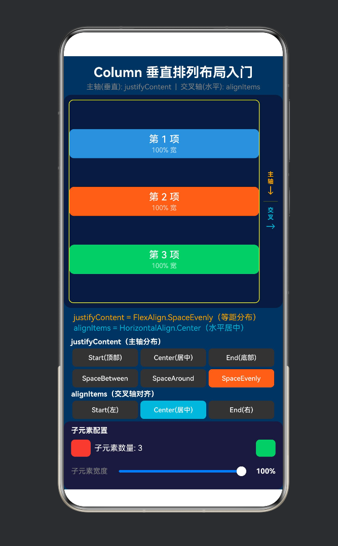
FlexAlign.SpaceEvenly 所有间距(含两端)相等 空白 ■ 空白 ■ 空白 ■ 空白(两端也有)
生效条件:Column 的高度必须 > 所有子元素高度之和(有剩余空间)。
3.3 alignItems — 交叉轴(水平)对齐
API 签名
.alignItems(value: HorizontalAlign): ColumnAttribute
HorizontalAlign 枚举值
枚举值 效果 说明
HorizontalAlign.Start 子元素左对齐 每个子元素的左边对齐 Column 左边缘
HorizontalAlign.Center 子元素水平居中 每个子元素的中心在 Column 水平中线上
HorizontalAlign.End 子元素右对齐 每个子元素的右边对齐 Column 右边缘
生效条件:Column 的宽度必须 > 子元素的宽度(有水平剩余空间)。
3.4 justifyContent 与 alignItems 的协作
这两个属性不是互斥的,而是两个维度的控制:
justifyContent → 垂直位置(上中下)
alignItems → 水平位置(左中右)
两者组合:6 × 3 = 18 种不同的布局效果
例如:
justifyContent(Center) + alignItems(Center) → 整体垂直水平居中
justifyContent(SpaceBetween) + alignItems(End) → 两端对齐且右对齐
justifyContent(End) + alignItems(Start) → 底部堆叠且左对齐
四、Demo 代码逐层剖析
4.1 项目结构与路由
{
“src”: [“pages/ColumnDemo”]
}
ColumnDemo.ets 共 412 行,结构如下:
ColumnDemo.ets (412行)
├── @Component ColumnDemo
│ ├── @State 变量(4个) ← justifyMode / alignMode / itemCount / itemWidthScale
│ ├── 常量数组(5组) ← 文字标签、枚举值、颜色
│ ├── build()
│ │ ├── 标题区
│ │ ├── 演示区 (Row)
│ │ │ ├── Column 布局容器 ← 核心演示区
│ │ │ │ └── ForEach 生成子元素
│ │ │ └── 轴方向指示图
│ │ ├── 当前属性值显示
│ │ ├── justifyContent 控制面板(6个按钮)
│ │ ├── alignItems 控制面板(3个按钮)
│ │ └── 子元素配置面板(增减 + 滑动条)
│ └── 辅助方法
│ ├── getItemArray() ← 生成 ForEach 迭代数组
│ ├── justifyButton() ← @Builder 按钮模板
│ └── alignButton() ← @Builder 按钮模板
4.2 四个 @State 变量的设计
@State private justifyMode: number = 0; // 当前 justifyContent 索引(0~5)
@State private alignMode: number = 0; // 当前 alignItems 索引(0~2)
@State private itemCount: number = 3; // 子元素数量(1~6)
@State private itemWidthScale: number = 0.6; // 子元素宽度比例(0.3~1.0)
每个变量控制一个独立的 UI 维度:
变量 控制的 UI 变化范围
justifyMode .justifyContent() 的枚举值 0~5(6 种模式)
alignMode .alignItems() 的枚举值 0~2(3 种模式)
itemCount 子元素数量 1~6
itemWidthScale 子元素的 width(百分比) 30%~100%
设计原则:四个变量之间没有耦合。改变 justifyMode 不会影响 alignMode,反之亦然。这让用户可以独立探索每个维度的效果。
4.3 子元素的 ForEach 生成
ForEach(this.getItemArray(), (item: number) => {
Column() {
Text(第 ${item + 1} 项)
.fontSize(16)
.fontColor(Color.White)
Text(${(this.itemWidthScale * 100).toFixed(0)}% 宽)
.fontSize(11)
.opacity(0.7)
}
.width(${this.itemWidthScale * 100}%)
.height(48)
.backgroundColor(this.itemColors[item % 8])
.borderRadius(8)
.justifyContent(FlexAlign.Center) // 子元素内部居中
.alignItems(HorizontalAlign.Center) // 子元素内部居中
}, (item: number) => item.toString())
关键细节:
子元素宽度使用百分比字符串(如 “60%”),相对于父 Column 的宽度
每个子元素内部也用了 justifyContent(Center) + alignItems(Center) 使其内容居中
getItemArray() 返回 [0, 1, 2] 这样的普通数组供 ForEach 迭代
private getItemArray(): number[] {
const arr: number[] = [];
for (let i = 0; i < this.itemCount; i++) {
arr.push(i);
}
return arr;
}
ForEach 在 ArkTS 中要求第一个参数是数组(不能是 Range 语法)。这里的 for 循环是为了将 itemCount(一个数字)转换为指定长度的数组。
4.4 核心 Column 布局属性
Column() {
ForEach(/* 子元素 */)
}
// ===== 核心属性 1:justifyContent 控制主轴分布 =====
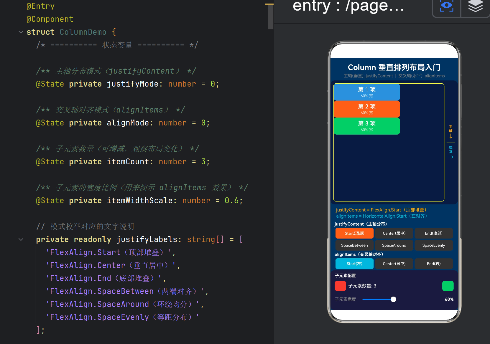
.justifyContent(this.justifyValues[this.justifyMode])
// ===== 核心属性 2:alignItems 控制交叉轴对齐 =====
.alignItems(this.alignValues[this.alignMode])
.width(‘100%’)
.height(‘100%’)
.border({ width: 1, color: ‘#ffffff22’ })
注意链式调用的顺序:justifyContent 和 alignItems 直接跟在 Column() 闭包后面,而不是跟在外层的布局上。这样语法清晰——这两个属性是属于这个 Column 容器的,不是属于外层容器。
4.5 轴方向指示图
在演示区的右侧,有一个 24vp 宽的轴方向指示图:
主 ← 橙色文字
轴
↓
—— 分割线 ——
交 ← 青色文字
叉
→
这是一个元可视化(meta-visualization)——它用 UI 元素解释 UI 布局本身的坐标系。通过这种设计,用户可以一边切换布局模式,一边看到当前正在修改的是哪个轴。
4.6 控制面板 1:justifyContent 六键切换
Column() {
Text(‘justifyContent(主轴分布)’)
.fontSize(12).fontColor(Color.White).fontWeight(FontWeight.Bold)
Row() {
this.justifyButton(‘Start(顶部)’, 0)
this.justifyButton(‘Center(居中)’, 1)
this.justifyButton(‘End(底部)’, 2)
}
Row() {
this.justifyButton(‘SpaceBetween’, 3)
this.justifyButton(‘SpaceAround’, 4)
this.justifyButton(‘SpaceEvenly’, 5)
}
}
6 种模式分两行排列(每行 3 个),避免按钮太挤。使用 @Builder 生成统一风格的按钮:
@Builder
justifyButton(label: string, mode: number) {
Button(label)
.height(30)
.backgroundColor(this.justifyMode === mode ? ‘#FF6B35’ : ‘#333’)
.gesture(TapGesture().onAction(() => {
this.justifyMode = mode; // ← 点击即切换,触发 UI 重绘
}))
}
状态驱动的 UI:当前选中的模式用橙色高亮(‘#FF6B35’),未选中的用深灰(‘#333’)。点击按钮 → 修改 @State → ArkUI 自动重绘 Column → 子元素重新排列。
4.7 控制面板 2:alignItems 三键切换
Row() {
this.alignButton(‘Start(左)’, 0)
this.alignButton(‘Center(居中)’, 1)
this.alignButton(‘End(右)’, 2)
}
只有 3 种模式,一行排列。高亮色为青色(‘#00B4D8’),与 justifyContent 的橙色区分,视觉上暗示"这是另一个维度的控制"。
4.8 控制面板 3:子元素配置
这个面板控制两个参数:
参数 1:子元素数量(+ / - 按钮)
Button(‘-’).gesture(TapGesture().onAction(() => {
if (this.itemCount > 1) this.itemCount–;
}))
Text(子元素数量: ${this.itemCount})
Button(‘+’).gesture(TapGesture().onAction(() => {
if (this.itemCount < 6) this.itemCount++;
}))
增减子元素可以直观看到:
子元素多时,SpaceBetween 的间距会变小
子元素少时,Start/Center/End 的效果更明显
只有一个子元素时,SpaceBetween ≈ SpaceAround ≈ SpaceEvenly(因为只有一个"间隔")
参数 2:子元素宽度(Slider 滑动条)
Slider({
value: this.itemWidthScale * 100,
min: 30, max: 100, step: 5
})
.onChange((value: number) => {
this.itemWidthScale = value / 100;
})
调整宽度可以直观看到:
宽度为 30% 时,alignItems.Start / Center / End 的差异非常明显
宽度为 100% 时,alignItems 三种模式看起来一样(因为子元素撑满了 Column)
五、六种 justifyContent 的可视化对比
5.1 Start
┌──────────────────┐
│ ┌────────────┐ │ ← 第 1 项在此
│ │ 第 1 项 │ │
│ └────────────┘ │
│ ┌────────────┐ │
│ │ 第 2 项 │ │
│ └────────────┘ │
│ ┌────────────┐ │
│ │ 第 3 项 │ │
│ └────────────┘ │
│ │ ← 底部大量空白
└──────────────────┘
特点:子元素紧贴顶部,底部留空。最符合"从上到下"的直觉。
5.2 Center
┌──────────────────┐
│ │ ← 顶部空白
│ ┌────────────┐ │
│ │ 第 1 项 │ │
│ └────────────┘ │
│ ┌────────────┐ │
│ │ 第 2 项 │ │
│ └────────────┘ │
│ ┌────────────┐ │
│ │ 第 3 项 │ │
│ └────────────┘ │
│ │ ← 底部空白(与顶部相等)
└──────────────────┘
特点:子元素整体在垂直方向居中,上下空白相等。
5.3 End
┌──────────────────┐
│ │ ← 顶部大量空白
│ ┌────────────┐ │
│ │ 第 1 项 │ │
│ └────────────┘ │
│ ┌────────────┐ │
│ │ 第 2 项 │ │
│ └────────────┘ │
│ ┌────────────┐ │
│ │ 第 3 项 │ │
│ └────────────┘ │ ← 第 3 项在此
└──────────────────┘
特点:子元素紧贴底部,顶部留空。
5.4 SpaceBetween
┌──────────────────┐
│ ┌────────────┐ │ ← 第 1 项在顶部
│ │ 第 1 项 │ │
│ └────────────┘ │
│ │ ← 中间空白(等距)
│ ┌────────────┐ │
│ │ 第 2 项 │ │
│ └────────────┘ │
│ │ ← 中间空白(等距)
│ ┌────────────┐ │
│ │ 第 3 项 │ │
│ └────────────┘ │ ← 第 3 项在底部
└──────────────────┘
特点:首元素在顶部,末元素在底部,中间的空白均分。两端无空白。
5.5 SpaceAround
┌──────────────────┐
│ │ ← 半份空白
│ ┌────────────┐ │
│ │ 第 1 项 │ │
│ └────────────┘ │
│ │ ← 一份空白
│ ┌────────────┐ │
│ │ 第 2 项 │ │
│ └────────────┘ │
│ │ ← 一份空白
│ ┌────────────┐ │
│ │ 第 3 项 │ │
│ └────────────┘ │
│ │ ← 半份空白
└──────────────────┘
特点:每个子元素左右(上下)的空间相等,所以两端各有一半的空白间距。
5.6 SpaceEvenly
┌──────────────────┐
│ │ ← 一份空白(两端也有)
│ ┌────────────┐ │
│ │ 第 1 项 │ │
│ └────────────┘ │
│ │ ← 一份空白
│ ┌────────────┐ │
│ │ 第 2 项 │ │
│ └────────────┘ │
│ │ ← 一份空白
│ ┌────────────┐ │
│ │ 第 3 项 │ │
│ └────────────┘ │
│ │ ← 一份空白(两端也有)
└──────────────────┘
特点:所有间距(包括两端)完全相等。这是与 SpaceAround 的核心区别。
六、三种 alignItems 的可视化对比
假设子元素宽度为 60%(未填满 Column):
6.1 Start(左对齐)
┌──────────────────────┐
│ ┌────────────┐ │
│ │ 第 1 项 │← 左对齐│
│ └────────────┘ │
│ ┌────────────┐ │
│ │ 第 2 项 │← 左对齐│
│ └────────────┘ │
│ ┌────────────┐ │
│ │ 第 3 项 │← 左对齐│
│ └────────────┘ │
└──────────────────────┘
↑ 左边对齐 ↑ 右侧空白
6.2 Center(水平居中)
┌──────────────────────┐
│ ┌────────────┐ │
│ │ 第 1 项 │ │
│ └────────────┘ │
│ ┌────────────┐ │
│ │ 第 2 项 │ │
│ └────────────┘ │
│ ┌────────────┐ │
│ │ 第 3 项 │ │
│ └────────────┘ │
└──────────────────────┘
↑ 左右空白相等
6.3 End(右对齐)
┌──────────────────────┐
│ ┌────────────┐ │
│ │ 第 1 项 │→ 右对齐
│ └────────────┘ │
│ ┌────────────┐ │
│ │ 第 2 项 │→ 右对齐
│ └────────────┘ │
│ ┌────────────┐ │
│ │ 第 3 项 │→ 右对齐
│ └────────────┘ │
└──────────────────────┘
↑ 左侧空白 ↑ 右边对齐
重要规律:当子元素宽度为 100% 时,三种 alignItems 效果相同——所有子元素填满整个 Column,没有"对齐"的空间。
七、常见问题与坑点
7.1 Column 不滚动
// ❌ 子元素超出屏幕后会被截断,不会滚动
Column() {
ForEach(50 items) { /* … */ }
}
// ✅ 需要包在 Scroll 中
Scroll() {
Column() {
ForEach(50 items) { /* … */ }
}
}
Column 默认不滚动。如果内容超过屏幕,超出部分会被截断(或被父容器 clip)。
7.2 justifyContent 不生效
原因:Column 的高度被内容撑满,没有剩余空间。
Column 高度 = 子元素总高度 + padding
如果 Column 高度 == 子元素总高度,没有剩余空间可以"分布"
解决方案:给 Column 设置一个固定高度或百分比高度:
Column() { /* … */ }
.height(‘100%’) // 或 .height(500)
.justifyContent(FlexAlign.SpaceBetween)
7.3 alignItems 不生效
与上面的问题类似——子元素宽度等于 Column 宽度。
// ❌ alignItems 不生效
Column() {
Text(‘Hello’).width(‘100%’) // 撑满了
Text(‘World’).width(‘100%’) // 撑满了
}
.alignItems(HorizontalAlign.Start) // 看不到效果
// ✅ 让子元素宽度 < Column 宽度
Column() {
Text(‘Hello’).width(‘60%’) // 左侧占 60%
Text(‘World’).width(‘60%’) // 左侧占 60%
}
.alignItems(HorizontalAlign.Start) // 可以看到了
7.4 百分比宽度的计算基准
// 子元素的 width(‘50%’) 是相对于直接父容器的宽度
Column() {
Column() {
// 这个 Text 的 50% = 外层 Column 宽度的 50%
Text(‘Hello’).width(‘50%’)
}
.width(‘80%’) // 外层 Column 宽度的 80%
}
.width(‘100%’) // 屏幕宽度的 100%
嵌套 Column 时,百分比计算规则是相对于最近的设置了宽度的父容器。
7.5 Column 与 Stack 的混淆
容器 排列方式 适用场景
Column 从上到下依次排列 列表、表单、文章
Row 从左到右依次排列 按钮组、标签栏
Stack 层层堆叠(Z 轴) 叠加文字、悬浮按钮
Flex 可配置方向的 Flex 布局 灵活换行场景
初学者常犯的错误:需要层叠(Stack)时用了 Column,导致元素并排而非叠加。
八、最佳实践清单
8.1 合理设置容器的尺寸
// 推荐的 Column 尺寸设置模式
Column() {
// 子元素
}
.width(‘100%’) // 撑满父容器宽度
.height(‘100%’) // 撑满父容器高度(配合 justifyContent 使用)
// 或
.height(‘auto’) // 由内容决定高度(默认行为)
8.2 嵌套 Column 时控制层级
// 避免过深嵌套(3~4 层以内)
Column() {
Column() {
Column() {
Column() {
// 太深了!难以维护
}
}
}
}
// 推荐:用 @Builder / @Component 拆分
Column() {
Header()
Content()
Footer()
}
8.3 使用 layoutWeight 实现比例布局
Column() {
Text(‘顶部’).layoutWeight(1) // 占 1/3
Text(‘中部’).layoutWeight(1) // 占 1/3
Text(‘底部’).layoutWeight(1) // 占 1/3
}
.width(‘100%’)
.height(‘100%’)
layoutWeight 让子元素按比例分配 Column 的高度,配合 justifyContent 可以实现灵活的垂直分布。
8.4 与 Scroll 结合实现可滚动列表
Scroll() {
Column() {
ForEach(this.items, (item: string) => {
Text(item).height(60).width(‘100%’)
})
}
.width(‘100%’)
}
.width(‘100%’)
.height(‘100%’)
.scrollable(ScrollDirection.Vertical)
8.5 动态内容留空处理
// 底部留空(Footer 永远在最下面)
Column() {
// 主要内容
Column() { /* … */ }
.layoutWeight(1) // 撑满剩余空间
// 底部栏
Text(‘底部信息’).height(40)
}
.height(‘100%’)
九、结语
9.1 核心回顾
Column 是 ArkUI 布局体系的基石。理解它,就理解了鸿蒙应用中"从上到下"的排列逻辑:
Column = 主轴方向(垂直) + 交叉轴方向(水平)的两个维度控制
justifyContent 控制垂直分布(上→中→下)
alignItems 控制水平对齐(左→中→右)
两者独立工作,组合出 18 种不同的布局效果
9.2 从 Column 到完整布局体系
Column(本文) → 垂直排列
↓
Row → 水平排列(Column 的镜像)
↓
Stack → 层叠排列(Z 轴)
↓
Flex → 灵活排列(可换行)
↓
Grid → 网格排列(二维)
↓
RelativeContainer → 相对定位排列
每一步都是对布局能力的扩展。但无论多复杂的界面,最底层的"积木"仍然是 Column 和 Row。
9.3 下一步学习建议
Row:Column 的"镜像",主轴变水平,交叉轴变垂直
Stack:层叠布局(Z 轴覆盖)
Flex:可换行的 Flex 布局
Grid:二维网格布局
RelativeContainer:锚点相对布局
布局动画:.animation() 和 animateTo 让布局变化更平滑
附录 A:完整 Demo 代码
/*
- ColumnDemo.ets —— 鸿蒙原生 ArkTS 布局方式之 Column 垂直排列入门
- ===== 核心技术 =====
-
- Column() —— 纵向布局容器(Flex 布局的垂直方向)
-
- alignItems —— 交叉轴(水平方向)对齐方式
-
- justifyContent —— 主轴(垂直方向)分布方式
- ===== Column 布局要点 =====
-
- Column 的子元素默认从上到下排列
-
- justifyContent 决定子元素在垂直方向上的分布
-
- alignItems 决定子元素在水平方向上的对齐
-
- Column 本身不是可滚动的(如需滚动请用 Scroll+Column)
-
- 子元素宽度不占满 Column 时,alignItems 效果才可见
-
- 子元素高度之和不超过 Column 高度时,justifyContent 效果才可见
*/
- 子元素高度之和不超过 Column 高度时,justifyContent 效果才可见
import { curves } from ‘@kit.ArkUI’;
@Entry
@Component
struct ColumnDemo {
@State private justifyMode: number = 0;
@State private alignMode: number = 0;
@State private itemCount: number = 3;
@State private itemWidthScale: number = 0.6;
private readonly justifyLabels: string[] = [
‘FlexAlign.Start(顶部堆叠)’,
‘FlexAlign.Center(垂直居中)’,
‘FlexAlign.End(底部堆叠)’,
‘FlexAlign.SpaceBetween(两端对齐)’,
‘FlexAlign.SpaceAround(环绕均分)’,
‘FlexAlign.SpaceEvenly(等距分布)’
];
private readonly alignLabels: string[] = [
‘HorizontalAlign.Start(左对齐)’,
‘HorizontalAlign.Center(水平居中)’,
‘HorizontalAlign.End(右对齐)’
];
private readonly justifyValues: FlexAlign[] = [
FlexAlign.Start, FlexAlign.Center, FlexAlign.End,
FlexAlign.SpaceBetween, FlexAlign.SpaceAround, FlexAlign.SpaceEvenly
];
private readonly alignValues: HorizontalAlign[] = [
HorizontalAlign.Start, HorizontalAlign.Center, HorizontalAlign.End
];
private readonly itemColors: string[] = [
‘#4A90D9’, ‘#FF6B35’, ‘#2ECC71’, ‘#9B59B6’,
‘#F1C40F’, ‘#E74C3C’, ‘#1ABC9C’, ‘#E67E22’
];
build() {
Column() {
// 标题
Text(‘Column 垂直排列布局入门’)
.fontSize(22).fontWeight(FontWeight.Bold)
.fontColor(Color.White).textAlign(TextAlign.Center)
.width(‘100%’).padding({ top: 14, bottom: 4 })
  Text('主轴(垂直): justifyContent  |  交叉轴(水平): alignItems')
    .fontSize(12).fontColor(Color.Gray)
    .textAlign(TextAlign.Center).width('100%').padding({ bottom: 6 })

  // 演示区
  Row() {
    // 核心 Column 布局容器
    Column() {
      Column() {
        ForEach(this.getItemArray(), (item: number) => {
          Column() {
            Text(`第 ${item + 1} 项`).fontSize(16)
              .fontColor(Color.White).fontWeight(FontWeight.Medium)
            Text(`${(this.itemWidthScale * 100).toFixed(0)}% 宽`)
              .fontSize(11).fontColor(Color.White).opacity(0.7).margin({ top: 2 })
          }
          .width(`${this.itemWidthScale * 100}%`).height(48)
          .backgroundColor(this.itemColors[item % this.itemColors.length])
          .borderRadius(8)
          .justifyContent(FlexAlign.Center)
          .alignItems(HorizontalAlign.Center)
        }, (item: number) => item.toString())
      }
      .justifyContent(this.justifyValues[this.justifyMode])
      .alignItems(this.alignValues[this.alignMode])
      .width('100%').height('100%')
      .border({ width: 1, color: '#ffffff22' }).borderRadius(8)
    }
    .layoutWeight(3).height('100%').margin({ right: 6 })

    // 轴方向指示
    Column() {
      Text('主').fontSize(10).fontColor(Color.Orange).fontWeight(FontWeight.Bold)
      Text('轴').fontSize(10).fontColor(Color.Orange).fontWeight(FontWeight.Bold)
      Text('↓').fontSize(16).fontColor(Color.Orange)
      Divider().height(1).color('#ffffff22').margin({ top: 8, bottom: 8 })
      Text('交').fontSize(10).fontColor('#00B4D8').fontWeight(FontWeight.Bold)
      Text('叉').fontSize(10).fontColor('#00B4D8').fontWeight(FontWeight.Bold)
      Text('→').fontSize(16).fontColor('#00B4D8')
    }
    .width(24).height('100%')
    .justifyContent(FlexAlign.Center).alignItems(HorizontalAlign.Center)
  }
  .width('100%').layoutWeight(1).backgroundColor('#0d1b3e')
  .borderRadius(12).padding(8).margin({ left: 12, right: 12 })

  // 当前属性
  Column() {
    Text(`justifyContent = ${this.justifyLabels[this.justifyMode]}`)
      .fontSize(13).fontColor(Color.Orange).width('100%')
    Text(`alignItems = ${this.alignLabels[this.alignMode]}`)
      .fontSize(13).fontColor('#00B4D8').width('100%').margin({ top: 2 })
  }
  .width('100%').padding({ left: 16, right: 16, top: 8, bottom: 4 })

  // justifyContent 控制面板
  Column() {
    Text('justifyContent(主轴分布)').fontSize(12)
      .fontColor(Color.White).fontWeight(FontWeight.Bold)
      .width('100%').padding({ bottom: 4 })
    Row() {
      this.justifyButton('Start(顶部)', 0)
      this.justifyButton('Center(居中)', 1)
      this.justifyButton('End(底部)', 2)
    }.width('100%')
    Row() {
      this.justifyButton('SpaceBetween', 3)
      this.justifyButton('SpaceAround', 4)
      this.justifyButton('SpaceEvenly', 5)
    }.width('100%').margin({ top: 4 })
  }.width('100%').padding({ left: 12, right: 12, top: 4 })

  // alignItems 控制面板
  Column() {
    Text('alignItems(交叉轴对齐)').fontSize(12)
      .fontColor(Color.White).fontWeight(FontWeight.Bold)
      .width('100%').padding({ bottom: 4 })
    Row() {
      this.alignButton('Start(左)', 0)
      this.alignButton('Center(居中)', 1)
      this.alignButton('End(右)', 2)
    }.width('100%')
  }.width('100%').padding({ left: 12, right: 12, top: 4 })

  // 子元素配置
  Column() {
    Text('子元素配置').fontSize(12)
      .fontColor(Color.White).fontWeight(FontWeight.Bold)
      .width('100%').padding({ bottom: 4 })
    Row() {
      Button('-').width(32).height(28).backgroundColor('#E74C3C')
        .fontColor(Color.White).fontSize(16).borderRadius(6).margin({ right: 6 })
        .gesture(TapGesture().onAction(() => {
          if (this.itemCount > 1) this.itemCount--;
        }))
      Text(`子元素数量: ${this.itemCount}`).fontSize(13)
        .fontColor(Color.White).layoutWeight(1)
      Button('+').width(32).height(28).backgroundColor('#2ECC71')
        .fontColor(Color.White).fontSize(16).borderRadius(6).margin({ left: 6 })
        .gesture(TapGesture().onAction(() => {
          if (this.itemCount < 6) this.itemCount++;
        }))
    }.width('100%').margin({ top: 4 })

    Row() {
      Text('子元素宽度').fontSize(12).fontColor(Color.Gray)
      Slider({ value: this.itemWidthScale * 100, min: 30, max: 100, step: 5 })
        .width('100%').layoutWeight(1).margin({ left: 8, right: 8 })
        .onChange((value: number) => { this.itemWidthScale = value / 100; })
      Text(`${(this.itemWidthScale * 100).toFixed(0)}%`).fontSize(12)
        .fontColor(Color.White).fontWeight(FontWeight.Bold).width(36)
    }.width('100%').margin({ top: 4 })
  }
  .width('100%').backgroundColor('#1a1a3e').borderRadius(10)
  .padding({ left: 12, right: 12, top: 8, bottom: 10 })
  .margin({ left: 12, right: 12, top: 4 })
}
.width('100%').height('100%').backgroundColor('#0f3460')
}
private getItemArray(): number[] {
const arr: number[] = [];
for (let i = 0; i < this.itemCount; i++) arr.push(i);
return arr;
}
@Builder
justifyButton(label: string, mode: number) {
Button(label).height(30).fontSize(11)
.backgroundColor(this.justifyMode === mode ? ‘#FF6B35’ : ‘#333’)
.fontColor(Color.White).borderRadius(6).layoutWeight(1).margin({ left: 2, right: 2 })
.gesture(TapGesture().onAction(() => { this.justifyMode = mode; }))
}
@Builder
alignButton(label: string, mode: number) {
Button(label).height(30).fontSize(11)
.backgroundColor(this.alignMode === mode ? ‘#00B4D8’ : ‘#333’)
.fontColor(Color.White).borderRadius(6).layoutWeight(1).margin({ left: 2, right: 2 })
.gesture(TapGesture().onAction(() => { this.alignMode = mode; }))
}
}
附录 B:参考资料
HarmonyOS NEXT 开发者文档 — Column 布局容器
HarmonyOS NEXT 开发者文档 — 布局基础
HarmonyOS NEXT 开发者文档 — FlexAlign
HarmonyOS NEXT 开发者文档 — 线性布局(Column / Row)
版权声明:本文为 HarmonyOS NEXT 技术分享系列的第四篇,遵循 CC BY-NC 4.0 协议。欢迎转载,但请注明出处。
系列文章:
第一篇:TapGesture 点击手势布局
第二篇:PanGesture 拖拽手势布局
第三篇:GestureGroup 组合手势布局
第四篇:Column 垂直排列入门(本文)

作为“人工智能6S店”的官方数字引擎,为AI开发者与企业提供一个覆盖软硬件全栈、一站式门户。
更多推荐
 0
0 0
0- 0


 已为社区贡献29条内容

所有评论(0)