
鸿蒙原生 ArkTS 布局方式之 foregroundColor 与 backgroundColor 配色实战
一、引言
前景色与背景色的搭配是 UI 设计中最基础也最重要的视觉决策,直接影响用户的可读性与操作体验。HarmonyOS NEXT 为 ArkTS 提供了三个核心颜色控制属性:
| 属性 | 作用范围 |
|---|---|
backgroundColor |
组件背景区域 |
foregroundColor |
组件整体前景(含文字及子组件) |
fontColor |
仅作用于 Text 文字本身 |
本文通过 7 个实战场景讲解这三个属性的使用方法与配色策略。
二、核心原理
2.1 foregroundColor 与 fontColor 区别
foregroundColor:作用于组件整体前景,在容器上设置后会向下传播影响所有子组件fontColor:仅作用于当前 Text 组件,不影响兄弟或子组件
选择原则:统一容器内颜色用 foregroundColor,单独控制某段文字用 fontColor。
2.2 配色三大原则
- 对比度:前景与背景必须有足够亮度差。深底配浅字,浅底配深字
- 色相和谐:同色系搭配温和统一,对比色搭配醒目突出
- 状态区分:默认、禁用等不同状态使用不同配色
三、环境
MyApplication/
└── entry/src/main/
    ├── ets/pages/ColorDemo.ets
    └── resources/base/profile/main_pages.json
四、7 个实战场景
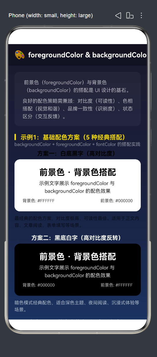
4.1 基础配色方案
@Component
struct BasicColorSchemesDemo {
  build() {
    Column() {
      ColorSchemeCard({ title: '白底黑字(高对比度)',
        bgColor: Color.White, fgColor: Color.Black })
      ColorSchemeCard({ title: '黑底白字(高对比度反转)',
        bgColor: Color.Black, fgColor: Color.White })
      ColorSchemeCard({ title: '深蓝底浅蓝字(同色系)',
        bgColor: '#1a237e', fgColor: '#bbdefb' })
      ColorSchemeCard({ title: '浅绿底深绿字(自然协调)',
        bgColor: '#e8f5e9', fgColor: '#2e7d32' })
      ColorSchemeCard({ title: '暖底冷字(对比色点缀)',
        bgColor: '#fff3e0', fgColor: '#1565c0' })
    }
  }
}
每个卡片的核心在于:
.backgroundColor(this.bgColor)   // 设置背景色
.foregroundColor(this.fgColor)   // 设置前景色(影响所有子组件文字)
| 方案 | 背景色 | 前景色 | 关系 | 场景 |
|---|---|---|---|---|
| 白底黑字 | #FFFFFF |
#000000 |
高对比 | 正文阅读 |
| 黑底白字 | #000000 |
#FFFFFF |
高对比 | 暗色模式 |
| 深蓝底浅蓝字 | #1a237e |
#bbdefb |
同色系 | 品牌卡片 |
| 浅绿底深绿字 | #e8f5e9 |
#2e7d32 |
同色系 | 环保应用 |
| 暖底冷字 | #fff3e0 |
#1565c0 |
对比色 | 促销卡片 |
4.2 foregroundColor vs fontColor 对比
// foregroundColor:影响容器内所有子组件
Column() {
  Text('前景色示例').fontSize(20)
  Text('foregroundColor 影响所有子组件')
  Row() {
    Circle().width(16).height(16).fill(Color.White)
    Text(' 圆点')
  }
}
.backgroundColor('#37474f')
.foregroundColor(Color.White)   // ← 整体前景全变白

// fontColor:仅影响当前 Text
Text('文字颜色示例').fontSize(20)
  .fontColor('#FFD700')          // ← 仅当前文字变金色
关键区别:foregroundColor(Color.White) 让容器内所有文字和子组件(含 Circle)都变成白色。fontColor('#FFD700') 仅让指定 Text 变金色。
4.3 颜色对比度与可读性
// 浅色背景 #E0E0E0
Column() {
  Text('黑色文字 —— 清晰可读').fontColor('#000000')
  Text('深灰色 —— 较清晰').fontColor('#555555')
  Text('灰色 —— 适中').fontColor('#999999')
  Text('浅灰色 —— 模糊').fontColor('#cccccc')
  Text('白色 —— 不可见').fontColor('#ffffff')
}.backgroundColor('#E0E0E0')

// 深色背景 #333333
Column() {
  Text('白色文字 —— 清晰可读').fontColor('#FFFFFF')
  Text('浅灰色 —— 较清晰').fontColor('#CCCCCC')
  Text('灰色 —— 适中').fontColor('#888888')
  Text('深灰色 —— 模糊').fontColor('#555555')
  Text('黑色 —— 不可见').fontColor('#000000')
}.backgroundColor('#333333')
亮度差异越大可读性越好。WCAG 标准建议正常文字对比度 ≥ 4.5:1。
4.4 品牌色配色策略
品牌色双模式应用:深色模式用品牌色背景 + 白色文字,浅色模式用浅色背景 + 品牌色文字。
// 深色模式:品牌色背景 + 白字
Row({ space: 10 }) {
  Column() { Text('主色调').fontColor(Color.White) }
    .width(70).height(70).borderRadius(12).backgroundColor('#1565c0')
  Column() { Text('成功').fontColor(Color.White) }
    .width(70).height(70).borderRadius(12).backgroundColor('#2e7d32')
  Column() { Text('危险').fontColor(Color.White) }
    .width(70).height(70).borderRadius(12).backgroundColor('#c62828')
  Column() { Text('警告').fontColor(Color.White) }
    .width(70).height(70).borderRadius(12).backgroundColor('#e65100')
}

// 浅色模式:浅色背景 + 品牌色文字
Row({ space: 10 }) {
  Column() { Text('主色调').fontColor('#1565c0') }
    .width(70).height(70).borderRadius(12).backgroundColor('#e3f2fd')
  Column() { Text('成功').fontColor('#2e7d32') }
    .width(70).height(70).borderRadius(12).backgroundColor('#e8f5e9')
  Column() { Text('危险').fontColor('#c62828') }
    .width(70).height(70).borderRadius(12).backgroundColor('#ffebee')
  Column() { Text('警告').fontColor('#e65100') }
    .width(70).height(70).borderRadius(12).backgroundColor('#fff3e0')
}
4.5 交互式配色预览器
通过 RGB 滑条实时调节前景色与背景色,@State 驱动预览区动态更新。
@Component
struct InteractiveColorPickerDemo {
  @State bgRed: number = 30;
  @State bgGreen: number = 30;
  @State bgBlue: number = 60;
  @State fgRed: number = 200;
  @State fgGreen: number = 200;
  @State fgBlue: number = 200;

  get bgColorStr(): string {
    return '#' + this.toHex(this.bgRed) + this.toHex(this.bgGreen) + this.toHex(this.bgBlue);
  }
  get fgColorStr(): string {
    return '#' + this.toHex(this.fgRed) + this.toHex(this.fgGreen) + this.toHex(this.fgBlue);
  }
  toHex(val: number): string {
    return Math.max(0, Math.min(255, val)).toString(16).padStart(2, '0');
  }

  build() {
    Column() {
      // 预览区域
      Column() {
        Text('配色预览').fontSize(22).fontWeight(FontWeight.Bold)
        Text('色值:背景=' + this.bgColorStr + '  前景=' + this.fgColorStr)
      }
      .width('100%').padding(24).borderRadius(16)
      .backgroundColor(this.bgColorStr)    // ← 动态背景色
      .foregroundColor(this.fgColorStr)    // ← 动态前景色

      // RGB 滑条
      this.buildSlider('R', this.bgRed, (v) => { this.bgRed = v; })
      this.buildSlider('G', this.bgGreen, (v) => { this.bgGreen = v; })
      this.buildSlider('B', this.bgBlue, (v) => { this.bgBlue = v; })
      this.buildSlider('R', this.fgRed, (v) => { this.fgRed = v; })
      this.buildSlider('G', this.fgGreen, (v) => { this.fgGreen = v; })
      this.buildSlider('B', this.fgBlue, (v) => { this.fgBlue = v; })

      // 预设按钮
      this.buildPreset('白底黑字', 255,255,255, 0,0,0)
      this.buildPreset('黑底白字', 0,0,0, 255,255,255)
    }
  }

  @Builder buildSlider(label: string, value: number, onChange: (v: number) => void) {
    Row() {
      Text(label).fontSize(13).width(20)
      Slider({ value, min: 0, max: 255, step: 1 })
        .width('70%').onChange((v) => onChange(v))
      Text(String(value)).fontSize(13).width(30).textAlign(TextAlign.End)
    }.width('100%')
  }
}
交互流程:滑条 → @State → getter 重新计算色值 → backgroundColor/foregroundColor 重新绑定 → 预览实时更新。
4.6 按钮配色策略
// 实心按钮:品牌色背景 + 白字
Button() { Text('主色按钮').fontColor(Color.White) }
  .backgroundColor('#1565c0').foregroundColor(Color.White)

// 轮廓按钮:透明 + 品牌色文字 + 品牌色边框
Button() { Text('主要').fontColor('#1565c0') }
  .backgroundColor(Color.Transparent).foregroundColor('#1565c0')
  .border({ width: 1, color: '#1565c0' })

// 禁用按钮:降低饱和度与对比度
Button() { Text('禁用按钮') }
  .backgroundColor('#9fa8da')
  .foregroundColor('rgba(255,255,255,0.5)')
  .enabled(false)
| 按钮类型 | 背景 | 文字 | 场景 |
|---|---|---|---|
| 实心主色 | 品牌色深色 | 白色 | 主要操作 |
| 实心危险 | #c62828 |
白色 | 删除/退出 |
| 轮廓按钮 | 透明 | 品牌色 | 次要操作 |
| 禁用按钮 | 低饱和度 | 半透明 | 不可用状态 |
4.7 背景色透明度层级
Column() {
  Column() { Text('opacity 1.0') }.height(36).backgroundColor('#1565c0')
  Column() { Text('opacity 0.8') }.height(36).backgroundColor('#1565c0').opacity(0.8)
  Column() { Text('opacity 0.6') }.height(36).backgroundColor('#1565c0').opacity(0.6)
  Column() { Text('opacity 0.4') }.height(36).backgroundColor('#1565c0').opacity(0.4)
  Column() { Text('opacity 0.2') }.height(36).backgroundColor('#1565c0').opacity(0.2)
}
同一色值通过不同 opacity 在深色基底下形成从深到浅的阶梯层次,常用于卡片堆叠、导航栏渐变、遮罩过渡等场景。
五、主页面整合
@Entry
@Component
struct ColorDemo {
  build() {
    Column() {
      Row() { Text('🎨 foregroundColor & backgroundColor').fontSize(18) }
        .width('100%').height(56).backgroundColor('rgba(0,0,0,0.3)')

      Scroll() {
        Column() {
          BasicColorSchemesDemo()
          ForegroundVsFontColorDemo()
          ContrastReadabilityDemo()
          BrandColorStrategyDemo()
          InteractiveColorPickerDemo()
          ButtonColorStrategyDemo()
          BackgroundOpacityDemo()

          Column() {
            Text('📖 要点总结').fontSize(16).fontColor('#FFD700')
            Text('1. 深色背景配浅色前景,浅色背景配深色前景,保证对比度。')
            Text('2. fontColor 仅作用于当前 Text;foregroundColor 影响容器内所有子组件。')
            Text('3. 同色系视觉和谐,对比色醒目突出,禁用状态降低饱和度。')
            Text('4. opacity 可在同一色值下营造丰富的视觉层次。')
            Text('5. 品牌色:深色模式用品牌色背景+白字,浅色模式用浅底+品牌色字。')
          }.width('100%').padding(20).backgroundColor('rgba(0,0,0,0.25)')
        }.width('100%').padding(16)
      }.layoutWeight(1)
    }.width('100%').height('100%')
    .linearGradient({
      direction: GradientDirection.Bottom,
      colors: [['#1a1a2e', 0], ['#16213e', 0.5], ['#0f3460', 1]]
    })
  }
}
六、进阶技巧
6.1 选型建议
| 场景 | 推荐 | 原因 |
|---|---|---|
| 容器内统一文字颜色 | foregroundColor |
一次性影响所有子组件 |
| 单独控制某个文字 | fontColor |
精确控制不影响兄弟组件 |
| 半透明效果 | opacity 或 rgba |
透明度控制 |
6.2 动态主题切换
@State isDark: boolean = false;

Column()
  .backgroundColor(this.isDark ? '#1a1a2e' : '#FFFFFF')
  .foregroundColor(this.isDark ? Color.White : Color.Black)
6.3 WCAG 对比度参考
- AAA 级:对比度 ≥ 7:1
- AA 级:对比度 ≥ 4.5:1
- 快速判断:转换为灰度后,前景与背景灰度差 > 125
七、常见问题
Q1:foregroundColor 和 fontColor 能同时使用?
A:可以。父容器的 foregroundColor 设定整体色调,子 Text 的 fontColor 单独覆盖。子组件的 fontColor 优先级更高。
Q2:Color.Transparent 和 rgba 透明色的区别?
A:Color.Transparent 是完全透明(alpha=0),适合轮廓按钮。rgba(r,g,b,a) 可控制部分透明,适合半透明遮罩。
Q3:如何实现深色/浅色模式切换?
A:使用 @State + 条件表达式:backgroundColor(isDark ? '#1a1a2e' : '#FFFFFF')。
八、总结
| 场景 | 关键技术 | 交互 |
|---|---|---|
| 1 | 5 种经典配色方案对比 | —— |
| 2 | foregroundColor vs fontColor 区别 | —— |
| 3 | 颜色对比度与可读性 | —— |
| 4 | 品牌色双模式应用 | —— |
| 5 | 交互式 RGB 配色预览器 | ✅ 滑条 |
| 6 | 按钮配色策略 | —— |
| 7 | 背景色透明度层级 | —— |
核心公式:
深底配浅字 + 浅底配深字 + 品牌色系统 = 专业配色 (✓)
合理运用 foregroundColor、backgroundColor 和 fontColor,在保证可读性的前提下构建层次分明、品牌统一的视觉界面。

作为“人工智能6S店”的官方数字引擎,为AI开发者与企业提供一个覆盖软硬件全栈、一站式门户。
更多推荐

 2
2 0
0- 0


 已为社区贡献48条内容

所有评论(0)