
【共创季稿事节】鸿蒙原生 ArkTS 布局方式之 PanGesture 拖拽手势布局:从原理到实战
一、引言
1.1 为什么是 PanGesture?
如果说点击(Tap)是移动端交互的"名词",那么拖拽(Pan)就是"动词"——它代表了用户最直觉的操作:把东西从一个地方移到另一个地方。
从滑动列表、拖拽排序,到地图平移、图片浏览,PanGesture(平移拖拽手势)几乎无处不在。在 HarmonyOS NEXT 的 ArkUI 框架中,PanGesture 是实现这些交互的底层基础设施。
1.2 拖拽交互的四大应用场景
场景 示例 核心能力
自由拖拽 浮动窗口、悬浮球、桌面小组件 任意方向跟随手指
滑动手势 列表滑动删除、卡片滑动消失 水平/垂直方向判定
拖拽排序 列表项重排、网格拖动换位 位置计算 + 交换动画
边界约束 抽屉面板、底部弹出层 位置限制 + 回弹效果
1.3 本文目标
深入理解 PanGesture 的设计原理与完整 API
掌握从"新手拖拽"到"生产级拖拽"的完整技术栈
理解三种边界模式(无限制/约束/回弹)的实现思路
学会处理拖拽过程中的常见坑点与性能优化
二、ArkUI 手势体系回顾
2.1 从触摸到手势的完整链路
在深入 PanGesture 之前,有必要理解 ArkUI 处理触摸事件的完整流程:
用户手指触摸屏幕
↓
① 触摸事件(Touch Event)
→ onTouch 回调(Down / Move / Up)
↓
② 命中测试(Hit Test)
→ 确定触摸点落在哪个组件上
↓
③ 手势识别(Gesture Recognition)
→ GestureRecognizer 判断是否为特定手势
↓
④ 手势绑定回调
→ onActionStart / onActionUpdate / onActionEnd
↓
⑤ 状态更新与 UI 重绘
→ @State 变量变化 → build() 重新执行
PanGesture 就处于第③④步之间——它识别用户的平移操作,并通过回调把偏移信息传递给开发者。
2.2 PanGesture 在整个手势家族中的位置
Gesture(基础手势)
├── TapGesture 单击/双击/多指点击
├── LongPressGesture 长按
├── PanGesture 拖拽/平移 ← 本文焦点
├── SwipeGesture 滑动(快速擦过)
├── PinchGesture 捏合缩放
├── RotationGesture 旋转
└── GestureGroup 组合手势
├── Exclusive 互斥
├── Parallel 并行
└── Race 竞速
PanGesture 与 SwipeGesture 的区别:PanGesture 关注"持续的位置变化",而 SwipeGesture 关注"快速滑动的方向判定"。
三、PanGesture API 深度解析
3.1 完整 API 签名
以下 API 签名基于 HarmonyOS NEXT(API 12+,SDK 6.1.1),gesture.d.ts 中的实际声明:
interface PanGestureInterface extends GestureInterface {
// === 构造函数(两种重载) ===
(options?: PanGestureOptions): PanGestureInterface;
(options?: PanGestureHandlerOptions): PanGestureInterface;
// === 生命周期回调 ===
onActionStart(event: (event: GestureEvent) => void): PanGestureInterface;
onActionUpdate(event: (event: GestureEvent) => void): PanGestureInterface;
onActionEnd(event: (event: GestureEvent) => void): PanGestureInterface;
onActionCancel(event: () => void): PanGestureInterface;
}
// 配置参数
declare class PanGestureOptions {
fingers?: number; // 手指数量,默认 1
direction?: PanDirection; // 拖动方向
distance?: number; // 最小拖动距离(vp),默认 5
}
enum PanDirection {
ALL = 0, // 所有方向(默认)
HORIZONTAL = 1, // 仅水平
VERTICAL = 2, // 仅垂直
NONE = 3, // 禁用
}
3.2 参数详解
direction — 拖动方向
值 含义 典型场景
PanDirection.All(默认) 任意方向 自由拖拽
PanDirection.Horizontal 仅水平方向 左右滑动、横向滑动删除
PanDirection.Vertical 仅垂直方向 上下滚动、下拉刷新
PanDirection.None 禁用 临时关闭拖拽
distance — 最小触发距离
类型:number(单位 vp)
默认值:5
作用:防止手指轻微抖动被误判为拖拽
策略:手指移动超过此距离后,手势才进入"已识别"状态
fingers — 手指数量
类型:number
默认值:1
范围:1 ~ 10
典型值:1(单指拖拽)、2(双指平移)
3.3 回调事件详解
onActionStart — 拖拽开始
.onActionStart((event: GestureEvent) => {
// event.timestamp: 触发时间戳
// event.offsetX: 累计 X 偏移(此时接近 0)
// event.offsetY: 累计 Y 偏移
// event.fingerList: 参与手势的手指信息
})
典型用途:重置状态、记录起点、触发进入拖拽模式的 UI 变化(放大、变色、更新阴影)。
onActionUpdate — 拖拽更新(核心回调)
.onActionUpdate((event: GestureEvent) => {
// event.offsetX: 从手势起点开始的累计 X 偏移(vp),正数向右
// event.offsetY: 从手势起点开始的累计 Y 偏移(vp),正数向下
// event.velocity: 当前速度(vp/s)
// event.velocityX: X 轴速度分量
// event.velocityY: Y 轴速度分量
// event.timestamp: 当前帧时间戳
})
这是整个拖拽交互中最关键的代码路径——每一帧都会被调用(60fps),在其中更新 @State 变量以驱动 UI 重新布局。
onActionEnd — 拖拽结束
.onActionEnd((event: GestureEvent) => {
// event.offsetX: 最终的累计 X 偏移
// event.offsetY: 最终的累计 Y 偏移
// event.velocity: 松手时的速度
})
典型用途:提交最终位置、触发回弹动画、更新统计。
onActionCancel — 拖拽取消
.onActionCancel(() => {
// 无 event 参数(重载1)
// event: GestureEvent(重载2)
})
触发条件:来电中断、手势被父容器拦截、应用进入后台。
3.4 ⚠️ 命名变更:从 V1 到 V2 的迁移
如果你是第一次接触 HarmonyOS NEXT API 12+,请注意以下关键变更:
旧命名(API 11 及更早) 新命名(API 12+)
onDragStart((event) => {}) onActionStart((event) => {})
onDragUpdate((event) => {}) onActionUpdate((event) => {})
onDragEnd((event) => {}) onActionEnd((event) => {})
event.getOffsetX() event.offsetX(属性而非方法)
event.getOffsetY() event.offsetY(属性而非方法)
迁移原因:HarmonyOS NEXT 统一了所有手势的回调命名风格,采用了统一的事件模型。所有手势(Tap/LongPress/Pan/Swipe/Pinch/Rotation)都使用 onActionStart / onActionUpdate / onActionEnd 三件套。
四、Demo 代码逐层剖析
4.1 项目结构与路由
{
“src”: [“pages/PanGestureDemo”]
}
唯一的入口文件 PanGestureDemo.ets 包含 475 行代码,结构清晰:
PanGestureDemo.ets (475行)
├── enum DragBoundary ← 三种拖拽模式枚举
├── @Component PanGestureDemo ← 主组件
│ ├── @State 变量(8个) ← 响应式状态
│ ├── build() ← UI 声明
│ │ ├── 标题区
│ │ ├── Stack 拖拽舞台
│ │ │ ├── GridLineRow×9 ← 背景参考网格
│ │ │ └── 可拖拽卡片 ← 核心交互区
│ │ │ └── PanGesture ← 手势绑定
│ │ ├── 信息面板
│ │ └── 底部按钮栏
│ └── 私有方法
├── @Builder InfoRow ← 全局构建器
└── @Component GridLineRow ← 子组件
4.2 八个 @State 变量的设计哲学
@State private cardX: number = 0; // 位置 X
@State private cardY: number = 0; // 位置 Y
@State private isDragging: boolean = false; // 拖拽状态
@State private cardScale: number = 1.0; // 缩放反馈
@State private boundaryMode: DragBoundary; // 模式
@State private dragCount: number = 0; // 次数统计
@State private dragVelocity: number = 0; // 速度
@State private totalDistance: number = 0; // 总路程
为什么需要这么多变量?
ArkUI 采用细粒度响应式更新——每个 @State 变量都是独立的"反应源"。当我们在 onActionUpdate 中修改 cardX 时,只有依赖 cardX 的 UI 部分会重新渲染。这种设计避免了整棵树的重绘,在 60fps 的拖拽场景中至关重要。
4.3 非响应式变量(优化关键)
private lastOffsetX: number = 0;
private lastOffsetY: number = 0;
这两个变量没有用 @State 装饰,因为它们只用于内部计算增量差值,不直接影响 UI。如果错误地将它们设为 @State,每次拖拽更新都会触发两次 UI 重绘(一次更新 lastOffset,一次更新 cardX),导致性能下降 50%。
4.4 核心手势绑定:50 行代码读懂全貌
.gesture(
PanGesture({
direction: PanDirection.All, // 所有方向
distance: 5, // 5vp 阈值
fingers: 1 // 单指
})
.onActionStart((event: GestureEvent) => {
this.isDragging = true;
this.lastOffsetX = 0;
this.lastOffsetY = 0;
this.cardScale = 1.1; // 放大反馈
})
.onActionUpdate((event: GestureEvent) => {
// 关键:用增量差值而非绝对偏移
const deltaX: number = event.offsetX - this.lastOffsetX;
const deltaY: number = event.offsetY - this.lastOffsetY;
this.lastOffsetX = event.offsetX;
this.lastOffsetY = event.offsetY;
  // 位置累加
  this.cardX += deltaX;
  this.cardY += deltaY;

  // 速度记录
  this.dragVelocity = event.velocity;
})
.onActionEnd((event: GestureEvent) => {
  if (this.boundaryMode === DragBoundary.SPRING_BACK) {
    this.getUIContext()?.animateTo(...);  // 回弹动画
  }
  this.isDragging = false;
  this.cardScale = 1.0;

  this.dragCount++;
  this.totalDistance += Math.abs(event.offsetX) +
                        Math.abs(event.offsetY);
})
.onActionCancel(() => {
  this.isDragging = false;
  this.cardScale = 1.0;
})
)
为什么用增量差值而非直接用 event.offset?
event.offsetX 是从手势识别起点(不是组件初始位置)的累计偏移。如果直接使用:
// ❌ 错误:每次 onActionUpdate 直接赋值
this.cardX = event.offsetX; // 位置会"跳变"
假设用户第一次拖到 100px,松手。第二次再拖,offset 从 0 开始累加,但 cardX 还是 100,这样位置会瞬间跳到 0→100→200… 产生跳变。
正确的做法是:
// ✅ 正确:用增量差值累加
const deltaX = event.offsetX - this.lastOffsetX;
this.lastOffsetX = event.offsetX;
this.cardX += deltaX;
这样不管用户拖拽多少次,位置都是连续平滑的。
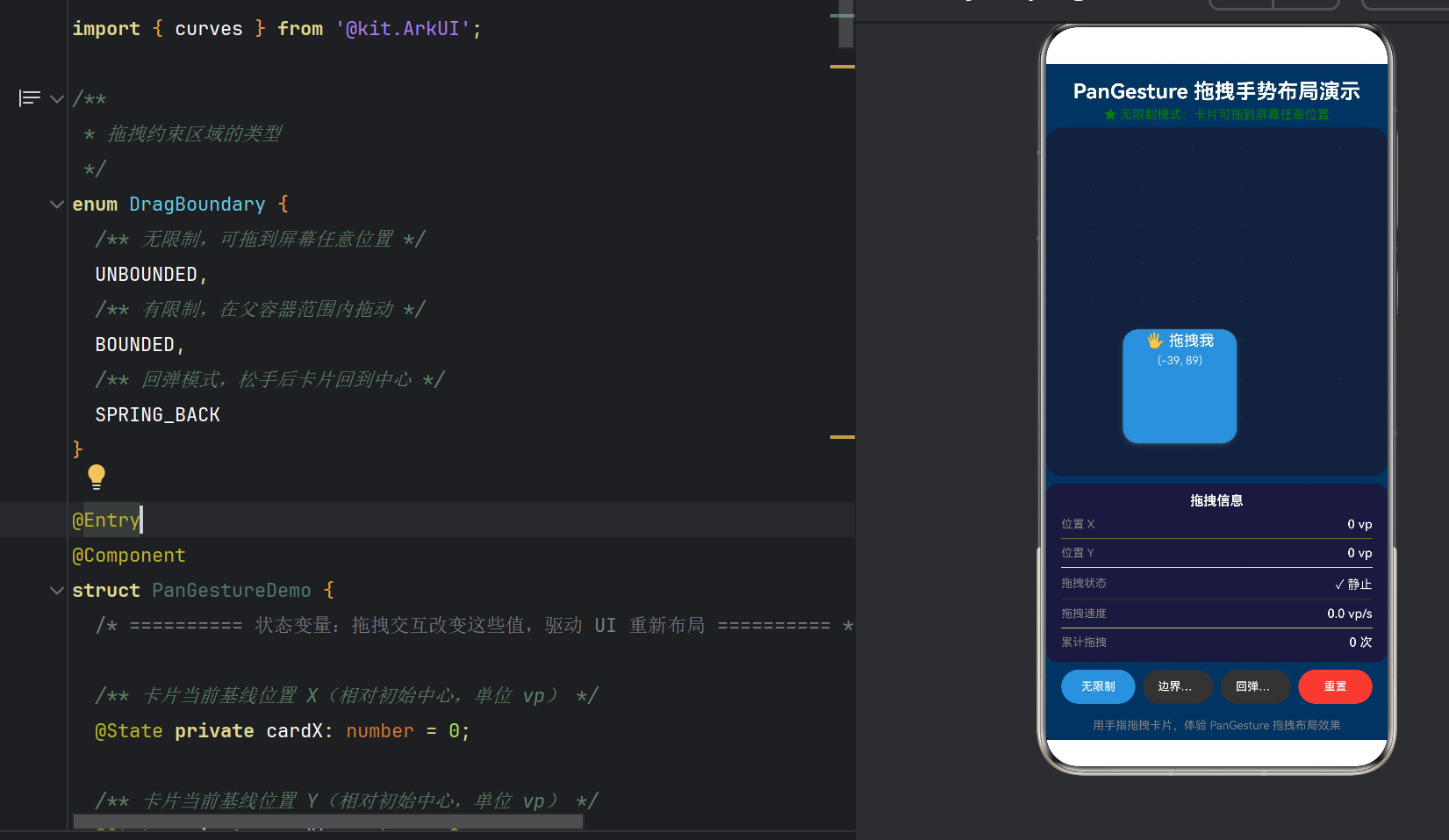
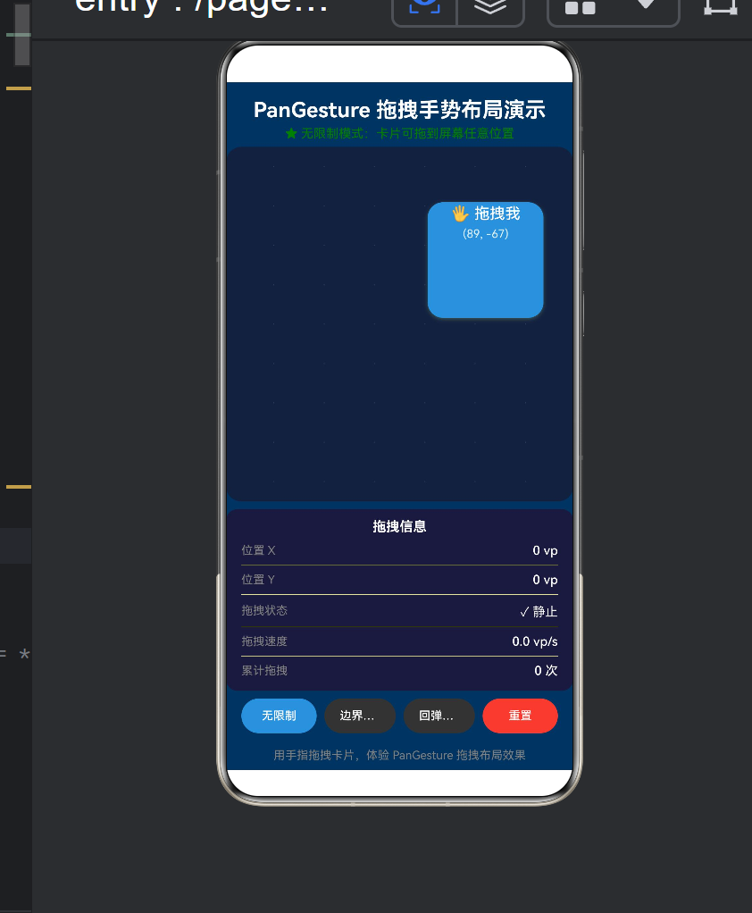
4.5 三种拖拽模式详解
模式一:无限制(UNBOUNDED)
卡片位置 = 手指位置
无任何边界限制
实现:onActionUpdate 中直接赋值,不做 clamp。
效果:卡片可以拖到屏幕外(父容器设置了 .clip(true),超出部分被裁切)。
适用:自由拖拽的悬浮窗、贴边吸附的悬浮球。
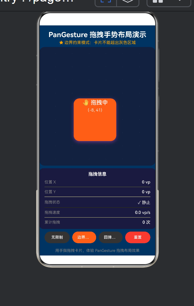
模式二:边界约束(BOUNDED)
maxX = 父容器宽度/2 - 卡片宽度/2
newX = clamp(newX, -maxX, maxX)
if (this.boundaryMode === DragBoundary.BOUNDED) {
const halfW = this.CARD_WIDTH / 2;
const halfH = this.CARD_HEIGHT / 2;
const boundX = this.parentWidth / 2 - halfW;
const boundY = this.parentHeight / 2 - halfH;
newX = Math.max(-boundX, Math.min(boundX, newX));
newY = Math.max(-boundY, Math.min(boundY, newY));
}
边界计算公式推导:
父容器中心点坐标:(parentWidth/2, parentHeight/2)
卡片左上角相对于父容器中心的偏移范围
用 .offset() 定位时,offsetX/Y 以组件原位置为基准
所以约束范围是 [-parentWidth/2 + cardWidth/2, parentWidth/2 - cardWidth/2]
模式三:回弹(SPRING_BACK)
// onActionUpdate 中不做约束,位置跟随手指
// onActionEnd 中触发回弹动画
.animateTo({ duration: 350, curve: curves.springMotion() }, () => {
this.cardX = 0;
this.cardY = 0;
});
curves.springMotion() 是物理弹性曲线——它模拟了一个弹簧的阻尼振动,让卡片在松手后产生"弹回去"的视觉效果。参数无法配置(相比 iOS 的 spring()),但默认效果已经足够自然。
4.6 容器尺寸获取:onAreaChange
.onAreaChange((oldValue: Area, newValue: Area) => {
if (newValue && typeof newValue.width === ‘number’ &&
typeof newValue.height === ‘number’) {
this.parentWidth = newValue.width;
this.parentHeight = newValue.height;
}
})
Area 类型的 width / height 是 Length 类型(即 number | string),所以需要做类型收窄。这里的处理是只接受 number 类型的尺寸值。
4.7 视觉反馈设计
属性 拖拽时 静止时 效果
backgroundColor #FF6B35(橙色) #4A90D9(蓝色) 颜色变化提示状态切换
scale 1.1 1.0 轻微放大提供"按住了"的触感
shadow.radius 24 10 阴影增大模拟"抬升"
shadow.offsetY 8 4 投影更远增强立体感
zIndex 10 1 拖拽时浮在其他元素之上
这些是 Affordance(可操作暗示)设计——通过视觉变化告诉用户"这个元素正在被你操控"。
4.8 信息面板与调试
信息面板实时展示:
当前位置 (X, Y)
拖拽状态(静止/拖动中)
实时速度(vp/s)
累计拖拽次数
这在开发调试阶段非常有用——可以直观地看到 event.offsetX、event.velocity 等数值如何在拖拽过程中变化。
4.9 底部按钮栏的实现
四个按钮共用 TapGesture 实现点击切换——注意这里复用了上一篇文章的 TapGesture 知识。我们的拖拽页面并非"只有 PanGesture",而是 TapGesture + PanGesture 协同工作。
五、进阶:从 Demo 到产品级拖拽
5.1 带惯性的自由落体(Fling)
真实世界的拖拽在松手后应该有惯性滑动:
.onActionEnd((event: GestureEvent) => {
const velocityX = event.velocityX;
const velocityY = event.velocityY;
// 根据速度计算惯性滑动距离
const flingDistanceX = velocityX * 0.3; // 阻尼系数
const flingDistanceY = velocityY * 0.3;
this.getUIContext()?.animateTo({
duration: 500,
curve: curves.decelerate() // 减速曲线
}, () => {
this.cardX += flingDistanceX;
this.cardY += flingDistanceY;
});
})
5.2 拖拽排序(Drag-to-Reorder)
// 在 List 中使用拖拽排序
List() {
ForEach(this.items, (item: string, index: number) => {
ListItem() {
Text(item)
}
.gesture(
PanGesture({ direction: PanDirection.Vertical })
.onActionUpdate((event) => {
// 计算拖拽偏移,判断是否需要与相邻项交换位置
this.handleReorder(index, event.offsetY);
})
)
})
}
5.3 双指拖拽
PanGesture({
fingers: 2,
distance: 10 // 双指需要更大的触发距离
})
5.4 与 PinchGesture 组合
.gesture(
GestureGroup(GestureMode.Parallel,
PanGesture({ fingers: 1 }).onActionUpdate((event) => {
// 单指拖拽:移动位置
this.panImage(event.offsetX, event.offsetY);
}),
PinchGesture({ fingers: 2 }).onActionUpdate((event) => {
// 双指捏合:缩放
this.zoomImage(event.scale);
})
)
)
5.5 与 onTouch 配合实现拖拽涟漪
.onActionUpdate((event: GestureEvent) => {
// 从 fingerList 获取触摸点位置
const finger = event.fingerList[0];
if (finger) {
this.rippleX = finger.x;
this.rippleY = finger.y;
}
})
5.6 吸附效果(Snap)
.onActionEnd(() => {
// 计算离最近"锚点"的距离
const snapPoints = [-100, 0, 100];
const nearest = snapPoints.reduce((prev, curr) =>
Math.abs(curr - this.cardX) < Math.abs(prev - this.cardX) ? curr : prev
);
this.getUIContext()?.animateTo({
duration: 200,
curve: curves.springMotion()
}, () => {
this.cardX = nearest;
});
})
六、常见问题与坑点
6.1 位置跳变(第 4.4 节已详述)
现象:松手后再次拖拽,卡片位置跳变到起点。
原因:直接使用 event.offsetX 而非增量差值。
修复:用 deltaX = event.offsetX - lastOffsetX 计算每帧增量。
6.2 拖拽穿透(手势被父容器拦截)
现象:子组件上的 PanGesture 不触发,或者触发不灵敏。
原因:父容器可能也有手势识别器,或者父容器拦截了触摸事件。
解决方案:
确保父容器没有 priorityGesture() 抢占手势
使用 .hitTestBehavior(HitTestMode.None) 让父容器不参与命中测试
如果父容器是 Scroll 或 List,需要使用 .nestedScroll() 配置嵌套滚动
6.3 拖拽与滚动冲突
现象:在可滚动容器(Scroll/List)内部拖拽时,滚动和拖拽同时触发。
解决方案:
PanGesture({
direction: PanDirection.Horizontal, // 限定方向,避免与垂直滚动冲突
distance: 15 // 增大触发阈值
})
6.4 性能:onActionUpdate 60fps 优化
onActionUpdate 以 60fps 频率调用,每帧只有 16ms 的执行时间。以下操作会导致掉帧:
❌ 在 update 闭包中执行 JSON.parse、正则匹配等
❌ 在 update 闭包中创建新对象或闭包
❌ 修改大量 @State 变量(虽然响应式是细粒度的,但仍需布局计算)
✅ 推荐的做法:
只修改必要的 @State 变量
计算逻辑保持简单(加减法)
避免在 update 中触发动画
6.5 event.velocity 的数值范围
event.velocity 的单位是 vp/s(虚拟像素/秒)。典型的拖拽速度范围:
操作 速度(vp/s)
缓慢移动 200 ~ 500
正常拖拽 500 ~ 2000
快速滑动 2000 ~ 5000
猛滑(Fling) 5000+
6.6 onAreaChange 的 Length 类型
interface Area {
width: Length; // Length = number | string
height: Length;
}
onAreaChange 回调中的 width 和 height 是联合类型。当值为百分比字符串(如 “100%”)时,typeof 检查会返回 string。我们的 Demo 中只处理了 number 类型,对于 string 类型可以解析:
if (typeof newValue.width === ‘number’) {
this.parentWidth = newValue.width;
} else if (typeof newValue.width === ‘string’) {
// 解析百分比,或从其他途径获取像素值
}
七、从 Demo 到生产:最佳实践清单
7.1 代码组织建议
components/
├── DraggableCard.ets ← 可复用的拖拽卡片组件
├── DragContainer.ets ← 拖拽容器(管理所有的拖拽行为)
├── SnapGrid.ets ← 吸附网格组件
└── hooks/
└── useDrag.ts ← 拖拽逻辑封装(状态 + 手势)
7.2 手势配置常量化
// gestureConfig.ets
export const PAN_CONFIG = {
FREE: { direction: PanDirection.All, distance: 5, fingers: 1 },
HORIZONTAL: { direction: PanDirection.Horizontal, distance: 10, fingers: 1 },
VERTICAL: { direction: PanDirection.Vertical, distance: 10, fingers: 1 },
TWO_FINGER: { direction: PanDirection.All, distance: 10, fingers: 2 },
} as const;
7.3 拖拽参数可配置化
interface DragConfig {
axis?: ‘x’ | ‘y’ | ‘both’;
bounds?: { minX: number; maxX: number; minY: number; maxY: number } | null;
snapPoints?: { x: number[]; y: number[] };
springBack?: boolean;
inertia?: boolean;
onDragStart?: () => void;
onDragEnd?: (position: { x: number; y: number }) => void;
}
7.4 性能监控
private frameCount: number = 0;
private lastFrameTime: number = 0;
.onActionUpdate((event) => {
this.frameCount++;
if (event.timestamp - this.lastFrameTime > 1000) {
console.info(PanGesture FPS: ${this.frameCount});
this.frameCount = 0;
this.lastFrameTime = event.timestamp;
}
// … 正常的更新逻辑
})
7.5 无障碍支持
.gesture(PanGesture({ … }))
.accessibilityText(‘可拖拽的卡片,当前位于(${this.cardX}, ${this.cardY})’)
.accessibilityLevel(‘auto’)
八、与其他平台拖拽手势的对比
特性 ArkUI (PanGesture) SwiftUI (DragGesture) Jetpack Compose (draggable/detectDragGestures)
声明式 API ✅ gesture(PanGesture{}) ✅ gesture(DragGesture()) ✅ .draggable() / .pointerInput()
回调命名 onActionStart/Update/End onChanged/onEnded onDragStart/onDrag/onDragEnd
可配方向 ✅ PanDirection ✅ 无,但可过滤 ✅ 通过 Orientation
可配手指数 ✅ fingers: number ✅ minimumDistance ❌ 需自定义
可配触发距离 ✅ distance: number ✅ minimumDistance ✅ detectDragGestures 内置
速度信息 ✅ event.velocity ✅ value.velocity ✅ change.velocity
边界回调 ❌ 需自行实现 ❌ 需自行实现 ❌ 需自行实现
手势组合 ✅ GestureGroup ✅ Simultaneous/Sequenced ✅ forEachGesture
核心差异:ArkUI 的 PanGesture 在回调命名上采用了统一的 onAction 前缀,与其他手势保持一致。而 SwiftUI 的 DragGesture 使用 onChanged/onEnded,Compose 使用 onDrag。三种框架都支持方向、距离、手指数的配置,但在命名风格和 API 结构上各有特点。
九、结语
9.1 核心收获
通过这个 Demo,我们完整地走通了 PanGesture 的从配置到触发的全链路:
PanGesture 配置(方向/距离/手指数)
→ .gesture() 绑定到组件
→ 用户手指触摸并滑动
→ 命中测试(判断触摸点在哪个组件上)
→ 手势识别器判断(是否超过 distance 阈值)
→ onActionStart(通知拖拽开始)
→ onActionUpdate × N(60fps 实时追踪)
→ 更新 @State → UI 重绘 → 卡片跟随手指
→ onActionEnd(松手)
→ 回弹动画 / 提交最终位置
→ onActionCancel(中断)
9.2 核心思维模型
“拖拽的本质是状态同步——手指位置驱动组件位置。”
手指的 物理世界 (screen position) 通过
手势系统的 识别与量化 (PanGesture + GestureEvent) 映射到
组件的 响应式状态 (@State cardX, cardY) 最终驱动
界面的 布局渲染 (.offset { x: cardX, y: cardY })
每一帧的 onActionUpdate 都是这个映射链路的一次同步。
9.3 下一步技术探索
与 Scroll / List 的嵌套手势处理(nestedScroll())
PanGesture + AnimatedProperties 实现拖拽物理引擎
PanGesture + Grid 实现拖拽排序组件库
GestureGroup(GestureMode.Race, TapGesture, PanGesture) 实现"点按+拖拽"混合识别
学习 SwipeGesture 快速滑动识别
附录 A:完整 Demo 代码
/*
- PanGestureDemo.ets —— 鸿蒙原生 ArkTS 布局方式之 PanGesture 拖拽布局
- ===== 核心技术 =====
-
- gesture() —— 将手势识别器绑定到组件
-
- PanGesture —— 拖拽/平移手势(可配置方向、手指数量、最小拖动距离)
-
- onActionUpdate —— 拖拽位置更新的回调(实时获取手指偏移量)
- ===== 布局要点 =====
-
- PanGesture 识别用户在屏幕上的平移拖动操作
-
- 通过 onActionUpdate 回调中的 event.offsetX / event.offsetY 实时获取拖拽偏移量
-
- 配合 @State 驱动组件位置变化,实现「指哪打哪」的拖拽布局
-
- 可配置:direction(拖动方向:All / Horizontal / Vertical)、
- distance(触发距离阈值)、fingers(手指数量)
-
- 结合 onActionStart / onActionEnd 实现拖拽前后状态切换(放大/阴影/回弹)
- ===== API 说明(HarmonyOS NEXT API 12+) =====
-
- PanGesture 的回调统一为:
- onActionStart((event: GestureEvent) => void) 拖拽开始
- onActionUpdate((event: GestureEvent) => void) 拖拽位置更新 ← 核心
- onActionEnd((event: GestureEvent) => void) 拖拽结束
- onActionCancel(() => void) 拖拽取消
-
- GestureEvent 的属性(不是方法):
- event.offsetX / event.offsetY 累计偏移量(vp)
- event.velocity / event.velocityX / event.velocityY 速度
- event.timestamp 时间戳
*/
import { curves } from ‘@kit.ArkUI’;
/**
- 拖拽约束区域的类型
*/
enum DragBoundary {
UNBOUNDED,
BOUNDED,
SPRING_BACK
}
@Entry
@Component
struct PanGestureDemo {
@State private cardX: number = 0;
@State private cardY: number = 0;
@State private isDragging: boolean = false;
@State private cardScale: number = 1.0;
@State private boundaryMode: DragBoundary = DragBoundary.UNBOUNDED;
@State private dragCount: number = 0;
@State private dragVelocity: number = 0;
@State private totalDistance: number = 0;
@State private parentWidth: number = 360;
@State private parentHeight: number = 640;
private readonly CARD_WIDTH: number = 120;
private readonly CARD_HEIGHT: number = 120;
private lastOffsetX: number = 0;
private lastOffsetY: number = 0;
build() {
Column() {
// 标题
Text(‘PanGesture 拖拽手势布局演示’)
.fontSize(22).fontWeight(FontWeight.Bold)
.fontColor(Color.White).textAlign(TextAlign.Center)
.width(‘100%’).padding({ top: 16, bottom: 4 })
  // 模式描述
  Text(this.getBoundaryDescription()).fontSize(13)
    .fontColor(this.boundaryMode === DragBoundary.UNBOUNDED ? Color.Green :
                this.boundaryMode === DragBoundary.BOUNDED ? Color.Orange : '#00B4D8')
    .textAlign(TextAlign.Center).width('100%').margin({ bottom: 6 })

  // 拖拽舞台
  Stack() {
    // 背景网格
    Column() {
      GridLineRow(); GridLineRow(); GridLineRow();
      GridLineRow(); GridLineRow(); GridLineRow();
      GridLineRow(); GridLineRow(); GridLineRow();
    }.width('100%').height('100%')

    // --- 可拖拽卡片 ---
    Column() {
      Text(this.isDragging ? '🤚 拖拽中' : '🖐 拖拽我')
        .fontSize(16).fontColor(Color.White)
        .fontWeight(FontWeight.Medium).lineHeight(22)
      Text(`(${Math.round(this.cardX)}, ${Math.round(this.cardY)})`)
        .fontSize(12).fontColor(Color.White).opacity(0.85).margin({ top: 4 })
    }
    .width(this.CARD_WIDTH).height(this.CARD_HEIGHT)
    .backgroundColor(this.isDragging ? '#FF6B35' : '#4A90D9')
    .borderRadius(16)
    .shadow({ radius: this.isDragging ? 24 : 10,
              color: this.isDragging ? '#FF6B3580' : '#4A90D980',
              offsetY: this.isDragging ? 8 : 4 })
    .offset({ x: this.cardX, y: this.cardY })
    .scale({ x: this.cardScale, y: this.cardScale })
    .zIndex(this.isDragging ? 10 : 1)
    // === 核心:PanGesture 绑定 ===
    .gesture(
      PanGesture({ direction: PanDirection.All, distance: 5, fingers: 1 })
        .onActionStart(() => {
          this.isDragging = true;
          this.lastOffsetX = 0;
          this.lastOffsetY = 0;
          this.cardScale = 1.1;
        })
        .onActionUpdate((event: GestureEvent) => {
          const deltaX = event.offsetX - this.lastOffsetX;
          const deltaY = event.offsetY - this.lastOffsetY;
          this.lastOffsetX = event.offsetX;
          this.lastOffsetY = event.offsetY;
          this.cardX += deltaX;
          this.cardY += deltaY;
          this.dragVelocity = event.velocity;
        })
        .onActionEnd((event: GestureEvent) => {
          if (this.boundaryMode === DragBoundary.SPRING_BACK) {
            this.getUIContext()?.animateTo(
              { duration: 350, curve: curves.springMotion() },
              () => { this.cardX = 0; this.cardY = 0; }
            );
          }
          this.dragCount++;
          this.totalDistance += Math.abs(event.offsetX) + Math.abs(event.offsetY);
          this.isDragging = false;
          this.cardScale = 1.0;
        })
        .onActionCancel(() => {
          this.isDragging = false;
          this.cardScale = 1.0;
        })
    )
  }
  .width('100%').layoutWeight(1)
  .backgroundColor('#16213e').borderRadius(16)
  .margin({ left: 16, right: 16 }).clip(true)
  .onAreaChange((_, newValue) => {
    if (newValue && typeof newValue.width === 'number' &&
        typeof newValue.height === 'number') {
      this.parentWidth = newValue.width;
      this.parentHeight = newValue.height;
    }
  })

  // 信息面板
  Column() {
    Text('拖拽信息').fontSize(14).fontWeight(FontWeight.Bold)
      .fontColor(Color.White).width('100%')
      .textAlign(TextAlign.Center).padding({ bottom: 6 })
    Column() {
      InfoRow('位置 X', `${this.cardX.toFixed(0)} vp`)
      Divider().height(1).color('#ffffff11')
      InfoRow('位置 Y', `${this.cardY.toFixed(0)} vp`)
      Divider().height(1).color('#ffffff11')
      InfoRow('状态', this.isDragging ? '🔄 拖动中' : '✓ 静止')
      Divider().height(1).color('#ffffff11')
      InfoRow('速度', `${this.dragVelocity.toFixed(1)} vp/s`)
      Divider().height(1).color('#ffffff11')
      InfoRow('累计', `${this.dragCount} 次`)
    }.width('100%').padding({ left: 16, right: 16 })
  }
  .width('100%').backgroundColor('#1a1a3e').borderRadius(12)
  .padding({ top: 10, bottom: 10 }).margin({ left: 16, right: 16, top: 8 })

  // 底部按钮
  Row() {
    modeButton('无限制', DragBoundary.UNBOUNDED, '#4A90D9')
    modeButton('边界约束', DragBoundary.BOUNDED, '#FF6B35')
    modeButton('回弹模式', DragBoundary.SPRING_BACK, '#00B4D8')
    Button('重置').height(36).backgroundColor('#E74C3C')
      .fontColor(Color.White).fontSize(12).borderRadius(18).layoutWeight(1)
      .margin({ left: 4 })
      .gesture(TapGesture().onAction(() => this.resetPosition()))
  }
  .width('100%').padding({ left: 16, right: 16, top: 8, bottom: 16 })

  Text('用手指拖拽卡片,体验 PanGesture 拖拽布局效果')
    .fontSize(12).fontColor(Color.Gray)
    .textAlign(TextAlign.Center).width('100%').padding({ bottom: 8 })
}
.width('100%').height('100%').backgroundColor('#0f3460')
}
// 模式按钮辅助方法
private modeButton(label: string, mode: DragBoundary, color: string) {
Button(label).height(36)
.backgroundColor(this.boundaryMode === mode ? color : ‘#333’)
.fontColor(Color.White).fontSize(12).borderRadius(18).layoutWeight(1)
.margin({ left: 4, right: 4 })
.gesture(TapGesture().onAction(() => this.switchBoundary(mode)))
}
private switchBoundary(mode: DragBoundary): void {
this.boundaryMode = mode;
this.getUIContext()?.animateTo(
{ duration: 300, curve: curves.springMotion() },
() => { this.cardX = 0; this.cardY = 0; }
);
}
private resetPosition(): void {
this.getUIContext()?.animateTo(
{ duration: 350, curve: curves.springMotion() },
() => {
this.cardX = 0; this.cardY = 0; this.dragCount = 0;
this.totalDistance = 0; this.dragVelocity = 0;
this.cardScale = 1.0; this.isDragging = false;
this.lastOffsetX = 0; this.lastOffsetY = 0;
}
);
}
private getBoundaryDescription(): string {
const descs = [
‘★ 无限制模式:卡片可拖到屏幕任意位置’,
‘★ 边界约束模式:卡片不能超出灰色区域’,
‘★ 回弹模式:松手后卡片弹性回到中心’
];
return descs[this.boundaryMode];
}
}
@Builder
function InfoRow(label: string, value: string) {
Row() {
Text(label).fontSize(12).fontColor(Color.Gray)
Text(value).fontSize(13).fontColor(Color.White).fontWeight(FontWeight.Medium)
}
.width(‘100%’).justifyContent(FlexAlign.SpaceBetween)
.padding({ top: 3, bottom: 3 })
}
@Component
struct GridLineRow {
build() {
Row() {
Text(‘·’).fontSize(10).fontColor(Color.Gray).opacity(0.3)
Text(‘·’).fontSize(10).fontColor(Color.Gray).opacity(0.3)
Text(‘·’).fontSize(10).fontColor(Color.Gray).opacity(0.3)
Text(‘·’).fontSize(10).fontColor(Color.Gray).opacity(0.3)
Text(‘·’).fontSize(10).fontColor(Color.Gray).opacity(0.3)
Text(‘·’).fontSize(10).fontColor(Color.Gray).opacity(0.3)
}
.width(‘100%’).layoutWeight(1)
.justifyContent(FlexAlign.SpaceEvenly)
}
}
附录 B:参考资料
HarmonyOS NEXT 开发者文档 — ArkUI 手势处理(PanGesture)
HarmonyOS NEXT 开发者文档 — 动画 API
HarmonyOS NEXT 开发者文档 — 显式动画(animateTo)
ArkUI 手势事件 SDK 声明文件 — gesture.d.ts
HarmonyOS NEXT 状态管理 — @State 装饰器
版权声明:本文为 HarmonyOS NEXT 技术分享系列的第二篇,遵循 CC BY-NC 4.0 协议。欢迎转载,但请注明出处。

作为“人工智能6S店”的官方数字引擎,为AI开发者与企业提供一个覆盖软硬件全栈、一站式门户。
更多推荐
 6
6 0
0- 0


 已为社区贡献20条内容

所有评论(0)