
鸿蒙原生 ArkTS 布局精讲:RelativeContainer 实现悬浮按钮(FAB)
鸿蒙原生 ArkTS 布局精讲:RelativeContainer 实现悬浮按钮(FAB)
一、引言
HarmonyOS NEXT(鸿蒙星河版)是华为从底层开始自研的操作系统,彻底剥离了 Android AOSP 代码。随之而来的是 ArkTS 这一声明式 UI 开发语言的全面普及。对于从 Android(XML + Jetpack Compose)或 iOS(SwiftUI)转过来的开发者而言,ArkTS 在语法上更接近 TypeScript + Flutter 的混合体,而其布局系统则是全新的设计。
在鸿蒙的布局体系中,RelativeContainer 是一个极其重要的容器组件。它允许子组件通过锚定规则(alignRules) 相对于父容器或兄弟组件进行定位,这种机制非常适合实现右下角悬浮按钮(FAB,FloatingActionButton) 这类需要"浮"在界面上的交互元素。
本文将从一个完整的实战项目出发,深度剖析 RelativeContainer + alignRules 的用法,并带你实现一个带交互反馈的 FAB 悬浮按钮。全文中英文混杂的代码将配有详细中文注释,适合鸿蒙初学者和中级开发者阅读。
二、RelativeContainer 布局系统概览
2.1 什么是 RelativeContainer
RelativeContainer 是 @kit.ArkUI 框架提供的相对定位容器。它的核心理念是:容器内的每一个子组件都通过锚定规则(alignRules)来描述"我该放在哪里"。锚定的目标可以是:
__container__:指向父容器本身(最常用)- 其他兄弟组件的
id:实现组件间的相对排列
2.2 alignRules 语法解析
每一个子组件都可以调用 .alignRules() 链式方法来声明自身的定位规则。其类型签名如下:
.alignRules({
  // 垂直方向:top / center / bottom(选一或组合)
  top:    { anchor: string, align: VerticalAlign },
  center: { anchor: string, align: VerticalAlign },
  bottom: { anchor: string, align: VerticalAlign },
  // 水平方向:start / middle / end(选一或组合)
  start:  { anchor: string, align: HorizontalAlign },
  middle: { anchor: string, align: HorizontalAlign },
  end:    { anchor: string, align: HorizontalAlign }
})
| 规则属性 | 作用方向 | 可选值 | 含义 |
|---|---|---|---|
top / center / bottom |
垂直 | VerticalAlign.Top / VerticalAlign.Center / VerticalAlign.Bottom |
本组件的顶边/中线/底边,锚定到目标组件的哪个位置 |
start / middle / end |
水平 | HorizontalAlign.Start / HorizontalAlign.Middle / HorizontalAlign.End |
本组件的左边/中线/右边,锚定到目标组件的哪个位置 |
anchor |
目标 | '__container__' 或组件 id |
锚定到谁身上 |
2.3 锚定机制的核心思维
理解 alignRules 的关键在于八字口诀:
“我的边缘,锚定到目标的边缘”
例如:
.alignRules({
  bottom: { anchor: '__container__', align: VerticalAlign.Bottom },
  end:    { anchor: '__container__', align: HorizontalAlign.End }
})
翻译成大白话就是:
- 把我的 底边(bottom) 锚定到容器的 底边(VerticalAlign.Bottom)
- 把我的 右侧(end) 锚定到容器的 右侧(HorizontalAlign.End)
效果就是:组件紧贴容器的右下角。
2.4 offset 微调位移
定位之后,offset() 方法可以对组件进行微调偏移:
.offset({ x: -24, y: -24 })
正数向右/向下偏移,负数向左/向上偏移。在 FAB 场景中,我们常用负数偏移将按钮从容器边缘"拉回"一些,制造出边距和悬浮感。
三、悬浮按钮(FAB)的设计模式
3.1 什么是 FAB
FAB(FloatingActionButton)是 Material Design 中引入的一种交互模式:一个圆形按钮悬浮在界面的右下角,通常用于触发主操作(如新建、添加、分享)。在鸿蒙中,虽然没有官方的 FAB 组件,但通过 Button + RelativeContainer 可以轻松实现。
3.2 FAB 的视觉特征
一个典型的 FAB 需要具备以下视觉要素:
- 正圆形:通过
width = height且borderRadius = width / 2实现 - 悬浮感:通过
shadow()阴影增强层次 - 右下角定位:通过
alignRules锚定到容器右下 - 内边距:通过
offset()让按钮离边缘有一定距离 - 图标:通常使用 “+” 或主题图标
3.3 与 Android FAB 的对比
| 维度 | Android(XML) | HarmonyOS(ArkTS) |
|---|---|---|
| 布局容器 | CoordinatorLayout / FrameLayout |
RelativeContainer |
| 定位方式 | android:layout_gravity="bottom|end" |
alignRules + __container__ |
| 偏移 | android:layout_margin |
.offset() |
| 圆角 | app:shape="circle" |
.borderRadius(28) |
| 阴影 | app:elevation |
.shadow() |
可以看到,鸿蒙的 ArkTS 方案在语法上更加链式化和声明式,阅读起来一目了然。
四、实战:完整示例剖析
下面我们将逐段分析示例项目中的核心代码。完整文件位于 entry/src/main/ets/pages/FloatingButtonPage.ets。
4.1 页面结构与状态定义
import router from '@ohos.router';

@Entry
@Component
struct FloatingButtonPage {
  @State fabClickCount: number = 0;
  @State showTip: boolean = false;
  // ...
}
@Entry标记页面入口,@Component声明这是一个组件。- 两个
@State变量管理交互状态:点击计数和提示显示开关。
4.2 顶层容器
build() {
  RelativeContainer() {
    // ... 所有子组件
  }
  .width('100%')
  .height('100%')
  .backgroundColor('#F5F5F5')
}
RelativeContainer 本身必须指定宽高(通常填满屏幕 100%),否则子组件的锚定无法确定范围。
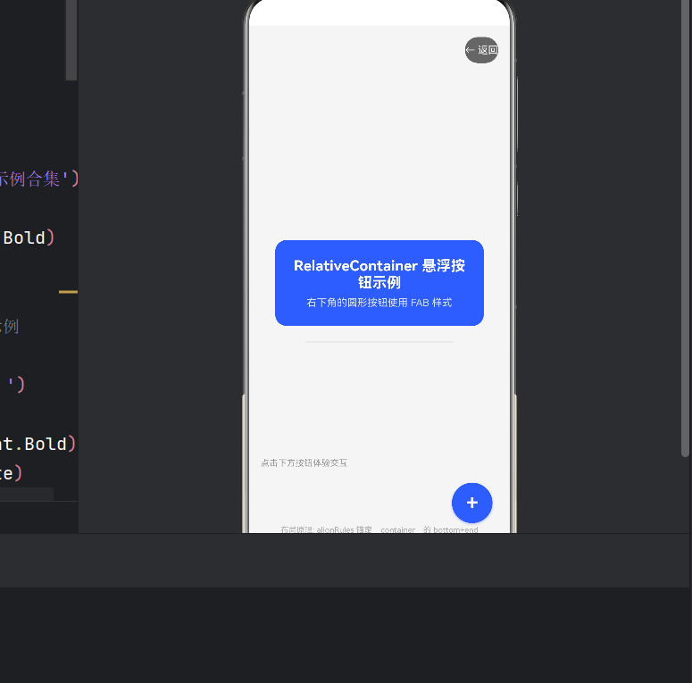
4.3 居中卡片(演示垂直+水平居中)
Column() {
  Text('RelativeContainer 悬浮按钮示例')
    .fontSize(20).fontWeight(FontWeight.Bold).fontColor(Color.White);
  Text('右下角的圆形按钮使用 FAB 样式')
    .fontSize(14).fontColor(Color.White).opacity(0.8).margin({ top: 8 });
}
.width('80%').padding(24).borderRadius(16).backgroundColor('#3A5CFF')
.alignRules({
  center: { anchor: '__container__', align: VerticalAlign.Center },
  middle: { anchor: '__container__', align: HorizontalAlign.Center }
})
.id('cardCenter')
要点:center + middle 组合实现水平和垂直双居中。id('cardCenter') 必须设置,因为后续的分隔线组件需要引用它作为锚定目标。
4.4 右上角返回按钮
Button() {
  Text('← 返回').fontSize(14).fontColor(Color.White)
}
.height(36).borderRadius(18).backgroundColor('#666666')
.alignRules({
  top:  { anchor: '__container__', align: VerticalAlign.Top },
  end:  { anchor: '__container__', align: HorizontalAlign.End }
})
.offset({ x: -16, y: 16 })
.id('backBtn')
.onClick(() => { router.back(); })
要点:top + end → 右上角。.offset({ x: -16, y: 16 }) → 向右偏移 +16(下沉),向左偏移 -16(内缩)。
4.5 左下角提示标签
Text('点击下方按钮体验交互')
  .fontSize(12).fontColor('#999999')
  .alignRules({
    bottom: { anchor: '__container__', align: VerticalAlign.Bottom },
    start:  { anchor: '__container__', align: HorizontalAlign.Start }
  })
  .offset({ x: 16, y: -100 })
  .id('labelText')
要点:bottom + start → 左下角。.offset({ y: -100 }) 向上拉 100px,避免与 FAB 重叠。
4.6 核心:右下角悬浮按钮(FAB)
Button() {
  Text('+').fontSize(28).fontColor(Color.White).fontWeight(FontWeight.Bold)
}
.width(56).height(56).borderRadius(28)
.backgroundColor('#3A5CFF')
.shadow({ radius: 8, color: '#663A5CFF', offsetX: 0, offsetY: 4 })
.alignRules({
  bottom: { anchor: '__container__', align: VerticalAlign.Bottom },
  end:    { anchor: '__container__', align: HorizontalAlign.End }
})
.offset({ x: -24, y: -24 })
.id('fabButton')
.onClick(() => {
  this.fabClickCount++;
  this.showTip = true;
  setTimeout(() => { this.showTip = false; }, 2000);
})
这是全文最关键的部分,逐点拆解:
4.6.1 圆形样式
width(56) + height(56) + borderRadius(28) = 正圆形。56 是直径,28 是半径。你可以根据需要调整为 48、64、72 等值。
4.6.2 阴影
.shadow({ radius: 8, color: '#663A5CFF', offsetX: 0, offsetY: 4 })
shadow 接受一个 Shadow 对象,包含:
radius:模糊半径,越大阴影越扩散color:阴影颜色,#66前缀表示 40% 透明度(ARGB)offsetX/offsetY:阴影偏移方向
阴影是营造"悬浮感"的关键——没有阴影的按钮看起来像是贴在平面上,有阴影后才产生"浮起来"的视觉效果。
4.6.3 右下角定位
.alignRules({
  bottom: { anchor: '__container__', align: VerticalAlign.Bottom },
  end:    { anchor: '__container__', align: HorizontalAlign.End }
})
这条规则等价于 Android 中的 android:layout_gravity="bottom|end"。bottom 代表子组件的底边对齐到容器的底边;end 代表子组件的右边对齐到容器的右边。
4.6.4 内边距
.offset({ x: -24, y: -24 })
如果不做偏移,按钮会贴死在右下角,没有呼吸空间。x: -24 将按钮向左移 24px,y: -24 将按钮向上移 24px,从而让按钮与容器边缘保持 24px 的间距。
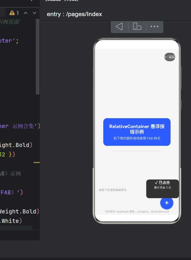
4.7 兄弟组件间的锚定
这个技巧值得单独拿出来讲:tipCard 没有锚定到 __container__,而是锚定到了兄弟组件 fabButton:
Column() {
  Text('✓ 已点击').fontSize(16).fontColor(Color.White);
  Text(`累计点击 ${this.fabClickCount} 次`).margin({ top: 4 });
}
// ...
.alignRules({
  bottom: { anchor: 'fabButton', align: VerticalAlign.Top },
  end:    { anchor: 'fabButton', align: HorizontalAlign.End }
})
.offset({ x: 0, y: -16 })
.id('tipCard')
bottom: { anchor: 'fabButton', align: VerticalAlign.Top } 表示:我的底边对齐到 fabButton 的顶边。这样无论 FAB 怎么移动,提示卡片总会紧贴在 FAB 上方,实现组件间的相对联动。
4.8 全组件锚定关系总图
┌─────────────────────────────────────────────────────────────┐
│  RelativeContainer (__container__)                          │
│                                                             │
│  ┌───────────────────────────────────────────────┐          │
│  │  backBtn (右上角: top + end)                    │          │
│  └───────────────────────────────────────────────┘          │
│                                                             │
│              ┌───────────────────────┐                       │
│              │   cardCenter          │                       │
│              │   (居中: center+middle)│                       │
│              │                       │                       │
│              └───────────────────────┘                       │
│                         ↓ (锚定引用)                          │
│                    decoLine                                   │
│                                                             │
│  labelText (左下角: bottom+start)                             │
│                                                             │
│                                    ┌──────┐                  │
│                                    │ FAB  │  ← tipCard      │
│                                    │ (+ ) │   锚定到 FAB     │
│                                    └──────┘  顶部            │
│                                  (右下角: bottom+end)         │
│                                                             │
│  hintText (底部居中: bottom+middle)                           │
└─────────────────────────────────────────────────────────────┘
五、Index 主页面与导航
入口页面同样使用了 RelativeContainer:
@Entry
@Component
struct Index {
build() {
RelativeContainer() {
Column() {
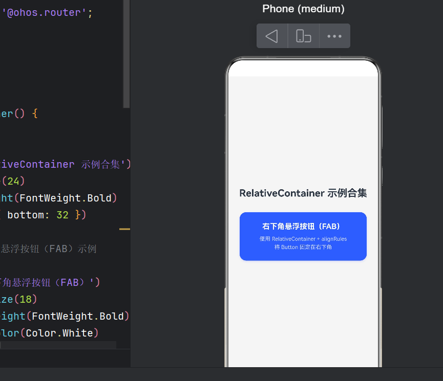
Text('RelativeContainer 示例合集')
.fontSize(24).fontWeight(FontWeight.Bold);
// ... 导航卡片
Column() {
Text('右下角悬浮按钮(FAB)');
Text('使用 RelativeContainer + alignRules\n将 Button 固定在右下角');
}
.onClick(() => {
router.pushUrl({ url: 'pages/FloatingButtonPage' });
})
}
.alignRules({
center: { anchor: '__container__', align: VerticalAlign.Center },
middle: { anchor: '__container__', align: HorizontalAlign.Center }
})
}
.width('100%').height('100%').backgroundColor('#F5F5F5')
}
}
整个 Column 在容器中居中,内部的导航卡片点击后跳转到 FAB 示例页。注意路由注册需要在 main_pages.json 中完成:
{
  "src": ["pages/Index", "pages/FloatingButtonPage"]
}
六、alignRules 常见误区与避坑指南
6.1 必须设置 id
每一个需要在 alignRules 中被其他组件引用的组件,必须显式设置 .id()。未设置 id 的组件无法被锚定。注意 id 值必须在同一容器内唯一。
6.2 alignRules 不是 margin
不要试图用 alignRules 来模拟 margin。alignRules 负责的是定位(position),间距应该由 .offset() 或子组件内部的 .margin() 来控制。二者各司其职。
6.3 容器必须有明确宽高
RelativeContainer 必须设置 .width() 和 .height(),否则子组件的锚定百分比/位置无法计算。通常设置为 '100%' 填满父布局。
6.4 不要在同一方向设置冲突规则
如果你同时设置了 top 和 bottom,系统会以最后一个为准。同理 start 和 end 也是互斥的。如果你想实现拉伸效果,应该考虑 Flex 或 Stack 布局。
6.5 offset 的坐标方向
ArkTS 的坐标轴是:X 轴向右为正,Y 轴向下为正。因此:
.offset({ x: -24 })→ 向左偏移.offset({ y: -24 })→ 向上偏移
七、进阶:撑满屏幕的多场景适配
在实际 App 中,FAB 可能需要适配不同尺寸的屏幕和设备。以下是一些进阶适配技巧:
7.1 响应式 FAB 大小
// 根据屏幕宽度动态调整 FAB 大小
private fabSize: number = 56;

aboutToAppear() {
  const displayInfo = display.getDefaultDisplaySync();
  const dpi = displayInfo.densityPixels;
  this.fabSize = dpi > 3.0 ? 64 : 56;
}
7.2 FAB 工具栏展开
当点击 FAB 后,弹出多个操作选项(类似 Inbox 风格):
if (this.isExpanded) {
  ForEach(this.actions, (item: FabAction) => {
    Button({ icon: item.icon })
      .width(40).height(40).borderRadius(20)
      .alignRules({
        bottom: { anchor: 'fabButton', align: VerticalAlign.Top },
        end:   { anchor: 'fabButton', align: HorizontalAlign.End }
      })
      .offset({ y: -16 * (this.actions.indexOf(item) + 1) })
  })
}
7.3 键盘弹出时的避让
当软键盘弹出时,FAB 可能被遮挡。可以通过监听键盘高度动态调整 FAB 的 offset:
import { window } from '@kit.ArkUI';
// ...
window.getLastWindow(getContext(), (err, win) => {
  win.on('keyboardHeightChange', (height: number) => {
    this.fabOffsetY = height > 0 ? -(24 + height) : -24;
  });
});
八、性能考量
在 ArkTS 中,RelativeContainer 的布局计算只发生在首次布局和状态变量变化触发重渲染时。相比于 Stack + 手动计算 position,RelativeContainer 的性能更优,因为它内部经过了 ArkUI 引擎的布局优化。
性能建议:
- 不要在
alignRules中使用动态变化的anchor值(除非必要) - 合理使用
@State粒度,避免大范围重渲染 - FAB 的阴影(
.shadow())属于绘制层,不影响布局性能
九、总结
本文从零搭建了一个基于 HarmonyOS NEXT + ArkTS 的完整示例应用,核心展示了 RelativeContainer 结合 alignRules 实现右下角悬浮按钮(FAB)的布局方案。
核心收获:
- RelativeContainer 是鸿蒙最灵活的相对定位容器,通过
alignRules实现精准锚定 - FAB 三要素:右下角锚定(bottom + end)+ 负偏移内边距(offset)+ 阴影(shadow)
- 兄弟组件锚定:通过引用其他组件的
id,实现组件间的联动排列 - 状态管理:
@State+ 条件渲染(if),让 FAB 具备交互反馈能力 - API 版本适配:当前项目基于 API 24(SDK 6.1.0),使用
@ohos.router的pushUrl/back进行页面导航
相对于传统 Android 开发的 CoordinatorLayout + app:elevation 方案,鸿蒙的 ArkTS 方案在声明式语法和链式调用上更加直观,掌握 alignRules 的精髓后,你可以快速实现各种复杂的相对定位布局。
十、参考资料

作为“人工智能6S店”的官方数字引擎,为AI开发者与企业提供一个覆盖软硬件全栈、一站式门户。
更多推荐

 1
1 0
0- 0


 已为社区贡献97条内容

所有评论(0)