
【共创季稿事节】鸿蒙 ArkTS 布局进阶:layoutWeight 权重分配与 animateTo 动画实战详解
目录
- 写在前面:为什么需要权重动画
- 核心概念全景图
2.1 layoutWeight:弹性空间分配的基石
2.2 animateTo:状态驱动的动画引擎
2.3 Curve:控制动画的"节奏感" - 手写一个权重动画 Demo
3.1 项目准备与文件结构
3.2 完整代码实现 - 代码深度拆解
4.1 interface WeightMode:ArkTS 的类型约束
4.2 @State 装饰器与响应式数据流
4.3 Row + layoutWeight:三栏弹性布局
4.4 animateTo 的完整签名与参数详解
4.5 权重可视化指示条的设计 - 动画曲线深度对比
5.1 系统内置曲线速查表
5.2 不同曲线的观感差异
5.3 如何为权重动画选择合适的曲线 - 进阶技巧与避坑指南
6.1 坑点一:width(0) 是 layoutWeight 生效的前提
6.2 坑点二:不要在 build() 中直接修改 layoutWeight
6.3 坑点三:ArkTS 的对象字面量类型限制
6.4 技巧一:多个 animateTo 串联实现序列动画
6.5 技巧二:权重为 0 实现"隐退"效果
6.6 技巧三:配合透明度实现完整入场/离场 - 真实场景应用案例
7.1 可拖拽分栏面板
7.2 数据可视化占比切换
7.3 自适应表单布局 - 性能考量与最佳实践
8.1 animateTo 的性能开销
8.2 layoutWeight 与懒加载的配合
8.3 避免过度动画化 - 总结与延伸阅读
- 写在前面:为什么需要权重动画
在移动端 UI 开发中,空间分配是一个永恒的话题。我们经常需要面对这样的场景:
一个容器内有多个面板,用户希望拖动调整它们的大小;
数据看板中,某个指标突然飙升,对应的区块需要"撑大"以引起注意;
应用侧边栏从收起状态切换到展开状态,主内容区需要平滑缩小。
传统做法是通过硬编码宽度 + 数值动画来实现,但这种方式存在明显的短板:
方案 缺点
固定宽度 + 数值变化 需要手动计算剩余空间,多面板时逻辑复杂
Flex 布局 + 百分比 百分比计算在动态增减面板时容易出错
绝对定位 + 坐标计算 代码可维护性差,嵌套时灾难
鸿蒙 ArkTS 提供的 layoutWeight 属性从根本上解决了这个问题:你不需要关心容器的总宽度是多少,也不需要做任何减法计算——只需告诉每个子元素它的「权重」是多少,框架自动完成空间分配。
而当我们将 layoutWeight 与 animateTo 动画引擎结合时,权重变化的过程可以被「视觉化」——用户看到的不是突兀的跳变,而是流畅的伸缩过渡。这就是本文要深入探讨的 「权重动画」模式。
- 核心概念全景图
在深入代码之前,有必要先厘清三个核心概念各自的定位和相互关系。
2.1 layoutWeight:弹性空间分配的基石
2.1.1 什么是 layoutWeight
layoutWeight 是鸿蒙 ArkUI 框架中 Row、Column 和 Flex 容器提供给子组件的属性。它的作用是指定子组件在主轴方向上占据「剩余空间」的比例。
┌─────────────────────────────────────┐
│ Row (width: 100%) │
│ ┌──────┬──────────────┬──────────┐ │
│ │ A │ B │ C │ │
│ │ wt=1 │ wt=3 │ wt=1 │ │
│ └──────┴──────────────┴──────────┘ │
│ 权重比例: A:B:C = 1:3:1 │
└─────────────────────────────────────┘
关键理解:layoutWeight 分配的是 剩余空间,而不是容器总空间。剩余空间 = 容器主轴尺寸 - 所有子组件非弹性尺寸之和。
2.1.2 layoutWeight 的计算规则
要准确理解 layoutWeight,需要掌握它的计算流程:
第一轮测量:子组件如果设置了固定 width(Row 容器下)或 height(Column 容器下),则按固定值占位。
计算剩余空间:容器尺寸 - 所有固定尺寸子组件的尺寸之和。
第二轮分配:设置了 layoutWeight 且 width / height 为 0(或未设置)的子组件,按权重比例瓜分剩余空间。
计算公式:
单子组件弹性宽度 = 剩余空间 × (该子组件权重 / 所有弹性子组件权重之和)
2.1.3 layoutWeight 的典型值策略
正数(1, 2, 3…):正常参与分配,数值越大占位越多。
小数(0.5, 1.5…):支持浮点权重,可以做更精细的控制。
0:不占用空间,子组件「消失」(但仍参与布局测量)。
负数:无效,会被当作 0 处理。
2.2 animateTo:状态驱动的动画引擎
2.2.1 声明式框架中的动画哲学
鸿蒙 ArkUI 采用声明式 UI 范式,其动画机制也遵循同样的思想——你不需要描述动画「怎么动」,只需要描述动画的「终点状态」,框架自动补全中间帧。
animateTo 就是这个哲学的核心实现。
┌──────────┐ animateTo({…}) ┌──────────┐
│ 状态 A │ ──────────────────────→ │ 状态 B │
│ wtA = 1 │ 框架自动生成中间帧 │ wtA = 3 │
│ wtB = 1 │ “补间动画” │ wtB = 1 │
│ wtC = 1 │ │ wtC = 1 │
└──────────┘ └──────────┘
↓ 动画过程中每一帧……
├─ 帧 1: wtA = 1.2, wtB = 1.0, wtC = 1.0
├─ 帧 2: wtA = 1.5, wtB = 1.0, wtC = 1.0
├─ 帧 3: wtA = 1.8, wtB = 1.0, wtC = 1.0
└─ 帧 n: wtA = 3.0, wtB = 1.0, wtC = 1.0
2.2.2 animateTo 的函数签名
animateTo(
value: AnimationOptions, // 动画配置
callback: () => void // 状态修改闭包
): void
AnimationOptions 的完整定义:
属性 类型 默认值 说明
duration number 1000 动画持续时间(毫秒)
curve Curve Curve.FastOutSlowIn 动画曲线
delay number 0 动画开始延迟(毫秒)
iterations number 1 动画播放次数,-1 表示无限循环
playMode PlayMode PlayMode.Normal 播放模式
tempo number 1.0 动画播放速度倍率
onFinish () => void undefined 动画完成回调
2.2.3 animateTo 的工作原理
当调用 animateTo 时,框架内部做了三件事:
快照当前状态:记录所有被 @State / @Prop / @Link 等装饰器追踪的状态变量的当前值。
执行闭包:同步执行传入的回调函数,更新状态变量。
插值计算:将快照值与新值之间的差异,按照 curve 曲线进行插值,逐帧驱动 UI 刷新。
关键洞察:animateTo 不是「动画函数」,而是「状态过渡声明」。它在闭包内修改的所有 @State 变量都会被纳入动画,不需要逐个指定。
2.3 Curve:控制动画的"节奏感"
2.3.1 什么是动画曲线
动画曲线(也称为缓动函数 / easing function)定义了动画进度与时间之间的关系。
值变化
│
│ 加速进入 ──→ 减速停止 (FastOutSlowIn)
│ 恒定速率 ──→ (Linear)
│ 超过目标 ──→ 回弹稳定 (Spring)
│
└──────────────────── 时间
没有曲线的动画是机械、生硬的。合适的曲线让动画看起来「自然」——就像物理世界中的物体运动一样。
2.3.2 ArkUI 内置曲线速览
Curve 枚举值 效果描述 适用场景
Linear 匀速变化 进度条、机械运动
Ease 慢→快→慢(默认) 通用入场动画
EaseIn 慢→快(加速) 离场、消失
EaseOut 快→慢(减速) 入场、出现
EaseInOut 慢→快→慢(更平滑) UI 过渡通用
FastOutSlowIn 快速开始,慢速结束 高优先级通知、强调
FastOutLinearIn 快速开始,匀速结束 数据更新
LinearOutSlowIn 匀速开始,慢速结束 卡片展开
2.3.3 曲线对权重动画的独特意义
对于 layoutWeight 动画而言,曲线选择直接影响用户的空间感知:
当某个面板的权重从 1 增加到 4 时,使用 FastOutSlowIn 会让面板「迅速」扩张到大部分尺寸,然后「微调」到最终大小——给人一种自信、干脆的感觉。
使用 EaseInOut 则会让整个过程平滑均匀,适合优雅、温和的场景。
使用 Linear 则全程匀速,适合不需要情感色彩的数据驱动场景。
3. 手写一个权重动画 Demo
理论讲完,我们进入实战。下面是一个完整的、可直接运行的权重动画示例应用。
3.1 项目准备与文件结构
在 HarmonyOS 工程中,我们创建以下文件:
entry/src/main/ets/pages/
├── Index.ets # 入口页(导航)
└── LayoutWeightAnimation.ets # 权重动画演示页
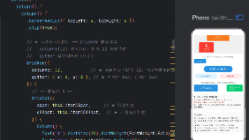
3.2 完整代码实现
3.2.1 入口页 Index.ets
import { router } from ‘@kit.ArkUI’;
@Entry
@Component
struct Index {
@State message: string = ‘Hello World’;
build() {
RelativeContainer() {
Text(this.message)
.id(‘HelloWorld’)
.fontSize($r(‘app.float.page_text_font_size’))
.fontWeight(FontWeight.Bold)
.alignRules({
center: { anchor: ‘container’, align: VerticalAlign.Center },
middle: { anchor: ‘container’, align: HorizontalAlign.Center }
})
.onClick(() => {
this.message = ‘Welcome’;
})
  // 导航按钮
  Button('▶ 权重动画演示')
    .id('btnLayoutWeight')
    .fontSize(16)
    .fontWeight(FontWeight.Medium)
    .backgroundColor('#FF4A90D9')
    .fontColor('#FFFFFFFF')
    .borderRadius(20)
    .width(180)
    .height(48)
    .alignRules({
      bottom: { anchor: '__container__', align: VerticalAlign.Bottom },
      middle: { anchor: '__container__', align: HorizontalAlign.Center }
    })
    .margin({ bottom: 120 })
    .onClick(() => {
      router.pushUrl({ url: 'pages/LayoutWeightAnimation' });
    })
}
.height('100%')
.width('100%')
}
}
Index.ets 的作用很简单:提供入口,通过 router.pushUrl 导航到演示页。这里的 alignRules 使用了 RelativeContainer 的锚点定位系统,将按钮固定在容器底部居中位置。
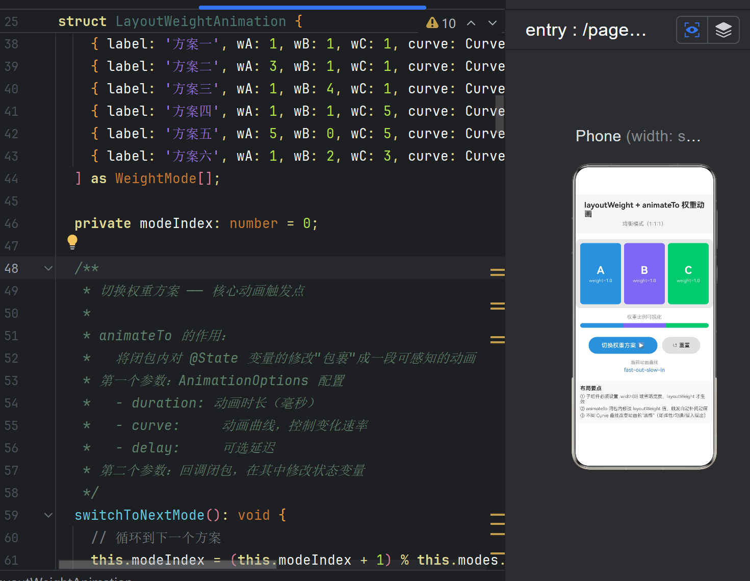
3.2.2 核心演示页 LayoutWeightAnimation.ets
这是本文的主角,完整代码已在项目中创建。下面是其核心模块的分析准备——先看完整代码框架:
// ArkTS 要求:所有对象结构必须显式声明为 class 或 interface
interface WeightMode {
label: string;
wA: number;
wB: number;
wC: number;
curve: Curve;
title: string;
}
@Entry
@Component
struct LayoutWeightAnimation {
@State weightA: number = 1;
@State weightB: number = 1;
@State weightC: number = 1;
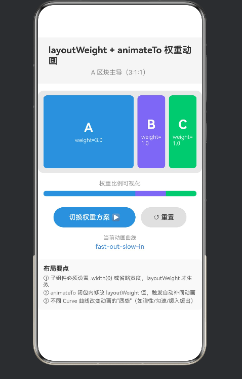
@State currentMode: string = ‘均衡模式(1:1:1)’;
private readonly modes: WeightMode[] = [
{ label: ‘方案一’, wA: 1, wB: 1, wC: 1, curve: Curve.FastOutSlowIn, title: ‘均衡模式(1:1:1)’ },
{ label: ‘方案二’, wA: 3, wB: 1, wC: 1, curve: Curve.FastOutLinearIn, title: ‘A 区块主导(3:1:1)’ },
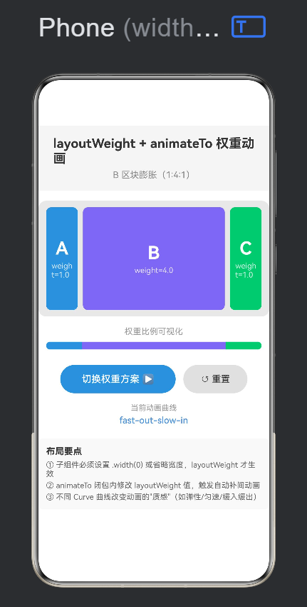
{ label: ‘方案三’, wA: 1, wB: 4, wC: 1, curve: Curve.FastOutLinearIn, title: ‘B 区块膨胀(1:4:1)’ },
{ label: ‘方案四’, wA: 1, wB: 1, wC: 5, curve: Curve.FastOutSlowIn, title: ‘C 区块占优(1:1:5)’ },
{ label: ‘方案五’, wA: 5, wB: 0, wC: 5, curve: Curve.Linear, title: ‘B 隐退(5:0:5)’ },
{ label: ‘方案六’, wA: 1, wB: 2, wC: 3, curve: Curve.FastOutSlowIn, title: ‘递增阶梯(1:2:3)’ },
] as WeightMode[];
private modeIndex: number = 0;
switchToNextMode(): void {
this.modeIndex = (this.modeIndex + 1) % this.modes.length;
const mode = this.modes[this.modeIndex];
animateTo(
  {
    duration: 800,
    curve: mode.curve,
    delay: 0,
    iterations: 1,
    playMode: PlayMode.Normal,
    onFinish: () => {
      console.info('[LayoutWeightAnimation] 权重动画播放完成');
    },
  },
  () => {
    this.weightA = mode.wA;
    this.weightB = mode.wB;
    this.weightC = mode.wC;
    this.currentMode = mode.title;
  }
);
}
resetToBalanced(): void {
animateTo(
{
duration: 600,
curve: Curve.FastOutSlowIn,
onFinish: () => {
this.modeIndex = 0;
this.currentMode = this.modes[0].title;
},
},
() => {
this.weightA = 1;
this.weightB = 1;
this.weightC = 1;
}
);
}
build() {
Column() {
// ── 标题区域 ──
Column() {
Text(‘layoutWeight + animateTo 权重动画’)
.fontSize(20)
.fontWeight(FontWeight.Bold)
.fontColor(‘#FF333333’);
Text(this.currentMode)
.fontSize(14)
.fontColor(‘#FF888888’)
.margin({ top: 6 });
}
.width(‘100%’)
.padding(16)
.backgroundColor(‘#FFF5F5F5’);
  // ── ★ 核心演示:Row + layoutWeight ──
  Row() {
    Column() {
      Text('A').fontSize(28).fontWeight(FontWeight.Bold).fontColor('#FFFFFFFF');
      Text(`weight=${this.weightA.toFixed(1)}`).fontSize(12).fontColor('#CCFFFFFF').margin({ top: 4 });
    }
    .width(0)
    .layoutWeight(this.weightA)
    .backgroundColor('#FF4A90D9')
    .borderRadius(8)
    .justifyContent(FlexAlign.Center)
    .alignItems(HorizontalAlign.Center)
    .padding(8)
    .margin(4)
    .height(160);

    // B、C 区块结构同上,颜色分别为紫色 #FF7B68EE 和绿色 #FF50C878
    // ...(完整代码见项目文件)
  }
  .width('100%')
  .height(180)
  .padding(8)
  .backgroundColor('#FFE8E8E8')
  .borderRadius(12)
  .margin({ top: 16, left: 12, right: 12 });

  // ── 权重可视化指示条 ──
  // ...(使用 layoutWeight 绘制比例条,直观显示权重占比)

  // ── 按钮区 ──
  Row() {
    Button('切换权重方案 ▶').onClick(() => this.switchToNextMode());
    Button('↺ 重置').onClick(() => this.resetToBalanced());
  }
  .width('100%')
  .justifyContent(FlexAlign.Center)
  .margin({ top: 24 });

  // ── 底部技术说明 ──
  // ...
}
.width('100%')
.height('100%')
.backgroundColor('#FFFFFFFF')
.padding({ top: 32 });
}
}
4. 代码深度拆解
上面给出了整体代码框架,现在我们来逐层拆解其中的关键设计。
4.1 interface WeightMode:ArkTS 的类型约束
interface WeightMode {
label: string;
wA: number;
wB: number;
wC: number;
curve: Curve;
title: string;
}
为什么必须写这个接口?
这里是很多从标准 TypeScript 转到 ArkTS 的同学遇到的第一个"劝退点"。ArkTS 是鸿蒙原生静态类型语言,它的类型系统比 TypeScript 更严格:
特性 TypeScript ArkTS
匿名对象类型 { a: number } ✅ 支持 ❌ 不允许
数组元素类型推断 宽松推断 必须显式可推断
as 类型断言 任意使用 有限使用
在标准 TypeScript 中,我们可以这样写:
// ❌ ArkTS 不允许
private readonly modes: Array<{ label: string; wA: number }> = […]
ArkTS 要求所有类型结构都必须有具名声明——要么是 interface,要么是 class。这就是我们提取 WeightMode 接口的原因。
4.2 @State 装饰器与响应式数据流
@State weightA: number = 1;
@State weightB: number = 1;
@State weightC: number = 1;
@State currentMode: string = ‘均衡模式(1:1:1)’;
4.2.1 @State 的响应式原理
@State 是 ArkUI 中最核心的装饰器。当它修饰的变量被赋值时,框架会自动标记该组件为"脏状态",并在下一个帧周期触发局部重绘。
用户点击按钮
│
▼
switchToNextMode()
│
├──→ this.weightA = 3
├──→ this.weightB = 1
├──→ this.weightC = 1
│
▼
ArkUI 框架检测到 @State 变更
│
├──→ 收集所有受影响的 UI 节点
├──→ 计算新布局(重新执行 build 中的布局函数)
└──→ 合成并渲染差异帧
4.2.2 为什么 weightA/B/C 需要是 @State?
如果我们不使用 @State,而是用普通成员变量:
// ❌ 这样不会触发 UI 更新
private weightA: number = 1;
修改 weightA 后,值虽然变了,但 UI 不会重新渲染。layoutWeight(this.weightA) 绑定的仍然是旧值。@State 是连接数据与 UI 的桥梁。
4.3 Row + layoutWeight:三栏弹性布局
我们来看最核心的布局结构:
Row() {
// 区块 A
Column() { /* … */ }
.width(0) // ★ 关键:设 0 表示不占用固定空间
.layoutWeight(this.weightA) // ★ 关键:按权重分配
.height(160)
.backgroundColor(‘#FF4A90D9’)
// 区块 B(同理)
Column() { /* … */ }
.width(0)
.layoutWeight(this.weightB)
.height(160)
.backgroundColor(‘#FF7B68EE’)
// 区块 C(同理)
Column() { /* … */ }
.width(0)
.layoutWeight(this.weightC)
.height(160)
.backgroundColor(‘#FF50C878’)
}
.width(‘100%’)
.height(180)
4.3.1 布局计算推演
假设容器当前宽度为 360px,三个区块的权重分别为 1:1:1:
步骤 1:测量固定尺寸
区块 A:width(0) → 0px
区块 B:width(0) → 0px
区块 C:width(0) → 0px
Row 内边距 8px + 8px = 16px
各区块 margin: 左4 + 右4 = 8px,三个共 24px
步骤 2:计算剩余空间
360px - 16px(padding)- 24px(margin)= 320px
步骤 3:按权重分配
总权重 = 1 + 1 + 1 = 3
区块 A 宽度 = 320px × 1/3 = 106.67px
区块 B 宽度 = 320px × 1/3 = 106.67px
区块 C 宽度 = 320px × 1/3 = 106.67px
当权重变为 3:1:1 时:
总权重 = 3 + 1 + 1 = 5
区块 A 宽度 = 320px × 3/5 = 192px ← 膨胀
区块 B 宽度 = 320px × 1/5 = 64px ← 收缩
区块 C 宽度 = 320px × 1/5 = 64px ← 收缩
这个过程由 animateTo 驱动,框架会在这两个状态之间生成连续的中间帧,表现为区块的平滑伸缩。
4.3.2 为什么必须设置 .width(0)
这是 layoutWeight 最容易踩的坑。如果不设置 .width(0),子组件默认会包裹内容(Column 默认宽度为内容宽度),此时 layoutWeight 不再生效。
// ❌ 错误用法:layoutWeight 不生效
Column() { /* … */ }
.layoutWeight(1)
// 没有设置 .width(0),Column 使用默认宽度
// ✅ 正确用法
Column() { /* … */ }
.width(0)
.layoutWeight(1)
为什么 ArkUI 这样设计?
这与其他框架的 Flex 布局逻辑一致——layoutWeight 分配的是剩余空间。只有当子组件声明了自己"不需要固定尺寸"(width: 0),布局系统才会把它纳入弹性分配的计算中。
4.4 animateTo 的完整签名与参数详解
4.4.1 参数展开分析
在 switchToNextMode 方法中,我们的 animateTo 调用如下:
animateTo(
{
duration: 800, // 1) 持续时间
curve: mode.curve, // 2) 动画曲线
delay: 0, // 3) 延迟启动
iterations: 1, // 4) 播放次数
playMode: PlayMode.Normal, // 5) 播放模式
onFinish: () => { // 6) 完成回调
console.info(‘[LayoutWeightAnimation] 权重动画播放完成’);
},
},
() => {
// 状态更新闭包
this.weightA = mode.wA;
this.weightB = mode.wB;
this.weightC = mode.wC;
this.currentMode = mode.title;
}
);
逐参数详解:
- duration: 800
单位毫秒。800ms 是一个比较舒适的长度——太短(<300ms)用户可能感知不到动画过程;太长(>1500ms)会让用户等待得不耐烦。
- curve: mode.curve
每个方案使用不同的曲线,便于对比差异。有些方案强调自信(FastOutSlowIn),有些方案强调均匀(Linear)。
- delay: 0
大多数交互式动画不需要延迟。延迟主要用于序列动画——让 B 在 A 完成后再开始。
- iterations: 1
权重变化动画只播放一次。设置为 -1 可以无限循环,通常用于加载指示器。
- playMode: PlayMode.Normal
Normal:正向播放
Reverse:反向播放(从终点到起点)
Alternate:交替正向反向(需配合 iterations > 1)
6) onFinish 回调
动画完成后触发。在 resetToBalanced 中,我们利用 onFinish 同步更新 modeIndex:
onFinish: () => {
this.modeIndex = 0; // 等动画播完再重置索引
this.currentMode = this.modes[0].title;
},
注意:modeIndex 没有用 @State 装饰,所以修改它不会触发 UI 重绘——这恰好是我们想要的,因为 UI 已经在动画中恢复到了均衡状态。
4.4.2 animateTo 闭包内的多变量同步
一个容易被忽略的细节:animateTo 闭包内修改了四个 @State 变量,但它们被视为同一个动画事务:
() => {
this.weightA = mode.wA; // ① 参与动画
this.weightB = mode.wB; // ② 参与动画
this.weightC = mode.wC; // ③ 参与动画
this.currentMode = mode.title; // ④ 参与动画
}
四个变量共享同一个 AnimationOptions(duration、curve 等)。这意味着:
weightA 从 1 → 3 的变化和 weightC 从 1 → 5 的变化同时开始,同时结束。
变化幅度不同(A 变化 2,C 变化 4),所以 C 的瞬时速率会高于 A——这正是物理世界中自然的运动行为。
如果把 currentMode 放到闭包外单独修改:
animateTo({…}, () => {
this.weightA = mode.wA;
this.weightB = mode.wB;
this.weightC = mode.wC;
// ❌ 漏掉了 currentMode
});
this.currentMode = mode.title; // ❌ 不会动画,立即跳变
这样 currentMode 的文字会"跳变"而不是平滑过渡(虽然文字本身只有离散值,但可能涉及字体大小、颜色的渐变动画)。最佳实践是将所有相关的状态变化放在同一个闭包内。
4.5 权重可视化指示条的设计
在演示页中,除了三个主色块,底部还设计了一个权重比例条:
Column() {
Text(‘权重比例可视化’).fontSize(13).fontColor(‘#FF999999’);
Row() {
Column()
.layoutWeight(this.weightA)
.height(12)
.backgroundColor(‘#FF4A90D9’)
.borderRadius({ topLeft: 6, bottomLeft: 6 });
Column()
  .layoutWeight(this.weightB)
  .height(12)
  .backgroundColor('#FF7B68EE');

Column()
  .layoutWeight(this.weightC)
  .height(12)
  .backgroundColor('#FF50C878')
  .borderRadius({ topRight: 6, bottomRight: 6 });
}
.width(‘100%’)
.height(12);
}
这个指示条的设计有几个巧妙之处:
同源数据:三个 Column 的 layoutWeight 绑定的是 weightA、weightB、weightC——与上方主色块完全一致。数据变化时,两者同步动画。
零高度 + 纯色块:不需要嵌套 Text、Button 等有默认尺寸的子组件,所以不需要设置 .width(0)——空的 Column() 天然无宽度。
视觉映射:用户在上方看到"A 区块变大了"的直观感受,在底部得到量化比例的印证,形成完整的学习闭环。
5. 动画曲线深度对比
5.1 系统内置曲线速查表
下表列出了 ArkUI 中所有可用的 Curve 枚举值及其数学特性:
枚举值 别名 (CSS) 加速度 终速度 过冲
Linear linear 0 0 无
Ease ease 先正后负 0 无
EaseIn ease-in 正 正 无
EaseOut ease-out 负 0 无
EaseInOut ease-in-out 先正后负 0 无
FastOutSlowIn — 先正后负(更陡) 0 无
FastOutLinearIn — 正(降为 0) 正 无
LinearOutSlowIn — 负 0 无
概念说明:
加速度:动画速率的变化趋势。正值表示加速,负值表示减速。
终速度:动画结束时的瞬时速度。如果为正,意味着动画"冲"到终点时仍有速度——视觉上需要另一个动画来抵消(或配合 springMotion 的回弹)。
过冲:动画在到达目标值后是否"超越"再回落。标准 Curve 都没有过冲,Spring 曲线有。
5.2 不同曲线的观感差异
5.2.1 FastOutSlowIn —— 自信干脆
进度
1.0 ┤ ╱╲
│ ╱ ╲
│ ╱ ╲
│╱ ╲
0.0 └──────────────── 时间
前半段:快速推进,让用户立即感知到变化。
后半段:缓慢微调,精确到位。
适合:通知展开、面板伸缩、高优先级交互。
在我们的 Demo 中,大多数方案使用此曲线,因为权重变化需要让用户"注意到"哪个面板在变化。
5.2.2 FastOutLinearIn —— 干脆但生硬
进度
1.0 ┤ ╱─────────
│ ╱
│ ╱
│ ╱
0.0 └──────────────── 时间
前半段:快速开始,与 FastOutSlowIn 一样。
后半段:匀速推进到终点,不再减速。
适合:数据驱动的实时更新,强调速度和效率而非优雅。
5.2.3 Linear —— 机械均匀
进度
1.0 ┤ ╱
│ ╱
│ ╱
│ ╱
0.0 └╱─────────────── 时间
全程:恒定速率,没有任何加速减速。
感觉:机械、呆板、不够自然。
适合:进度条、机器运行状态指示、不需要情感色彩的场景。
在 Demo 的「方案五:B 隐退」中,我们使用 Linear 曲线——因为 B 的权重降为 0 的过程用匀速最能体现「机械折叠」的感觉。
5.3 如何为权重动画选择合适的曲线
场景 推荐曲线 理由
通知/提醒面板弹出 FastOutSlowIn 快速引起注意,平滑到位
侧边栏展开 EaseOut 优雅滑出,不突兀
数据看板面板切换 FastOutSlowIn 强调数据变化
拖拽调整大小 Linear 或自定义 跟随手指,均匀响应
面板收起/隐藏 EaseIn 先慢后快,干净消失
呼吸灯/脉冲效果 Spring 系列 自然的弹性回弹
选择曲线的核心原则:思考你希望用户感受到什么。
想让用户注意到变化 → 快速开始(FastOutSlowIn、FastOutLinearIn)
想让用户感到舒适优雅 → 缓慢结束(EaseOut、LinearOutSlowIn)
想让用户感到中性机械 → 匀速(Linear)
6. 进阶技巧与避坑指南
6.1 坑点一:width(0) 是 layoutWeight 生效的前提
现象:设置了 .layoutWeight(2) 但子组件宽度没有任何变化。
原因:子组件(如 Column)有默认宽度(包裹内容),layoutWeight 分配的是剩余空间,而当子组件已有固定宽度时,剩余空间为 0。
解决方案:
// ✅ 正确
Column()
.width(0) // 放弃固定尺寸
.layoutWeight(2) // 参与弹性分配
// ✅ 也可以省略 width,只要子组件没有固定尺寸
Column()
.layoutWeight(2) // 空 Column 默认没有宽度
更隐蔽的情况:
// ❌ 错误:子组件包含 Text,有默认宽度
Column() {
Text(‘Hello’)
}
.layoutWeight(2) // Column 因为 Text 有内容宽度,layoutWeight 失效
// ✅ 修正:明确设置为 0
Column() {
Text(‘Hello’)
}
.width(0) // 覆盖内容宽度
.layoutWeight(2) // 生效
6.2 坑点二:不要在 build() 中直接修改 layoutWeight
现象:页面会陷入死循环——build() 内修改状态 → 触发重绘 → 再次进入 build() → 再次修改状态 → …
错误示例:
build() {
Row() {
Column()
.width(0)
.layoutWeight(this.weightA)
// ❌ 严禁在 build 中修改状态
.onAppear(() => {
this.weightA = 5; // 会触发无限重绘
})
}
}
正确做法:所有状态修改都放在事件回调或生命周期方法中。
6.3 坑点三:ArkTS 的对象字面量类型限制
现象:
ERROR: Object literals cannot be used as type declarations (arkts-no-obj-literals-as-types)
ERROR: Array literals must contain elements of only inferrable types (arkts-no-noninferrable-arr-literals)
ERROR: Object literal must correspond to some explicitly declared class or interface (arkts-no-untyped-obj-literals)
解决方案:始终为复杂数据结构声明 interface 或 class。
// ① 声明接口
interface WeightMode {
label: string;
wA: number;
wB: number;
wC: number;
curve: Curve;
title: string;
}
// ② 接口作为数组类型标注
private readonly modes: WeightMode[] = [
// …
];
// ③ 字面量数组用 as 断言辅助类型推断
] as WeightMode[];
6.4 技巧一:多个 animateTo 串联实现序列动画
有时我们希望 A 先展开,B 再展开——即序列动画。可以通过 onFinish 回调串联:
animateTo({ duration: 500, curve: Curve.EaseOut }, () => {
this.weightA = 3;
}).onFinish(() => {
// 第一个动画完成后,启动第二个
animateTo({ duration: 500, curve: Curve.EaseOut }, () => {
this.weightB = 3;
}).onFinish(() => {
animateTo({ duration: 500, curve: Curve.EaseOut }, () => {
this.weightC = 3;
});
});
});
这种模式也常被称作 「链式动画」 或 「瀑布流动画」。
6.5 技巧二:权重为 0 实现"隐退"效果
在「方案五」中,我们将 B 的权重设为 0:
A: 5, B: 0, C: 5
权重为 0 的子组件在视觉上消失,但它仍然参与布局测量(占用 margin 空间)。这使得 B 区域的「隐退」看起来像是被 A 和 C 从两侧"挤没"的——而不是突然消失。
如果希望完全移除(包括 margin),需要同时将 margin 也动画到 0。
6.6 技巧三:配合透明度实现完整入场/离场
layoutWeight 只处理空间分配,不处理透明度。如果要实现一个面板从「完全透明且无空间」到「完全不透明且占据权重」的整体动画,需要组合使用:
animateTo({ duration: 600 }, () => {
this.panelOpacity = 1.0; // 透明度动画
this.panelWeight = 3; // 权重动画(空间)
});
Column()
.width(0)
.layoutWeight(this.panelWeight)
.opacity(this.panelOpacity) // 透明度联动
视觉效果:面板一边「展开」一边「显现」,流畅自然。
- 真实场景应用案例
7.1 可拖拽分栏面板
场景:IDE 或文件管理器中的可拖拽分栏布局。
思路:监听拖拽手势,在 onDrag 回调中通过 animateTo 动态更新左右面板的 layoutWeight。
Column() {
// 左侧面板
CodeEditor()
.width(0)
.layoutWeight(this.leftWeight)
// 分割条(可拖拽)
Divider()
.width(4)
.onDrag((event: DragEvent) => {
const offset = event.getDelta().x;
const total = this.leftWeight + this.rightWeight;
const deltaWeight = offset / containerWidth * total;
animateTo({ duration: 50 }, () => {
this.leftWeight += deltaWeight;
this.rightWeight -= deltaWeight;
});
})
// 右侧面板
PreviewPanel()
.width(0)
.layoutWeight(this.rightWeight)
}
这里的技巧是 duration: 50——拖拽场景需要极低延迟,50ms 的动画既能平滑跟随手指,又不会引入明显的滞后感。
7.2 数据可视化占比切换
场景:数据看板中,点击不同维度切换指标分布。
思路:每个数据项对应一个 layoutWeight,数据变化时批量更新权重。
struct DataDashboard {
@State itemWeights: number[] = [1, 1, 1, 1, 1];
switchToMetric(metric: ‘sales’ | ‘traffic’ | ‘conversion’): void {
const newWeights = this.getWeightsForMetric(metric);
animateTo({ duration: 1000, curve: Curve.FastOutSlowIn }, () => {
this.itemWeights = newWeights;
});
}
build() {
Row() {
ForEach(this.itemWeights, (weight: number, index: number) => {
DataBar() // 自定义数据柱组件
.width(0)
.layoutWeight(weight)
.backgroundColor(this.colors[index])
})
}
.width(‘100%’)
.height(300)
}
}
7.3 自适应表单布局
场景:表单中,根据用户选择动态展示/隐藏附加字段。
思路:每个字段区域的权重根据其「可见性」动态变化。
// 当用户勾选"添加备注"时,备注区域从 0 权重展开到 2
animateTo({ duration: 300, curve: Curve.EaseOut }, () => {
this.noteWeight = 2; // 展开
this.noteOpacity = 1.0; // 淡入
});
// 取消勾选时,权重归零
animateTo({ duration: 200, curve: Curve.EaseIn }, () => {
this.noteWeight = 0;
this.noteOpacity = 0.0;
});
表单布局中使用权重动画的优势:不需要知道表单容器的总高度或总宽度,框架自动处理一切。
- 性能考量与最佳实践
8.1 animateTo 的性能开销
animateTo 的开销主要来自两个方面:
开销来源 原因 优化建议
布局重新计算 每次 layoutWeight 变化都触发重新布局 避免在同一动画中修改过多子组件的权重
帧渲染 60fps 的动画需要每秒渲染 60 帧 保持 build 函数轻量,避免复杂计算
8.1.1 动画性能的量化指标
60fps(16.67ms/帧):流畅,用户感知不到卡顿
30fps(33.33ms/帧):勉强可接受,但能感受到不流畅
<30fps:明显卡顿,需要优化
在权重动画中,由于涉及布局重新计算(Relayout)和重新渲染(Repaint),单帧耗时通常高于单纯的透明度动画。如果发现掉帧,可以从以下几个方面排查:
子组件数量:Row 中有多少个弹性子组件?通常 3-5 个是安全的,超过 10 个建议做懒加载。
build 函数复杂度:每次布局变化都会重新执行 build,如果 build 中有大量条件判断或循环,会影响性能。
是否触发了离屏渲染:避免在弹性布局中使用复杂的阴影、模糊效果。
8.2 layoutWeight 与懒加载的配合
当 Row 中的子组件数量较多时(如聊天列表中的弹性输入框区域),应使用 ForEach + LazyForEach 来优化:
// 推荐:LazyForEach 延迟加载不可见子组件
Row() {
LazyForEach(this.dataSource, (item: WeightItem, index: number) => {
WeightBlock()
.width(0)
.layoutWeight(item.weight)
.backgroundColor(item.color)
}, (item: WeightItem) => item.id)
}
.width(‘100%’)
8.3 避免过度动画化
权重动画虽然炫酷,但不宜滥用。以下是几条指导原则:
应该使用动画的场景:
用户主动触发的交互(点击、拖拽)
状态切换的明确指示(展开/收起)
数据变化的重要通知
不应该使用动画的场景:
页面初始化时的布局(首次渲染应该直接到位)
高频数据更新(实时行情、传感器数据)
用户正在滚动页面时触发的布局变化
过度动画化的典型表现:
每次页面加载都看到所有元素从 0 权重"生长"到正常大小
每次数据刷新都伴随面板剧烈伸缩
动画持续时间过长(> 1.5s),用户等待感明显
9. 总结与延伸阅读
9.1 本文要点回顾
layoutWeight 是 Row / Column / Flex 容器中弹性分配空间的关键属性,使用 width(0) + layoutWeight(n) 组合。
animateTo 是状态驱动的声明式动画接口,在闭包内修改 @State 变量即可触发动画。
曲线 控制动画的"节奏感",不同的曲线传达不同的交互语义。
ArkTS 的类型系统 比 TypeScript 更严格,对象结构需要显式 interface / class 声明。
权重动画适用于分栏布局、数据看板、自适应表单等场景,但需要避免过度动画化。
9.2 关键代码片段速查
基础用法(三栏等宽):
Row() {
PanelA().width(0).layoutWeight(1)
PanelB().width(0).layoutWeight(1)
PanelC().width(0).layoutWeight(1)
}
带动画的权重切换:
animateTo({ duration: 800, curve: Curve.FastOutSlowIn }, () => {
this.weightA = 3;
this.weightB = 1;
this.weightC = 1;
});
权重归零实现隐退:
animateTo({ duration: 400, curve: Curve.EaseIn }, () => {
this.weightB = 0; // B 面板消失
});
9.3 延伸阅读
HarmonyOS NEXT 官方文档 - ArkUI 布局
HarmonyOS NEXT 官方文档 - animateTo API
HarmonyOS NEXT 官方文档 - Curve 枚举
HarmonyOS NEXT 官方文档 - @State 装饰器
本文配套完整示例代码:详见项目 entry/src/main/ets/pages/LayoutWeightAnimation.ets
运行方式:在 DevEco Studio 中打开项目,连接真机或模拟器运行,点击首页「▶ 权重动画演示」按钮即可体验 6 种权重分配方案的动态切换动画。

作为“人工智能6S店”的官方数字引擎,为AI开发者与企业提供一个覆盖软硬件全栈、一站式门户。
更多推荐
 0
0 0
0- 0


 已为社区贡献19条内容

所有评论(0)