
【共创季稿事节】鸿蒙原生 ArkTS 布局方式之 GridRow 栅格系统布局:12 列自适应布局完全指南
一、引言
在移动端和桌面端 UI 开发中,栅格系统(Grid System) 是所有布局体系的基石。从 Bootstrap 的 12 列栅格到 Material Design 的响应式布局,栅格系统帮助开发者实现 一致的对齐、灵活的自适应和高效的多端适配。
HarmonyOS 原生提供了 GridRow + GridCol 组件,构建了一套完整的 响应式栅格布局系统。相比传统的 Row + Column + Flex 组合,GridRow 的优势在于:
特性 GridRow 栅格系统 传统 Flex 布局
列数控制 columns 显式定义总列数 需手动计算百分比
响应式断点 内置 sm/md/lg 三级断点 需自行监听屏幕变化
间距管理 gutter 统一控制行列间距 需逐个组件设置 margin
偏移 offset 原生支持 需用空占位组件
嵌套 GridCol 内可再嵌 GridRow 需多层 Flex 嵌套
视觉网格线 配合开发调试更直观 无原生支持
本文将围绕 GridRow 栅格系统,从基础概念到 6 种实战布局模式,配合完整的 Demo 代码,带你掌握鸿蒙栅格系统的全部能力。
二、核心概念
2.1 GridRow — 栅格容器
GridRow 是整个栅格系统的 容器组件,它负责:
将可用宽度划分为 N 列(由 columns 指定)
在列之间分配 gutter 间距
自动换行:子项 GridCol 超出总列数时折行
GridRow({
columns: { sm: 12, md: 8, lg: 6 }, // 三级断点列数
gutter: { x: 12, y: 12 } // 行列间距
}) {
// GridCol 子项
}
2.2 GridCol — 栅格列
GridCol 是 GridRow 的 直接子组件,每个 GridCol 代表栅格中的一个单元格:
GridCol({
span: { sm: 12, md: 6, lg: 4 }, // 跨列数(支持响应式)
offset: { sm: 0, md: 1, lg: 2 } // 偏移列数(支持响应式)
}) {
// 列内容
}
关键参数:
参数 类型 说明 示例值
span number | BreakpointOption 占据的列数 { sm: 12, md: 6, lg: 4 }
offset number | BreakpointOption 向右偏移的列数 { sm: 0, md: 2, lg: 3 }
order number 排序顺序(不常用) 2
2.3 响应式断点(Breakpoints)
GridRow 内置了三档屏幕宽度断点:
断点 缩写 宽度范围 典型设备
sm small 320vp ~ 599vp 手机竖屏
md medium 600vp ~ 839vp 平板竖屏 / 手机横屏
lg large 840vp+ 平板横屏 / 桌面
断点配置在 columns 中指定:
// 小屏 12 列 ← 中屏 8 列 ← 大屏 6 列
columns: { sm: 12, md: 8, lg: 6 }
GridCol 的 span 和 offset 同样支持断点:
GridCol({
span: { sm: 12, md: 8, lg: 6 },
offset: { sm: 0, md: 2, lg: 3 }
})
2.4 gutter — 间距控制
gutter 定义栅格项之间的间距,分为水平(x)和垂直(y)两个维度:
gutter: { x: 12, y: 16 }
// x: 水平间距 12vp(列与列之间)
// y: 垂直间距 16vp(行与行之间)
gutter 的视觉表现为:项与项之间留白,但容器边缘无多余间距,这得益于栅格系统内部使用了负 margin 技术。
2.5 栅格布局的核心约束
GridRow 栅格系统遵循以下关键规则:
┌────────────────────────────────────────────────────┐
│ GridRow 容器 │
│ columns: 12 │
│ │
│ ┌──────┐ ┌──────┐ ┌──────┐ ┌──────┐ ┌──────┐ ┌── │
│ │Col 1 │ │Col 2 │ │Col 3 │ │Col 4 │ │Col 5 │ │… │
│ │span:2│ │span:3│ │span:2│ │span:1│ │span:4│ │ │
│ └──────┘ └──────┘ └──────┘ └──────┘ └──────┘ └── │
│ ├── 2 ──┤ ├── 3 ──┤ ├── 2 ─┤ ├─ 1 ─┤ ├── 4 ──┤ │
│ │◄─────────── 每行 span 之和 = 12 ──────────────►│ │
│ │
│ 换行:当 GridCol 的 span 之和超过 columns │
│ 总列数时,自动折行处理 │
└────────────────────────────────────────────────────┘
核心约束: 同一行中所有 GridCol 的 span 之和 ≤ columns(总列数)。超出自动换行。
三、Demo 项目架构解析
3.1 项目结构
entry/src/main/ets/pages/GridRowDemo.ets ← 单一文件(993行)
所有代码集中在一个文件中,便于演示和阅读。关键架构:
GridRowDemo (struct)
├── @State 状态变量(7个)
│ ├── activeBreakpoint — 当前断点索引
│ ├── activeColsConfig — 列数配置索引
│ ├── gutterX / gutterY — 间距控制
│ ├── showGridLines — 辅助线开关
│ ├── activeDemoSection — 当前演示区
│ └── useOffset — 偏移演示
├── colConfigs (5种列数预设)
├── build() → 主 UI
├── 6 大 Demo 区域(@Builder)
│ ├── buildEqualWidthDemo()
│ ├── buildUnevenWidthDemo()
│ ├── buildOffsetDemo()
│ ├── buildNestedDemo()
│ ├── buildMixedDensityDemo()
│ └── buildResponsiveDemo()
├── 控制面板
│ ├── buildControlPanel()
│ └── buildSectionSelector()
├── 辅助方法
│ ├── getCurrentCols()
│ ├── getColsCount()
│ └── getEqualSpan()
└── 接口定义
├── BreakpointCols
├── ColConfig
└── GridItem
3.2 接口定义
interface BreakpointCols {
sm: number;
md: number;
lg: number;
}
interface ColConfig {
label: string;
cols: BreakpointCols;
}
interface GridItem {
id: number;
}
BreakpointCols 通过显式声明 sm / md / lg 三个字段,避免了 ArkTS 中 Record<string, number> 的对象字面量兼容性问题。
3.3 列数配置预设
private readonly colConfigs: ColConfig[] = [
{ label: ‘12 列(均匀)’, cols: { sm: 12, md: 12, lg: 12 } },
{ label: ‘8 列(紧凑)’, cols: { sm: 8, md: 8, lg: 8 } },
{ label: ‘6 列(宽松)’, cols: { sm: 6, md: 6, lg: 6 } },
{ label: ‘自适应(12/8/6)’, cols: { sm: 12, md: 8, lg: 6 } },
{ label: ‘自适应(6/8/12)’, cols: { sm: 6, md: 8, lg: 12 } },
];
这五种配置涵盖了最常见的栅格使用场景:
均匀模式:所有屏幕尺寸使用相同的列数
自适应模式:小屏列数多(精细),大屏列数少(宽松),反之亦然
四、六大布局模式逐行解读
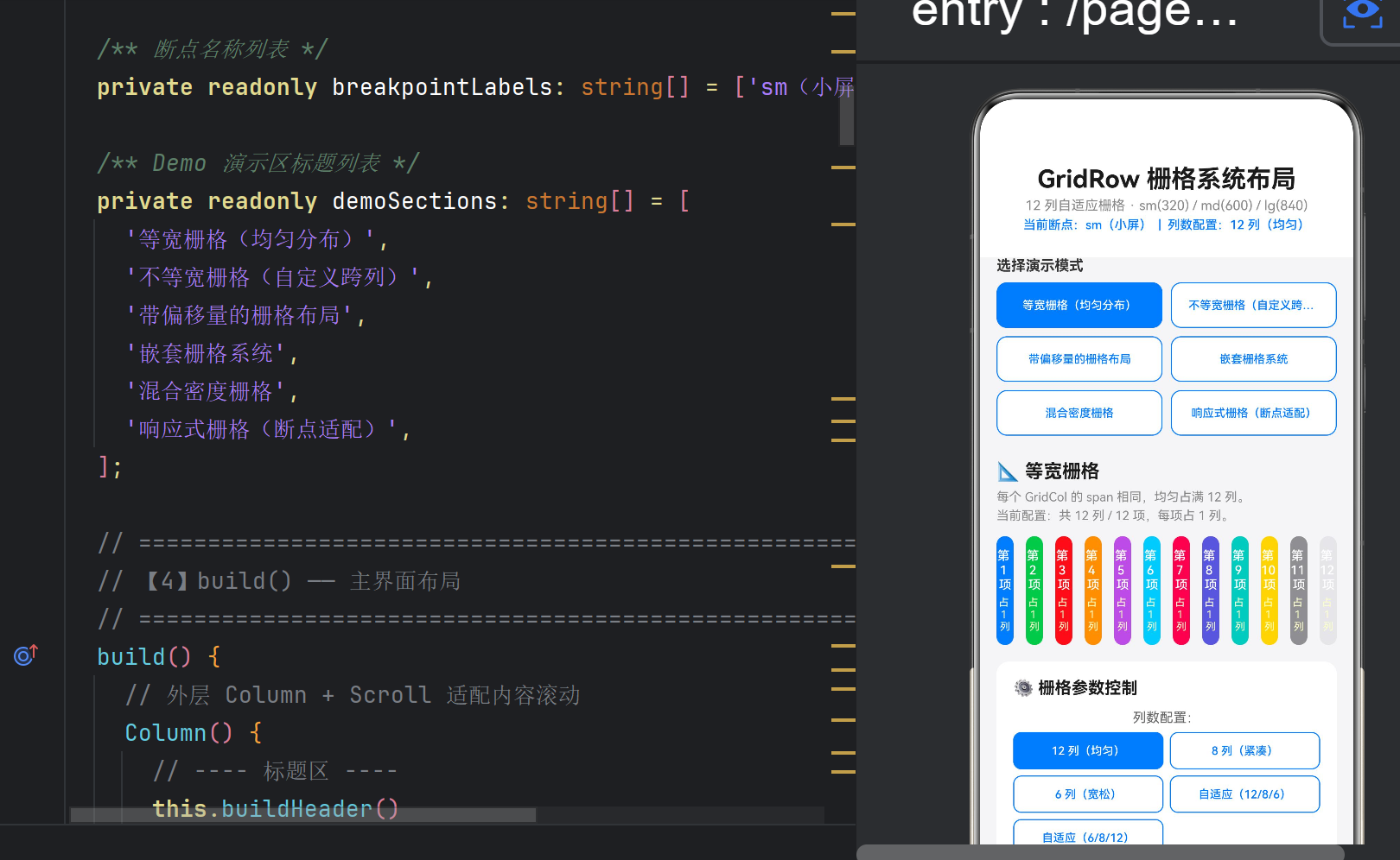
4.1 📐 等宽栅格 — 基础用法
场景: 所有 GridCol 宽度完全相等,均匀占满容器。
GridRow({
columns: this.getCurrentCols(),
gutter: { x: this.gutterX, y: this.gutterY }
}) {
// GridCol 不传 span → 自动等宽分配
ForEach(this.getColumnItems(12), (item: GridItem, idx: number) => {
GridCol() {
// 每个 GridCol 自动平分 12 列的空间
}
})
}
要点: GridCol() 不带 span 参数时,GridRow 会自动将总列数平均分配给所有 GridCol。例如 12 列配置下放 4 个 GridCol,每个自动占 3 列。
适用: 图标矩阵、标签列表、统计卡片等。
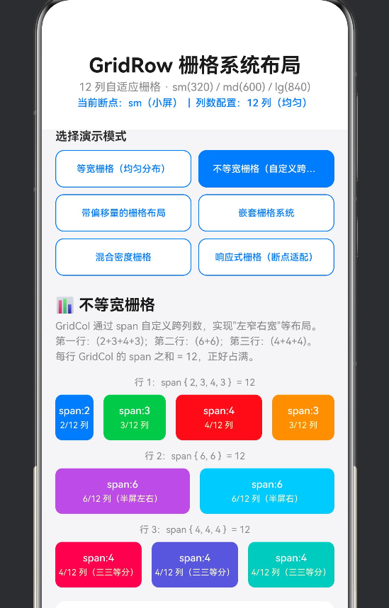
4.2 📊 不等宽栅格 — 自定义跨列
场景: 不同 GridCol 占据不同的列数,实现"左窄右宽"或"主侧栏"布局。
// 左:2 列(窄) 中:3 列 中:4 列(主) 右:3 列
GridRow({ columns: 12, gutter: { x: 12, y: 12 } }) {
GridCol({ span: 2 }) { /* 左侧栏 / }
GridCol({ span: 3 }) { / 内容一 / }
GridCol({ span: 4 }) { / 主内容 / }
GridCol({ span: 3 }) { / 右侧栏 */ }
}
Demo 中演示了三行典型的 span 组合:
行1:span { 2, 3, 4, 3 } = 12 (不对称布局)
行2:span { 6, 6 } = 12 (左右对称)
行3:span { 4, 4, 4 } = 12 (三等分)
适用: 后台管理面板、新闻详情页(主栏+侧栏)、商品详情等。
4.3 ↔️ 带偏移量的栅格 — offset 属性
场景: GridCol 需要向右留空若干列,实现居中、右对齐等效果。
// 居中:span=4, offset=4 → (12-4)/2 = 4
GridCol({ span: 4, offset: 4 }) { /* 居中内容 */ }
// 靠右:span=4, offset=8 → 12-4 = 8
GridCol({ span: 4, offset: 8 }) { /* 靠右内容 */ }
偏移的数学关系: offset + span ≤ columns
Demo 中还演示了 响应式 offset:
GridCol({
span: { sm: 12, md: 8, lg: 6 },
offset: { sm: 0, md: 2, lg: 3 }
})
小屏时 offset=0(满宽不偏移),中屏 offset=2,大屏 offset=3。
适用: 居中表单、登录框、模态框、非对称艺术布局。
4.4 🪆 嵌套栅格 — GridRow 递归使用
场景: GridCol 内部再次使用 GridRow,实现多层级复杂布局。
GridRow({ columns: 12 }) {
GridCol({ span: 4 }) {
Column() {
Text(‘外层 4 列’)
// ★ 嵌套 GridRow:内部再分 2 列
GridRow({ columns: { sm: 2 }, gutter: { x: 6 } }) {
GridCol() { /* 内层 1/2 / }
GridCol() { / 内层 2/2 / }
}
}
}
GridCol({ span: 4 }) {
// 内部 4 等分
GridRow({ columns: { sm: 4 }, gutter: { x: 4 } }) {
GridCol() { / 1/4 / }
GridCol() { / 2/4 / }
GridCol() { / 3/4 / }
GridCol() { / 4/4 */ }
}
}
}
注意: 嵌套栅格的 columns 仅在当前 GridCol 的宽度范围内生效,不影响外层栅格。
适用: 复杂仪表盘、嵌套卡片布局、评论区回复结构。
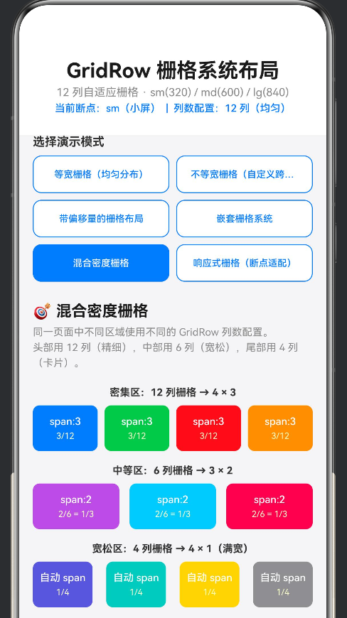
4.5 🎯 混合密度栅格 — 多 GridRow 协作
场景: 同一页面中不同区域使用不同列数配置,满足不同内容的展示密度需求。
// 密集区:12 列栅格(精细控制)
GridRow({ columns: 12, gutter: { x: 8, y: 8 } }) { /* … */ }
// 中等区:6 列栅格
GridRow({ columns: 6, gutter: { x: 12, y: 12 } }) { /* … */ }
// 宽松区:4 列栅格(大间距卡片)
GridRow({ columns: 4, gutter: { x: 16, y: 16 } }) { /* … */ }
要点:
页面中的每个 GridRow 可以是独立的列数配置
密集区(12 列)适合图标网格、标签列表
宽松区(4-6 列)适合卡片流、文章列表
适用: 首页综合面板、商品列表页、视频/内容流。
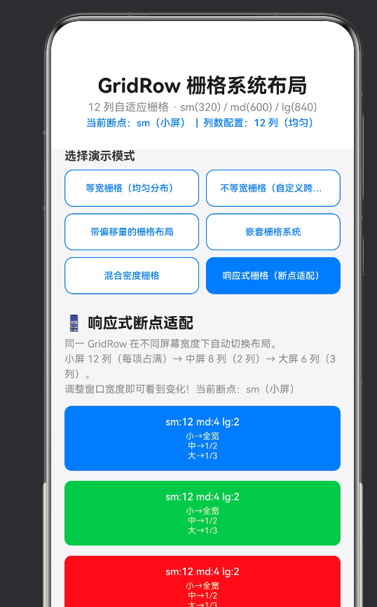
4.6 📱 响应式栅格 — 断点适配
场景: 同一 GridRow 在不同屏幕宽度下自动切换列数和子项排列方式。
GridRow({
columns: { sm: 12, md: 8, lg: 6 },
gutter: { x: this.gutterX, y: this.gutterY }
}) {
ForEach(this.getColumnItems(6), (_, idx) => {
GridCol({
span: { sm: 12, md: 4, lg: 2 }
}) {
// 小屏:每项占 12/12 = 100%(单列)
// 中屏:每项占 4/8 = 50%(两列)
// 大屏:每项占 2/6 = 33%(三列)
}
})
}
响应式变化一览:
断点 总列数 每项 span 每项占比 每行项数
sm 12 12 100% 1
md 8 4 50% 2
lg 6 2 33% 3
适用: 任何需要多端适配的页面(手机→平板→桌面)。
五、参数控制面板设计
Demo 的底部控制面板使用栅格系统本身来布局控件,实现了 “用栅格演示栅格” 的自指效果。
5.1 列数配置选择器
GridRow({ columns: { sm: 2, md: 3, lg: 5 }, gutter: { x: 6, y: 6 } }) {
ForEach(this.colConfigs, (cfg: ColConfig, idx: number) => {
GridCol() {
Button(cfg.label) // 5 种列数预设按钮
// 选中状态:蓝底白字;未选中:白底蓝字
.backgroundColor(this.activeColsConfig === idx ? ‘#007AFF’ : ‘#FFFFFF’)
}
})
}
小屏 2 列(折叠),中屏 3 列,大屏 5 列 — 本身就是一个响应式布局的绝佳示例。
5.2 Gutter 间距滑块
两个 Slider 分别控制 X 和 Y 方向的间距,值范围 0~32vp,步长 2vp:
Slider({
value: this.gutterX, min: 0, max: 32, step: 2
}).onChange((val: number) => { this.gutterX = val; })
随着滑块拖动,上方所有 GridRow 的间距实时变化,直观展示 gutter 的效果。
5.3 辅助网格线
// 12 列边界指示器
GridRow({ columns: { sm: 12 }, gutter: { x: 0 } }) {
ForEach(this.getColumnItems(12), (_, idx) => {
GridCol({ span: 1 }) {
Column() {
Text(‘’ + (idx + 1))
}
.height(16)
.backgroundColor(idx % 2 === 0 ? ‘#007AFF44’ : ‘#007AFF22’)
}
})
}
开启后,在等宽栅格底部显示 12 个半透明色块,精确标注每一列的边界。
5.4 断点快捷切换
三个按钮(sm / md / lg)快速切换 activeBreakpoint:
Button(‘sm’).onClick(() => { this.activeBreakpoint = 0; })
Button(‘md’).onClick(() => { this.activeBreakpoint = 1; })
Button(‘lg’).onClick(() => { this.activeBreakpoint = 2; })
切换时,标题区显示 “当前断点:lg(大屏)”,所有使用 getCurrentCols() 的 GridRow 同步更新。
六、GridRow 的底层原理(简化)
6.1 内部计算逻辑
GridRow 的底层实现可以简化为以下伪代码:
// 伪代码:GridRow 内部计算逻辑
class GridRowLayout {
// 输入
totalColumns: number; // 总列数(如 12)
gutterX: number; // 水平间距
items: GridColConfig[]; // 子项列表,含 span 和 offset
// 计算过程
layout(): Position[] {
    let currentRow = 0;
    let columnCursor = 0;
    const positions: Position[] = [];

    for (const item of items) {
        // 处理 offset:先偏移
        columnCursor += item.offset;

        // 检查是否需要换行
        if (columnCursor + item.span > this.totalColumns) {
            currentRow++;
            columnCursor = item.offset;
        }

        // 计算位置
        const x = (columnCursor / this.totalColumns) * containerWidth;
        const width = (item.span / this.totalColumns) * containerWidth
                      - gutterX * (1 - 1/totalColumns);

        positions.push({ x, y: currentRow * rowHeight, width });
        columnCursor += item.span;
    }
    return positions;
}
}
6.2 与 CSS Grid 的对比
特性 HarmonyOS GridRow CSS Grid
容器 GridRow display: grid
列项 GridCol grid-column
断点 内置 sm/md/lg @media query
间距 gutter 统一 gap
偏移 offset 属性 grid-column-start
自动换行 内置支持 auto-fill / auto-fit
鸿蒙的 GridRow 在设计上借鉴了 CSS Grid 的核心理念,但通过 ArkTS 装饰器语法 实现了更简洁的声明式用法。
七、最佳实践与陷阱规避
7.1 ✅ 最佳实践
- 善用响应式断点
// ✅ 推荐:用响应式 span 适配多端
GridCol({ span: { sm: 12, md: 6, lg: 4 } })
// ❌ 不推荐:固定 span 在所有屏幕
GridCol({ span: 4 }) // 大屏看着太宽,小屏可能溢出
2. 用 grid 布局替代多层 Flex 嵌套
// ✅ GridRow 一行搞定
GridRow({ columns: 12 }) {
GridCol({ span: 8 }) { /* 主内容 / }
GridCol({ span: 4 }) { / 侧栏 */ }
}
// ❌ Flex 需要 3 层嵌套 + 手动计算百分比
Row() {
Column() { /* 主内容 / }.width(‘66.67%’)
Column() { / 侧栏 */ }.width(‘33.33%’)
}
3. gutter 统一管理间距
使用 gutter 统一控制间距,避免在各个子组件中零散设置 margin:
// ✅ gutter 统一
GridRow({ gutter: { x: 16, y: 16 } })
// ❌ 手动 margin(间距不一致,难以维护)
GridCol() { /* … */ }.margin({ right: 16, bottom: 16 })
4. 控制面板辅助调试
在生产开发中,可以保留一个隐藏的调试面板,动态切换栅格配置,快速验证布局在不同列数下的表现。
7.2 ⚠️ 常见陷阱
陷阱 1:span 之和超过 columns 导致意外换行
GridRow({ columns: 12 }) {
GridCol({ span: 8 }) { }
GridCol({ span: 6 }) { } // 8+6=14 > 12 → 自动折行
// 结果:第 2 个 GridCol 跑到下一行
}
陷阱 2:offset + span 超过总列数
GridCol({ span: 6, offset: 8 }) // 8+6=14 > 12 → 同样触发换行
陷阱 3:GridRow 的直接子组件必须是 GridCol
GridRow({ columns: 12 }) {
Text(‘直接写 Text 不行’) // ❌ GridRow 只能包含 GridCol
}
// ✅ 正确做法
GridRow({ columns: 12 }) {
GridCol({ span: 12 }) {
Text(‘把 Text 放在 GridCol 里面’)
}
}
陷阱 4:断点配置不完整
// ⚠️ 只配了 sm 和 lg,缺少 md
columns: { sm: 12, lg: 6 }
// md 断点未定义 → 可能使用默认值或异常
7.3 性能建议
避免过度嵌套: GridCol 内再嵌 GridRow 原则上不限层级,但建议不超过 3 层,以免影响布局性能
ForEach 的 key 生成: 为 GridCol 提供稳定的 key 值,帮助 ArkUI 框架高效复用节点
避免频繁切换列数配置: columns 的切换会导致 GridRow 完全重新布局,应在用户操作确认后再变更
八、扩展场景
8.1 表单布局
// 标签居左 + 输入框
GridRow({ columns: 12, gutter: { x: 8, y: 16 } }) {
GridCol({ span: 3 }) { Text(‘用户名’) }
GridCol({ span: 9 }) { TextInput({ placeholder: ‘请输入’ }) }
GridCol({ span: 3 }) { Text(‘密码’) }
GridCol({ span: 9 }) { TextInput({ placeholder: ‘请输入’ }) }
GridCol({ span: 12, offset: 3 }) {
Button(‘提交’).width(‘100%’)
}
}
8.2 商品列表页
GridRow({ columns: { sm: 12, md: 8, lg: 6 }, gutter: { x: 12, y: 12 } }) {
ForEach(productList, (product) => {
GridCol({ span: { sm: 12, md: 4, lg: 2 } }) {
ProductCard({ data: product })
}
})
}
// 小屏 1 列 → 中屏 2 列 → 大屏 3 列
8.3 仪表盘面板
GridRow({ columns: 12, gutter: { x: 12, y: 12 } }) {
// 顶部:全宽统计
GridCol({ span: 12 }) { buildStatsBar() }
// 中部:图表区域 8 列 + 活动列表 4 列
GridCol({ span: 8 }) { buildChartPanel() }
GridCol({ span: 4 }) { buildActivityFeed() }

// 底部:四象限指标(每个 3 列)
GridCol({ span: 3 }) { buildMetricCard('用户数', 1234) }
GridCol({ span: 3 }) { buildMetricCard('订单量', 567) }
GridCol({ span: 3 }) { buildMetricCard('收入', '¥89K') }
GridCol({ span: 3 }) { buildMetricCard('转化率', '3.2%') }
}
九、完整代码清单
以下为核心 Demo 文件 GridRowDemo.ets 的完整源代码(关键部分,完整版见项目目录):
/**
- GridRowDemo.ets
- GridRow 栅格系统布局演示 — 12 列自适应栅格系统
*/
import { promptAction } from ‘@kit.ArkUI’;
/* ========= 接口定义 ========= */
interface BreakpointCols { sm: number; md: number; lg: number; }
interface ColConfig { label: string; cols: BreakpointCols; }
interface GridItem { id: number; }
/* ========= 颜色常量 ========= */
const COLORS: string[] = [
‘#007AFF’, ‘#34C759’, ‘#FF3B30’, ‘#FF9500’,
‘#AF52DE’, ‘#5AC8FA’, ‘#FF2D55’, ‘#5856D6’,
‘#00C7BE’, ‘#FFD60A’, ‘#8E8E93’, ‘#E5E5EA’,
];
@Entry
@Component
struct GridRowDemo {
@State activeBreakpoint: number = 0;
@State activeColsConfig: number = 0;
@State gutterX: number = 12;
@State gutterY: number = 12;
@State showGridLines: boolean = false;
@State activeDemoSection: number = 0;
@State useOffset: boolean = false;
private readonly colConfigs: ColConfig[] = [
{ label: ‘12 列(均匀)’, cols: { sm: 12, md: 12, lg: 12 } },
{ label: ‘8 列(紧凑)’, cols: { sm: 8, md: 8, lg: 8 } },
{ label: ‘6 列(宽松)’, cols: { sm: 6, md: 6, lg: 6 } },
{ label: ‘自适应(12/8/6)’, cols: { sm: 12, md: 8, lg: 6 } },
{ label: ‘自适应(6/8/12)’, cols: { sm: 6, md: 8, lg: 12 } },
];
private readonly demoSections: string[] = [
‘等宽栅格’, ‘不等宽栅格’, ‘带偏移量’,
‘嵌套栅格’, ‘混合密度’, ‘响应式栅格’,
];
build() {
Column() {
this.buildHeader()
Scroll() {
Column() {
this.buildSectionSelector()
      if (this.activeDemoSection === 0) { this.buildEqualWidthDemo() }
      else if (this.activeDemoSection === 1) { this.buildUnevenWidthDemo() }
      else if (this.activeDemoSection === 2) { this.buildOffsetDemo() }
      else if (this.activeDemoSection === 3) { this.buildNestedDemo() }
      else if (this.activeDemoSection === 4) { this.buildMixedDensityDemo() }
      else if (this.activeDemoSection === 5) { this.buildResponsiveDemo() }

      this.buildControlPanel()
      this.buildTechFooter()
    }.width('100%').padding({ left: 16, right: 16, bottom: 32 })
  }.width('100%').layoutWeight(1)
}.width('100%').height('100%').backgroundColor('#F5F5F7')
}
// ★ GridRow 核心用法示例:等宽栅格
@Builder
buildEqualWidthDemo() {
Column() {
Text(‘📐 等宽栅格’).fontSize(18).fontWeight(FontWeight.Bold)
GridRow({
columns: this.getCurrentCols(),
gutter: { x: this.gutterX, y: this.gutterY }
}) {
ForEach(this.getColumnItems(12), (_, idx) => {
GridCol() {
// GridCol 不传 span → 自动等宽
Column() {
Text(‘第 ’ + (idx + 1) + ’ 项’)
.fontSize(12).fontColor(‘#FFFFFF’).textAlign(TextAlign.Center)
}
.width(‘100%’).padding(12)
.backgroundColor(COLORS[idx % COLORS.length])
.borderRadius(8)
}
})
}.width(‘100%’)
}.width(‘100%’).margin({ bottom: 16 })
}
// … 其余 @Builder 方法(buildUnevenWidthDemo、buildOffsetDemo 等)
// 完整版见项目文件 GridRowDemo.ets
getCurrentCols(): BreakpointCols {
return this.colConfigs[this.activeColsConfig].cols;
}
getColsCount(): number {
const cols = this.getCurrentCols();
if (this.activeBreakpoint === 0) return cols.sm;
if (this.activeBreakpoint === 1) return cols.md;
return cols.lg;
}
getColumnItems(count: number): GridItem[] {
const items: GridItem[] = [];
for (let i = 0; i < count; i++) items.push({ id: i });
return items;
}
}
十、运行效果预览
启动应用后,从首页点击蓝色按钮进入演示页,可以看到:
标题区 — 显示当前断点和列数配置
模式选择器 — 6 个按钮用 GridRow 栅格排列,选中态高亮
六大 Demo 区域:
等宽栅格 → 12 色块均匀排列
不等宽栅格 → 3 行不同 span 组合
带偏移量 → 居中 / 右对齐 / 响应式 offset
嵌套栅格 → 三层嵌套,内部再分 2/4/3 列
混合密度 → 12/6/4 列三个 GridRow 并排
响应式栅格 → 调整断点按钮,布局实时变化
控制面板 — 列数配置、gutter 滑块、辅助线开关、断点切换
技术说明 — 7 个核心 API 的含义一览
十一、总结
GridRow + GridCol 构成了鸿蒙 ArkTS 中 响应式栅格布局 的标准方案:
GridRow 定义总列数和间距,提供响应式断点支持
GridCol 定义跨列数和偏移量,构建具体的列区域
响应式断点 sm/md/lg 覆盖手机、平板、桌面全场景
嵌套栅格 支持无限层级,满足复杂布局需求
这套栅格系统适用于:
✅ 所有需要多列自适应排版的页面
✅ 后台仪表盘和数据面板
✅ 商品列表和内容流
✅ 表单和设置页面
✅ 任何需要从手机到桌面端多端适配的场景
与鸿蒙其他布局方式的关系:
Row / Column / Flex:用于一维简单排列
GridRow / GridCol:用于二维复杂栅格
Stack:用于层叠/覆盖布局
List:用于长列表/虚拟滚动
本文对应的完整源代码位于 Demo0626/ 项目的 entry/src/main/ets/pages/GridRowDemo.ets,可直接在 DevEco Studio 中打开并运行。

作为“人工智能6S店”的官方数字引擎,为AI开发者与企业提供一个覆盖软硬件全栈、一站式门户。
更多推荐
 0
0 0
0- 0


 已为社区贡献12条内容

所有评论(0)