
# Column 固定宽度约束布局指南 > **鸿蒙原生 ArkTS —— Column + `width` / `constrainSize` / `layoutWeight` 布局方式**
·
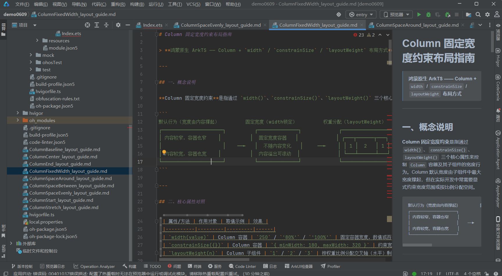
一、概念说明
Column 固定宽度约束是指通过 width()、constrainSize()、layoutWeight() 三个核心属性来控制 Column 容器及其子组件的宽度行为。Column 默认宽度由子组件中最大宽度撑起,但在实际开发中常需要显式约束宽度范围或按比例分配空间。
默认行为(宽度由内容撑起)         固定宽度(width锁定)         权重分配(layoutWeight)
┌─────────────────────┐          ┌──────────────┐             ┌─────────────────────┐
│ 内容较窄,容器也窄    │          │  固定宽度容器   │             │ ┌───┬──────┬───┐     │
│                     │    ──►   │  不随内容变化   │     ──►    │ │ 1 │  2   │ 1 │     │
│ 内容较宽,容器也宽    │          │  内容溢出可滚动  │             │ └───┴──────┴───┘     │
└─────────────────────┘          └──────────────┘             └─────────────────────┘
二、核心属性对照
| 属性/方法 | 作用对象 | 取值示例 | 效果 |
|---|---|---|---|
width(value) |
Column 容器 | 250 / '80%' / '100%' |
固定容器宽度,数值或百分比 |
constrainSize({}) |
Column 容器 | { minWidth: 180, maxWidth: 320 } |
约束宽度在 min~max 之间弹性变化 |
layoutWeight(n) |
Column 子组件 | 1 / 2 / 3 |
按权重比例分配交叉轴(水平)剩余空间 |
关键认知:
width和constrainSize作用于容器本身,layoutWeight作用于子组件。在 Column 中,交叉轴是水平方向,因此layoutWeight控制子组件的水平宽度分配。
三、width 的三种常见用法
                    width(250)                     width("80%")                  width("100%")
           ┌──────────────────┐          ┌──────────────────────────┐    ┌──────────────────────────┐
           │  固定 250vp       │          │  父容器宽度的 80%         │    │  占满父容器宽度            │
           │  不随内容变化      │          │  随父容器缩放而缩放        │    │  与父容器等宽              │
           │  内容可能溢出      │          │  响应式友好               │    │  最常用                    │
           └──────────────────┘          └──────────────────────────┘    └──────────────────────────┘
四、代码结构(.ets 文件)
ColumnFixedWidthDemo.ets
├── import 语句
├── @Entry @Component struct ColumnFixedWidthDemo
│   ├── @State 状态变量
│   └── build()
│       ├── Scroll 全屏滚动容器
│       │   └── Column({ space: 24 })
│       │       ├── [区域1] TitleSection ── 标题 + 布局要点说明
│       │       ├── [区域2] width 固定宽度
│       │       │   ├── 2.1 width(250) 固定窄宽度
│       │       │   ├── 2.2 width("80%") 百分比宽度
│       │       │   └── 2.3 width("100%") 占满父容器
│       │       ├── [区域3] constrainSize
│       │       │   ├── 3.1 minWidth + maxWidth 约束
│       │       │   └── 3.2 无约束 vs minWidth 对比
│       │       ├── [区域4] layoutWeight
│       │       │   ├── 4.1 等宽比例 1:1:1
│       │       │   ├── 4.2 权重比例 1:2:1
│       │       │   └── 4.3 Column 子组件等宽排列
│       │       ├── [区域5] 综合示例 ── 响应式卡片
│       │       └── [区域6] 参数总结 ── 属性对比表格
│       └── 底部留白
├── [子组件] TitleSection
└── [子组件] SectionTitle
五、核心代码片段
5.1 固定宽度 width(250)
Column({ space: 8 }) {
  Text('width(250) — 固定 250vp 窄宽度').fontSize(12).fontColor('#64748b')
  Text('这是一个固定宽度的 Column 容器……')
    .fontSize(13).fontColor('#1e293b')
    .backgroundColor('#ffffff').padding(8).borderRadius(6)
}
.width(250)          // ★ 固定宽度 250vp
.alignItems(ItemAlign.Start).padding(12)
.backgroundColor('#dbeafe')
.border({ width: 1, color: '#93c5fd' }).borderRadius(8)
5.2 百分比宽度 width(“80%”)
Column({ space: 8 }) {
  Text('width("80%") — 父容器宽度的 80%').fontSize(12).fontColor('#64748b')
  ForEach(['项目 A', '项目 B', '项目 C'], (item: string) => {
    Text(item).fontSize(14).fontColor('#ffffff')
      .width('100%').padding(8).backgroundColor('#3b82f6').borderRadius(4)
  })
}
.width('80%')        // ★ 百分比宽度
.alignItems(ItemAlign.Center).padding(12)
.backgroundColor('#f3e8ff')
.border({ width: 1, color: '#d8b4fe' }).borderRadius(8)
5.3 constrainSize 约束宽度范围
Column() {
  Text('constrainSize({ minWidth: 180, maxWidth: 320 })').fontSize(12)
  Text('宽度约束在 180vp ~ 320vp 之间……').fontSize(13).lineHeight(20)
    .backgroundColor('#ffffff').padding(8).borderRadius(6)
}
.constrainSize({ minWidth: 180, maxWidth: 320 })  // ★ 宽度约束
.alignItems(ItemAlign.Start).padding(12)
.backgroundColor('#fef3c7')
.border({ width: 1, color: '#fde68a' }).borderRadius(8)
5.4 layoutWeight 权重分配
// 等宽 1:1:1
Row({ space: 4 }) {
  Text('A').layoutWeight(1).height(44).backgroundColor('#3b82f6').borderRadius(6)
  Text('B').layoutWeight(1).height(44).backgroundColor('#8b5cf6').borderRadius(6)
  Text('C').layoutWeight(1).height(44).backgroundColor('#06b6d4').borderRadius(6)
}
.width('100%')

// 不等宽 1:2:1
Row({ space: 4 }) {
  Text('1x').layoutWeight(1).height(44).backgroundColor('#3b82f6')
  Text('2x(两倍宽)').layoutWeight(2).height(44).backgroundColor('#8b5cf6')
  Text('1x').layoutWeight(1).height(44).backgroundColor('#06b6d4')
}
.width('100%')
5.5 Column 子组件 + layoutWeight
Row({ space: 4 }) {
  Column({ space: 4 }) {
    Text('📊').fontSize(24)
    Text('数据').fontSize(12).fontColor('#475569')
  }
  .layoutWeight(1)           // ★ 等宽分配
  .padding(8).backgroundColor('#eff6ff').borderRadius(8)
  .alignItems(ItemAlign.Center)

  Column({ space: 4 }) {
    Text('📈').fontSize(24)
    Text('统计').fontSize(12).fontColor('#475569')
  }
  .layoutWeight(1)
  .padding(8).backgroundColor('#faf5ff').borderRadius(8)
  .alignItems(ItemAlign.Center)

  Column({ space: 4 }) {
    Text('⚙️').fontSize(24)
    Text('设置').fontSize(12).fontColor('#475569')
  }
  .layoutWeight(1)
  .padding(8).backgroundColor('#f0fdf4').borderRadius(8)
  .alignItems(ItemAlign.Center)
}
.width('100%').alignItems(VerticalAlign.Top)
六、子组件详解
6.1 TitleSection(标题区域)
显示页面大标题、副标题(属性说明)和一个灰底文本框,详细列出 width / constrainSize / layoutWeight 三种方式的说明。
6.2 SectionTitle(段落小标题)
轻量级可复用组件,接收 @Prop label 属性,fontSize: 16 中等粗细文字。
七、适用场景
| 场景 | 推荐方式 |
|---|---|
| ✅ 固定宽度侧边栏 | width(240) — 锁定导航栏宽度 |
| ✅ 响应式内容区 | constrainSize({ minWidth: 320, maxWidth: 800 }) — 弹性适应 |
| ✅ 等宽菜单项 | layoutWeight(1) — 菜单项均分宽度 |
| ✅ 表单标签等宽 | width(100) — 标签统一宽度对齐 |
| ✅ 卡片网格 | layoutWeight(1) + constrainSize({ minWidth }) — 卡片等宽 + 最小宽度 |
| ✅ 百分比布局 | width('50%') — 左右分栏 |
八、注意事项
-
width与constrainSize的优先级:如果同时设置了width和constrainSize,width优先,constrainSize中的minWidth/maxWidth仍然生效,但不会超过width设定的值。 -
layoutWeight在 Column 与 Row 中的区别:- 在
Column中:layoutWeight控制**交叉轴(水平)**宽度分配 - 在
Row中:layoutWeight控制**主轴(水平)**宽度分配 - 使用
layoutWeight时,父容器必须有明确的宽度(通常设为width('100%'))
- 在
-
layoutWeight与百分比宽度的配合:子组件设置了layoutWeight后,如果有固定宽度则被忽略,由权重决定最终宽度。 -
constrainSize除了minWidth/maxWidth,还支持minHeight/maxHeight,可用于同时约束宽高范围。
九、相关资源
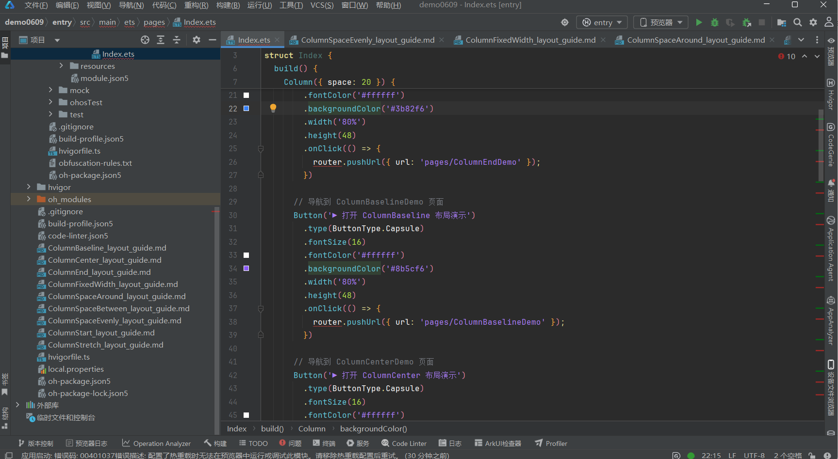
- 代码文件:entry/src/main/ets/pages/ColumnFixedWidthDemo.ets
- 入口页面:entry/src/main/ets/pages/Index.ets(点击红色按钮跳转)
- 姊妹布局:
ColumnStart—ColumnStart_layout_guide.mdColumnCenter—ColumnCenter_layout_guide.mdColumnEnd—ColumnEnd_layout_guide.mdColumnSpaceBetween—ColumnSpaceBetween_layout_guide.mdColumnSpaceAround—ColumnSpaceAround_layout_guide.mdColumnSpaceEvenly—ColumnSpaceEvenly_layout_guide.mdColumnStretch—ColumnStretch_layout_guide.mdColumnBaseline—ColumnBaseline_layout_guide.md
文档生成日期:2026-06-23

作为“人工智能6S店”的官方数字引擎,为AI开发者与企业提供一个覆盖软硬件全栈、一站式门户。
更多推荐
 0
0 0
0- 0


 已为社区贡献13条内容

所有评论(0)