
HarmonyOS7 多设备适配最怕返工:断点、mediaquery 和响应式布局讲透
前言
鸿蒙生态里最让人头大的事情之一,就是多设备适配。你写的页面在手机上跑得好好的,一上平板就左边空一大片,折叠屏展开更是直接"社死"。
我之前做项目的时候,一开始偷懒只做了手机适配,后来产品说要适配平板和折叠屏,差点推倒重来。后来系统学了一遍断点体系和栅格布局,才算真正搞定。今天就聊聊这个话题。
鸿蒙的多设备生态
HarmonyOS 7 支持的设备形态相当丰富:手机、平板、折叠屏、2in1 笔记本、智慧屏、车机。作为开发者,你最常打交道的就是前四种。
这几种设备的屏幕宽度差异巨大:
| 设备类型 | 典型宽度 (vp) |
|---|---|
| 手机 | 360 ~ 412 |
| 折叠屏(展开) | 580 ~ 840 |
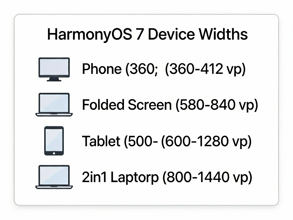
| 平板 | 600 ~ 1280 |
| 2in1 | 800 ~ 1440 |
如果写死布局,根本没法玩。所以我们需要一套响应式方案。
mediaquery 媒体查询
@ohos.mediaquery 是鸿蒙提供的媒体查询能力,可以监听屏幕宽度、高度、密度、方向等变化。
基本用法很简单:
import mediaquery from '@ohos.mediaquery'

@Entry
@Component
struct ResponsivePage {
  @State screenWidth: number = 0
  private listener: mediaquery.MediaQueryListener | null = null

  aboutToAppear() {
    // 监听屏幕宽度大于等于 600vp 的情况
    this.listener = mediaquery.matchMediaSync('(width>=600vp)')
    this.listener.on('change', (result: mediaquery.MediaQueryResult) => {
      if (result.matches) {
        this.screenWidth = 600 // 大屏模式
      } else {
        this.screenWidth = 360 // 小屏模式
      }
    })
  }

  aboutToDisappear() {
    this.listener?.off('change')
  }

  build() {
    Column() {
      if (this.screenWidth >= 600) {
        Text('大屏模式')
      } else {
        Text('小屏模式')
      }
    }
  }
}
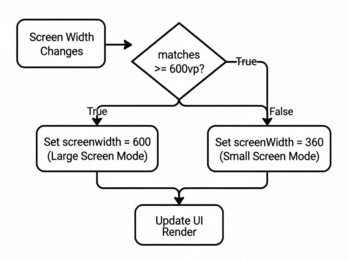
这里有个坑:matchMediaSync 的回调是在主线程执行的,别在里面做太重的操作,不然会卡 UI。
断点系统 (Breakpoint) 设计
光用 mediaquery 还不够系统化。做大型项目的时候,我们需要一套断点规范。鸿蒙推荐的做法是定义三到四个断点:
// 断点定义
export enum BreakpointType {
  SM = 'sm',  // 手机竖屏 <600vp
  MD = 'md',  // 折叠屏/手机横屏 600~840vp
  LG = 'lg',  // 平板 840~1080vp
  XL = 'xl',  // 2in1/大屏 >1080vp
}
实际项目中,我会封装一个断点监听的 Hook:
import mediaquery from '@ohos.mediaquery'

export class BreakpointSystem {
  private static listeners: Map<string, mediaquery.MediaQueryListener> = new Map()
  private static callbacks: ((bp: BreakpointType) => void)[] = []

  static init() {
    const rules: [string, BreakpointType][] = [
      ['(width<600vp)', BreakpointType.SM],
      ['(600vp<=width<840vp)', BreakpointType.MD],
      ['(840vp<=width<1080vp)', BreakpointType.LG],
      ['(width>=1080vp)', BreakpointType.XL],
    ]

    rules.forEach(([query, bp]) => {
      const listener = mediaquery.matchMediaSync(query)
      listener.on('change', (result: mediaquery.MediaQueryResult) => {
        if (result.matches) {
          BreakpointSystem.callbacks.forEach(cb => cb(bp))
        }
      })
      BreakpointSystem.listeners.set(query, listener)
    })
  }

  static onChange(callback: (bp: BreakpointType) => void) {
    BreakpointSystem.callbacks.push(callback)
  }

  static destroy() {
    BreakpointSystem.listeners.forEach((listener) => {
      listener.off('change')
    })
    BreakpointSystem.listeners.clear()
    BreakpointSystem.callbacks = []
  }
}
然后在页面里用起来:
@Entry
@Component
struct MyPage {
  @State breakpoint: BreakpointType = BreakpointType.SM

  aboutToAppear() {
    BreakpointSystem.init()
    BreakpointSystem.onChange((bp) => {
      this.breakpoint = bp
    })
  }

  aboutToDisappear() {
    BreakpointSystem.destroy()
  }

  build() {
    Column() {
      // 根据断点决定列数
      if (this.breakpoint === BreakpointType.SM) {
        this.SmallLayout()
      } else if (this.breakpoint === BreakpointType.MD) {
        this.MediumLayout()
      } else {
        this.LargeLayout()
      }
    }
  }

  @Builder
  SmallLayout() {
    List() {
      ForEach(dataList, (item: NewsItem) => {
        ListItem() { NewsCard(item) }
      })
    }
  }

  @Builder
  MediumLayout() {
    // 两列瀑布流
    WaterFlow() {
      ForEach(dataList, (item: NewsItem) => {
        FlowItem() { NewsCard(item) }
      })
    }
    .columnsTemplate('1fr 1fr')
  }

  @Builder
  LargeLayout() {
    // 左侧导航 + 右侧三列内容
    Row() {
      SideBar()
      WaterFlow() {
        ForEach(dataList, (item: NewsItem) => {
          FlowItem() { NewsCard(item) }
        })
      }
      .columnsTemplate('1fr 1fr 1fr')
    }
  }
}
GridRow/GridCol 栅格布局
鸿蒙的 GridRow + GridCol 组件提供了类似 Bootstrap 的栅格系统,总共 24 列,支持按断点设置每列占几格。
@Entry
@Component
struct GridDemo {
  build() {
    Scroll() {
      GridRow({ columns: 24, gutter: 12 }) {
        // 手机占满整行,平板占一半,大屏占三分之一
        GridCol({ span: { sm: 24, md: 12, lg: 8 } }) {
          Card() { Text('模块 A') }.width('100%')
        }
        GridCol({ span: { sm: 24, md: 12, lg: 8 } }) {
          Card() { Text('模块 B') }.width('100%')
        }
        GridCol({ span: { sm: 24, md: 24, lg: 8 } }) {
          Card() { Text('模块 C') }.width('100%')
        }
      }
      .padding(16)
    }
  }
}
这个栅格系统的好处是声明式的,不需要你自己去监听断点变化再手动计算宽度,系统自动帮你搞定。
实战:新闻详情页的多设备适配
来看一个完整的例子。新闻详情页在手机上是单列瀑布流,平板变成左右分栏(列表+详情),折叠屏展开则是三栏布局:
@Entry
@Component
struct NewsPage {
  @State breakpoint: BreakpointType = BreakpointType.SM
  @State selectedNews: NewsItem | null = null
  private newsList: NewsItem[] = getMockNews()

  aboutToAppear() {
    BreakpointSystem.init()
    BreakpointSystem.onChange((bp) => {
      this.breakpoint = bp
    })
  }

  aboutToDisappear() {
    BreakpointSystem.destroy()
  }

  build() {
    Row() {
      // 导航栏:仅大屏显示
      if (this.breakpoint === BreakpointType.XL) {
        NavSidebar().width(200)
      }

      // 列表区域
      if (this.breakpoint === BreakpointType.SM) {
        // 手机:全宽列表,点击进入详情
        this.NewsListView()
      } else {
        // 平板及以上:左侧列表
        this.NewsListView()
          .width(this.breakpoint === BreakpointType.XL ? '30%' : '40%')

        // 右侧详情
        if (this.selectedNews) {
          NewsDetail(this.selectedNews)
            .width(this.breakpoint === BreakpointType.XL ? '50%' : '60%')
        }
      }
    }
    .width('100%')
    .height('100%')
  }

  @Builder
  NewsListView() {
    List({ space: 8 }) {
      ForEach(this.newsList, (item: NewsItem) => {
        ListItem() {
          NewsCard(item)
            .onClick(() => {
              if (this.breakpoint !== BreakpointType.SM) {
                this.selectedNews = item
              } else {
                // 手机端跳转新页面
                router.pushUrl({ url: 'pages/NewsDetail', params: { id: item.id } })
              }
            })
        }
      })
    }
    .padding(12)
  }
}
核心思路就两条:
- 小屏用跳转,大屏用分栏。手机上列表和详情分两个页面,平板以上直接左右分栏。
- 断点驱动布局切换。通过
BreakpointSystem统一管理断点状态,页面根据@State响应式刷新。
一些踩坑经验
折叠屏内外屏切换:折叠屏合上和展开是两种完全不同的宽度,你的断点监听要能覆盖到这两种情况。上面封装的 BreakpointSystem 天然支持,因为它监听的是实时宽度变化。
GridCol 的 span 不支持动画:栅格列数切换时没有过渡动画,如果想平滑过渡,得自己用 animateTo 包一下。
别在 builder 里做复杂判断:@Builder 里的条件判断越简单越好,复杂的逻辑放到计算属性或者 @State 变量里预处理。
模拟器不够用:DevEco Studio 的模拟器只能模拟固定分辨率,建议用 Previewer 的多设备预览功能快速检查各个断点下的效果。
多设备适配是鸿蒙开发者的必修课。与其等设备多了再补,不如一开始就把断点体系搭好。前期多花一天时间设计断点规范,后期能省一周的返工时间。我的建议是:先把 sm/md/lg 三个断点跑通,xl 后面再加。

作为“人工智能6S店”的官方数字引擎,为AI开发者与企业提供一个覆盖软硬件全栈、一站式门户。
更多推荐
 1
1 0
0- 0


 已为社区贡献39条内容

所有评论(0)