
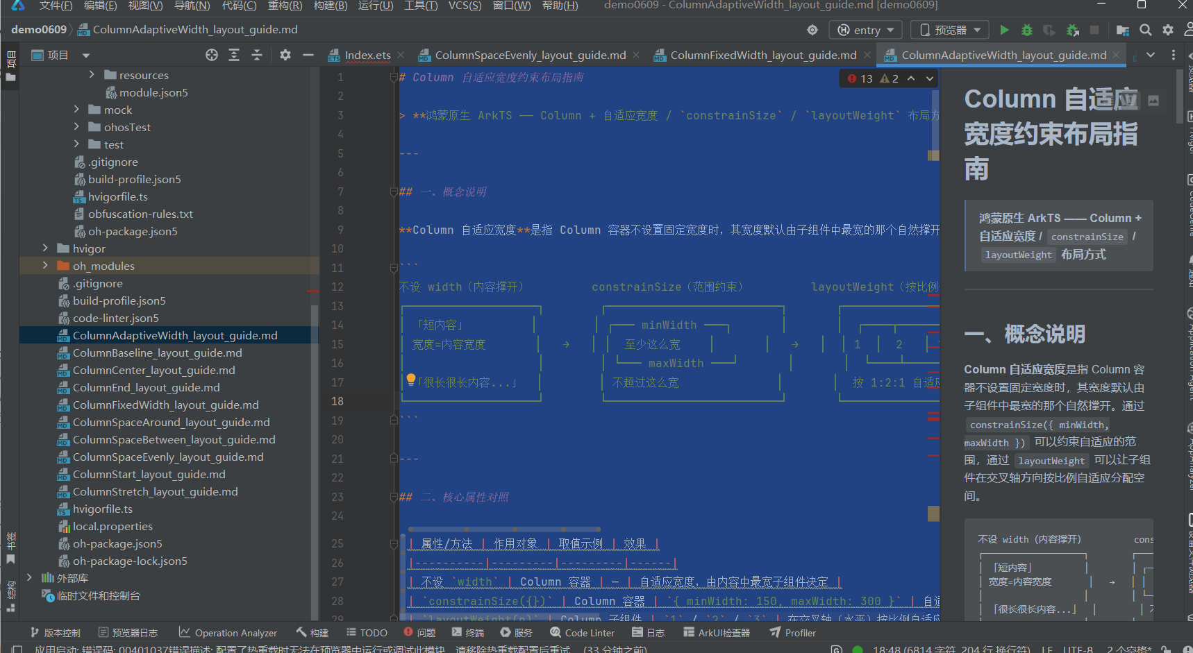
# Column 自适应宽度约束布局指南 > **鸿蒙原生 ArkTS —— Column + 自适应宽度 / `constrainSize` / `layoutWeight` 布局方式** --
·
一、概念说明
Column 自适应宽度是指 Column 容器不设置固定宽度时,其宽度默认由子组件中最宽的那个自然撑开。通过 constrainSize({ minWidth, maxWidth }) 可以约束自适应的范围,通过 layoutWeight 可以让子组件在交叉轴方向按比例自适应分配空间。
不设 width(内容撑开)         constrainSize(范围约束)         layoutWeight(按比例分配)
┌───────────────────┐        ┌─────────────────────────┐       ┌──────────────────────────┐
│ 「短内容」         │        │ ┌─── minWidth ───┐       │       │  ┌────┬──────┬────┐      │
│ 宽度=内容宽度       │   →   │ │  至少这么宽    │       │   →   │  │ 1  │  2   │ 1  │      │
│                   │        │ └─── maxWidth ───┘       │       │  └────┴──────┴────┘      │
│ 「很长很长内容...」  │        │ 不超过这么宽              │       │  按 1:2:1 自适应分配      │
└───────────────────┘        └─────────────────────────┘       └──────────────────────────┘
二、核心属性对照
| 属性/方法 | 作用对象 | 取值示例 | 效果 |
|---|---|---|---|
不设 width |
Column 容器 | — | 自适应宽度,由内容中最宽子组件决定 |
constrainSize({}) |
Column 容器 | { minWidth: 150, maxWidth: 300 } |
自适应范围约束,弹性适应 |
layoutWeight(n) |
Column 子组件 | 1 / 2 / 3 |
在交叉轴(水平)按比例自适应分配空间 |
三、四种宽度模式对比
         自适应(默认)                  百分比                     固定                      约束范围
  ┌──────────────────────┐    ┌──────────────────────┐   ┌──────────────┐       ┌──────────────────────┐
  │  内容决定宽度          │    │  父容器宽度 * 80%     │   │  固定 250vp   │       │  ┌── min ──┐          │
  │  短内容→窄, 长内容→宽  │    │  随父容器缩放         │   │  不随内容变化  │       │  │弹性适应 │          │
  │  无限自适应            │    │  响应式               │   │  可能溢出     │       │  │ ── max ──┘          │
  └──────────────────────┘    └──────────────────────┘   └──────────────┘       └──────────────────────┘
四、代码结构(.ets 文件)
ColumnAdaptiveWidthDemo.ets
├── import 语句
├── @Entry @Component struct ColumnAdaptiveWidthDemo
│   ├── @State 状态变量
│   └── build()
│       ├── Scroll 全屏滚动容器
│       │   └── Column({ space: 24 })
│       │       ├── [区域1] TitleSection ── 标题 + 布局要点说明
│       │       ├── [区域2] 默认自适应
│       │       │   ├── 2.1 短内容 → 窄容器
│       │       │   ├── 2.2 中内容 → 中等宽度
│       │       │   ├── 2.3 长内容 → 宽容器
│       │       │   └── 2.4 同一 Row 内三列对比
│       │       ├── [区域3] constrainSize
│       │       │   ├── 3.1 仅 minWidth — 最短保障
│       │       │   ├── 3.2 仅 maxWidth — 最长限制
│       │       │   └── 3.3 双向约束 — 弹性适应
│       │       ├── [区域4] 自适应卡片列表
│       │       ├── [区域5] 自适应表单场景
│       │       └── [区域6] 四种宽度模式总结表
│       └── 底部留白
├── [子组件] TitleSection
└── [子组件] SectionTitle
五、核心代码片段
5.1 默认自适应宽度(不设 width)
// 短内容 → 窄容器
Column({ space: 6 }) {
  Text('不设 width — 宽度由内容自动撑开').fontSize(12).fontColor('#64748b')
  Text('短内容').fontSize(14).fontColor('#ffffff')
    .padding({ left: 16, right: 16, top: 8, bottom: 8 })
    .backgroundColor('#3b82f6').borderRadius(6)
}
// ★ 不设 width → 自适应宽度
.alignItems(ItemAlign.Start).padding(12)
.backgroundColor('#eff6ff')
.border({ width: 1, color: '#bfdbfe' }).borderRadius(8)
5.2 constrainSize 最小宽度约束
Column({ space: 6 }) {
  Text('constrainSize({ minWidth: 200 }) — 内容再短也不小于 200vp')
    .fontSize(12).fontColor('#64748b')
  Text('即使只有几个字')
    .fontSize(14).fontColor('#ffffff').padding(10)
    .backgroundColor('#3b82f6').borderRadius(6)
}
.constrainSize({ minWidth: 200 })  // ★ 最小宽度约束
.alignItems(ItemAlign.Start).padding(12)
.backgroundColor('#dbeafe')
.border({ width: 1, color: '#93c5fd' }).borderRadius(8)
5.3 constrainSize 双向约束
Column({ space: 6 }) {
  Text('constrainSize({ minWidth: 150, maxWidth: 300 }) — 弹性适应')
    .fontSize(12).fontColor('#64748b')
  Text('宽度在 150~300vp 之间自适应……')
    .fontSize(14).fontColor('#ffffff').padding(10)
    .backgroundColor('#f59e0b').borderRadius(6)
}
.constrainSize({ minWidth: 150, maxWidth: 300 })  // ★ 双向约束
.alignItems(ItemAlign.Start).padding(12)
.backgroundColor('#fef3c7')
.border({ width: 1, color: '#fde68a' }).borderRadius(8)
5.4 自适应卡片列表
Column({ space: 8 }) {
  ForEach(this.cardContents, (content: string, index: number) => {
    Column({ space: 4 }) {
      Row() {
        Circle().width(8).height(8).fill(
          index === 0 ? '#3b82f6' : index === 1 ? '#8b5cf6' : '#06b6d4')
        Text('卡片 ' + (index + 1)).fontSize(14).fontWeight(FontWeight.Medium)
      }
      Text(content).fontSize(13).fontColor('#475569')
        .padding(8).backgroundColor('#eff6ff').borderRadius(6)
    }
    .layoutWeight(1)                          // ★ 等宽分配
    .width('100%').padding(12)
    .backgroundColor('#ffffff')
    .border({ width: 1, color: '#e2e8f0' }).borderRadius(8)
    .constrainSize({ minWidth: 200 })          // ★ 最小宽度
  })
}
.width('100%')
六、子组件详解
6.1 TitleSection(标题区域)
显示页面大标题、副标题(属性说明)和一个灰底文本框,详细列出四种宽度模式和 constrainSize / layoutWeight 的说明。
6.2 SectionTitle(段落小标题)
轻量级可复用组件,接收 @Prop label 属性,fontSize: 16 中等粗细文字。
七、适用场景
| 场景 | 推荐方式 | 说明 |
|---|---|---|
| ✅ 动态内容卡片 | 自适应 + constrainSize({minWidth}) |
卡片宽度随内容变化,但保持最小宽度 |
| ✅ Tooltip/弹出面板 | 自适应 + constrainSize({maxWidth}) |
内容较短时窄,较长时限制宽度自动换行 |
| ✅ 响应式表单 | width('100%') |
表单项占满容器,随容器缩放 |
| ✅ 导航菜单 | layoutWeight(1) |
菜单项等宽自适应排列 |
| ✅ 信息展示面板 | 自适应 + constrainSize({min, max}) |
在合理范围内弹性适应内容 |
八、注意事项
-
Column 默认是自适应宽度的,不设
width时宽度 = 子组件中最宽者的宽度。这是 Column 的默认行为。 -
constrainSize与width同时设置时:width决定基础值,constrainSize中的minWidth/maxWidth会覆盖width的限制范围。例如width(100).constrainSize({minWidth: 150})最终宽度至少 150vp。 -
constrainSize不会改变 Column 的 flex 行为——它只控制宽度的数值范围。如果要让 Column 在父容器中自适应分配空间,仍需配合layoutWeight或在父容器中使用 flex 属性。 -
layoutWeight的子组件必须位于有明确宽度的 Column 中,否则权重分配无参考基准。通常在 Column 上设width('100%')或固定宽度。
九、相关资源
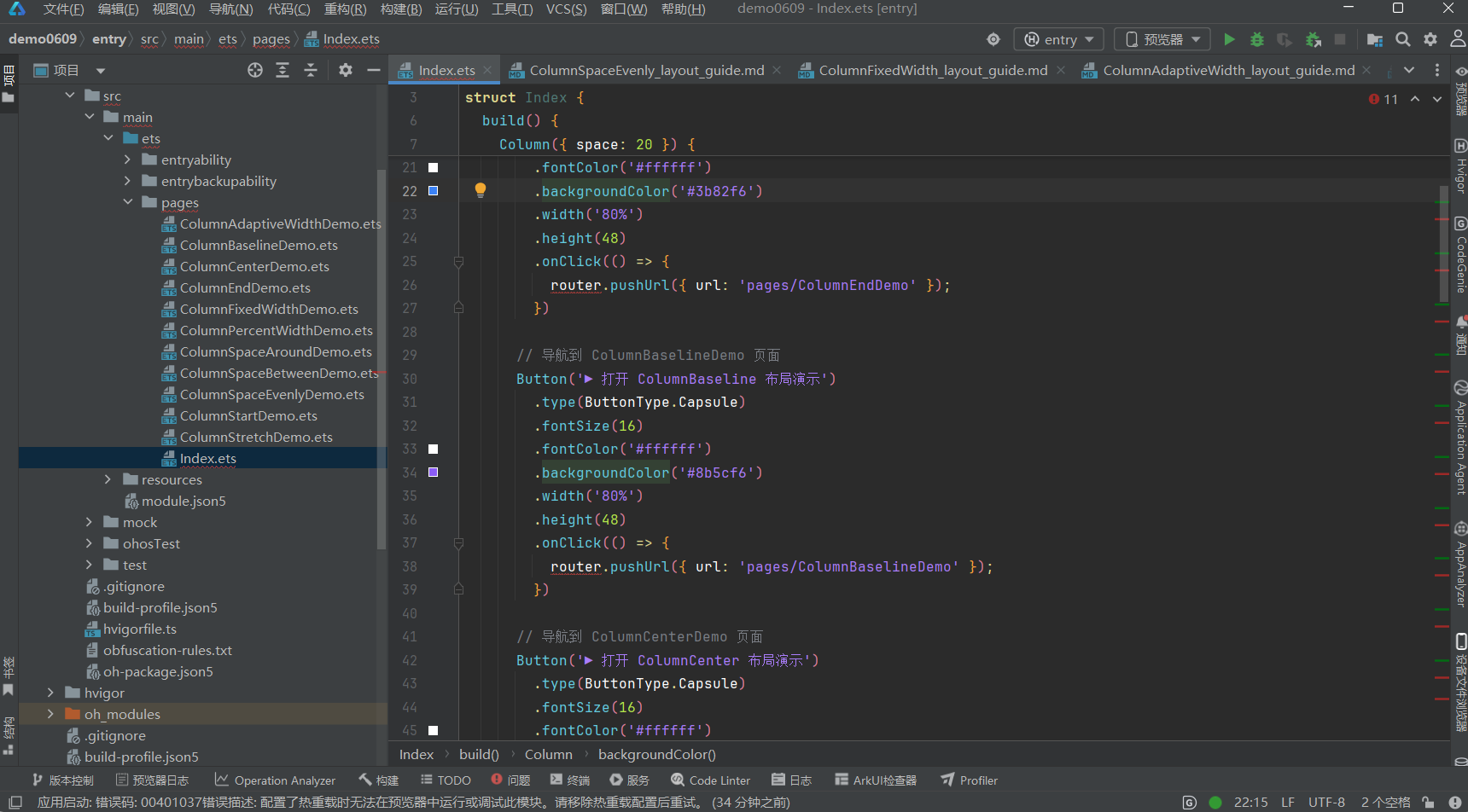
- 代码文件:entry/src/main/ets/pages/ColumnAdaptiveWidthDemo.ets
- 入口页面:entry/src/main/ets/pages/Index.ets(点击青色按钮跳转)
- 姊妹布局:
ColumnFixedWidth—ColumnFixedWidth_layout_guide.mdColumnStart—ColumnStart_layout_guide.mdColumnCenter—ColumnCenter_layout_guide.mdColumnEnd—ColumnEnd_layout_guide.mdColumnSpaceBetween—ColumnSpaceBetween_layout_guide.mdColumnSpaceAround—ColumnSpaceAround_layout_guide.mdColumnSpaceEvenly—ColumnSpaceEvenly_layout_guide.mdColumnStretch—ColumnStretch_layout_guide.md
文档生成日期:2026-06-23

作为“人工智能6S店”的官方数字引擎,为AI开发者与企业提供一个覆盖软硬件全栈、一站式门户。
更多推荐

 0
0 0
0- 0


 已为社区贡献11条内容

所有评论(0)