
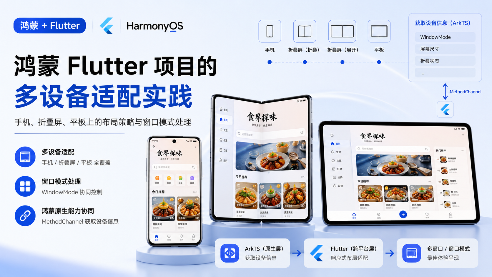
鸿蒙 Flutter 项目的多设备适配:手机、折叠屏、平板上的布局策略与窗口模式处理
适合谁看
-
正在做 Flutter 鸿蒙项目多设备适配的开发者
-
想让 Flutter 应用支持折叠屏和平板的开发者
-
遇到"折叠屏展开后布局错乱"问题的人
问题背景
Flutter 的响应式布局主要依赖 MediaQuery、LayoutBuilder 和断点系统。但在鸿蒙生态中,设备形态更加多样:
-
手机:竖屏为主,屏幕宽度 360-400dp
-
折叠屏:展开后宽度可达 600dp+,折叠时和普通手机类似
-
平板:横屏为主,宽度 800dp+
单纯的 Flutter 断点系统不足以处理所有场景,因为:
-
折叠屏的展开/折叠会触发窗口重建
-
鸿蒙的窗口模式(全屏、分屏、自由窗口)影响可用区域
-
设备特有的参数(铰链位置、屏幕比例)需要从 ArkTS 获取
项目中的真实场景
食界探味在不同设备上的布局策略:
|
设备 |
布局策略 |
导航方式 |
|---|---|---|
|
手机竖屏 |
单列卡片 |
底部 Tab |
|
折叠屏展开 |
双列卡片 |
底部 Tab |
|
平板横屏 |
三列卡片或侧边栏 |
侧边导航 |
核心实现
第一层:从 ArkTS 获取设备信息
创建一个专门的 MethodChannel 获取鸿蒙设备信息:
// core/platform/device_info_channel.dart
class DeviceInfoChannel {
  static const _channel = MethodChannel('com.foodvoyage.device_info');

  static Future<DeviceInfo> getDeviceInfo() async {
    try {
      final result = await _channel.invokeMethod<Map>('getDeviceInfo');
      if (result == null) return DeviceInfo.unknown();

      return DeviceInfo(
        deviceType: result['deviceType'] as String? ?? 'phone',
        screenWidth: (result['screenWidth'] as num?)?.toDouble() ?? 360,
        screenHeight: (result['screenHeight'] as num?)?.toDouble() ?? 640,
        isFoldable: result['isFoldable'] as bool? ?? false,
        isExpanded: result['isExpanded'] as bool? ?? false,
        windowMode: result['windowMode'] as String? ?? 'fullscreen',
      );
    } on MissingPluginException {
      return DeviceInfo.unknown();
    }
  }
}

class DeviceInfo {
  final String deviceType;
  final double screenWidth;
  final double screenHeight;
  final bool isFoldable;
  final bool isExpanded;
  final String windowMode;

  const DeviceInfo({
    required this.deviceType,
    required this.screenWidth,
    required this.screenHeight,
    required this.isFoldable,
    required this.isExpanded,
    required this.windowMode,
  });

  factory DeviceInfo.unknown() => const DeviceInfo(
    deviceType: 'phone',
    screenWidth: 360,
    screenHeight: 640,
    isFoldable: false,
    isExpanded: false,
    windowMode: 'fullscreen',
  );

  bool get isTablet => deviceType == 'tablet' || screenWidth > 720;
  bool get isLargeScreen => screenWidth > 600;
}
第二层:ArkTS 侧设备信息获取
// plugins/DeviceInfoPlugin.ets
import { deviceInfo } from '@kit.BasicServicesKit';
import { window } from '@kit.ArkUI';

export default class DeviceInfoPlugin implements FlutterPlugin, MethodCallHandler {
  private channel: MethodChannel | null = null;

  onAttachedToEngine(binding: FlutterPluginBinding): void {
    this.channel = new MethodChannel(binding.getBinaryMessenger(), 'com.foodvoyage.device_info');
    this.channel.setMethodCallHandler(this);
  }

  onMethodCall(call: MethodCall, result: MethodResult): void {
    if (call.method === 'getDeviceInfo') {
      this.handleGetDeviceInfo(result);
    }
  }

  private async handleGetDeviceInfo(result: MethodResult): Promise<void> {
    try {
      const deviceType = deviceInfo.deviceType;
      const display = window.getLastWindow(getContext(this));
      const windowProps = (await display).getWindowProperties();
      const windowWidth = windowProps.windowRect.width;
      const windowHeight = windowProps.windowRect.height;

      const args = new Map<string, Object>();
      args.set('deviceType', deviceType);
      args.set('screenWidth', windowWidth);
      args.set('screenHeight', windowHeight);
      args.set('isFoldable', deviceType === 'foldable');
      args.set('isExpanded', windowWidth > 600);
      args.set('windowMode', this.getWindowMode(windowProps));

      result.success(args);
    } catch (err) {
      result.error('DEVICE_INFO_ERROR', `${err}`, null);
    }
  }

  private getWindowMode(props: window.WindowProperties): string {
    // 根据窗口属性判断模式
    return 'fullscreen';
  }
}
第三层:Flutter 侧断点适配
// core/theme/breakpoints.dart
class Breakpoints {
  static const double mobile = 360;
  static const double tablet = 600;
  static const double desktop = 840;

  static ScreenSize getSize(double width) {
    if (width >= desktop) return ScreenSize.desktop;
    if (width >= tablet) return ScreenSize.tablet;
    return ScreenSize.mobile;
  }
}

enum ScreenSize { mobile, tablet, desktop }
// 使用断点适配布局
class ResponsiveLayout extends StatelessWidget {
final Widget mobile;
final Widget? tablet;
final Widget? desktop;
const ResponsiveLayout({
required this.mobile,
this.tablet,
this.desktop,
});
@override
Widget build(BuildContext context) {
final width = MediaQuery.of(context).size.width;
final size = Breakpoints.getSize(width);
switch (size) {
case ScreenSize.desktop:
return desktop ?? tablet ?? mobile;
case ScreenSize.tablet:
return tablet ?? mobile;
case ScreenSize.mobile:
return mobile;
}
}
}第四层:折叠屏展开/折叠处理
折叠屏展开/折叠会触发窗口重建,Flutter 需要处理:
-
状态保持:展开/折叠时保持页面状态
-
布局切换:根据新宽度切换布局
-
路由栈保持:展开/折叠时不丢失路由栈
// 折叠屏状态监听
class FoldableHandler {
  static DeviceInfo? _lastInfo;

  static void onDeviceInfoChanged(DeviceInfo newInfo) {
    if (_lastInfo == null) {
      _lastInfo = newInfo;
      return;
    }

    // 检测展开/折叠变化
    if (_lastInfo!.isExpanded != newInfo.isExpanded) {
      _handleFoldChange(newInfo.isExpanded);
    }

    _lastInfo = newInfo;
  }

  static void _handleFoldChange(bool isExpanded) {
    // 展开/折叠时的特殊处理
    // 例如:重新计算网格列数、调整侧边栏显示
  }
}
第五层:导航策略适配
// 根据屏幕尺寸选择导航方式
class AdaptiveNavigation extends StatelessWidget {
  final int currentIndex;
  final ValueChanged<int> onIndexChanged;
  final List<NavigationItem> items;

  const AdaptiveNavigation({
    required this.currentIndex,
    required this.onIndexChanged,
    required this.items,
  });

  @override
  Widget build(BuildContext context) {
    final width = MediaQuery.of(context).size.width;

    if (width > 720) {
      // 平板:侧边导航
      return _buildSideNavigation();
    } else {
      // 手机/折叠屏折叠态:底部 Tab
      return _buildBottomNavigation();
    }
  }

  Widget _buildSideNavigation() {
    return NavigationRail(
      selectedIndex: currentIndex,
      onDestinationSelected: onIndexChanged,
      destinations: items.map((item) => NavigationRailDestination(
        icon: Icon(item.icon),
        label: Text(item.label),
      )).toList(),
    );
  }

  Widget _buildBottomNavigation() {
    return BottomNavigationBar(
      currentIndex: currentIndex,
      onTap: onIndexChanged,
      items: items.map((item) => BottomNavigationBarItem(
        icon: Icon(item.icon),
        label: item.label,
      )).toList(),
    );
  }
}
关键代码位置
-
app/lib/core/platform/device_info_channel.dart— Flutter 侧设备信息获取(新增) -
app/ohos/entry/src/main/ets/plugins/DeviceInfoPlugin.ets— ArkTS 侧设备信息获取(新增) -
app/lib/core/theme/breakpoints.dart— 断点定义 -
各 feature 页面的响应式布局代码
鸿蒙侧实现
鸿蒙侧的工作:
-
设备信息获取:
deviceInfo.deviceType获取设备类型 -
窗口信息获取:
window.getLastWindow获取窗口尺寸 -
窗口模式判断:根据窗口属性判断全屏/分屏/自由窗口
-
折叠状态监听:监听折叠屏的展开/折叠事件
Flutter 侧实现
Flutter 侧的适配策略:
-
断点系统:
Breakpoints定义 mobile/tablet/desktop 三个断点 -
响应式组件:
ResponsiveLayout根据宽度选择布局 -
导航适配:根据屏幕尺寸选择底部 Tab 或侧边导航
-
折叠屏处理:监听设备信息变化,切换布局
常见坑
-
坑 1:折叠屏展开/折叠时 Flutter 页面重建。展开/折叠会触发窗口重建,Flutter 的
StatefulWidget状态可能丢失。需要用AutomaticKeepAliveClientMixin或全局状态管理保持状态。 -
坑 2:
MediaQuery在折叠屏上的值不准确。MediaQuery.of(context).size返回的是 Flutter 视口大小,不是物理屏幕大小。如果需要物理屏幕信息,必须从 ArkTS 获取。 -
坑 3:分屏模式下布局错乱。鸿蒙分屏模式下,应用的可用区域变小,但
MediaQuery可能不会及时更新。需要监听窗口变化事件。 -
坑 4:平板横屏时底部 Tab 不合适。底部 Tab 在宽屏上浪费空间,需要切换为侧边导航。但 GoRouter 的
ShellRoute不能动态切换导航组件。 -
坑 5:设备信息获取时机。
DeviceInfoPlugin的handleGetDeviceInfo是异步的,Flutter 侧需要在页面渲染前获取设备信息,否则会出现布局闪烁。
可复用模板
// Flutter 侧 - 响应式网格布局模板
class ResponsiveGrid extends StatelessWidget {
  final int mobileColumns;
  final int tabletColumns;
  final int desktopColumns;
  final List<Widget> children;

  const ResponsiveGrid({
    this.mobileColumns = 1,
    this.tabletColumns = 2,
    this.desktopColumns = 3,
    required this.children,
  });

  @override
  Widget build(BuildContext context) {
    final width = MediaQuery.of(context).size.width;
    final columns = width > 840
        ? desktopColumns
        : width > 600
            ? tabletColumns
            : mobileColumns;

    return GridView.count(
      crossAxisCount: columns,
      children: children,
    );
  }
}
// 鸿蒙侧 - 设备信息获取模板
export default class DeviceInfoPlugin implements FlutterPlugin, MethodCallHandler {
private channel: MethodChannel | null = null;
onAttachedToEngine(binding: FlutterPluginBinding): void {
this.channel = new MethodChannel(binding.getBinaryMessenger(), 'com.example.device_info');
this.channel.setMethodCallHandler(this);
}
onMethodCall(call: MethodCall, result: MethodResult): void {
if (call.method === 'getDeviceInfo') {
this.getDeviceInfo(result);
}
}
private async getDeviceInfo(result: MethodResult): Promise<void> {
const deviceType = deviceInfo.deviceType;
const win = await window.getLastWindow(getContext(this));
const props = win.getWindowProperties();
const args = new Map<string, Object>();
args.set('deviceType', deviceType);
args.set('screenWidth', props.windowRect.width);
args.set('screenHeight', props.windowRect.height);
args.set('isFoldable', deviceType === 'foldable');
args.set('isExpanded', props.windowRect.width > 600);
result.success(args);
}
}本篇总结
鸿蒙 Flutter 项目的多设备适配,核心是三层协同:ArkTS 侧获取设备信息(设备类型、窗口尺寸、折叠状态)→ MethodChannel 传递到 Flutter → Flutter 侧根据断点选择布局策略。折叠屏的展开/折叠是最复杂的场景,需要同时处理状态保持、布局切换和路由栈保持。

作为“人工智能6S店”的官方数字引擎,为AI开发者与企业提供一个覆盖软硬件全栈、一站式门户。
更多推荐
 1
1 0
0- 0


 已为社区贡献75条内容

所有评论(0)