
鸿蒙 ArkTS Grid 布局深度解析:columnsTemplate 列模板三种定义方式
鸿蒙 ArkTS Grid 布局深度解析:columnsTemplate 列模板三种定义方式
一、引言
在 HarmonyOS NEXT 开发中,Grid 是 ArkUI 框架最强大的布局组件之一。它的核心能力 columnsTemplate 属性用一段字符串定义网格有多少列、每列多宽,背后蕴藏着三种截然不同的单位机制:fr(弹性比例)、px(固定像素)、%(百分比)。
本文将从一个可运行的完整示例出发,深入剖析这三种列模板定义方式的原理、行为和适用场景。
二、Grid 组件与 columnsTemplate
Grid 允许开发者在行和列两个维度上排布子组件,与 Row(线性行)和 Column(线性列)的单一维度不同。
基本用法:
Grid() {
  GridItem() { /* 子组件 */ }
  GridItem() { /* 子组件 */ }
  // ...
}
.columnsTemplate('1fr 1fr 1fr')
.rowsTemplate('60px 60px')
.columnsGap(8)
.rowsGap(8)
columnsTemplate 字符串由空格分隔多个"列宽值",值的个数决定列数。每个值可用的三种单位:
| 单位 | 名称 | 示例 |
|---|---|---|
fr |
弹性比例 | '1fr 2fr 1fr' |
px |
固定像素 | '80px 80px 80px' |
% |
百分比 | '30% 40% 30%' |
三者可以混合使用,如 '100px 1fr 30%'。
三、完整示例代码
/**
* columnsTemplate 三种定义方式对比
* fr单位、px单位、百分比
* columnsTemplate('1fr 1fr 1fr')
* columnsTemplate('100px 100px 100px')
* columnsTemplate('30% 40% 30%')
*/
function generateColors(colCount: number, rowCount: number): ResourceColor[] {
const palette: ResourceColor[] = [
'#FF6B81', '#5BC0EB', '#F9C74F',
'#90BE6D', '#F9844A', '#43AA8B',
'#577590', '#F94144', '#A06CD5', '#4D908E',
];
const colors: ResourceColor[] = [];
for (let i = 0; i < colCount * rowCount; i++) {
colors.push(palette[i % palette.length]);
}
return colors;
}
@Entry
@Component
struct Index {
build() {
Scroll() {
Column({ space: 20 }) {
// 页面标题
Text('Grid columnsTemplate 列模板三种定义方式')
.fontSize(20).fontWeight(FontWeight.Bold)
.textAlign(TextAlign.Center).width('100%')
.padding({ top: 16, bottom: 8 })
// ===== 示例一:fr =====
Column() {
Text('① fr(弹性比例单位)').fontSize(18)
.fontWeight(FontWeight.Medium).width('100%')
.padding({ left: 12, top: 12, bottom: 4 })
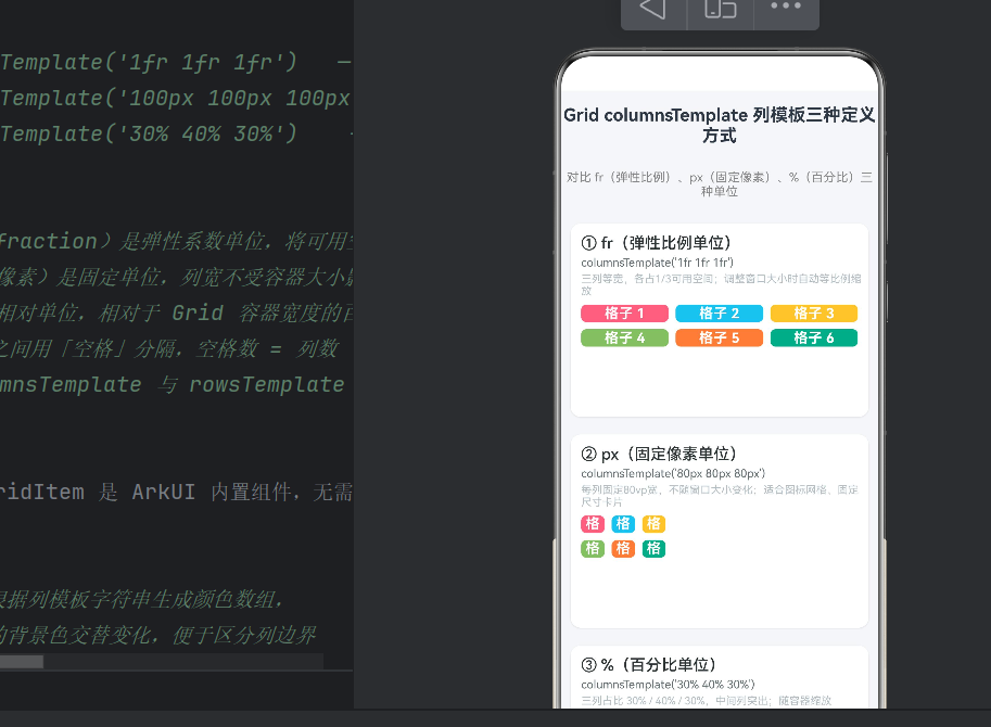
Text("columnsTemplate('1fr 1fr 1fr')")
.fontSize(13).fontColor('#636E72')
.fontFamily('Courier New').width('100%')
.padding({ left: 12, bottom: 4 })
Text('三列等宽,各占1/3;窗口缩放时自动等比例调整')
.fontSize(12).fontColor('#B2BEC3')
.width('100%').padding({ left: 12, bottom: 8 })
Grid() {
ForEach(generateColors(3, 2), (color: ResourceColor, index: number) => {
GridItem() {
Column() {
Text(`格子 ${index + 1}`)
.fontSize(16).fontColor(Color.White)
.fontWeight(FontWeight.Bold).textAlign(TextAlign.Center)
.width('100%')
}.width('100%').height('100%')
.justifyContent(FlexAlign.Center)
}.backgroundColor(color).borderRadius(6)
})
}
.columnsTemplate('1fr 1fr 1fr') // 三列各占1份弹性比例
.rowsTemplate('60px 60px')
.columnsGap(8).rowsGap(8)
.width('100%').height(128)
.padding({ left: 12, right: 12, bottom: 12 })
}
.backgroundColor(Color.White).borderRadius(12)
.shadow({ radius: 4, color: '#1A000000', offsetX: 0, offsetY: 2 })
.width('94%')
// ===== 示例二:px =====
Column() {
Text('② px(固定像素单位)').fontSize(18)
.fontWeight(FontWeight.Medium).width('100%')
.padding({ left: 12, top: 12, bottom: 4 })
Text("columnsTemplate('80px 80px 80px')")
.fontSize(13).fontColor('#636E72')
.fontFamily('Courier New').width('100%')
.padding({ left: 12, bottom: 4 })
Text('每列固定80vp宽,不随窗口大小变化')
.fontSize(12).fontColor('#B2BEC3')
.width('100%').padding({ left: 12, bottom: 8 })
Grid() {
ForEach(generateColors(3, 2), (color: ResourceColor, index: number) => {
GridItem() {
Column() {
Text(`格子 ${index + 1}`)
.fontSize(16).fontColor(Color.White)
.fontWeight(FontWeight.Bold).textAlign(TextAlign.Center)
.width('100%')
}.width('100%').height('100%')
.justifyContent(FlexAlign.Center)
}.backgroundColor(color).borderRadius(6)
})
}
.columnsTemplate('80px 80px 80px') // 三列各80vp,固定不变
.rowsTemplate('60px 60px')
.columnsGap(8).rowsGap(8)
.width('100%').height(128)
.padding({ left: 12, right: 12, bottom: 12 })
}
.backgroundColor(Color.White).borderRadius(12)
.shadow({ radius: 4, color: '#1A000000', offsetX: 0, offsetY: 2 })
.width('94%')
// ===== 示例三:% =====
Column() {
Text('③ %(百分比单位)').fontSize(18)
.fontWeight(FontWeight.Medium).width('100%')
.padding({ left: 12, top: 12, bottom: 4 })
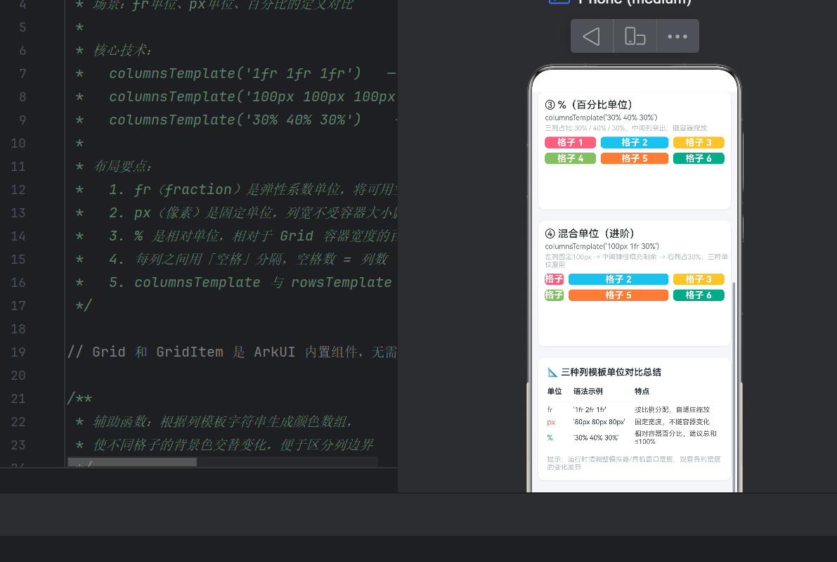
Text("columnsTemplate('30% 40% 30%')")
.fontSize(13).fontColor('#636E72')
.fontFamily('Courier New').width('100%')
.padding({ left: 12, bottom: 4 })
Text('三列占比 30% / 40% / 30%,中间列突出')
.fontSize(12).fontColor('#B2BEC3')
.width('100%').padding({ left: 12, bottom: 8 })
Grid() {
ForEach(generateColors(3, 2), (color: ResourceColor, index: number) => {
GridItem() {
Column() {
Text(`格子 ${index + 1}`)
.fontSize(16).fontColor(Color.White)
.fontWeight(FontWeight.Bold).textAlign(TextAlign.Center)
.width('100%')
}.width('100%').height('100%')
.justifyContent(FlexAlign.Center)
}.backgroundColor(color).borderRadius(6)
})
}
.columnsTemplate('30% 40% 30%') // 三列30% / 40% / 30%
.rowsTemplate('60px 60px')
.columnsGap(8).rowsGap(8)
.width('100%').height(128)
.padding({ left: 12, right: 12, bottom: 12 })
}
.backgroundColor(Color.White).borderRadius(12)
.shadow({ radius: 4, color: '#1A000000', offsetX: 0, offsetY: 2 })
.width('94%')
// ===== 示例四:混合 =====
Column() {
Text('④ 混合单位(进阶)').fontSize(18)
.fontWeight(FontWeight.Medium).width('100%')
.padding({ left: 12, top: 12, bottom: 4 })
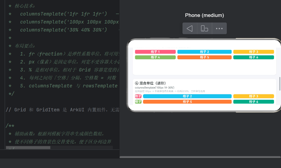
Text("columnsTemplate('100px 1fr 30%')")
.fontSize(13).fontColor('#636E72')
.fontFamily('Courier New').width('100%')
.padding({ left: 12, bottom: 4 })
Text('左列固定100px → 中间弹性 → 右列占30%')
.fontSize(12).fontColor('#B2BEC3')
.width('100%').padding({ left: 12, bottom: 8 })
Grid() {
ForEach(generateColors(3, 2), (color: ResourceColor, index: number) => {
GridItem() {
Column() {
Text(`格子 ${index + 1}`)
.fontSize(16).fontColor(Color.White)
.fontWeight(FontWeight.Bold).textAlign(TextAlign.Center)
.width('100%')
}.width('100%').height('100%')
.justifyContent(FlexAlign.Center)
}.backgroundColor(color).borderRadius(6)
})
}
.columnsTemplate('100px 1fr 30%') // 混合:px + fr + %
.rowsTemplate('60px 60px')
.columnsGap(8).rowsGap(8)
.width('100%').height(128)
.padding({ left: 12, right: 12, bottom: 12 })
}
.backgroundColor(Color.White).borderRadius(12)
.shadow({ radius: 4, color: '#1A000000', offsetX: 0, offsetY: 2 })
.width('94%')
}
.width('100%')
}
.width('100%').height('100%').backgroundColor('#F5F6FA')
}
}
四、fr 单位深度解析(弹性比例)
4.1 什么是 fr
fr 是 “fraction” 的缩写,代表弹性比例单位。它将 Grid 容器的可用宽度(扣除固定列和间距后的剩余空间)按比例分配给各列。
.columnsTemplate('1fr 1fr 1fr')  // 三列等宽
.columnsTemplate('1fr 2fr 1fr')  // 中间列是两侧的两倍
4.2 计算原理
以容器宽 360vp、模板 '1fr 2fr 1fr'、columnsGap 8vp 为例:
- 扣除间距: 8 × (3-1) = 16vp
- 可用空间: 360 - 16 = 344vp
- 每份 fr 值: 344 ÷ (1+2+1) = 86vp
- 列宽: 86vp、172vp、86vp
4.3 特性与适用场景
| 维度 | 说明 |
|---|---|
| 自适应 | 是,窗口缩放时自动等比例调整 |
| 总和约束 | 无(总份额自动归一化) |
| 多设备兼容 | 优 |
| 典型场景 | 自适应卡片列表、仪表盘面板、商品网格 |
适用场景: 等分卡片列表(1fr 1fr 1fr)、正文+侧边栏(2fr 1fr)、自适应面板。
五、px 单位深度解析(固定像素)
5.1 什么是 px(vp)
ArkUI 中 px 对应 vp(虚拟像素),是设备无关像素,在不同密度设备上视觉尺寸一致。
.columnsTemplate('80px 80px 80px') // 三列各宽80vp
5.2 计算原理
px 列宽就是字面值,不受容器大小影响。同样容器宽 360vp、模板 '80px 80px 80px':
- 列总宽:240vp
- 间距:16vp
- 剩余 104vp(右侧留白)
容器变宽时右侧留白,变窄时右侧可能溢出。
5.3 特性与适用场景
| 维度 | 说明 |
|---|---|
| 自适应 | 否,固定不变 |
| 精度 | 绝对精确 |
| 多设备兼容 | 差 |
| 典型场景 | 头像列表、固定尺寸图标、日历网格 |
溢出应对: 放在 Scroll 容器中允许横向滚动,或配合媒体查询在不同宽度下切换模板。
六、百分比单位深度解析(%)
6.1 定义
百分比表示列宽占 Grid 容器总宽度的比例。
.columnsTemplate('30% 40% 30%')   // 中列最宽
.columnsTemplate('50% 50%')        // 两列各半
6.2 计算原理
列宽 = 容器宽 × (百分比/100)。以 360vp 容器、'30% 40% 30%'为例:
- 108vp、144vp、108vp
注意:百分比计算的是容器总宽,而非扣除间距后的宽度。
6.3 必须注意的陷阱
陷阱一:百分比总和。总和 > 100% 会导致列重叠或溢出:
// 危险:总和 110%
.columnsTemplate('40% 40% 30%')

// 安全:总和 100%
.columnsTemplate('30% 40% 30%')
陷阱二:间距叠加。'50% 50%' 加 16vp columnsGap 会使总占用超过容器宽度。建议百分比总和控制在 95%~98% 为间距留出余量。
6.4 特性与适用场景
| 维度 | 说明 |
|---|---|
| 自适应 | 是,按比例缩放 |
| 精度 | 相对精确(需注意总和) |
| 多设备兼容 | 良好 |
| 典型场景 | 对称布局(50% 50%)、突出中栏(20% 60% 20%) |
七、三种单位运行时对比
| 维度 | fr | px | % |
|---|---|---|---|
| 基准 | 剩余可用空间 | 绝对 vp 值 | 容器总宽 |
| 自适应 | 是,等比例 | 否,固定 | 是,按比例 |
| 容器变宽 | 列变宽 | 右侧留白 | 列变宽 |
| 容器变窄 | 列变窄 | 右侧溢出 | 列变窄 |
| 总和约束 | 无 | 无 | 建议 100% |
| 调试难度 | 低 | 低 | 中 |
| 多设备适配 | 优 | 差 | 良好 |
八、混合单位实战
混合模板的分配优先级:先 px → 再 % → 最后 fr。
以 '100px 1fr 30%'、容器宽 360vp、gap 8vp 为例:
间距:8 × 2 = 16vp
px 列:100vp
% 列:360 × 30% = 108vp
剩余空间:360 - 16 - 100 - 108 = 136vp
fr 列(1fr):136vp
实战建议:
- px 列放在最左侧,不受其他列影响
- % 列计算容器总宽百分比,多个 % 列互不影响
- 混合模板中至少保留一个 fr 列充当弹性缓冲区
- 常见组合:
'200px 1fr'(左侧固定 + 自适应)、'1fr 200px'(自适应 + 右侧固定)、'80px 1fr 200px'(三栏经典布局)
九、与 rowsTemplate 的配合
rowsTemplate 支持同三种单位,作用于行高:
Grid() {
  // 6 个 GridItem
}
.columnsTemplate('1fr 1fr 1fr')   // 三列
.rowsTemplate('60px 60px')        // 两行固定高
当 GridItem 数量 = 列数 × 行数时形成规则矩形网格。columnsGap 和 rowsGap 控制间距。
十、最佳实践
10.1 单位选型原则
- 需要弹性自适应 → fr(首选,最安全)
- 子组件尺寸固定 → px(图标、头像等)
- 需要明确比例 → %(注意总和 + 间距)
10.2 性能要点
- 避免 Grid 嵌套 Grid,除非确实需要子网格
- 50+ 个 GridItem 时用 ForEach 启用懒加载
- 开发时用交替背景色调试列边界(参考示例中的
generateColors)
10.3 调试建议
- DevEco Studio Inspector 可实时查看 Grid 列宽
- 在不同尺寸模拟器上验证布局弹性行为
- 关注 Hvigor 编译警告中的 layout 相关信息
十一、总结
columnsTemplate 的三种单位是 Grid 布局的核心语法:
- fr 弹性布局首选,自动分配剩余空间,适应性强
- px 像素级精确控制,适合固定元素,注意溢出
- % 按容器百分比分配,需注意总和 + 间距
- 混合使用最强大,理解"先 px 再 % 最后 fr"的优先级
在 HarmonyOS NEXT 开发中,掌握这三种单位的特性和适用场景,能让你应对从简单的卡片网格到复杂的仪表盘面板等各类布局需求。建议在模拟器中运行示例代码,调整窗口宽度观察三种单位的差异化表现,加深理解。
本文示例代码基于 HarmonyOS NEXT API 24(ArkTS),项目创建后替换 Index.ets 即可运行。

作为“人工智能6S店”的官方数字引擎,为AI开发者与企业提供一个覆盖软硬件全栈、一站式门户。
更多推荐
 4
4 0
0- 0


 已为社区贡献5条内容

所有评论(0)