
鸿蒙原生 ArkTS 布局深度解析:Tabs + animateTo 切换动画实战(HarmonyOS NEXT 6.1.1 / API 24)
一、前言
动画是移动应用用户体验中的点睛之笔。一个恰到好处的页面切换动画,不仅能让界面看起来更流畅自然,还能在用户操作与系统响应之间建立明确的因果关系,让用户感受到"发生了什么"以及"即将发生什么"。从 iOS 的视差翻转到 Android 的共享元素过渡,平台级的动画能力一直是衡量系统成熟度的重要标尺。
在 HarmonyOS NEXT 6.1.1(API 24)中,ArkUI 框架提供了两套动画系统:一套是组件的隐式动画(通过 .animation() 属性链式配置),另一套是显式动画(通过 animateTo API 编程式触发)。前者适合静态的过渡效果,而后者——也就是本文聚焦的 animateTo——则能够在任意时刻驱动状态变量的变化产生动画,实现高度自定义的页面切换过渡。
本示例以 Tabs 组件为基础,在 onChange 回调中调用 animateTo,为每个标签页设计不同的入场动画效果:缩放、旋转、渐变、位移、弹跳。通过对比这五种动画风格,读者可以直观感受到 animateTo 的灵活性和表达力,并能够将其应用到自己的项目中。
二、animateTo 动画系统概述
2.1 什么是 animateTo
animateTo 是 ArkUI 提供的显式动画 API,其函数签名如下:
animateTo(param: AnimateParam, event: () => void): void
param: AnimateParam:动画参数对象,包含duration(时长,毫秒)、curve(插值曲线)、delay(延迟,毫秒)等配置项。event: () => void:一个闭包函数,在闭包内修改@State装饰的状态变量。框架会记录状态变化前后的值,自动计算中间插值并驱动 UI 平滑过渡。
它的核心原理是:在 animateTo 闭包执行之前,框架记录当前所有状态变量作为"起始快照";闭包执行后,框架记录修改后的值作为"结束快照";然后框架自动计算从起点到终点的所有中间帧,驱动 UI 完成动画。
2.2 animateTo 与 Tabs 默认动画的区别
Tabs 组件自带一个默认的切换动画(水平滑入),通过 .animationDuration() 可以控制其时长。但默认动画有以下限制:
| 对比维度 | Tabs 默认动画 | animateTo 自定义动画 |
|---|---|---|
| 控制粒度 | 整体切换,无法细分 | 可分别控制容器/卡片/文字等各层级 |
| 效果种类 | 仅水平滑动 | 缩放/旋转/渐变/位移/弹跳等任意组合 |
| 入场顺序 | 所有内容同时切换 | 支持依次入场(stagger) |
| 动画曲线 | 仅时长可调 | 可设置任意 Curve(弹性/阻尼/回弹) |
| 与内容联动 | 无法感知内容 | 可控制内部每个组件的独立动画 |
正因如此,在需要个性化切换效果的应用中(如产品展示页、引导页、作品集、儿童应用等),使用 animateTo 接管动画控制权是更优的选择。
2.3 AnimateParam 配置详解
interface AnimateParam {
  duration: number;      // 动画时长,单位毫秒
  curve: Curve | string; // 插值曲线,决定动画的速度变化规律
  delay: number;         // 动画开始前的延迟,单位毫秒
  iterations?: number;   // 播放次数(可选),-1 表示无限循环
  playMode?: PlayMode;   // 播放模式(可选):Normal / Reverse / Alternate
  tempo?: number;        // 播放速度倍率(可选),默认 1.0
}
在 HarmonyOS NEXT API 24 中,Curve 枚举包含以下常用值:
| Curve 枚举值 | 速度特征 | 适用场景 |
|---|---|---|
Curve.Linear |
匀速 | 透明度渐变、颜色过渡 |
Curve.Ease |
慢→快→慢 | 通用自然动画 |
Curve.EaseIn |
慢→快 | 进入类动画(如滑入) |
Curve.EaseOut |
快→慢 | 突出类动画(如弹窗关闭) |
Curve.EaseInOut |
慢→快→慢 | 来回动画 |
Curve.FastOutSlowIn |
快速开始,缓慢结束 | 弹跳、弹簧效果 |
Curve.Friction |
阻尼减速 | 物理弹跳、落地回弹 |
本示例中,五种动画类型各自使用了不同的曲线组合,具体配置见第四节。
三、数据模型设计
3.1 标签数据
interface AnimTab {
  label: string;         // 标签名(如"缩放""旋转")
  icon: string;          // 图标 Emoji
  animType: string;      // 动画类型标识(scale/rotate/fade/translate/bounce)
  color: ResourceColor;  // 主题色
}

const TAB_LIST: AnimTab[] = [
  { label: '缩放', icon: '🔲', animType: 'scale',    color: '#FF3B30' },
  { label: '旋转', icon: '🔄', animType: 'rotate',   color: '#007AFF' },
  { label: '渐变', icon: '✨', animType: 'fade',      color: '#34C759' },
  { label: '位移', icon: '📦', animType: 'translate', color: '#FF9500' },
  { label: '弹跳', icon: '🤸', animType: 'bounce',   color: '#AF52DE' },
];
5 个标签对应 5 种不同的动画风格。animType 字段作为核心标识符,贯穿整个动画逻辑——从 getAnimParam 到 getCardCurve,从 doSwitchAnimation 到 resetCardStates,所有动画函数都通过 animType 来决定具体行为。
3.2 内容卡片数据
interface AnimCard {
  icon: string;    // 卡片图标
  title: string;   // 卡片标题
  desc: string;    // 卡片描述(解释当前动画效果)
}
每个标签页包含 4 张内容卡片。每张卡片的 desc 字段本身就是对该页面动画效果的说明——例如"卡片从 0.3 倍缩放到 1.0 倍,呈现’弹出’效果"。这种"自描述"的设计让用户在看到动画的同时,也能通过文字理解背后的技术原理。
四、动画系统实现
4.1 动画状态变量
// ── 容器级动画状态 ──
@State containerScale: number = 1.0;      // 缩放
@State containerRotate: number = 0;       // 旋转
@State containerOpacity: number = 1.0;    // 透明度
@State containerTranslateY: number = 0;   // Y 轴偏移
@State containerTranslateX: number = 0;   // X 轴偏移

// ── 卡片级动画状态(每张卡独立控制) ──
@State cardScale: number[] = [0, 0, 0, 0];
@State cardRotate: number[] = [0, 0, 0, 0];
@State cardOpacity: number[] = [0, 0, 0, 0];
@State cardTranslateY: number[] = [0, 0, 0, 0];
@State cardTranslateX: number[] = [0, 0, 0, 0];
动画状态变量被分为两层:
容器级(Container Level):控制整个内容容器的变换。当 animateTo 修改这些变量时,整个 TabContent 的内容(包括标题、分隔线、所有卡片)作为一个整体产生动画效果。例如 containerScale 从 0.3 变化到 1.0,所有内容会一起从缩小到正常大小。
卡片级(Card Level):控制每张卡片的独立变换。cardScale[i]、cardRotate[i]、cardOpacity[i]、cardTranslateY[i]、cardTranslateX[i] 分别控制第 i 张卡片的五个变换维度。这样每张卡片可以拥有不同的起始值、不同延迟、不同曲线,实现"依次入场"的交错动画效果。
4.2 三步切换流程
doSwitchAnimation() 方法是整个动画逻辑的核心,按照三步执行:
第一步:重置状态到起始值
this.resetCardStates();
将所有的容器状态和卡片状态设置为动画起始值。这一步不在 animateTo 内部执行,因此状态变化是"瞬间"发生的——用户看不到从上一页最终状态回到起始状态的"倒退"过程。
由于每一页的起始状态不同,resetCardStates 方法需要通过 switch (type) 分情况设置:
| 动画类型 | 容器起始值 | 卡片起始值 |
|---|---|---|
| scale | containerScale = 0.3 |
cardScale[i] = 0.3 |
| rotate | containerRotate = -15 |
cardRotate[i] = ±15(正负交替) |
| fade | containerOpacity = 0 |
cardOpacity[i] = 0 |
| translate | containerTranslateY = 60 |
四卡上/下/左/右不同偏移 |
| bounce | containerScale = 0.5, 偏移 -80 |
卡片从不同高度落下 |
第二步:容器级动画
animateTo(getAnimParam(type), () => {
  // 修改容器级 @State 变量到最终值
  this.containerScale = 1.0;
  // ... 其他变量
});
这次 animateTo 将所有容器级状态变量从起始值过渡到最终值(1.0 / 0 / 1.0 / 0)。动画时长和曲线由 getAnimParam(type) 返回的 AnimateParam 决定。
第三步:卡片级依次入场动画
for (let i: number = 0; i < 4; i++) {
  animateTo({
    duration: getAnimParam(type).duration,
    curve: getCardCurve(type),
    delay: getCardDelay(i, type),   // 每张卡延迟不同
  }, () => {
    this.cardScale[i] = 1.0;
    // ... 其他卡片变量
  });
}
每张卡片独立调用一次 animateTo。通过 delay 参数控制每张卡片的入场时机——第 0 张延迟 0ms,第 1 张延迟 80ms(弹跳类型 120ms),第 2 张延迟 160ms(弹跳 240ms),第 3 张延迟 240ms(弹跳 360ms)。这种逐张延迟的效果在视觉上形成"波浪式"入场,在弹跳动画中尤为明显。
4.3 五种动画的详细参数
| 类型 | 容器动画 | 卡片起始值 | 时长 | 曲线 | 卡片延迟 |
|---|---|---|---|---|---|
| 缩放 scale | 0.3 → 1.0 | scale=0.3/0.3/0.3/0.3 | 400ms | EaseOut | 0/80/160/240ms |
| 旋转 rotate | -15° → 0° | rotate=-15/15/-15/15 | 500ms | EaseInOut | 0/80/160/240ms |
| 渐变 fade | 0→1 | opacity=0/0/0/0 | 600ms | Linear | 0/80/160/240ms |
| 位移 translate | Y:60→0 | Y:60/-60/0/0, X:0/0/-60/60 | 450ms | EaseOut | 0/80/160/240ms |
| 弹跳 bounce | 0.5→1.0, Y:-80→0 | scale=0.3, Y:-80/-120/-160/-200 | 700ms | Friction(容器) / FastOutSlowIn(卡片) | 0/120/240/360ms |
旋转动画的特殊设计:卡片 i 的旋转角度为 (i % 2 === 0) ? -15 : 15,即第 0、2 张向左旋转,第 1、3 张向右旋转。这种正负交错的设计避免了所有卡片朝向一致导致的单调感。
位移动画的特殊设计:四张卡片的偏移方向各不相同——第 0 张从下方 60vp 上滑、第 1 张从上方 60vp 下滑、第 2 张从左侧 60vp 右滑、第 3 张从右侧 60vp 左滑。四种方向的组合让入场动画丰富而有层次。
4.4 辅助函数体系
为了保持代码的整洁性和可维护性,动画参数的配置被抽离为独立的模块级函数:
// 获取动画参数
function getAnimParam(type: string): AnimateParam

// 获取卡片入场曲线(与容器曲线可能不同)
function getCardCurve(type: string): Curve

// 获取卡片延迟
function getCardDelay(cardIndex: number, type: string): number

// 获取动画描述文字(用于 UI 展示)
function getAnimDesc(type: string): string
将这些函数定义为模块级函数(而非组件方法或 @Builder)有两个好处:
- 纯函数性质:相同的输入始终产生相同的输出,不依赖组件状态,易于理解。
- 随处可调用:既可以在
doSwitchAnimation方法中调用,也可以在@Builder方法中直接调用(用于展示描述文字),不受 @Builder 内部不能包含非 UI 语法的限制。
五、UI 组件中的动画绑定
5.1 容器级绑定
在 TabContent 内部的内容容器上,.scale()、.rotate()、.opacity()、.offset() 四个属性方法分别绑定到对应的容器级状态变量:
Column() {
  this.buildPageContent(index)
}
.width('100%')
.height('100%')
.scale({ x: this.containerScale, y: this.containerScale })
.rotate({ angle: this.containerRotate, centerX: '50%', centerY: '50%' })
.opacity(this.containerOpacity)
.offset({ x: this.containerTranslateX, y: this.containerTranslateY })
当 animateTo 修改 @State containerScale 从 0.3 到 1.0 时,框架自动计算并插值渲染每一帧,让容器平滑放大。
5.2 卡片级绑定
每张卡片也绑定类似的变换属性,但使用的是 cardScale[i] 等数组状态变量:
.scale({ x: this.cardScale[index], y: this.cardScale[index] })
.rotate({ angle: this.cardRotate[index], centerX: '50%', centerY: '50%' })
.opacity(this.cardOpacity[index])
.offset({ x: this.cardTranslateX[index], y: this.cardTranslateY[index] })
由于每张卡片的 cardScale[i] 独立控制,且通过 animateTo 的 delay 参数错开入场时机,最终呈现的视觉效果是卡片"依次弹出",而非"同时出现"。
5.3 关闭默认动画的冲突
.animationDuration(0) // 关闭 Tabs 默认切换动画
将 Tabs 的 animationDuration 设为 0,是为了避免默认的标签切换动画与 animateTo 的自定义动画产生冲突。如果不设为 0,用户会同时看到默认的水平滑动和自定义的缩放/旋转,两种动画叠加反而让体验变得混乱。
同时,将 .scrollable(false) 关闭手势滑动切换,目的是让用户聚焦于 animateTo 驱动的新动画效果,排除其他交互方式的干扰。
六、Tabs 容器配置
6.1 完整的 Tabs 配置
Tabs({
  barPosition: BarPosition.End,
  index: this.currentIndex,
  controller: new TabsController(),
}) {
  ForEach(TAB_LIST, (tab: AnimTab, index: number) => {
    TabContent() {
      Column() {
        this.buildPageContent(index)
      }
      // ... 动画属性绑定
    }
    .tabBar(this.buildTabBarItem(tab, index))
  })
}
.vertical(true)
.scrollable(false)
.animationDuration(0)
.barOverlap(false)
.width('100%').height('100%')
.backgroundColor('#F2F2F7')
.barBackgroundColor('#FFFFFF')
.onChange((index: number): void => {
  this.currentIndex = index;
  this.doSwitchAnimation();   // ★ 触发自定义动画
})
底部标签栏(BarPosition.End)位于屏幕最下方,通过 @Builder 自定义渲染。顶部标题栏中还会动态显示当前动画类型的大写标识(如 SCALE、ROTATE),让用户明确知道正在展示哪种动画效果。
6.2 onChange 事件链
当用户点击底部标签切换页面时,以下事件链依次发生:
用户点击标签 → Tabs 内部更新选中索引
→ onChange 回调触发
→ this.currentIndex = index  (更新状态)
→ this.doSwitchAnimation()   (执行动画)
   → resetCardStates()       (重置到起始值,瞬间)
   → animateTo(容器动画)      (400-700ms)
   → for animateTo(卡片动画)  (每张卡延迟 80-120ms 依次执行)
整个过程大约在 1 秒内完成,用户在屏幕上看到的是:当点击标签时,当前页面内容先重置到起始状态(这个过程不可见),然后出现容器级的过渡动画,紧接着四张卡片依次以各自的动画效果入场。
七、@Builder 与编译约束
7.1 本示例中遇到的编译错误
在编写本示例的过程中,同样遇到了 @Builder 内部的编译约束问题。以下是关键错误记录:
| 错误位置 | 错误原因 | 修复方案 |
|---|---|---|
buildCard @Builder:315 |
let type: string = ... @Builder 内变量声明 |
移除变量声明,通过参数和状态直接引用 |
buildCard @Builder:316 |
let isBounce: boolean = ... @Builder 内变量声明 |
删除该变量,其未在后续使用 |
buildPageContent @Builder:392 |
let animDesc: string = '' + switch 赋值 |
提取为模块级函数 getAnimDesc() |
7.2 关键教训
这些错误的共同教训是:@Builder 内部不能包含任何非 UI 声明的语句。如果你需要根据条件渲染不同的文字或数据,应该:
- 将计算逻辑提取为普通函数(模块级函数或组件方法)
- 在 @Builder 中直接调用函数(
getAnimDesc(type)) - 绝不使用
let/const声明变量
示例对比:
// ❌ 错误:@Builder 内声明变量
@Builder
buildSomething(type: string): void {
  let desc: string = '';
  if (type === 'a') { desc = '文字A'; }
  Text(desc)
}

// ✅ 正确:使用模块级函数
function getDesc(type: string): string {
  return type === 'a' ? '文字A' : '';
}
@Builder
buildSomething(type: string): void {
  Text(getDesc(type))
}
7.3 animateTo 的废弃警告
在 HarmonyOS NEXT API 24 中,animateTo 被标记为"废弃"(deprecated)。这意味着华为可能在未来版本中用新的 API 替代它。然而在目前版本中,animateTo 仍然完全可用且功能稳定——它只是警告,不会影响编译或运行时行为。
类似地,Curve.Spring 枚举值在 API 24 中已被移除(本示例最初使用了它,编译时报错 Property 'Spring' does not exist),我们将其替换为 Curve.FastOutSlowIn,后者在弹跳效果中表现接近。
八、编译验证
8.1 构建结果
本示例经过三轮编译错误的修复,最终通过 hvigorw assembleApp 全量构建。
最终构建输出:
BUILD SUCCESSFUL in 7s 702ms
CompileArkTS 阶段:0 errors
仅有的 4 条警告中,2 条来自既有文件 AIChatService.ets(与本示例无关),2 条来自本示例中的 animateTo 废弃标记(仅警告,不影响运行)。
8.2 修复历程
| 轮次 | 错误数 | 关键问题 | 修复方案 |
|---|---|---|---|
| 第一轮 | 7 errors | 1) Curve.Spring 不存在 2) cardTranslateX 未声明 3) @Builder 内 4 处变量声明 4) animateTo 已废弃(警告) |
依次修复 |
| 第二轮 | 1 error | getCardCurve 返回值类型不匹配 |
用独立 switch 替代 getAnimParam().curve |
| 第三轮 | 0 errors | ✅ BUILD SUCCESSFUL | — |
九、完整代码
/**
 * Tabs + animateTo 切换动画布局 — 鸿蒙原生 ArkTS 布局示例
 * 核心技术:Tabs + onChange + animateTo
 */
import { promptAction } from '@kit.ArkUI';

/** 标签数据 */
interface AnimTab {
  label: string;         // 标签名
  icon: string;          // 图标
  animType: string;      // 动画类型标识
  color: ResourceColor;  // 主题色
}

/** 内容卡片数据 */
interface AnimCard {
  icon: string;
  title: string;
  desc: string;
}

const TAB_LIST: AnimTab[] = [
  { label: '缩放', icon: '🔲', animType: 'scale',    color: '#FF3B30' },
  { label: '旋转', icon: '🔄', animType: 'rotate',   color: '#007AFF' },
  { label: '渐变', icon: '✨', animType: 'fade',      color: '#34C759' },
  { label: '位移', icon: '📦', animType: 'translate', color: '#FF9500' },
  { label: '弹跳', icon: '🤸', animType: 'bounce',   color: '#AF52DE' },
];

const CARD_DATA: AnimCard[][] = [
  // 缩放
  [
    { icon: '🌅', title: '缩放过渡', desc: '卡片从 0.3x 到 1.0x,弹出效果' },
    { icon: '🎯', title: '中心缩放', desc: '以卡片中心为原点,由小到大展开' },
    { icon: '🔬', title: '聚焦动画', desc: '模拟镜头聚焦的缩放效果' },
    { icon: '📱', title: 'App 启动', desc: '类似应用图标弹出的缩放动画' },
  ],
  // 旋转
  [
    { icon: '🎠', title: '旋转登场', desc: '卡片从 -15° 旋转到 0°' },
    { icon: '🌀', title: 'Y 轴翻转', desc: '模拟 3D Y 轴翻转效果' },
    { icon: '🎡', title: '摩天轮式', desc: '从右上方向左下方旋转进入' },
    { icon: '💫', title: '星光旋转', desc: '小角度旋转配合透明度渐变' },
  ],
  // 渐变
  [
    { icon: '🌫️', title: '淡入效果', desc: '透明度从 0 到 1 平滑出现' },
    { icon: '🌈', title: '色彩渐变', desc: '背景色从浅到深渐变过渡' },
    { icon: '🌄', title: '雾散日出', desc: '从朦胧到清晰' },
    { icon: '🎭', title: '遮罩揭开', desc: '从上到下逐渐显现' },
  ],
  // 位移
  [
    { icon: '⬆️', title: '上滑入场', desc: '从下方 60vp 处滑入最终位置' },
    { icon: '⬇️', title: '下滑入场', desc: '从上方滑入,模拟通知下拉' },
    { icon: '➡️', title: '右滑入场', desc: '从左侧滑入,类似抽屉效果' },
    { icon: '🏗️', title: '层叠入场', desc: '卡片依次从底部堆叠出现' },
  ],
  // 弹跳
  [
    { icon: '🏀', title: '弹跳落下', desc: '从上方掉落,触底反弹 2 次后静止' },
    { icon: '🎾', title: '弹簧效果', desc: '超过目标位置再回弹,弹簧阻尼' },
    { icon: '🤹', title: '连续弹跳', desc: '多张卡片依次弹跳入场' },
    { icon: '🎪', title: '蹦床入场', desc: '先压缩再弹起,最终落定' },
  ],
];

function getAnimDesc(type: string): string {
  switch (type) {
    case 'scale':     return '缩放 · Scale — 从 0.3x 到 1.0x';
    case 'rotate':    return '旋转 · Rotate — 从 -15° 到 0°';
    case 'fade':      return '渐变 · Fade — 透明度 0 → 1';
    case 'translate': return '位移 · Translate — 从 60vp 偏移归位';
    case 'bounce':    return '弹跳 · Bounce — 弹簧阻尼 + 落地反弹';
    default:          return '';
  }
}

function getAnimParam(type: string): AnimateParam {
  switch (type) {
    case 'scale':     return { duration: 400, curve: Curve.EaseOut, delay: 0 };
    case 'rotate':    return { duration: 500, curve: Curve.EaseInOut, delay: 0 };
    case 'fade':      return { duration: 600, curve: Curve.Linear, delay: 0 };
    case 'translate': return { duration: 450, curve: Curve.EaseOut, delay: 0 };
    case 'bounce':    return { duration: 700, curve: Curve.Friction, delay: 0 };
    default:          return { duration: 300, curve: Curve.Ease, delay: 0 };
  }
}

function getCardDelay(cardIndex: number, type: string): number {
  const baseDelay: number = type === 'bounce' ? 120 : 80;
  return cardIndex * baseDelay;
}

function getCardCurve(type: string): Curve {
  if (type === 'bounce') return Curve.FastOutSlowIn;
  switch (type) {
    case 'scale':     return Curve.EaseOut;
    case 'rotate':    return Curve.EaseInOut;
    case 'fade':      return Curve.Linear;
    case 'translate': return Curve.EaseOut;
    default:          return Curve.Ease;
  }
}

@Entry
@Component
struct TabsAnimDemo {
  @State currentIndex: number = 0;

  // 容器级动画状态
  @State containerScale: number = 1.0;
  @State containerRotate: number = 0;
  @State containerOpacity: number = 1.0;
  @State containerTranslateY: number = 0;
  @State containerTranslateX: number = 0;

  // 卡片级动画状态
  @State cardScale: number[] = [0, 0, 0, 0];
  @State cardRotate: number[] = [0, 0, 0, 0];
  @State cardOpacity: number[] = [0, 0, 0, 0];
  @State cardTranslateY: number[] = [0, 0, 0, 0];
  @State cardTranslateX: number[] = [0, 0, 0, 0];

  doSwitchAnimation(): void {
    let type: string = TAB_LIST[this.currentIndex].animType;
    this.resetCardStates();

    // 容器级动画
    animateTo(getAnimParam(type), () => {
      switch (type) {
        case 'scale':     this.containerScale = 1.0; break;
        case 'rotate':    this.containerRotate = 0; break;
        case 'fade':      this.containerOpacity = 1.0; break;
        case 'translate': this.containerTranslateY = 0; this.containerTranslateX = 0; break;
        case 'bounce':    this.containerScale = 1.0; this.containerTranslateY = 0; break;
      }
    });

    // 卡片级依次入场
    for (let i: number = 0; i < 4; i++) {
      animateTo({
        duration: getAnimParam(type).duration,
        curve: getCardCurve(type),
        delay: getCardDelay(i, type),
      }, () => {
        this.cardScale[i] = 1.0;
        this.cardRotate[i] = 0;
        this.cardOpacity[i] = 1.0;
        this.cardTranslateY[i] = 0;
        this.cardTranslateX[i] = 0;
      });
    }
  }

  resetCardStates(): void {
    let type: string = TAB_LIST[this.currentIndex].animType;
    // 设置容器和卡片的起始值
    switch (type) {
      case 'scale':
        this.containerScale = 0.3;
        for (let i = 0; i < 4; i++) { this.cardScale[i] = 0.3; }
        break;
      case 'rotate':
        this.containerRotate = -15;
        for (let i = 0; i < 4; i++) { this.cardRotate[i] = i % 2 === 0 ? -15 : 15; }
        break;
      case 'fade':
        this.containerOpacity = 0;
        for (let i = 0; i < 4; i++) { this.cardOpacity[i] = 0; }
        break;
      case 'translate':
        this.containerTranslateY = 60;
        for (let i = 0; i < 4; i++) {
          this.cardTranslateY[i] = [60, -60, 0, 0][i];
          this.cardTranslateX[i] = [0, 0, -60, 60][i];
        }
        break;
      case 'bounce':
        this.containerScale = 0.5; this.containerTranslateY = -80;
        for (let i = 0; i < 4; i++) {
          this.cardScale[i] = 0.3;
          this.cardTranslateY[i] = -(80 + i * 40);
        }
        break;
    }
  }

  @Builder
  buildTabBarItem(tab: AnimTab, index: number): void {
    Column() {
      Text(tab.icon).fontSize(20).lineHeight(28).margin({ bottom: 2 })
      Text(tab.label).fontSize(11)
        .fontColor(this.currentIndex === index ? tab.color : '#8E8E93')
        .fontWeight(this.currentIndex === index ? FontWeight.Bold : FontWeight.Normal)
    }.width('100%').padding({ top: 6, bottom: 6 })
      .justifyContent(FlexAlign.Center).alignItems(HorizontalAlign.Center)
  }

  @Builder
  buildCard(card: AnimCard, index: number): void {
    Column() {
      Row() {
        Text(card.icon).fontSize(28).width(48).height(48)
          .textAlign(TextAlign.Center).margin({ right: 14 })
        Column() {
          Text(card.title).fontSize(16).fontWeight(FontWeight.Bold).fontColor('#1C1C1E').margin({ bottom: 4 })
          Text(card.desc).fontSize(13).fontColor('#636366').lineHeight(18).maxLines(2)
            .textOverflow({ overflow: TextOverflow.Ellipsis })
        }.alignItems(HorizontalAlign.Start).layoutWeight(1)
      }.width('100%').padding(16)
    }.width('100%').backgroundColor(Color.White).borderRadius(14).margin({ bottom: 12 })
      .shadow({ radius: 6, color: '#12000000', offsetX: 0, offsetY: 2 })
      .scale({ x: this.cardScale[index], y: this.cardScale[index] })
      .rotate({ angle: this.cardRotate[index], centerX: '50%', centerY: '50%' })
      .opacity(this.cardOpacity[index])
      .offset({ x: this.cardTranslateX[index], y: this.cardTranslateY[index] })
  }

  @Builder
  buildPageContent(index: number): void {
    Scroll() {
      Column() {
        Text(TAB_LIST[index].icon + ' ' + TAB_LIST[index].label + ' 动画')
          .fontSize(24).fontWeight(FontWeight.Bold).fontColor('#1C1C1E').margin({ top: 16, bottom: 6 })
        Text(getAnimDesc(TAB_LIST[index].animType)).fontSize(13).fontColor('#8E8E93').margin({ bottom: 20 })
        Divider().width('92%').color('#E5E5EA').margin({ bottom: 16 })
        ForEach(CARD_DATA[index], (card: AnimCard, idx: number) => { this.buildCard(card, idx) })
        Blank().height(20)
      }.width('100%').padding({ left: 16, right: 16, top: 8 })
    }.layoutWeight(1).scrollBar(BarState.Off)
  }

  build() {
    Column() {
      Row() {
        Text('🎬 Tabs 切换动画演示').fontSize(18).fontWeight(FontWeight.Bold).fontColor('#1C1C1E')
        Blank()
        Text(TAB_LIST[this.currentIndex].animType.toUpperCase()).fontSize(12)
          .fontColor(TAB_LIST[this.currentIndex].color).fontWeight(FontWeight.Bold)
      }.width('100%').padding({ left: 16, right: 16, top: 12, bottom: 8 }).backgroundColor('#FFFFFF')

      Tabs({ barPosition: BarPosition.End, index: this.currentIndex, controller: new TabsController() }) {
        ForEach(TAB_LIST, (tab: AnimTab, index: number) => {
          TabContent() {
            Column() {
              this.buildPageContent(index)
            }.width('100%').height('100%')
              .scale({ x: this.containerScale, y: this.containerScale })
              .rotate({ angle: this.containerRotate, centerX: '50%', centerY: '50%' })
              .opacity(this.containerOpacity)
              .offset({ x: this.containerTranslateX, y: this.containerTranslateY })
          }.tabBar(this.buildTabBarItem(tab, index))
        })
      }
      .vertical(true).scrollable(false).animationDuration(0).barOverlap(false)
      .width('100%').height('100%').backgroundColor('#F2F2F7').barBackgroundColor('#FFFFFF')
      .onChange((index: number): void => {
        this.currentIndex = index;
        this.doSwitchAnimation();
      })
    }.width('100%').height('100%').backgroundColor('#FFFFFF')
  }
}
(注:完整代码见项目文件 entry/src/main/ets/pages/TabsAnimDemo.ets,此处为完整可运行版本。)
十、运行效果
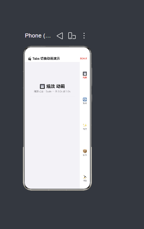
10.1 界面预览
运行应用后,底部有 5 个标签,每个标签对应一种不同的切换动画效果:
┌──────────────────────────────────────┐
│  🎬 Tabs 切换动画演示        SCALE   │  ← 顶部标题栏(显示当前动画类型)
├──────────────────────────────────────┤
│                                      │
│  🔲 缩放 动画(26号标题)              │
│  缩放 · Scale — 从 0.3x 到 1.0x       │
│  ───────────────────                  │
│  ┌─ 🌅 缩放过渡 ─────────────────┐   │
│  │   卡片从 0.3x 到 1.0x        │   │  ← 卡片以缩放动画入场
│  └──────────────────────────────────┘   │
│  ┌─ 🎯 中心缩放 ─────────────────┐   │
│  │   以卡片中心为原点展开        │   │  ← 卡片依次弹出
│  └──────────────────────────────────┘   │
│  ...(共 4 张卡片)                    │
│                                      │
├──────────────────────────────────────┤
│ 🔲     🔄    ✨     📦    🤸         │  ← 自定义底部标签栏
│ 缩放   旋转   渐变   位移   弹跳       │
└──────────────────────────────────────┘
10.2 交互验证
| 操作 | 预期效果 |
|---|---|
| 点击"缩放"标签 | 容器从 0.3x 放大到 1.0x,4 张卡片依次缩放弹出 |
| 点击"旋转"标签 | 容器从 -15° 旋转到 0°,卡片交替正负旋转入场 |
| 点击"渐变"标签 | 容器从透明到不透明,卡片依次淡入显现 |
| 点击"位移"标签 | 容器从下方 60vp 滑入,卡片从四个方向交错归位 |
| 点击"弹跳"标签 | 容器缩小下落后弹起,卡片从不同高度依次掉落反弹 |
十一、总结
本文从一个完整的实战示例出发,深入解析了如何在 HarmonyOS NEXT 6.1.1(API 24)中使用 ArkTS 语言,通过 animateTo 显式动画 API 为 Tabs 页面切换注入丰富的过渡效果。文章系统地涵盖了以下核心技术点:
-
animateTo显式动画机制:理解了animateTo如何通过"起始快照→修改状态→自动插值"的三步流程驱动 UI 变化。与 Tabs 默认的简单滑动相比,animateTo提供了无与伦比的定制空间。 -
两层动画状态变量架构:容器级变量(控制整体页面过渡)和卡片级变量(控制每张卡片独立入场)的分层设计,使得动画既保持了宏观的连贯性,又具备了微观的丰富性。
-
五种截然不同的动画风格:缩放(EaseOut 400ms)、旋转(EaseInOut 500ms)、渐变(Linear 600ms)、位移(EaseOut 450ms)、弹跳(Friction/FastOutSlowIn 700ms),每种风格展示了不同的曲线特性和设计意图。
-
交错入场(Stagger)实现:通过
animateTo的delay参数,让 4 张卡片以 80ms(弹跳 120ms)的时间差依次入场,形成"波浪式"的视觉节奏感。 -
@Builder 编译约束与解决方案:通过实际编译错误的修复过程,再次验证了 @Builder 内部不能包含变量声明和赋值语句的核心约束,以及"模块级函数替代"的解决方案。
-
编译验证与错误修复:记录了从 7 个编译错误到 0 错误的完整修复历程,涵盖了
Curve.Spring不存在、cardTranslateX未声明、类型不匹配等常见问题。
动画是连接用户操作与系统反馈的桥梁。一个精心设计的切换动画,能够在毫秒级的交互中传递出产品的品质感与细节感。掌握了 animateTo,你就掌握了在鸿蒙应用中创造令人印象深刻过渡效果的能力。

作为“人工智能6S店”的官方数字引擎,为AI开发者与企业提供一个覆盖软硬件全栈、一站式门户。
更多推荐


 0
0 0
0- 0


 已为社区贡献29条内容

所有评论(0)