
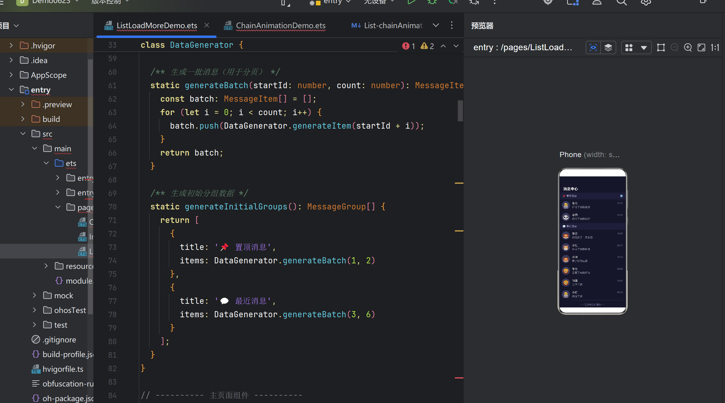
【共创季稿事节】鸿蒙原生 ArkTS 布局实战:List + 尾部加载更多布局完全解析
目录
引言:为什么需要尾部加载
HarmonyOS 列表布局体系概览
核心 API 详解
Demo 整体架构设计
逐层拆解 Demo 代码
尾部加载的三种状态管理
ListItemGroup 与 sectionHeader 详解
ArkTS 语法避坑指南
性能优化与最佳实践
常见问题排查
总结与展望
- 引言:为什么需要尾部加载
1.1 用户场景
假设你正在刷一个社交 App 的消息列表:
刚进入页面时,你看到了最近的 10 条消息。
继续向下滑动,滑到列表底部时,一条「正在加载更多…」的提示出现。
1 秒后,新的 10 条消息自动追加到列表末尾。
你再滑一次,底部提示再次出现,又一批新数据加载出来。
这种「滚动到底部 → 自动加载 → 追加数据」的交互模式,是移动端列表最流行的分页策略之一。它被称为:
无限滚动(Infinite Scroll)
尾部加载更多(Load More on Scroll)
触底加载(Reach End Loading)
1.2 为什么好?
体验顺滑:用户无需点击「下一页」按钮,滑动操作自然衔接。
感知不到分页:数据分页对用户透明,感觉就像一个完整的长列表。
性能可控:每次只追加一小批数据(如 5~20 条),不会导致一次渲染几千条造成卡顿。
1.3 鸿蒙方案的优势
在 HarmonyOS NEXT 中,ArkUI 框架内建了 List.onReachEnd() 事件 + ListItemGroup 分组容器,配合 LoadingProgress 原生加载指示器,开发者仅需少量代码即可实现完整的「带分组的无限滚动列表」。本文将从实战 Demo 出发,逐步拆解这一布局方案的完整实现。
- HarmonyOS 列表布局体系概览
2.1 列表的核心组件
组件 作用 对应平台概念
List 可滚动的列表容器 iOS: UITableView / Android: RecyclerView
ListItem 列表中的单个条目 iOS: UITableViewCell / Android: ViewHolder
ListItemGroup 带分组标题的条目组 iOS: UITableView section / Android: ConcatAdapter 分组
2.2 布局层次
Column (页面容器)
├── 标题栏 (Row)
└── List (可滚动容器)
├── ListItemGroup (分组 1)
│ ├── header: “置顶”
│ ├── ListItem: 条目 1
│ └── ListItem: 条目 2
├── ListItemGroup (分组 2)
│ ├── header: “最近”
│ ├── ListItem: 条目 3
│ ├── ListItem: 条目 4
│ └── …
└── ListItem (尾部加载区域) ← 核心特征
├── LoadingProgress
└── Text “加载更多…”
2.3 数据驱动的 UI 更新
ArkTS 采用单向数据流:@State 变量的变化驱动 build() 重新执行。在我们的 Demo 中:
用户滑到底部
│
▼
onReachEnd 事件触发
│
▼
this.isLoadingMore = true ← @State 变化
│
▼
build() 重新执行,底部出现 LoadingProgress
│
▼
setTimeout 模拟网络延迟
│
▼
this.groups = updatedGroups ← @State 变化(新数据追加)
this.isLoadingMore = false
│
▼
build() 重新执行,底部 LoadingProgress 消失,新数据可见
3. 核心 API 详解
3.1 List.onReachEnd()
签名:
List()
.onReachEnd(() => {
// 触底回调
})
触发条件:
scrollOffset + visibleSize >= totalContentSize - distance
其中 distance 是触底阈值,当前版本默认值为 0(严格滚到底才触发)。
防重复机制:该事件在用户持续滑动时可能被多次触发。开发者需要在回调中自行判断是否正在加载,以防止连续发出多个请求。
Demo 中的防重复处理:
private loadMoreData(): void {
if (this.isLoadingMore || this.noMoreData) {
return; // 正在加载 或 无更多数据 → 不触发
}
// … 发起加载
}
3.2 ListItemGroup
签名:
ListItemGroup({
header: this.buildHeader() // @Builder 函数
}) {
// 子 ListItem
}
核心特性:
粘性标题:header 区域在分组滚动到顶部时会自动吸附,类似于 iOS 的 UITableViewStylePlain 效果。
独立分隔线:通过 .divider() 属性可以为分组单独设置分隔线样式。
内容隔离:不同分组的 ListItem 在布局上是独立容器,互不影响。
3.3 LoadingProgress
签名:
LoadingProgress()
.color(‘#7C3AED’) // 颜色
.width(24) // 尺寸
.height(24)
LoadingProgress 是鸿蒙原生的加载动画组件,内置旋转/脉冲动画效果,无需额外配置即可使用。
3.4 @Builder 装饰器
作用:定义一个可复用的 UI 构建函数,通常用于构建复杂的子组件片段。
特点:
可以用 @Builder 装饰类方法。
在 build() 中通过 this.myBuilder() 调用。
可接受参数,支持条件逻辑。
Demo 中的用例:
@Builder
private buildSectionHeader(title: string, index: number): void {
Row() {
Text(title).fontColor(‘#9090B0’)
// …
}
// …
}
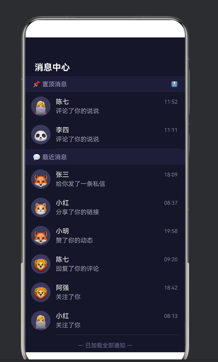
4. Demo 整体架构设计
4.1 页面功能
功能 交互方式 技术实现
初始列表展示 进入页面即显示 DataGenerator.generateInitialGroups()
滚动触底加载 向下滑动到底部 List.onReachEnd() + loadMoreData()
加载中状态 底部出现 LoadingProgress @State isLoadingMore 控制
无更多数据提示 底部显示「已加载全部」 @State noMoreData 控制
下拉刷新 从顶部下拉 handleRefresh() 重置全部数据
分组粘性标题 滚动时标题吸顶 ListItemGroup.header
4.2 数据结构
MessageGroup[]
├── MessageGroup { title: “📌 置顶消息”, items: MessageItem[] }
└── MessageGroup { title: “💬 最近消息”, items: MessageItem[] }
└── MessageItem
├── id: number
├── avatar: string (emoji)
├── userName: string
├── content: string
├── time: string
└── unread: number
4.3 状态矩阵
isLoadingMore noMoreData 界面表现
false false 无尾部内容(等待触底)
true false 显示 LoadingProgress + “正在加载更多…”
false true 显示 “— 已加载全部通知 —”
true true 不应出现(代码逻辑已拦截)
5. 逐层拆解 Demo 代码
5.1 数据模型层
interface MessageItem {
id: number;
avatar: string;
userName: string;
content: string;
time: string;
unread: number;
}
interface MessageGroup {
title: string;
items: MessageItem[];
}
设计要点:
id 作为 ForEach 的稳定 key,必须唯一且不变。
unread 用于演示「条件渲染」(有未读数才显示角标)。
time 使用字符串 “08:30” 格式,简单明了。
5.2 数据生成器
class DataGenerator {
private static avatarList: string[] = [‘👤’, ‘😎’, ‘🤖’, …];
private static nameList: string[] = [‘张三’, ‘李四’, …];
private static actionList: string[] = [
‘回复了你的评论’, ‘赞了你的动态’, …
];
static generateItem(id: number): MessageItem { … }
static generateBatch(startId: number, count: number): MessageItem[] { … }
static generateInitialGroups(): MessageGroup[] { … }
}
为什么要用 class + static 而非直接写函数?
ArkTS 中推荐将工具方法组织在 class 中。
private static 成员仅在类内部可见,封装性好。
使用 DataGenerator.xxx 调用,语义清晰。
5.3 主组件状态
struct ListLoadMoreDemo {
@State private groups: MessageGroup[] = …;
private nextId: number = 10;
@State private isLoadingMore: boolean = false;
@State private noMoreData: boolean = false;
@State private isRefreshing: boolean = false;
private readonly pageSize: number = 5;
private readonly loadDelay: number = 1500;
}
注意 @State 与普通字段的区别:
装饰器 是否驱动 UI 刷新 适用场景
@State 是 需要响应式更新的变量
无装饰器 否 纯内部状态(nextId、常量)
readonly 否 编译时常量(pageSize、loadDelay)
5.4 核心加载逻辑
private loadMoreData(): void {
if (this.isLoadingMore || this.noMoreData) { return; }
this.isLoadingMore = true; // 显示尾部 LoadingProgress
setTimeout(() => {
const newItems = DataGenerator.generateBatch(this.nextId, this.pageSize);
this.nextId += this.pageSize;
// 将新数据追加到「最近消息」分组
const updatedGroups: MessageGroup[] = this.groups.map((group) => {
  if (group.title === '💬 最近消息') {
    return { title: group.title, items: group.items.concat(newItems) };
  }
  return group;
});
this.groups = updatedGroups;

this.isLoadingMore = false;

if (this.nextId > 25) {
  this.noMoreData = true;  // 全部加载完毕
}
}, this.loadDelay);
}
这段代码是「尾部加载」的灵魂。关键设计决策:
前置拦截:在函数入口判断 isLoadingMore || noMoreData,避免重复请求。
先设 loading 再异步:isLoadingMore = true 立即生效,UI 立刻显示 LoadingProgress。
不可变更新:不直接修改 this.groups,而是 map 生成新数组赋值——这是 ArkTS 的推荐模式,确保 UI 准确刷新。
模拟结束条件:加载 3 次(nextId > 25)后标记 noMoreData = true,演示「已无更多」状态。
5.5 List 构建
List() {
ForEach(this.groups, (group, groupIndex) => {
ListItemGroup({ header: this.buildSectionHeader(group.title, groupIndex) }) {
ForEach(group.items, (item) => {
ListItem() { /* 消息卡片 UI */ }
}, (item) => item.id.toString())
}
}, (group) => group.title)
if (this.isLoadingMore) {
ListItem() { LoadingProgress() + Text(“正在加载更多…”) }
}
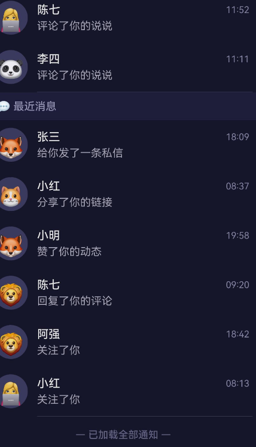
if (this.noMoreData && !this.isLoadingMore) {
ListItem() { Text(“— 已加载全部通知 —”) }
}
}
.onReachEnd(() => { this.loadMoreData(); })
.edgeEffect(EdgeEffect.Spring)
.key(‘list_’ + this.isRefreshing)
嵌套结构拆解:
Level 1: List ← 可滚动容器
Level 2: ForEach(groups) ← 遍历分组
Level 3: ListItemGroup ← 分组容器(带粘性标题)
Level 4: ForEach(items) ← 遍历分组内消息
Level 5: ListItem ← 单条消息
Level 5: Text / Row / Column ← 消息内容
Level 2: if(isLoadingMore) ← 条件渲染:加载指示器
Level 3: ListItem > Row ← 尾部加载区域
Level 2: if(noMoreData) ← 条件渲染:已无更多
Level 3: ListItem > Row ← 尾部结束提示
5.6 条件渲染的三种模式
Demo 的尾部区域使用了三种条件渲染模式:
模式 语法 使用场景
if (condition) { UI } 单一条件 isLoadingMore 时显示加载
if (conditionA && !conditionB) 复合条件 noMoreData 且不在加载中
默认(无 if) 兜底 既不加载也无完毕时,底部空白
5.7 消息卡片 UI
ListItem() {
Row() {
// 头像
Text(item.avatar)
.width(44).height(44)
.backgroundColor(‘#3A3A5C’)
.borderRadius(22)
// 文本区域
Column() {
  // 第一行:用户名 + 时间
  Row() {
    Text(item.userName).fontColor('#E0E0E0')
    Text(item.time).fontColor('#8080A0')
  }
  // 第二行:消息内容 + 未读角标
  Row() {
    Text(item.content).maxLines(1)
      .textOverflow({ overflow: TextOverflow.Ellipsis })
    if (item.unread > 0) {
      Text(item.unread > 99 ? '99+' : item.unread.toString())
        .backgroundColor('#FF4757').borderRadius(10)
    }
  }
}
}
}
设计要点:
头像使用 Emoji Text 代替图片,减少资源依赖。
Column + 两层 Row 实现「两行两列」的消息卡片布局。
未读角标使用 if 条件渲染,无未读时隐藏。
maxLines(1) + textOverflow(TextOverflow.Ellipsis) 防止长文本溢出。
6. 尾部加载的三种状态管理
6.1 状态机
┌─────────────────────────────┐
│ 初始状态 │
│ isLoadingMore = false │
│ noMoreData = false │
└────────┬────────────────────┘
│ 用户滑到底部
▼
┌─────────────────────────────┐
│ 加载中 │
│ isLoadingMore = true │
│ 显示 LoadingProgress │
└────────┬────────────────────┘
│ 数据返回
▼
┌─────────────────────────────┐
│ 追加完成 │
│ isLoadingMore = false │
│ 评价:还有更多? │
└──────┬──────────┬───────────┘
│ 还有数据 │ 已无数据
▼ ▼
┌──────────┐ ┌────────────────┐
│ 返回「初始」│ │ 无更多数据 │
│ 等待下次 │ │ noMore=true │
│ 触底加载 │ │ 显示结束提示 │
└──────────┘ └────────────────┘
6.2 状态转换代码
// 初始 → 加载中
this.isLoadingMore = true;
// 加载中 → 追加完成
this.groups = updatedGroups;
this.isLoadingMore = false;
// 追加完成 → 无更多数据
if (this.nextId > 25) {
this.noMoreData = true;
}
// 无更多数据 → 初始(通过下拉刷新)
this.nextId = 10;
this.noMoreData = false;
this.groups = DataGenerator.generateInitialGroups();
6.3 为什么使用两个独立布尔值而非枚举
有人可能会问:既然只有三种状态,为什么不用一个枚举?
enum LoadState { IDLE, LOADING, FINISHED }
在这个场景中,两个布尔值比枚举更合适,原因如下:
UI 条件渲染更直观:if (this.isLoadingMore) vs if (state === LoadState.LOADING)
未来可扩展:如果需要「加载失败」状态,加一个 @State loadError: boolean 即可,无需修改枚举定义。
兼容 ! 运算:if (this.noMoreData && !this.isLoadingMore) 这种复合条件用枚举写反而冗余。
7. ListItemGroup 与 sectionHeader 详解
7.1 作用
ListItemGroup 是 List 的「分组容器」,它的核心价值在于:
分组标题(header):给同一组 ListItem 一个公共的标题。
粘性悬浮:滚动时 header 会吸附在列表顶部,直到该分组完全滚出可视区。
隔离样式:不同分组可以有不同的分隔线、背景色。
7.2 header 的构建方式
方式一(使用 @Builder):
ListItemGroup({ header: this.buildSectionHeader(title, index) }) {
// items
}
@Builder
private buildSectionHeader(title: string, index: number): void {
Row() {
Text(title).fontSize(14).fontColor(‘#9090B0’);
}
.height(36)
.backgroundColor(‘#1E1E38’)
}
方式二(内联构建):如果 header 逻辑简单,也可以直接在参数中写 Column() { Text(…) }。
7.3 header 的粘性效果
默认情况下,ListItemGroup 的 header 具有粘性效果(sticky)。这意味着:
当分组 1 正在滚动时,其 header 停留在列表顶部。
当分组 2 即将进入时,分组 1 的 header 被分组 2 的 header「推上去」。
这种效果无需额外配置,是 ListItemGroup 的内建行为。
7.4 分组分隔线
ListItemGroup({
header: this.buildSectionHeader(…)
}) {
// …
}
.divider({ strokeWidth: 0 }) // 分组内无分隔线
Demo 中将分隔线设置在 List 层面:
List()
.divider({
strokeWidth: 1,
color: ‘#2A2A45’,
startMargin: 68, // 从头像右侧开始
endMargin: 12
})
这样分隔线会从头像右边缘开始绘制,不会贯穿整行,视觉效果更精致。
- ArkTS 语法避坑指南
在编写这个 Demo 的过程中,我遇到了几个 ArkTS 独有的语法限制,值得记录下来供读者参考。
8.1 Static 方法中不能使用 this
错误写法:
class DataGenerator {
private static avatarList = […];
static generateItem(id: number): MessageItem {
const avatar = this.avatarList[0]; // ❌
// …
}
}
正确写法:
class DataGenerator {
private static avatarList = […];
static generateItem(id: number): MessageItem {
const avatar = DataGenerator.avatarList[0]; // ✅
// …
}
}
原因:ArkTS 的静态方法中,this 不指向类本身(不同于 TypeScript)。必须显式使用 ClassName.staticMember。
8.2 不支持对象展开运算符
错误写法:
const updated = { …group, items: newItems }; // ❌
正确写法:
const updated = {
title: group.title,
items: group.items.concat(newItems) // ✅
};
原因:… 展开运算符在 ArkTS 中被限制,只能用于数组到剩余参数或数组字面量的场景。对象展开不支持。
8.3 类型必须明确
ArkTS 要求所有变量、参数、返回值都有明确的类型标注。这与 TypeScript 的「类型推断」不同:
// ✅ ArkTS 要求
const names: string[] = [‘张三’, ‘李四’];
function foo(x: number): string { return x.toString(); }
// ❌ 以下写法在 TypeScript 中可推断,但在 ArkTS 中可能报错
const names = [‘张三’, ‘李四’]; // 需要显示标注类型
function foo(x) { return x.toString(); } // 参数需要类型
8.4 组件属性只能在 build() 中链式调用
// ✅ 正确
build() {
Text(‘Hello’)
.fontSize(16)
.fontColor(Color.Red);
}
// ❌ 错误:不能在 build() 外设置组件属性
8.5 if 条件渲染的位置限制
在 ArkTS 的 build() 中,if 语句可以作为组件树的节点出现,但不能在组件链式调用中间插入:
// ✅ 正确
Column() {
if (condition) {
Text(‘visible’)
}
}
// ❌ 错误
Text(‘hello’)
.if (condition) .fontSize(20) // 不能这样写
9. 性能优化与最佳实践
9.1 控制每次加载的条数
每次 onReachEnd 加载的数据量(pageSize)直接影响用户体验:
pageSize 优点 缺点
5~10 加载快,网络延迟感知低 触底频繁,需多次加载
20~50 触底次数少 单次加载慢,首屏渲染压力大
推荐:10~20 条/次,既能保证单次加载的流畅性,又不会让用户频繁等待。
9.2 避免重复触发
onReachEnd 在网络延迟期间可能被再次触发,务必做好防重复处理:
if (this.isLoadingMore || this.noMoreData) return;
9.3 使用稳定的 key
ForEach 的 keyGenerator 和 List 的 .key() 是性能的关键:
ForEach(groups, (group) => { … },
(group: MessageGroup): string => group.title) // 分组 key
ForEach(items, (item) => { … },
(item: MessageItem): string => item.id.toString()) // 条目 key
List()
.key(‘list_’ + this.isRefreshing) // 刷新后重建
为什么 key 重要?当 key 不变时,ArkUI 引擎会复用已有的组件实例,只更新数据绑定,避免销毁重建的开销。
9.4 列表项复杂度控制
每个 ListItem 内部的 UI 层级尽量控制在 4 层以内:
ListItem > Row > Column > Row ← 推荐(4 层)
ListItem > Row > Column > Row > Stack > Flex > Grid ← 不推荐(嵌套过深)
9.5 使用 EdgeEffect.Spring
List()
.edgeEffect(EdgeEffect.Spring)
Spring 效果让列表在顶部或底部边缘有弹性「回弹」效果,视觉反馈更自然,是移动端列表的标配。
- 常见问题排查
10.1 onReachEnd 不触发
排查步骤:
确认 List 设置了 layoutWeight(1) 或明确的高度——如果 List 高度为 0,内容不会溢出,事件不会触发。
确认 List 的内容总高度超过 List 的可视区高度——内容太少时根本不会出现滚动,自然不会触底。
检查 onReachEnd 回调用的是箭头函数而非普通函数:
.onReachEnd(() => { this.loadMoreData(); }) // ✅
.onReachEnd(this.loadMoreData) // ❌ this 指向错误
10.2 加载后又马上再次触发加载
症状:LoadingProgress 出现后又消失,然后立即再次出现。
原因:网络请求完成 → isLoadingMore = false → 数据追加 → 列表变长 → 但滚动位置没变 → 再次触底 → onReachEnd 再次触发。
解决:确保 loadMoreData() 开头有防重复判断:
private loadMoreData(): void {
if (this.isLoadingMore || this.noMoreData) {
return;
}
// …
}
10.3 下拉刷新后动画不重新播放
原因:数据变但 ForEach 的 key 没变,组件被复用而非重建。
解决:使用 .key() 属性:
List()
.key(‘list_’ + this.isRefreshing)
刷新时修改 isRefreshing,List 被重建,所有 ListItem 重新挂载。
10.4 ListItemGroup 的 header 不显示
排查:
确认 header 参数传递的是 @Builder 函数或组件,而非字符串。
确认 header 组件设置了 width(‘100%’),否则可能宽度为 0 不可见。
检查背景色是否与 list 背景色相同导致视觉上「消失」。
10.5 分隔线位置不对
List()
.divider({
strokeWidth: 1,
color: ‘#2A2A45’,
startMargin: 68, // 从头像右侧开始
endMargin: 12
})
如果分隔线被头像遮挡或太长/太短,调整 startMargin 和 endMargin 即可。单位是 vp(虚拟像素)。
- 总结与展望
11.1 本文要点回顾
List + onReachEnd 是鸿蒙实现「尾部加载更多」的核心组合。
ListItemGroup + header 提供分组展示 + 粘性标题效果。
LoadingProgress 是原生加载指示器,与 @State isLoadingMore 配合实现加载状态切换。
三种尾部状态:空闲(无显示)、加载中(LoadingProgress)、已完成(文案提示)。
ArkTS 语法限制:static 方法中不能用 this、不支持对象展开运算符、类型需显式标注。
性能优化:控制 pageSize、防重复触发、使用稳定 key、简化层级。
11.2 适用场景
场景 推荐
IM 消息列表 ✅ 完美适用
社交动态/资讯流 ✅ 完美适用
商品列表/搜索结果 ✅ 完美适用
设置项/配置页 ❌ 内容少,无需分页
树形/多层展开列表 ⚠️ 需额外处理
11.3 未来展望
onReachEndDistance 配置:当前版本不支持设置触底阈值,未来可能支持,让开发者可以在「距离底部还有 X vp」时提前加载。
List + LazyForEach:对于超长列表(1000+ 条),结合 LazyForEach 实现节点回收,内存更优。
骨架屏融合:加载更多时显示骨架屏(Skeleton)而非简单的 LoadingProgress,体验进一步提升。
错误重试:添加「加载失败,点击重试」状态,增强鲁棒性。
11.4 写在最后
「List + 尾部加载更多」是移动端开发中最常用但也最容易被低估的交互模式。很多开发者觉得「不就是触底回调加个 loading 嘛」,但一个真正好的列表加载体验,需要考虑到状态转换的完备性、防重复触发的严谨性、列表更新的性能、以及视觉上的细节(分隔线、角标、字体、颜色)。
鸿蒙 ArkUI 通过 List.onReachEnd() + ListItemGroup + LoadingProgress 的黄金三角组合,将这一模式的实现门槛降到了最低,让开发者可以聚焦于业务逻辑和数据组织,而非动画调度和事件处理。
希望本文对你理解鸿蒙列表布局有所帮助。如果你在实际开发中遇到了其他问题,欢迎一起探讨交流。
附录 A:完整 Demo 代码
文件位置:entry/src/main/ets/pages/ListLoadMoreDemo.ets
/**
- 鸿蒙原生 ArkTS 布局示例 —— List + 尾部加载更多布局
- 【布局要点】
-
- List 的 onReachEnd() 监听滚动触底事件,触发加载更多数据。
-
- ListItemGroup 的 header 区域展示分类标题(sectionHeader)。
-
- 列表末尾的 ListItem 显示「加载中」状态(LoadingProgress)。
-
- 使用 ForEach 动态渲染列表项,append 方式追加新数据。
-
- 常用于:消息流、商品列表、资讯列表等需要分页加载的场景。
*/
- 常用于:消息流、商品列表、资讯列表等需要分页加载的场景。
interface MessageItem {
id: number;
avatar: string;
userName: string;
content: string;
time: string;
unread: number;
}
interface MessageGroup {
title: string;
items: MessageItem[];
}
class DataGenerator {
private static avatarList: string[] = [‘👤’, ‘😎’, ‘🤖’, ‘👩💻’, ‘🧑🔧’, ‘🦊’, ‘🐱’, ‘🐼’, ‘🐨’, ‘🦁’];
private static nameList: string[] = [‘张三’, ‘李四’, ‘王五’, ‘赵六’, ‘陈七’, ‘小红’, ‘小明’, ‘小刚’, ‘莉莉’, ‘阿强’];
private static actionList: string[] = [‘回复了你的评论’, ‘赞了你的动态’, ‘转发了你的文章’, ‘给你发了一条私信’, ‘提到了你’, ‘评论了你的说说’, ‘分享了你的链接’, ‘关注了你’, ‘@了你’, ‘给你的作品点赞’];
static generateItem(id: number): MessageItem {
const rand = (arr: string[]) => arr[Math.floor(Math.random() * arr.length)];
const hour = Math.floor(Math.random() * 12) + 8;
const min = Math.floor(Math.random() * 60);
return {
id, avatar: rand(DataGenerator.avatarList),
userName: rand(DataGenerator.nameList),
content: rand(DataGenerator.actionList),
time: ${hour.toString().padStart(2, '0')}:${min.toString().padStart(2, '0')},
unread: Math.random() > 0.6 ? Math.floor(Math.random() * 9) + 1 : 0
};
}
static generateBatch(startId: number, count: number): MessageItem[] {
const batch: MessageItem[] = [];
for (let i = 0; i < count; i++) {
batch.push(DataGenerator.generateItem(startId + i));
}
return batch;
}
static generateInitialGroups(): MessageGroup[] {
return [
{ title: ‘📌 置顶消息’, items: DataGenerator.generateBatch(1, 2) },
{ title: ‘💬 最近消息’, items: DataGenerator.generateBatch(3, 6) }
];
}
}
@Entry
@Component
struct ListLoadMoreDemo {
@State private groups: MessageGroup[] = DataGenerator.generateInitialGroups();
private nextId: number = 10;
@State private isLoadingMore: boolean = false;
@State private noMoreData: boolean = false;
@State private isRefreshing: boolean = false;
private readonly pageSize: number = 5;
private readonly loadDelay: number = 1500;
private loadMoreData(): void {
if (this.isLoadingMore || this.noMoreData) { return; }
this.isLoadingMore = true;
setTimeout(() => {
const newItems = DataGenerator.generateBatch(this.nextId, this.pageSize);
this.nextId += this.pageSize;
const updatedGroups: MessageGroup[] = this.groups.map((group) => {
if (group.title === ‘💬 最近消息’) {
return { title: group.title, items: group.items.concat(newItems) };
}
return group;
});
this.groups = updatedGroups;
this.isLoadingMore = false;
if (this.nextId > 25) { this.noMoreData = true; }
}, this.loadDelay);
}
private handleRefresh(): void {
this.isRefreshing = true;
setTimeout(() => {
this.nextId = 10;
this.noMoreData = false;
this.groups = DataGenerator.generateInitialGroups();
this.isRefreshing = false;
}, 1000);
}
build() {
Column() {
// 标题栏
Row() {
Text(‘消息中心’).fontSize(20).fontWeight(FontWeight.Bold).fontColor(Color.White);
Row().width(24).height(24)
}
.width(‘100%’).justifyContent(FlexAlign.SpaceBetween)
.padding({ left: 20, right: 20, top: 12, bottom: 8 })
  // 列表
  List() {
    ForEach(this.groups, (group, groupIndex) => {
      ListItemGroup({ header: this.buildSectionHeader(group.title, groupIndex) }) {
        ForEach(group.items, (item) => {
          ListItem() {
            Row() {
              Text(item.avatar).fontSize(28).width(44).height(44)
                .textAlign(TextAlign.Center).lineHeight(44)
                .backgroundColor('#3A3A5C').borderRadius(22).margin({ right: 12 });
              Column() {
                Row() {
                  Text(item.userName).fontSize(15).fontWeight(FontWeight.Medium)
                    .fontColor('#E0E0E0').layoutWeight(1);
                  Text(item.time).fontSize(12).fontColor('#8080A0');
                }.width('100%');
                Row() {
                  Text(item.content).fontSize(14).fontColor('#A0A0B0')
                    .maxLines(1).textOverflow({ overflow: TextOverflow.Ellipsis }).layoutWeight(1);
                  if (item.unread > 0) {
                    Text(item.unread > 99 ? '99+' : item.unread.toString())
                      .fontSize(11).fontColor(Color.White)
                      .backgroundColor('#FF4757').borderRadius(10)
                      .padding({ left: 6, right: 6, top: 2, bottom: 2 });
                  }
                }.width('100%').margin({ top: 4 });
              }.layoutWeight(1).alignItems(HorizontalAlign.Start);
            }.width('100%').padding({ top: 10, bottom: 10, right: 4 })
          }.margin({ left: 12, right: 12 }).backgroundColor('transparent')
        }, (item) => item.id.toString())
      }.divider({ strokeWidth: 0 })
    }, (group) => group.title)

    // 尾部加载区域
    if (this.isLoadingMore) {
      ListItem() {
        Row() {
          LoadingProgress().color('#7C3AED').width(24).height(24).margin({ right: 10 });
          Text('正在加载更多...').fontSize(14).fontColor('#8080A0');
        }.width('100%').justifyContent(FlexAlign.Center).padding(16)
      }.backgroundColor('transparent')
    }
    if (this.noMoreData && !this.isLoadingMore) {
      ListItem() {
        Text('— 已加载全部通知 —')
          .fontSize(13).fontColor('#606080').fontWeight(FontWeight.Medium)
          .width('100%').textAlign(TextAlign.Center).padding(16)
      }.backgroundColor('transparent')
    }
  }
  .onReachEnd(() => { this.loadMoreData(); })
  .edgeEffect(EdgeEffect.Spring)
  .scrollBar(BarState.Auto)
  .width('100%').layoutWeight(1)
  .divider({ strokeWidth: 1, color: '#2A2A45', startMargin: 68, endMargin: 12 })
  .key('list_' + this.isRefreshing)
}
.width('100%').height('100%')
.backgroundColor('#16162A')
.padding({ top: 44 })
}
@Builder
private buildSectionHeader(title: string, index: number): void {
Row() {
Text(title).fontSize(14).fontWeight(FontWeight.Medium).fontColor(‘#9090B0’)
.textAlign(TextAlign.Start).layoutWeight(1);
Text(${index === 0 ? '🔝' : ''}).fontSize(12).fontColor(‘#606080’);
}
.width(‘100%’).height(36)
.padding({ left: 16, right: 16 })
.backgroundColor(‘#1E1E38’)
.alignItems(VerticalAlign.Center)
}
}
附录 B:核心 API 速查表
API 用途 所在组件
.onReachEnd(callback) 滚动触底回调 List
.chainAnimation(enabled) 链式入场动画 List
.divider(style) 分隔线样式 List / ListItemGroup
.edgeEffect(effect) 边缘回弹效果 List / Scroll
.scrollBar(state) 滚动条策略 List / Scroll
.layoutWeight(weight) 布局权重 所有容器
.key(key) 组件关联键 所有组件
ListItemGroup({header}) 分组容器 List 子级
LoadingProgress() 加载指示器 独立组件
@Builder UI 构建函数 函数装饰器
@State 响应式状态 属性装饰器
附录 C:版本变更记录
版本 日期 说明
v1.0 2025.06 初稿,基于 HarmonyOS NEXT 6.1.1 (API 24)
本文由 AtomCode 生成,基于真实鸿蒙项目的实践总结。
文中代码已在 HarmonyOS NEXT 6.1.1 (API 24) + ArkTS 环境下编译通过。
项目源码:D:\HarmonyOS-Life\Demo0623

作为“人工智能6S店”的官方数字引擎,为AI开发者与企业提供一个覆盖软硬件全栈、一站式门户。
更多推荐
 0
0 0
0- 0


 已为社区贡献4条内容

所有评论(0)