
ArktsUI弹窗,路由页面跳转和交互事件
一、前言
本篇主要学习鸿蒙 ArkTS 两种核心交互能力:组件状态点击事件、弹窗提示,以及页面路由跳转功能,通过完整实例实现按钮修改文本、弹窗弹出、登录 / 注册页面互相跳转,同时掌握路由页面注册配置规范,理解 ArkTS 声明式 UI 与事件驱动开发逻辑。
二、案例
1.表单输入与交互事件开发
@Entry
@Component
struct EventDemo{
@State username:string = ""
@State password:string = ""
build() {
Column({space:30}) {
Text('用户登录')
.fontSize(32)
.fontWeight(FontWeight.Bolder)
.margin({ top: 20, bottom: 30 })
TextInput({text:this.username, placeholder: '请输入账号:' })
.width(320)
.height(52)
.borderRadius(12)
.fontSize(16)
.onChange((value:string)=>{
this.username = value
})
TextInput({text:this.password,placeholder: "请输入密码:" })
.type(InputType.Password)
.width(320)
.height(52)
.borderRadius(12)
.fontSize(16)
.onChange((value:string)=>{
this.password = value
})
Row({space:20}) {
Button("立即登录")
.width("45%")
.height(50)
.backgroundColor(0x007Dff)
.fontSize(18)
.borderRadius(12)
.margin({ bottom: 80 })
.onClick(() => {
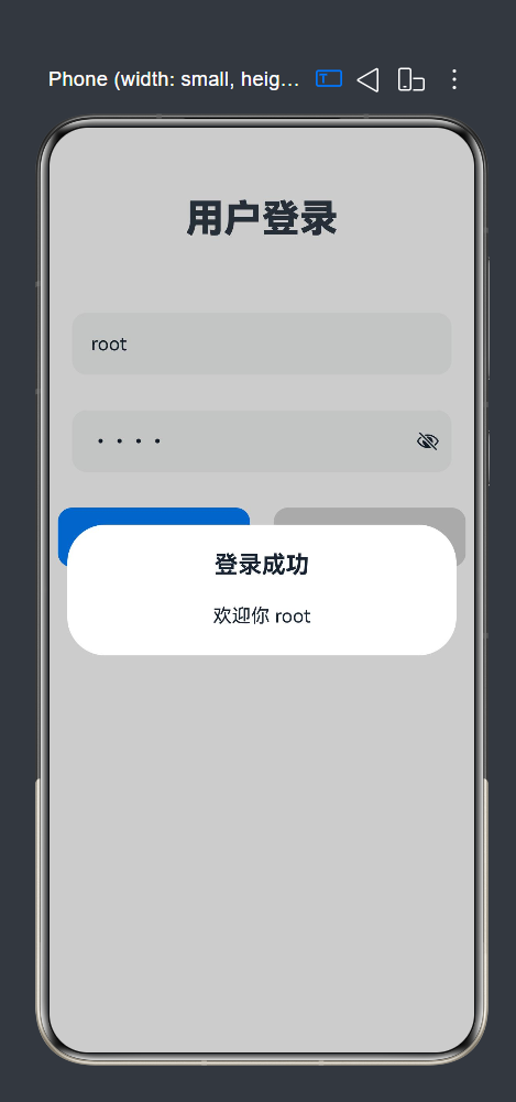
if (this.username == "root" && this.password == "root") {
AlertDialog.show({
title: "登录成功",
message: `欢迎你 ${this.username}`
})
} else {
AlertDialog.show({
title: "登录失败",
message: "用户名或者密码错误"
})
}
})
Button('清除内容')
.width("45%")
.height(50)
.fontColor(Color.Black)
.backgroundColor(0xd5d5d5)
.fontSize(18)
.borderRadius(12)
.margin({ bottom: 80 })
.onClick(()=>{
this.username=""
this.password=""
})
}
}
.width('100%')
.height('100%')
}
}
- 核心知识点拆解
(1)@State 响应式状态
被@State修饰的变量为页面状态变量,变量值修改后,绑定该变量的 UI 组件会自动刷新,无需手动操作视图。示例中msg控制页面文本展示。
(2)onClick 点击事件
Button、Text、布局容器等所有可交互组件均可绑定onClick,点击组件后执行回调内逻辑,是主动操作类交互的基础。
(3)AlertDialog 系统弹窗
鸿蒙内置弹窗 API,无需自定义组件,一键唤起弹窗,支持自定义标题与提示文本,适合操作成功、消息提醒场景。
(4)Column 纵向布局
纵向排列组件,通过space设置组件间距,justifyContent实现页面垂直居中,统一宽高与内边距优化页面样式。
2.基础点击事件与弹窗交互
@Entry
@Component
struct EventCard{
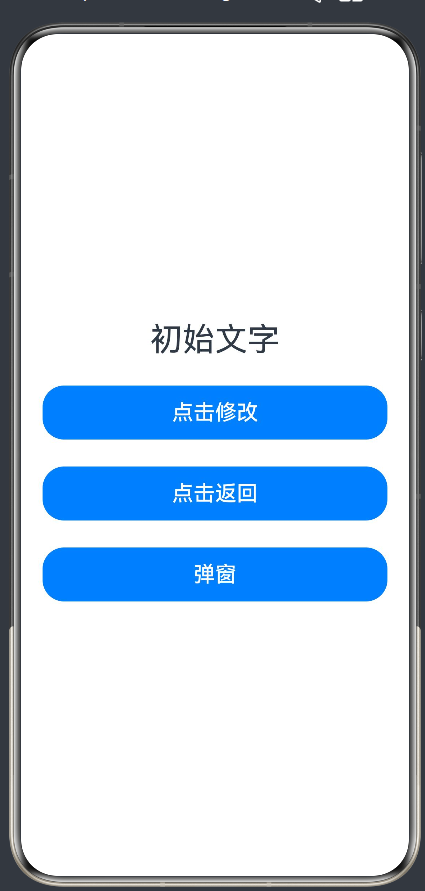
@State msg:string="初始文字"
build() {
Column({space:25}) {
Text(this.msg)
.fontSize(30)
.textAlign(TextAlign.Center)
Button('点击修改')
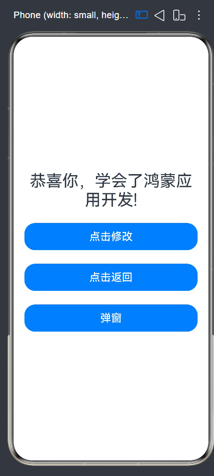
.onClick(() => {
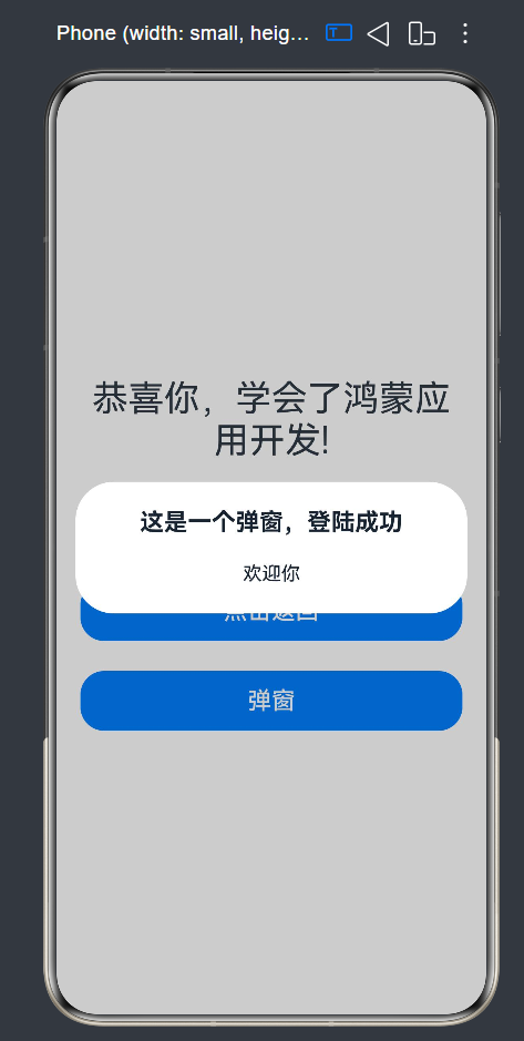
this.msg = "恭喜你,学会了鸿蒙应用开发!"
})
.width('100%')
.height(50)
.fontSize(20)
Button('点击返回')
.onClick(() => {
this.msg = "初始文字"
})
.width('100%')
.height(50)
.fontSize(20)
Button('弹窗')
.onClick(()=>{
AlertDialog.show({
title: "这是一个弹窗,登陆成功",
message: "欢迎你"
})
})
.width('100%')
.height(50)
.fontSize(20)
}
.width('100%')
.height('100%')
.padding(20)
.justifyContent(FlexAlign.Center)
}
}
- 核心知识点拆解
(1)响应式状态@State
被@State修饰的变量为页面状态变量,变量值发生修改时,绑定该变量的 UI 组件会自动刷新,无需手动更新视图。案例中msg变量控制 Text 文本显示。
(2)按钮点击事件onClick
所有可交互组件(Button、Text)均可绑定onClick点击回调,点击后执行内部逻辑,实现交互逻辑与 UI 分离。
(3)系统弹窗AlertDialog.show()
鸿蒙内置弹窗 API,支持自定义标题、提示信息,无需额外自定义弹窗组件,快速实现消息提示场景。
(4)布局容器 Column
纵向排列组件,通过space设置组件间距,justifyContent控制整体垂直居中,统一设置宽高、内边距统一页面样式。
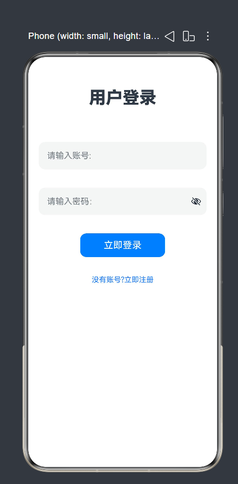
3.页面路由双向跳转(登录页 + 注册页 + 路由配置)
(1)登录页面 Logins
@Entry
@Component
struct Login{
  @State isOn: boolean = false;
  build() {
    Column({space:30}){
      Text('用户登录')
        .fontSize(32)
        .fontWeight(FontWeight.Bolder)
        .margin({top:20,bottom:30})

      TextInput({placeholder:'请输入账号:'})
        .width(320)
        .height(52)
        .borderRadius(12)
        .fontSize(16)

      TextInput({placeholder:"请输入密码:"})
        .type(InputType.Password)
        .width(320)
        .height(52)
        .borderRadius(12)
        .fontSize(16)

      Row({space:10}){
        Toggle({type:ToggleType.Switch,isOn:this.isOn})
          .onChange((val)=>{
            this.isOn=val;
            console.log("开发状态:",val);
          })
        Text('记住密码')
          .fontSize(16)
          .fontColor(Color.Gray)
      }

      Button('立即登录')
        .width(320)
        .height(52)
        .backgroundColor(0x007Dff)
        .fontSize(18)
        .borderRadius(12)

      Text('用户注册 | 忘记密码')

      Text('鸿蒙应用开发实训系统@2026')
        .fontSize(14)
        .fontColor(Color.Gray)
        .margin({top:40})
    }
    .backgroundColor(0xF8F8F8)
    .width('100%')
    .height('100%')
    .justifyContent(FlexAlign.Center)
  }
}
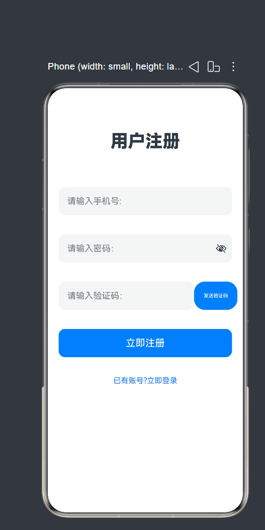
(2)注册页面 Register1
import router from '@ohos.router';
@Entry
@Component
struct Register1{

  build() {
    Column({space:35}){
      Text('用户注册')
        .fontSize(32)
        .fontWeight(FontWeight.Bolder)
        .margin({top:20,bottom:30})

      TextInput({placeholder:'请输入手机号:'})
        .width(320)
        .height(52)
        .borderRadius(12)
        .fontSize(16)

      TextInput({placeholder:"请输入密码:"})
        .type(InputType.Password)
        .width(320)
        .height(52)
        .borderRadius(12)
        .fontSize(16)

      Row() {
        TextInput({ placeholder: "请输入验证码:" })
          .type(InputType.Number)
          .width(250)
          .height(52)
          .borderRadius(12)
          .fontSize(16)
        Button('发送验证码')
          .width('25%')
          .height(52)
      }

      Button('立即注册')
        .width(320)
        .height(52)
        .backgroundColor(0x007Dff)
        .fontSize(18)
        .borderRadius(12)

      Text('已有账号?立即登录')
        .fontSize(14)
        .fontColor(0x1677ff)
        .onClick(()=>{
         router.back(
           // {url:'pages/Logins'}
         )
        })
    }
    .width('100%')
    .height('100%')
    .padding(20)
  }
}
(3)路由页面配置文件
{
  "src": [
    "pages/Index",
    "pages/Second",
    "pages/Logins",
    "pages/Register1"
  ]
}- 核心知识点拆解
(1)路由模块导入
多页面跳转必须导入官方路由包:import router from '@ohos.router',否则无法调用跳转 API。
(2)页面跳转方法router.pushUrl()
打开新页面,参数url填写目标页面完整路径,路径必须和配置文件、页面文件存放路径保持一致。
(3)页面注册配置规则
所有需要被路由跳转访问的页面,都必须写入配置文件src数组(recourse中的profile里面的main_page)中;未注册页面调用跳转时会直接报错,页面无法打开。
(4)文本点击交互
Text 文本同样支持绑定onClick事件,可制作文字跳转链接,常用于登录 / 注册切换、协议跳转等场景。
三、交互事件的区别及案例
1.onClick 点击事件
onClick(() => {
  // 点击后执行逻辑
})
适用组件
- Button、Text、Image、Row、Column 等所有可点击容器 / 基础组件。
特点
- 无参数,只感知「点击动作」,不感知数据变化;
- 多用于主动触发操作:跳转页面、修改文字、弹出弹窗、提交表单。
2. onChange 值变更事件
onChange(() => {
  // 组件数值发生变化时执行逻辑
})
适用组件
- 输入框TextInput、滑块Slider、开关Toggle、选择器Select等带有可修改数值的交互组件。
特点
- 自带回调参数,可获取组件最新值;
- 被动监听数据变化,不用点击按钮,只要内容改变就执行;
- 场景:实时表单校验、输入实时搜索、滑块数值同步、开关状态监听。
3.总结对比
| 对比项 | onClick | onChange |
|---|---|---|
| 触发条件 | 用户点击组件 | 组件内部数值 / 内容改变 |
| 适用组件 | Button、Text、布局容器等全部可点击组件 | TextInput、Slider、Toggle、Picker 等带值组件 |
| 回调参数 | 无参数 | 携带变化后的最新数值 |
| 使用场景 | 跳转页面、弹窗、提交、切换文本 | 实时监听输入、数值同步、表单实时校验 |
| 触发频率 | 点击一次执行一次 | 值每变动一次就执行一次 |
4.综合完整演示代码(融合两种事件)
@Entry
@Component
struct EventDemo {
  @State msg: string = "初始文字"
  @State inputVal: string = ""
  build() {
    Column({space: 20}) {
      Text(this.msg).fontSize(30)

      // onChange 监听输入框变化
      TextInput({text: this.inputVal, placeholder: "输入文字"})
        .width("100%")
        .onChange((val: string) => {
          this.inputVal = val
        })

      // onClick 点击按钮同步输入内容
      Button("同步输入内容到上方文字")
        .width("100%")
        .onClick(() => {
          this.msg = this.inputVal
        })
    }
    .width("100%")
    .padding(20)
    .justifyContent(FlexAlign.Center)
  }
}
作为“人工智能6S店”的官方数字引擎,为AI开发者与企业提供一个覆盖软硬件全栈、一站式门户。
更多推荐


 7
7 0
0- 0


 已为社区贡献1条内容

所有评论(0)