
鸿蒙StyledString完全指南:从富文本选型到图文混排实战
在移动端开发中,富文本展示几乎无处不在。你有没有遇到过这样的场景——产品经理要求评论区的用户昵称显示为蓝色并可点击、话题标签高亮显示、表情文字要替换成图片……这些需求看似简单,但如果用传统的 Text + Span 方式来实现,往往要写大量重复代码,样式还难以动态更新。
鸿蒙 ArkUI 提供了一套全新的解决方案——属性字符串(StyledString)。它就像“带样式的字符串”,可以和 Text 组件无缝结合,性能媲美原生文本,同时支持动态样式、图文混排、点击交互和自定义绘制。本文将带你从零到一掌握 StyledString 的核心用法。
一、富文本方案怎么选?
在动手之前,先搞清楚一个问题:鸿蒙里能做富文本的方案有好几个,我该选哪个?
| 技术方案 | 适用场景 | 与 StyledString 的差异 |
|---|---|---|
| Text + Span | 价格标签、评论中固定关键词高亮 | 样式静态,无法动态更新;不支持图片 |
| Text + StyledString | @/#高亮跳转、图文混排、自定义绘制 | 本文主角:样式动态更新、图文混排、手势交互 |
| RichEditor | 用户可编辑的富文本编辑器 | 有编辑能力,但自定义样式更新受限 |
| Web | 新闻详情、协议条款等完整 HTML 页面 | 功能最强但长列表性能差 |
| RichText | ❌ 已停止维护 | 不推荐使用 |
一句话选型:需要动态展示富文本 + 交互 → 用 StyledString;需要用户编辑 → 用 RichEditor;要展示完整的 HTML 页面 → 用 Web。
选型决策树:
富文本需求
    │
    ├─ 仅需展示简单富文本(价格标签、评论高亮)
    │   └─ ✅ Text + Span
    │
    ├─ 需要精细化样式控制 + 交互(@/#高亮跳转、图文混排)
    │   └─ ✅ Text + StyledString  ← 本文重点
    │
    ├─ 需要富文本编辑能力(用户可输入带格式内容)
    │   └─ ✅ RichEditor
    │
    └─ 需要解析复杂 HTML 内容(新闻详情、协议条款)
        └─ ✅ Web
二、StyledString 核心定位
StyledString 是鸿蒙官方推荐的富文本方案,核心定位有三:
- 与 Text 组件无缝集成:通过
TextController.setStyledString()绑定,不改变布局结构 - 支持图文混排:通过
ImageAttachment将图片嵌入文本流 - 支持交互和自定义:点击事件(
GestureStyle)和自定义绘制(CustomSpan)
┌─────────────────────────────────────────────┐
│           Text 组件(展示层)                │
│                  ↓                          │
│  TextController.setStyledString()          │
│                  ↓                          │
│      ┌─────────────────────────┐           │
│      │    MutableStyledString  │           │
│      │    (样式+内容+交互)    │           │
│      └─────────────────────────┘           │
│         ↓           ↓           ↓          │
│    TextStyle   ImageAttachment  CustomSpan  │
│    (字体样式)   (图片混排)   (自定义绘制)   │
└─────────────────────────────────────────────┘
三、核心 API 速览
创建属性字符串
// 不可变字符串样式
new StyledString('文本内容', [样式配置])

// 可变字符串样式
new MutableStyledString('文本内容', [样式配置])
核心样式类型
| 样式类 | 对应 Key | 用途 |
|---|---|---|
TextStyle |
FONT |
字体颜色、大小、粗细 |
DecorationStyle |
DECORATION |
下划线、删除线 |
GestureStyle |
GESTURE |
点击、长按事件 |
ImageAttachment |
IMAGE |
图片附件 |
关键方法
mutableString.appendStyledString(other: StyledString): void
mutableString.setStyle(spanStyle: SpanStyle): void
mutableString.replaceString(start, length, other: string): void
四、实战一:基础样式
目标:在“鸿蒙应用开发 - 属性字符串实战教程”中,让“鸿蒙”显示为红色加粗、“应用开发”显示为蓝色斜体、“属性字符串”显示为绿色加粗下划线。
import { LengthMetrics } from '@kit.ArkUI';

@Entry
@Component
struct StyledStringBasicPage {
  private textController: TextController = new TextController();

  aboutToAppear(): void {
    const styledString = new MutableStyledString(
      '鸿蒙应用开发 - 属性字符串实战教程',
      [
        {
          start: 0,
          length: 2,
          styledKey: StyledStringKey.FONT,
          styledValue: new TextStyle({
            fontColor: Color.Red,
            fontSize: LengthMetrics.fp(28),
            fontWeight: FontWeight.Bold
          })
        },
        {
          start: 3,
          length: 4,
          styledKey: StyledStringKey.FONT,
          styledValue: new TextStyle({
            fontColor: '#007DFF',
            fontSize: LengthMetrics.fp(20),
            fontStyle: FontStyle.Italic
          })
        },
        {
          start: 8,
          length: 10,
          styledKey: StyledStringKey.FONT,
          styledValue: new TextStyle({
            fontColor: '#52C41A',
            fontSize: LengthMetrics.fp(18),
            fontWeight: FontWeight.Bold
          })
        },
        {
          start: 8,
          length: 10,
          styledKey: StyledStringKey.DECORATION,
          styledValue: new DecorationStyle({
            type: TextDecorationType.Underline,
            color: '#52C41A'
          })
        }
      ]
    );

    this.textController.setStyledString(styledString);
  }

  build() {
    Column({ space: 20 }) {
      Text('属性字符串基础用法')
        .fontSize(24)
        .fontWeight(FontWeight.Bold)
        .width('100%')
        .textAlign(TextAlign.Center);

      Text(undefined, { controller: this.textController })
        .width('100%')
        .padding(20)
        .backgroundColor('#F5F5F5')
        .borderRadius(8);

      Column({ space: 8 }) {
        Text('样式说明:')
          .fontSize(16)
          .fontWeight(FontWeight.Bold)
          .alignSelf(ItemAlign.Start);

        Text('• "鸿蒙" → 红色、28号、加粗')
          .fontSize(14)
          .fontColor('#666')
          .alignSelf(ItemAlign.Start);

        Text('• "应用开发" → 蓝色、20号、斜体')
          .fontSize(14)
          .fontColor('#666')
          .alignSelf(ItemAlign.Start);

        Text('• "属性字符串" → 绿色、18号、加粗、下划线')
          .fontSize(14)
          .fontColor('#666')
          .alignSelf(ItemAlign.Start);
      }
      .width('100%')
      .padding(15)
      .backgroundColor('#FFF7E6')
      .borderRadius(8)
      .alignItems(HorizontalAlign.Start);
    }
    .width('100%')
    .height('100%')
    .padding(20)
    .justifyContent(FlexAlign.Center)
    .backgroundColor('#FFFFFF');
  }
}
运行效果:不同关键词按需着色、加粗、斜体,一眼就能区分重点。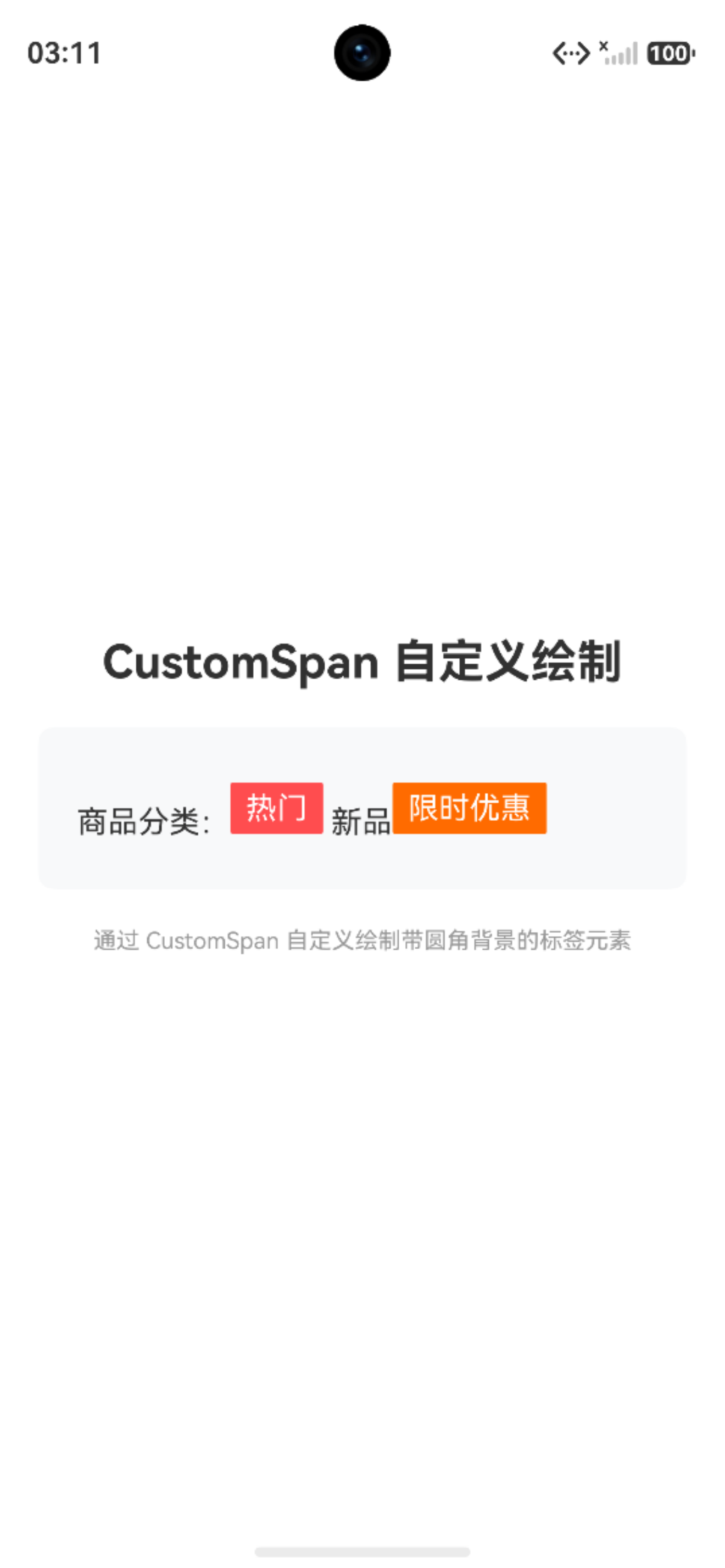
五、实战二:高亮超链接(@/#/https)
场景:社交应用中,@昵称、#话题、https链接 需要高亮并支持点击跳转。
import { LengthMetrics, promptAction } from '@kit.ArkUI';

@Entry
@Component
struct HighlightLinkPage {
  private textController: TextController = new TextController();

  aboutToAppear(): void {
    const rawText = '@鸿蒙开发者 分享了一篇关于 #鸿蒙开发 的文章,点击查看 https://developer.huawei.com';

    const styledString = new MutableStyledString(rawText, [
      // @昵称高亮 + 点击事件
      {
        start: 0,
        length: 6,  // @ + 鸿蒙开发者 = 6个字符
        styledKey: StyledStringKey.FONT,
        styledValue: new TextStyle({
          fontColor: '#007DFF',
          fontSize: LengthMetrics.fp(16),
          fontWeight: FontWeight.Bold
        })
      },
      {
        start: 0,
        length: 6,
        styledKey: StyledStringKey.GESTURE,
        styledValue: new GestureStyle({
          onClick: () => {
            promptAction.showToast({ message: '跳转到 @鸿蒙开发者 个人主页' });
          }
        })
      },
      // #话题高亮 + 点击事件
      {
        start: 15,  // '#' 的索引
        length: 6,  // # + 鸿蒙开发 = 6个字符
        styledKey: StyledStringKey.FONT,
        styledValue: new TextStyle({
          fontColor: '#FF6B00',
          fontSize: LengthMetrics.fp(16),
          fontWeight: FontWeight.Bold
        })
      },
      {
        start: 15,
        length: 6,
        styledKey: StyledStringKey.GESTURE,
        styledValue: new GestureStyle({
          onClick: () => {
            promptAction.showToast({ message: '跳转到 #鸿蒙开发 话题页' });
          }
        })
      },
      // URL 链接高亮 + 下划线 + 点击事件
      {
        start: 30,  // 'h' 的索引
        length: 28, // 整个URL长度
        styledKey: StyledStringKey.FONT,
        styledValue: new TextStyle({
          fontColor: '#007DFF',
          fontSize: LengthMetrics.fp(16)
        })
      },
      {
        start: 30,
        length: 28,
        styledKey: StyledStringKey.DECORATION,
        styledValue: new DecorationStyle({
          type: TextDecorationType.Underline,
          color: '#007DFF'
        })
      },
      {
        start: 30,
        length: 28,
        styledKey: StyledStringKey.GESTURE,
        styledValue: new GestureStyle({
          onClick: () => {
            promptAction.showToast({ message: '打开链接:https://developer.huawei.com' });
          }
        })
      }
    ]);

    this.textController.setStyledString(styledString);
  }

  build() {
    Column({ space: 20 }) {
      Text('高亮超链接实战')
        .fontSize(24)
        .fontWeight(FontWeight.Bold)
        .width('100%')
        .textAlign(TextAlign.Center);

      Text(undefined, { controller: this.textController })
        .width('100%')
        .padding(20)
        .backgroundColor('#F8F9FA')
        .borderRadius(8)
        .lineHeight(28);

      Column({ space: 8 }) {
        Text('交互说明:')
          .fontSize(16)
          .fontWeight(FontWeight.Bold)
          .alignSelf(ItemAlign.Start);

        Text('• 蓝色 @昵称 → 点击跳转个人主页')
          .fontSize(14)
          .fontColor('#666')
          .alignSelf(ItemAlign.Start);

        Text('• 橙色 #话题 → 点击跳转话题页')
          .fontSize(14)
          .fontColor('#666')
          .alignSelf(ItemAlign.Start);

        Text('• 下划线链接 → 点击打开网页')
          .fontSize(14)
          .fontColor('#666')
          .alignSelf(ItemAlign.Start);
      }
      .width('100%')
      .padding(15)
      .backgroundColor('#FFF7E6')
      .borderRadius(8)
      .alignItems(HorizontalAlign.Start);
    }
    .width('100%')
    .height('100%')
    .padding(20)
    .justifyContent(FlexAlign.Center)
    .backgroundColor('#FFFFFF');
  }
}
运行效果:@昵称显示蓝色,话题显示橙色,链接带下划线。点击不同区域弹出对应的 Toast 提示。
关键技巧:通过 start 和 length 精确定位文本片段,利用 GestureStyle 实现点击交互,DecorationStyle 添加下划线。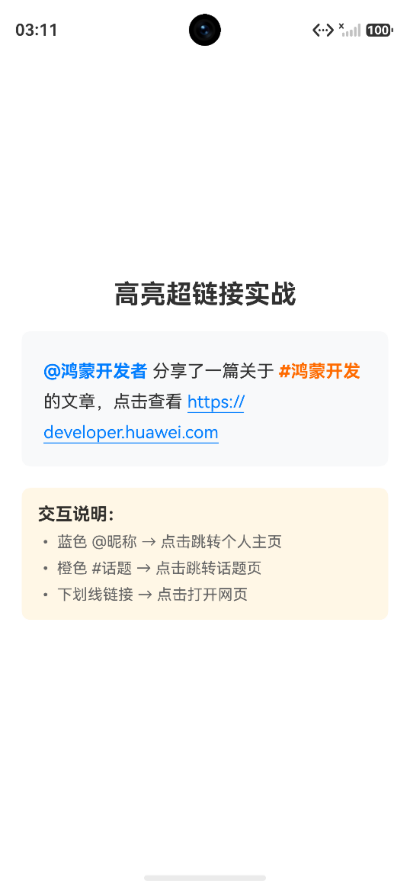
六、实战三:图片表情
场景:服务端返回带 [哈哈]、[赞] 占位符的文本,客户端将其替换为可点击的图片表情。
核心代码:
import { LengthMetrics, promptAction } from '@kit.ArkUI';

interface MatchItem {
  index: number;
  text: string;
}

const EMOJI_MAP: Map<string, Resource> = new Map([
  ['[哈哈]', $r('app.media.smile')],
  ['[赞]', $r('app.media.like')]
]);

@Entry
@Component
struct EmojiImagePage {
  private textController: TextController = new TextController();

  private createClickableImageSpan(resource: Resource, emojiText: string): StyledString {
    const imageAttachment = new ImageAttachment({
      resourceValue: resource,
      size: { width: 24, height: 24 }
    });

    const imageOnlySpan = new StyledString(imageAttachment);
    const imageSpan = new MutableStyledString('');
    imageSpan.appendStyledString(imageOnlySpan);

    const gestureStyle: SpanStyle = {
      start: 0,
      length: 1,
      styledKey: StyledStringKey.GESTURE,
      styledValue: new GestureStyle({
        onClick: () => {
          promptAction.showToast({ message: `点击了 ${emojiText} 表情` });
        }
      })
    };
    imageSpan.setStyle(gestureStyle);

    return imageSpan;
  }

  async aboutToAppear(): Promise<void> {
    await this.buildStyledString();
  }

  private async buildStyledString(): Promise<void> {
    const serverResponse = '今天的鸿蒙开发课程太棒了 [哈哈] 大家一起来学习 [赞]';

    const regex = /(\[[^\]]+\])/g;
    const matches: MatchItem[] = [];
    let match: RegExpExecArray | null;
    while ((match = regex.exec(serverResponse)) !== null) {
      matches.push({ index: match.index, text: match[0] });
    }

    const styledString = new MutableStyledString('');
    let lastIndex = 0;

    for (let i = 0; i < matches.length; i++) {
      const item = matches[i];
      const index = item.index;
      const emojiText = item.text;

      if (index > lastIndex) {
        const plainText = serverResponse.substring(lastIndex, index);
        const textSpan = new MutableStyledString(plainText, [
          {
            start: 0,
            length: plainText.length,
            styledKey: StyledStringKey.FONT,
            styledValue: new TextStyle({
              fontColor: '#333333',
              fontSize: LengthMetrics.fp(16)
            })
          }
        ]);
        styledString.appendStyledString(textSpan);
      }

      const resource = EMOJI_MAP.get(emojiText);
      if (resource) {
        const imageSpan = this.createClickableImageSpan(resource, emojiText);
        styledString.appendStyledString(imageSpan);
        console.info(`✅ 表情渲染成功: ${emojiText}`);
      } else {
        const textSpan = new MutableStyledString(emojiText, [
          {
            start: 0,
            length: emojiText.length,
            styledKey: StyledStringKey.FONT,
            styledValue: new TextStyle({
              fontColor: '#999999',
              fontSize: LengthMetrics.fp(16)
            })
          }
        ]);
        styledString.appendStyledString(textSpan);
      }

      lastIndex = index + emojiText.length;
    }

    if (lastIndex < serverResponse.length) {
      const plainText = serverResponse.substring(lastIndex);
      const textSpan = new MutableStyledString(plainText, [
        {
          start: 0,
          length: plainText.length,
          styledKey: StyledStringKey.FONT,
          styledValue: new TextStyle({
            fontColor: '#333333',
            fontSize: LengthMetrics.fp(16)
          })
        }
      ]);
      styledString.appendStyledString(textSpan);
    }

    this.textController.setStyledString(styledString);
  }

  build() {
    Column({ space: 20 }) {
      Text('图片表情实战')
        .fontSize(24)
        .fontWeight(FontWeight.Bold)
        .width('100%')
        .textAlign(TextAlign.Center);

      Text(undefined, { controller: this.textController })
        .width('100%')
        .padding(20)
        .backgroundColor('#F8F9FA')
        .borderRadius(8)
        .fontSize(16)
        .fontColor('#333333')
        .lineHeight(32);

      Text('💡 点击表情图片可触发 Toast 提示')
        .fontSize(12)
        .fontColor('#999')
        .width('100%')
        .textAlign(TextAlign.Center);

      Row({ space: 16 }) {
        Column({ space: 4 }) {
          Text('[哈哈]').fontSize(14).fontColor('#999');
          Image($r('app.media.smile')).width(24).height(24);
        }
        .alignItems(HorizontalAlign.Center);
        Column({ space: 4 }) {
          Text('[赞]').fontSize(14).fontColor('#999');
          Image($r('app.media.like')).width(24).height(24);
        }
        .alignItems(HorizontalAlign.Center);
      }
      .width('100%')
      .padding(15)
      .justifyContent(FlexAlign.Center)
      .backgroundColor('#F5F5F5')
      .borderRadius(8);

      Text('说明:模拟服务端返回的 [哈哈] [赞] 被正确渲染为可点击的图片表情')
        .fontSize(12)
        .fontColor('#999')
        .width('100%')
        .textAlign(TextAlign.Center);
    }
    .width('100%')
    .height('100%')
    .padding(20)
    .justifyContent(FlexAlign.Center)
    .backgroundColor('#FFFFFF');
  }
}
核心技巧:
ImageAttachment支持resourceValue直接传Resource,无需手动转换PixelMap- 正则
/(\[[^\]]+\])/g一次性匹配所有占位符 GestureStyle让图片也能响应点击事件- 没有匹配到资源时降级显示为灰色文本,不丢失内容
效果:[哈哈] 和 [赞] 显示为小图标,点击弹出对应的 Toast 提示。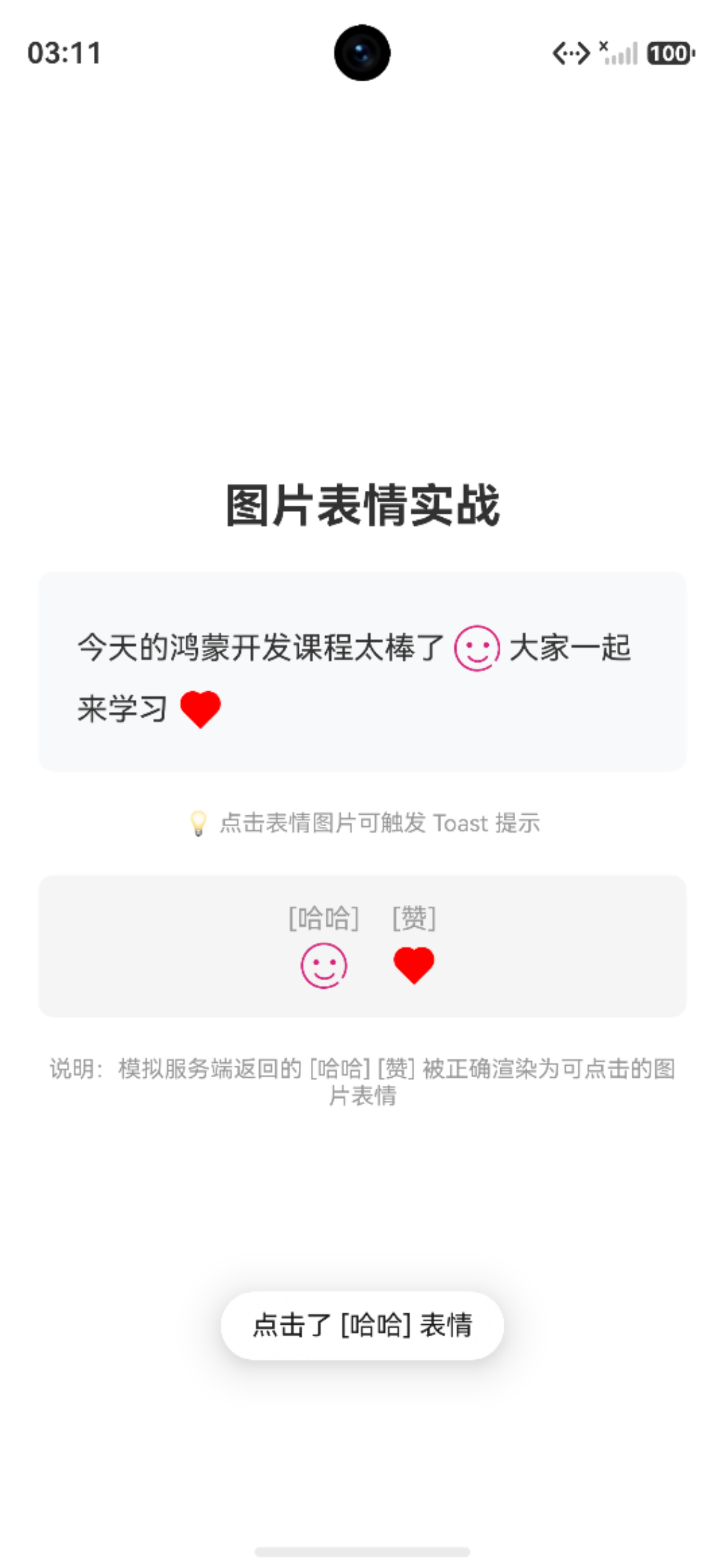
七、实战四:CustomSpan 自定义绘制
场景:带圆角背景的“热门”、“新品”标签,完全自定义视觉样式。
核心代码:
import { LengthMetrics } from '@kit.ArkUI';
import { common2D, drawing } from '@kit.ArkGraphics2D';

class TagCustomSpan extends CustomSpan {
  private text: string;
  private bgColor: common2D.Color;
  private textColor: common2D.Color;
  private measuredWidth: number = 0;
  private measuredHeight: number = 0;
  private paddingX: number = 8;
  private paddingY: number = 4;
  private uiContext: UIContext | undefined;
  private fontSizeFp: number = 0;

  constructor(uiContext: UIContext, text: string, bgColor: string, textColor: string = '#FFFFFF') {
    super();
    this.uiContext = uiContext;
    this.text = text;
    this.bgColor = this.hexToColor(bgColor);
    this.textColor = this.hexToColor(textColor);
  }

  private hexToColor(hex: string): common2D.Color {
    let colorStr = hex.replace('#', '');
    if (colorStr.length === 6) {
      colorStr = 'FF' + colorStr;
    }
    const alpha = parseInt(colorStr.substring(0, 2), 16);
    const red = parseInt(colorStr.substring(2, 4), 16);
    const green = parseInt(colorStr.substring(4, 6), 16);
    const blue = parseInt(colorStr.substring(6, 8), 16);
    return { alpha, red, green, blue };
  }

  onMeasure(measureInfo: CustomSpanMeasureInfo): CustomSpanMetrics {
    this.fontSizeFp = measureInfo.fontSize;

    const measureUtils = this.uiContext?.getMeasureUtils();
    let textWidthVp = 0;
    let textHeightVp = 0;

    if (measureUtils && this.uiContext) {
      const textSize = measureUtils.measureTextSize({
        textContent: this.text,
        fontSize: this.fontSizeFp
      });
      const textWidthPx = Number(textSize.width ?? 0);
      const textHeightPx = Number(textSize.height ?? 0);
      textWidthVp = this.uiContext.px2vp(textWidthPx);
      textHeightVp = this.uiContext.px2vp(textHeightPx);
    } else {
      textWidthVp = this.text.length * 14;
      textHeightVp = 16;
    }

    this.measuredWidth = textWidthVp + this.paddingX * 2;
    this.measuredHeight = textHeightVp + this.paddingY * 2;

    return {
      width: this.measuredWidth,
      height: this.measuredHeight
    };
  }

  onDraw(context: DrawContext, drawInfo: CustomSpanDrawInfo): void {
    const canvas = context.canvas;
    const toPx = (vp: number): number => this.uiContext?.vp2px(vp) ?? vp * 2;

    const bgWidthPx = toPx(this.measuredWidth);
    const bgHeightPx = toPx(this.measuredHeight);

    // 绘制圆角背景
    const bgBrush = new drawing.Brush();
    bgBrush.setColor(this.bgColor);
    bgBrush.setAntiAlias(true);
    canvas.attachBrush(bgBrush);

    const lineHeight = drawInfo.lineBottom - drawInfo.lineTop;
    const topOffset = (lineHeight - bgHeightPx) / 2;
    const rect: common2D.Rect = {
      left: drawInfo.x,
      top: drawInfo.lineTop + topOffset,
      right: drawInfo.x + bgWidthPx,
      bottom: drawInfo.lineTop + topOffset + bgHeightPx
    };
    const roundRect = new drawing.RoundRect(rect, 4, 4);
    canvas.drawRoundRect(roundRect);
    canvas.detachBrush();

    // 绘制文字
    const textBrush = new drawing.Brush();
    textBrush.setColor(this.textColor);
    textBrush.setAntiAlias(true);
    canvas.attachBrush(textBrush);

    const font = new drawing.Font();
    const fontSizePx = this.uiContext?.fp2px(this.fontSizeFp || 16) ?? this.fontSizeFp * 3.5;
    font.setSize(fontSizePx);

    const textBlob = drawing.TextBlob.makeFromString(
      this.text,
      font,
      drawing.TextEncoding.TEXT_ENCODING_UTF8
    );

    const textX = drawInfo.x + toPx(this.paddingX);
    const bgCenterY = drawInfo.lineTop + topOffset + bgHeightPx / 2;
    const textY = bgCenterY + fontSizePx * 0.35;

    canvas.drawTextBlob(textBlob, textX, textY);
    canvas.detachBrush();
  }
}

@Entry
@Component
struct CustomSpanPage {
  private textController: TextController = new TextController();

  aboutToAppear(): void {
    const styledString = new MutableStyledString('');

    const textSpan = new MutableStyledString('商品分类:', [
      {
        start: 0,
        length: 5,
        styledKey: StyledStringKey.FONT,
        styledValue: new TextStyle({
          fontColor: '#333333',
          fontSize: LengthMetrics.fp(16)
        })
      }
    ]);
    styledString.appendStyledString(textSpan);

    const customSpan1 = new TagCustomSpan(this.getUIContext(), '热门', '#FF4D4F', '#FFFFFF');
    styledString.appendStyledString(new MutableStyledString(customSpan1));

    const textSpan2 = new MutableStyledString(' 新品', [
      {
        start: 0,
        length: 3,
        styledKey: StyledStringKey.FONT,
        styledValue: new TextStyle({
          fontColor: '#333333',
          fontSize: LengthMetrics.fp(16)
        })
      }
    ]);
    styledString.appendStyledString(textSpan2);

    const customSpan2 = new TagCustomSpan(this.getUIContext(), '限时优惠', '#FF6B00', '#FFFFFF');
    styledString.appendStyledString(new MutableStyledString(customSpan2));

    this.textController.setStyledString(styledString);
  }

  build() {
    Column({ space: 20 }) {
      Text('CustomSpan 自定义绘制')
        .fontSize(24)
        .fontWeight(FontWeight.Bold)
        .width('100%')
        .textAlign(TextAlign.Center);

      Text(undefined, { controller: this.textController })
        .width('100%')
        .padding(20)
        .backgroundColor('#F8F9FA')
        .borderRadius(8)
        .lineHeight(44)
        .fontSize(16)
        .fontColor('#333333');

      Text('通过 CustomSpan 自定义绘制带圆角背景的标签元素')
        .fontSize(12)
        .fontColor('#999')
        .width('100%')
        .textAlign(TextAlign.Center);
    }
    .width('100%')
    .height('100%')
    .padding(20)
    .justifyContent(FlexAlign.Center)
    .backgroundColor('#FFFFFF');
  }
}
运行效果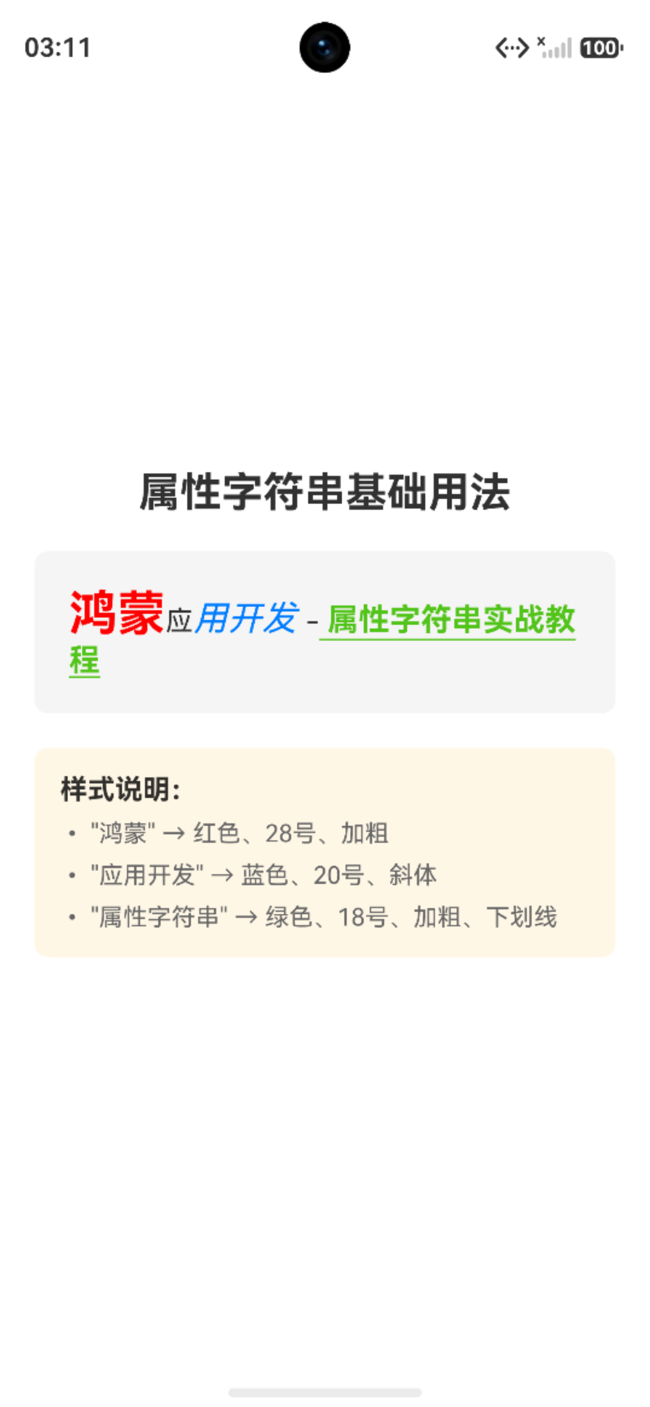
⚠️ 踩坑提醒:
onDraw中绘制文字时,drawInfo.baseline是当前行的基线位置,文字 y 坐标应基于此计算,否则会出现文字与背景错位。另外注意绘制文字单位px,我们原字体单位fp 需要单位转换。
八、总结
核心要点速查
| 要点 | 说明 |
|---|---|
| 推荐使用 | MutableStyledString(可变,支持动态追加) |
| 绑定方式 | TextController.setStyledString() |
| 样式优先级 | 属性字符串样式 > 组件样式;属性字符串 > Span 子组件 |
| 交互实现 | GestureStyle 实现点击/长按 |
| 图文混排 | ImageAttachment 支持 resourceValue(本地资源)和 value(PixelMap) |
| 自定义绘制 | 继承 CustomSpan 实现 onMeasure/onDraw |
| 单位规范 | 字体用 fp,尺寸用 vp,绘制坐标用 px |
适用场景与选型建议
- 简单富文本(固定样式):
Text + Span足够 - 动态样式 + 交互(@/#高亮、图文混排):StyledString 是最佳选择
- 用户可编辑富文本:使用
RichEditor组件 - 完整 HTML 页面:使用
Web组件

作为“人工智能6S店”的官方数字引擎,为AI开发者与企业提供一个覆盖软硬件全栈、一站式门户。
更多推荐

 1
1 0
0- 0


 已为社区贡献105条内容

所有评论(0)