
鸿蒙原生 ArkTS 布局系列(五):Flex + ItemAlign.Stretch —— 交叉轴拉伸等高对齐完全指南
一、引言
在移动端 UI 设计中,「等高」是一种非常常见的视觉需求。无论是仪表盘上的统计卡片、底部操作栏的功能按钮,还是列表页中的信息卡片,将不同内容的子组件统一为相同高度,都能显著提升界面的整洁度和专业感。
想象以下场景:你的应用首页有一个四列的数据概览面板,分别展示「今日订单」「营收金额」「活跃用户」「退款率」。四个面板的内容长度各不相同——有的只有两个数字,有的包含一行描述文字。如果让它们自由发挥高度,面板会参差不齐,视觉上十分凌乱。但如果给每个面板手动设置相同高度,又需要不断调整以适配不同屏幕。
这就是 Stretch 拉伸对齐的用武之地。
在鸿蒙 ArkTS 的布局体系中,实现等高布局有多种方法:
- 手动设置统一高度:给每个子组件设置相同的固定高度值,简单粗暴但缺乏弹性
- 使用 layoutWeight 等比分摊:让子组件在主轴方向按比例分配空间,较为灵活
- 使用 Flex 容器的 ItemAlign.Stretch:声明式方案,子组件自动拉伸至容器交叉轴尺寸
其中,ItemAlign.Stretch 是最优雅、最「声明式」的解决方案——你只需要告诉容器「拉伸我的子组件」,容器就会自动将所有子组件在交叉轴方向上拉伸至相同高度,无需任何手动计算或比例分配。
然而,与基线对齐类似,Row 容器的 alignItems() 方法并不支持 Stretch。Row.alignItems() 的参数类型为 VerticalAlign,仅提供 Top、Center、Bottom 三种基础对齐方式。要实现交叉轴拉伸,同样需要借助 Flex 容器的构造函数参数。
本文将围绕「Flex + ItemAlign.Stretch」这一布局模式,从原理到实践,从简单对比到复杂应用场景,深入讲解交叉轴拉伸的完整知识体系。
二、什么是「交叉轴拉伸」?
2.1 核心概念
在 Flex 布局中,交叉轴(Cross Axis) 是与主轴(Main Axis)垂直的方向:
- 对于
FlexDirection.Row(水平排列),主轴是水平方向,交叉轴是垂直方向 - Stretch 的作用就是将子组件在交叉轴方向上拉伸至容器的交叉轴尺寸
简单来说:Flex + Row + Stretch = 水平排列 + 所有子组件等高
2.2 Stretch 的工作原理
当 Flex 容器设置了 alignItems(ItemAlign.Stretch) 后:
- 容器会测量自身的交叉轴尺寸(对于水平 Flex,即容器的高度)
- 遍历所有子组件,忽略它们自身设置的交叉轴尺寸(即高度)
- 将每个子组件的交叉轴尺寸拉伸至与容器相同
关键前提:容器的交叉轴尺寸必须是确定的(显式设置或由父容器约束)。如果容器没有固定高度,Stretch 的效果将不可见。
2.3 与手动设置高度的对比
假设有四个子组件,高度分别为 60px、80px、100px、120px:
| 实现方式 | 代码量 | 是否自适应 | 维护成本 |
|---|---|---|---|
| 手动设置统一高度 | 每个子组件设置 .height(80) |
否 | 高(需手动调整) |
| layoutWeight 分摊 | 需配合容器高度 | 是(相对等比) | 中 |
| ItemAlign.Stretch | 容器设置一行属性 | 是 | 低 |
三、Row 与 Flex 的 Stretch API 差异
3.1 为什么 Row 不支持 Stretch?
与基线对齐的情况相同:Row 是 Flex 的轻量级特化版本,其 alignItems() 方法被设计为接受 VerticalAlign 枚举,仅提供三种最常用的对齐方式:
// Row 支持的三种对齐
Row() { /* ... */ }
  .alignItems(VerticalAlign.Top)      // 顶部对齐
  .alignItems(VerticalAlign.Center)   // 居中对齐(默认)
  .alignItems(VerticalAlign.Bottom)   // 底部对齐
Stretch 属于更高级的弹性布局能力,需要通过 Flex 容器的构造函数参数来使用。
3.2 正确的 Stretch 语法
// ✅ 正确语法:Flex 构造函数参数
Flex({
  direction: FlexDirection.Row,       // 水平排列
  alignItems: ItemAlign.Stretch        // ★ 交叉轴拉伸
}) {
  Text('组件 A').height(60)           // 此高度会被 Stretch 覆盖
  Text('组件 B').height(100)          // 此高度会被 Stretch 覆盖
  Text('组件 C').height(80)           // 此高度会被 Stretch 覆盖
}
.height(120)                          // 容器高度 = 拉伸后的统一高度
3.3 与 Row 的完整对比
| 特性 | Row | Flex + Stretch |
|---|---|---|
| 主轴方向 | 水平 | 水平(通过 direction 指定) |
| 交叉轴对齐参数 | VerticalAlign |
ItemAlign |
| 顶部对齐 | .alignItems(VerticalAlign.Top) |
{ alignItems: ItemAlign.Start } |
| 居中对齐 | .alignItems(VerticalAlign.Center) |
{ alignItems: ItemAlign.Center } |
| 底部对齐 | .alignItems(VerticalAlign.Bottom) |
{ alignItems: ItemAlign.End } |
| 交叉轴拉伸 | ❌ 不支持 | ✅ { alignItems: ItemAlign.Stretch } |
| 链式调用 | ✅ 支持 | ❌(需在构造函数中传入) |
四、ItemAlign.Stretch 的详细效果
4.1 当子组件没有设置高度时
如果子组件没有显式设置 height(或设置为 0),Stretch 会直接将其拉伸至容器高度。子组件内部的内容会按照其自身的布局属性在拉伸后的空间内排列。
这是 Stretch 最自然的用法——子组件只需关注内容,高度由容器统一控制。
4.2 当子组件设置了固定高度时
如果子组件设置了固定 height(如 height(80)),Stretch 会覆盖这个固定高度,将子组件拉伸至容器高度。
Flex({ direction: FlexDirection.Row, alignItems: ItemAlign.Stretch }) {
  Text('原高度 60px').height(60)    // ← 被拉伸至容器高度
  Text('原高度 100px').height(100)  // ← 被拉伸至容器高度
}
.height(120)
此时两个文字组件都是 120px 高,它们的 .height(60) 和 .height(100) 被 Stretch 覆盖。
4.3 当子组件设置了 layoutWeight 时
layoutWeight 控制的是主轴方向(水平方向)的宽度分配,与 Stretch(控制交叉轴/垂直方向的高度)互不冲突。两者可以完美配合:
Flex({ direction: FlexDirection.Row, alignItems: ItemAlign.Stretch }) {
  Column() { /* ... */ }
    .layoutWeight(1)        // 水平方向等宽
    .height('100%')          // 垂直方向填满
  Column() { /* ... */ }
    .layoutWeight(2)        // 水平方向占 2 份宽度
    .height('100%')
}
.height(150)
这样既实现了「水平等宽/不等宽分布」,又实现了「垂直等高」。
4.4 Stretch 与 height(‘100%’) 的关系
在 Stretch 布局中,建议给子组件设置 .height('100%')。原因如下:
ItemAlign.Stretch会在布局层面将子组件拉伸至容器高度- 但子组件内部的布局(如 Column 的排列)需要一个明确的高度约束
- 设置
.height('100%')可以让子组件的内容正确地在拉伸后的高度范围内排列
// ✅ 推荐:Stretch + height('100%')
Flex({ direction: FlexDirection.Row, alignItems: ItemAlign.Stretch }) {
  Column() {
    Text('标题')
    Text('描述内容')
  }
  .height('100%')   // 让 Column 内部感知被拉伸后的高度
  .layoutWeight(1)
}
.height(100)
五、完整示例代码解析
下面通过完整的可运行示例,展示 Stretch 的 4 种典型应用场景。
5.1 数据模型与子组件定义
// ── 数据接口 ──
interface CardItem { label: string; desc: string; color: string; }
interface ActionItem { icon: string; label: string; color: string; }
interface BlockItem { label: string; color: string; height: number; }
interface StatItem {
  number: string; unit: string; label: string;
  color: string; accent: string;
}
色块组件(HeightBlock)
@Component
struct HeightBlock {
  public label: string = '';
  public color: string = '#888';
  public intrinsicHeight: number = 60;

  build() {
    Column() {
      Text(this.label).fontSize(14).fontWeight(FontWeight.Bold).fontColor('#fff')
      Text(`${this.intrinsicHeight}px`).fontSize(11)
        .fontColor('rgba(255,255,255,0.8)').margin({ top: 2 })
    }
    .alignItems(HorizontalAlign.Center)
    .justifyContent(FlexAlign.Center)
    .width(65)
    .height(this.intrinsicHeight)      // 固定高度,将被 Stretch 覆盖
    .backgroundColor(this.color)
    .borderRadius(6)
  }
}
内容卡片组件(StretchCard)
@Component
struct StretchCard {
  public item: CardItem = { label: '', desc: '', color: '#e8ecf0' };

  build() {
    Column() {
      Text(this.item.label).fontSize(15).fontWeight(FontWeight.Bold).fontColor('#1a1a2e')
      Text(this.item.desc).fontSize(12).fontColor('#555').margin({ top: 6 })
    }
    .alignItems(HorizontalAlign.Start)
    .width(0).layoutWeight(1)          // 水平等宽
    .height('100%')                     // 垂直填满
    .padding(12)
    .backgroundColor(this.item.color)
    .borderRadius(10)
  }
}
操作按钮组件(StretchButton)
@Component
struct StretchButton {
  public item: ActionItem = { icon: '📄', label: '', color: '#3a7bd5' };

  build() {
    Column() {
      Text(this.item.icon).fontSize(28)
      Text(this.item.label).fontSize(13).fontColor('#fff').margin({ top: 4 })
    }
    .alignItems(HorizontalAlign.Center)
    .justifyContent(FlexAlign.Center)
    .width(0).layoutWeight(1)           // 水平等宽
    .height('100%')                      // 垂直填满
    .backgroundColor(this.item.color)
    .borderRadius(10)
  }
}
统计数据卡片(StatCard)
@Component
struct StatCard {
  public number: string = '0';
  public unit: string = '';
  public label: string = '';
  public color: string = '#f0f4f8';
  public accentColor: string = '#3a7bd5';

  build() {
    Column() {
      Row() {
        Text(this.number).fontSize(28).fontWeight(FontWeight.Bold)
          .fontColor(this.accentColor)
        Text(this.unit).fontSize(13).fontColor(this.accentColor)
          .margin({ left: 2 }).alignSelf(ItemAlign.End)
      }.alignItems(VerticalAlign.Bottom)

      Text(this.label).fontSize(12).fontColor('#888').margin({ top: 4 })
    }
    .alignItems(HorizontalAlign.Center)
    .justifyContent(FlexAlign.Center)
    .width(0).layoutWeight(1)
    .height('100%')
    .padding(10)
    .backgroundColor(this.color)
    .borderRadius(10)
  }
}
5.2 主页面
@Entry
@Component
struct RowStretchPage {
  private readonly blocks: BlockItem[] = [
    { label: '短', color: '#e74c3c', height: 60 },
    { label: '中', color: '#3498db', height: 80 },
    { label: '长', color: '#2ecc71', height: 100 },
    { label: '超长', color: '#f39c12', height: 120 },
  ];
  private readonly cards: CardItem[] = [
    { label: '📌 通知', desc: '您的应用已通过审核。', color: '#e8f0fe' },
    { label: '📊 报告', desc: '本周活跃用户增长 12%。', color: '#e6f4ea' },
    { label: '⚙️ 更新', desc: 'v3.2.0 发布,含多项优化。', color: '#fef7e0' },
    { label: '🎯 建议', desc: '检测到 3 处可优化项。', color: '#fce8e6' },
  ];
  private readonly actions: ActionItem[] = [
    { icon: '📷', label: '拍照', color: '#3a7bd5' },
    { icon: '📁', label: '相册', color: '#2ecc71' },
    { icon: '📍', label: '位置', color: '#f39c12' },
    { icon: '🎵', label: '音乐', color: '#9b59b6' },
  ];
  private readonly stats: StatItem[] = [
    { number: '99', unit: '%', label: '满意度', color: '#e8f0fe', accent: '#3a7bd5' },
    { number: '1.2k', unit: '', label: '日活用户', color: '#e6f4ea', accent: '#2ecc71' },
    { number: '48', unit: 'h', label: '响应时长', color: '#fef7e0', accent: '#f39c12' },
    { number: '7', unit: '天', label: '连续签到', color: '#fce8e6', accent: '#e74c3c' },
  ];

  build() {
    Column() {
      // ── 标题区 ──
      Column() {
        Text('📐 Flex(Row) + alignItems(ItemAlign.Stretch)')
          .fontSize(20).fontWeight(FontWeight.Bold).fontColor('#fff')
        Text('水平排列 · 交叉轴拉伸 · 所有子组件等高填满容器')
          .fontSize(12).fontColor('#cce0ff').margin({ top: 4 })
      }.width('100%').padding(20).backgroundColor('#2d5f8a')

      // ══ 演示一:色块等高对比 ══
      Column() {
        Text('📏 色块 Stretch 等高效果').fontSize(15)
          .fontWeight(FontWeight.Bold).fontColor('#1a1a2e').margin({ bottom: 8 })

        Text('▼ 不使用 Stretch — 色块保持自身高度')
          .fontSize(11).fontColor('#999').margin({ bottom: 4 })
        Row() {
          ForEach(this.blocks, (b: BlockItem) => {
            HeightBlock({ label: b.label, color: b.color, intrinsicHeight: b.height })
          }, (b: BlockItem) => b.label)
        }.width('100%').height(80).padding(6)
        .backgroundColor('#f0f4f8').borderRadius(10)

        Text('▼ ★ 使用 Stretch — 色块被拉伸等高 ★')
          .fontSize(11).fontColor('#c7254e').fontWeight(FontWeight.Bold).margin({ bottom: 4 })
        Flex({ direction: FlexDirection.Row, alignItems: ItemAlign.Stretch }) {
          ForEach(this.blocks, (b: BlockItem) => {
            HeightBlock({ label: b.label, color: b.color, intrinsicHeight: b.height })
          }, (b: BlockItem) => b.label)
        }.width('100%').height(80).padding(6)
        .backgroundColor('#f0f4f8').borderRadius(10)
        .border({ width: 2, color: '#c7254e', style: BorderStyle.Dashed })
      }.width('100%').padding(14).backgroundColor('#fff').borderRadius(12).margin(10)

      // ══ 演示二~四同样结构,具体见完整代码 ══
    }.width('100%').height('100%').backgroundColor('#eef2f7')
  }
}
完整代码见项目文件:
entry/src/main/ets/pages/RowStretchPage.ets
六、四种应用场景详解
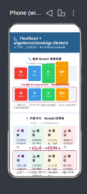
6.1 场景一:不同高度色块——Stretch 的基础效果
场景说明:四个色块的高度分别为 60px、80px、100px、120px,放在一个高度为 80px 的容器中。
不使用 Stretch(Row 默认):
- 60px 的色块不会被拉伸,保持矮小
- 100px 和 120px 的色块超过容器高度,溢出或被裁剪
- 视觉上参差不齐
使用 Stretch(核心方案):
- 所有色块被拉伸至容器高度 80px
- 60px 的色块变高,100px 和 120px 的色块被压缩
- 视觉上全部等高
6.2 场景二:内容卡片——描述文字行数不同
场景说明:四张信息卡片,标题长度和描述文字行数各不相同,放在 100px 高的容器中。
不使用 Stretch:
- 卡片高度随内容变化,高的高、矮的矮
- 视觉上不整齐
使用 Stretch:
- 所有卡片等高 100px
- 卡片内部的内容在拉伸后的空间内重新排列
- 配合
.layoutWeight(1)实现等宽 + 等高
6.3 场景三:操作按钮组——统一按钮高度
场景说明:四个功能按钮(拍照、相册、位置、音乐),各自有图标和文字。
使用 Stretch:
- 按钮高度统一为 80px
- 图标和文字在按钮内部居中排列
- 视觉效果整齐划一
6.4 场景四:统计面板——数据卡片等高
场景说明:四个统计项(满意度、日活用户、响应时长、连续签到),数据长度和单位各不相同。
使用 Stretch:
- 统计卡片等高 90px
- 大号数字 + 小号单位 + 底部标签 的布局在等高区域内排列
- 面板整体视觉平衡
七、常见问题与避坑指南
7.1 问题一:Row 不能直接使用 ItemAlign.Stretch
// ❌ 编译错误
Row() { /* ... */ }
  .alignItems(ItemAlign.Stretch)

// ✅ 正确:使用 Flex 构造函数
Flex({ direction: FlexDirection.Row, alignItems: ItemAlign.Stretch }) {
  /* ... */
}
7.2 问题二:Flex 的 alignItems 不能链式调用
// ❌ 编译错误:Property does not exist
Flex() { /* ... */ }
  .alignItems(ItemAlign.Stretch)

// ✅ 正确:在构造函数中传入
Flex({ direction: FlexDirection.Row, alignItems: ItemAlign.Stretch }) {
  /* ... */
}
7.3 问题三:Stretch 没有效果——容器没有固定高度
// ❌ 容器高度 0(或自适应),Stretch 不可见
Flex({ direction: FlexDirection.Row, alignItems: ItemAlign.Stretch }) {
  ChildA()
  ChildB()
}
// 没有设置 height

// ✅ 容器必须有明确高度
Flex({ direction: FlexDirection.Row, alignItems: ItemAlign.Stretch }) {
  ChildA()
  ChildB()
}
.height(100)           // 固定高度
// 或 .layoutWeight(1)  // 由父容器撑满
7.4 问题四:子组件内容没有充分利用拉伸后的空间
如果子组件没有设置 .height('100%'),虽然 Stretch 会在布局层将子组件拉伸,但子组件内部的内容可能无法感知到拉伸后的高度,导致内容排列不正确。
// ✅ 推荐:子组件设置 height('100%')
Flex({ direction: FlexDirection.Row, alignItems: ItemAlign.Stretch }) {
  Column() {
    Text('标题')
    Text('描述')
  }
  .height('100%')    // 子组件内部感知被拉伸的高度
  .layoutWeight(1)
}
.height(120)
7.5 问题五:Stretch 与其他对齐方式混淆
Stretch 不是「居中对齐」,也不是「底部对齐」。它做的事情是拉伸子组件使其填满容器交叉轴。之后子组件内部的内容可以根据需要独立设置对齐方式:
Flex({ direction: FlexDirection.Row, alignItems: ItemAlign.Stretch }) {
  // 子组件被拉伸至容器高度
  Column() {
    Text('内容')
      .alignSelf(VerticalAlign.Top)    // 内容在拉伸后的空间内顶部对齐
  }
  .height('100%')

  Column() {
    Text('内容')
      .alignSelf(VerticalAlign.Bottom) // 内容在拉伸后的空间内底部对齐
  }
  .height('100%')
}
.height(100)
7.6 问题六:Stretch 容器嵌套使用时的注意事项
当 Stretch 容器内部再嵌套另一个 Flex 或 Row 时,需要特别注意高度传递:
// ✅ 嵌套场景:外层 Stretch 拉伸,内层 Row 继续布局
Flex({ direction: FlexDirection.Row, alignItems: ItemAlign.Stretch }) {
  // 左侧面板——被 Stretch 拉伸至容器高度
  Column() {
    Text('面板标题')
    // 内部继续使用 Row 布局
    Row() {
      Text('子项A')
      Text('子项B')
    }
    .width('100%')
  }
  .height('100%')           // 必须!内层 Column 需要高度约束
  .layoutWeight(1)

  // 右侧面板——同样被拉伸
  Column() {
    Text('另一面板')
  }
  .height('100%')
  .layoutWeight(1)
}
.height(200)
如果内层 Column 没有设置 .height('100%'),内层 Row 的内容可能无法正确填充被拉伸后的空间,导致布局异常。
7.7 问题七:Stretch 与滚动容器(Scroll)的配合
Stretch 不能直接与 Scroll 配合使用,因为 Scroll 需要子组件有确定的内容高度来决定滚动范围。如果在 Scroll 内部使用 Stretch,会导致布局计算冲突:
// ❌ 不推荐:Stretch 在 Scroll 内部
Scroll() {
  Flex({ direction: FlexDirection.Row, alignItems: ItemAlign.Stretch }) {
    // ... 子组件
  }
  .height('100%')
}
替代方案:使用固定高度的 Flex 替代 Scroll,或者将 Stretch 逻辑放在 Scroll 外部。
7.8 问题八:Stretch 与 alignSelf 的协同
除了在 Flex 容器上设置 alignItems: ItemAlign.Stretch,还可以在单个子组件上使用 alignSelf(ItemAlign.Stretch) 来覆盖容器的默认对齐方式。这让你可以灵活控制:大部分子组件使用默认对齐,特定子组件独立拉伸。
Flex({ direction: FlexDirection.Row, alignItems: ItemAlign.Center }) {
  // 大多数子组件居中对齐
  Text('居中的文字').fontSize(16)

  // 这个子组件独立拉伸
  Column() {
    Text('被拉伸的内容')
  }
  .height('100%')
  .layoutWeight(1)
  .alignSelf(ItemAlign.Stretch)    // 覆盖容器的 Center 设置
}
.height(80)
这在某些需要「大部分居中对齐 + 个别拉伸填满」的混合布局中非常实用。
八、最佳实践总结
8.1 使用 Stretch 的场景判断
符合以下条件时,优先使用 Stretch:
- 需要水平排列的子组件统一高度
- 子组件内容长度/行数不确定
- 希望容器控制高度,子组件专注内容
- 需要「等宽 + 等高」的网格布局
8.2 三要素检查清单
使用 Stretch 时,确认以下三点:
| 要素 | 说明 | 检查 |
|---|---|---|
| 容器高度 | Flex 必须有固定 height 或由父容器约束 | ✅ |
| Stretch 参数 | 在构造函数中设置 alignItems: ItemAlign.Stretch |
✅ |
| 子组件填满 | 子组件设置 .height('100%') 感知拉伸 |
✅(推荐) |
8.3 性能建议
- Stretch 是一个纯布局计算操作,无额外渲染开销
- 对于大量子组件,配合
ForEach使用,避免直接列出一长串子组件 - 避免在 Stretch 容器中嵌套过深(超过 5 层可能影响布局性能)
8.4 布局决策速查表
| 想要的效果 | 推荐方案 |
|---|---|
| 水平排列 + 底部对齐 | Row().alignItems(VerticalAlign.Bottom) |
| 水平排列 + 居中对齐 | Row().alignItems(VerticalAlign.Center)(默认) |
| 水平排列 + 基线对齐 | Flex({ direction: FlexDirection.Row, alignItems: ItemAlign.Baseline }) |
| 水平排列 + 等高拉伸 | Flex({ direction: FlexDirection.Row, alignItems: ItemAlign.Stretch }) |
| 水平排列 + 换行 | Flex({ direction: FlexDirection.Row, wrap: FlexWrap.Wrap }) |
| 水平排列 + 不等宽 | Flex + layoutWeight(n) 分配比例 |
九、总结
本文深入讲解了鸿蒙 ArkTS 中通过 Flex + ItemAlign.Stretch 实现交叉轴拉伸对齐的技术方案。我们从「等高布局」的实际需求出发,分析了 Stretch 的工作原理,与 Row 的局限性进行了对比,并通过四个实际演示场景(色块等高、内容卡片、操作按钮、统计面板)完整展示了 Stretch 的应用效果。
核心要点回顾
- Stretch = 交叉轴拉伸:对于水平 Flex,Stretch 让所有子组件在垂直方向等高
- Row 不支持 Stretch:必须通过
Flex({ direction: FlexDirection.Row, alignItems: ItemAlign.Stretch })实现 - 容器需要固定高度:
height必须显式设置,或者由父容器约束,Stretch 的效果才可见 - 子组件配合
height('100%'):让子组件内部内容正确感知被拉伸后的高度,是避免布局异常的推荐做法 - 与 layoutWeight 配合实现等宽等高:水平方向使用
layoutWeight(n)分配宽度,垂直方向使用 Stretch 统一高度 - alignSelf 覆盖容器的 alignItems:可以在单个子组件上使用
alignSelf(ItemAlign.Stretch)来独立控制 - 嵌套时注意高度传递:内层容器必须设置
.height('100%')以感知外层 Stretch 的拉伸尺寸
本系列回顾
至此,我们完成了鸿蒙原生 ArkTS 布局系列中关于「水平排列容器」的完整覆盖。五种对齐方式各有所长:
| 布局方式 | 核心代码 | 交叉轴对齐 | 适用场景 |
|---|---|---|---|
| 顶部对齐 | Row.alignItems(VerticalAlign.Top) |
顶部 | 通知栏、标签栏 |
| 居中对齐 | Row.alignItems(VerticalAlign.Center) |
居中 | 通用默认、图文混排 |
| 底部对齐 | Row.alignItems(VerticalAlign.Bottom) |
底部 | 导航栏、输入栏、工具条 |
| 基线对齐 | Flex({ ..., alignItems: ItemAlign.Baseline }) |
文字基线 | 价格标签、标题混排、图文组合 |
| 拉伸等高 | Flex({ ..., alignItems: ItemAlign.Stretch }) |
填满容器 | 卡片行、按钮组、统计面板 |
从 Row 到 Flex 的演进
许多学习者在初次接触鸿蒙 ArkTS 布局时,会困惑于何时使用 Row、何时使用 Flex。通过本系列的学习,可以总结出一个简单的原则:
- 如果只需要基础的顶部/居中/底部对齐,使用
Row——代码更简洁、语义更清晰 - 如果需要基线对齐或拉伸等高,使用
Flex——虽然需要构造函数参数,但提供了 Row 不具备的高级能力
这两种容器并不是互斥的,在同一个页面中可以根据需要混合使用。例如,外层使用 Flex + Stretch 实现等高卡片行,卡片内部使用 Row + Bottom 实现底部对齐的内容。
掌握这些布局方式的最佳途径是动手实践。建议读者将本文中的四个演示场景复制到 DevEco Studio 中运行,调整参数观察变化,深入理解每种对齐方式的行为。只有通过实际操作,才能真正掌握鸿蒙 ArkTS 布局的精髓。

作为“人工智能6S店”的官方数字引擎,为AI开发者与企业提供一个覆盖软硬件全栈、一站式门户。
更多推荐


 6
6 0
0- 0


 已为社区贡献10条内容

所有评论(0)