
【共创季稿事节】鸿蒙ArkTS之Row反向排列从右到左布局深度解析
鸿蒙 ArkTS 布局深度解析:Row 反向排列(从右到左)实战
一、引言
1.1 背景
随着鸿蒙生态的全球化进程加速,越来越多的应用需要面向海外用户发布。在中东、北非等地区,阿拉伯语(Arabic)和希伯来语(Hebrew)是主流语言,它们的阅读方向是从右到左(Right-to-Left,简称 RTL)。支持 RTL 不仅仅是文字方向的切换,更是整个 UI 布局的镜像翻转——导航栏、按钮排列、列表滑动方向都需要相应调整。
HarmonyOS NEXT 在 ArkTS 声明式 UI 框架中提供了原生且优雅的 RTL 布局支持。本文以 Row 组件的反向排列 为核心,深入剖析 Direction.Rtl 的实现原理、使用场景和最佳实践。
1.2 前置知识
- ArkTS 基本语法(装饰器、组件、状态管理)
- 熟悉
@Component和@Entry装饰器的用法 - 对 Flexbox 布局有基本认知
二、Row 组件基础回顾
2.1 Row 是什么
Row 是 水平方向 的线性布局容器,类似于前端 Flexbox 中的 flex-direction: row。它将子组件沿水平主轴依次排列,支持间距和对齐控制。
Row(option?: RowOption)
RowOption 参数:
| 参数 | 类型 | 说明 |
|---|---|---|
space |
number | string |
子组件间距,单位 vp |
reverse |
boolean |
是否反转排列(API 24) |
2.2 核心属性
| 属性方法 | 参数类型 | 作用 |
|---|---|---|
.direction() |
Direction |
设置主轴方向走向 |
.justifyContent() |
FlexAlign |
主轴对齐方式 |
.alignItems() |
VerticalAlign |
交叉轴(垂直)对齐 |
2.3 默认行为:LTR
默认情况下 Row 为从左到右(LTR):
- 主轴起点在最左侧
- 子组件按添加顺序从左向右排列
FlexAlign.Start对应左对齐,FlexAlign.End对应右对齐
三、direction 属性深度解析
3.1 Direction 枚举(API 24)
enum Direction {
  Ltr,  // 从左到右(默认)
  Rtl   // 从右到左
}
适用容器:Row、Column、Flex、List、Scroll。
3.2 direction 的工作原理
设置 .direction(Direction.Rtl) 后:
- 主轴起点反转:从左侧切换到右侧
- 子组件排列反转:从右向左依次排列
- 对齐语义反转:
FlexAlign.Start对应右侧对齐 - 交叉轴不受影响:垂直方向对齐方式不变
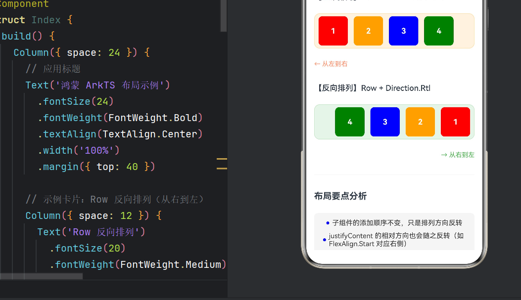
核心思想:子组件添加顺序不变,仅仅是排列方向镜像翻转。
3.3 与 FlexDirection 的区别
| 对比维度 | Direction.Rtl |
FlexDirection.RowReverse |
|---|---|---|
| 适用组件 | Row、Column、List、Flex | Flex 组件 |
| 设计意图 | RTL 语言适配 | 视觉排列反转 |
| 国际化支持 | 系统级自动适配 | 手动控制,不感知语言 |
最佳实践:RTL 语言适配优先使用
Direction.Rtl,它能触发更多系统级翻转。FlexDirection.RowReverse更适合纯视觉反转场景。
四、实战:Demo 逐段解析
4.1 项目结构
entry/src/main/ets/pages/
├── Index.ets              // 主页导航
└── RowReverseDemo.ets     // RTL 布局演示(核心)
4.2 封装 ColorBlock 组件
@Component
struct ColorBlock {
  private blockColor: Color = Color.Gray;
  private label: string = '';
  private size: number = 60;

  build() {
    Column() {
      Text(this.label)
        .fontColor(Color.White)
        .fontSize(16)
        .fontWeight(FontWeight.Bold)
    }
    .width(this.size)
    .height(this.size)
    .backgroundColor(this.blockColor)
    .borderRadius(8)
    .justifyContent(FlexAlign.Center)
    .alignItems(HorizontalAlign.Center)
  }
}
通过 @Component 封装为独立组件,参数化颜色、标签和尺寸,内部 Column 保证文字双轴居中。
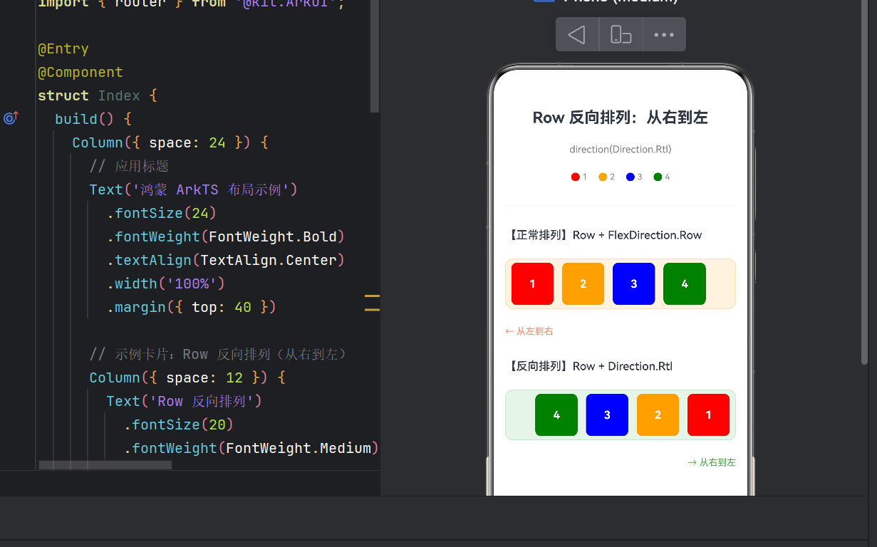
4.3 核心布局对比
// ---- 正常排列:从左到右(对比组) ----
Row({ space: 12 }) {
  ColorBlock({ blockColor: Color.Red,    label: '1', size: 60 })
  ColorBlock({ blockColor: Color.Orange, label: '2', size: 60 })
  ColorBlock({ blockColor: Color.Blue,   label: '3', size: 60 })
  ColorBlock({ blockColor: Color.Green,  label: '4', size: 60 })
}
.backgroundColor('#FFF3E0')     // 浅橙色背景
// 默认 Direction.Ltr,无需显式设置

// ---- 反向排列:从右到左(核心演示) ----
Row({ space: 12 }) {
  ColorBlock({ blockColor: Color.Red,    label: '1', size: 60 })
  ColorBlock({ blockColor: Color.Orange, label: '2', size: 60 })
  ColorBlock({ blockColor: Color.Blue,   label: '3', size: 60 })
  ColorBlock({ blockColor: Color.Green,  label: '4', size: 60 })
}
.backgroundColor('#E8F5E9')     // 浅绿色背景
.direction(Direction.Rtl)       // ★ 核心:从右到左
效果对比:
| 布局方式 | 排列顺序 | 1号位置 | 4号位置 |
|---|---|---|---|
| LTR | 1→2→3→4 | 最左侧 | 最右侧 |
| RTL | 4→3→2→1 | 最右侧 | 最左侧 |
4.4 图例组件
@Component
struct Legend {
  build() {
    Row({ space: 16 }) {
      // 红色圆点 + "1"
      Row({ space: 4 }) {
        Circle().width(12).height(12).fill(Color.Red)
        Text('1').fontSize(12).fontColor(Color.Gray)
      }
      // 橙色圆点 + "2"
      Row({ space: 4 }) {
        Circle().width(12).height(12).fill(Color.Orange)
        Text('2').fontSize(12).fontColor(Color.Gray)
      }
      // 蓝色圆点 + "3"
      Row({ space: 4 }) {
        Circle().width(12).height(12).fill(Color.Blue)
        Text('3').fontSize(12).fontColor(Color.Gray)
      }
      // 绿色圆点 + "4"
      Row({ space: 4 }) {
        Circle().width(12).height(12).fill(Color.Green)
        Text('4').fontSize(12).fontColor(Color.Gray)
      }
    }
    .width('100%')
    .justifyContent(FlexAlign.Center)
  }
}
使用 Circle 组件制作小圆点标记,帮助用户快速理解颜色-编号对应关系。
4.5 页面整体结构
build() {
  Scroll() {
    Column({ space: 24 }) {
      // 标题区
      Text('Row 反向排列:从右到左')
        .fontSize(22).fontWeight(FontWeight.Bold)

      // 图例
      Legend()

      // 正常排列演示区(浅橙色)
      // 反向排列演示区(浅绿色,核心)
      // 底部要点分析区
    }
    .padding({ left: 16, right: 16, bottom: 32 })
  }
  .backgroundColor(Color.White)
}
Scroll 提供纵向滚动能力,Column({ space: 24 }) 统一各区域间距。
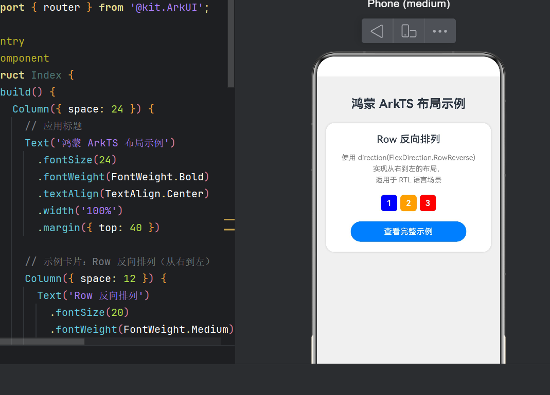
4.6 主页导航(Index.ets)
@Entry
@Component
struct Index {
  build() {
    Column({ space: 24 }) {
      Text('鸿蒙 ArkTS 布局示例')

      // 示例卡片
      Column({ space: 12 }) {
        // 预览小样:数字色块反向排列
        Row({ space: 6 }) {
          Text('3')  // 红色
          Text('2')  // 橙色
          Text('1')  // 蓝色
        }
        .direction(Direction.Rtl)

        Button('查看完整示例')
          .onClick(() => {
            router.pushUrl({ url: 'pages/RowReverseDemo' });
          })
      }
      .backgroundColor(Color.White)
      .borderRadius(16)
    }
  }
}
卡片式设计,包含迷你预览和跳转按钮。
五、RTL 适配完整方案
5.1 鸿蒙 RTL 支持层次
| 层次 | 支持方式 |
|---|---|
| 系统设置 | 切换 RTL 语言时自动触发 |
| 框架层 | Direction 枚举 + 语义化 start/end |
| 应用层 | 开发者手动适配 |
5.2 语义化:用 start/end 替代 left/right
// ❌ 不推荐
.margin({ left: 16 })

// ✅ 推荐(RTL 下自动翻转)
.margin({ start: 16 })
支持 start/end 的属性:margin、padding、alignRules、TextAlign、FlexAlign。
5.3 RTL 适配检查清单
- Row/Column 的
direction是否正确设置 - 所有
left/right已替换为start/end - 自定义 Canvas 绘图是否需镜像
- 图标是否需镜像翻转(箭头、语音波形等非对称图标)
-
SwipeGesture滑动方向是否正确 - 导航栏返回按钮方向是否正确
- 侧边抽屉滑出方向是否适配
- 列表
initialIndex是否设为最后一项
5.4 调试技巧
- DevEco Studio 切换语言:模拟器系统设置切换为阿拉伯语验证
- 颜色标记:如本文用橙色/绿色区分 LTR 和 RTL 容器
- 方向指示:添加箭头文字(← / →)辅助判断
- 自动化测试:使用
@ohos.test框架验证 RTL 下布局坐标
六、常见踩坑记录
6.1 RowReverse 已废弃
API 12 起,RowReverse 组件已废弃,统一使用 Row + .direction(Direction.Rtl):
// ❌ 旧代码(废弃)
RowReverse() { /* ... */ }

// ✅ 新代码
Row() { /* ... */ }
.direction(Direction.Rtl)
6.2 direction 与 justifyContent 的交互
设置 Direction.Rtl 后,justifyContent 的对齐语义也会反转:
Row() { Text('A'); Text('B') }
.direction(Direction.Rtl)
.justifyContent(FlexAlign.Start)  // RTL 下表示右侧对齐
6.3 direction 不继承
direction 不会被子容器继承。内层 Row 默认仍是 Direction.Ltr:
Row() {
  Row() { Text('内部') }   // ← 仍是 LTR!
}
.direction(Direction.Rtl)
解决方案:为每个需要 RTL 的容器单独设置 direction。
6.4 与 Scroll 的配合
当 Row 嵌套在 Scroll 中时,需确保滚动方向和排列方向协调一致。
七、性能优化建议
7.1 合理使用 ForEach
子组件较多时使用 ForEach 避免重复代码:
Row({ space: 8 }) {
  ForEach(this.items, (item: number, index: number) => {
    ColorBlock({ label: `${index + 1}`, blockColor: this.getColor(index) })
  }, (item) => item.toString())
}
.direction(Direction.Rtl)
7.2 避免嵌套过深
Row 嵌套层级建议不超过 5 层,否则影响布局计算性能。
7.3 使用 LazyForEach
含图片或复杂内容时使用 LazyForEach 减少首帧渲染:
Row({ space: 8 }) {
  LazyForEach(this.dataSource, (item: MyData) => {
    ComplexCard(item)
  }, (item) => item.id)
}
.direction(Direction.Rtl)
八、运行指南
8.1 环境要求
- DevEco Studio:5.0.0+
- HarmonyOS SDK:API 24(HarmonyOS NEXT 6.x)
- 模拟器/真机:支持 HarmonyOS NEXT
8.2 运行步骤
- DevEco Studio → “Open Project” → 选择项目目录
- 等待 Gradle 同步完成
- 点击运行,选择模拟器或真机
- 主页显示导航卡片,点击 “查看完整示例” 跳转演示页
- 上下对比两个 Row 容器的排列差异
8.3 预期效果
| 区域 | 视觉效果 |
|---|---|
| 上方(橙色背景) | 红→橙→蓝→绿,从左到右 |
| 下方(绿色背景) | 绿→蓝→橙→红,从右到左 |
| 方向指示 | “← 从左到右” / “→ 从右到左” |
| 底部要点 | 4 条分析,蓝色圆点标记 |
九、总结
9.1 核心知识点
- Row 组件是鸿蒙最基本的水平布局容器,默认 LTR
Direction.Rtl实现从右到左布局,适用于 Row、Column、List、Flexdirection与justifyContent配合时,对齐语义会反转- RTL 适配需从系统设置、框架支持和应用层三个维度综合考虑
- 性能优化:合理使用
ForEach、避免深层嵌套、采用懒加载
9.2 实践建议
- 尽早考虑 RTL:设计阶段就将 RTL 布局纳入考量
- 多用语义化 API:始终用
start/end而非left/right - 实际测试:在模拟器或真机切换为 RTL 语言进行验证
RTL 布局适配不仅是技术问题,更是对用户文化习惯的尊重。当一位阿拉伯语用户打开你的应用,看到布局从右侧自然展开,这种细节上的用心能极大提升产品的专业度和用户好感。
附录
参考文档
版本记录
| 版本 | 说明 |
|---|---|
| v1.0 | 初始发布,基于 API 24 |
版权声明:本文为原创技术文章,转载请注明出处。

作为“人工智能6S店”的官方数字引擎,为AI开发者与企业提供一个覆盖软硬件全栈、一站式门户。
更多推荐

 11
11 0
0- 0


 已为社区贡献13条内容

所有评论(0)