
鸿蒙原生 ArkTS 布局实战:Column 权重占比布局全解析
1. 前言:为什么需要权重占比布局?
在鸿蒙原生应用开发中,布局是构建用户界面的基石。ArkUI 提供了 Column(纵向容器)和 Row(横向容器)两大弹性布局容器,其中 layoutWeight 属性是实现弹性空间分配的核心工具。
在实际开发中,我们经常会遇到这样的需求:
“页面中有三个输入框,希望它们等分纵向空间,各占 1/3 的高度。”
或者:
“表单中有标题区、内容区和操作区,希望它们按 1:3:1 的比例分配垂直空间。”
这正是 权重占比布局(Weight Ratio Layout) 的应用场景。与固定高度布局相比,权重布局具有以下优势:
| 特性 | 固定高度布局 | 权重占比布局 |
|---|---|---|
| 适配性 | 不同屏幕尺寸需要手动调 | 自动等比例适配 |
| 可维护性 | 改一处高度需调整全部 | 改一个权重即可 |
| 视觉一致性 | 内容多少影响布局 | 始终保持比例 |
| 代码量 | 较多(需计算高度) | 较少(声明式权重) |
典型的应用场景包括:
- 登录/注册表单:用户名、密码、验证码三行等分空间
- 设置页面:分类标题、选项列表、操作按钮按比例分配
- 多栏仪表盘:多个监控面板均等分布
- 聊天界面:消息列表区与输入区分割
2. Column 布局基础回顾
在深入 layoutWeight 之前,有必要回顾 Column 容器的基本布局规则。
2.1 Column 的坐标系
Column 是一个纵向(垂直方向)的弹性布局容器。它的两个轴如下:
┌──────────────────────────────┐
│  ┌──────────────────────┐   │  ← 主轴起点(顶部)
│  │ 子组件 1             │   │
│  ├──────────────────────┤   │
│  │ 子组件 2             │   │  ← 主轴方向(垂直)
│  ├──────────────────────┤   │     ↓
│  │ 子组件 3             │   │
│  └──────────────────────┘   │  ← 主轴终点(底部)
└──────────────────────────────┘
     ←── 交叉轴方向(水平)──→
- 主轴(Main Axis):垂直方向,从顶部到底部
- 交叉轴(Cross Axis):水平方向,从左到右
2.2 Column 的核心属性
| 属性 | 作用轴 | 功能 |
|---|---|---|
justifyContent |
主轴(垂直) | 控制子组件在垂直方向上的排列方式 |
alignItems |
交叉轴(水平) | 控制子组件在水平方向上的对齐方式 |
layoutWeight |
主轴(垂直) | 按权重分配垂直空间 |
2.3 默认行为:内容撑开高度
在不使用 layoutWeight 的情况下,Column 中的子组件高度由其内容决定:
Column() {
  Text('Hello')        // 高度 ≈ 字体行高
  Text('World\n!!')    // 高度 ≈ 两倍行高
  Button('Click')      // 高度 ≈ 42vp
}
// 父 Column 的总高度 = 三个子组件高度之和 + padding + margin
这种"内容撑开"的行为在表单场景中往往导致各输入框高度不一,视觉上不整齐:
┌──────────────────┐
│ Hello            │  ← 很矮(仅一行文字)
├──────────────────┤
│ World            │  ← 中等(两行文字)
│ !!               │
├──────────────────┤
│ [ Click ]        │  ← 较高(按钮固定高度)
└──────────────────┘
layoutWeight 正是为了解决这个问题而生的。
3. layoutWeight 核心原理解析
3.1 layoutWeight 是什么
layoutWeight 是 ArkUI 中的一个弹性权重属性,它告诉父容器:“请按我的权重值分配剩余空间给我。”
函数签名:
.layoutWeight(value: number | string): this
参数:一个正数(整数或小数),或者可解析为数字的字符串(如 '2'、'1.5')。
行为规则:
- 空间分配基准:父容器先测量所有没有
layoutWeight的子组件,计算出它们占用的空间 - 计算剩余空间:父容器总尺寸减去已占用的空间 = 剩余可分配空间
- 按权重分配:所有设置了
layoutWeight的子组件,按权重比例瓜分剩余空间 - 权重覆盖固定值:如果子组件同时设置了
width/height和layoutWeight,固定值被忽略
3.2 height(0) + layoutWeight 黄金组合
这是 ArkUI 布局中最核心的技巧之一:
Column()
  .height(0)               // ← 放弃固定高度
  .layoutWeight(1)          // ← 由权重接管高度
为什么需要 height(0)?
如果不设置 height(0),Column 的高度由子组件的内容撑开。当 Column 内部包含 Text、Image 等有固有高度的组件时,Column 会有一个"固有高度"。这个固有高度会干扰 layoutWeight 的计算——布局引擎需要先减去这个固有高度才能得到剩余空间,导致最终高度不符合预期。
设置 height(0) 后,Column 的"需求高度"被清零,layoutWeight 可以完全接管高度分配,计算出的比例就是最终比例。
视觉对比:
不加 height(0):                        加了 height(0):
┌──────────────────────┐                ┌──────────────────────┐
│ Column               │                │ Column(height:0)     │
│   ┌──────────────┐   │                │                      │ ← 无固有高度
│   │ 子组件 A     │   │  ← 子组件撑开  │   ┌──────────────┐   │
│   └──────────────┘   │                │   │ 子组件 A     │   │
│                      │                │   │  (权重 1)    │   │
│                      │                │   └──────────────┘   │
│                      │                │   ┌──────────────┐   │
│   // 剩余空间很大    │                │   │ 子组件 B     │   │
│                      │                │   │  (权重 2)    │   │
│                      │                │   └──────────────┘   │
│                      │                │                      │
└──────────────────────┘                └──────────────────────┘
  权重分配不准确                          权重分配准确,1:2 比例
3.3 权重计算公式
当多个子组件都使用了 layoutWeight 时,高度的计算公式为:
单个子组件高度 = 父容器高度 × (自身权重 / 所有子组件权重之和)
示例:父容器高度为 600vp,三个子组件的权重分别为 1、2、3。
总权重 = 1 + 2 + 3 = 6

子组件 A 高度 = 600 × (1/6) = 100vp
子组件 B 高度 = 600 × (2/6) = 200vp  ← B 是 A 的两倍
子组件 C 高度 = 600 × (3/6) = 300vp  ← C 是 A 的三倍
3.4 父容器必须有明确高度
这是 ArkUI 布局引擎的基本原则:「父容器必须有明确的高度,layoutWeight 才能按比例分配。」
所谓"明确高度"指:
- 通过
.height(N)设置一个固定数值(如380) - 通过
.height('100%')设置为父容器的一定比例 - 通过父容器的
.height('100%')向上传递,最终由窗口决定 - 通过
layoutWeight在更外层分配
错误示例:
// ❌ 父容器没有明确高度
Column() {
  Column() {
    // 子组件使用 layoutWeight,但父 Column 高度不确定
    Text('A').height(0).layoutWeight(1)
    Text('B').height(0).layoutWeight(1)
  }
  // 这里没有给外层 Column 设置高度
}
正确示例:
// ✅ 父容器有明确高度
Column() {
  Column() {
    Text('A').height(0).layoutWeight(1)
    Text('B').height(0).layoutWeight(1)
  }
  .height(400)     // ← 明确高度 400vp
}
4. 实战项目:多行输入框等分纵向空间
4.1 项目结构全景
MyApplication/
├── entry/src/main/ets/
│   ├── pages/
│   │   └── ColumnWeightPage.ets    ← 主页面(本篇核心,472行)
│   └── entryability/
│       └── EntryAbility.ets         ← 应用入口
├── entry/src/main/resources/
│   └── base/profile/
│       └── main_pages.json          ← 页面路由
└── entry/src/main/
    └── module.json5                  ← 模块配置
4.2 数据模型定义
首先定义项目中使用的数据类型:
/**
 * 输入框行的配置
 */
interface InputConfig {
  label: string;       // 标签文字(如"用户名""密码")
  placeholder: string; // 占位提示
  weight: number;      // layoutWeight 权重值
  color: string;       // 背景色
  icon: string;        // 图标 emoji
}

/**
 * 无权重对比项的数据模型
 */
interface NoWeightItem {
  label: string;
  icon: string;
  color: string;
}
数据模型的设计遵循"关注点分离"原则——InputConfig 存储所有可配置的属性,InputPanel 组件只负责渲染,二者通过构造参数传递数据。
4.3 子组件:InputPanel —— 带权重的输入框行
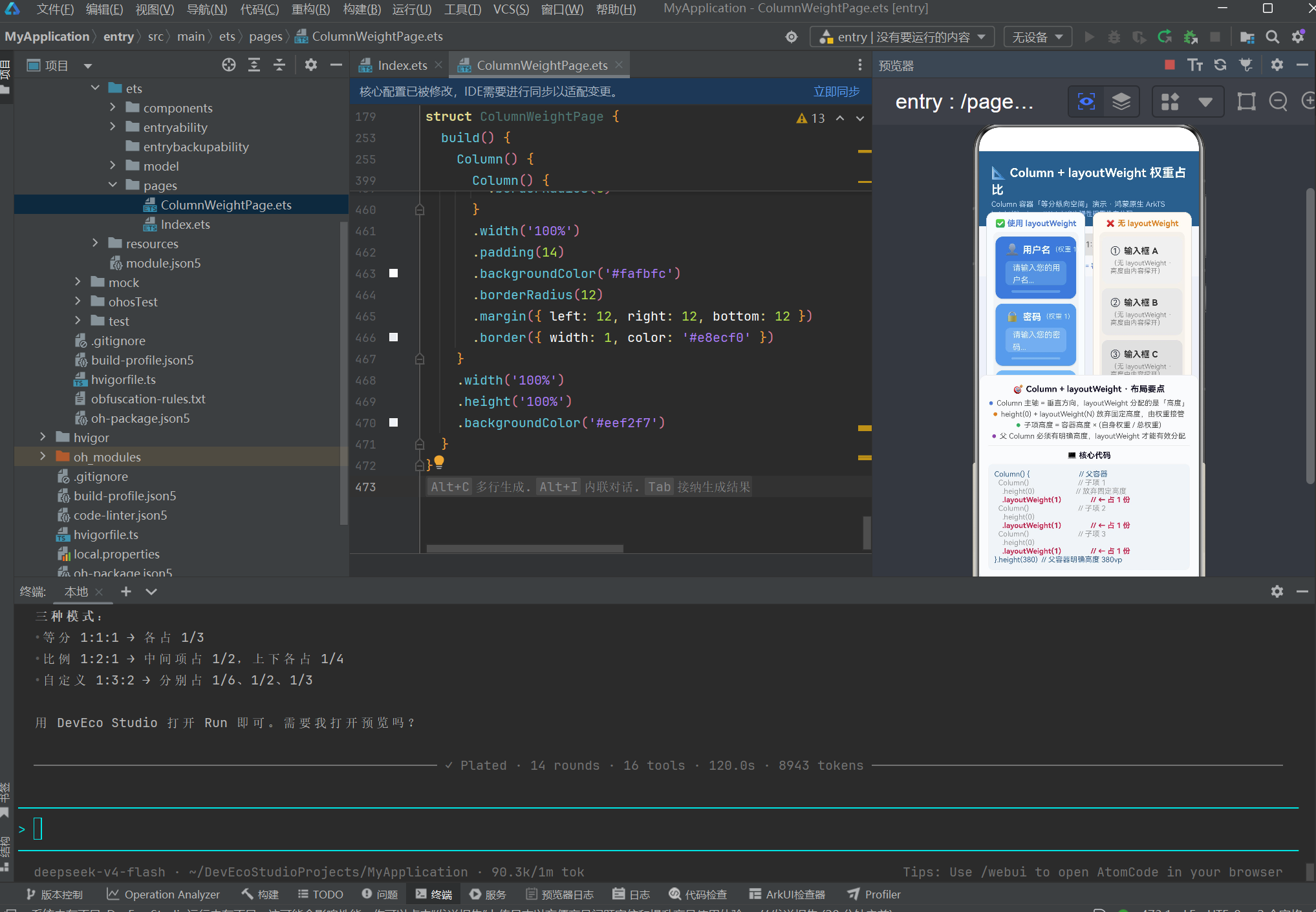
InputPanel 是本项目的核心子组件。它在内部使用 Column 容器,并通过 height(0) + layoutWeight 在父容器的纵向分配中占据比例空间。
@Component
struct InputPanel {
  private label: string = '';
  private placeholder: string = '';
  private weightValue: number = 1;
  private bgColor: string = '#3a7bd5';
  private icon: string = '';
  private panelIndex: number = 0;

  build() {
    // ═══════════════════════════════════════════════════
    //  ★★★ 核心:Column + layoutWeight 纵向权重 ★★★
    //  height(0) → 放弃固定高度,由 layoutWeight 接管
    //  layoutWeight(N) → 高度 = 容器高 × (N / 总权重)
    // ═══════════════════════════════════════════════════
    Column() {
      // ── 头部:图标 + 标签 + 权重标注 ──
      Row() {
        Text(this.icon).fontSize(18).margin({ right: 6 })
        Text(this.label)
          .fontSize(15)
          .fontWeight(FontWeight.Bold)
          .fontColor('#ffffff')
        Text(`(权重 ${this.weightValue})`)
          .fontSize(11)
          .fontColor('#ccffffff')
          .margin({ left: 8 })
      }
      .width('100%')
      .margin({ bottom: 8 })

      // ── 模拟输入框(带占位文字) ──
      Row() {
        Text(this.placeholder)
          .fontSize(13)
          .fontColor('#ddffffff')
          .margin({ left: 12 })
      }
      .width('100%')
      .height(40)
      .backgroundColor('#30ffffff')
      .borderRadius(8)

      // ── 底部比例装饰条 ──
      Row()
        .width('80%')
        .height(4)
        .borderRadius(2)
        .backgroundColor('#40ffffff')
        .margin({ top: 8 })
    }
    // ═══════════════════════════════════════════════════
    //  关键属性链(必须按此顺序):
    //    ├─ height(0) → 放弃固定高度
    //    ├─ layoutWeight(N) → ★ 按权重分配纵向空间
    //    ├─ width('100%') → 水平撑满父容器
    //    └─ justifyContent(Center) → 内容垂直居中
    // ═══════════════════════════════════════════════════
    .height(0)
    .layoutWeight(this.weightValue)    // ← ★ 核心
    .width('100%')
    .justifyContent(FlexAlign.Center)
    .padding({ left: 16, right: 16 })
    .backgroundColor(this.bgColor)
    .borderRadius(12)
    .margin({ top: 4, bottom: 4 })
    .shadow({ radius: 4, color: '#30000000', offsetX: 0, offsetY: 2 })
  }
}
布局要点:
.height(0):放弃固有高度,让layoutWeight完全接管.layoutWeight(this.weightValue):告诉父 Column “我占 weightValue 份高度”.width('100%'):水平方向撑满父容器.justifyContent(FlexAlign.Center):内部内容垂直居中- 内部的
Row()模拟输入框使用固定 40vp 高度,但其外层 Column 会均匀分配
4.4 子组件:NoWeightPanel —— 无权重对比面板
为了直观展示 layoutWeight 的作用,我们创建了一个不带权重的面板用于对比:
@Component
struct NoWeightPanel {
  private label: string = '';
  private icon: string = '';
  private bgColor: string = '#e0e0e0';

  build() {
    Column() {
      Row() {
        Text(this.icon).fontSize(16).margin({ right: 6 })
        Text(this.label)
          .fontSize(14)
          .fontWeight(FontWeight.Bold)
          .fontColor('#333333')
      }
      .width('100%')
      .margin({ bottom: 4 })

      Text('(无 layoutWeight · 高度由内容撑开)')
        .fontSize(11)
        .fontColor('#888888')
        .width('100%')
    }
    .width('100%')
    .justifyContent(FlexAlign.Center)
    .padding(14)
    .backgroundColor(this.bgColor)
    .borderRadius(10)
    .margin({ top: 4, bottom: 4 })
  }
}
区别在于:NoWeightPanel 没有 .height(0) 和 .layoutWeight(N),因此它的高度完全由文字内容撑开。三个面板各自占据一行文字的高度,不会均分父容器。
4.5 主页面:ColumnWeightPage
主页面是整个演示的核心。它采用上下结构,包含标题区、控制区、核心演示区和说明面板。
页面布局层次:
Column(最外层,全屏 .height('100%'))
├── Column(标题区:蓝色背景)
│   └── Text × 3(主标题、副标题、API说明)
├── Column(控制区:按钮行 + 状态文字)
│   ├── Row
│   │   ├── Button("等分 1:1:1")
│   │   ├── Button("比例 1:2:1")
│   │   └── Button("自定义 1:3:2")
│   └── Text(当前总权重说明)
├── Row(核心演示区 ★★★)
│   │
│   ├── Column(左侧:有权重)
│   │   ├── Text("✅ 使用 layoutWeight")
│   │   └── Column(内部 Column)
│   │       ├── InputPanel(weight:1)   ← 按权重分配
│   │       ├── InputPanel(weight:2)   ← 按权重分配
│   │       └── InputPanel(weight:1)   ← 按权重分配
│   │   .height(380)       ← 明确高度
│   │
│   └── Column(右侧:无权重对比)
│       ├── Text("❌ 无 layoutWeight")
│       └── Column
│           ├── NoWeightPanel          ← 内容撑开
│           ├── NoWeightPanel
│           └── NoWeightPanel
│       .height(380)       ← 明确高度
│
└── Column(说明面板:要点 + 核心代码)
4.6 三种权重模式设计与数据
本项目设计了三种权重模式,每种模式对应不同的业务场景:
@State private currentMode: number = MODE_EQUAL;  // 0=等分, 1=比例, 2=自定义

private readonly modeData: InputConfig[][] = [
  // ── 模式 0:等分 1:1:1 ──
  [
    { label: '用户名', placeholder: '请输入您的用户名...', weight: 1, color: '#3a7bd5', icon: '👤' },
    { label: '密码',   placeholder: '请输入您的密码...',   weight: 1, color: '#5a9be5', icon: '🔒' },
    { label: '验证码', placeholder: '请输入短信验证码...', weight: 1, color: '#7bb8f0', icon: '📱' },
  ],
  // ── 模式 1:比例 1:2:1 ──
  [
    { label: '简要说明', placeholder: '简短描述...',           weight: 1, color: '#e67e22', icon: '📝' },
    { label: '详细内容', placeholder: '请详细填写内容...',     weight: 2, color: '#d35400', icon: '📄' },
    { label: '备注信息', placeholder: '其他补充...',           weight: 1, color: '#e89840', icon: '📌' },
  ],
  // ── 模式 2:自定义 1:3:2 ──
  [
    { label: '标题',   placeholder: '输入标题...',     weight: 1, color: '#27ae60', icon: '🏷️' },
    { label: '正文',   placeholder: '输入正文内容...', weight: 3, color: '#2ecc71', icon: '📃' },
    { label: '标签',   placeholder: '输入标签...',     weight: 2, color: '#1e8449', icon: '🔖' },
  ],
];
每种模式的核心区别在于 weight 值:
| 模式 | 权重值 | 总权重 | 各占比例 |
|---|---|---|---|
| 等分 1:1:1 | 1, 1, 1 | 3 | 1/3, 1/3, 1/3 |
| 比例 1:2:1 | 1, 2, 1 | 4 | 1/4, 1/2, 1/4 |
| 自定义 1:3:2 | 1, 3, 2 | 6 | 1/6, 1/2, 1/3 |
设计意图:
- 等分模式适用于表单输入框(用户名、密码、验证码各行高度一致)
- 比例模式适用于内容展示(标题略小、正文占大头、备注略小)
- 自定义模式适用于复杂表单(标题短小、正文区最大、标签区中等)
4.7 模式切换交互逻辑
/**
 * 切换模式(带动画)
 */
private switchMode(mode: number): void {
  animateTo({ duration: 350 }, () => {
    this.currentMode = mode;
  });
}

/**
 * 获取当前模式的输入框配置
 */
private getCurrentInputs(): InputConfig[] {
  return this.modeData[this.currentMode];
}

/**
 * 获取当前模式的总权重值
 */
private getTotalWeight(): number {
  const inputs = this.getCurrentInputs();
  let sum = 0;
  for (let i = 0; i < inputs.length; i++) {
    sum += inputs[i].weight;
  }
  return sum;
}
当用户点击切换按钮时:
switchMode方法被调用,更新@State currentModeanimateTo以 350ms 动画过渡@State变化触发布局刷新getCurrentInputs()返回新模式的输入框配置ForEach重新渲染子组件列表layoutWeight根据新权重值重新计算高度分配
4.8 主页面完整代码
以下是主页面完整代码(关键部分):
import { hilog } from '@kit.PerformanceAnalysisKit';

const TAG = 'ColumnWeightDemo';
const MODE_EQUAL: number = 0;
const MODE_RATIO: number = 1;
const MODE_CUSTOM: number = 2;

// ...(接口定义和子组件见前文)...

@Entry
@Component
struct ColumnWeightPage {
  @State private currentMode: number = MODE_EQUAL;

  private readonly modeData: InputConfig[][] = [ /* 三种模式数据 */ ];
  private readonly modeNames: string[] = ['等分 1:1:1', '比例 1:2:1', '自定义 1:3:2'];

  build() {
    Column() {
      /* 区域 1:标题区 */
      Column() {
        Text('📐 Column + layoutWeight 权重占比')
          .fontSize(20).fontWeight(FontWeight.Bold)
          .fontColor('#ffffff')
        Text('Column 容器「等分纵向空间」演示')
          .fontSize(12).fontColor('#cce0ff').margin({ top: 4 })
      }
      .alignItems(HorizontalAlign.Start)
      .width('100%').padding({ top: 20, bottom: 14, left: 20, right: 20 })
      .backgroundColor('#2d5f8a')

      /* 区域 2:模式切换按钮 */
      Column() {
        Row() {
          ForEach(this.modeNames, (name: string, idx: number) => {
            Button(name)
              .height(36).fontSize(13)
              .backgroundColor(this.currentMode === idx ? '#3a7bd5' : '#e0e0e0')
              .onClick(() => this.switchMode(idx))
          }, (name: string) => name)
        }
        .width('100%').justifyContent(FlexAlign.Center)

        Text(`总权重 = ${this.getTotalWeight()},每项高度 = 容器高 × (自身权重 / ${this.getTotalWeight()})`)
          .fontSize(11).fontColor('#3a7bd5').margin({ top: 8 })
      }
      .width('100%').padding({ top: 12, bottom: 10 })
      .backgroundColor('#f5f7fa')

      /* 区域 3:核心演示区 ★★★ */
      Row() {
        // ── 左侧:有权重 ──
        Column() {
          Text('✅ 使用 layoutWeight')
          Column() {
            ForEach(this.getCurrentInputs(), (item: InputConfig, idx: number) => {
              InputPanel({
                label: item.label,
                placeholder: item.placeholder,
                weightValue: item.weight,
                bgColor: item.color,
                icon: item.icon,
                panelIndex: idx,
              })
            }, (item: InputConfig) => item.label)
          }
          .height(0).layoutWeight(1)   // ← 内部子项按权重分配
          .width('100%')
        }
        .height(380).layoutWeight(1)   // ← 左侧列高度 380vp

        // ── 右侧:无权重对比 ──
        Column() {
          Text('❌ 无 layoutWeight')
          Column() {
            ForEach(this.noWeightData, (item: NoWeightItem, idx: number) => {
              NoWeightPanel({ label: item.label, icon: item.icon, bgColor: item.color })
            }, (item: NoWeightItem) => item.label)
          }
          .height(0).layoutWeight(1)
        }
        .height(380).layoutWeight(1)
      }
      .layoutWeight(1).width('100%')

      /* 区域 4:说明面板 */
      Column() {
        Text('🎯 Column + layoutWeight · 布局要点')
        // ... 要点列表和核心代码展示 ...
      }
    }
    .width('100%').height('100%')
    .backgroundColor('#eef2f7')
  }
}
5. 运行效果分析
5.1 模式一:等分 1:1:1
当选中"等分 1:1:1"模式时:
┌────────────────────────────────────────────────┐
│ ✅ 使用 layoutWeight        ❌ 无 layoutWeight   │
│ ┌────────────────────────┐ ┌─────────────────┐  │
│ │ 👤 用户名  (权重 1)     │ │ ① 输入框 A      │  │
│ │ [请输入您的用户名...]   │ │ (内容撑开)     │  │
│ │ ═══════════════════════ │ │                 │  │
│ ├────────────────────────┤ ├─────────────────┤  │
│ │ 🔒 密码    (权重 1)     │ │ ② 输入框 B      │  │
│ │ [请输入您的密码...]     │ │ (内容撑开)     │  │
│ │ ═══════════════════════ │ │                 │  │
│ ├────────────────────────┤ ├─────────────────┤  │
│ │ 📱 验证码  (权重 1)     │ │ ③ 输入框 C      │  │
│ │ [请输入短信验证码...]   │ │ (内容撑开)     │  │
│ │ ═══════════════════════ │ │                 │  │
│ └────────────────────────┘ └─────────────────┘  │
│         ↑ 三等分 ↑                  ↑ 内容撑开 ↑ │
└────────────────────────────────────────────────┘
左侧:三个输入框高度完全相等,各占 380vp 的 1/3 ≈ 127vp。每个框内权重标注为 (权重 1)。
右侧:三个面板高度由 NoWeightPanel 内部的文字行高决定,每个只有约 50vp,整体紧凑于顶部,底部留下大量空白。
5.2 模式二:比例 1:2:1
切换到"比例 1:2:1"模式:
┌────────────────────────────────────────────────┐
│ ✅ 使用 layoutWeight                            │
│ ┌────────────────────────┐                     │
│ │ 📝 简要说明  (权重 1)   │  ← 占 1/4(约95vp)│
│ │ [简短描述...]          │                     │
│ ├────────────────────────┤                     │
│ │                        │                     │
│ │ 📄 详细内容  (权重 2)   │  ← 占 2/4(约190vp)│
│ │ [请详细填写内容...]    │                     │
│ │                        │                     │
│ ├────────────────────────┤                     │
│ │ 📌 备注信息  (权重 1)   │  ← 占 1/4(约95vp)│
│ │ [其他补充...]          │                     │
│ └────────────────────────┘                     │
└────────────────────────────────────────────────┘
效果:中间"详细内容"区高度是上下两区的两倍,视觉上形成"头尾小、中间大"的布局,适合需要突出正文内容的场景。
计算过程:总权重 = 1 + 2 + 1 = 4,高度 = 380 × (权重/4)。
5.3 模式三:自定义 1:3:2
切换到"自定义 1:3:2"模式:
┌────────────────────────────────────────────────┐
│ ✅ 使用 layoutWeight                            │
│ ┌────────────────────────┐                     │
│ │ 🏷️ 标题    (权重 1)    │  ← 占 1/6(约63vp)│
│ │ [输入标题...]          │                     │
│ ├────────────────────────┤                     │
│ │                        │                     │
│ │                        │                     │
│ │ 📃 正文    (权重 3)     │  ← 占 3/6(约190vp)│
│ │ [输入正文内容...]      │                     │
│ │                        │                     │
│ │                        │                     │
│ ├────────────────────────┤                     │
│ │ 🔖 标签    (权重 2)     │  ← 占 2/6(约127vp)│
│ │ [输入标签...]          │                     │
│ └────────────────────────┘                     │
└────────────────────────────────────────────────┘
效果:正文区最大,标签区中等,标题区最小。适用于博客编辑/文章发布等场景。
计算过程:总权重 = 1 + 3 + 2 = 6,高度 = 380 × (权重/6)。
5.4 对比:有权重 vs 无权重
左右两栏的对比是最直观的教学工具:
| 对比维度 | 使用 layoutWeight(左) | 无 layoutWeight(右) |
|---|---|---|
| 高度分配 | 按权重比例均分 | 内容撑开(文字高度) |
| 空间利用率 | 100% 填满父容器 | 底部留白 |
| 视觉一致性 | 所有子项高度差明确 | 高度碎片化 |
| 自适应 | 随父容器高度变化自动重算 | 不变 |
| 代码量 | 多一行 .layoutWeight(N) |
少一行 |
6. 布局引擎原理:layoutWeight 如何分配高度
为了深入理解 layoutWeight,我们需要了解 ArkUI 布局引擎的三阶段执行过程。
6.1 测量阶段
布局引擎首先测量父容器 Column 的尺寸。对于 height(380) 的父容器,其可用高度为 380vp。
然后引擎遍历所有子组件,测量它们的"需求高度":
子组件 InputPanel A:height(0) → 需求高度 = 0vp
                    layoutWeight(1) → 标记为"弹性子项"

子组件 InputPanel B:height(0) → 需求高度 = 0vp
                    layoutWeight(2) → 标记为"弹性子项"

子组件 InputPanel C:height(0) → 需求高度 = 0vp
                    layoutWeight(1) → 标记为"弹性子项"
6.2 分配阶段
引擎计算"剩余空间":
父容器高度 = 380vp
非弹性子项总高度 = 0vp(所有子项都是弹性的)
剩余空间 = 380 - 0 = 380vp
然后按权重分配:
总权重 = 1 + 2 + 1 = 4

InputPanel A 高度 = 380 × (1/4) =  95vp
InputPanel B 高度 = 380 × (2/4) = 190vp
InputPanel C 高度 = 380 × (1/4) =  95vp
6.3 布局阶段
引擎将计算出的高度赋值给每个子组件,并执行子组件内部内容的布局(justifyContent(FlexAlign.Center) 使输入框内容垂直居中)。
6.4 嵌套 layoutWeight 场景
在本项目中还存在"嵌套 layoutWeight"的场景:
外层的 Row 高度由其父 Column 的 layoutWeight(1) 分配
  ├── Column(左侧有权重栏).height(380) ← 固定高度
  │     └── Column.height(0).layoutWeight(1)
  │           ├── InputPanel.height(0).layoutWeight(1)
  │           ├── InputPanel.height(0).layoutWeight(2)
  │           └── InputPanel.height(0).layoutWeight(1)
  └── Column(右侧无权重栏).height(380) ← 固定高度
        └── Column.height(0).layoutWeight(1)
              ├── NoWeightPanel(无权重,内容撑开)
              ├── NoWeightPanel(无权重,内容撑开)
              └── NoWeightPanel(无权重,内容撑开)
两层布局引擎的执行顺序是:
- 最外层
Column确定高度 = 全屏高度 - 标题区、控制区、说明面板依次占据部分空间
- 核心演示区
Row通过layoutWeight(1)占据剩余空间 Row内部的左右两列Column通过各自的layoutWeight(1)平分 Row 宽度- 左右两列各自的内部
Column.height(0).layoutWeight(1)在 380vp 内分配子项高度
7. 常见陷阱与最佳实践
7.1 父容器没有明确高度
症状:layoutWeight 不生效,子组件高度异常。
原因:布局引擎需要知道父容器的总高度才能计算比例。如果父容器高度不确定(例如由内容撑开),引擎无法完成分配。
错误代码:
Column() {
  Column() {
    Text('A').height(0).layoutWeight(1)
    Text('B').height(0).layoutWeight(1)
  }
  // ❌ 父 Column 没有设 height,无法分配
}
正确代码:
Column() {
  Column() {
    Text('A').height(0).layoutWeight(1)
    Text('B').height(0).layoutWeight(1)
  }
  .height(400)  // ✅ 明确高度
}
7.2 忘记设置 height(0)
症状:子组件高度比例不对,某些子组件看起来"占据了过多空间"。
原因:子组件没有 height(0) 时,其固有高度(由内容撑开)会参与布局计算,导致剩余空间减少。
错误代码:
Column() {
  Text('AAA')           // 没有 height(0)
    .layoutWeight(1)    // ❌ 固有高度干扰
  Text('BBB')
    .height(0)
    .layoutWeight(1)
}
正确代码:
Column() {
  Text('AAA')
    .height(0)          // ✅ 放弃固有高度
    .layoutWeight(1)
  Text('BBB')
    .height(0)
    .layoutWeight(1)
}
7.3 layoutWeight 与固定高度冲突
症状:子组件的固定高度和 layoutWeight 同时生效,效果不确定。
规则:当 height 和 layoutWeight 同时设置时,layoutWeight 优先覆盖 height。但建议只保留一个以保持代码清晰。
// ❌ 不推荐:同时设置两个
Column().height(200).layoutWeight(1)

// ✅ 推荐:只保留 layoutWeight
Column().height(0).layoutWeight(1)
7.4 过多嵌套影响性能
症状:页面切换模式时有卡顿感。
原因:每层 layoutWeight 分配都需要布局引擎重新计算。嵌套过深会指数级增加计算量。
建议:保持在 2-3 层嵌套以内。如果超过 3 层,考虑提取子组件或重构布局。
7.5 权重值为零或负数
症状:布局异常,子组件可能消失。
规则:layoutWeight 的值必须为正数。零和负数会导致布局引擎行为未定义。
// ❌ 无效
Column().height(0).layoutWeight(0)
Column().height(0).layoutWeight(-1)

// ✅ 有效
Column().height(0).layoutWeight(1)
Column().height(0).layoutWeight(0.5)  // 小数也支持
8. 拓展场景:实际应用中的权重布局
8.1 登录表单三行等分
最直接的应用场景——登录/注册页面的三个输入框等分纵向空间:
@Component
struct LoginForm {
  build() {
    Column() {
      Column() {
        InputField({ label: '用户名', icon: '👤', weight: 1 })
        InputField({ label: '密码',   icon: '🔒', weight: 1 })
        InputField({ label: '验证码', icon: '📱', weight: 1 })
        Button('登录').width('100%').height(44).margin({ top: 12 })
      }
      .height(0)
      .layoutWeight(1)
      .width('100%')
      .padding(16)
    }
    .height(320)
    .width('100%')
  }
}
8.2 设置页功能区分组
设置页面中,标题区、选项区和操作区按比例分配:
Column() {
  Text('设置').fontSize(20).fontWeight(FontWeight.Bold)

  Column() {
    // 功能选项区域(占大头)
    Text('通知设置').height(0).layoutWeight(3)
    // 操作按钮区域(占小头)
    Text('退出登录').height(0).layoutWeight(1)
  }
  .height(0)
  .layoutWeight(1)
  .width('100%')
}
.height(500)
8.3 多栏仪表盘布局
使用 Row + layoutWeight 实现水平方向的多栏仪表盘(原理与 Column 相同,方向不同):
Row() {
  Column() { /* 监控面板 A */ }
    .width(0).layoutWeight(1).constraintSize({ minWidth: 200 })

  Column() { /* 监控面板 B */ }
    .width(0).layoutWeight(2).constraintSize({ minWidth: 300 })

  Column() { /* 监控面板 C */ }
    .width(0).layoutWeight(1).constraintSize({ minWidth: 200 })
}
.height(300)
.width('100%')
8.4 聊天界面输入区 + 消息区
聊天界面常见布局:消息列表区占大部分,输入区占小部分:
Column() {
  // 消息列表区(占 5/6)
  Column() {
    ForEach(messages, (msg: Message) => {
      MessageBubble({ message: msg })
    })
  }
  .height(0)
  .layoutWeight(5)
  .width('100%')

  // 输入区(占 1/6)
  Row() {
    TextInput({ placeholder: '输入消息...' })
      .layoutWeight(1)
    Button('发送')
  }
  .height(0)
  .layoutWeight(1)
  .width('100%')
  .padding(8)
  .backgroundColor('#f5f5f5')
}
.height('100%')
.width('100%')
9. 性能优化指南
9.1 使用 LazyForEach 替代 ForEach
如果 Column 的子项数量很大(超过 20 个),建议使用 LazyForEach 替代 ForEach,实现懒加载:
Column() {
  LazyForEach(this.dataSource, (item: Item) => {
    WeightCell({ weight: item.weight, label: item.label })
  }, (item: Item) => item.id)
}
.height(0)
.layoutWeight(1)
9.2 减少 @State 的粒度
@State 变化会触发整个 build() 重新执行。如果只需更新某个子项的状态,将状态下放到子组件中:
// ❌ 粗粒度:整个页面重绘
@State private mode: number = 0;

// ✅ 细粒度:子组件内部管理自己的状态
struct WeightCell {
  @State private isActive: boolean = false;
  // ...
}
9.3 使用 @Prop 传递不可变数据
对于不需要双向绑定的数据,使用 @Prop 而非 @Link:
// ✅ 推荐
struct InputPanel {
  @Prop weightValue: number = 1;   // 单向数据流
  // ...
}

// ❌ 除非需要双向修改,否则避免
struct InputPanel {
  @Link weightValue: number;        // 双向绑定
  // ...
}
9.4 避免不必要的 animateTo
animateTo 虽然视觉效果流畅,但每次调用都会触发完整的布局重排。对于频繁的状态切换,可以考虑直接赋值:
// 高频切换时,直接赋值(无动画)
private switchModeQuick(mode: number): void {
  this.currentMode = mode;
}

// 低频切换时,带动画
private switchModeSmooth(mode: number): void {
  animateTo({ duration: 350 }, () => {
    this.currentMode = mode;
  });
}
10. 总结
本文完整地介绍了鸿蒙原生 ArkTS 中 Column + layoutWeight 权重占比布局 的实现方案。从布局基础概念出发,深入到 API 使用、组件封装、布局引擎原理和性能优化,覆盖了权重布局的方方面面。
核心收获
| 知识点 | 要点 |
|---|---|
layoutWeight(N) |
子组件在 Column 中按权重 N 分配纵向空间 |
height(0) |
放弃固有高度,让 layoutWeight 完全接管 |
| 计算公式 | 子项高度 = 父容器高 × (自身权重 / 总权重) |
| 父容器必须固高 | 父 Column 需要明确的 height 值 |
| 嵌套分配 | 外层 layoutWeight 先分配,内部再细分 |
| 对比验证 | 同上屏对比有权重 vs 无权重,教学效果最好 |
适用场景
- 表单输入框等分纵向空间
- 设置页功能区和操作区的比例分割
- 聊天界面的消息区与输入区分割
- 多面板仪表盘的等分布局
- 任何需要子组件按比例自适应高度的场景
与其他布局方式的对比
| 布局方式 | 优点 | 缺点 | 适用场景 |
|---|---|---|---|
| 固定高度 | 精确可控 | 不响应式 | 按钮、图标等固定尺寸 |
| 百分比高度 | 相对自适应 | 需要计算百分比 | 简单的两分屏 |
| layoutWeight | 弹性灵活、比例清晰 | 父容器必须有高度 | 表单、面板、列表 |
| flexGrow/flexShrink | 更细粒度 | 理解成本高 | 复杂弹性布局 |

作为“人工智能6S店”的官方数字引擎,为AI开发者与企业提供一个覆盖软硬件全栈、一站式门户。
更多推荐


 1
1 0
0- 0


 已为社区贡献13条内容

所有评论(0)