
【共创季稿事节】鸿蒙原生ArkTS布局方式之RowCenter垂直对齐
鸿蒙原生ArkTS布局方式之RowCenter垂直对齐
一、引言
在鸿蒙(HarmonyOS)应用开发中,布局管理是构建高质量用户界面的核心技能。ArkTS作为HarmonyOS NEXT的官方开发语言,提供了一套强大而灵活的布局系统。其中,Row布局容器是最基础也是最常用的布局组件之一,而alignItems(ItemAlign.Center)则是实现子组件垂直居中对齐的关键属性。
本文将深入探讨Row布局的垂直居中对齐机制,通过理论讲解、代码示例和实际应用场景,帮助开发者全面掌握这一核心布局技术。
二、Row布局基础概念
2.1 Row布局概述
Row是ArkUI框架中用于横向排列子组件的线性布局容器。它的核心特点包括:
- 横向排列:子组件沿水平方向依次排列
- 主轴与交叉轴:Row的主轴为水平方向,交叉轴为垂直方向
- 弹性布局:支持灵活的对齐方式和空间分配
2.2 Row布局的基本语法
Row({ space: number }) {
  // 子组件
}
.width('100%')
.height(100)
参数说明:
space:子组件之间的间距(可选)
2.3 Row布局的关键属性
| 属性 | 说明 | 默认值 |
|---|---|---|
width |
容器宽度 | 自适应内容宽度 |
height |
容器高度 | 自适应内容高度 |
space |
子组件间距 | 0 |
alignItems |
交叉轴对齐方式 | ItemAlign.Center |
justifyContent |
主轴对齐方式 | FlexAlign.Start |
wrap |
是否换行 | FlexWrap.NoWrap |
三、垂直对齐机制详解
3.1 alignItems属性的作用
alignItems属性用于控制Row容器内子组件在垂直方向(交叉轴)上的对齐方式。这是实现垂直居中的核心属性。
3.2 ItemAlign枚举值说明
ArkUI提供了四种垂直对齐方式:
enum ItemAlign {
  Start,      // 顶部对齐
  Center,     // 垂直居中(默认)
  End,        // 底部对齐
  Stretch     // 拉伸填满容器高度
}
3.2.1 ItemAlign.Start(顶部对齐)
子组件沿容器顶部对齐,子组件高度保持原有尺寸。
Row({ space: 12 }) {
  Text('短文本')
  Text('这是一段较长的文本内容')
  Text('中等长度文本')
}
.height(80)
.alignItems(ItemAlign.Start)
3.2.2 ItemAlign.Center(垂直居中)⭐
子组件在垂直方向上居中对齐,这是最常用的对齐方式。
Row({ space: 12 }) {
  Text('短文本')
  Text('这是一段较长的文本内容')
  Text('中等长度文本')
}
.height(80)
.alignItems(ItemAlign.Center)
3.2.3 ItemAlign.End(底部对齐)
子组件沿容器底部对齐。
Row({ space: 12 }) {
  Text('短文本')
  Text('这是一段较长的文本内容')
  Text('中等长度文本')
}
.height(80)
.alignItems(ItemAlign.End)
3.2.4 ItemAlign.Stretch(拉伸对齐)
子组件会被拉伸以填满容器的高度。
Row({ space: 12 }) {
  Text('短文本')
    .backgroundColor('#FF6B6B')
  Text('这是一段较长的文本内容')
    .backgroundColor('#4ECDC4')
  Text('中等长度文本')
    .backgroundColor('#45B7D1')
}
.height(80)
.alignItems(ItemAlign.Stretch)
3.3 对齐方式对比图
为了更直观地理解四种对齐方式的区别,我们来看一个对比示例:
Column({ space: 16 }) {
  // Start 对齐
  Row({ space: 8 }) {
    Text('A').width(60).height(30).backgroundColor('#FF6B6B')
    Text('B').width(60).height(50).backgroundColor('#4ECDC4')
    Text('C').width(60).height(40).backgroundColor('#45B7D1')
  }
  .width('100%')
  .height(80)
  .backgroundColor('#fff0f0')
  .alignItems(ItemAlign.Start)

  // Center 对齐
  Row({ space: 8 }) {
    Text('A').width(60).height(30).backgroundColor('#FF6B6B')
    Text('B').width(60).height(50).backgroundColor('#4ECDC4')
    Text('C').width(60).height(40).backgroundColor('#45B7D1')
  }
  .width('100%')
  .height(80)
  .backgroundColor('#e8f5e9')
  .alignItems(ItemAlign.Center)

  // End 对齐
  Row({ space: 8 }) {
    Text('A').width(60).height(30).backgroundColor('#FF6B6B')
    Text('B').width(60).height(50).backgroundColor('#4ECDC4')
    Text('C').width(60).height(40).backgroundColor('#45B7D1')
  }
  .width('100%')
  .height(80)
  .backgroundColor('#e3f2fd')
  .alignItems(ItemAlign.End)

  // Stretch 对齐
  Row({ space: 8 }) {
    Text('A').width(60).backgroundColor('#FF6B6B')
    Text('B').width(60).backgroundColor('#4ECDC4')
    Text('C').width(60).backgroundColor('#45B7D1')
  }
  .width('100%')
  .height(80)
  .backgroundColor('#fff3e0')
  .alignItems(ItemAlign.Stretch)
}
.padding(16)
四、RowCenter垂直居中的核心实现
4.1 基础实现示例
下面是一个完整的RowCenter垂直居中布局示例:
@Entry
@Component
struct RowCenterDemo {
  build() {
    Column() {
      // 页面标题
      Text('Row垂直居中示例')
        .fontSize(24)
        .fontWeight(FontWeight.Bold)
        .margin({ bottom: 24 })

      // 核心布局:不同高度的子组件垂直居中
      Row({ space: 12 }) {
        // 高度40的卡片
        Column() {
          Text('卡片1')
            .fontSize(14)
            .fontColor('#FFFFFF')
        }
        .width(80)
        .height(40)
        .backgroundColor('#FF6B6B')
        .borderRadius(8)
        .justifyContent(FlexAlign.Center)

        // 高度60的卡片
        Column() {
          Text('卡片2')
            .fontSize(14)
            .fontColor('#FFFFFF')
        }
        .width(80)
        .height(60)
        .backgroundColor('#4ECDC4')
        .borderRadius(8)
        .justifyContent(FlexAlign.Center)

        // 高度80的卡片
        Column() {
          Text('卡片3')
            .fontSize(14)
            .fontColor('#FFFFFF')
        }
        .width(80)
        .height(80)
        .backgroundColor('#45B7D1')
        .borderRadius(8)
        .justifyContent(FlexAlign.Center)
      }
      .width('100%')
      .height(120)
      .backgroundColor('#f5f5f5')
      .borderRadius(12)
      .padding(12)
      // 关键:设置垂直居中对齐
      .alignItems(ItemAlign.Center)
    }
    .width('100%')
    .height('100%')
    .padding(20)
    .backgroundColor('#FFFFFF')
  }
}
4.2 使用@Builder优化代码
当需要重复创建相似组件时,推荐使用@Builder装饰器:
@Entry
@Component
struct RowCenterWithBuilder {
  // 定义复用的卡片构建器
  @Builder
  demoCard(color: string, height: number, text: string) {
    Column() {
      Text(text)
        .fontSize(14)
        .fontColor('#FFFFFF')
        .fontWeight(FontWeight.Medium)
    }
    .width(60)
    .height(height)
    .backgroundColor(color)
    .borderRadius(8)
    .justifyContent(FlexAlign.Center)
  }

  build() {
    Column() {
      Text('使用@Builder优化')
        .fontSize(24)
        .fontWeight(FontWeight.Bold)
        .margin({ bottom: 24 })

      Row({ space: 12 }) {
        this.demoCard('#FF6B6B', 40, '高度40')
        this.demoCard('#4ECDC4', 60, '高度60')
        this.demoCard('#45B7D1', 80, '高度80')
        this.demoCard('#96CEB4', 50, '高度50')
      }
      .width('100%')
      .height(120)
      .backgroundColor('#f5f5f5')
      .borderRadius(12)
      .padding(12)
      .alignItems(ItemAlign.Center)
    }
    .width('100%')
    .height('100%')
    .padding(20)
    .backgroundColor('#FFFFFF')
  }
}
五、实际应用场景
5.1 场景一:图标+文字组合
这是最常见的应用场景,如导航菜单、列表项等:
@Entry
@Component
struct IconTextDemo {
  build() {
    Column({ space: 8 }) {
      // 导航菜单项1
      Row({ space: 8 }) {
        Text('🏠')
          .fontSize(24)

        Text('首页')
          .fontSize(16)
          .fontColor('#333333')
      }
      .width('100%')
      .height(50)
      .backgroundColor('#e8f4f8')
      .borderRadius(8)
      .padding({ left: 16, right: 16 })
      .alignItems(ItemAlign.Center)

      // 导航菜单项2
      Row({ space: 8 }) {
        Text('⚙️')
          .fontSize(24)

        Text('设置')
          .fontSize(16)
          .fontColor('#333333')
      }
      .width('100%')
      .height(50)
      .backgroundColor('#fff3e0')
      .borderRadius(8)
      .padding({ left: 16, right: 16 })
      .alignItems(ItemAlign.Center)

      // 导航菜单项3
      Row({ space: 8 }) {
        Text('👤')
          .fontSize(24)

        Text('个人中心')
          .fontSize(16)
          .fontColor('#333333')
      }
      .width('100%')
      .height(50)
      .backgroundColor('#fce4ec')
      .borderRadius(8)
      .padding({ left: 16, right: 16 })
      .alignItems(ItemAlign.Center)
    }
    .width('100%')
    .height('100%')
    .padding(20)
    .backgroundColor('#FFFFFF')
  }
}
5.2 场景二:按钮组横向排列
在表单提交、对话框等场景中,按钮组需要水平排列且垂直居中:
@Entry
@Component
struct ButtonGroupDemo {
  build() {
    Column() {
      Text('操作按钮组')
        .fontSize(24)
        .fontWeight(FontWeight.Bold)
        .margin({ bottom: 24 })

      Row({ space: 16 }) {
        Button('取消')
          .fontSize(14)
          .fontColor('#666666')
          .backgroundColor('#e0e0e0')
          .borderRadius(20)
          .height(36)
          .width(80)

        Button('确定')
          .fontSize(14)
          .fontColor('#FFFFFF')
          .backgroundColor('#2196F3')
          .borderRadius(20)
          .height(36)
          .width(80)

        Button('删除')
          .fontSize(14)
          .fontColor('#FFFFFF')
          .backgroundColor('#f44336')
          .borderRadius(20)
          .height(36)
          .width(80)
      }
      .width('100%')
      .height(60)
      .backgroundColor('#fafafa')
      .borderRadius(12)
      .padding(12)
      .alignItems(ItemAlign.Center)
      .justifyContent(FlexAlign.Center)
    }
    .width('100%')
    .height('100%')
    .padding(20)
    .backgroundColor('#FFFFFF')
  }
}
5.3 场景三:搜索栏布局
搜索栏通常包含图标、输入框和按钮,需要垂直居中对齐:
@Entry
@Component
struct SearchBarDemo {
  @State searchText: string = ''

  build() {
    Column() {
      Text('搜索栏示例')
        .fontSize(24)
        .fontWeight(FontWeight.Bold)
        .margin({ bottom: 24 })

      Row({ space: 12 }) {
        // 搜索图标
        Text('🔍')
          .fontSize(20)
          .margin({ left: 16 })

        // 输入框
        TextInput({ placeholder: '请输入搜索内容' })
          .width('100%')
          .height(40)
          .backgroundColor('#FFFFFF')
          .borderRadius(8)
          .padding({ left: 12 })
          .onChange((value: string) => {
            this.searchText = value
          })

        // 清除按钮
        Button('✕')
          .fontSize(16)
          .width(40)
          .height(40)
          .backgroundColor('#f0f0f0')
          .borderRadius(8)
          .margin({ right: 16 })
      }
      .width('100%')
      .height(60)
      .backgroundColor('#f0f0f0')
      .borderRadius(30)
      .alignItems(ItemAlign.Center)
    }
    .width('100%')
    .height('100%')
    .padding(20)
    .backgroundColor('#FFFFFF')
  }
}
5.4 场景四:状态栏/工具栏
状态栏通常包含多个操作按钮和状态指示器:
@Entry
@Component
struct ToolBarDemo {
  @State notificationCount: number = 3
  @State batteryLevel: number = 85

  build() {
    Column() {
      Text('状态栏示例')
        .fontSize(24)
        .fontWeight(FontWeight.Bold)
        .margin({ bottom: 24 })

      Row({ space: 16 }) {
        // 返回按钮
        Button('←')
          .fontSize(20)
          .width(44)
          .height(44)
          .backgroundColor('transparent')

        // 标题
        Text('设置页面')
          .fontSize(18)
          .fontWeight(FontWeight.Medium)
          .fontColor('#333333')
          .layoutWeight(1)

        // 通知图标(带角标)
        Stack() {
          Text('🔔')
            .fontSize(20)

          if (this.notificationCount > 0) {
            Text(`${this.notificationCount}`)
              .fontSize(10)
              .fontColor('#FFFFFF')
              .backgroundColor('#f44336')
              .width(16)
              .height(16)
              .borderRadius(8)
              .textAlign(TextAlign.Center)
              .position({ right: -8, top: -8 })
          }
        }

        // 电池图标
        Row({ space: 4 }) {
          Text('🔋')
            .fontSize(20)

          Text(`${this.batteryLevel}%`)
            .fontSize(12)
            .fontColor('#666666')
        }
      }
      .width('100%')
      .height(56)
      .backgroundColor('#FFFFFF')
      .padding({ left: 12, right: 12 })
      .alignItems(ItemAlign.Center)
      .shadow({ radius: 4, color: 'rgba(0,0,0,0.1)', offsetY: 2 })
    }
    .width('100%')
    .height('100%')
    .padding(0)
    .backgroundColor('#f5f5f5')
  }
}
六、与justifyContent的配合使用
6.1 justifyContent属性说明
justifyContent用于控制子组件在主轴(Row的水平方向)上的对齐方式:
enum FlexAlign {
  Start,        // 起始位置对齐
  Center,       // 居中对齐
  End,          // 末尾位置对齐
  SpaceBetween, // 两端对齐,中间均匀分布
  SpaceAround,  // 均匀分布,包含两端空白
  SpaceEvenly   // 均匀分布,间距相等
}
6.2 组合使用示例
将alignItems与justifyContent结合使用,可以实现更复杂的布局效果:
@Entry
@Component
struct CombinedAlignment {
  build() {
    Column({ space: 20 }) {
      // 示例1:水平居中 + 垂直居中
      Row({ space: 12 }) {
        Text('A').width(60).height(40).backgroundColor('#FF6B6B')
        Text('B').width(60).height(50).backgroundColor('#4ECDC4')
        Text('C').width(60).height(40).backgroundColor('#45B7D1')
      }
      .width('100%')
      .height(100)
      .backgroundColor('#e8f5e9')
      .borderRadius(8)
      .alignItems(ItemAlign.Center)
      .justifyContent(FlexAlign.Center)

      // 示例2:水平两端对齐 + 垂直居中
      Row({ space: 12 }) {
        Text('A').width(60).height(40).backgroundColor('#FF6B6B')
        Text('B').width(60).height(50).backgroundColor('#4ECDC4')
        Text('C').width(60).height(40).backgroundColor('#45B7D1')
      }
      .width('100%')
      .height(100)
      .backgroundColor('#e3f2fd')
      .borderRadius(8)
      .alignItems(ItemAlign.Center)
      .justifyContent(FlexAlign.SpaceBetween)

      // 示例3:水平均匀分布 + 垂直居中
      Row({ space: 12 }) {
        Text('A').width(60).height(40).backgroundColor('#FF6B6B')
        Text('B').width(60).height(50).backgroundColor('#4ECDC4')
        Text('C').width(60).height(40).backgroundColor('#45B7D1')
      }
      .width('100%')
      .height(100)
      .backgroundColor('#fff3e0')
      .borderRadius(8)
      .alignItems(ItemAlign.Center)
      .justifyContent(FlexAlign.SpaceAround)
    }
    .width('100%')
    .height('100%')
    .padding(20)
    .backgroundColor('#FFFFFF')
  }
}
七、布局嵌套与复杂场景
7.1 Row与Column的嵌套
在实际应用中,经常需要将Row和Column嵌套使用:
@Entry
@Component
struct NestedLayout {
  build() {
    Column({ space: 16 }) {
      // 外层Row
      Row({ space: 12 }) {
        // 左侧:图标
        Text('📱')
          .fontSize(48)

        // 右侧:Column嵌套
        Column({ space: 8 }) {
          Text('智能手机')
            .fontSize(20)
            .fontWeight(FontWeight.Bold)
            .fontColor('#333333')

          Row({ space: 4 }) {
            Text('📊')
              .fontSize(16)

            Text('销量: 12,345')
              .fontSize(14)
              .fontColor('#666666')
          }
          .alignItems(ItemAlign.Center)

          Row({ space: 4 }) {
            Text('⭐')
              .fontSize(16)

            Text('评分: 4.8')
              .fontSize(14)
              .fontColor('#666666')
          }
          .alignItems(ItemAlign.Center)
        }
        .layoutWeight(1)
        .alignItems(HorizontalAlign.Start)
      }
      .width('100%')
      .height(120)
      .backgroundColor('#f5f5f5')
      .borderRadius(12)
      .padding(16)
      .alignItems(ItemAlign.Center)
    }
    .width('100%')
    .height('100%')
    .padding(20)
    .backgroundColor('#FFFFFF')
  }
}
7.2 动态列表项
结合ForEach实现动态列表,每个列表项使用Row布局:
@Entry
@Component
struct DynamicList {
  private readonly items: Item[] = [
    { id: 1, icon: '📧', title: '邮件', count: 5 },
    { id: 2, icon: '📞', title: '电话', count: 0 },
    { id: 3, icon: '💬', title: '消息', count: 12 },
    { id: 4, icon: '📅', title: '日程', count: 3 },
  ]

  build() {
    Column({ space: 8 }) {
      Text('动态列表示例')
        .fontSize(24)
        .fontWeight(FontWeight.Bold)
        .margin({ bottom: 16 })

      ForEach(this.items, (item: Item) => {
        Row({ space: 12 }) {
          // 图标
          Text(item.icon)
            .fontSize(24)

          // 标题
          Text(item.title)
            .fontSize(16)
            .fontColor('#333333')
            .layoutWeight(1)

          // 数量角标
          if (item.count > 0) {
            Text(`${item.count}`)
              .fontSize(12)
              .fontColor('#FFFFFF')
              .backgroundColor('#f44336')
              .padding({ left: 6, right: 6, top: 2, bottom: 2 })
              .borderRadius(10)
          } else {
            Text('')
              .width(24)
          }
        }
        .width('100%')
        .height(56)
        .backgroundColor('#FFFFFF')
        .borderRadius(8)
        .padding({ left: 16, right: 16 })
        .alignItems(ItemAlign.Center)
        .shadow({ radius: 2, color: 'rgba(0,0,0,0.05)', offsetY: 1 })
      })
    }
    .width('100%')
    .height('100%')
    .padding(20)
    .backgroundColor('#f5f5f5')
  }
}

interface Item {
  id: number
  icon: string
  title: string
  count: number
}
八、性能优化与最佳实践
8.1 避免不必要的嵌套
过多的布局嵌套会影响渲染性能,应尽量扁平化结构:
不好的做法:
Row() {
  Column() {
    Row() {
      Text('内容')
    }
  }
}
推荐做法:
Row() {
  Text('内容')
}
8.2 合理设置容器尺寸
避免使用过大的容器尺寸,合理利用layoutWeight分配空间:
Row() {
  Text('固定宽度')
    .width(100)

  Text('弹性宽度')
    .layoutWeight(1)

  Text('固定宽度')
    .width(80)
}
.width('100%')
8.3 使用@Builder复用组件
当多个地方需要相同样式的组件时,使用@Builder提高代码复用性:
@Entry
@Component
struct ReusableComponents {
  @Builder
  actionButton(icon: string, text: string, color: string) {
    Column({ space: 4 }) {
      Text(icon)
        .fontSize(24)

      Text(text)
        .fontSize(12)
        .fontColor('#666666')
    }
    .width(64)
    .height(64)
    .backgroundColor(color)
    .borderRadius(12)
    .justifyContent(FlexAlign.Center)
    .alignItems(HorizontalAlign.Center)
  }

  build() {
    Row({ space: 12 }) {
      this.actionButton('📷', '拍照', '#e8f4f8')
      this.actionButton('📁', '文件', '#fff3e0')
      this.actionButton('🔗', '链接', '#fce4ec')
      this.actionButton('📍', '位置', '#e8f5e9')
    }
    .width('100%')
    .padding(16)
    .justifyContent(FlexAlign.SpaceAround)
  }
}
8.4 响应式布局考虑
在不同屏幕尺寸下保持良好的布局效果:
@Entry
@Component
struct ResponsiveLayout {
  build() {
    Row({ space: 12 }) {
      Text('固定')
        .width(80)
        .height(40)
        .backgroundColor('#FF6B6B')

      Text('弹性')
        .layoutWeight(1)
        .height(40)
        .backgroundColor('#4ECDC4')

      Text('固定')
        .width(80)
        .height(40)
        .backgroundColor('#45B7D1')
    }
    .width('100%')
    .height(60)
    .backgroundColor('#f5f5f5')
    .alignItems(ItemAlign.Center)
  }
}
九、常见问题与解决方案
9.1 问题:子组件没有垂直居中
原因分析:
- Row容器的高度可能没有正确设置
- 子组件可能设置了
alignSelf属性覆盖了容器的alignItems
解决方案:
// 确保Row容器有明确的高度
Row() {
  Text('内容')
}
.height(100)  // 设置明确高度
.alignItems(ItemAlign.Center)
9.2 问题:子组件被拉伸
原因分析:
- 可能设置了
alignItems(ItemAlign.Stretch) - 子组件的
layoutWeight可能导致拉伸
解决方案:
Row() {
  Text('内容')
    .height(40)  // 设置固定高度
}
.height(100)
.alignItems(ItemAlign.Center)  // 使用Center而非Stretch
9.3 问题:间距不均匀
原因分析:
- 子组件宽度不一致
space属性设置不当
解决方案:
Row({ space: 16 }) {  // 统一间距
  Text('A').width(60).height(40)
  Text('B').width(60).height(50)
  Text('C').width(60).height(40)
}
.width('100%')
.height(100)
.alignItems(ItemAlign.Center)
十、总结
10.1 核心要点回顾
- Row布局:横向排列子组件的容器
- alignItems属性:控制垂直方向对齐方式
- ItemAlign.Center:实现垂直居中对齐
- 常见应用场景:图标+文字、按钮组、搜索栏、状态栏等
10.2 实践建议
- 优先使用
alignItems(ItemAlign.Center)实现垂直居中 - 结合
justifyContent实现水平方向的对齐 - 使用
@Builder提高组件复用性 - 避免过度嵌套,保持布局扁平化
10.3 扩展学习
掌握Row垂直居中对齐后,可以进一步学习:
- Column布局的水平对齐(
justifyContent) - Flex布局的高级特性
- 响应式布局设计
通过不断实践和探索,您将能够灵活运用ArkTS布局系统,构建出美观且高效的鸿蒙应用界面。
附录:完整示例代码
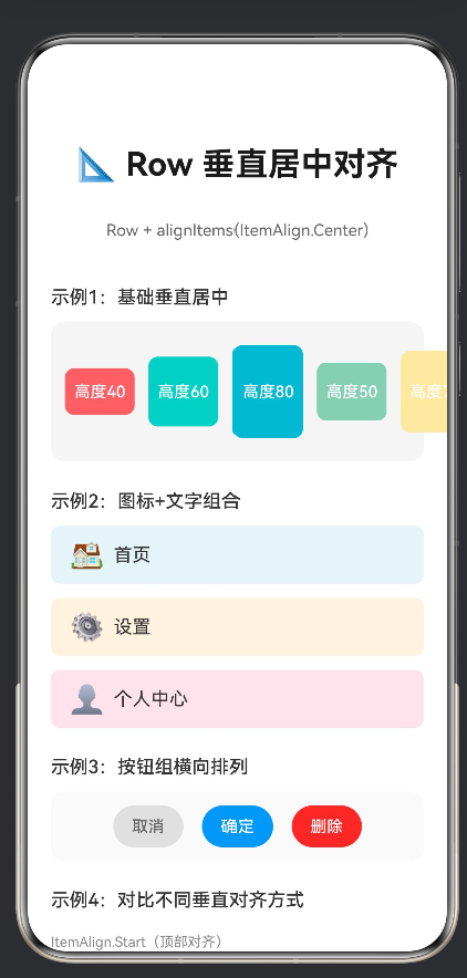
以下是本文中使用的完整示例代码,位于项目的entry/src/main/ets/pages/RowCenterLayout.ets文件中:
@Entry
@Component
struct RowCenterLayout {
  @Builder
  demoCard(color: string, height: number, text: string) {
    Column() {
      Text(text)
        .fontSize(14)
        .fontColor('#FFFFFF')
        .fontWeight(FontWeight.Medium)
    }
    .width(60)
    .height(height)
    .backgroundColor(color)
    .borderRadius(8)
    .justifyContent(FlexAlign.Center)
  }

  build() {
    Column({ space: 24 }) {
      Text('📐 Row 垂直居中对齐')
        .fontSize(28)
        .fontWeight(FontWeight.Bold)
        .fontColor('#1a1a1a')
        .margin({ top: 48, bottom: 8 })

      Text('Row + alignItems(ItemAlign.Center)')
        .fontSize(14)
        .fontColor('#666666')
        .margin({ bottom: 16 })

      // 示例1:基础居中对齐
      Column({ space: 12 }) {
        Text('示例1:基础垂直居中')
          .fontSize(16)
          .fontWeight(FontWeight.Medium)
          .fontColor('#333333')
          .alignSelf(ItemAlign.Start)

        Row({ space: 12 }) {
          this.demoCard('#FF6B6B', 40, '高度40')
          this.demoCard('#4ECDC4', 60, '高度60')
          this.demoCard('#45B7D1', 80, '高度80')
          this.demoCard('#96CEB4', 50, '高度50')
          this.demoCard('#FFEAA7', 70, '高度70')
        }
        .width('100%')
        .height(120)
        .backgroundColor('#f5f5f5')
        .borderRadius(12)
        .padding(12)
        .alignItems(ItemAlign.Center)
      }
      .width('100%')
      .padding({ left: 20, right: 20 })

      // 示例2:图标+文字组合
      Column({ space: 12 }) {
        Text('示例2:图标+文字组合')
          .fontSize(16)
          .fontWeight(FontWeight.Medium)
          .fontColor('#333333')
          .alignSelf(ItemAlign.Start)

        Row({ space: 8 }) {
          Text('🏠').fontSize(24)
          Text('首页').fontSize(16).fontColor('#333333')
        }
        .width('100%')
        .height(50)
        .backgroundColor('#e8f4f8')
        .borderRadius(8)
        .padding({ left: 16, right: 16 })
        .alignItems(ItemAlign.Center)

        Row({ space: 8 }) {
          Text('⚙️').fontSize(24)
          Text('设置').fontSize(16).fontColor('#333333')
        }
        .width('100%')
        .height(50)
        .backgroundColor('#fff3e0')
        .borderRadius(8)
        .padding({ left: 16, right: 16 })
        .alignItems(ItemAlign.Center)

        Row({ space: 8 }) {
          Text('👤').fontSize(24)
          Text('个人中心').fontSize(16).fontColor('#333333')
        }
        .width('100%')
        .height(50)
        .backgroundColor('#fce4ec')
        .borderRadius(8)
        .padding({ left: 16, right: 16 })
        .alignItems(ItemAlign.Center)
      }
      .width('100%')
      .padding({ left: 20, right: 20 })

      // 示例3:按钮组横向排列
      Column({ space: 12 }) {
        Text('示例3:按钮组横向排列')
          .fontSize(16)
          .fontWeight(FontWeight.Medium)
          .fontColor('#333333')
          .alignSelf(ItemAlign.Start)

        Row({ space: 16 }) {
          Button('取消')
            .fontSize(14)
            .fontColor('#666666')
            .backgroundColor('#e0e0e0')
            .borderRadius(20)
            .height(36)

          Button('确定')
            .fontSize(14)
            .fontColor('#FFFFFF')
            .backgroundColor('#2196F3')
            .borderRadius(20)
            .height(36)

          Button('删除')
            .fontSize(14)
            .fontColor('#FFFFFF')
            .backgroundColor('#f44336')
            .borderRadius(20)
            .height(36)
        }
        .width('100%')
        .height(60)
        .backgroundColor('#fafafa')
        .borderRadius(12)
        .padding(12)
        .alignItems(ItemAlign.Center)
        .justifyContent(FlexAlign.Center)
      }
      .width('100%')
      .padding({ left: 20, right: 20 })

      // 示例4:对比不同对齐方式
      Column({ space: 12 }) {
        Text('示例4:对比不同垂直对齐方式')
          .fontSize(16)
          .fontWeight(FontWeight.Medium)
          .fontColor('#333333')
          .alignSelf(ItemAlign.Start)

        Text('ItemAlign.Start(顶部对齐)')
          .fontSize(12)
          .fontColor('#888888')
          .alignSelf(ItemAlign.Start)
          .margin({ top: 8 })

        Row({ space: 8 }) {
          this.demoCard('#FF6B6B', 30, '30')
          this.demoCard('#4ECDC4', 50, '50')
          this.demoCard('#45B7D1', 40, '40')
        }
        .width('100%')
        .height(80)
        .backgroundColor('#fff0f0')
        .borderRadius(8)
        .padding(8)
        .alignItems(ItemAlign.Start)

        Text('ItemAlign.Center(居中对齐)⭐')
          .fontSize(12)
          .fontColor('#4CAF50')
          .alignSelf(ItemAlign.Start)
          .margin({ top: 8 })

        Row({ space: 8 }) {
          this.demoCard('#FF6B6B', 30, '30')
          this.demoCard('#4ECDC4', 50, '50')
          this.demoCard('#45B7D1', 40, '40')
        }
        .width('100%')
        .height(80)
        .backgroundColor('#e8f5e9')
        .borderRadius(8)
        .padding(8)
        .alignItems(ItemAlign.Center)

        Text('ItemAlign.End(底部对齐)')
          .fontSize(12)
          .fontColor('#888888')
          .alignSelf(ItemAlign.Start)
          .margin({ top: 8 })

        Row({ space: 8 }) {
          this.demoCard('#FF6B6B', 30, '30')
          this.demoCard('#4ECDC4', 50, '50')
          this.demoCard('#45B7D1', 40, '40')
        }
        .width('100%')
        .height(80)
        .backgroundColor('#e3f2fd')
        .borderRadius(8)
        .padding(8)
        .alignItems(ItemAlign.End)
      }
      .width('100%')
      .padding({ left: 20, right: 20 })

      // 布局要点说明
      Column({ space: 10 }) {
        Text('📝 布局要点')
          .fontSize(16)
          .fontWeight(FontWeight.Bold)
          .fontColor('#333333')
          .alignSelf(ItemAlign.Start)

        Text(
          '① Row 容器:子组件沿水平方向依次排列\n' +
          '② alignItems(ItemAlign.Center):设置垂直居中对齐\n' +
          '③ 不同高度的子组件会以中线为基准对齐\n' +
          '④ 常用于图标+文字、按钮组等场景'
        )
          .fontSize(13)
          .fontColor('#666666')
          .lineHeight(22)
          .alignSelf(ItemAlign.Start)
      }
      .width('100%')
      .padding(20)
      .backgroundColor('#f8f9fa')
      .borderRadius(12)
      .margin({ left: 20, right: 20, bottom: 40 })

    }
    .width('100%')
    .height('100%')
    .backgroundColor('#FFFFFF')
  }
}
文档版本:v1.0
创建日期:2026年6月
适用平台:HarmonyOS NEXT
技术栈:ArkTS + ArkUI

作为“人工智能6S店”的官方数字引擎,为AI开发者与企业提供一个覆盖软硬件全栈、一站式门户。
更多推荐

 1
1 0
0- 0


 已为社区贡献2条内容

所有评论(0)