
《鸿蒙原生应用开发实战》第三篇:沉浸式 UI 设计与组件化开发
《鸿蒙原生应用开发实战》第三篇:沉浸式 UI 设计与组件化开发
前言
上一篇我们完成了数据模型和状态管理,本篇聚焦 UI 层面。作为一名鸿蒙开发者,ArkTS 的声明式 UI 语法和丰富的组件库让我们能够轻松实现精美的视觉设计。
「光遇·心境」应用的核心是光影沉浸体验,所有 UI 都围绕"光"和"色彩"展开。本文将详细拆解如何在 ArkTS 中实现:
- 渐变背景与色彩方案
- 毛玻璃效果与光晕
- 卡片设计与阴影体系
- 横向/纵向滚动布局
- @Builder 组件化实战
- 响应式尺寸与资源引用
一、整体的视觉风格设计
深色主题基调
整个应用采用深色主题,使用从深蓝到靛蓝的渐变色作为默认背景:
.linearGradient({
  direction: GradientDirection.Bottom,
  colors: [
    ['#1a1a2e', 0],    // 深空蓝
    ['#16213e', 0.5],  // 中蓝
    ['#0f3460', 1]     // 深靛蓝
  ]
})
这种配色方案的好处:
- 护眼:深色背景减少眩光,长时间使用更舒适
- 突出内容:深色背景让彩色的场景卡片更加醒目
- 沉浸感:像在黑暗的房间中欣赏光影作品
颜色资源管理
使用 color.json 统一管理颜色值:
{
  "color": [
    { "name": "start_window_background", "value": "#1a1a2e" },
    { "name": "text_primary", "value": "#FFFFFF" },
    { "name": "text_secondary", "value": "#B0B0C0" },
    { "name": "text_accent", "value": "#FFD700" }
  ]
}
在代码中通过 $r() 引用:
Text('副标题')
  .fontColor($r('app.color.text_secondary'))  // 引用 color.json

// 对比硬编码
Text('副标题')
  .fontColor('#B0B0C0')  // 硬编码,不推荐
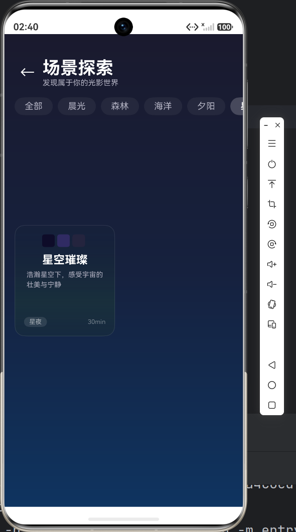
二、沉浸式卡片设计
每日推荐卡片(大卡片)
首页的大卡片是应用的门面,我们使用了三种视觉技术:
1. 渐变背景 + 阴影
DailyRecommendCard() {
  Column() {
    // 卡片内容...
  }
  .width('88%')
  .aspectRatio(1.6)
  .borderRadius($r('app.float.large_radius'))     // 24vp 大圆角
  .linearGradient({
    direction: GradientDirection.RightBottom,
    colors: [
      [this.dailyScene.colors[0], 0],
      [this.dailyScene.colors[1], 0.5],
      [this.dailyScene.colors[2], 1]
    ]
  })
  .shadow({
    radius: 20,
    color: this.dailyScene.colors[0] + '66',     // 半透明阴影
    offsetY: 8
  })
}
这里的 shadow 是点睛之笔 —— 阴影颜色取自场景的主色调并加上 40% 透明度,让"光"从卡片上"溢出":
场景"黎明破晓"的主色是 #FF6B35(橙色)
阴影颜色为 #FF6B3566(半透明橙色光晕)
2. 光晕装饰元素
在卡片内部,我们用椭圆和模糊效果制造出"发光"的视觉效果:
Stack() {
  // 光晕效果
  Ellipse()
    .width('60%')
    .height(40)
    .fill(`rgba(255, 107, 53, 0.3)`)
    .blur(30)                            // 30px 高斯模糊
    .position({ x: '20%', y: '0%' })

  Column() {
    Text('每日推荐')
      .fontSize($r('app.float.caption_font_size'))
      .fontColor($r('app.color.text_accent'))  // 金色
      .letterSpacing(4)                         // 字间距(高级感)

    Text(this.dailyScene.name).fontSize(32)
    // ... 更多内容
  }
}
blur(30) 是关键 API —— 相当于 CSS 的 backdrop-filter: blur(),创建了梦幻的光晕效果。
3. 场景卡片(网格布局)
在场景列表页(ScenePage),我们使用 2 列网格布局展示卡片:
@Builder
SceneCard(item: SceneItem) {
  Column() {
    // 色块预览(3个彩色小方块)
    Row() {
      ForEach(item.colors, (color: string) => {
        Row()
          .width(20).height(20)
          .backgroundColor(color)
          .borderRadius(4)
          .margin({ right: 4 })
      })
    }
    .margin({ bottom: 10 })

    Text(item.name).fontSize(18).fontColor(Color.White).fontWeight(FontWeight.Bold)
    Text(item.desc).fontSize(11).fontColor($r('app.color.text_secondary'))
    Blank()  // 自动撑开
    // 底部标签
    Row() { /* category 和 duration */ }
  }
  .width('46%')           // 每行两个,留出间距
  .aspectRatio(0.9)       // 固定宽高比
  .padding(14)
  .borderRadius($r('app.float.card_radius'))  // 16vp
  .linearGradient({
    direction: GradientDirection.Bottom,
    colors: [
      [item.colors[0] + '33', 0],    // 20% 透明度
      [item.colors[1] + '22', 0.7],
      [item.colors[2] + '11', 1]
    ]
  })
  .border({ width: 1, color: 'rgba(255,255,255,0.1)' })  // 微光边框
}
设计技巧:在渐变颜色后添加
+ '33'等透明度后缀,使卡片呈现半透明效果,隐约透出底部的深色背景,增强层次感。
三、横向滚动 —— 精选推荐区
首页的"精选推荐"区域使用了横向滚动容器:
// 横向可滚动的推荐列表
Scroll() {
  Row() {
    ForEach(this.hotScenes, (item: SceneItem) => {
      this.HotSceneCard(item)
    }, (item: SceneItem) => item.id.toString())
  }
  .padding({ left: $r('app.float.padding_medium') })
}
.scrollable(ScrollDirection.Horizontal)  // 设置为横向滚动
.width('100%')
.height(200)
每个推荐卡片 150×180,纯渐变背景,居中展示名称和时长:
@Builder
HotSceneCard(item: SceneItem) {
  Column() {
    Text(item.name).fontSize(18).fontColor(Color.White).fontWeight(FontWeight.Bold)
    Text(item.desc).fontSize(12).fontColor('rgba(255,255,255,0.7)')
    Text(`${item.duration}min`).fontSize(12)
      .margin({ top: 8 })
      .padding({ left: 10, right: 10, top: 3, bottom: 3 })
      .backgroundColor('rgba(255,255,255,0.12)')
      .borderRadius(10)
  }
  .width(150).height(180).padding(16)
  .justifyContent(FlexAlign.Center)
  .borderRadius($r('app.float.card_radius'))
  .linearGradient({
    direction: GradientDirection.Bottom,
    colors: [[item.colors[0], 0], [item.colors[1], 0.6], [item.colors[2], 1]]
  })
}
注意:横向滚动时,
Row内的内容不要设置固定宽度,否则无法滚动。滚动容器的width设'100%'即可。
四、详情页的沉浸式设计
详情页(DetailPage)是沉浸感最强的一页,分为上下两部分:
上半部分:渐变背景 + 光晕
// 55% 高度的渐变背景
Stack() {
  // 渐变背景
  Column()
    .width('100%').height('55%')
    .linearGradient({
      direction: GradientDirection.Bottom,
      colors: [
        [this.scene.colors[0], 0],
        [this.scene.colors[1], 0.4],
        [this.scene.colors[2], 1]
      ]
    })

  // 光晕装饰 1
  Ellipse().width('80%').height(100)
    .fill(Color.White).opacity(0.08).blur(40)

  // 光晕装饰 2
  Ellipse().width('50%').height(150)
    .fill(this.scene.colors[0]).opacity(0.3).blur(50)

  // 前景内容
  Column() {
    // 返回按钮 + 收藏按钮
    Row() { /* ... */ }
    Blank()
    // 场景名称、描述、标签
    Column() { /* ... */ }
  }
}
.clip(new Rect())  // 裁剪溢出部分
两层不同大小和透明度的椭圆叠加,产生丰富的光晕层次感。
下半部分:可滚动详情
Scroll() {
  Column() {
    Text('场景描述').fontSize(16).fontColor(Color.White)
    Text(this.scene.detail).fontSize(14).fontColor($r('app.color.text_secondary'))

    // 分隔线
    Row().width('100%').height(1)
      .backgroundColor('rgba(255,255,255,0.08)')

    // 色彩分析
    Text($r('app.string.color_analysis')).fontSize(16)
    Row() {
      ForEach(this.getColorRects(), (rect: ColorRect) => {
        Column() {
          Row().width(48).height(48).backgroundColor(rect.color).borderRadius(12)
          Text(rect.name).fontSize(10)
        }
      })
    }

    // 推荐白噪音
    Text($r('app.string.recommend_sound'))
    Row() { /* 白噪音卡片 */ }
  }
}
.backgroundColor('#1a1a2e')
这里使用了 ForEach 渲染色彩分析方块,每个方块显示场景的一个主题色:
getColorRects(): ColorRect[] {
  const names: string[] = ['主色调', '辅助色', '点缀色'];
  const rects: ColorRect[] = [];
  for (let i = 0; i < this.scene!.colors.length; i++) {
    rects.push(makeColorRect(
      this.scene!.colors[i],
      i < names.length ? names[i] : `色${i + 1}`
    ));
  }
  return rects;
}
五、布局实战要点
1. Flex 布局技巧
ArkTS 中,Row 和 Column 默认就是 Flex 容器:
// 左右两端对齐(左侧内容 → 空白 → 右侧内容)
Row() {
  Text('左侧')
  Blank()      // 自动填充剩余空间
  Text('右侧')
}
.width('100%')

// 居中对齐(垂直和水平)
Column() {
  Text('居中内容')
}
.width('100%').height('100%')
.justifyContent(FlexAlign.Center)    // 垂直居中
.alignItems(HorizontalAlign.Center)  // 水平居中
2. 分隔线组件
ArkTS 中没有独立的 <Divider> 组件,我们用空 Row 实现:
Row()
  .width('100%')
  .height(1)
  .backgroundColor('rgba(255,255,255,0.08)')
  .margin({ top: 20, bottom: 20 })
3. 等分布局
统计卡片中使用 layoutWeight 实现三等分:
Row() {
  this.StatCard('💖', `${this.favCount}`, '已收藏')
    .layoutWeight(1)   // 等分权重
  this.DividerVertical()
  this.StatCard('👁️', `${this.visitedCount}`, '已浏览')
    .layoutWeight(1)
  this.DividerVertical()
  this.StatCard('🎵', '8', '白噪音')
    .layoutWeight(1)
}
六、响应式尺寸与资源管理
float.json —— 统一管理尺寸
{
  "float": [
    { "name": "title_font_size", "value": "28fp" },    // 大标题
    { "name": "body_font_size", "value": "14fp" },      // 正文
    { "name": "caption_font_size", "value": "12fp" },   // 小标题
    { "name": "card_radius", "value": "16vp" },         // 卡片圆角
    { "name": "padding_large", "value": "24vp" }        // 大间距
  ]
}
fp 与 vp 单位
| 单位 | 含义 | 受字体缩放影响 | 适用场景 |
|---|---|---|---|
| fp | 字体像素 | ✅ | 字号 |
| vp | 虚拟像素 | ❌ | 间距、尺寸 |
| % | 百分比 | ❌ | 相对布局 |
引用方式
// 引用 float.json 中的尺寸
.fontSize($r('app.float.body_font_size'))
.padding($r('app.float.padding_large'))
.borderRadius($r('app.float.card_radius'))
七、踩坑记录
坑1:Scroll 嵌套 Scroll 无法滚动
现象:横向 Scroll 内的内容超出仍无法滑动
原因:外层 Scroll 拦截了触摸事件
解决:避免嵌套可滚动容器,或设置 scrollable(ScrollDirection.Horizontal) 明确方向
坑2:aspectRatio 不生效
原因:未设置宽度或高度其中一个
解决:设置 width('46%') 后,aspectRatio(0.9) 会自动计算 height = width / 0.9
坑3:ellipse 模糊效果性能问题
现象:多 Ellipse + blur 出现卡顿
解决:减少同时渲染的 Ellipse 数量,使用低模糊值,或使用 opacity 替代更多 blur
总结
本篇我们深入学习了:
- ✅ 深色主题 + 渐变背景设计
- ✅ 毛玻璃光晕效果实现
- ✅ 卡片设计体系(阴影、半透明、圆角)
- ✅ 横向/纵向滚动布局实战
- ✅ @Builder 组件化设计模式
- ✅ fp/vp 响应式尺寸管理
从视觉角度看,整个应用的 UI 统一且有特色 —— 深色底、彩色卡、光影晕。这也是应用名「光遇·心境」在 UI 层面的体现。
下一篇我们将聚焦页面之间的导航与参数传递,深入剖析路由器的工作原理。
下一篇预告:多页面导航与参数传递实战 —— router 路由机制、参数序列化、页面生命周期管理

作为“人工智能6S店”的官方数字引擎,为AI开发者与企业提供一个覆盖软硬件全栈、一站式门户。
更多推荐
 5
5 0
0- 0


 已为社区贡献42条内容

所有评论(0)