
深入鸿蒙原生 ArkTS 布局:Column 最大宽度约束完全指南
一、引言
在鸿蒙原生应用开发中,maxWidth(最大宽度)是一个看似简单却极具威力的布局约束。它解决了一个所有开发者都会遇到的核心矛盾:如何在宽屏设备上充分利用空间,又不让内容过宽导致难以阅读?
想象以下场景:
- 在手机上,文章内容应该撑满屏幕,充分利用有限的宽度
- 在平板上,同样一篇文章如果也撑满屏幕,每行文字会变得非常长,读者需要频繁转动头部来跟踪文本,阅读体验急剧下降
- 在折叠屏展开状态下,问题更加突出
maxWidth 正是为解决这个问题而生的。它允许你为 Column 设置一个"最大宽度上限"——在手机等窄屏设备上,这个上限不起作用,Column 正常撑满;在平板等宽屏设备上,Column 达到上限后停止变宽,内容居中显示,两侧留白。
本文将通过 5 大场景,从基础到实战,深入剖析 constraintSize({ maxWidth }) 的方方面面。
二、maxWidth 的核心原理
2.1 计算公式
Column 在同时存在多种宽度约束时,最终宽度的计算遵循以下公式:
最终宽度 = min(主宽度计算值, maxWidth, 父容器宽度)
其中"主宽度计算值"取决于 Column 的宽度设置方式:
| 设置方式 | 主宽度计算值 |
|---|---|
| 不设 width,内容撑开 | 内容宽度 + padding |
| width(固定值) | 固定值 |
| width(百分比) | 父容器宽度 × 百分比 |
| layoutWeight | 剩余空间 × 权重比例 |
| 不设 width(纯自适应) | 父容器内容区宽度 |
2.2 maxWidth 的本质
理解 maxWidth 最关键的一点:它是"上限"而非"固定值"。
width(200)= “我的宽度永远是 200vp”,不管内容多短或多长constraintSize({ maxWidth: 200 })= “我最宽 200vp,但可以更窄”
当 Column 的实际内容宽度(或百分比计算值)小于 maxWidth 时,maxWidth 不起作用,Column 的宽度由内容或其他约束决定。
2.3 maxWidth 的优先级
父容器宽度 > maxWidth > 内容宽度/百分比/权重
如果父容器宽度本身就小于 maxWidth,那么 maxWidth 实际上不会生效——Column 的宽度受父容器限制,不可能超过父容器。
三、项目配置
3.1 SDK 版本
本文代码基于 HarmonyOS NEXT 6.1.1(API 24),在 build-profile.json5 中确认:
{
  "app": {
    "products": [
      {
        "name": "default",
        "targetSdkVersion": "6.1.1(24)",
        "compatibleSdkVersion": "6.1.1(24)",
        "runtimeOS": "HarmonyOS"
      }
    ]
  }
}
3.2 页面路由
在 main_pages.json 中注册页面:
{
  "src": [
    "pages/ColumnMaxWidthPage"
  ]
}
在 EntryAbility.ets 中加载页面:
onWindowStageCreate(windowStage: window.WindowStage): void {
  windowStage.loadContent('pages/ColumnMaxWidthPage', (err) => {
    if (err.code) {
      hilog.error(0x0000, 'App', 'Failed: %{public}s', JSON.stringify(err));
      return;
    }
  });
}
3.3 颜色系统
interface ColorsConfig {
  primary: string;
  primaryLight: string;
  secondary: string;
  secondaryLight: string;
  accent: string;
  accentLight: string;
  info: string;
  infoLight: string;
  warning: string;
  warningLight: string;
  textPrimary: string;
  textSecondary: string;
  textTertiary: string;
  cardBg: string;
  codeBg: string;
  pageBg: string;
  border: string;
  divider: string;
  shadow: string;
  dimBg: string;
}

const COLORS: ColorsConfig = {
  primary: '#0EA5E9',
  primaryLight: '#E0F2FE',
  secondary: '#8B5CF6',
  secondaryLight: '#EDE9FE',
  accent: '#F43F5E',
  accentLight: '#FFE4E6',
  info: '#10B981',
  infoLight: '#D1FAE5',
  warning: '#F59E0B',
  warningLight: '#FEF3C7',
  textPrimary: '#0F172A',
  textSecondary: '#475569',
  textTertiary: '#94A3B8',
  cardBg: '#FFFFFF',
  codeBg: '#F1F5F9',
  pageBg: '#F8FAFC',
  border: '#E2E8F0',
  divider: '#CBD5E1',
  shadow: 'rgba(0, 0, 0, 0.05)',
  dimBg: '#1E293B',
};
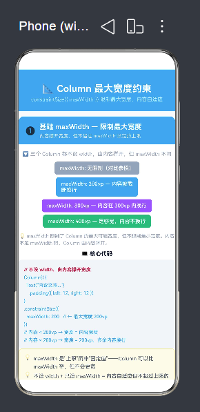
四、场景一:基础 maxWidth 演示
4.1 场景说明
同一个内容长度的 Column,分别设置不同的 maxWidth 值(无限制 / 200 / 300 / 400),直观展示 maxWidth 如何截断内容的宽度扩展。
4.2 完整代码
// ── 无 maxWidth(完全自适应) ──
Column() {
  Text('maxWidth: 无限制(对比参照)')
    .fontSize(12).fontWeight(FontWeight.Medium)
    .fontColor('#FFFFFF').padding({ left: 12, right: 12 })
}
.alignItems(HorizontalAlign.Center)
.padding({ top: 8, bottom: 8 })
.backgroundColor('#94A3B8')
.borderRadius(6)
// ↑ 没有 maxWidth,宽度由内容完全撑开

// ── maxWidth: 200vp ──
Column() {
  Text('maxWidth: 200vp — 内容被截断换行')
    .fontSize(12).fontWeight(FontWeight.Medium)
    .fontColor('#FFFFFF').padding({ left: 12, right: 12 })
}
.alignItems(HorizontalAlign.Center)
.padding({ top: 8, bottom: 8 })
.backgroundColor('#0EA5E9')
.borderRadius(6)
.constraintSize({ maxWidth: 200 })   // ← 最大宽度 200vp

// ── maxWidth: 300vp ──
Column() {
  Text('maxWidth: 300vp — 内容在 300vp 内换行')
    .fontSize(12).fontWeight(FontWeight.Medium)
    .fontColor('#FFFFFF').padding({ left: 12, right: 12 })
}
.alignItems(HorizontalAlign.Center)
.padding({ top: 8, bottom: 8 })
.backgroundColor('#8B5CF6')
.borderRadius(6)
.constraintSize({ maxWidth: 300 })

// ── maxWidth: 400vp ──
Column() {
  Text('maxWidth: 400vp — 足够宽,内容不换行')
    .fontSize(12).fontWeight(FontWeight.Medium)
    .fontColor('#FFFFFF').padding({ left: 12, right: 12 })
}
.alignItems(HorizontalAlign.Center)
.padding({ top: 8, bottom: 8 })
.backgroundColor('#10B981')
.borderRadius(6)
.constraintSize({ maxWidth: 400 })
4.3 行为分析
运行上述代码,你将看到四条宽度不同的色块:
- 灰色块(无限制):文本完整显示在一行,宽度完全由内容撑开
- 天蓝色块(maxWidth:200):宽度只有 200vp,文本被迫换行显示
- 紫色块(maxWidth:300):宽度 300vp,部分文本换行
- 绿色块(maxWidth:400):宽度 400vp,文本不换行
关键发现:随着 maxWidth 值的增大,Column 的实际宽度也随之增大,但都受限于各自的上限。
4.4 不设 width 只设 maxWidth 的意义
这种写法的核心优势在于:Column 的宽度是自适应的,但有一个上限。
Column() {
  Text('动态内容')
    .padding({ left: 12, right: 12 })
}
.constraintSize({ maxWidth: 200 })
- 当内容宽度 < 200vp 时 → Column 宽度 = 内容宽度(紧凑包裹)
- 当内容宽度 ≥ 200vp 时 → Column 宽度 = 200vp(达到上限,内容换行)
这比 width(200) 灵活得多——width(200) 不管内容多短都固定 200vp,可能造成右侧大量留白。
五、场景二:maxWidth vs width 深度对比
5.1 场景说明
同样是数值 200,width(200) 和 constraintSize({ maxWidth: 200 }) 的行为在内容较短时截然不同。本节从 4 个维度进行系统对比。
5.2 对比代码
// ── 对比组 1:短内容 ──
Row() {
  // 左边:固定宽度 200
  Column() {
    Text('width(200)')
      .fontSize(11).fontWeight(FontWeight.Medium)
      .fontColor('#FFFFFF')
  }
  .height(48)
  .backgroundColor('#0EA5E9')
  .borderRadius(6)
  .width(200)                       // ← 固定 200vp

  // 右边:最大宽度 200
  Column() {
    Text('maxWidth(200)')
      .fontSize(11).fontWeight(FontWeight.Medium)
      .fontColor('#FFFFFF')
  }
  .height(48)
  .backgroundColor('#8B5CF6')
  .borderRadius(6)
  .constraintSize({ maxWidth: 200 }) // ← 最大 200vp
}
// 结果:width(200) 固定 200,maxWidth(200) 只撑开到内容宽度

// ── 对比组 2:长内容(超出 200vp) ──
Row() {
  // 左边:固定宽度 200
  Column() {
    Text('width(200) 固定不变')
      .fontSize(11).fontWeight(FontWeight.Medium)
      .fontColor('#FFFFFF')
  }
  .height(56)
  .backgroundColor('#0EA5E9')
  .borderRadius(6)
  .width(200)

  // 右边:最大宽度 200
  Column() {
    Text('maxWidth(200) 长文本自动换行效果')
      .fontSize(11).fontWeight(FontWeight.Medium)
      .fontColor('#FFFFFF')
  }
  .padding({ top: 6, bottom: 6 })
  .backgroundColor('#8B5CF6')
  .borderRadius(6)
  .constraintSize({ maxWidth: 200 })
}
// 结果:两者都是 200vp,但 maxWidth 版本内容换行显示
5.3 四维度对比表
| 对比维度 | width(200) | maxWidth(200) |
|---|---|---|
| 内容较短时 | 宽度 = 200,右侧留空 | 宽度 = 内容宽度,紧凑包裹 |
| 内容较长时 | 宽度 = 200,内容换行 | 宽度 = 200,和 width 一样 |
| 父容器缩小时 | 宽度 = 200,可能溢出父容器 | 宽度 = 父容器宽度(受父容器限制) |
| 本质 | 固定值,绝不改变 | 上限值,可以更窄 |
5.4 核心差异点
差异一:短内容的处理
width(200) 是强制值。即使 Column 中只有一个字符,Column 的宽度也是 200vp。这意味着:
Column() { Text('A') }.width(200)
显示效果:字母" A" 在 200vp 宽的色块中,右侧大量空白。这在侧边栏、图标按钮等场景下是可以接受的,但在标签、徽章等需要紧凑包裹内容的场景下就不合适了。
maxWidth(200) 是软上限。Column 的宽度由内容决定,但不会超过 200vp。同样只有一个字符:
Column() { Text('A') }.constraintSize({ maxWidth: 200 })
显示效果:字母" A" 只占据不到 20vp 的宽度,色块紧凑包裹内容。
差异二:父容器宽度的影响
width(200) 不受父容器宽度影响。如果父容器只有 180vp 宽,Column 会溢出。
maxWidth(200) 受父容器宽度约束。如果父容器只有 180vp 宽,Column 的实际宽度是 180vp(取父容器宽度和 maxWidth 的较小值)。
5.5 选型建议
| 需求 | 推荐方案 |
|---|---|
| 侧边栏/导航菜单 | width(固定值) |
| 标签/徽章/气泡 | maxWidth(上限) |
| 图片容器 | width(固定值) |
| 文章内容 | maxWidth(上限) |
| 卡片组件 | 两者皆可,看需求 |
| 自适应面板 | maxWidth(上限) |
六、场景三:百分比 + maxWidth 双重限制
6.1 场景说明
百分比宽度和 maxWidth 的组合是最常用也最强大的"双重限制"模式。百分比让 Column 随父容器等比例缩放,maxWidth 则防止在大屏上过度拉伸。
公式:最终宽度 = min(父容器 × 百分比, maxWidth)
6.2 代码演示
// ── 无 maxWidth(仅百分比) ──
Column() {
  Text('width("80%") | 无 maxWidth')
    .fontSize(12).fontWeight(FontWeight.Medium)
    .fontColor('#FFFFFF')
    .textAlign(TextAlign.Center).width('100%')
  Text('大屏上非常宽')
    .fontSize(9).fontColor('#BFDBFE')
    .textAlign(TextAlign.Center).width('100%')
}
.height(44)
.backgroundColor('#94A3B8')
.borderRadius(6)
.width('80%')                      // ← 80% 宽度,无上限

// ── maxWidth: 280vp ──
Column() {
  Text('width("80%") | maxWidth: 280vp')
    .fontSize(12).fontWeight(FontWeight.Medium)
    .fontColor('#FFFFFF')
    .textAlign(TextAlign.Center).width('100%')
  Text('大屏上 ≤ 280vp')
    .fontSize(9).fontColor('#BAE6FD')
    .textAlign(TextAlign.Center).width('100%')
}
.height(44)
.backgroundColor('#0EA5E9')
.borderRadius(6)
.width('80%')
.constraintSize({ maxWidth: 280 })  // ← 上限 280vp

// ── maxWidth: 200vp ──
Column() {
  Text('width("80%") | maxWidth: 200vp')
    .fontSize(12).fontWeight(FontWeight.Medium)
    .fontColor('#FFFFFF')
    .textAlign(TextAlign.Center).width('100%')
  Text('更严格的上限')
    .fontSize(9).fontColor('#EDE9FE')
    .textAlign(TextAlign.Center).width('100%')
}
.height(44)
.backgroundColor('#8B5CF6')
.borderRadius(6)
.width('80%')
.constraintSize({ maxWidth: 200 })

// ── maxWidth: 150vp ──
Column() {
  Text('width("80%") | maxWidth: 150vp')
    .fontSize(12).fontWeight(FontWeight.Medium)
    .fontColor('#FFFFFF')
    .textAlign(TextAlign.Center).width('100%')
  Text('最严格的上限')
    .fontSize(9).fontColor('#D1FAE5')
    .textAlign(TextAlign.Center).width('100%')
}
.height(44)
.backgroundColor('#10B981')
.borderRadius(6)
.width('80%')
.constraintSize({ maxWidth: 150 })
6.3 在不同屏幕宽度下的行为
| 屏幕宽度 | 80% 计算值 | max=280 | max=200 | max=150 |
|---|---|---|---|---|
| 360vp | 288vp | 280(超限锁定) | 200(超限锁定) | 150(超限锁定) |
| 320vp | 256vp | 256(范围内) | 200(超限锁定) | 150(超限锁定) |
| 250vp | 200vp | 200(范围内) | 200(刚好上限) | 150(超限锁定) |
| 180vp | 144vp | 144(范围内) | 144(范围内) | 144(范围内) |
从表中可以清晰地看到:
- 当 80% 计算值 >
maxWidth时,Column 宽度 =maxWidth - 当 80% 计算值 ≤
maxWidth时,Column 宽度 = 80% 计算值 maxWidth越小,上限越早被触发
6.4 最佳实践:黄金组合
Column() {
  // 文章内容、卡片内容等
}
.width('80%')
.constraintSize({ maxWidth: 600 })
这是文章类页面最推荐的写法。在手机上(通常 360~420vp),80% ≈ 288~336vp,还在合理范围内;在平板上(通常 600~1024vp),80% 计算值远超 600vp,Column 锁定在 600vp,居中显示,两侧留白。
七、场景四:layoutWeight + maxWidth 上限
7.1 场景说明
layoutWeight 按比例分配父容器的剩余空间。但如果某个 Column 被分配的空间过大,可以使用 maxWidth 为它设置"个人上限"。当 Column 达到上限后,剩余空间重新分配给其他 Column。
7.2 代码演示
Row() {
  // Column A: 权重 1,无限制
  Column() {
    Text('A').fontSize(18).fontWeight(FontWeight.Bold)
      .fontColor('#FFFFFF').textAlign(TextAlign.Center)
      .width('100%')
    Text('W:1').fontSize(10).fontColor('#BAE6FD')
      .textAlign(TextAlign.Center).width('100%')
    Text('无上限').fontSize(9).fontColor('#7DD3FC')
      .textAlign(TextAlign.Center).width('100%')
  }
  .height(72)
  .backgroundColor('#0EA5E9')
  .borderRadius(8)
  .layoutWeight(1)

  // Column B: 权重 1,但 maxWidth: 120
  Column() {
    Text('B').fontSize(18).fontWeight(FontWeight.Bold)
      .fontColor('#FFFFFF').textAlign(TextAlign.Center)
      .width('100%')
    Text('W:1 + max:120').fontSize(10).fontColor('#EDE9FE')
      .textAlign(TextAlign.Center).width('100%')
    Text('≤ 120vp').fontSize(9).fontColor('#DDD6FE')
      .textAlign(TextAlign.Center).width('100%')
  }
  .height(72)
  .backgroundColor('#8B5CF6')
  .borderRadius(8)
  .layoutWeight(1)
  .constraintSize({ maxWidth: 120 })  // ← 上限 120vp

  // Column C: 权重 1,无限制
  Column() {
    Text('C').fontSize(18).fontWeight(FontWeight.Bold)
      .fontColor('#FFFFFF').textAlign(TextAlign.Center)
      .width('100%')
    Text('W:1').fontSize(10).fontColor('#D1FAE5')
      .textAlign(TextAlign.Center).width('100%')
    Text('无上限').fontSize(9).fontColor('#A7F3D0')
      .textAlign(TextAlign.Center).width('100%')
  }
  .height(72)
  .backgroundColor('#10B981')
  .borderRadius(8)
  .layoutWeight(1)
}
.width('100%')
7.3 权重 + maxWidth 的分配机制
三个 Column 的权重都是 1:1:1,理想情况下各占 1/3 的宽度。但在不同屏幕宽度下,B 的 maxWidth: 120 会改变分配结果。
情况一:窄屏(如 360vp)
剩余空间 ≈ 340vp(扣除 margin),1/3 ≈ 113vp。B 的 113vp 没有超过 120vp,所以三个 Column 等宽,每人 ~113vp。
情况二:宽屏(如 600vp)
剩余空间 ≈ 580vp,1/3 ≈ 193vp。B 的 193vp 超过了 120vp,所以 B 锁定在 120vp。A 和 C 重新分配剩余空间:
A 的宽度 = (580 - 120) × 1/2 = 230vp
C 的宽度 = (580 - 120) × 1/2 = 230vp
最终比例:A ≈ 230vp : B = 120vp : C ≈ 230vp(不再是 1:1:1)
7.4 应用场景
这种模式非常适合以下场景:
- 仪表盘指标卡:多个指标按权重排列,但每个卡片有最大宽度,防止单个卡片过大
- 自适应标签栏:标签按权重分配空间,但每个标签有最大宽度,防止文字被过度拉伸
- 数据表格列:列宽按权重分配,但每列有最大宽度限制
八、场景五:综合实战——文章阅读面板
8.1 场景说明
这是 maxWidth 最经典的应用场景。文章内容区在手机上撑满屏幕以充分利用有限宽度,在平板上被限制在 600vp 以提高阅读舒适度。
研究表明:每行 45~75 个英文字符(或 30~40 个中文字符)是最佳阅读宽度。换算成 vp,大约在 600~720vp 之间。
8.2 完整代码
// 文章卡片:核心 maxWidth 约束
Column() {
  // 文章头部
  Row() {
    Column() {
      Text('深入理解鸿蒙 ArkTS 布局系统')
        .fontSize(18).fontWeight(FontWeight.Bold)
        .fontColor('#0F172A').lineHeight(26)
      Row() {
        Text('发布于 2024-12-20').fontSize(11)
          .fontColor('#94A3B8')
        Text('·').fontSize(11).fontColor('#94A3B8')
          .margin({ left: 6, right: 6 })
        Text('阅读 5 min').fontSize(11)
          .fontColor('#94A3B8')
      }
      .margin({ top: 6 })
    }
    .alignItems(HorizontalAlign.Start)
    .layoutWeight(1)

    // 头像
    Column() {
      Text('A').fontSize(18).fontWeight(FontWeight.Bold)
        .fontColor('#FFFFFF')
    }
    .width(40).height(40)
    .backgroundColor('#0EA5E9')
    .borderRadius(20)
  }
  .width('100%')
  .margin({ bottom: 16 })

  // 正文段落
  Text('一、为什么需要最大宽度约束')
    .fontSize(16).fontWeight(FontWeight.Bold)
    .fontColor('#0F172A').lineHeight(24)
    .margin({ bottom: 8 })

  Text('在传统的 Web 开发中,我们经常使用 max-width 来限制内容区域的宽度,以提高大屏上的阅读体验。研究表明,每行 45~75 个英文字符(或 30~40 个中文字符)是最佳阅读宽度。在鸿蒙 ArkTS 中,constraintSize 的 maxWidth 属性正是为此而生。在宽屏设备上,如果没有最大宽度限制,文字行会变得非常长,读者需要频繁转动头部来跟踪文本,极大地降低了阅读舒适度。')
    .fontSize(14).fontColor('#475569')
    .lineHeight(24)
    .margin({ bottom: 12 })

  Text('二、maxWidth 的工作原理')
    .fontSize(16).fontWeight(FontWeight.Bold)
    .fontColor('#0F172A').lineHeight(24)
    .margin({ bottom: 8 })

  Text('constraintSize({ maxWidth: 600 }) 设置了 Column 的最大宽度为 600vp。当父容器宽度小于 600vp 时,Column 的宽度等于父容器宽度。当父容器宽度大于 600vp 时,Column 的宽度被锁定在 600vp,不会继续膨胀。在手机上,maxWidth 不起作用,Column 撑满屏幕。在平板上,Column 被限制在 600vp,居中显示,两侧留白。')
    .fontSize(14).fontColor('#475569')
    .lineHeight(24)
    .margin({ bottom: 12 })

  // 标签行
  Row() {
    ForEach(['ArkTS', '鸿蒙', '布局', 'maxWidth'], (tag: string) => {
      Text(tag)
        .fontSize(11).fontColor('#0EA5E9')
        .padding({ left: 10, right: 10, top: 4, bottom: 4 })
        .backgroundColor('#E0F2FE')
        .borderRadius(12)
        .margin({ right: 6 })
    }, (tag: string) => tag)
  }
  .width('100%')

  Divider().height(1).width('100%').color('#CBD5E1')
    .margin({ top: 14, bottom: 10 })

  // 底部操作栏
  Row() {
    Row() {
      Text('👍 128').fontSize(12).fontColor('#475569')
    }
    .padding({ left: 10, right: 10, top: 5, bottom: 5 })
    .backgroundColor('#F1F5F9')
    .borderRadius(16)
    .margin({ right: 8 })

    Row() {
      Text('💬 36').fontSize(12).fontColor('#475569')
    }
    .padding({ left: 10, right: 10, top: 5, bottom: 5 })
    .backgroundColor('#F1F5F9')
    .borderRadius(16)

    Button('分享')
      .height(30).backgroundColor('#0EA5E9')
      .fontColor('#FFFFFF').fontSize(12)
      .borderRadius(15)
      .layoutWeight(1)
      .margin({ left: 10 })
  }
  .width('100%')
}
// ★ 核心:maxWidth 约束 ★
.alignItems(HorizontalAlign.Start)
.width('80%')                      // ← 手机:80% 自适应
.constraintSize({ maxWidth: 600 }) // ← 大屏:不超过 600vp
.padding(16)
.backgroundColor('#FFFFFF')
.borderRadius(12)
.border({ width: 1, color: '#E2E8F0' })
8.3 自适应效果
| 设备 | 屏幕宽度 | 文章宽度 | 说明 |
|---|---|---|---|
| 手机 | 360vp | 80% ≈ 288vp | 自适应撑满,maxWidth 不生效 |
| 大屏手机 | 414vp | 80% ≈ 331vp | 自适应撑满 |
| 小平板 | 600vp | 80% = 480vp < 600,所以 480vp | 自适应,接近上限 |
| 大平板 | 800vp | 80% = 640vp > 600,锁定 600vp | 达到上限,居中留白 |
| 折叠屏展开 | 1000vp | 锁定 600vp | 居中,左右各 200vp 留白 |
8.4 操作栏的三段式布局
底部操作栏使用了"固定 + 自适应 + 固定"的经典布局:
Row() {
  // 点赞按钮:固定宽度(内容撑开 + padding)
  Row() { Text('👍 128') }
    .padding({ left: 10, right: 10, top: 5, bottom: 5 })
    .backgroundColor('#F1F5F9').borderRadius(16)
    .margin({ right: 8 })

  // 评论按钮:固定宽度
  Row() { Text('💬 36') }
    .padding({ left: 10, right: 10, top: 5, bottom: 5 })
    .backgroundColor('#F1F5F9').borderRadius(16)

  // 分享按钮:自适应撑满剩余空间
  Button('分享')
    .layoutWeight(1)  // ← 自适应
    .margin({ left: 10 })
}
点赞和评论按钮使用固定宽度(内容撑开),分享按钮使用 layoutWeight(1) 自适应占满剩余空间。这种布局在文章阅读面板中非常常见。
九、maxWidth 的常见陷阱与最佳实践
9.1 常见陷阱
陷阱一:误以为 maxWidth 是固定值
// 错误理解 ❌
Column() { Text('内容') }
  .constraintSize({ maxWidth: 200 })
// 以为 Column 永远是 200vp

// 正确理解 ✅
// maxWidth(200) 是上限,不是固定值
// 内容短时 Column 宽度 < 200vp
陷阱二:maxWidth 和 minWidth 混淆
constraintSize({
  minWidth: 100,   // 最小宽度(不能小于 100)
  maxWidth: 200    // 最大宽度(不能大于 200)
})
// 最终宽度 = clamp(计算值, 100, 200)
// 如果计算值 < 100 → 取 100
// 如果计算值 > 200 → 取 200
// 否则 → 取计算值
陷阱三:忽视父容器宽度对 maxWidth 的限制
Row() {
  Column() { /* ... */ }
    .constraintSize({ maxWidth: 400 })
}
.width(300)  // 父容器只有 300vp
// maxWidth(400) 实际上不起作用!
// 因为 Column 不能超过父容器 300vp
陷阱四:在 Scroll 容器中使用 maxWidth 的意外行为
在 Scroll 容器中,如果未设置明确的宽度限制,子组件的 maxWidth 可能无法按预期工作,因为 Scroll 提供了无限的内容空间。
9.2 最佳实践
最佳实践一:文章内容区的黄金组合
Column() {
  // 文章正文
}
.width('85%')
.constraintSize({ maxWidth: 640 })
最佳实践二:卡片组件的安全宽度
Column() {
  // 卡片内容
}
.width('45%')
.constraintSize({ maxWidth: 320, minWidth: 200 })
三保险:百分比决定比例,minWidth 防止过窄,maxWidth 防止过宽。
最佳实践三:弹窗面板的最大宽度
Column() {
  // 弹窗内容
}
.width('90%')
.constraintSize({ maxWidth: 480 })
弹窗在手机上几乎撑满(90%),在平板上最大 480vp,居中显示。
最佳实践四:多列布局中的 maxWidth 应用
Row() {
  Column().width('25%').constraintSize({ maxWidth: 200 })
  Column().width('50%').constraintSize({ maxWidth: 400 })
  Column().width('25%').constraintSize({ maxWidth: 200 })
}
每列在百分比的基础上各自有最大宽度限制,防止某列在宽屏上过度膨胀。
十、maxWidth 与其他布局技术的配合
10.1 maxWidth + media query
虽然 constraintSize 本身已经具备了响应能力,但在某些场景下,结合媒体查询可以实现更精细的控制:
// 通过判断屏幕宽度动态调整 maxWidth
const isWideScreen = this.screenWidth >= 600;
const cardMaxWidth = isWideScreen ? 320 : 200;

Column() { /* ... */ }
  .width('45%')
  .constraintSize({ maxWidth: cardMaxWidth });
10.2 maxWidth + flexShrink
当父容器宽度变小时,子组件不仅受 maxWidth 限制,还可能受到 flexShrink 的影响被压缩。理解这些约束的协同关系很重要:
最终宽度 = min(计算值, maxWidth, 父容器宽)
三个约束取最小值,哪个先触达就取哪个。
10.3 maxWidth + padding 的协同
注意 maxWidth 限制的是 Column 的内容区宽度,不包括 padding:
Column() {
  // 内容区宽度 ≤ maxWidth
}
.padding(16)                          // padding 在内容区之外
.constraintSize({ maxWidth: 400 })    // 内容区 ≤ 400vp
// 视觉总宽度 = 400 + 16×2 = 432vp
十一、总结
11.1 核心要点回顾
本文围绕 Column 最大宽度约束,通过 5 个场景系统性地讲解了 maxWidth 的方方面面:
- 基础 maxWidth 演示 — 不设 width,由内容撑开,
maxWidth限制上限 - maxWidth vs width 对比 — 相同数值下固定值和上限值的 4 维度行为差异
- 百分比 + maxWidth 双重限制 —
min(父容器 × 百分比, maxWidth)的黄金组合 - layoutWeight + maxWidth 上限 — 权重分配 + 个人上限,超限后空间重分配
- 综合实战:文章阅读面板 — 80% + maxWidth:600 实现手机撑满/大屏锁定
11.2 maxWidth 的设计哲学
maxWidth 的设计哲学可以用一句话概括:给自由设边界。
Column 在默认情况下是自由的——它的宽度由内容决定,可以无限延伸。maxWidth 为这种自由设置了一个合理的边界:你可以在边界内随意伸展,但不能越过这条线。
这种设计哲学贯穿了鸿蒙 ArkTS 的整个布局系统。好的布局不是通过固定值把所有东西钉死,而是通过约束来描述行为规则,让布局引擎在规则范围内自动计算出最优结果。
11.3 下一步学习
掌握了 maxWidth 之后,建议继续探索:
- minWidth:与 maxWidth 对应的最小宽度约束
- constraintSize 的完整用法:同时设置 min/maxWidth + min/maxHeight
- aspectRatio:宽高比约束,与 maxWidth 配合实现自适应比例容器
- layoutWeight 的进阶用法:在 Column 中垂直分配空间

作为“人工智能6S店”的官方数字引擎,为AI开发者与企业提供一个覆盖软硬件全栈、一站式门户。
更多推荐
 0
0 0
0- 0


 已为社区贡献11条内容

所有评论(0)