
HarmonyOS NEXT 线性渐变布局实战 —— LinearGradient 动态方向切换
HarmonyOS NEXT 线性渐变布局实战 —— LinearGradient 动态方向切换
基于鸿蒙 ArkTS 的
linearGradient通用属性,实现全屏背景线性渐变的动态方向切换,涵盖 6 种渐变方向、多色色标、重复渐变等核心用法,并深入解析 ArkTS 渲染机制中的关键技巧。
运行截图: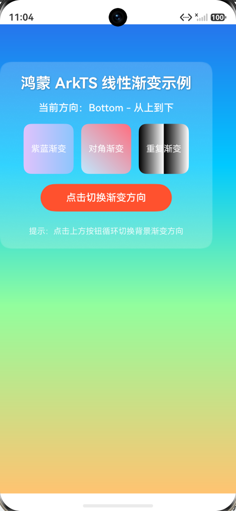
一、项目概述
1.1 项目简介
本项目是「21天鸿蒙 ArkTS 训练营」的线性渐变布局实战示例,演示了 HarmonyOS NEXT 中 linearGradient 属性的完整用法。核心亮点在于通过 @Builder + if/else 条件渲染方案,解决了 ArkTS 中 linearGradient 属性在 state 变化时不重绘的渲染缓存问题,实现了点击按钮即可循环切换全屏背景渐变方向的交互效果。
1.2 技术栈
| 技术 | 说明 |
|---|---|
| 开发语言 | ArkTS(HarmonyOS NEXT 官方开发语言) |
| 开发工具 | DevEco Studio 6.x |
| 目标系统 | HarmonyOS NEXT(API 12+ / SDK 6.1.1) |
| 目标设备 | 手机(phone) |
| 核心技术 | @Entry / @Component / @State / @Builder / linearGradient |
1.3 功能特性
- 6 种渐变方向:Top / Bottom / Left / Right / LeftTop / RightBottom,点击按钮循环切换
- 多色色标渐变:4 段渐变(科技蓝 → 清新青 → 草绿色 → 暖橙色),色标位置可自定义
- 静态渐变演示:3 个小色块分别演示两色渐变、对角渐变、重复渐变(repeating)
- 毛玻璃卡片:内容区域使用半透明背景 +
backdropBlur毛玻璃效果 - 实时方向显示:UI 实时显示当前渐变方向名称,便于调试确认
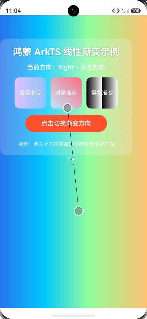
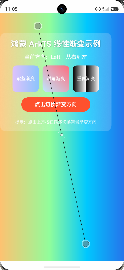
二、运行效果
2.1 界面展示
┌─────────────────────────────┐
│  全屏渐变背景(可切换方向)     │
│                             │
│  ┌───────────────────────  │
│  │  鸿蒙 ArkTS 线性渐变示例  │  │
│  │  当前方向:Right - 从左到右 │  │
│  │                       │  │
│  │ [紫蓝] [对角] [重复]    │  │
│  │                       │  │
│  │  [点击切换渐变方向]      │  │
│  │                       │  │
│  │  提示:点击上方按钮循环切换  │  │
│  └───────────────────────┘  │
│                             │
└─────────────────────────────┘
2.2 交互说明
- 启动应用后,全屏显示从上到下的四色渐变背景
- 点击「点击切换渐变方向」按钮,背景渐变方向按以下顺序循环切换:
- Top(从下到上)→ Bottom(从上到下)→ Right(从左到右)→ Left(从右到左)→ LeftTop(从右下到左上)→ RightBottom(从左上到右下)→ 回到 Top…
- 每次切换后,「当前方向」文字同步更新
- 三个小色块始终保持静态渐变效果不变
三、项目结构
ArkTsLinearGradient/
├── AppScope/                          # 应用级配置
│   ├── app.json5                      # 应用配置文件
│   └── resources/                     # 应用级资源
├── entry/                             # 主模块
│   ├── src/main/
│   │   ├── ets/
│   │   │   ├── entryability/          # 入口 Ability
│   │   │   │   └── EntryAbility.ets
│   │   │   ── pages/                 # 页面目录
│   │   │       └── Index.ets          # ★ 核心页面(本示例全部逻辑)
│   │   ├── resources/                 # 模块级资源
│   │   ── module.json5               # 模块配置文件
│   ├── build-profile.json5            # 构建配置
│   └── oh-package.json5               # 依赖配置
├── build-profile.json5                # 全局构建配置
├── hvigorfile.ts                      # 构建脚本
── oh-package.json5                   # 全局依赖配置
四、核心技术详解
4.1 linearGradient 属性
linearGradient 是 ArkTS 的通用属性,可应用于任意组件,用于创建线性渐变效果。
参数说明
.linearGradient({
  angle: 0,                              // 渐变角度(0~360),与 direction 互斥
  direction: GradientDirection.Bottom,   // 渐变方向(枚举值)
  colors: [[0xFF2675EC, 0.0], ...],     // 颜色数组:[颜色, 位置比例]
  repeating: false                       // 是否重复渐变
})
GradientDirection 枚举值
| 枚举值 | 方向说明 | 渐变走向 |
|---|---|---|
GradientDirection.Top |
从下到上 | 底部 → 顶部 |
GradientDirection.Bottom |
从上到下 | 顶部 → 底部 |
GradientDirection.Left |
从右到左 | 右侧 → 左侧 |
GradientDirection.Right |
从左到右 | 左侧 → 右侧 |
GradientDirection.LeftTop |
从右下到左上 | 右下角 → 左上角 |
GradientDirection.LeftBottom |
从右上到左下 | 右上角 → 左下角 |
GradientDirection.RightTop |
从左下到右上 | 左下角 → 右上角 |
GradientDirection.RightBottom |
从左上到右下 | 左上角 → 右下角 |
colors 参数格式
// 格式:Array<[ResourceColor, number]>
// 每个元组:[颜色值, 位置比例(0~1)]
private gradientColors: Array<[ResourceColor, number]> = [
  [0xFF2675EC, 0.0],   // 0% 位置:科技蓝(起点色)
  [0xFF00C9FF, 0.3],   // 30% 位置:清新青
  [0xFF92FE9D, 0.6],   // 60% 位置:草绿色
  [0xFFFFC371, 1.0]    // 100% 位置:暖橙色(终点色)
];
注意:ArkTS 严格模式禁止使用
any类型,colors 必须声明为Array<[ResourceColor, number]>。
4.2 动态切换渐变方向的核心技巧
问题背景
在 ArkTS 中,linearGradient 作为通用属性存在渲染缓存机制。当 @State 变量变化触发 build 重跑时,已渲染的 linearGradient 属性不会自动更新——这是 ArkTS 渲染引擎的已知行为。
解决方案:@Builder + if/else 条件渲染
// 为每种方向创建独立的 @Builder
@Builder
gradientTop() {
  Column()
    .width('100%')
    .height('100%')
    .linearGradient({
      direction: GradientDirection.Top,
      colors: this.gradientColors
    })
}

// 主渲染方法:通过 if/else 选择对应的 Builder
@Builder
gradientBackground() {
  if (this.directionIndex % 6 === 0) {
    this.gradientTop()
  } else if (this.directionIndex % 6 === 1) {
    this.gradientBottom()
  }
  // ... 其他方向
}

// 在 build 中使用
build() {
  Stack() {
    this.gradientBackground()  // 条件渲染渐变背景
    // ... 内容层
  }
}
原理分析
点击按钮 → directionIndex++ → @State 变化 → build 重跑
    ↓
if/else 分支切换(例如从 0 变为 1)
    ↓
ArkTS 渲染引擎检测到分支变化
    ↓
销毁旧的 Column 组件(gradientTop 对应的组件树)
    ↓
创建新的 Column 组件(gradientBottom 对应的组件树)
    ↓
新 Column 的 linearGradient 属性首次渲染 → 渐变正确显示
关键点:if/else 的每个分支是完全独立的组件树。当分支切换时,ArkTS 会销毁旧组件并创建新组件,新组件的所有属性(包括 linearGradient)都会重新初始化渲染,从而绕过渲染缓存问题。
为什么不用 switch? ArkTS 的
switch语句在某些版本中不会触发组件树的完全重建,而 if/else 能确保每个分支是独立的条件分支,组件重建更可靠。
4.3 其他技术要点
Stack 布局
Stack({ alignContent: Alignment.TopStart }) {
  this.gradientBackground()    // 第一层:渐变背景
  Column({ space: 16 }) {      // 第二层:内容卡片
    // ...
  }
}
使用 Stack 堆叠布局,渐变背景铺满全屏,内容卡片叠加在上方。
毛玻璃效果
.backgroundColor('#33FFFFFF')   // 半透明白色(20% 不透明度)
.backdropBlur(8)                // 背景模糊半径 8vp
文字阴影
.textShadow({
  radius: 4,                    // 模糊半径
  color: 0x55000000,            // 阴影颜色(半透明黑)
  offsetX: 2,                   // 水平偏移
  offsetY: 2                    // 垂直偏移
})
五、完整代码
// 引入 ArkTS 装饰器及容器组件所需的基础能力
// @Entry 标记当前自定义组件为页面入口
// @Component 声明这是一个自定义组件
// 鸿蒙布局体系中,线性渐变通过 .linearGradient() 通用属性使用
// 它接收 direction(方向)和 colors(颜色数组)来描述渐变效果
//
// 核心技巧:用 @Builder 为每种方向创建独立的渐变组件
// 通过 if/else 条件渲染,directionIndex 变化时 ArkTS 会销毁旧组件、创建新组件
// 这样 linearGradient 属性一定会重新生效,避免渲染缓存问题
@Entry
@Component
struct Index {
  // @State 状态变化时 UI 会自动刷新
  // 用整数索引循环指向 6 种渐变方向
  @State directionIndex: number = 0;

  // 渐变方向名称数组:用于 UI 显示,便于确认点击是否生效
  private directionNames: string[] = [
    'Top - 从下到上',
    'Bottom - 从上到下',
    'Right - 从左到右',
    'Left - 从右到左',
    'LeftTop - 从右下到左上',
    'RightBottom - 从左上到右下'
  ];

  // 渐变颜色数组:定义渐变过程中经过的关键色及位置
  // ArkTS 严格类型要求 colors 必须为 Array<[ResourceColor, number]>
  // 元组中第一个元素为颜色,第二个元素为该颜色所处的渐变位置(0~1)
  private gradientColors: Array<[ResourceColor, number]> = [
    [0xFF2675EC, 0.0],   // 起点色:科技蓝
    [0xFF00C9FF, 0.3],   // 中间色:清新青
    [0xFF92FE9D, 0.6],   // 中间色:草绿色
    [0xFFFFC371, 1.0]    // 终点色:暖橙色
  ];

  // 简单两色渐变数组:用于演示下方三个小色块
  private simpleColors: Array<[ResourceColor, number]> = [
    [0xFFE0C3FC, 0.0],   // 起点:浅紫
    [0xFF8EC5FC, 1.0]    // 终点:天蓝
  ];

  // ============ 6 个 @Builder 方法,每个对应一种渐变方向 ============
  // 通过 if/else 条件渲染不同 Builder,directionIndex 变化时 ArkTS 会销毁旧组件、创建新组件
  // 这样 linearGradient 属性一定会重新生效

  // 方向 0:从下到上
  @Builder
  gradientTop() {
    Column()
      .width('100%')
      .height('100%')
      .linearGradient({
        direction: GradientDirection.Top,
        colors: this.gradientColors
      })
  }

  // 方向 1:从上到下
  @Builder
  gradientBottom() {
    Column()
      .width('100%')
      .height('100%')
      .linearGradient({
        direction: GradientDirection.Bottom,
        colors: this.gradientColors
      })
  }

  // 方向 2:从左到右
  @Builder
  gradientRight() {
    Column()
      .width('100%')
      .height('100%')
      .linearGradient({
        direction: GradientDirection.Right,
        colors: this.gradientColors
      })
  }

  // 方向 3:从右到左
  @Builder
  gradientLeft() {
    Column()
      .width('100%')
      .height('100%')
      .linearGradient({
        direction: GradientDirection.Left,
        colors: this.gradientColors
      })
  }

  // 方向 4:从右下到左上
  @Builder
  gradientLeftTop() {
    Column()
      .width('100%')
      .height('100%')
      .linearGradient({
        direction: GradientDirection.LeftTop,
        colors: this.gradientColors
      })
  }

  // 方向 5:从左上到右下
  @Builder
  gradientRightBottom() {
    Column()
      .width('100%')
      .height('100%')
      .linearGradient({
        direction: GradientDirection.RightBottom,
        colors: this.gradientColors
      })
  }

  // ============ 主渲染方法:根据 directionIndex 选择对应的 @Builder ============
  // 使用 if/else 而非 switch,确保每个分支是完全独立的组件树
  @Builder
  gradientBackground() {
    if (this.directionIndex % 6 === 0) {
      this.gradientTop()
    } else if (this.directionIndex % 6 === 1) {
      this.gradientBottom()
    } else if (this.directionIndex % 6 === 2) {
      this.gradientRight()
    } else if (this.directionIndex % 6 === 3) {
      this.gradientLeft()
    } else if (this.directionIndex % 6 === 4) {
      this.gradientLeftTop()
    } else {
      this.gradientRightBottom()
    }
  }

  build() {
    // 根容器使用 Stack 堆叠
    // 第一层:渐变背景(通过 @Builder 条件渲染,方向变化时强制重建)
    // 第二层:内容 Column
    Stack({ alignContent: Alignment.TopStart }) {
      // ============ 第一部分:全屏渐变背景 ============
      // 使用 @Builder 条件渲染:每种方向对应独立的 Column + linearGradient
      // directionIndex 变化时,if/else 分支切换,ArkTS 销毁旧 Column 创建新 Column
      // 新 Column 的 linearGradient 属性一定会重新渲染
      this.gradientBackground()

      // ============ 第二部分:内容展示区 ============
      // 半透明卡片叠加在渐变背景之上
      Column({ space: 16 }) {
        // 标题
        Text('鸿蒙 ArkTS 线性渐变示例')
          .fontSize(24)
          .fontWeight(FontWeight.Bold)
          .fontColor(Color.White)
          .textShadow({ radius: 4, color: 0x55000000, offsetX: 2, offsetY: 2 })

        // 当前方向显示:随点击实时更新,便于确认点击是否生效
        Text('当前方向:' + this.directionNames[this.directionIndex % 6])
          .fontSize(16)
          .fontColor(Color.White)
          .fontWeight(FontWeight.Medium)

        // 三个小色块:使用 .linearGradient() 通用属性演示静态渐变
        Row({ space: 12 }) {
          Text('紫蓝渐变')
            .fontSize(14)
            .fontColor(Color.White)
            .width(80)
            .height(80)
            .textAlign(TextAlign.Center)
            .borderRadius(12)
            // 简单两色横向渐变
            .linearGradient({
              direction: GradientDirection.Right,
              colors: this.simpleColors
            })

          Text('对角渐变')
            .fontSize(14)
            .fontColor(Color.White)
            .width(80)
            .height(80)
            .textAlign(TextAlign.Center)
            .borderRadius(12)
            // 对角方向渐变
            .linearGradient({
              direction: GradientDirection.LeftBottom,
              colors: [
                [0xFFFF6E7F, 0.0],
                [0xFFBFE9FF, 1.0]
              ]
            })

          Text('重复渐变')
            .fontSize(14)
            .fontColor(Color.White)
            .width(80)
            .height(80)
            .textAlign(TextAlign.Center)
            .borderRadius(12)
            // repeating: true 时颜色在终点之后循环重复
            .linearGradient({
              direction: GradientDirection.Right,
              colors: [
                [0xFF000000, 0.0],
                [0xFFFFFFFF, 0.5]
              ],
              repeating: true
            })
        }

        // 切换方向按钮:Text + onClick 是兼容性最好的点击实现
        Text('点击切换渐变方向')
          .width('70%')
          .height(44)
          .fontSize(16)
          .fontColor(Color.White)
          .fontWeight(FontWeight.Medium)
          .textAlign(TextAlign.Center)
          .backgroundColor(0xFFFF512F)
          .borderRadius(22)
          .onClick(() => {
            // 自增索引实现循环切换
            this.directionIndex++;
          })

        // 提示文本
        Text('提示:点击上方按钮循环切换背景渐变方向')
          .fontSize(13)
          .fontColor('#FFFFFF')
          .opacity(0.85)
          .margin({ top: 8 })
      }
      .width('90%')
      .padding(20)
      .margin({ top: 60 })
      .borderRadius(16)
      .backgroundColor('#33FFFFFF')
      .backdropBlur(8)
    }
    .width('100%')
    .height('100%')
  }
}
六、常见问题与避坑指南
6.1 linearGradient 不随 state 变化更新
现象:修改 @State 变量后,linearGradient 的 direction 或 colors 没有重新渲染。
原因:ArkTS 的渲染引擎对通用属性(universal attributes)存在缓存机制,state 变化触发的 build 重跑不会更新已渲染的 linearGradient。
解决方案:使用 @Builder + if/else 条件渲染,让每个方向对应独立的组件树,分支切换时强制销毁重建。
6.2 编译错误:Cannot find name ‘LinearGradientDirection’
原因:鸿蒙 NEXT 中正确的枚举名称是 GradientDirection,而非 LinearGradientDirection。
解决:全局替换 LinearGradientDirection → GradientDirection。
6.3 编译错误:Use explicit types instead of “any”
原因:ArkTS 严格模式禁止使用 any 和 unknown 类型。
解决:将 Array<any> 改为 Array<[ResourceColor, number]>。
6.4 编译错误:Destructuring variable declarations are not supported
原因:ArkTS 严格模式不支持解构赋值声明。
解决:将 const [x0r, y0r, x1r, y1r] = dir 改为逐个索引访问 dir[0]、dir[1] 等。
6.5 编译错误:No overload matches this call (CanvasRenderingContext2D)
原因:CanvasRenderingContext2D 构造函数不接受空字符串参数。
解决:使用无参构造 new CanvasRenderingContext2D()。
6.6 点击按钮无反应
原因:Button 组件叠加 .linearGradient() 在某些版本存在点击兼容问题。
解决:使用 Text + backgroundColor + onClick 替代 Button + linearGradient 的组合。
七、扩展与进阶
7.1 自定义渐变色板
修改 gradientColors 数组即可自定义渐变颜色:
// 日落风格渐变
private sunsetColors: Array<[ResourceColor, number]> = [
  [0xFFFF6B35, 0.0],   // 橙红色
  [0xFFFF8E53, 0.25],  // 暖橙色
  [0xFFFFC371, 0.5],   // 金黄色
  [0xFFFFEAA7, 0.75],  // 淡黄色
  [0xFFDFE6E9, 1.0]    // 灰白色
];
7.2 添加渐变动画
结合 animateTo 实现渐变方向切换时的过渡动画:
.onClick(() => {
  animateTo({ duration: 500, curve: Curve.EaseInOut }, () => {
    this.directionIndex++;
  });
})
7.3 使用 angle 参数实现任意角度渐变
.linearGradient({
  angle: 45,  // 45 度角渐变(从左下到右上)
  colors: this.gradientColors
})
注意:
angle和direction互斥,同时设置时direction优先级更高。
八、参考资源
九、版本信息
| 项目 | 版本 |
|---|---|
| HarmonyOS SDK | 6.1.1 (API 12) |
| DevEco Studio | 6.x |
| ArkTS 严格模式 | 开启 |
| 项目创建日期 | 2026-06-12 |
十、许可证
本项目仅用于学习交流,代码遵循 MIT 许可证。
作者:21天鸿蒙 ArkTS 训练营学员
更新时间:2026-06-12
适用系统:HarmonyOS NEXT(API 12+)

作为“人工智能6S店”的官方数字引擎,为AI开发者与企业提供一个覆盖软硬件全栈、一站式门户。
更多推荐


 5
5 0
0- 0


 已为社区贡献7条内容

所有评论(0)