
鸿蒙原生 ArkTS 布局深度实践:Column + SpaceAround 均匀环绕分布 —— 以「健康管理」应用
一、写在前面
在鸿蒙 ArkUI 的布局体系中,Column 和 Row 是最基础的两个布局容器,而 justifyContent 属性则决定了子组件在主轴方向上的排列策略。对于 Column 容器(主轴为垂直方向),justifyContent 提供了五种对齐方式:Start、Center、End、SpaceBetween、SpaceAround 和 SpaceEvenly。
其中,FlexAlign.SpaceAround(均匀环绕分布) 是一种兼顾平衡感与呼吸感的布局策略。它将容器的剩余空间均匀分布在每个子组件两侧,使得子组件之间、子组件与容器边缘之间都留有间距——虽然边缘间距只有中间间距的一半,但这种"环绕"效果让整体布局显得柔和、不压迫、有呼吸感。
本文将以一个「健康管理」应用为实战载体,从零到一剖析 Column + SpaceAround 的实现原理、代码写法、与其他对齐方式的精确对比,以及在实际项目中的最佳实践。读完本文,你将对 SpaceAround 的适用场景和细节把控了然于胸。
二、SpaceAround 的精确语义
2.1 数学定义
在深入代码之前,我们先从数学上精确理解 SpaceAround 的行为。
假设:
- 容器主轴方向尺寸(高度)=
H - 子组件数量 =
N - 每个子组件在主轴方向上的尺寸 =
S₁, S₂, ..., Sₙ - 子组件总尺寸 =
sum(S)
剩余空间:R = H - sum(S)
对于 FlexAlign.SpaceAround,间距分配规则如下:
| 位置 | 间距公式 | 说明 |
|---|---|---|
| 容器起始端(顶部)与第 1 个子组件 | R / (2N) |
是中间间距的一半 |
| 第 i 个子组件与第 i+1 个子组件之间 | R / N |
中间间距完整 |
| 第 N 个子组件与容器终止端(底部) | R / (2N) |
是中间间距的一半 |
直观来看,SpaceAround 相当于在每个子组件周围"包裹"了等宽的透明间距,但由于首尾子组件外侧的间距只有一半与内侧共享,所以实际呈现为:两端间距 = 中间间距的一半。
2.2 三个 Space 对齐方式对比
| 对齐方式 | 两端间距 | 中间间距 | 3 个子组件示意图 |
|---|---|---|---|
SpaceBetween |
0 | R / (N-1) |
[A]───[B]───[C] |
SpaceAround |
R / (2N) |
R / N |
─[A]──[B]──[C]─ |
SpaceEvenly |
R / (N+1) |
R / (N+1) |
──[A]──[B]──[C]── |
其中 ─ 代表间距,[A] 代表子组件。从示意图中可以清楚看到:
- SpaceBetween:两端没有间距,中间间距最大
- SpaceAround:两端有间距(约为中间的一半),中间间距次之
- SpaceEvenly:所有间距完全相等,两端间距最长但中间间距最短
2.3 SpaceAround 的视觉特征
SpaceAround 在视觉上有几个鲜明的特征:
- 不贴边:与 SpaceBetween 的"顶天立地"不同,SpaceAround 在容器两端留有间距,内容不会紧贴屏幕边缘。
- 均匀感:虽然两端间距只有中间间距的一半,但在视觉上,由于子组件本身占据一定空间,这种"半间距"往往看起来恰到好处——不会像 SpaceEvenly 那样边缘太空,也不会像 SpaceBetween 那样边缘太挤。
- 呼吸感:每个子组件周围都有间距环绕,整体呈现出一种"漂浮"或"悬浮"的视觉效果,非常适合内容卡片、指标面板等需要视觉层次感的场景。
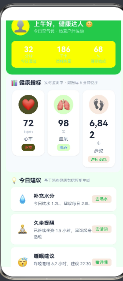
三、实战:健康管理应用
3.1 应用场景分析
我们构建一个「健康管理」应用页面,模拟用户日常查看健康数据的场景。页面包含以下内容板块:
- 页面顶部:用户头像、欢迎语、今日运动概览(运动时长、消耗热量、目标完成率)
- 健康指标看板:心率、血氧、步数三项核心指标,以卡片形式横向排列
- 今日健康建议:基于用户健康数据智能生成的个性化建议列表(补水、久坐提醒、睡眠建议)
- 快捷操作区:「开始运动」和「记录饮食」两个功能入口按钮
整个页面的数据结构天然分为 4 个区域,我们希望它们在垂直方向上均匀分布,同时边缘不贴边、中间有呼吸感——这正是 SpaceAround 的用武之地。
3.2 数据模型设计
首先定义两个数据接口:
/**
 * 健康指标项
 */
interface HealthMetric {
  emoji: string;       // 指标图标(如 ❤️ 🫁 👣)
  label: string;       // 指标名称(如 心率、血氧、步数)
  value: string;       // 指标数值(如 72、98、6,842)
  unit: string;        // 单位(如 bpm、%、步)
  status: string;      // 状态描述(如 正常、优秀、达标 68%)
  color: string;       // 主题色(如 #ef4444、#3b82f6、#22c55e)
}

/**
 * 今日建议项
 */
interface Suggestion {
  icon: string;        // 建议图标
  title: string;       // 建议标题
  desc: string;        // 建议描述
  action: string;      // 操作按钮文案
}
设计思路:
HealthMetric包含颜色字段color,每个指标使用不同的主题色(红/蓝/绿),增强视觉区分度。- 图标使用 emoji 而非图标字体或图片资源,零依赖、零加载延迟,适合原型和演示场景。
Suggestion的action字段提供操作按钮文案,暗示用户可以交互,增强页面功能感。
3.3 子组件一:健康指标卡片
@Component
struct MetricCard {
  private metric: HealthMetric = { emoji: '', label: '', value: '', unit: '', status: '', color: '' };

  build() {
    Column() {
      // 指标图标(圆形带透明背景)
      Text(this.metric.emoji)
        .fontSize(32)
        .textAlign(TextAlign.Center)
        .width(56)
        .height(56)
        .backgroundColor(this.metric.color + '20')  // 20% 透明度
        .borderRadius(28)

      // 指标数值
      Text(this.metric.value)
        .fontSize(26)
        .fontWeight(FontWeight.Bold)
        .fontColor('#1e293b')
        .lineHeight(34)
        .margin({ top: 8 })

      // 单位
      Text(this.metric.unit)
        .fontSize(12)
        .fontColor('#94a3b8')
        .lineHeight(16)

      // 指标名称
      Text(this.metric.label)
        .fontSize(13)
        .fontColor('#64748b')
        .lineHeight(18)
        .margin({ top: 4 })

      // 状态标签
      Text(this.metric.status)
        .fontSize(11)
        .fontColor(this.metric.color)
        .fontWeight(FontWeight.Medium)
        .lineHeight(16)
        .padding({ left: 8, right: 8, top: 2, bottom: 2 })
        .backgroundColor(this.metric.color + '15')
        .borderRadius(8)
        .margin({ top: 6 })
    }
    .alignItems(HorizontalAlign.Center)
    .width('100%')
    .padding(14)
    .backgroundColor('#ffffff')
    .borderRadius(16)
    .shadow({ radius: 6, color: '#1a000000', offsetX: 0, offsetY: 2 })
  }
}
设计要点:
-
透明度拼接颜色:
this.metric.color + '20'这样的写法在 ArkTS 中是合法的——它将十六进制颜色码与两位透明度值拼接,如#ef4444+20=#ef444420(20% 透明度)。这是鸿蒙 ArkUI 的颜色格式规范之一。 -
垂直居中堆叠:卡片内使用
Column + alignItems(HorizontalAlign.Center)将所有内容垂直堆叠并水平居中,适合展示单一指标数据。 -
投影提升层次:
.shadow({ radius: 6, color: '#1a000000', offsetX: 0, offsetY: 2 })给卡片添加柔和阴影,产生浮起效果。
3.4 子组件二:健康建议卡片
@Component
struct SuggestionCard {
  private item: Suggestion = { icon: '', title: '', desc: '', action: '' };

  build() {
    Row() {
      // 左侧图标
      Text(this.item.icon)
        .fontSize(24)
        .width(40)
        .height(40)
        .textAlign(TextAlign.Center)

      // 右侧文字
      Column() {
        Text(this.item.title)
          .fontSize(15)
          .fontWeight(FontWeight.Bold)
          .fontColor('#1e293b')
          .lineHeight(22)

        Text(this.item.desc)
          .fontSize(12)
          .fontColor('#64748b')
          .lineHeight(18)
          .margin({ top: 2 })
      }
      .alignItems(HorizontalAlign.Start)
      .layoutWeight(1)
      .margin({ left: 12 })

      // 操作按钮
      Text(this.item.action)
        .fontSize(12)
        .fontColor('#22c55e')
        .fontWeight(FontWeight.Medium)
        .padding({ left: 10, right: 10, top: 4, bottom: 4 })
        .backgroundColor('#22c55e15')
        .borderRadius(6)
    }
    .alignItems(VerticalAlign.Center)
    .width('100%')
    .padding(14)
    .backgroundColor('#ffffff')
    .borderRadius(12)
    .shadow({ radius: 3, color: '#10000000', offsetX: 0, offsetY: 1 })
  }
}
设计要点:
-
水平三栏布局(图标 + 文字 + 按钮):外层使用
Row水平排列,layoutWeight(1)让中间文字区撑满剩余宽度,右侧按钮固定宽度。 -
点击引导:右侧操作按钮使用绿色文字 + 浅绿背景,视觉上暗示可点击,提升交互预期。
-
轻量阴影:与 MetricCard 的 6px 阴影不同,SuggestionCard 使用 3px 阴影,视觉层次更轻,符合"建议"的辅助定位。
3.5 主页面:SpaceAround 核心布局
@Entry
@Component
struct HealthPage {
  private readonly metrics: HealthMetric[] = [
    { emoji: '❤️', label: '心率', value: '72', unit: 'bpm', status: '正常', color: '#ef4444' },
    { emoji: '🫁', label: '血氧', value: '98', unit: '%', status: '优秀', color: '#3b82f6' },
    { emoji: '👣', label: '步数', value: '6,842', unit: '步', status: '达标 68%', color: '#22c55e' },
  ];

  private readonly suggestions: Suggestion[] = [
    { icon: '💧', title: '补充水分', desc: '今日饮水 1.2L,建议每日 2.0L', action: '去喝水' },
    { icon: '🧘', title: '久坐提醒', desc: '已连续坐姿 1.5 小时,建议起身活动', action: '去活动' },
    { icon: '😴', title: '睡眠建议', desc: '昨晚睡眠 6.2 小时,建议 22:30 前入睡', action: '看详情' },
  ];

  build() {
    Scroll() {
      Column() {
        // ===== 区域 1:绿色头部 — 用户信息 + 今日概览 =====
        Column() {
          Row() {
            Text('👤').fontSize(32).width(52).height(52)
              .backgroundColor('#ffffff30').borderRadius(26).textAlign(TextAlign.Center)
            Column() {
              Text('上午好,健康达人 🌞').fontSize(18).fontWeight(FontWeight.Bold).fontColor('#ffffff').lineHeight(26)
              Text('今日空气优 · 适宜户外运动').fontSize(12).fontColor('#bbf7d0').margin({ top: 2 })
            }.alignItems(HorizontalAlign.Start).margin({ left: 12 })
          }.alignItems(VerticalAlign.Center).width('100%')

          Row() {
            Column() {
              Text('32').fontSize(22).fontWeight(FontWeight.Bold).fontColor('#ffffff')
              Text('分钟').fontSize(11).fontColor('#bbf7d0')
              Text('今日运动').fontSize(11).fontColor('#86efac').margin({ top: 2 })
            }.layoutWeight(1)
            Divider().width(1).height(36).color('#ffffff30')
            Column() {
              Text('186').fontSize(22).fontWeight(FontWeight.Bold).fontColor('#ffffff')
              Text('千卡').fontSize(11).fontColor('#bbf7d0')
              Text('消耗热量').fontSize(11).fontColor('#86efac').margin({ top: 2 })
            }.layoutWeight(1)
            Divider().width(1).height(36).color('#ffffff30')
            Column() {
              Text('68').fontSize(22).fontWeight(FontWeight.Bold).fontColor('#ffffff')
              Text('%').fontSize(11).fontColor('#bbf7d0')
              Text('目标完成').fontSize(11).fontColor('#86efac').margin({ top: 2 })
            }.layoutWeight(1)
          }.alignItems(VerticalAlign.Center).width('100%').margin({ top: 16 })
            .padding({ top: 12, bottom: 12 }).backgroundColor('#ffffff15').borderRadius(12)
        }
        .alignItems(HorizontalAlign.Start).width('100%')
        .padding({ left: 16, right: 16, top: 24, bottom: 20 })
        .backgroundColor('#22c55e').borderRadius(18)

        // ===== 区域 2:健康指标看板 =====
        Column() {
          Row() {
            Text('📊 健康指标').fontSize(16).fontWeight(FontWeight.Bold).fontColor('#1e293b')
            Text('实时监测中 · 数据每 5 分钟更新').fontSize(11).fontColor('#94a3b8').margin({ left: 8 })
          }.width('100%').margin({ bottom: 12 })

          Row() {
            ForEach(this.metrics, (metric: HealthMetric) => {
              MetricCard({ metric: metric }).layoutWeight(1).margin({ left: 4, right: 4 })
            }, (metric: HealthMetric) => metric.label)
          }.alignItems(VerticalAlign.Top).width('100%')
        }
        .alignItems(HorizontalAlign.Start).width('100%').padding(14)
        .backgroundColor('#f8fafc').borderRadius(16)

        // ===== 区域 3:今日健康建议 =====
        Column() {
          Row() {
            Text('💡 今日建议').fontSize(16).fontWeight(FontWeight.Bold).fontColor('#1e293b')
            Text('基于您的健康数据智能生成').fontSize(11).fontColor('#94a3b8').margin({ left: 8 })
          }.width('100%').margin({ bottom: 10 })

          ForEach(this.suggestions, (item: Suggestion) => {
            SuggestionCard({ item: item }).margin({ bottom: 8 })
          }, (item: Suggestion) => item.title)
        }
        .alignItems(HorizontalAlign.Start).width('100%').padding(14)
        .backgroundColor('#f0fdf4').borderRadius(16)

        // ===== 区域 4:快捷操作 =====
        Column() {
          Row() {
            Column() {
              Text('🏃').fontSize(28)
              Text('开始运动').fontSize(13).fontWeight(FontWeight.Medium).fontColor('#1e293b').margin({ top: 6 })
              Text('跑步 · 骑行 · 瑜伽').fontSize(10).fontColor('#94a3b8').margin({ top: 2 })
            }.layoutWeight(1).padding(12).backgroundColor('#ffffff').borderRadius(12)
              .shadow({ radius: 3, color: '#10000000', offsetX: 0, offsetY: 1 })

            Column() {
              Text('🥗').fontSize(28)
              Text('记录饮食').fontSize(13).fontWeight(FontWeight.Medium).fontColor('#1e293b').margin({ top: 6 })
              Text('早餐 · 午餐 · 晚餐').fontSize(10).fontColor('#94a3b8').margin({ top: 2 })
            }.layoutWeight(1).padding(12).backgroundColor('#ffffff').borderRadius(12)
              .shadow({ radius: 3, color: '#10000000', offsetX: 0, offsetY: 1 }).margin({ left: 10 })
          }.alignItems(VerticalAlign.Top).width('100%')

          Text('今日已打卡 · 连续健康记录 15 天 🌟')
            .fontSize(12).fontColor('#94a3b8').width('100%').textAlign(TextAlign.Center).margin({ top: 14 })
        }
        .alignItems(HorizontalAlign.Start).width('100%').padding({ top: 8, bottom: 4 })
      }
      // ★★★ 核心:SpaceAround 均匀环绕分布 ★★★
      .justifyContent(FlexAlign.SpaceAround)     // ← 主轴(垂直)均匀环绕
      .alignItems(HorizontalAlign.Center)          // ← 交叉轴(水平)居中
      .width('100%')
      .height(760)                                // ← 必须!固定高度
      .padding({ left: 14, right: 14, top: 14, bottom: 14 })
      .backgroundColor('#f0fdf4')
    }
    .width('100%')
    .height('100%')
    .backgroundColor('#f0fdf4')
  }
}
3.6 核心布局代码逐行解读
Column() {
  // 4 个区域子组件
}
.justifyContent(FlexAlign.SpaceAround)  // ← (1)
.alignItems(HorizontalAlign.Center)     // ← (2)
.width('100%')                          // ← (3)
.height(760)                            // ← (4) ★关键
.padding(14)                            // ← (5)
逐行解读:
第 (1) 行 .justifyContent(FlexAlign.SpaceAround)
核心指令。告诉 Column 容器:“请将我的子组件在垂直方向上均匀环绕分布——每个子组件周围都有等宽的间距,容器顶部和底部也各留有(中间间距一半的)间距。”
第 (2) 行 .alignItems(HorizontalAlign.Center)
交叉轴(水平方向)居中对齐。由于 Column 的宽度是 100%,子组件自身宽度可能小于容器宽度,HorizontalAlign.Center 让它们在水平方向上居中显示。
第 (3) 行 .width('100%')
宽度撑满父容器(即 Scroll 的可用宽度)。
第 (4) 行 .height(760) ⚠️ 关键条件
为什么 SpaceAround 必须要有固定高度?
核心原因与 SpaceBetween 相同:如果 Column 的高度由子组件撑开(即 height 未设置或设为 auto),那么容器高度恰好等于所有子组件总高度,剩余空间 R = 0。当 R = 0 时,SpaceAround 没有任何间距可以分配,所有子组件紧凑排列在一起,效果退化到与 FlexAlign.Start 无异。
只有给 Column 设置一个大于子组件总高度的固定值,才能产生正的剩余空间,SpaceAround 才能将剩余空间均匀分配到子组件周围。
第 (5) 行 .padding(14)
注意:Column 的 padding 是在 justifyContent 计算之前被减去的。也就是说,SpaceAround 在分配间距时,参考的是 padding 之后的内边距盒尺寸。如果你希望顶部和底部也有 padding 的留白,加上即可——这会让 SpaceAround 的"两端半间距"在 padding 基础上进一步分布。
四、SpaceAround 与 SpaceBetween、SpaceEvenly 的深度对比
4.1 并排对比代码
下面的代码将三种对齐方式并排显示,方便你在真机上直观观察差异:
@Entry
@Component
struct ThreeWayCompare {
  build() {
    Row() {
      // ── SpaceBetween ──
      Column() {
        Text('顶').fontSize(12).backgroundColor('#ef4444').fontColor('#fff').padding(8).borderRadius(4)
        Text('中').fontSize(12).backgroundColor('#fca5a5').fontColor('#fff').padding(8).borderRadius(4)
        Text('底').fontSize(12).backgroundColor('#ef4444').fontColor('#fff').padding(8).borderRadius(4)
      }
      .justifyContent(FlexAlign.SpaceBetween)
      .alignItems(HorizontalAlign.Center)
      .width('28%')
      .height(320)
      .border({ width: 1, color: '#e2e8f0' })
      .borderRadius(8)
      .padding(8)

      // ── SpaceAround ──
      Column() {
        Text('顶').fontSize(12).backgroundColor('#22c55e').fontColor('#fff').padding(8).borderRadius(4)
        Text('中').fontSize(12).backgroundColor('#86efac').fontColor('#fff').padding(8).borderRadius(4)
        Text('底').fontSize(12).backgroundColor('#22c55e').fontColor('#fff').padding(8).borderRadius(4)
      }
      .justifyContent(FlexAlign.SpaceAround)
      .alignItems(HorizontalAlign.Center)
      .width('28%')
      .height(320)
      .border({ width: 1, color: '#e2e8f0' })
      .borderRadius(8)
      .padding(8)

      // ── SpaceEvenly ──
      Column() {
        Text('顶').fontSize(12).backgroundColor('#3b82f6').fontColor('#fff').padding(8).borderRadius(4)
        Text('中').fontSize(12).backgroundColor('#93c5fd').fontColor('#fff').padding(8).borderRadius(4)
        Text('底').fontSize(12).backgroundColor('#3b82f6').fontColor('#fff').padding(8).borderRadius(4)
      }
      .justifyContent(FlexAlign.SpaceEvenly)
      .alignItems(HorizontalAlign.Center)
      .width('28%')
      .height(320)
      .border({ width: 1, color: '#e2e8f0' })
      .borderRadius(8)
      .padding(8)
    }
    .width('100%')
    .height('100%')
    .padding(16)
    .backgroundColor('#f8fafc')
  }
}
4.2 观察要点
在模拟器或真机上运行对比代码时,注意观察以下差异:
| 观察点 | SpaceBetween | SpaceAround | SpaceEvenly |
|---|---|---|---|
| 顶部边缘 | 「顶」紧贴容器顶部 | 「顶」上方有半间距 | 「顶」上方有一个完整间距 |
| 底部边缘 | 「底」紧贴容器底部 | 「底」下方有半间距 | 「底」下方有一个完整间距 |
| 中间间距 | 最大(独占全部 R) | 中等(R/N) | 最小(R/(N+1)) |
| 整体感觉 | 紧凑、顶天立地 | 柔和、环绕呼吸 | 匀称、均衡平稳 |
4.3 视觉心理学分析
为什么会有这三种不同的设计?
- SpaceBetween 强调的是"最大化利用空间"。首尾贴边确保关键内容(如导航标题、底部按钮)始终在边缘,符合 Fitts 定律(屏幕边缘的元素更容易点击)。
- SpaceAround 强调的是"视觉环绕感"。每个元素周围都有间距,整体呈"悬浮"状态,适合展示信息卡片、数据指标等需要"逐项阅读"的内容。
- SpaceEvenly 强调的是"绝对公平"。数学上完全等分空间,适合等分菜单、标签栏等要求视觉权重完全一致的场景。
4.4 选择指南
| 场景 | 推荐值 | 理由 |
|---|---|---|
| 页面骨架(标题+内容+按钮) | SpaceBetween | 最大化内容空间 |
| 数据看板/指标面板 | SpaceAround | 呼吸感强,适合逐项阅读 |
| 功能菜单/导航标签 | SpaceEvenly | 视觉权重完全均等 |
| 设置页/表单 | SpaceBetween 或 Start | 内容紧凑优先 |
| 引导页/欢迎页 | SpaceAround 或 Center | 视觉舒适,不压迫 |
五、进阶技巧与常见问题
5.1 嵌套 Column 的间距累加
在实际项目中,Column 往往不是单层结构。当内层 Column 也使用了 alignItems 或 padding 时,间距会累加:
// 外层 Column + SpaceAround
Column() {
  // 内层 Column
  Column() {
    Text('标题')
    Text('副标题')
  }
  .padding(16)    // 内层 padding
  .backgroundColor('#f8fafc')

  Column() {
    Text('内容')
  }
  .padding(16)
  .backgroundColor('#ffffff')
}
.justifyContent(FlexAlign.SpaceAround)
.height(400)
在这种情况下,SpaceAround 分配的是外层 Column 的直接子组件(两个内层 Column)之间的间距。而每个内层 Column 内部的 padding 则独立控制自己的内边距。理解这个层次关系,有助于精确控制布局。
5.2 动态内容与固定高度的矛盾
SpaceAround 要求固定高度,但实际内容长度可能是动态的。这个问题有三种常见解决思路:
方案一:设置合理的最小高度
Column() {
  // 动态内容
}
.constraintSize({ minHeight: 600 })
.justifyContent(FlexAlign.SpaceAround)
constraintSize 约束了容器的尺寸范围。当内容较短时,容器至少为 600vp,SpaceAround 生效;内容超长时,容器可以增长,SpaceAround 逐渐退化为 Start 行为。
方案二:配合 layoutWeight
// 父容器固定高度
Row() {
  Column() {
    // ... 子组件
  }
  .justifyContent(FlexAlign.SpaceAround)
  .layoutWeight(1)   // 占满 Row 的剩余高度
  .height('100%')
}
.height(700)  // 父容器固定高度
利用父容器固定高度 + 子容器的 layoutWeight(1),既实现了固定高度,又保持了响应式。
方案三:动态计算高度
@State private containerHeight: number = 600;

aboutToAppear() {
  // 根据屏幕高度动态设置
  this.containerHeight = px2vp(AppStorage.get<number>('screenHeight') ?? 800) - 100;
}
在 aboutToAppear 生命周期中获取屏幕高度,动态计算出合适的容器高度。
5.3 SpaceAround 与 Scroll 的配合
如我们在健康页面中所做的那样,Scroll 在 SpaceAround 外层提供了溢出保护:
Scroll() {
  Column() {
    // 内容区域
  }
  .justifyContent(FlexAlign.SpaceAround)
  .height(760)
}
要理解这其中的"双状态"行为:
- 正常状态(内容总高度 < 760vp):SpaceAround 生效,4 个区域均匀环绕分布。
- 溢出状态(内容总高度 > 760vp,比如用户添加了 10 个建议项):Column 的固定高度 760vp 无法容纳所有内容。此时 Scroll 发挥作用,允许用户上下滚动查看完整内容。SpaceAround 在固定高度内仍然生效,但被裁剪的内容需要通过滚动来查看。
这种设计确保了在大多数情况下布局优雅,在极端情况下功能完备。
5.4 与 Row + SpaceAround 的组合
SpaceAround 也可以用于 Row 容器实现水平方向的均匀环绕:
Row() {
  Text('🏠').fontSize(24)
  Text('📊').fontSize(24)
  Text('👤').fontSize(24)
  Text('⚙️').fontSize(24)
}
.justifyContent(FlexAlign.SpaceAround)
.width('100%')
.height(60)
.backgroundColor('#ffffff')
这在底部导航栏、标签栏等场景中非常实用——每个图标在水平方向上均匀环绕,视觉平衡且不贴边。
5.5 动画过渡效果
SpaceAround 布局配合高度动画,可以实现平滑的内容展开/收起效果:
@State private showDetail: boolean = false;

build() {
  Column() {
    Text('📊 健康指标')
      .fontSize(16)
      .fontWeight(FontWeight.Bold)
      .onClick(() => {
        animateTo({ duration: 300, curve: Curve.EaseInOut }, () => {
          this.showDetail = !this.showDetail;
        });
      })

    if (this.showDetail) {
      Text('心率:72 bpm · 静息心率正常范围 60~100')
        .fontSize(12).fontColor('#64748b').margin({ top: 8 })
      Text('血氧:98% · 正常值 ≥ 95%')
        .fontSize(12).fontColor('#64748b').margin({ top: 4 })
      Text('步数:6,842 步 · 目标 10,000 步')
        .fontSize(12).fontColor('#64748b').margin({ top: 4 })
    }

    Text('查看更多 →')
      .fontSize(12).fontColor('#22c55e').margin({ top: 8 })
  }
  .justifyContent(FlexAlign.SpaceAround)
  .height(this.showDetail ? 240 : 120)
  .animation({ duration: 300, curve: Curve.EaseInOut })
  .padding(14)
  .backgroundColor('#ffffff')
  .borderRadius(16)
}
点击标题展开详情时,Column 高度从 120vp 动画过渡到 240vp,SpaceAround 自动重新计算间距分配,整个过程由 .animation() 属性驱动,平滑自然。
六、完整项目代码
6.1 主页面:HealthPage.ets
/**
 * 鸿蒙原生 ArkTS 布局示例 — Column + justifyContent(FlexAlign.SpaceAround)
 * 功能:演示 Column 主轴(垂直方向)均匀环绕分布布局
 *        每个子组件两侧的间距相等,两端间距为中间间距的一半
 * 场景:健康数据面板 / 运动指标看板 / 身体指标监测
 * 核心技术:
 *   - Column 容器(主轴:垂直方向)
 *   - justifyContent(FlexAlign.SpaceAround) — 子组件均匀环绕分布
 *   - alignItems(HorizontalAlign.Center) — 子组件在交叉轴(水平)居中对齐
 * 运行环境:HarmonyOS NEXT 6.1.1(API 24)
 */

import { hilog } from '@kit.PerformanceAnalysisKit';

const TAG = 'HealthPage';

interface HealthMetric {
  emoji: string;
  label: string;
  value: string;
  unit: string;
  status: string;
  color: string;
}

interface Suggestion {
  icon: string;
  title: string;
  desc: string;
  action: string;
}

@Component
struct MetricCard {
  private metric: HealthMetric = { emoji: '', label: '', value: '', unit: '', status: '', color: '' };

  build() {
    Column() {
      Text(this.metric.emoji)
        .fontSize(32).textAlign(TextAlign.Center)
        .width(56).height(56)
        .backgroundColor(this.metric.color + '20')
        .borderRadius(28)

      Text(this.metric.value)
        .fontSize(26).fontWeight(FontWeight.Bold)
        .fontColor('#1e293b').lineHeight(34).margin({ top: 8 })

      Text(this.metric.unit)
        .fontSize(12).fontColor('#94a3b8').lineHeight(16)

      Text(this.metric.label)
        .fontSize(13).fontColor('#64748b').lineHeight(18).margin({ top: 4 })

      Text(this.metric.status)
        .fontSize(11).fontColor(this.metric.color)
        .fontWeight(FontWeight.Medium).lineHeight(16)
        .padding({ left: 8, right: 8, top: 2, bottom: 2 })
        .backgroundColor(this.metric.color + '15').borderRadius(8).margin({ top: 6 })
    }
    .alignItems(HorizontalAlign.Center)
    .width('100%').padding(14)
    .backgroundColor('#ffffff').borderRadius(16)
    .shadow({ radius: 6, color: '#1a000000', offsetX: 0, offsetY: 2 })
  }
}

@Component
struct SuggestionCard {
  private item: Suggestion = { icon: '', title: '', desc: '', action: '' };

  build() {
    Row() {
      Text(this.item.icon).fontSize(24).width(40).height(40).textAlign(TextAlign.Center)

      Column() {
        Text(this.item.title).fontSize(15).fontWeight(FontWeight.Bold).fontColor('#1e293b').lineHeight(22)
        Text(this.item.desc).fontSize(12).fontColor('#64748b').lineHeight(18).margin({ top: 2 })
      }
      .alignItems(HorizontalAlign.Start).layoutWeight(1).margin({ left: 12 })

      Text(this.item.action)
        .fontSize(12).fontColor('#22c55e').fontWeight(FontWeight.Medium)
        .padding({ left: 10, right: 10, top: 4, bottom: 4 })
        .backgroundColor('#22c55e15').borderRadius(6)
    }
    .alignItems(VerticalAlign.Center)
    .width('100%').padding(14)
    .backgroundColor('#ffffff').borderRadius(12)
    .shadow({ radius: 3, color: '#10000000', offsetX: 0, offsetY: 1 })
  }
}

@Entry
@Component
struct HealthPage {
  private readonly metrics: HealthMetric[] = [
    { emoji: '❤️', label: '心率', value: '72', unit: 'bpm', status: '正常', color: '#ef4444' },
    { emoji: '🫁', label: '血氧', value: '98', unit: '%', status: '优秀', color: '#3b82f6' },
    { emoji: '👣', label: '步数', value: '6,842', unit: '步', status: '达标 68%', color: '#22c55e' },
  ];

  private readonly suggestions: Suggestion[] = [
    { icon: '💧', title: '补充水分', desc: '今日饮水 1.2L,建议每日 2.0L', action: '去喝水' },
    { icon: '🧘', title: '久坐提醒', desc: '已连续坐姿 1.5 小时,建议起身活动', action: '去活动' },
    { icon: '😴', title: '睡眠建议', desc: '昨晚睡眠 6.2 小时,建议 22:30 前入睡', action: '看详情' },
  ];

  build() {
    Scroll() {
      Column() {
        // 区域 1:绿色头部
        Column() {
          Row() {
            Text('👤').fontSize(32).width(52).height(52)
              .backgroundColor('#ffffff30').borderRadius(26).textAlign(TextAlign.Center)
            Column() {
              Text('上午好,健康达人 🌞').fontSize(18).fontWeight(FontWeight.Bold).fontColor('#ffffff').lineHeight(26)
              Text('今日空气优 · 适宜户外运动').fontSize(12).fontColor('#bbf7d0').margin({ top: 2 })
            }.alignItems(HorizontalAlign.Start).margin({ left: 12 })
          }.alignItems(VerticalAlign.Center).width('100%')

          Row() {
            Column() { Text('32').fontSize(22).fontWeight(FontWeight.Bold).fontColor('#ffffff')
              Text('分钟').fontSize(11).fontColor('#bbf7d0')
              Text('今日运动').fontSize(11).fontColor('#86efac').margin({ top: 2 }) }.layoutWeight(1)
            Divider().width(1).height(36).color('#ffffff30')
            Column() { Text('186').fontSize(22).fontWeight(FontWeight.Bold).fontColor('#ffffff')
              Text('千卡').fontSize(11).fontColor('#bbf7d0')
              Text('消耗热量').fontSize(11).fontColor('#86efac').margin({ top: 2 }) }.layoutWeight(1)
            Divider().width(1).height(36).color('#ffffff30')
            Column() { Text('68').fontSize(22).fontWeight(FontWeight.Bold).fontColor('#ffffff')
              Text('%').fontSize(11).fontColor('#bbf7d0')
              Text('目标完成').fontSize(11).fontColor('#86efac').margin({ top: 2 }) }.layoutWeight(1)
          }.alignItems(VerticalAlign.Center).width('100%').margin({ top: 16 })
            .padding({ top: 12, bottom: 12 }).backgroundColor('#ffffff15').borderRadius(12)
        }
        .alignItems(HorizontalAlign.Start).width('100%')
        .padding({ left: 16, right: 16, top: 24, bottom: 20 })
        .backgroundColor('#22c55e').borderRadius(18)

        // 区域 2:健康指标
        Column() {
          Row() {
            Text('📊 健康指标').fontSize(16).fontWeight(FontWeight.Bold).fontColor('#1e293b')
            Text('实时监测中 · 数据每 5 分钟更新').fontSize(11).fontColor('#94a3b8').margin({ left: 8 })
          }.width('100%').margin({ bottom: 12 })
          Row() {
            ForEach(this.metrics, (m: HealthMetric) => {
              MetricCard({ metric: m }).layoutWeight(1).margin({ left: 4, right: 4 })
            }, (m: HealthMetric) => m.label)
          }.alignItems(VerticalAlign.Top).width('100%')
        }
        .alignItems(HorizontalAlign.Start).width('100%').padding(14)
        .backgroundColor('#f8fafc').borderRadius(16)

        // 区域 3:健康建议
        Column() {
          Row() {
            Text('💡 今日建议').fontSize(16).fontWeight(FontWeight.Bold).fontColor('#1e293b')
            Text('基于您的健康数据智能生成').fontSize(11).fontColor('#94a3b8').margin({ left: 8 })
          }.width('100%').margin({ bottom: 10 })
          ForEach(this.suggestions, (item: Suggestion) => {
            SuggestionCard({ item: item }).margin({ bottom: 8 })
          }, (item: Suggestion) => item.title)
        }
        .alignItems(HorizontalAlign.Start).width('100%').padding(14)
        .backgroundColor('#f0fdf4').borderRadius(16)

        // 区域 4:快捷操作
        Column() {
          Row() {
            Column() {
              Text('🏃').fontSize(28)
              Text('开始运动').fontSize(13).fontWeight(FontWeight.Medium).fontColor('#1e293b').margin({ top: 6 })
              Text('跑步 · 骑行 · 瑜伽').fontSize(10).fontColor('#94a3b8').margin({ top: 2 })
            }.layoutWeight(1).padding(12).backgroundColor('#ffffff').borderRadius(12)
              .shadow({ radius: 3, color: '#10000000', offsetX: 0, offsetY: 1 })

            Column() {
              Text('🥗').fontSize(28)
              Text('记录饮食').fontSize(13).fontWeight(FontWeight.Medium).fontColor('#1e293b').margin({ top: 6 })
              Text('早餐 · 午餐 · 晚餐').fontSize(10).fontColor('#94a3b8').margin({ top: 2 })
            }.layoutWeight(1).padding(12).backgroundColor('#ffffff').borderRadius(12)
              .shadow({ radius: 3, color: '#10000000', offsetX: 0, offsetY: 1 }).margin({ left: 10 })
          }.alignItems(VerticalAlign.Top).width('100%')

          Text('今日已打卡 · 连续健康记录 15 天 🌟')
            .fontSize(12).fontColor('#94a3b8').width('100%').textAlign(TextAlign.Center).margin({ top: 14 })
        }
        .alignItems(HorizontalAlign.Start).width('100%').padding({ top: 8, bottom: 4 })
      }
      // ★★★ 核心:SpaceAround 均匀环绕分布 ★★★
      .justifyContent(FlexAlign.SpaceAround)
      .alignItems(HorizontalAlign.Center)
      .width('100%')
      .height(760)
      .padding({ left: 14, right: 14, top: 14, bottom: 14 })
      .backgroundColor('#f0fdf4')
    }
    .width('100%')
    .height('100%')
    .backgroundColor('#f0fdf4')
  }
}
6.2 入口配置:EntryAbility.ets
import { AbilityConstant, UIAbility, Want } from '@kit.AbilityKit';
import { hilog } from '@kit.PerformanceAnalysisKit';
import { window } from '@kit.ArkUI';

export default class EntryAbility extends UIAbility {
  onWindowStageCreate(windowStage: window.WindowStage): void {
    hilog.info(0x0000, 'testTag', 'Ability onWindowStageCreate');
    windowStage.loadContent('pages/HealthPage', (err) => {
      if (err.code) {
        hilog.error(0x0000, 'testTag',
          'Failed to load content. Cause: %{public}s', JSON.stringify(err));
      }
    });
  }
}
6.3 页面路由注册:main_pages.json
{
  "src": [
    "pages/HealthPage",
    "pages/StudyPlanPage",
    "pages/Index"
  ]
}
七、布局效果预览
当应用运行在 HarmonyOS NEXT 模拟器或真机上时,页面布局效果如下:
┌────────────────────────────────────────────┐
│                                            │
│  ┌──────────────────────────────────────┐  │
│  │  👤 上午好,健康达人 🌞              │  │  ← 区域 1
│  │     今日空气优 · 适宜户外运动          │  │    绿色头部
│  │  32分钟 │ 186千卡 │ 68%             │  │
│  └──────────────────────────────────────┘  │
│                    ═══                     │  ← SpaceAround 间距
│  ┌──────────────────────────────────────┐  │
│  │  📊 健康指标       实时监测中         │  │  ← 区域 2
│  │  ┌────┐  ┌────┐  ┌────┐            │  │    健康指标
│  │  │ ❤️ │  │ 🫁 │  │ 👣 │            │  │
│  │  │ 72 │  │ 98 │  │ 6842│            │  │
│  │  └────┘  └────┘  └────┘            │  │
│  └──────────────────────────────────────┘  │
│                    ═══                     │  ← SpaceAround 间距
│  ┌──────────────────────────────────────┐  │
│  │  💡 今日建议       智能生成           │  │  ← 区域 3
│  │  💧 补充水分              去喝水     │  │    健康建议
│  │  🧘 久坐提醒              去活动     │  │
│  │  😴 睡眠建议              看详情     │  │
│  └──────────────────────────────────────┘  │
│                    ═══                     │  ← SpaceAround 间距
│  ┌──────────────────────────────────────┐  │
│  │   🏃 开始运动    🥗 记录饮食         │  │  ← 区域 4
│  │   跑步·骑行·瑜伽  早餐·午餐·晚餐      │  │    快捷操作
│  │     今日已打卡 · 连续 15 天 🌟       │  │
│  └──────────────────────────────────────┘  │
│                                            │
└────────────────────────────────────────────┘
关键观察:
- 每个区域之间都有等宽的间距(
═══部分),由 SpaceAround 自动计算分配。 - 最顶部区域(绿色头部)与容器上边缘之间有间距(约为中间间距的一半)。
- 最底部区域(快捷操作)与容器下边缘之间有间距(同样为中间间距的一半)。
- 这种"首尾半间距、中间全间距"的分布模式,正是 SpaceAround 区别于 SpaceBetween 和 SpaceEvenly 的核心特征。
八、总结与最佳实践
8.1 何时使用 SpaceAround?
| 场景 | 说明 | 示例 |
|---|---|---|
| 数据看板 / 仪表盘 | 多个指标卡片需均匀分布,不贴边更美观 | 健康指标、财务数据、监控面板 |
| 功能菜单 / 应用首页 | 多个功能入口环绕排列,视觉呼吸感 | 健康应用首页、工具类 App |
| 个人中心 / 个人主页 | 头像、统计、动态等板块均匀环绕 | 社交 App 个人页 |
| 设置页面 | 分区设置项之间环绕分布,不拥挤 | App 设置、系统偏好设置 |
| 统计概览 / 报告页 | 多组统计数据柔和等距分布 | 运动报告、学习报告 |
8.2 核心要点速查表
| 要点 | 说明 |
|---|---|
| 主旨 | 子组件在主轴方向上均匀环绕分布 |
| 计算公式 | 两端间距 = R/(2N),中间间距 = R/N |
| 高度要求 | 必须固定高度,否则无效果 |
| 交叉轴控制 | alignItems(HorizontalAlign.xxx) |
| 与 SpaceBetween 区别 | Between 首尾贴边,Around 首尾留半间距 |
| 与 SpaceEvenly 区别 | Evenly 所有间距相等,Around 两端间距是中间一半 |
| 配合 Scroll | 内容溢出时可滚动 |
| 子组件数量 | ≥ 2 个才有明显效果 |
8.3 记忆口诀
Around 环绕有呼吸,半距留白在首尾;
Between 贴边两头紧,Evenly 等距最均匀。
九、延伸思考
掌握了 Column + SpaceAround 之后,你可以进一步探索以下方向:
-
Row + SpaceAround:水平方向的均匀环绕,应用于底部导航栏、标签栏、操作按钮组等场景。与 Column 垂直方向形成互补。
-
Flex 容器的 wrap 模式:当子组件数量不确定且需要自动换行时,
Flex的direction: FlexDirection.Row+wrap: FlexWrap.Wrap配合justifyContent: FlexAlign.SpaceAround可以实现网格状均匀环绕的多行布局。 -
响应式适配:在不同屏幕尺寸(折叠屏、平板、手表)上,动态调整
justifyContent的值。大屏使用 SpaceAround 增加呼吸感,小屏使用 SpaceBetween 节省空间。 -
Grid 容器:鸿蒙的
Grid容器提供等分网格布局,与 SpaceAround 在布局理念上互补。Grid 擅长 N×M 的网格排列,SpaceAround 擅长 1×N 的线性均匀分布。 -
动画与 SpaceAround 组合:结合鸿蒙的
springMotion弹性动画曲线,实现卡片添加/删除时的弹性间距重排效果,提升用户体验。
十、Space* 三兄弟对照速查
┌─────────────────────────────────────────────────────────┐
│                  Space 三兄弟对照表                       │
├─────────────┬─────────────┬──────────────┬──────────────┤
│   特性      │  SpaceBetween│  SpaceAround  │  SpaceEvenly │
├─────────────┼─────────────┼──────────────┼──────────────┤
│ 顶部间距    │      0       │    R/(2N)     │   R/(N+1)    │
│ 中间间距    │   R/(N-1)    │    R/N        │   R/(N+1)    │
│ 底部间距    │      0       │    R/(2N)     │   R/(N+1)    │
│ 边缘留白    │   无         │    有(半距)  │  有(全距)   │
│ 呼吸感      │   弱         │    中         │   强         │
│ 空间利用率  │   高         │    中         │   低         │
│ 适用场景    │ 骨架/登录页   │  看板/菜单    │ 标签/导航栏  │
└─────────────┴─────────────┴──────────────┴──────────────┘
选择 SpaceAround,你选择的是视觉上的平衡与呼吸感——每个组件都被等距环绕,仿佛悬浮在空间中,既不拥挤也不疏离。在健康管理这样的场景中,这种布局语言传达出"从容、有序、可掌控"的心理暗示,与健康管理的核心理念不谋而合。
希望这篇深度实践能帮助你吃透 Column + SpaceAround,在鸿蒙 ArkTS 布局之路上更进一步。

作为“人工智能6S店”的官方数字引擎,为AI开发者与企业提供一个覆盖软硬件全栈、一站式门户。
更多推荐

 0
0 0
0- 0


 已为社区贡献9条内容

所有评论(0)