
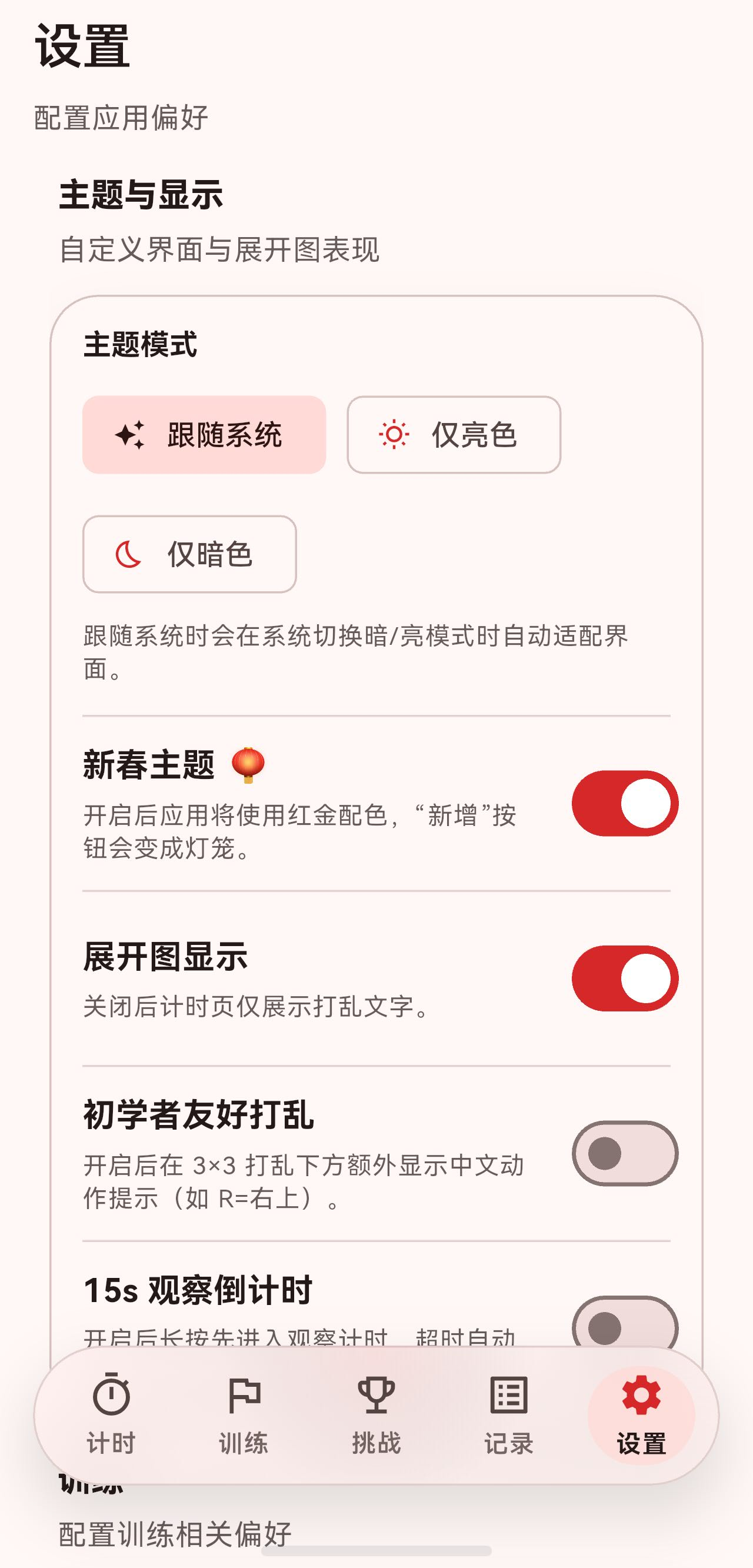
【Flutter x HarmonyOS 6】设置页面的逻辑实现
上一篇我们聊了设置页面的 UI 设计,这篇深入看看设置页面的逻辑实现。
设置页面看起来简单,但背后涉及主题切换、持久化存储、握姿感知等多个逻辑模块。这篇我们逐一拆解。
一、设置数据的持久化
1.1 AppSettings 数据模型
设置数据使用 Hive 进行持久化,通过 @HiveType 和 @HiveField 注解自动生成序列化代码:
(typeId: 3)
class AppSettings extends HiveObject {
(0)
String? defaultTrainingPlanId;
(1)
ThemePreference themePreference;
(2)
bool showScrambleNet;
(3)
bool enableInspectionCountdown;
(4)
bool hasSeenUsageTutorial;
(5)
bool enableBeginnerFriendlyScramble;
(6)
bool challengeAttemptDetailNewestFirst;
(7)
bool enableChineseNewYearTheme;
AppSettings({
this.defaultTrainingPlanId,
this.themePreference = ThemePreference.system,
this.showScrambleNet = true,
this.enableInspectionCountdown = false,
this.hasSeenUsageTutorial = false,
this.enableBeginnerFriendlyScramble = false,
this.challengeAttemptDetailNewestFirst = true,
this.enableChineseNewYearTheme = true,
});
}
主题偏好也是一个 Hive 枚举:
(typeId: 4)
enum ThemePreference {
(0)
system,
(1)
light,
(2)
dark,
}
1.2 AppSettingsService
AppSettingsService 是设置的服务层,继承 ChangeNotifier,负责读写设置并通知 UI:
class AppSettingsService extends ChangeNotifier {
  late Box<AppSettings> _settingsBox;
  static const String _settingsKey = 'appSettings';

  AppSettings get settings => _settingsBox.get(_settingsKey) ?? AppSettings();

  Future<void> init() async {
    if (!Hive.isAdapterRegistered(ThemePreferenceAdapter().typeId)) {
      Hive.registerAdapter(ThemePreferenceAdapter());
    }
    if (!Hive.isAdapterRegistered(AppSettingsAdapter().typeId)) {
      Hive.registerAdapter(AppSettingsAdapter());
    }
    _settingsBox = await Hive.openBox<AppSettings>('app_settings');
    if (_settingsBox.isEmpty) {
      await _settingsBox.put(_settingsKey, AppSettings());
    }
  }
}
初始化流程:
- 注册 Hive 适配器(确保序列化代码可用)。
- 打开
app_settingsBox。 - 如果 Box 为空,写入默认设置。
1.3 设置变更方法
每个设置项都有对应的 setter,模式统一:
Future<void> setThemePreference(ThemePreference preference) async {
  final currentSettings = settings;
  currentSettings.themePreference = preference;
  await _settingsBox.put(_settingsKey, currentSettings);
  notifyListeners();
}

Future<void> setShowScrambleNet(bool value) async {
  final currentSettings = settings;
  currentSettings.showScrambleNet = value;
  await _settingsBox.put(_settingsKey, currentSettings);
  notifyListeners();
}

Future<void> setChineseNewYearThemeEnabled(bool value) async {
  final currentSettings = settings;
  currentSettings.enableChineseNewYearTheme = value;
  await _settingsBox.put(_settingsKey, currentSettings);
  notifyListeners();
}
三步走:读取 → 修改 → 持久化 + 通知。
二、主题切换逻辑
2.1 ThemePreference 到 ThemeMode 的映射
在 main.dart 中,LrTimerApp 通过 Consumer<AppSettingsService> 监听设置变化:
Consumer<AppSettingsService>(
  builder: (context, settingsService, _) {
    final themeMode = _resolveThemeMode(settingsService.themePreference);
    final isNewYearTheme = settingsService.chineseNewYearThemeEnabled;

    return MaterialApp(
      themeMode: themeMode,
      theme: isNewYearTheme
          ? _buildChineseNewYearTheme(Brightness.light)
          : ThemeData(
              colorScheme: ColorScheme.fromSeed(seedColor: const Color(0xFF0E5AD7)),
              useMaterial3: true,
            ),
      darkTheme: isNewYearTheme
          ? _buildChineseNewYearTheme(Brightness.dark)
          : ThemeData(
              colorScheme: ColorScheme.fromSeed(
                seedColor: const Color(0xFF0E5AD7),
                brightness: Brightness.dark,
              ),
              useMaterial3: true,
            ),
      // ...
    );
  },
)
映射方法:
ThemeMode _resolveThemeMode(ThemePreference preference) {
  switch (preference) {
    case ThemePreference.light:
      return ThemeMode.light;
    case ThemePreference.dark:
      return ThemeMode.dark;
    case ThemePreference.system:
    default:
      return ThemeMode.system;
  }
}
当用户切换主题偏好时,AppSettingsService 调用 notifyListeners(),Consumer 重建 MaterialApp,新主题立即生效。
2.2 新春主题
新春主题使用红金配色:
ThemeData _buildChineseNewYearTheme(Brightness brightness) {
  final bool isDark = brightness == Brightness.dark;

  final primaryRed = isDark ? const Color(0xFFE63946) : const Color(0xFFD62828);
  final goldAccent = isDark ? const Color(0xFFFFD700) : const Color(0xFFFFC107);

  final colorScheme = ColorScheme.fromSeed(
    seedColor: primaryRed,
    brightness: brightness,
    primary: primaryRed,
    secondary: goldAccent,
    tertiary: isDark ? const Color(0xFFFF6B6B) : const Color(0xFFFF4444),
  );

  return ThemeData(
    colorScheme: colorScheme,
    useMaterial3: true,
  );
}
亮色和暗色模式下使用不同的红色和金色值,确保对比度。
2.3 系统状态栏适配
主题切换时,同步更新系统状态栏样式:
builder: (context, child) {
  final brightness = Theme.of(context).brightness;
  SystemChrome.setSystemUIOverlayStyle(
    SystemUiOverlayStyle(
      statusBarColor: Colors.transparent,
      statusBarIconBrightness: brightness == Brightness.dark
          ? Brightness.light
          : Brightness.dark,
      statusBarBrightness: brightness,
    ),
  );
  return child ?? const SizedBox.shrink();
},
深色模式下状态栏图标变亮,浅色模式下变暗。这在鸿蒙系统上同样生效,因为 Flutter 的 SystemChrome 会调用平台原生 API。
三、握姿感知与 UI 适配
3.1 HoldingHandController
HoldingHandController 监听设备握姿变化:
enum HoldingSide {
  left,
  right,
  unknown,
}

class HoldingHandController extends ChangeNotifier {
  HoldingHandController({HoldingHandService? service})
      : _service = service ?? HoldingHandService();

  final HoldingHandService _service;
  StreamSubscription<dynamic>? _sub;

  HoldingSide _side = HoldingSide.unknown;
  HoldingSide get side => _side;

  void start() {
    _sub?.cancel();
    _sub = _service.stream.listen(
      (event) {
        final next = _service.parseSide(event);
        if (next == _side) {
          return;
        }
        _side = next;
        notifyListeners();
      },
      onError: (_) {
        // 不支持/无权限等情况:保持默认 unknown,不崩溃。
      },
    );
  }
}
握姿数据来自 HoldingHandService,它通过平台通道读取鸿蒙的握姿传感器数据。当握姿变化时,通知所有监听者。
3.2 GripAwareSwitchTile
设置页面的开关项使用 GripAwareSwitchTile,它会根据握姿自动调整开关位置:
class GripAwareSwitchTile extends StatefulWidget {
  const GripAwareSwitchTile({
    required this.value,
    required this.onChanged,
    required this.title,
    this.subtitle,
    this.contentPadding,
  });
  // ...
}
核心逻辑在 _GripAwareSwitchTileState 中:
void didChangeDependencies() {
super.didChangeDependencies();
final holdingSide = context.watch<HoldingHandController>().side;
if (_currentSide != holdingSide) {
final previousSide = _currentSide;
_currentSide = holdingSide;
// 首次构建时,直接跳到目标位置,不播放动画
if (_isFirstBuild) {
_isFirstBuild = false;
if (holdingSide == HoldingSide.left) {
_controller.value = 1.0;
} else {
_controller.value = 0.0;
}
} else {
// 后续切换才播放动画
if (holdingSide == HoldingSide.left) {
_controller.forward();
} else {
_controller.reverse();
}
}
}
}
动画控制:
- 首次构建时直接跳到目标位置(避免页面加载时播放动画)。
- 后续握姿变化时,播放 400ms 的交叉滑动动画。
3.3 布局实现
Widget build(BuildContext context) {
  return AnimatedBuilder(
    animation: _animation,
    builder: (context, child) {
      final progress = _animation.value;

      return InkWell(
        onTap: widget.onChanged != null
            ? () => widget.onChanged!(!widget.value)
            : null,
        child: Padding(
          padding: widget.contentPadding ?? const EdgeInsets.symmetric(horizontal: 16, vertical: 8),
          child: LayoutBuilder(
            builder: (context, constraints) {
              final width = constraints.maxWidth;
              const switchWidth = 52.0;

              // 开关的位置:从右边滑动到左边
              final switchX = (width - switchWidth) * (1 - progress);

              // 文字的位置:从左边滑动到右边
              final textX = (switchWidth + 16) * progress;

              return SizedBox(
                height: widget.subtitle != null ? 72 : 56,
                child: Stack(
                  clipBehavior: Clip.none,
                  children: [
                    // 开关
                    Positioned(
                      left: switchX,
                      top: 0,
                      bottom: 0,
                      child: Align(
                        alignment: Alignment.centerLeft,
                        child: Switch.adaptive(
                          value: widget.value,
                          onChanged: widget.onChanged,
                        ),
                      ),
                    ),
                    // 文字内容
                    Positioned(
                      left: textX,
                      right: (switchWidth + 16) * (1 - progress),
                      top: 0,
                      bottom: 0,
                      child: Align(
                        alignment: Alignment.centerLeft,
                        child: Column(
                          mainAxisSize: MainAxisSize.min,
                          crossAxisAlignment: CrossAxisAlignment.start,
                          children: [
                            DefaultTextStyle(
                              style: theme.textTheme.titleMedium?.copyWith(
                                    fontWeight: FontWeight.w700,
                                  ) ??
                                  const TextStyle(fontWeight: FontWeight.w700),
                              child: widget.title,
                            ),
                            if (widget.subtitle != null) ...[
                              const SizedBox(height: 4),
                              DefaultTextStyle(
                                style: theme.textTheme.bodyMedium?.copyWith(
                                      color: theme.textTheme.bodyMedium?.color
                                          ?.withOpacity(0.75),
                                    ) ??
                                    const TextStyle(),
                                child: widget.subtitle!,
                              ),
                            ],
                          ],
                        ),
                      ),
                    ),
                  ],
                ),
              );
            },
          ),
        ),
      );
    },
  );
}
progress 从 0(右手,开关在右)到 1(左手,开关在左),通过 Stack + Positioned 实现开关和文字的交叉滑动。
四、握姿感知的 FAB 适配
挑战页面的新建按钮 GripAwareNewFab 也响应握姿变化,但动画更复杂——它采用"退出 → 切换边 → 进入"的三阶段动画:
enum _FabTransitionStage {
  idle,
  exiting,
  entering,
}
4.1 握姿变化处理
void _handleGripChanged() {
  if (!mounted) return;

  final nextSide = _controller?.side;
  if (nextSide == null) return;

  _pendingSide = nextSide;

  // 正在动画中:只更新目标边,等退出完成后再切。
  if (_stage != _FabTransitionStage.idle) {
    return;
  }

  if (_displaySide == nextSide) {
    return;
  }

  // 启动:先往当前边缘方向滑出屏幕,再从新边缘滑入。
  _stage = _FabTransitionStage.exiting;
  _anim.duration = _exitDuration;
  _anim
    ..reset()
    ..forward();

  setState(() {});
}
4.2 动画状态机
_anim.addStatusListener((status) {
  if (!mounted) return;

  if (status == AnimationStatus.completed) {
    if (_stage == _FabTransitionStage.exiting) {
      // 退出完成后:把 FAB 切到目标边,然后执行进入动画。
      _displaySide = _pendingSide ?? _displaySide;
      _stage = _FabTransitionStage.entering;
      _anim.duration = _enterDuration;
      _anim
        ..reset()
        ..forward();
      setState(() {});
      return;
    }

    if (_stage == _FabTransitionStage.entering) {
      _stage = _FabTransitionStage.idle;
      _anim.reset();
      setState(() {});
      return;
    }
  }
});
状态流转:idle → exiting(220ms)→ entering(320ms)→ idle。
4.3 位移计算
double dxFor(double t) {
  if (_stage == _FabTransitionStage.exiting) {
    final target = isLeft ? -screenWidth : screenWidth;
    return target * t;  // 从当前位置滑出屏幕
  }
  if (_stage == _FabTransitionStage.entering) {
    final start = isLeft ? -screenWidth : screenWidth;
    return start * (1 - t);  // 从屏幕外滑入目标位置
  }
  return 0;
}
退出时向当前边缘方向滑出,进入时从新边缘方向滑入。
4.4 新春主题下的 FAB
当新春主题开启时,FAB 变成灯笼:
if (isNewYearTheme) {
  return Positioned(
    left: isLeft ? horizontal : null,
    right: isLeft ? null : horizontal,
    bottom: bottom,
    child: AnimatedBuilder(
      animation: _curve,
      builder: (context, child) {
        final t = _curve.value;
        return Transform.translate(
          offset: Offset(dxFor(t), 0),
          child: Transform.scale(
            scale: scaleFor(t),
            child: Opacity(opacity: opacityFor(t), child: child),
          ),
        );
      },
      child: IgnorePointer(
        ignoring: _stage != _FabTransitionStage.idle,
        child: Tooltip(
          message: widget.tooltip,
          child: GestureDetector(
            onTap: widget.onPressed,
            child: Container(
              width: 56,
              height: 56,
              alignment: Alignment.center,
              child: Text('🏮', style: TextStyle(fontSize: 48)),
            ),
          ),
        ),
      ),
    ),
  );
}
默认主题下则使用标准的 FloatingActionButton,带红色背景和金色边框:
DecoratedBox(
  decoration: BoxDecoration(
    shape: BoxShape.circle,
    border: Border.all(color: fabBorder, width: 1.4),
  ),
  child: FloatingActionButton(
    heroTag: widget.tooltip,
    tooltip: widget.tooltip,
    onPressed: widget.onPressed,
    backgroundColor: fabBackground,    // Color(0xFFE53935)
    foregroundColor: fabForeground,    // Color(0xFFFFF8E1)
    child: Icon(widget.icon),
  ),
)
五、使用教程逻辑
设置页面的"使用教程"项使用 TutorialService 触发教程:
_SettingsActionTile(
  icon: Icons.menu_book_outlined,
  title: '使用教程',
  subtitle: '首次进入会自动引导,也可在此再次查看',
  trailing: Icon(Icons.arrow_forward_ios, size: 16),
  onTap: () {
    TutorialService().requestUsageTutorial();
    context.read<AppTabController>().setIndex(0);
    ScaffoldMessenger.of(context).showSnackBar(
      const SnackBar(
        content: Text('已切换到计时页,开始使用教程'),
        duration: Duration(seconds: 2),
      ),
    );
  },
),
TutorialService 是一个单例,用于跨页面传递教程请求:
class TutorialService {
  static final TutorialService _instance = TutorialService._internal();
  factory TutorialService() => _instance;
  TutorialService._internal();

  bool _pendingUsageTutorial = false;

  /// 从任意页面请求"在计时页展示一次使用教程"。
  void requestUsageTutorial() {
    _pendingUsageTutorial = true;
  }

  /// 计时页消费并清除"待展示教程"请求。
  bool consumePendingUsageTutorial() {
    final value = _pendingUsageTutorial;
    _pendingUsageTutorial = false;
    return value;
  }
}
流程:
- 设置页调用
requestUsageTutorial()设置标志位。 - 切换到计时页(
setIndex(0))。 - 计时页调用
consumePendingUsageTutorial()检查并清除标志位。 - 如果有待展示的教程,开始展示。
六、默认训练计划选择
6.1 数据读取
class _DefaultPlanSelector extends StatelessWidget {
Widget build(BuildContext context) {
final settingsService = context.watch<AppSettingsService>();
final planRepository = context.read<TrainingPlanRepository>();
final plans = planRepository.fetchPlans();
final defaultPlanId = settingsService.settings.defaultTrainingPlanId;
final defaultPlan =
defaultPlanId != null ? planRepository.findPlan(defaultPlanId) : null;
return _SettingsActionTile(
icon: Icons.playlist_add_check_circle_outlined,
title: '默认训练计划',
subtitle: defaultPlan?.name ?? '未设置',
trailing: const Icon(Icons.arrow_forward_ios, size: 16),
onTap: () {
_showPlanSelectionDialog(
context, plans,
service.settings.defaultTrainingPlanId,
service,
);
},
);
}
}
副标题动态显示当前选中的计划名称,未设置时显示"未设置"。
6.2 选择对话框
void _showPlanSelectionDialog(
  BuildContext context,
  List<TrainingPlan> plans,
  String? currentPlanId,
  AppSettingsService settingsService,
) {
  showDialog<void>(
    context: context,
    builder: (context) {
      return AlertDialog(
        title: const Text('选择默认训练计划'),
        content: SizedBox(
          width: double.maxFinite,
          child: ListView(
            shrinkWrap: true,
            children: [
              RadioListTile<String?>(
                title: const Text('无'),
                value: null,
                groupValue: currentPlanId,
                onChanged: (value) {
                  settingsService.setDefaultTrainingPlan(value);
                  Navigator.of(context).pop();
                },
              ),
              ...plans.map((plan) {
                return RadioListTile<String?>(
                  title: Text(plan.name),
                  value: plan.id,
                  groupValue: currentPlanId,
                  onChanged: (value) {
                    settingsService.setDefaultTrainingPlan(value);
                    Navigator.of(context).pop();
                  },
                );
              }),
            ],
          ),
        ),
        actions: [
          TextButton(
            onPressed: () => Navigator.of(context).pop(),
            child: const Text('取消'),
          ),
        ],
      );
    },
  );
}
选择后立即调用 setDefaultTrainingPlan 持久化,并关闭对话框。
七、总结
这篇我们深入梳理了设置页面的逻辑实现:
- 数据持久化:使用 Hive +
@HiveType注解,自动生成序列化代码。 - 设置服务:
AppSettingsService统一管理读写和通知,三步走模式(读取 → 修改 → 持久化 + 通知)。 - 主题切换:通过
Consumer<AppSettingsService>监听变化,重建MaterialApp切换主题。 - 新春主题:红金配色,FAB 变灯笼,全应用生效。
- 握姿感知:
HoldingHandController监听鸿蒙传感器数据,GripAwareSwitchTile和GripAwareNewFab响应握姿变化。 - FAB 动画:三阶段状态机(idle → exiting → entering),实现丝滑的边缘切换。
- 跨页面通信:
TutorialService单例,用标志位实现跨页面的教程触发。
设置页面的逻辑实现,体现了 Flutter 应用中"设置即状态"的设计理念:设置变更通过 ChangeNotifier 传播,UI 自动响应,持久化与 UI 解耦。

作为“人工智能6S店”的官方数字引擎,为AI开发者与企业提供一个覆盖软硬件全栈、一站式门户。
更多推荐
 7
7 0
0- 0


 已为社区贡献2条内容

所有评论(0)