
【共创季稿事节】鸿蒙原生 ArkTS 布局方式之 Sheet 底部弹窗布局实战
鸿蒙原生 ArkTS 布局方式之 Sheet 底部弹窗布局实战
一套不依赖任何第三方库、100% 原生 ArkUI 的底部弹窗组件方案。
读完本文你可以直接复制代码,在任何 HarmonyOS NEXT 项目里用上高质量的 Bottom Sheet。
目录
- 一、为什么我们需要 Bottom Sheet
- 二、技术选型
- 三、核心概念
- 四、从零搭建
- 五、三种 Sheet 实战
- 六、交互闭环
- 七、可复用 Builder 抽象
- 八、ArkTS / ArkUI 避坑
- 九、可扩展方向
- 十、总结
- 附录
一、为什么我们需要 Bottom Sheet
在 iOS 里它叫 Action Sheet,在 Android Material Design 里它叫 Bottom Sheet,在 Web 社区里它被叫做 Drawer 或 Sheet——不管名字怎么变,**“从屏幕底部滑出来的面板”**已经成为移动端最通用的交互范式之一。
它解决三个具体问题:
1. 轻量操作收敛
App 的主界面应该只放最核心的操作。剩下的"新建、保存、分享、收藏、下载、删除"——这些低频但重要的操作,都可以收进底部 Sheet,而不是散落在各个角落。
2. 分享场景天然适配
微信、QQ、微博、短信、复制链接……每一个平台 App 都有分享面板,而分享面板几乎都是从底部弹出的。Sheet 就是最适配分享场景的布局。
3. 底部可达区
人的拇指在竖屏单手持机时,最舒适的操作区域是屏幕下 1/3。底部 Sheet 里的按钮天然落在这个区域,比居中弹窗的可达性好。
我们的目标
| 需求 | 实现方式 |
|---|---|
| 弹出层从底部滑出 | Stack 层叠 + Column 贴底 |
| 点击遮罩关闭 | SheetMask Builder + onClick |
| 关闭按钮 | SheetHeader 里的 ✕ |
| 多种 Sheet 形态 | ActionSheet / ShareSheet / MoreMenuSheet 三个 Builder |
| 操作后反馈 | Toast Builder + setTimeout 自动消失 |
| 不依赖第三方库 | 纯 ArkUI,不引 @ohos 以外的包 |
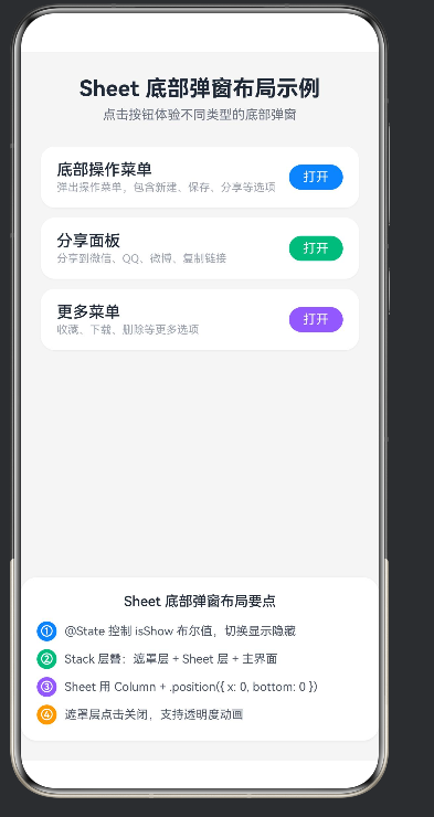
成品预览
我们的示例最终有 3 种 Sheet:
| Sheet | 形态 | 适用场景 |
|---|---|---|
| 底部操作菜单 | 列表 + 箭头 + 取消 | 文件操作、编辑操作 |
| 分享面板 | 3×2 Grid + 平台图标 | 分享、邀请 |
| 更多菜单 | 彩色列表 + 附加操作行 | 更多设置、批量操作 |
二、技术选型
2.1 为什么不用第三方库
HarmonyOS NEXT 仍在快速演进阶段,社区生态不如 Android / iOS 成熟。GitHub 上能找到的 ArkUI 组件库大多要么:
- 只支持旧版 API 4 / API 9
- 没有维护
- 代码质量不稳定(写了很多奇怪的 workaround)
底部弹窗的实现本身不算难——我们为什么不自己写一份,而且完全可控、完全符合 ArkTS 的规范?
2.2 我们用的 ArkUI 组件
| 组件 | 作用 |
|---|---|
Stack |
层叠容器,z 轴方向堆叠子组件 |
Column |
垂直布局 |
Row |
水平布局 |
Grid + GridItem |
网格布局(分享面板用) |
Text |
文本 |
Button |
按钮 |
Scroll(可选) |
当 Sheet 内容超过屏幕高度时可滚动 |
2.3 装饰器
| 装饰器 | 作用 |
|---|---|
@Entry |
标记页面入口 |
@Component |
标记 struct 为组件 |
@State |
响应式状态,变化时自动刷新 UI |
@Builder |
抽离 UI 片段,函数式组件的 ArkUI 版本 |
2.4 核心组合公式
Sheet 弹窗 = Stack 层叠 + @State 布尔开关 + Sheet 独立 Builder + 遮罩层 + 贴底布局
三、核心概念
在动手写代码之前,把 4 个核心概念讲透。以后做任何 Sheet、任何浮层,都是这套思路的变体。
3.1 Stack 层叠
ArkUI 的 Stack 是 z 轴方向的布局容器——写在前面的子组件在最底层,写在后面的在最上层。
Stack() {
  Column() { 主界面内容 }     ← 底层(最先写)
  Column() { 遮罩层 }          ← 中层
  Column() { Sheet 面板 }     ← 上层(最后写)
}
一个常见误区:有人以为 Stack 里的子组件会重叠,就会像浮动层那样自动铺满屏幕——不会。Stack 里的 Column 如果没给 .height('100%'),它的高度就等于内容高度,只会贴在顶部。我们后面实现 SheetMask 时会用到 .width('100%').height('100%')。
3.2 @State 布尔开关
ArkUI 里控制"显示 / 隐藏"浮层的最标准方式:一个 @State boolean + if 条件渲染。
@State showActionSheet: boolean = false

build() {
  Stack() {
    Column() { /* 主界面 */ }
    if (this.showActionSheet) {
      this.SheetMask(() => { this.showActionSheet = false })
      this.ActionSheet()
    }
  }
}
为什么用 if 而不是 .opacity(0)?
| 方式 | 效果 | 问题 |
|---|---|---|
if |
条件为 false 时组件不存在 | ✅ 干净,性能好 |
.opacity(0) |
组件还在那,只是透明 | ❌ 还能接收点击,还占布局 |
.visibility(Visibility.None) |
不显示,占布局空间 | ❌ 占空间,有副作用 |
.display(false) |
API 11+ 才支持 | ⚠️ 兼容性 |
所以最佳实践是 if。
3.3 贴底布局
Sheet 要从底部弹出来。我们用什么?
Column() { /* Sheet 内容 */ }
  .width('100%')
  .backgroundColor('#FFFFFF')
  .borderRadius({ topLeft: 20, topRight: 20 })
  .position({ x: 0, y: 0 })
等等——.position({ x: 0, y: 0 }) 是贴顶部啊?
哦,因为我们在 Stack 里。Stack 的每个子组件默认左上角对齐。但 Stack 内部的 Column 如果没有固定高度,它会从顶部开始布局。我们想要它"沉到底部"怎么办?
解法:给 Stack 设 .alignContent(Alignment.Bottom)。
Stack() {
  // 主界面
  // Sheet
}
.alignContent(Alignment.Bottom)  // 让未定位的子组件沉到底部
或者,如果你用 .position({ x, y }) 绝对定位:
Column() { /* Sheet */ }
  .width('100%')
  .position({ x: 0, y: '80%' })  // 从屏幕顶部往下 80%
但百分比定位在不同分辨率下不稳定。推荐 Stack + alignContent(Bottom) + Sheet 固定高度或最小高度。
3.4 遮罩层
Column() {
  // 空内容,只当背景
}
.width('100%')
.height('100%')
.backgroundColor('rgba(0,0,0,0.45)')
.position({ x: 0, y: 0 })
.onClick(() => { /* 关闭 Sheet */ })
遮罩层要点:
- 必须铺满屏幕:
.width('100%').height('100%') - 颜色用 rgba 半透明:
rgba(0,0,0,0.45) - 点击事件:
.onClick里关闭 Sheet 的 @State - z 轴顺序:遮罩层要在 Sheet 面板下方,但在主界面上方
所以 Stack 里的顺序是:
Stack() {
  Column() { 主界面 }          ← 最底层
  Column() { 遮罩层 }          ← 中层(在主界面之上)
  Column() { Sheet 面板 }      ← 最上层(在遮罩之上,否则点击会被遮罩拦截)
}
这一点极其重要:Sheet 面板必须写在遮罩层后面,否则用户点击 Sheet 上的按钮会先被遮罩层接住,无法触发 Sheet 自己的 onClick。
四、从零搭建
现在开始写代码。我们一步步地从 0 搭出完整应用。
4.1 文件头
const MENU_ACTIONS: string[] = ['新建', '保存', '分享', '收藏', '下载', '删除']
const MENU_ICONS: string[] = ['📝', '💾', '🔗', '⭐', '⬇️', '🗑️']
const MENU_COLORS: string[] = ['#3B82F6', '#10B981', '#8B5CF6', '#F59E0B', '#06B6D4', '#EF4444']

const SHARE_PLATFORMS: string[] = ['微信', '朋友圈', 'QQ', '微博', '复制链接', '系统分享']
const SHARE_ICONS: string[] = ['💬', '👥', '🐧', '📢', '🔗', '📤']
const SHARE_COLORS: string[] = ['#07C160', '#07C160', '#12B7F5', '#E6162D', '#6B7280', '#3B82F6']
几个细节:
- 所有常量放在文件最顶部、struct 外面
- 数组元素全部是
string(ArkTS 要求) - 颜色统一 16 进制,不带
#以外的前缀
4.2 页面入口
@Entry
@Component
struct Index {
  @State showActionSheet: boolean = false
  @State showShareSheet: boolean = false
  @State showMenuSheet: boolean = false
  @State sheetType: string = ''
  @State currentSheetTitle: string = ''
  @State toastText: string = ''
  @State showToast: boolean = false
7 个 @State 变量:
- 3 个控制三种 Sheet 的开关
- 2 个 Sheet 元数据(可选,示例里演示了但实际上没用到)
- 2 个 Toast 提示
4.3 主 build 结构
build() {
  Stack() {
    Column() {
      /* 首页内容:标题 + 三个按钮 + 布局说明卡 */
    }
    .width('100%')
    .height('100%')
    .backgroundColor('#F5F5F5')

    if (this.showActionSheet) {
      this.SheetMask(() => { this.showActionSheet = false })
      this.ActionSheet()
    }

    if (this.showShareSheet) {
      this.SheetMask(() => { this.showShareSheet = false })
      this.ShareSheet()
    }

    if (this.showMenuSheet) {
      this.SheetMask(() => { this.showMenuSheet = false })
      this.MoreMenuSheet()
    }

    if (this.showToast) {
      /* Toast 浮层 */
    }
  }
  .width('100%')
  .height('100%')
}
Z 轴顺序(从底到顶):
┌─────────────────────────────────┐
│  Toast 浮层                     │  ← 最顶层(Toast 要盖在一切之上)
├─────────────────────────────────┤
│  Sheet 面板                     │  ← 上层
├─────────────────────────────────┤
│  遮罩层                         │  ← 中层
├─────────────────────────────────┤
│  首页内容 Column                │  ← 底层
└─────────────────────────────────┘
4.4 首页内容
Column() {
  Text('Sheet 底部弹窗布局示例')
    .fontSize(22)
    .fontWeight(FontWeight.Bold)
    .fontColor('#1F2937')
    .margin({ top: 24, bottom: 6 })

  Text('点击按钮体验不同类型的底部弹窗')
    .fontSize(13)
    .fontColor('#6B7280')
    .margin({ bottom: 24 })

  Column() {
    this.DemoButton('底部操作菜单', '弹出操作菜单,包含新建、保存、分享等选项', '#3B82F6', ...)
    this.DemoButton('分享面板', '分享到微信、QQ、微博、复制链接', '#10B981', ...)
    this.DemoButton('更多菜单', '收藏、下载、删除等更多选项', '#8B5CF6', ...)
  }
  .width('100%')
  .padding({ left: 20, right: 20 })

  Blank().layoutWeight(1)

  /* 底部:布局要点卡片 */
}
要点:
Blank().layoutWeight(1)把顶部按钮区和底部说明卡撑开- 底部说明卡带阴影
.shadow,看起来更"像卡片"
4.5 DemoButton Builder
@Builder
DemoButton(title: string, desc: string, color: string, onClick: () => void) {
  Row() {
    Column() {
      Text(title)
        .fontSize(16)
        .fontWeight(FontWeight.Medium)
        .fontColor('#1F2937')
      Text(desc)
        .fontSize(11)
        .fontColor('#9CA3AF')
        .margin({ top: 2 })
        .maxLines(1)
        .textOverflow({ overflow: TextOverflow.Ellipsis })
    }
    .layoutWeight(1)
    .alignItems(HorizontalAlign.Start)

    Text('打开')
      .fontSize(13)
      .fontColor('#FFFFFF')
      .padding({ left: 14, right: 14, top: 5, bottom: 5 })
      .backgroundColor(color)
      .borderRadius(14)
  }
  .width('100%')
  .padding({ left: 16, right: 16, top: 14, bottom: 14 })
  .backgroundColor('#FFFFFF')
  .borderRadius(14)
  .shadow({ radius: 4, color: 'rgba(0,0,0,0.04)', offsetX: 0, offsetY: 2 })
  .onClick(() => { onClick() })
  .margin({ bottom: 10 })
}
Builder 参数设计:
title/desc/color:纯数据onClick:回调函数,调用方传具体行为
这样 DemoButton 本身不关心"打开的是什么 Sheet",只负责 UI。复用性很强。
4.6 SheetMask Builder(遮罩层)
@Builder
SheetMask(onTap: () => void) {
  Column() {
    // 空内容,只当背景
  }
  .width('100%')
  .height('100%')
  .backgroundColor('rgba(0,0,0,0.45)')
  .position({ x: 0, y: 0 })
  .onClick(() => { onTap() })
}
一个优化点(进阶版):
如果想让遮罩层出现时带"淡入动画"——用 opacity + animateTo:
@Builder
SheetMask(onTap: () => void) {
  Column() {
  }
  .width('100%')
  .height('100%')
  .backgroundColor('rgba(0,0,0,0.45)')
  .opacity(this.sheetVisible ? 1 : 0)
  .position({ x: 0, y: 0 })
  .onClick(() => {
    animateTo({ duration: 150 }, () => {
      onTap()
    })
  })
}
配合 show 变化时也 animateTo,就能有淡入淡出效果。我们示例用了最简单的版本。
4.7 SheetHeader Builder
三种 Sheet 都需要一个"标题 + 副标题 + 关闭按钮 + 分割线"的头部。抽成公共 Builder:
@Builder
SheetHeader(title: string, subtitle: string) {
  Column() {
    Row() {
      Column() {
        Text(title)
          .fontSize(17)
          .fontWeight(FontWeight.Medium)
          .fontColor('#1F2937')
        Text(subtitle)
          .fontSize(11)
          .fontColor('#9CA3AF')
          .margin({ top: 2 })
      }
      .layoutWeight(1)
      .alignItems(HorizontalAlign.Start)

      Text('✕')
        .fontSize(16)
        .fontColor('#9CA3AF')
        .padding({ left: 10, right: 10, top: 4, bottom: 4 })
        .onClick(() => { this.closeAllSheets() })
    }
    .width('100%')

    Row() {
      // 空的 Row 当分割线
    }
    .width('100%')
    .height(1)
    .backgroundColor('#F3F4F6')
    .margin({ top: 12, bottom: 4 })
  }
  .width('100%')
  .padding({ left: 16, right: 16, top: 14 })
}
关闭按钮的实现选择:
- 用
Text('✕')+ onClick:最简单,自定义字号颜色 - 用
Image($r('app.media.ic_close')):有图标的可以用 - 用
Button('')+ Icon:Button 默认自带 padding,容易显得奇怪
我们选了 Text(‘✕’),因为它最轻量、纯字符、零资源依赖。
4.8 Toast 提示
操作完成后需要给用户反馈。Android 有 Toast,iOS 有 HUD。我们自己写一个:
@Builder
// Toast 在 build() 里直接内联写,不需要抽 Builder
if (this.showToast) {
  Column() {
    Text(this.toastText)
      .fontSize(14)
      .fontColor('#FFFFFF')
  }
  .padding({ left: 20, right: 20, top: 12, bottom: 12 })
  .backgroundColor('rgba(0,0,0,0.75)')
  .borderRadius(12)
  .position({ x: 80, y: 520 })
  .width('70%')
}
自动消失:
showToastTip(text: string): void {
  this.toastText = text
  this.showToast = true
  setTimeout(() => {
    this.showToast = false
  }, 1500)
}
进阶优化:用 position({ x, y }) 不如用 Stack 里的 alignContent 居中。更精确的写法:
// 把 Toast 放进一个小 Stack 容器里
Stack() {
  if (this.showToast) {
    Column() { Text(this.toastText) ... }
  }
}
.width('100%').height('100%')
.alignContent(Alignment.Center)
这样就不需要硬编码 position({ x: 80, y: 520 })。我们示例为了简单用了硬编码,生产环境建议用居中 Stack。
五、三种 Sheet 实战
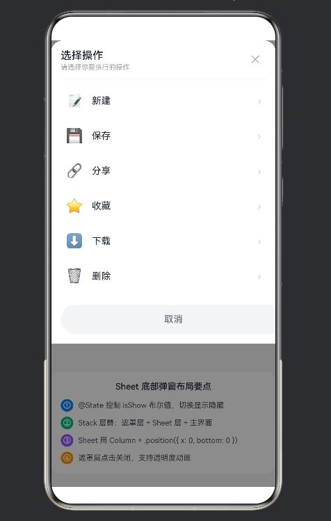
5.1 ActionSheet:底部操作菜单
场景:用户选中一个文件,底部弹出"新建/保存/分享/收藏/下载/删除"。
@Builder
ActionSheet() {
  Column() {
    this.SheetHeader('选择操作', '请选择你要执行的操作')

    Column() {
      ForEach(MENU_ACTIONS, (action: string, idx: number) => {
        Row() {
          Text(MENU_ICONS[idx])
            .fontSize(22)
            .margin({ right: 14 })

          Text(action)
            .fontSize(15)
            .fontColor('#1F2937')
            .layoutWeight(1)

          Text('›')
            .fontSize(16)
            .fontColor('#D1D5DB')
        }
        .width('100%')
        .height(52)
        .padding({ left: 16, right: 16 })
        .borderRadius(12)
        .onClick(() => {
          this.closeAllSheets()
          this.showToastTip(`${action} 操作已执行`)
        })
        .margin({ bottom: 4 })
      })
    }
    .width('100%')
    .padding({ left: 8, right: 8, top: 4, bottom: 8 })

    Button('取消')
      .width('100%')
      .height(46)
      .fontSize(15)
      .fontWeight(FontWeight.Medium)
      .fontColor('#6B7280')
      .backgroundColor('#F3F4F6')
      .borderRadius(23)
      .margin({ left: 16, right: 16, top: 8, bottom: 16 })
      .onClick(() => { this.closeAllSheets() })
  }
  .width('100%')
  .backgroundColor('#FFFFFF')
  .borderRadius({ topLeft: 20, topRight: 20 })
  .position({ x: 0, y: 0 })
  .alignItems(HorizontalAlign.Start)
}
设计要点:
| 细节 | 原因 |
|---|---|
列表项 .height(52) |
单手操作舒适区:食指中指的跨度大约就是 52~60 |
列表项底部 .margin({ bottom: 4 }) |
项与项之间的呼吸感 |
取消按钮 .borderRadius(23) (接近半高) |
大圆角胶囊型按钮,操作强提示 |
取消按钮 .backgroundColor('#F3F4F6') |
灰色取消 vs 彩色主要动作,强调操作优先级 |
Sheet 整体 .borderRadius({ topLeft: 20, topRight: 20 }) |
顶部圆角,底部贴屏,像一张卡片从底部卷上来 |
| 每个 Row 里左侧 icon + 中间文字 + 右侧箭头 | 三栏布局最紧凑、信息量最大 |
ForEach 遍历:
ForEach(array, (item, index) => { ... })- ArkUI 的 ForEach 是原生支持的,性能比自己写 for 循环好
- 如果 index 不使用,写
(_) =>可以避免 lint 警告 - ArkUI 的 ForEach 闭包里不要修改 @State(会触发重复渲染)
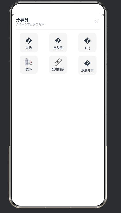
5.2 ShareSheet:分享面板
场景:3×2 网格,微信/朋友圈/QQ/微博/复制链接/系统分享。
@Builder
ShareSheet() {
  Column() {
    this.SheetHeader('分享到', '选择一个平台进行分享')

    Grid() {
      ForEach(SHARE_PLATFORMS, (platform: string, idx: number) => {
        GridItem() {
          Column() {
            Text(SHARE_ICONS[idx])
              .fontSize(26)
              .margin({ bottom: 6 })
            Text(platform)
              .fontSize(12)
              .fontColor('#374151')
          }
          .width(70)
          .padding({ top: 10, bottom: 10 })
          .backgroundColor('#F5F5F5')
          .borderRadius(12)
          .onClick(() => {
            this.closeAllSheets()
            this.showToastTip(`已分享到 ${platform}`)
          })
        }
      })
    }
    .columnsTemplate('1fr 1fr 1fr')
    .columnsGap(12)
    .rowsGap(12)
    .width('100%')
    .padding({ left: 16, right: 16, top: 8, bottom: 12 })

    Button('取消分享')
      .width('100%')
      .height(46)
      .fontSize(15)
      .fontWeight(FontWeight.Medium)
      .fontColor('#6B7280')
      .backgroundColor('#F3F4F6')
      .borderRadius(23)
      .margin({ left: 16, right: 16, top: 8, bottom: 16 })
      .onClick(() => { this.closeAllSheets() })
  }
  .width('100%')
  .backgroundColor('#FFFFFF')
  .borderRadius({ topLeft: 20, topRight: 20 })
  .position({ x: 0, y: 0 })
}
Grid 三栏关键参数:
.columnsTemplate('1fr 1fr 1fr')   // 3 列等宽
.columnsGap(12)                    // 列间距
.rowsGap(12)                       // 行间距
每个 GridItem 里的 Column 设计:
.width(70)让每格内容区域固定宽度,视觉整齐.backgroundColor('#F5F5F5')浅灰底图标 + 文字区,类似微信分享面板的质感- Emoji 图标比图片资源更轻量,不用管理 assets
.borderRadius(12)圆角格子
分享面板 vs 操作菜单的设计差异:
| 维度 | ActionSheet 列表 | ShareSheet 网格 |
|---|---|---|
| 信息密度 | 一行一个 | 一格一个 |
| 数量上限 | 8~10 行 | 3×4 = 12 格 |
| 手势 | 上下滚动 | 上下左右(通常不需要滚动) |
| 适合 | 文字为主的操作 | 图标/Logo 为主的平台选择 |
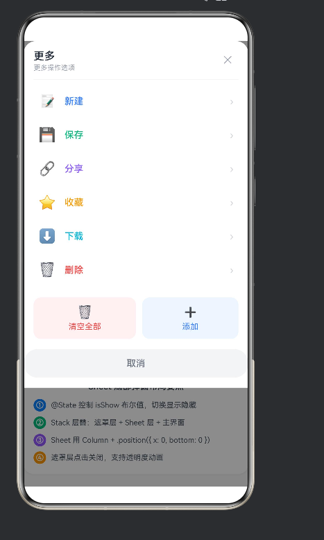
5.3 MoreMenuSheet:更多菜单 + 附加操作
场景:列表用彩色文字区分,底部多两个批量操作按钮。
@Builder
MoreMenuSheet() {
  Column() {
    this.SheetHeader('更多', '更多操作选项')

    Column() {
      ForEach(MENU_ACTIONS, (action: string, idx: number) => {
        Row() {
          Text(MENU_ICONS[idx])
            .fontSize(22)
            .margin({ right: 14 })

          Text(action)
            .fontSize(15)
            .fontColor(MENU_COLORS[idx])  // ← 每项不同颜色
            .layoutWeight(1)
            .fontWeight(FontWeight.Medium)

          Text('›')
            .fontSize(16)
            .fontColor('#D1D5DB')
        }
        .width('100%')
        .height(52)
        .padding({ left: 16, right: 16 })
        .borderRadius(12)
        .onClick(() => {
          this.closeAllSheets()
          if (action === '删除') {
            this.showToastTip('已删除')
          } else {
            this.showToastTip(`${action} 操作已执行`)
          }
        })
        .margin({ bottom: 2 })
      })
    }
    .width('100%')
    .padding({ left: 8, right: 8, top: 4, bottom: 8 })

    Row() {
      Column() {
        Text('🗑️')
          .fontSize(20)
          .margin({ bottom: 4 })
        Text('清空全部')
          .fontSize(13)
          .fontColor('#EF4444')
      }
      .layoutWeight(1)
      .padding({ top: 12, bottom: 12 })
      .backgroundColor('#FEF2F2')
      .borderRadius(12)
      .onClick(() => {
        this.closeAllSheets()
        this.showToastTip('已清空全部')
      })

      Column() {
        Text('➕')
          .fontSize(20)
          .margin({ bottom: 4 })
        Text('添加')
          .fontSize(13)
          .fontColor('#3B82F6')
      }
      .layoutWeight(1)
      .padding({ top: 12, bottom: 12 })
      .backgroundColor('#EFF6FF')
      .borderRadius(12)
      .onClick(() => {
        this.closeAllSheets()
        this.showToastTip('已添加新项')
      })
      .margin({ left: 10 })
    }
    .width('100%')
    .padding({ left: 16, right: 16, top: 8, bottom: 12 })

    Button('取消')
      .width('100%')
      .height(46)
      .fontSize(15)
      .fontWeight(FontWeight.Medium)
      .fontColor('#6B7280')
      .backgroundColor('#F3F4F6')
      .borderRadius(23)
      .margin({ left: 16, right: 16, top: 4, bottom: 16 })
      .onClick(() => { this.closeAllSheets() })
  }
  .width('100%')
  .backgroundColor('#FFFFFF')
  .borderRadius({ topLeft: 20, topRight: 20 })
  .position({ x: 0, y: 0 })
}
MoreMenu 的设计重点:
- 每项文字用
MENU_COLORS[idx]不同颜色——删除是红色、保存是绿色、分享是紫色,一眼区分操作风险等级 - 底部"双按钮行"——
Row + 两个 Column + layoutWeight(1)等分,分别用浅红/浅蓝底 + 彩色文字 - 删除操作的文字颜色用
#EF4444(红色)+ 图标 🗑️,视觉上"警告"用户
六、交互闭环
6.1 统一关闭入口
三个 Sheet 都要关闭,我们写一个 helper:
closeAllSheets(): void {
  this.showActionSheet = false
  this.showShareSheet = false
  this.showMenuSheet = false
}
所有关闭动作(遮罩点击、✕ 点击、取消按钮、操作执行后)都调这个方法。不要在每个地方都写三行 false,集中管理。
6.2 操作执行流程
一个完整操作的生命周期:
用户点击 Sheet 里的某一行
    │
    ├── 1. 执行业务逻辑(实际项目里这里调 API)
    │
    ├── 2. this.closeAllSheets()     ← 关闭所有 Sheet
    │
    └── 3. this.showToastTip(...)    ← 反馈结果
.onClick(() => {
  this.closeAllSheets()
  this.showToastTip(`${action} 操作已执行`)
})
6.3 Toast 自动消失
showToastTip(text: string): void {
  this.toastText = text
  this.showToast = true
  setTimeout(() => {
    this.showToast = false
  }, 1500)
}
为什么 1500ms?研究表明人类识别一条提示大约需要 300~500ms,读一遍 + 消化大约 1200ms。1500ms 刚好够扫一眼,不会忘记也不会觉得烦人。
6.4 状态流转图
@State showActionSheet = false     (首页初始状态)
        │
        │ 点击 DemoButton
        ▼
showActionSheet = true             (Sheet 出现)
        │
        │ 点击某一行 / 遮罩 / ✕ / 取消
        ▼
showActionSheet = false            (Sheet 关闭)
        │
        │ 可选:showToast = true
        ▼
showToast = true → (1500ms) → showToast = false
七、可复用 Builder 抽象
7.1 为什么要 Builder
ArkUI 里 @Builder 就是函数组件。它让你把"一个可复用的 UI 片段"抽成独立函数,参数传数据,返回组件树。
我们示例里抽了 5 个 Builder:
| Builder | 职责 | 被谁用 |
|---|---|---|
DemoButton |
首页按钮 | build() 里调用 3 次 |
SheetMask |
遮罩层 | build() 里每个 Sheet 前调用 |
SheetHeader |
Sheet 头部 | 3 种 Sheet 都用 |
ActionSheet |
操作菜单 | build() 里条件渲染 |
ShareSheet |
分享面板 | build() 里条件渲染 |
MoreMenuSheet |
更多菜单 | build() 里条件渲染 |
7.2 Builder 参数的三种形态
纯值参数:title: string, subtitle: string
@Builder
SheetHeader(title: string, subtitle: string) { ... }
回调参数:onClick: () => void
@Builder
DemoButton(title: string, desc: string, color: string, onClick: () => void) { ... }
类型化列表参数:actions: MenuAction[](进阶版)
如果你想让 Sheet 完全可配置,可以传一个数组进去:
class MenuAction {
  icon: string = ''
  label: string = ''
  color: string = '#374151'
  key: string = ''
}

@Builder
ActionSheet(actions: MenuAction[], onSelect: (key: string) => void) {
  // 遍历 actions 生成 Row 列表
}
这样 ActionSheet 就和业务数据解耦了——任何页面传任意 MenuAction 数组都能复用。
7.3 我们可以继续抽
当前三种 Sheet 还有公共部分可以进一步抽:
- Sheet 圆角 + 白色背景(
.borderRadius({ topLeft: 20, topRight: 20 })) - Sheet 整体容器的 padding + 阴影
- 取消按钮(三种 Sheet 里的取消按钮写法几乎一样)
一个更彻底的抽取:
@Builder
SheetContainer(content: CustomBuilder) {
  Column() {
    content()
  }
  .width('100%')
  .backgroundColor('#FFFFFF')
  .borderRadius({ topLeft: 20, topRight: 20 })
  .position({ x: 0, y: 0 })
}
但 ArkUI 对 Builder 嵌套 CustomBuilder 的写法和普通组件不同。初学者建议先别这么抽象——等你真正遇到"在 5 个不同页面都要写 Sheet"时再抽。
八、ArkTS / ArkUI 避坑
我们在开发过程中遇到了 6 个 ArkTS 编译错误。每一个都值得写在这里,以后遇到直接对照。
坑 1:Builder 里不能写 const
错误:
@Builder
ShareSheet() {
  const sharePlatforms: string[] = ['微信', '朋友圈', 'QQ', '微博', '复制链接', '系统分享']
  const shareIcons: string[] = ['💬', '👥', '🐧', '📢', '🔗', '📤']

  Column() { ... }
}
ArkTS 报错:
Only UI component syntax can be written here. <ArkTSCheck> :352
Only UI component syntax can be written here. <ArkTSCheck> :353
原因:ArkUI 的 @Builder 函数体里只允许写 UI 组件语法(Column/Row/Text/Button/if/ForEach)。不能写 const、let、函数调用(除了 @Builder)。
解决:把常量提升到 struct 外部或提升为 @State:
// 放在 struct 外面,文件顶层
const SHARE_PLATFORMS: string[] = ['微信', '朋友圈', 'QQ', '微博', '复制链接', '系统分享']
const SHARE_ICONS: string[] = ['💬', '👥', '🐧', '📢', '🔗', '📤']
坑 2:import 没用会被警告
错误:
import { categories, problems, generateQuiz, ... } from '../data/problems'
ArkTS 警告:
All imports in import declaration are unused. <ArkTSCheck>
解决:直接删掉。如果整个 import 块都没用(比如我们这篇的示例已经不依赖 problems.ts),把整行 import 去掉。
坑 3:class 声明了但没用
错误:
class MenuItem {
  icon: string = ''
  label: string = ''
  color: string = '#374151'
  action: string = ''
}
ArkTS 警告:
'MenuItem' is declared but never used. <ArkTSCheck>
解决:没用就删。如果以后要用来做可配置 MenuAction 再说。
坑 4:非 Text 组件没有 textAlign
错误:
Column() {
  Text('Hello')
}
.width('70%')
.textAlign(TextAlign.Center)  // ❌ Column 没有这个方法
ArkTS 报错:
Property 'textAlign' does not exist on type 'ColumnAttribute'. <ArkTSCheck>
解决:textAlign 是 Text 组件的属性,不是 Column / Row 的。如果要整个 Column 内容居中,用 .justifyContent(FlexAlign.Center)。如果要 Toast 的文字居中,给 Text 本身 加 .textAlign(TextAlign.Center)。
坑 5:对象字面量不能做类型
错误:
interface ShareItem {
  platform: string
  icon: string
}
const items: ShareItem[] = [
  { platform: '微信', icon: '💬' },
]
ArkTS 可能报错(取决于版本):
Object literal must correspond to some explicitly declared class or interface
解决:用 new 实例化 class:
class ShareItem {
  platform: string = ''
  icon: string = ''
}
const items: ShareItem[] = []
let item: ShareItem = new ShareItem()
item.platform = '微信'
item.icon = '💬'
items.push(item)
不过:在较新的 ArkUI 版本里,数组元素全是 string 的简单数组不会触发这个错误。我们用的字符串数组(SHARE_PLATFORMS)没问题。
坑 6:建议用 layered parameters(配色方案)
ArkTS 会大量报:
It is recommended that you use layered parameters for easier color mode switching and theme color changing. <ArkTSCheck>
意思是:你写死了 #3B82F6 这种颜色值,ArkTS 建议你抽到 Resources 里做"浅色/深色两层"。
解决:这个只是建议,不是错误。示例项目可以忽略。生产项目建议:
// 在 resources/base/element/color.json 里声明
// 然后 $r('app.color.primary') 引用
九、可扩展方向
9.1 加动画
当前示例是"瞬时出现 / 瞬时消失"。加上动画后体验会好很多。
淡入淡出遮罩:
@Builder
SheetMask(onTap: () => void) {
  Column() { }
  .width('100%')
  .height('100%')
  .backgroundColor('rgba(0,0,0,0.45)')
  .opacity(this.showActionSheet ? 1 : 0)
  .position({ x: 0, y: 0 })
  .onClick(() => { onTap() })
  .animation({ duration: 200, curve: Curve.EaseInOut })
}
Sheet 从底部滑入:
// Sheet 的 position y: 从 '100%'(屏幕外底部)过渡到 0
Column() { /* Sheet 内容 */ }
.position({ x: 0, y: this.showActionSheet ? 0 : '100%' })
.animation({ duration: 250, curve: Curve.EaseOut })
9.2 动态高度 Sheet
当前示例 Sheet 高度由内容撑开。如果想做"半屏 Sheet":
Column() { /* Sheet 内容 */ }
.height('50%')   // 或 .height(300) 固定高度
做"拖拽关闭"Sheet(从下往上拉展开,往下拉关闭):需要 gesture(GestureGroup(GestureMode.Exclusive, PanGesture(...))) 配合状态。这个是进阶话题。
9.3 底部安全区适配
刘海屏 / 有系统导航栏的设备,Sheet 底部可能会被遮挡。解决:
import { window } from '@kit.ArkUI'

// 或者直接加一个安全区 padding
Column() { /* Sheet 内容 */ }
.padding({ bottom: 34 })   // iPhone 底部 home indicator 约 34px
9.4 做成通用组件库
把 Sheet 系列抽成一个独立模块:
components/
├── sheets/
│   ├── ActionSheet.ets
│   ├── ShareSheet.ets
│   ├── MoreMenuSheet.ets
│   ├── SheetMask.ets
│   ├── SheetHeader.ets
│   └── Toast.ets
然后在任意页面里直接 import 使用:
import { ActionSheet, ShareSheet, Toast } from '../components/sheets'
9.5 系统原生分享
目前的 ShareSheet 是 UI 层面的分享。实际调起系统原生分享面板:
import { share } from '@kit.ShareKit'
import { Want } from '@kit.AbilityKit'

async function shareTo(platform: string) {
  const want: Want = {
    bundleName: platformBundleMap[platform],
    abilityName: 'ShareAbility',
    parameters: {
      shareContent: '...',
      shareType: 0  // 0 文本 1 图片 2 链接
    }
  }
  await share.share(want)
}
十、总结
我们做了什么
- 一套零第三方依赖、100% 原生 ArkUI 的底部弹窗方案
- 3 种 Sheet 形态:列表 / 网格 / 更多菜单 + 批量操作
- 4 个公共 Builder 抽象:DemoButton / SheetMask / SheetHeader / Toast
- 完整的交互闭环:点击 → 弹出 → 选择 → 关闭 → 反馈
核心公式再复习一遍
// 1. 状态变量
@State showSheet: boolean = false

// 2. Stack 层叠
Stack() {
  Column() { 主界面 }          // 底层
  if (this.showSheet) {
    this.SheetMask(() => { this.showSheet = false })   // 中层(遮罩)
    Column() { /* Sheet */ }                            // 上层(内容)
  }
}
.alignContent(Alignment.Bottom)   // Sheet 沉到底部

// 3. 打开
DemoButton(..., () => { this.showSheet = true })

// 4. 关闭
closeAllSheets(): void { this.showSheet = false }
一句话原则
状态驱动 UI,Builder 复用结构,Stack 层叠浮层。
就这 12 个字。记住了,任何浮层都能写。
附录
完整代码结构
entry/
└── src/main/
    └── ets/
        └── pages/
            └── Index.ets            ~ 490 行(单文件完整示例)
依赖
- HarmonyOS NEXT API 11+
- DevEco Studio 4.2+
- 不依赖任何 @ohos 扩展包,所有组件来自 ArkUI 核心
速查表
| 要做什么 | 怎么写 |
|---|---|
| 布尔开关 Sheet | @State showXxx: boolean = false |
| 显示隐藏 | if (this.showXxx) { ... } |
| 遮罩层 | Column(){}.width('100%').height('100%').backgroundColor('rgba(0,0,0,0.45)') |
| Sheet 贴底 | Stack + .alignContent(Alignment.Bottom) + Sheet Column .width('100%') |
| 顶部圆角 | .borderRadius({ topLeft: 20, topRight: 20 }) |
| Grid 3 栏 | .columnsTemplate('1fr 1fr 1fr') |
| Toast | Stack 浮层 + Column + .backgroundColor('rgba(0,0,0,0.75)') |
| Toast 自动消失 | setTimeout(() => { this.showToast = false }, 1500) |
| 动画 | .animation({ duration: 200, curve: Curve.EaseInOut }) |
| Builder 参数 | @Builder Name(arg1: string, onClick: () => void) { ... } |
| 列表遍历 | ForEach(array, (item, idx) => { ... }) |
| 常量放哪 | struct 外面,文件顶层 |
阅读顺序建议
如果你是 HarmonyOS 新手:
- 先把这篇看完
- 把 Index.ets 复制到 DevEco Studio 里跑起来
- 把 ActionSheet 里的 MENU_ACTIONS 改成你自己 App 的操作列表
- 把 ShareSheet 里的 SHARE_PLATFORMS 改成你 App 支持的分享渠道
- 在业务页面里用同样的 Stack + @State + if 模式
如果你是 ArkTS 老手:
- 直接把 4 个 Builder(SheetMask / SheetHeader / ActionSheet / ShareSheet)抽到 components 文件夹
- 用 MenuAction class 让 ActionSheet 完全可配置
- 加上第 9 节的动画和安全区
本文档基于 Going/OPEN 项目 v0.2 源码,2026 年 6 月整理。
一套 Bottom Sheet,不止是一套代码——它是你写任何浮层、任何抽屉、任何弹窗的范式。

作为“人工智能6S店”的官方数字引擎,为AI开发者与企业提供一个覆盖软硬件全栈、一站式门户。
更多推荐
 1
1 0
0- 0


 已为社区贡献1条内容

所有评论(0)