
鸿蒙原生 ArkTS 布局详解:Column + alignItems(ItemAlign.Center) 居中对齐实战
一、引言
在上一篇文章中,我们深入探讨了 Column + alignItems(Start) 的左对齐布局模式,掌握了信息流列表和表单页面的构建方法。在实际开发中,另一个高频出现的需求是居中对齐——无论是个人中心的头像和名称、价格计划页的卡片内容,还是登录弹窗的表单控件,居中对齐布局无处不在。
本文以 「Column + alignItems(ItemAlign.Center)」 布局模式为核心,通过一个功能丰富的实战 Demo,深入讲解:
- Column 容器的居中对齐控制
alignItems(Center)在多种场景中的应用justifyContent的六种分布模式- 卡片、列表、表单等组件如何在 Column 中居中对齐
- ArkTS 严格模式下的类型定义规范和避坑技巧
二、居中对齐布局的设计原则
2.1 什么时候用居中对齐
居中对齐不是万能药,但在以下场景中效果最佳:
| 场景 | 原因 | 示例 |
|---|---|---|
| 卡片类内容 | 卡片本身视觉重量居中,文字居中最平衡 | 价格计划、产品卡片 |
| 个人资料头 | 头像 + 名称天然适合居中排列 | 个人中心、联系人详情 |
| 弹窗/浮层 | 模态内容需要聚焦,居中最不分散注意力 | 确认弹窗、操作菜单 |
| 表单 | 登录/注册页表单居中更美观 | 登录页、注册页 |
| 功能菜单 | 图标 + 标签居中对齐更整齐 | 首页快捷入口 |
2.2 居中对齐 vs 左对齐
| 对比维度 | 居中对齐 | 左对齐 |
|---|---|---|
| 阅读效率 | 较低(视线需移动) | 较高(扫描式阅读) |
| 视觉美感 | 平衡、正式 | 自然、亲和 |
| 适用内容 | 短文本、卡片、标题 | 长文本、列表、文章 |
| 表单设计 | 居中表单更现代 | 左对齐表单更传统 |
| 移动端适配 | 容易居中 | 需考虑边距 |
Column 的 alignItems(Center) 是实现居中对齐的最直接方式。与手动计算边距或使用绝对定位相比,它更简洁、更可维护。
三、Column + alignItems(Center) 核心概念
3.1 对齐机制
当 Column 设置 alignItems(HorizontalAlign.Center) 时,所有子组件在水平方向居中排列。其效果等效于 CSS Flexbox 中的 align-items: center。
Column 宽度 100%
┌─────────────────────────────┐
│                             │
│      ┌─────────────┐       │
│      │  子组件 A    │← 居中  │
│      └─────────────┘       │
│                             │
│        ┌───────┐           │
│        │ 子 B   │← 居中     │
│        └───────┘           │
│                             │
└─────────────────────────────┘
3.2 与 alignItems(Start) 的对比
// 左对齐 —— 所有子组件靠在左边
Column() {
  Text('标题').width(200)
  Text('描述').width(150)
}
.alignItems(HorizontalAlign.Start)

// 居中对齐 —— 所有子组件居中
Column() {
  Text('标题').width(200)
  Text('描述').width(150)
}
.alignItems(HorizontalAlign.Center)
左对齐时,短文本会紧贴左边缘;居中对齐时,短文本会自动居中,视觉效果更平衡。
3.3 justifyContent 的组合效果
justifyContent 控制主轴(垂直)方向,与 alignItems(Center) 组合使用可达到不同效果:
// 水平居中 + 垂直靠上
Column() { /* ... */ }
  .alignItems(HorizontalAlign.Center)
  .justifyContent(FlexAlign.Start)

// 水平居中 + 垂直居中(最常用)
Column() { /* ... */ }
  .alignItems(HorizontalAlign.Center)
  .justifyContent(FlexAlign.Center)

// 水平居中 + 两端对齐
Column() { /* ... */ }
  .alignItems(HorizontalAlign.Center)
  .justifyContent(FlexAlign.SpaceBetween)
四、实战 Demo:完整代码解析
下面我们逐一解析 ColumnCenter 页面的每个组成部分。
4.1 数据模型
interface MenuItem {
  icon: string;
  label: string;
  desc: string;
}

interface PlanFeature {
  name: string;
  included: boolean;
}

interface PlanItem {
  title: string;
  price: string;
  features: PlanFeature[];
  isPopular: boolean;
}
三个接口分别对应:功能菜单项、价格计划功能、价格计划完整数据。ArkTS 严格模式下,所有对象字面量类型必须通过 interface 显式声明。
4.2 子组件 MenuCard(功能菜单卡片)
@Component
struct MenuCard {
  icon: string = '';
  label: string = '';
  desc: string = '';

  build() {
    Column() {
      Text(this.icon).fontSize(32).lineHeight(40)
      Text(this.label)
        .fontSize(14).fontWeight(FontWeight.Medium)
        .fontColor('#1a1a2e').margin({ top: 6 })
      Text(this.desc)
        .fontSize(11).fontColor('#999999').margin({ top: 2 })
    }
    .alignItems(HorizontalAlign.Center)   // ★ 卡片内所有内容居中对齐
    .justifyContent(FlexAlign.Center)     // 垂直方向也居中
    .width(100).height(110)
    .backgroundColor('#ffffff')
    .borderRadius(14)
    .shadow({ radius: 4, color: '#15000000', offsetX: 0, offsetY: 2 })
  }
}
要点:卡片本身 Column 的宽高固定(100x110),内部三个 Text 通过 alignItems(Center) 居中排列,图标在上、标题在中、描述在下。justifyContent(Center) 确保它们在垂直方向上整体居中。
4.3 子组件 PlanCard(价格计划卡片)
价格计划卡片是一个典型的居中布局综合体——标题、价格、功能列表、按钮全部居中:
@Component
struct PlanCard {
  title: string = '';
  price: string = '';
  features: PlanFeature[] = [];
  isPopular: boolean = false;

  build() {
    Column() {
      Text(this.title)
        .fontSize(18).fontWeight(FontWeight.Bold).fontColor('#1a1a2e')

      Text(this.price)
        .fontSize(28).fontWeight(FontWeight.Bold)
        .fontColor('#3a7bd5').margin({ top: 8 })

      Text('/月').fontSize(12).fontColor('#999').margin({ top: 2 })

      Divider().height(1).width('80%').color('#e8e8e8')
        .margin({ top: 14, bottom: 14 })

      ForEach(this.features, (item: PlanFeature) => {
        Row() {
          Text(item.included ? '✅' : '❌').fontSize(14).margin({ right: 6 })
          Text(item.name).fontSize(13)
            .fontColor(item.included ? '#333' : '#bbb')
        }
        .alignItems(VerticalAlign.Center)
        .width(140).margin({ bottom: 6 })
      })

      Button(this.isPopular ? '立即开通' : '了解详情')
        .width(140).height(36)
        .backgroundColor(this.isPopular ? '#3a7bd5' : '#f0f4ff')
        .fontColor(this.isPopular ? '#ffffff' : '#3a7bd5')
        .borderRadius(18).fontSize(13)
        .fontWeight(FontWeight.Medium).margin({ top: 12 })
    }
    .alignItems(HorizontalAlign.Center)     // ★ 所有内容水平居中
    .width(180)
    .padding({ top: 24, bottom: 20, left: 16, right: 16 })
    .backgroundColor('#ffffff')
    .borderRadius(16)
    .shadow({ radius: 8, color: '#20000000', offsetX: 0, offsetY: 4 })
    .border({
      width: this.isPopular ? 2 : 1,
      color: this.isPopular ? '#3a7bd5' : '#eceff5',
    })
  }
}
要点:
- 标题、价格、“月” 字样全部通过
alignItems(Center)居中 - 分隔线宽度设为
80%,在居中布局中视觉效果最好 - 功能列表使用 Row 内联排列,在每个 Row 中使用
alignItems(VerticalAlign.Center)让图标和文字垂直居中 - 按钮也居中显示,热门版(isPopular)有蓝色边框高亮
4.4 子组件 ProfileHeader(个人资料头部)
@Component
struct ProfileHeader {
  build() {
    Column() {
      Text('👤').fontSize(48)
        .width(80).height(80)
        .textAlign(TextAlign.Center).lineHeight(80)
        .backgroundColor('#e6f0ff').borderRadius(40)

      Text('张三')
        .fontSize(20).fontWeight(FontWeight.Bold)
        .fontColor('#1a1a2e').margin({ top: 10 })

      Text('高级开发工程师 · 鸿蒙生态部')
        .fontSize(13).fontColor('#888888').margin({ top: 4 })

      Row() {
        Text('🏆 全栈').fontSize(11).fontColor('#3a7bd5')
          .padding({ left: 10, right: 10, top: 4, bottom: 4 })
          .backgroundColor('#e6f0ff').borderRadius(12)
        Text('📱 ArkTS').fontSize(11).fontColor('#2d5f8a')
          .padding({ left: 10, right: 10, top: 4, bottom: 4 })
          .backgroundColor('#dceaff').borderRadius(12).margin({ left: 8 })
        Text('☁️ 鸿蒙').fontSize(11).fontColor('#5a7d9a')
          .padding({ left: 10, right: 10, top: 4, bottom: 4 })
          .backgroundColor('#eef2f7').borderRadius(12).margin({ left: 8 })
      }.margin({ top: 12 })
    }
    .alignItems(HorizontalAlign.Center)     // ★ 头像、名称、标签全部居中
    .width('100%').padding(24)
    .backgroundColor('linear-gradient(180deg, #e6f0ff, #ffffff)')
    .borderRadius(16)
  }
}
要点:
- 圆形头像通过
borderRadius(40)(宽度 80 的一半)实现 - 姓名和职位描述靠
alignItems(Center)居中 - 底部标签徽章使用 Row 排列,Row 本身在 Column 中居中
4.5 主页面 ColumnCenterDemo
@Entry
@Component
struct ColumnCenterDemo {
@State selectedIndex: number = 0;
@State toastMsg: string = '';
private readonly justifyLabels: string[] = [
'Start', 'Center', 'End',
'SpaceBetween', 'SpaceAround', 'SpaceEvenly',
];
private readonly justifyValues: FlexAlign[] = [
FlexAlign.Start, FlexAlign.Center, FlexAlign.End,
FlexAlign.SpaceBetween, FlexAlign.SpaceAround, FlexAlign.SpaceEvenly,
];
private readonly menuItems: MenuItem[] = [
{ icon: '📊', label: '数据看板', desc: '实时数据监控' },
{ icon: '📝', label: '工作报告', desc: '周报月报管理' },
{ icon: '👥', label: '团队协作', desc: '多人协同编辑' },
];
private readonly plans: PlanItem[] = [
{
title: '基础版', price: '¥0',
features: [
{ name: '基础数据分析', included: true },
{ name: '3 个项目空间', included: true },
{ name: '5 人协作', included: true },
{ name: '高级报表', included: false },
{ name: 'API 接入', included: false },
],
isPopular: false,
},
{
title: '专业版', price: '¥99',
features: [
{ name: '完整数据分析', included: true },
{ name: '无限项目空间', included: true },
{ name: '50 人协作', included: true },
{ name: '高级报表', included: true },
{ name: 'API 接入', included: true },
],
isPopular: true,
},
];
private switchJustify(index: number): void {
this.selectedIndex = index;
this.toastMsg = `切换至:${this.justifyLabels[index]}`;
setTimeout(() => { this.toastMsg = ''; }, 2000);
}
private goBack(): void {
try {
router.back();
} catch (err) {
hilog.error(0x0000, 'ColumnCenter', 'back failed');
}
}
build() {
Column() {
// ─── 区域 1:标题栏 ───
Column() {
Row() {
Text('← 返回').fontSize(14).fontColor('#ffffff')
.onClick(() => { this.goBack(); })
}.width('100%').justifyContent(FlexAlign.Start)
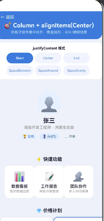
Text('🎯 Column + alignItems(Center)')
.fontSize(20).fontWeight(FontWeight.Bold)
.fontColor('#ffffff').lineHeight(28).margin({ top: 4 })
Text('所有子组件居中对齐 · 垂直排列 · 卡片/弹窗场景')
.fontSize(12).fontColor('#cce0ff').margin({ top: 4 })
}
.alignItems(HorizontalAlign.Center) // ★ 标题栏居中
.width('100%').padding({ top: 12, bottom: 16, left: 16, right: 16 })
.backgroundColor('#3a7bd5')
.borderRadius({ bottomLeft: 20, bottomRight: 20 })
// ─── 区域 2:justifyContent 切换按钮 ───
Column() {
Text('justifyContent 模式')
.fontSize(12).fontWeight(FontWeight.Bold)
.fontColor('#1a1a2e').margin({ bottom: 8 })
// 第一行
Row() {
ForEach([0, 1, 2], (idx: number) => {
Column() {
Text(this.justifyLabels[idx]).fontSize(11)
.fontColor(this.selectedIndex === idx ? '#ffffff' : '#3a7bd5')
.fontWeight(this.selectedIndex === idx ? FontWeight.Bold : FontWeight.Normal)
.textAlign(TextAlign.Center)
}
.width(90).height(36).justifyContent(FlexAlign.Center)
.backgroundColor(this.selectedIndex === idx ? '#3a7bd5' : '#f0f4ff')
.borderRadius(18).margin({ right: 6 })
.onClick(() => { this.switchJustify(idx); })
})
}.width('100%').justifyContent(FlexAlign.Center)
// 第二行
Row() {
ForEach([3, 4, 5], (idx: number) => {
Column() {
Text(this.justifyLabels[idx]).fontSize(11)
.fontColor(this.selectedIndex === idx ? '#ffffff' : '#3a7bd5')
.fontWeight(this.selectedIndex === idx ? FontWeight.Bold : FontWeight.Normal)
.textAlign(TextAlign.Center)
}
.width(90).height(36).justifyContent(FlexAlign.Center)
.backgroundColor(this.selectedIndex === idx ? '#3a7bd5' : '#f0f4ff')
.borderRadius(18).margin({ right: 6 })
.onClick(() => { this.switchJustify(idx); })
})
}.width('100%').justifyContent(FlexAlign.Center).margin({ top: 6 })
}
.alignItems(HorizontalAlign.Center)
.width('100%').padding(12).backgroundColor('#ffffff')
.borderRadius(12).margin({ left: 12, right: 12, top: 12 })
.shadow({ radius: 3, color: '#10000000', offsetX: 0, offsetY: 2 })
// ─── 区域 3:核心演示区(Scroll + Column + Center) ───
Scroll() {
Column() {
// --- 个人信息 ---
ProfileHeader()
Divider().height(1).width('90%').color('#e8e8e8')
.margin({ top: 16, bottom: 16 })
// --- 功能菜单 ---
Text('⚡ 快捷功能').fontSize(16).fontWeight(FontWeight.Bold)
.fontColor('#1a1a2e').margin({ bottom: 12 })
Row() {
ForEach(this.menuItems, (item: MenuItem) => {
MenuCard({ icon: item.icon, label: item.label, desc: item.desc })
})
}.justifyContent(FlexAlign.Center).width('100%')
Divider().height(1).width('90%').color('#e8e8e8')
.margin({ top: 16, bottom: 16 })
// --- 价格计划 ---
Text('💎 价格计划').fontSize(16).fontWeight(FontWeight.Bold)
.fontColor('#1a1a2e').margin({ bottom: 12 })
Row() {
ForEach(this.plans, (plan: PlanItem) => {
PlanCard({
title: plan.title, price: plan.price,
features: plan.features, isPopular: plan.isPopular,
})
}, (plan: PlanItem) => plan.title)
}.justifyContent(FlexAlign.Center).width('100%')
// --- 联系表单 ---
Divider().height(1).width('90%').color('#e8e8e8')
.margin({ top: 16, bottom: 16 })
Text('📝 联系表单(居中版)')
.fontSize(16).fontWeight(FontWeight.Bold)
.fontColor('#1a1a2e').margin({ bottom: 12 })
Column() {
Text('姓名').fontSize(13).fontColor('#555').margin({ bottom: 6 })
TextInput({ placeholder: '请输入您的姓名' })
.height(40).width(240)
.backgroundColor('#f5f7fa').borderRadius(8).padding({ left: 14 })
}.alignItems(HorizontalAlign.Center).margin({ bottom: 14 })
Column() {
Text('手机号').fontSize(13).fontColor('#555').margin({ bottom: 6 })
TextInput({ placeholder: '请输入手机号码' })
.height(40).width(240)
.backgroundColor('#f5f7fa').borderRadius(8).padding({ left: 14 })
}.alignItems(HorizontalAlign.Center).margin({ bottom: 14 })
Button('提交信息').width(240).height(42)
.backgroundColor('#3a7bd5').fontColor('#ffffff')
.borderRadius(21).fontSize(15).fontWeight(FontWeight.Medium)
.margin({ top: 4, bottom: 8 })
.onClick(() => {
this.toastMsg = '✅ 信息已提交(演示)';
setTimeout(() => { this.toastMsg = ''; }, 2000);
})
// --- 布局说明 ---
Divider().height(1).width('90%').color('#e8e8e8')
.margin({ top: 16, bottom: 16 })
Column() {
Text('🎯 布局要点')
.fontSize(15).fontWeight(FontWeight.Bold)
.fontColor('#1a1a2e').margin({ bottom: 10 })
Row() {
Text('●').fontColor('#3a7bd5').fontSize(10).margin({ right: 8 })
Text('Column 主轴 = 垂直方向,交叉轴 = 水平方向')
.fontSize(12).fontColor('#555')
}.alignItems(VerticalAlign.Top).margin({ bottom: 5 })
Row() {
Text('●').fontColor('#3a7bd5').fontSize(10).margin({ right: 8 })
Text('alignItems(Center) → 所有子组件水平居中')
.fontSize(12).fontColor('#555')
}.alignItems(VerticalAlign.Top).margin({ bottom: 5 })
Row() {
Text('●').fontColor('#3a7bd5').fontSize(10).margin({ right: 8 })
Text('justifyContent 控制子组件垂直分布')
.fontSize(12).fontColor('#555')
}.alignItems(VerticalAlign.Top).margin({ bottom: 5 })
Row() {
Text('●').fontColor('#3a7bd5').fontSize(10).margin({ right: 8 })
Text('适合:弹窗、个人中心、价格页、登录表单等')
.fontSize(12).fontColor('#555')
}.alignItems(VerticalAlign.Top)
Divider().height(1).width('100%').color('#e8e8e8')
.margin({ top: 12, bottom: 10 })
Text('💻 核心代码')
.fontSize(13).fontWeight(FontWeight.Bold)
.fontColor('#1a1a2e').margin({ bottom: 6 })
Column() {
Text("Column() {").fontSize(11).fontColor('#2d5f8a')
.fontFamily('Courier New')
Text(' // 子组件列表...').fontSize(11).fontColor('#999')
.fontFamily('Courier New')
Text('}').fontSize(11).fontColor('#2d5f8a').fontFamily('Courier New')
Text(".alignItems(HorizontalAlign.Center) // ★ 居中")
.fontSize(11).fontColor('#c7254e').fontWeight(FontWeight.Bold)
.fontFamily('Courier New')
Text(".justifyContent(FlexAlign.Center)")
.fontSize(11).fontColor('#2d5f8a').fontFamily('Courier New')
}
.alignItems(HorizontalAlign.Start).width('100%').padding(12)
.backgroundColor('#f0f4f8').borderRadius(8)
}
.alignItems(HorizontalAlign.Center).width('100%').padding(14)
.backgroundColor('#fafbfc').borderRadius(12)
.border({ width: 1, color: '#e8ecf0' })
Column().height(40)
}
// ★ 核心布局属性
.alignItems(HorizontalAlign.Center)
.justifyContent(this.justifyValues[this.selectedIndex])
.width('100%').padding(14)
}
.width('100%').layoutWeight(1)
// ─── 底部消息栏 ───
Text(this.toastMsg)
.fontSize(14).fontColor('#ffffff')
.backgroundColor('#3a7bd5').width('80%')
.textAlign(TextAlign.Center)
.padding({ top: 10, bottom: 10 }).borderRadius(20)
.position({ x: '10%', bottom: 20 })
.opacity(this.toastMsg.length > 0 ? 1.0 : 0.0)
.animation({ duration: 300 })
}
.width('100%').height('100%').backgroundColor('#eef2f7')
}
}
五、从 Start 到 Center:布局思路的转变
5.1 相同的 Column,不同的 alignItems
| 模式 | 代码 | 视觉效果 |
|---|---|---|
| Start | .alignItems(HorizontalAlign.Start) |
子组件靠左排列 |
| Center | .alignItems(HorizontalAlign.Center) |
子组件居中排列 |
| End | .alignItems(HorizontalAlign.End) |
子组件靠右排列 |
只需修改 alignItems 的参数,无需调整任何子组件的边距或位置,布局模式就完全改变了。这正是声明式布局的威力。
5.2 子组件宽度的影响
在 Column + Center 布局中,子组件自身的宽度会影响居中的视觉效果:
- 固定宽度的子组件:居中效果最明显,左右留白均匀
- 宽度自适应的子组件:居中效果取决于内容宽度,短文本居中,长文本可能撑满
- 宽度 100% 的子组件:填满 Column,居中和左对齐效果相同
// 固定宽度 → 明显居中
Text('居中文本').width(200)

// 自适应宽度 → 根据文字长度居中
Text('短文本')  // 很短,居中明显
Text('这是一段比较长的文本,占据更多宽度')  // 较长,居中效果减弱

// 100% 宽度 → 居中和左对齐无区别
Text('已填满').width('100%')
5.3 子组件的嵌套对齐
Column 的 alignItems(Center) 只作用于直接子组件,不影响子组件内部的布局。如果一个子组件内部有自己的 Column/Row,其内部的对齐方式由它自己的 alignItems 决定:
Column() {
  // 这个 Column 在父容器中居中
  Column() {
    Text('A')
    Text('B')
  }
  .alignItems(HorizontalAlign.Start)  // 内部左对齐,但整体在父容器中居中
  .width(200)
}
.alignItems(HorizontalAlign.Center)   // 父容器:所有子组件居中
六、Scroll + Column:解决内容溢出
6.1 为什么需要 Scroll
当 Column 中的内容高度超过屏幕时,没有 Scroll 包裹会导致内容被裁剪。本文 Demo 在核心演示区使用了 Scroll:
Scroll() {
  Column() {
    // 个人信息、功能菜单、价格计划、表单、布局说明...
  }
  .alignItems(HorizontalAlign.Center)
  .justifyContent(this.justifyValues[this.selectedIndex])
  .width('100%').padding(14)
}
.width('100%').layoutWeight(1)
要点:
- Scroll 的外层
layoutWeight(1)让它占满标题栏和按钮栏之外的剩余空间 - Column 放在 Scroll 内部,内容超过屏幕高度时可滚动
justifyContent在 Scroll + Column 中效果有限(垂直空间 = 内容高度时 justifyContent 不生效),但在内容未满屏时仍可见效
6.2 layoutWeight 的用法
Column() {
  // 区域 1:标题栏(高度 = 自适应内容)
  // 区域 2:切换按钮(高度 = 自适应内容)
  Scroll() { /* 核心演示区 */ }
    .layoutWeight(1)     // ★ 占用所有剩余高度
  // 底部通知栏(通过 position 浮动,不参与流式布局)
}
layoutWeight(1) 让 Scroll 自动填满标题栏和按钮栏下方的所有空间,无需手动计算高度。
七、ArkTS 严格模式注意点
7.1 interface 必须在 struct 之前定义
// ✅ 正确顺序
interface MenuItem { icon: string; label: string; desc: string; }

@Component
struct MenuCard { /* ... */ }

// ❌ 错误:struct 之后定义 interface 导致编译错误
@Component
struct MenuCard { /* ... */ }

interface MenuItem { /* ... */ }  // 编译报错
所有 interface 或 type 定义必须放在 @Component struct 之前。
7.2 ForEach 的参数类型
// ✅ 正确:使用已定义的接口
ForEach(this.plans, (plan: PlanItem) => { ... }, (plan: PlanItem) => plan.title)

// ❌ 错误:使用内联对象字面量
ForEach(this.plans, (plan: { title: string; price: string }) => { ... })
7.3 输入属性不能加 private
// ✅ 正确
@Component
struct MenuCard {
  label: string = '';         // 输入属性
  @State private count: number = 0;  // 内部状态可以用 private
}

// ❌ 错误
@Component
struct MenuCard {
  private label: string = '';  // 警告:不能通过构造函数初始化
}
7.4 router API 的异常处理
router.pushUrl 和 router.back 在 API 24 中已标记为弃用,但仍可正常使用。建议用 try-catch 包裹:
try {
  router.pushUrl({ url: 'pages/ColumnCenter' });
} catch (err) {
  hilog.error(0x0000, 'Index', 'navigation failed');
}
八、布局性能建议
8.1 Scroll 内避免嵌套过多 layoutWeight
Scroll 内部的 Column 使用 layoutWeight 可能不会按预期工作,因为 Scroll 的内容高度是动态的。建议在 Scroll 外部使用 layoutWeight,内部 Column 使用自适应高度。
8.2 Column 嵌套层级控制
Column 的嵌套层级不宜过深(建议不超过 5 层),否则会影响布局性能。本文 Demo 的嵌套层级:
Column (最外层, height=100%)
  ├── Column (标题栏, 自适应)
  ├── Column (切换按钮, 自适应)
  ├── Scroll (layoutWeight=1)
  │     └── Column (核心内容, alignItems Center)
  │           ├── ProfileHeader (Column)
  │           ├── Row → MenuCard × 3
  │           ├── Row → PlanCard × 2
  │           ├── Column (表单行) × 2
  │           └── Column (布局说明)
  └── Text (toast, position 浮动)
最大嵌套深度为 4 层,在合理范围内。
8.3 合理使用 Divider
Divider 是轻重量的分割线组件,应优先使用而非手动绘制 View:
// ✅ 推荐
Divider().height(1).width('90%').color('#e8e8e8')

// ❌ 避免
Column() {
  Column().height(1).width('90%').backgroundColor('#e8e8e8')
}
九、从 Start 到 Center:一次布局,两种模式
本文 Demo 与上一篇 ColumnStart 文章共享相同的项目结构,但展示了完全不同的视觉风格:
| 对比项 | ColumnStart | ColumnCenter |
|---|---|---|
| alignItems | HorizontalAlign.Start |
HorizontalAlign.Center |
| 视觉风格 | 左对齐、列表式 | 居中对齐、卡片式 |
| 典型场景 | 信息流、文章列表 | 个人中心、价格页、弹窗 |
| 子组件 | 宽、内容较多 | 窄、内容精炼 |
| 切换模式 | 4 种 justifyContent | 6 种 justifyContent |
| 滚动 | 无 Scroll(内容较少) | 有 Scroll(内容较多) |
两个 Demo 共用相同的基础架构(@Entry @Component、@State、interface 定义、ForEach、alignItems + justifyContent),仅在最关键的 alignItems 参数上不同。
十、总结与进阶
核心要点
alignItems(HorizontalAlign.Center)让 Column 的所有子组件水平居中,是最常用的居中布局方式- 居中对齐适合卡片、个人中心、价格页、表单、弹窗等场景
- Scroll + Column 组合用于内容超过屏幕高度的场景
- layoutWeight 控制剩余空间的分配,比百分比更灵活
- ArkTS 严格模式要求所有类型必须显式声明
对比 ColumnStart 与 ColumnCenter
| 布局模式 | alignItems 值 | justifyContent 默认 | 核心场景 |
|---|---|---|---|
| Start | HorizontalAlign.Start |
FlexAlign.Start |
信息流、文章列表、设置页 |
| Center | HorizontalAlign.Center |
FlexAlign.Start |
个人中心、价格页、弹窗 |
| End | HorizontalAlign.End |
FlexAlign.Start |
操作菜单、右下角悬浮 |
进阶学习路径
掌握了 Column 的 Start 和 Center 两种对齐模式后,你已经可以应对绝大多数页面布局需求。建议继续学习:
- Row 布局:水平排列的对齐控制(alignItems + justifyContent 的 Row 版本)
- Stack 布局:层叠布局(悬浮按钮、遮罩层)
- Grid 布局:网格布局(相册、商品陈列)
- Flex 布局:Column/Row 的父类,更灵活的对齐和换行控制
- List 组件:高性能长列表渲染
- 动画:
.animation()和.transition()让布局变化更平滑
Column + alignItems(Center) 是最基础也是最实用的居中布局方式。掌握它之后,你可以轻松构建个人中心、价格计划、登录注册等常见页面。
SDK 版本:HarmonyOS NEXT 6.1.1(API 24)
开发工具:DevEco Studio 6.x
*项目路径:entry/src/main/ets/pages/ColumnCe
文章摘要
本文是一篇关于在 ArkTS/HarmonyOS 应用开发中,使用 Column 布局组件配合 alignItems(Center) 属性实现居中对齐的深度指南。文章系统性地阐述了居中对齐布局的设计原则、适用场景,并通过与 alignItems(Start)(左对齐)的对比,凸显了其视觉中心化的优势。
核心部分深入解析了 Column + alignItems(Center) 的对齐机制、与 justifyContent 的组合效果。文章的重点是一个完整的实战 Demo 代码解析,逐步构建了包含个人资料头部、功能菜单卡片和价格计划卡片的个人中心页面,详细展示了如何在实际项目中应用居中对齐布局。
此外,文章还探讨了从 Start 到 Center 的布局思路转变、使用 Scroll 组件处理内容溢出的方法,并指出了在 ArkTS 严格模式下开发需要注意的语法细节(如 interface 定义顺序、ForEach 参数类型等)。最后,提供了布局性能优化建议,并总结了 ColumnStart 与 ColumnCenter 的核心差异,为开发者提供了清晰的学习路径。
关键词:ArkTS, HarmonyOS, Column, alignItems(Center), 居中对齐, 布局, 实战Demo, 性能优化
nter.ets*

作为“人工智能6S店”的官方数字引擎,为AI开发者与企业提供一个覆盖软硬件全栈、一站式门户。
更多推荐


 0
0 0
0- 0


 已为社区贡献2条内容

所有评论(0)