
鸿蒙原生 ArkTS 布局详解:Column + alignItems(ItemAlign.Start) 垂直排列实战
一、引言
HarmonyOS NEXT 是华为全栈自研的操作系统,ArkTS 是其原生开发语言。ArkUI 提供声明式布局能力,Column 是其中使用频率最高的组件。
本文以 Column + alignItems(ItemAlign.Start) 布局模式为核心,通过实战 Demo 讲解:
- Column 的基本原理与属性
alignItems交叉轴对齐控制justifyContent主轴分布策略- ArkTS 严格模式的常见编译错误与解决方案
二、ArkUI 布局体系概述
2.1 布局容器三剑客
| 容器 | 主轴方向 | 交叉轴 | 适用场景 |
|---|---|---|---|
Column |
垂直(从上到下) | 水平 | 纵向列表、表单、文章详情 |
Row |
水平(从左到右) | 垂直 | 导航栏、按钮组、标签行 |
Stack |
层叠(Z 轴) | 无 | 悬浮按钮、遮罩层、重叠布局 |
2.2 主轴与交叉轴
理解 Column 的关键在于分清主轴(Main Axis)和交叉轴(Cross Axis):
Column:
┌─────────────────────┐
│  主轴(垂直)↓       │
│  ┌───────┐          │
│  │ 子组件A │←交叉轴→  │
│  └───────┘          │
│  ┌───────┐          │
│  │ 子组件B │          │
│  └───────┘          │
└─────────────────────┘
Column 的两个核心属性分别控制这两个轴:
Column() { ... }
  .alignItems(HorizontalAlign.Start)   // 控制交叉轴(水平)对齐
  .justifyContent(FlexAlign.Start)     // 控制主轴(垂直)分布
三、Column 容器深度解析
3.1 基本用法
@Entry
@Component
struct MinimalDemo {
  build() {
    Column() {
      Text('第一行')
      Text('第二行')
      Text('第三行')
    }
  }
}
默认情况下:子组件沿垂直方向从上到下排列,水平方向居中,Column 宽度由最宽的子组件撑开,高度由所有子组件累加撑开。
3.2 alignItems —— 交叉轴对齐
alignItems 接收 HorizontalAlign 枚举值:
| 枚举值 | 效果 | 典型场景 |
|---|---|---|
HorizontalAlign.Start |
子组件左对齐 | 表单标签、文章正文、信息流卡片 |
HorizontalAlign.Center |
子组件水平居中(默认) | 弹窗、居中按钮组 |
HorizontalAlign.End |
子组件右对齐 | 操作菜单、金额显示 |
当 Column 宽度设为 '100%' 时,alignItems 效果最明显:
Column() {
  Text('左对齐文本').width(200).height(40).backgroundColor('#f0f0f0')
  Text('也是左对齐').width(150).height(40).backgroundColor('#e0e0e0')
}
.alignItems(HorizontalAlign.Start)
.width('100%')
3.3 justifyContent —— 主轴分布
justifyContent 接收 FlexAlign 枚举值:
| 枚举值 | 效果 |
|---|---|
FlexAlign.Start |
从顶部开始排列(默认) |
FlexAlign.Center |
垂直居中排列 |
FlexAlign.End |
从底部开始排列 |
FlexAlign.SpaceBetween |
两端对齐,子组件间等距 |
FlexAlign.SpaceAround |
每个子组件两侧间距相等 |
FlexAlign.SpaceEvenly |
所有间距(含边缘)完全相等 |
关键前提:justifyContent 仅在 Column 高度大于所有子组件高度之和时才生效。
3.4 Column 的尺寸控制
- 自适应(默认):不设置宽高,由内容撑开
- 百分比:
width('100%')/height('50%') - 固定值:
width(360)/height(600) - layoutWeight:按权重分配剩余空间(类似 CSS flex-grow)
Column() { /* A */ }.layoutWeight(1)  // 占 1/3
Column() { /* B */ }.layoutWeight(2)  // 占 2/3
height(0) + layoutWeight(1) 是"撑满剩余空间"的经典模式。
四、实战 Demo:完整代码逐段解析
4.1 数据模型
ArkTS 严格模式下禁止使用内联对象字面量作为类型声明,必须用 interface 显式定义:
interface InfoItem {
  title: string;
  desc: string;
}
4.2 子组件 InfoCard(信息卡片)
卡片内部同样使用 Column + Start 布局:
@Component
struct InfoCard {
  title: string = '';
  desc: string = '';
  index: number = 0;

  build() {
    Column() {
      Text(this.title)
        .fontSize(16).fontWeight(FontWeight.Bold)
        .fontColor('#1a1a2e').lineHeight(22)
      Text(this.desc)
        .fontSize(13).fontColor('#666666')
        .lineHeight(20).margin({ top: 6 })
    }
    .alignItems(HorizontalAlign.Start)   // 卡片内文字左对齐
    .width('100%').padding(14)
    .backgroundColor('#f8f9fc')
    .borderRadius(10)
    .shadow({ radius: 4, color: '#20000000', offsetX: 0, offsetY: 2 })
    .margin({ bottom: 10 })
  }
}
4.3 子组件 FormRow(表单行)
典型 Column + Start 场景:标签在上、输入框在下,都靠左对齐:
@Component
struct FormRow {
  label: string = '';
  placeholder: string = '';
  @State private value: string = '';

  build() {
    Column() {
      Text(this.label)
        .fontSize(14).fontWeight(500).fontColor('#333333')
      TextInput({ placeholder: this.placeholder, text: this.value })
        .height(40).width('100%').backgroundColor('#ffffff')
        .borderRadius(6).border({ width: 1, color: '#d9d9d9' })
        .padding({ left: 12 })
        .onChange((val: string) => { this.value = val; })
    }
    .alignItems(HorizontalAlign.Start)
    .width('100%').margin({ bottom: 14 })
  }
}
注意:只有 @State 变量可以用 private,普通输入属性不能加 private,否则父组件构造函数传值会触发编译警告。
4.4 主页面 ColumnStartDemo
@Entry
@Component
struct ColumnStartDemo {
@State currentJustify: FlexAlign = FlexAlign.Start;
@State selectedIndex: number = 0;
@State toastMsg: string = ''; // 自定义通知消息
private readonly justifyOptions: FlexAlign[] = [
FlexAlign.Start, FlexAlign.Center,
FlexAlign.End, FlexAlign.SpaceBetween,
];
private readonly justifyLabels: string[] = [
'Start(顶部对齐)', 'Center(垂直居中)',
'End(底部对齐)', 'SpaceBetween(两端等距)',
];
private readonly infoList: InfoItem[] = [
{ title: '📌 系统通知', desc: '您的鸿蒙应用已通过安全检测。' },
{ title: '📊 数据报告', desc: '本周活跃用户较上周增长 12%。' },
{ title: '⚙️ 版本更新', desc: 'v3.2.0 发布:新增 ColumnStart 布局。' },
];
private switchJustify(index: number): void {
this.selectedIndex = index;
this.currentJustify = this.justifyOptions[index];
this.toastMsg = `切换至:${this.justifyLabels[index]}`;
setTimeout(() => { this.toastMsg = ''; }, 2000);
}
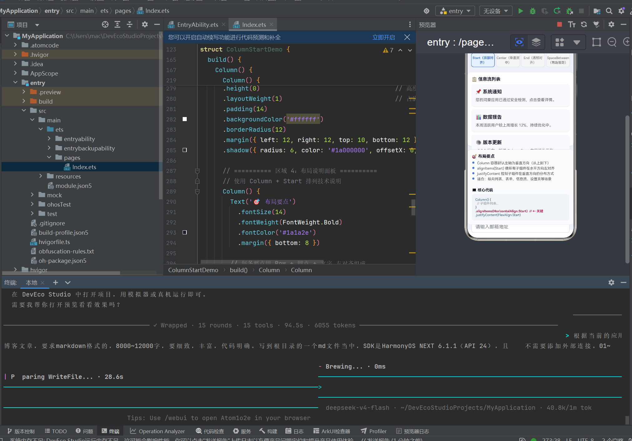
build() {
Column() {
// ─── 区域 1:标题栏 ───
Column() {
Text('📐 Column + alignItems(Start) 布局演示')
.fontSize(18).fontWeight(FontWeight.Bold)
.fontColor('#ffffff').lineHeight(26)
Text('子组件顶部对齐 · 垂直排列 · 信息流/表单场景')
.fontSize(12).fontColor('#cce0ff').margin({ top: 4 })
}
.alignItems(HorizontalAlign.Start)
.width('100%').padding(16)
.backgroundColor('#2d5f8a')
.borderRadius({ bottomLeft: 16, bottomRight: 16 })
// ─── 区域 2:justifyContent 切换按钮 ───
Row() {
ForEach(this.justifyLabels, (label: string, idx: number) => {
Column() {
Text(label).fontSize(11)
.fontColor(this.selectedIndex === idx ? '#3a7bd5' : '#666')
.fontWeight(this.selectedIndex === idx ? FontWeight.Bold : FontWeight.Normal)
.textAlign(TextAlign.Center).lineHeight(16)
}
.width(80).height(48)
.justifyContent(FlexAlign.Center)
.backgroundColor(this.selectedIndex === idx ? '#e6f0ff' : '#f5f5f5')
.borderRadius(8)
.border({
width: this.selectedIndex === idx ? 1.5 : 1,
color: this.selectedIndex === idx ? '#3a7bd5' : '#e0e0e0',
})
.onClick(() => { this.switchJustify(idx); })
}, (item: string) => item)
}
.width('100%').justifyContent(FlexAlign.SpaceEvenly)
.padding({ top: 12, bottom: 8, left: 8, right: 8 })
// ─── 区域 3:核心演示区(Column + Start + 可切换 justifyContent) ───
Column() {
// 信息流列表
Text('📋 信息流列表')
.fontSize(15).fontWeight(FontWeight.Bold)
.fontColor('#1a1a2e').margin({ bottom: 8 })
ForEach(this.infoList, (item: InfoItem, idx: number) => {
InfoCard({ title: item.title, desc: item.desc, index: idx })
}, (item: InfoItem) => item.title)
Divider().height(1).width('100%')
.color('#e8e8e8').margin({ top: 6, bottom: 14 })
// 用户反馈表单
Text('📝 用户反馈表单')
.fontSize(15).fontWeight(FontWeight.Bold)
.fontColor('#1a1a2e').margin({ bottom: 10 })
FormRow({ label: '👤 联系人', placeholder: '请输入您的姓名' })
FormRow({ label: '📱 手机号', placeholder: '请输入手机号码' })
FormRow({ label: '📧 邮箱', placeholder: '请输入邮箱地址' })
Button('提交反馈').width('100%').height(42)
.backgroundColor('#3a7bd5').fontColor('#ffffff')
.borderRadius(10).fontSize(15).fontWeight(FontWeight.Medium)
.margin({ top: 4 })
.onClick(() => {
this.toastMsg = '✅ 反馈已提交(演示)';
setTimeout(() => { this.toastMsg = ''; }, 2000);
})
}
// ★ 核心布局属性
.alignItems(HorizontalAlign.Start) // 交叉轴左对齐
.justifyContent(this.currentJustify) // 主轴分布可动态切换
.width('100%').height(0).layoutWeight(1)
.padding(14).backgroundColor('#ffffff')
.borderRadius(12)
.margin({ left: 12, right: 12, top: 10, bottom: 12 })
.shadow({ radius: 6, color: '#1a000000', offsetX: 0, offsetY: 2 })
// ─── 区域 4:底部通知栏 ───
Text(this.toastMsg)
.fontSize(14).fontColor('#ffffff')
.backgroundColor('#3a7bd5').width('90%')
.textAlign(TextAlign.Center)
.padding({ top: 10, bottom: 10 }).borderRadius(20)
.position({ x: '5%', bottom: 30 })
.opacity(this.toastMsg.length > 0 ? 1.0 : 0.0)
.animation({ duration: 300 })
}
.width('100%').height('100%').backgroundColor('#eef2f7')
}
}
4.5 关键布局技巧
height(0) + layoutWeight(1):layoutWeight 类似 CSS 的 flex-grow。当父容器高度固定时,子 Column 设置 layoutWeight(1) 会占用剩余高度。height(0) 确保"从零开始分配"。
动态 justifyContent:点击切换按钮更新 @State currentJustify,框架自动触发 Column 重绘,子组件位置实时变化。
自定义通知替代 showToast:用 @State toastMsg + Text 组件实现。消息为空时 opacity: 0,设置后显示,setTimeout 2 秒后清空。.animation({ duration: 300 }) 提供淡入淡出过渡。
五、ForEach 的正确使用
ForEach(this.infoList, (item: InfoItem, idx: number) => {
    InfoCard({ title: item.title, desc: item.desc, index: idx })
  },
  (item: InfoItem) => item.title  // 键值:唯一且稳定
)
第三个参数是键值生成函数,帮助框架追踪子组件身份,对列表 diff 和复用至关重要。
六、ArkTS 严格模式避坑指南
6.1 对象字面量不能作为类型声明
ERROR: Object literals cannot be used as type declarations
// ❌ 错误
private readonly infoList: { title: string; desc: string }[] = [...];

// ✅ 正确
interface InfoItem { title: string; desc: string; }
private readonly infoList: InfoItem[] = [...];
6.2 私有属性不能通过构造函数初始化
// ❌ 错误:输入属性用 private
@Component struct InfoCard { private title: string = ''; }

// ✅ 正确:去掉 private
@Component struct InfoCard { title: string = ''; }
例外:@State private value 是内部状态,可不通过构造函数传值,允许用 private。
6.3 showToast 弃用与异常处理
promptAction.showToast 在 API 24 中已弃用且可能抛出异常。推荐用纯 ArkUI 组件实现通知提示——如本文 Demo 使用 @State toastMsg + Text 组件 + setTimeout 自动隐藏。
七、布局性能优化
长列表用 List:数据量超过 20 项时,List 支持懒加载,比 Column 更高效。避免不必要的 @State:不需要参与 UI 渲染的数据用普通成员变量。使用 animation:.opacity().animation({ duration: 300 }) 为布局变化添加平滑过渡。
八、从其他平台迁移对照
| CSS Flexbox | ArkUI | Android | SwiftUI |
|---|---|---|---|
flex-direction: column |
Column() |
orientation="vertical" |
VStack |
align-items: flex-start |
.alignItems(Start) |
gravity="left" |
alignment: .leading |
justify-content: flex-start |
.justifyContent(Start) |
— | — |
justify-content: space-between |
.justifyContent(SpaceBetween) |
— | — |
flex-grow: 1 |
.layoutWeight(1) |
layout_weight |
Spacer() |
gap |
.space() / .margin() |
— | spacing |
| — | — | match_parent |
.width('100%') |
九、总结与进阶
核心要点
- Column 是 ArkUI 最常用的垂直布局容器,主轴垂直,交叉轴水平
alignItems(Start)将所有子组件左对齐,是构建表单和列表的基石justifyContent控制垂直分布,6 种枚举值满足不同排列需求height(0) + layoutWeight(1)是撑满剩余空间的推荐模式- ArkTS 严格模式要求显式定义类型,内联对象字面量不被允许
- 弃用 API 应尽早替换,用
@State+ 自定义组件替代showToast
进阶路径
| 方向 | 组件/API | 说明 |
|---|---|---|
| 弹性布局 | Flex |
Column/Row 的父类 |
| 滚动列表 | List + ListItem |
长列表性能优化 |
| 网格布局 | Grid + GridItem |
相册、商品展示 |
| 层叠布局 | Stack |
悬浮按钮、遮罩层 |
| 响应式 | MediaQuery + GridRow |
折叠屏适配 |
| 动画 | .animation() + .transition() |
页面过渡效果 |
Column + alignItems(Start) 是 ArkUI 最基础的布局模式。掌握它之后,你可以构建绝大多数 UI 页面。本文通过完整 Demo,从数据模型、子组件设计、状态管理到布局属性配置,全方位展示了这一模式的实际用法。
SDK 版本:HarmonyOS NEXT 6.1.1(API 24)
开发工具:DevEco Studio 6.x
项目路径:entry/src/main/ets/pages/Index.ets

作为“人工智能6S店”的官方数字引擎,为AI开发者与企业提供一个覆盖软硬件全栈、一站式门户。
更多推荐


 0
0 0
0- 0


 已为社区贡献2条内容

所有评论(0)