
鸿蒙 HarmonyOS ArkTS 页面布局全解析:从线性到相对布局实战
1.默认标签栏在顶部;Text('学校简介').fontSize(26).fontWeight(FontWeight.Bold).margin({bottom:15})Button("按钮2").width(100).height(40).margin({left:10})Button("按钮3").width(100).height(40).margin({left:10})Text('欢迎来到
前言
在 HarmonyOS 应用开发中,页面布局是 UI 交互的骨架。ArkTS 框架封装了多套成熟布局容器,适配手机、平板、折叠屏多设备自适应需求。
本文结合课堂实战案例,拆解线性布局 Row/Column、相对布局 RelativeContainer、标签页 Tabs三大高频布局,附带可直接运行的完整代码、踩坑排错方案,零基础也能快速上手。
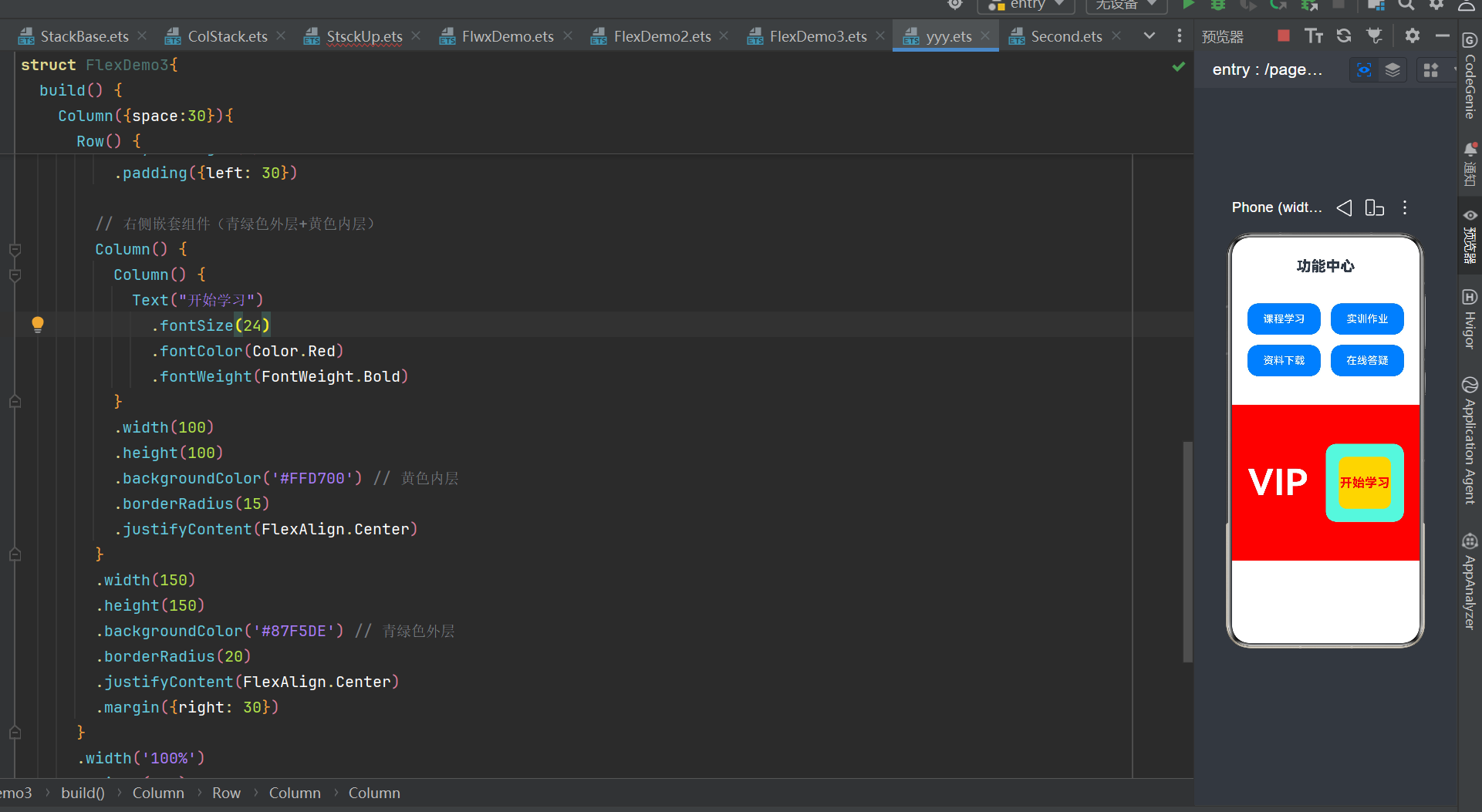
一、基础线性布局:Row & Column(90% 基础页面首选)
线性布局是最简易的流式容器:
Column:垂直自上而下排列子组件
Row:水平从左到右排列子组件
支持间距、主轴对齐、交叉轴对齐三大核心样式,适配表单、按钮组、图文列表等场景。
基础示例代码
@Entry
@Component
struct LineLayoutDemo {
build() {
Column() {
Text("垂直布局标题")
.fontSize(24)
.fontWeight(FontWeight.Bold)
// 水平按钮行
Row() {
Button("按钮1").width(100).height(40)
Button("按钮2").width(100).height(40).margin({left:10})
Button("按钮3").width(100).height(40).margin({left:10})
}
.width("100%")
.justifyContent(FlexAlign.Center) // 水平居中
.margin({top:20}
Text("底部文本").margin({top:30}).fontSize(16)
}
.width("100%")
.padding(20)
}
}
核心属性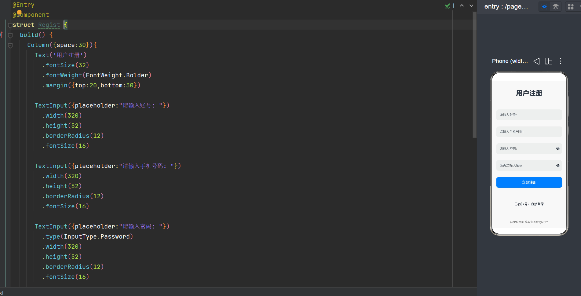
1.space(数值):统一设置子组件间距
2.justifyContent(FlexAlign.xxx):主轴对齐(Start 左 / Center 中 / End 右)
3.alignItems(ItemAlign.xxx):交叉轴对齐(垂直居中、顶部对齐等)
二、精准定位:RelativeContainer 相对布局(复杂错落布局专用)
当页面元素无法用简单线性排列时(组件互相错位、锚定依附),使用RelativeContainer相对布局。
原理:给每个子组件设置唯一id,通过alignRules锚定到父容器 / 其他组件的上下左右位置。
实战案例(课堂完整效果图代码)
需求:顶部红色标题 → 居中按钮 → 红色提示文字 → 下方并排双按钮
@Entry
@Component
struct RelativeDemo1 {
build() {
RelativeContainer() {
// 1.顶部红色标题
Text('相对布局页面设计')
.fontSize(40)
.fontWeight(FontWeight.Bolder)
.backgroundColor(Color.Red)
.id('title')
.alignRules({
top: { anchor: '__container__', align: VerticalAlign.Top },
left: { anchor: '__container__', align: HorizontalAlign.Start }
})
.margin(15)
// 2.第一个基础按钮(锚定标题下方居中)
Button('基础按钮')
.width(100)
.height(80)
.fontSize(25)
.id('buttonid')
.alignRules({
top: { anchor: 'title', align: VerticalAlign.Bottom },
middle: { anchor: 'title', align: HorizontalAlign.Center }
})
.margin(20)
// 3.红色提示文本(锚定第一个按钮下方居中)
Text('这个组件依赖于button')
.fontSize(26)
.fontColor(Color.Red)
.id('textid')
.alignRules({
top: { anchor: 'buttonid', align: VerticalAlign.Bottom },
middle: { anchor: 'buttonid', align: HorizontalAlign.Center }
})
.margin({ top: 30 })
// 4.第二个并排按钮(锚定文本下方、贴第一个按钮右侧)
Button('基础按钮')
.width(100)
.height(80)
.fontSize(25)
.id('button2')
.alignRules({
top: { anchor: 'textid', align: VerticalAlign.Bottom },
left: { anchor: 'buttonid', align: HorizontalAlign.End }
})
.margin({ top: 20, left: 10 })
}
.width('100%')
.height('100%')
.backgroundColor(Color.Gray)
}
}
关键知识点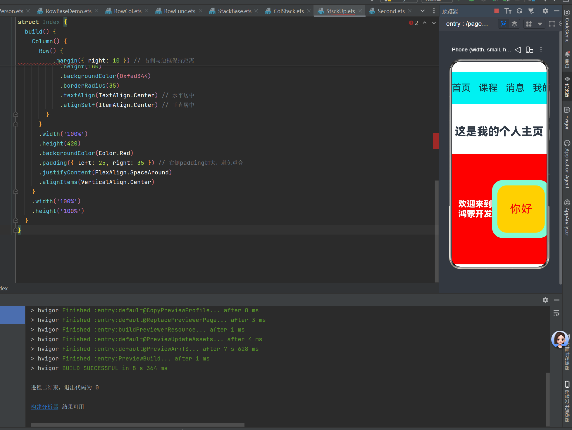
1.__container__ 固定标识:代表 RelativeContainer 父容器本身
2.枚举严格区分(高频报错点):
3.垂直方位 top/bottom/middle → 只能用 VerticalAlign
4.水平方位 left → 只能用 HorizontalAlign
5.无HorizontalAlign.Right,靠右统一使用HorizontalAlign.End
三、多页面切换:Tabs 标签页布局
适合首页分模块切换场景(如学校简介、系部、班级、个人中心四页面切换),顶部 / 底部渲染标签栏,点击切换内容。
@Entry
@Component
struct SchoolInfoTabs {
build() {
Tabs() {
TabContent() {
SchoolIntroPage()
}.tabBar('学校简介')
TabContent() {
DeptIntroPage()
}.tabBar('系部简介')
TabContent() {
ClassIntroPage()
}.tabBar('班级介绍')
TabContent() {
PersonalCenterPage()
}.tabBar('个人中心')
}
.width('100%')
.height('100%')
.barHeight(40) // 标签栏高度
}
}
@Component
struct SchoolIntroPage {
build() {
Column() {
Text('学校简介').fontSize(26).fontWeight(FontWeight.Bold).margin({bottom:15})
Text('欢迎来到河北软件职业技术学院').fontSize(18).margin({bottom:10})
Swiper() {
Image($r("app.media.startIcon")).width('100%').height(180)
}
.width('90%').height(180).autoPlay(true).loop(true).margin({bottom:20})
Text('河北软件职业技术学院是河北省公办全日制高职...').fontSize(16).lineHeight(28)
}
.width('100%').padding(15)
}
}
// 系部、班级、个人中心页面可同理拆分组件
布局特性
1.默认标签栏在顶部;旧版本BarPosition仅支持 Start (左)、End (右),无法直接设置底部,底部 导航需手动用 Column 上下分层实现
2.TabContent 为每个切换页面的独立内容容器,.tabBar("文字") 设置标签显示文本
四、开发高频踩坑避坑指南
坑 1:相对布局横竖枚举混用
报错:VerticalAlign 不能赋值给 HorizontalAlign
✅ 解决:top/bottom/middle 只用 VerticalAlign;left 只用 HorizontalAlign,不要交叉填写。
坑 2:HorizontalAlign.Right 不存在
✅ 解决:鸿蒙标准靠右枚举为 HorizontalAlign.End,没有 Right 字段。
坑 3:Column ({space, alignItems}) 编译报错
低版本 SDK 中 Column 构造对象仅支持 space,alignItems必须拆成链式写法:
// 错误写法 Column({space:20, alignItems:ItemAlign.Center})
// 正确写法 Column({space:20}).alignItems(ItemAlign.Center)
坑 4:资源图片提示 Unknown resource name
✅ 解决:引用格式固定$r("app.media.文件名"),不带.png/.jpg后缀;文件名大小写必须和 media 文件夹内完全一致。
结尾
HarmonyOS ArkTS 布局体系轻量化且灵活,优先用线性布局完成常规页面,复杂自由定位使用 RelativeContainer,多页面切换交给 Tabs。开发时严格遵守枚举、组件 API 语法规范,能规避 90% 编译报错。
后续可以进阶学习 Grid 网格布局、List 长列表高性能渲染,适配更复杂电商、资讯类应用界面。

作为“人工智能6S店”的官方数字引擎,为AI开发者与企业提供一个覆盖软硬件全栈、一站式门户。
更多推荐
 0
0 0
0- 0


 已为社区贡献1条内容

所有评论(0)