
鸿蒙原生 ArkTS 布局方式——Column 最大高度约束:constraintSize maxHeight 防溢出
本文介绍了鸿蒙ArkUI框架中constraintSize的弹性约束机制,重点解析了maxHeight属性的工作原理与使用场景。通过8个示例场景演示了从无约束基线到滚动模式的完整解决方案:无约束时Column自由扩展;设置maxHeight后内容超出会被裁剪;通过嵌套Scroll组件可实现高度受限的滚动区域。文章强调constraintSize相比固定高度的优势在于内容较少时自动收缩,避免留白,同
一、引言
在移动端应用开发中,一个极其常见但又容易忽视的问题是:动态内容溢出。无论是聊天列表、评论区域、下拉菜单,还是搜索结果预览、弹幕展示区,几乎每个业务场景都会遇到「数据量不确定,但容器必须控制高度」的需求。
传统的做法通常是给容器一个固定的 height 值。但固定高度有一个致命缺陷:数据少时有多余留白,数据多时直接溢出导致布局错乱或遮挡其他 UI 元素。换句话说,height 是一个「刚性」约束——它不会根据内容自动调整。
鸿蒙 ArkUI 框架提供了一套更优雅的解决方案:constraintSize 弹性约束系统。其中,constraintSize({ maxHeight: N }) 允许开发者对 Column(以及其它容器组件)设置一个「最大高度上限」,Column 在不超过该上限的前提下仍然保持「内容自适应」的特性。
本文将基于一个完整的示例应用(et s编号 012),从底层原理到实战场景,层层递进地剖析 constraintSize maxHeight 的用法、注意事项和最佳实践。全文包含 8 个独立的演示场景,每个场景都有可运行的完整代码,帮助读者从「知道」到「会用」,从「会用」到「用好」。
二、核心概念解析
2.1 什么是 constraintSize?
constraintSize 是 ArkUI 框架提供的一个尺寸约束属性,用于限制组件的可扩展范围。它接受一个 ConstraintSizeOptions 对象,该对象包含四个可选字段:
| 字段 | 类型 | 默认值 | 含义 |
|---|---|---|---|
minWidth |
Length | 0 | 最小宽度(组件宽度不能小于此值) |
maxWidth |
Length | Infinity | 最大宽度(组件宽度不能大于此值) |
minHeight |
Length | 0 | 最小高度(组件高度不能小于此值) |
maxHeight |
Length | Infinity | 最大高度(组件高度不能大于此值) |
Infinity在 ArkUI 中的实际含义是「无限制」,即由子组件和内容自然决定尺寸。
constraintSize 的核心理念是弹性约束:它不像 height(N) 那样将组件「钉死」在一个固定尺寸上,而是划定了一个「允许范围」,组件在范围内自动适配内容。
2.2 maxHeight 的「柔性」语义
理解 maxHeight 的关键在于区分它与 height 的本质不同:
height(200) = 「你必须是 200vp 高,不管内容有多少」
constraintSize({ maxHeight: 200 }) = 「你最多 200vp 高,但如果内容更少,你可以更矮」
用一个简单的表格来对比:
| 场景 | height(200) | constraintSize({ maxHeight: 200 }) |
|---|---|---|
| 内容高度 = 80vp | 容器高 200vp,下方 120vp 空白 | 容器高 80vp,刚好包裹内容 |
| 内容高度 = 200vp | 容器高 200vp,内容刚好填满 | 容器高 200vp,内容刚好填满 |
| 内容高度 = 300vp | 容器高 200vp,100vp 溢出(被裁剪或滚动) | 容器高 200vp,100vp 溢出(被裁剪或滚动) |
可以看出,在上限范围内(内容高度 ≤ 200vp),maxHeight 表现得像内容自适应;在上限边界处(内容高度 = 200vp),两者行为一致;在超出边界时(内容高度 > 200vp),两者行为也一致。两者的核心差异就在「内容少」的那一侧。
2.3 默认的溢出行为:Clip
当 Column 的实际内容高度超过 maxHeight 时,框架默认采用 Clip(裁剪) 策略。也就是说,超出的内容不会被渲染,用户看不到。这在很多场景下是我们期望的行为(比如防止 UI 撑爆),但在另一些场景下可能需要改成滚动模式(用户仍想查看全部内容)。
ArkUI 的 Column 组件有一个 clip 属性(默认为 true),控制是否裁剪超出部分。但即使 clip = false,超出部分也仅仅是「可见但溢出容器边界」,并不会自动出现滚动条。要实现滚动,需要嵌套 Scroll 组件。
三、场景化示例详解
现在我们逐场景剖析示例应用中的每一个演示,涵盖从「无约束基线」到「多模式实战对比」的完整学习路径。
完整文件概览
在深入每个场景之前,先列出完整文件的头部结构,以便读者了解整体骨架:
// ────────── 导入 ──────────
import { router } from '@kit.ArkUI';

// ────────── 页面入口 ──────────
@Entry
@Component
struct ColumnMaxHeightPage012 {
  // 状态数据
  @State dynamicItems: string[] = [ ... ];
  private readonly dynamicColors: string[] = [ ... ];
  private itemCount: number = 3;
  private readonly sampleItems: string[] = [ ... ];

  build() {
    Column() {
      TitleBar()
      Scroll() {
        Column() {
          // 场景1 ~ 场景8 依次排列
        }
      }
    }
  }
}
整体布局结构是:最外层一个全屏 Column,顶部是标题栏(TitleBar 子组件),下方是 Scroll 包裹的 8 个场景卡片。每个卡片使用 SceneCard 通用容器组件,通过 @BuilderParam 实现内容插槽,保持代码整洁一致。
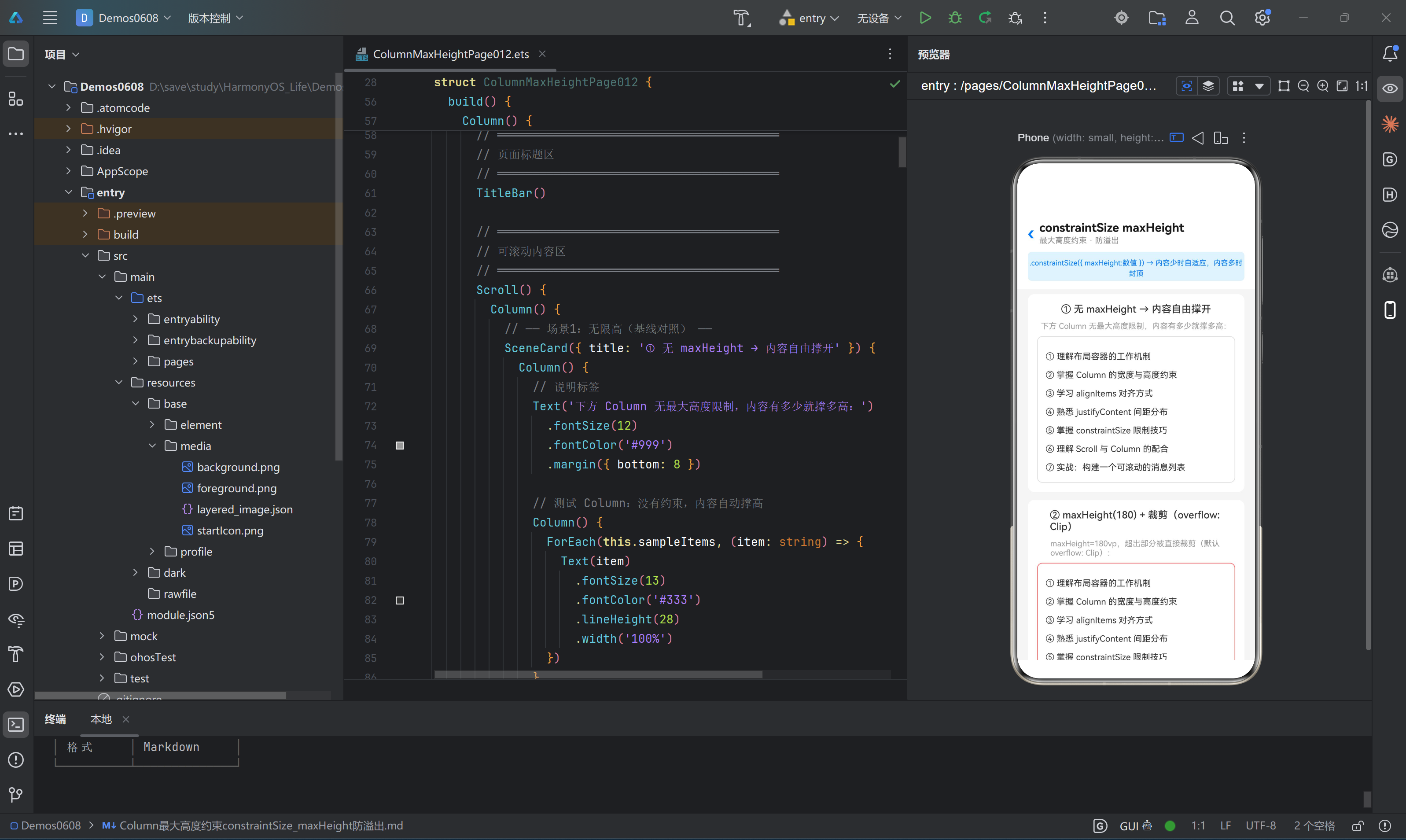
场景一:无 maxHeight 基线对照
目的:建立一个「自由撑开」的参照组,让读者直观感受没有约束时 Column 的行为。
核心代码:
Column() {
  ForEach(this.sampleItems, (item: string) => {
    Text(item)
      .fontSize(13)
      .fontColor('#333')
      .lineHeight(28)
      .width('100%')
  })
}
.width('100%')
.padding(12)
.backgroundColor('#FFFFFF')
.borderRadius(8)
// ★ 注意:没有 .constraintSize({ maxHeight }) → 无限高
运行效果:列中有 7 行文本,每行行高 28vp,加上 12vp × 2 的内边距,总高度约为 7 × 28 + 24 = 220vp。因为没有设置 maxHeight,Column 自然地撑开到 220vp,完整显示所有内容。
要点解读:
- Column 的默认高度是「内容自适应」的,没有任何上限。
- 这种行为的优点是简单自然,缺点是在动态数据场景下不可控——数据量大时 Column 会无限生长,可能撑出屏幕、覆盖下方 UI,甚至在嵌套 Scroll 时导致双重滚动冲突。
- 本场景的灰色边框仅仅用于视觉区分,不产生布局约束。
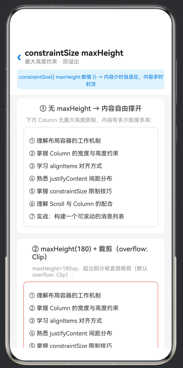
场景二:maxHeight(180) + 裁剪模式
目的:展示 constraintSize 最基础、最直接的用法——给 Column 加上一个高度上限,超出部分直接裁剪。
核心代码:
Column() {
  ForEach(this.sampleItems, (item: string) => {
    Text(item)
      .fontSize(13)
      .fontColor('#333')
      .lineHeight(28)
      .width('100%')
  })
}
.width('100%')
.padding(12)
.backgroundColor('#FFFFFF')
.borderRadius(8)
.constraintSize({ maxHeight: 180 })
// ★ 关键属性 ↑↑↑
// 内容本该有 7×28=196vp 高(不含 padding),但 maxHeight=180 限制了
// 默认 overflow=Clip → 超出的部分直接裁剪,不可见
.border({ width: 1, color: '#FF6B6B' })
运行效果:Column 的红色边框高度被限制在 180vp。7 行文本在加上上下内边距后原有 ~220vp 的高度,但现在第 7 行和第 6 行的大部分都被裁剪掉了,用户只能看到约 5 行文本。
要点解读:
.constraintSize({ maxHeight: 180 })是这一行代码决定了高度上限。- 红色边框的作用是帮助读者肉眼分辨「界限在哪里」。在实际产品代码中不需要加红色边框,可以用
clip(true)安静地裁剪。 - 裁剪是无声的——没有报错、没有警告,超出部分就是不可见了。开发者需要自己确保核心信息没有被裁掉。
maxHeight的取值单位是 vp(virtual pixel,虚拟像素),它是鸿蒙的抽象像素单位,不同屏幕密度下自动缩放。
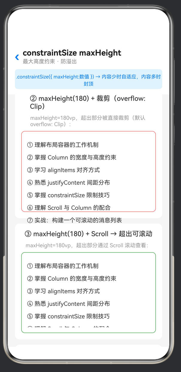
场景三:maxHeight + Scroll 滚动模式
目的:解决「裁剪导致信息丢失」的问题——在限制最大高度的同时,允许用户通过滚动查看被隐藏的内容。
核心代码:
Column() {
  // 外层 Column 设 maxHeight = 180
  Column() {
    // 内层 Scroll 接管滚动
    Scroll() {
      Column() {
        ForEach(this.sampleItems, (item: string) => {
          Text(item)
            .fontSize(13)
            .fontColor('#333')
            .lineHeight(28)
            .width('100%')
        })
      }
      .width('100%')
    }
    .width('100%')
    .scrollBar(BarState.Auto)
  }
  .width('100%')
  .padding(12)
  .backgroundColor('#FFFFFF')
  .borderRadius(8)
  .constraintSize({ maxHeight: 180 })
  // ★ 关键:Column 最大 180vp,内部 Scroll 填满该空间
  // 内容超限时 Scroll 接管滚动
  .border({ width: 1, color: '#4CAF50' })
}
运行效果:Colum n 被限制在 180vp 高度内(绿色边框为界),但内容并未被裁剪——Scroll 组件接管了超出部分,提供了竖滑滚动条。用户可以上下滚动完整查看全部 7 行文本。
要点解读:
- 这是实战中最推荐的方案:
maxHeight + Scroll的组合实现了「布局可控 + 内容完整」的双赢。 - 结构层次:外层 Column(约束高度)→ 内层 Scroll(提供滚动能力)→ 最内层 Column(内容)。这个三层嵌套是固定的模式。
.scrollBar(BarState.Auto)设置滚动条自动显示/隐藏,比BarState.Off对用户更友好。- 绿色边框同样仅供演示标记,产品代码中不需要。
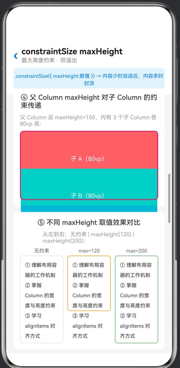
场景四:父 Column maxHeight 约束子 Column
目的:展示 maxHeight 的约束传递效应——父容器的高度限制会如何影响子容器的渲染。
核心代码:
// 父 Column — 限制最大高度
Column() {
  // 子 A(80vp)
  Column() {
    Text('子 A(80vp)')
      .fontSize(13).fontColor('#fff')
      .textAlign(TextAlign.Center)
      .width('100%').lineHeight(80)
  }
  .width('100%').height(80)
  .backgroundColor('#FF6B6B')
  .borderRadius({ topLeft: 6, topRight: 6 })

  // 子 B(80vp)
  Column() {
    Text('子 B(80vp)')
      .fontSize(13).fontColor('#fff')
      .textAlign(TextAlign.Center)
      .width('100%').lineHeight(80)
  }
  .width('100%').height(80)
  .backgroundColor('#4ECDC4')

  // 子 C(80vp)
  Column() {
    Text('子 C(80vp)')
      .fontSize(13).fontColor('#fff')
      .textAlign(TextAlign.Center)
      .width('100%').lineHeight(80)
  }
  .width('100%').height(80)
  .backgroundColor('#45B7D1')
  .borderRadius({ bottomLeft: 6, bottomRight: 6 })
}
.width('100%')
.constraintSize({ maxHeight: 150 })
// ★ 父 maxHeight=150 → 3×80=240vp 的内容,超出的 90vp 被裁剪
// 子 C 几乎完全不可见(只露出底部边角),子 B 可见一半
.border({ width: 2, color: '#E91E63' })
.borderRadius(8)
运行效果:父 Column 被粉色边框约束在 150vp 高度内。三个子 Column 各占 80vp,总和 240vp。子 A(红色)完整显示,子 B(绿色)只显示上半部分(约 70vp),子 C(蓝色)除了底部圆角的一丝痕迹外完全不可见。
要点解读:
- 这是一个非常重要的布局概念:子组件的高度声明不会「突破」父容器的约束。即使每个子 Column 写了
.height(80),当父容器空间不足时,子组件仍然会被裁剪。 - 这种约束传递机制保证了父容器对其内部空间的绝对控制权——这是鸿蒙 ArkUI 布局引擎的核心规则之一。
- 在实际开发中,这意味着:不要假设子组件设置了固定高度就一定能完整显示。如果父容器的
maxHeight比子组件总和还小,后面的子组件就会被「吃掉」。 - 解决方案包括:① 调整父容器的
maxHeight使之能够容纳所有子组件;② 改用 Scroll 模式,让用户滚动查看被隐藏的子组件;③ 重新设计布局,使用更扁平的结构。
场景五:不同 maxHeight 取值效果对比
目的:通过并排对比三种不同取值(无约束 / max=120 / max=200),让读者直观感受不同限制强度下 Column 的表现差异。
核心代码:
Row() {
  // 5a — 无约束
  Column() {
    Text('无约束').fontSize(11).fontColor('#666')
      .textAlign(TextAlign.Center).width('100%').margin({ bottom: 4 })
    Column() {
      ForEach(this.sampleItems.slice(0, 3), (item: string) => {
        Text(item).fontSize(11).fontColor('#333')
          .lineHeight(22).width('100%').padding({ left: 4, right: 4 })
      })
    }
    .width('100%').padding(6).backgroundColor('#FFF')
    .borderRadius(6).border({ width: 1, color: '#E0E0E0' })
    // 无 maxHeight
  }
  .layoutWeight(1).alignItems(HorizontalAlign.Center)
  .margin({ right: 6 })

  // 5b — maxHeight: 120
  Column() {
    Text('max=120').fontSize(11).fontColor('#666')
      .textAlign(TextAlign.Center).width('100%').margin({ bottom: 4 })
    Column() {
      // ... 相同内容 ...
    }
    .width('100%').padding(6).backgroundColor('#FFF')
    .borderRadius(6)
    .constraintSize({ maxHeight: 120 })        // ★ max=120
    .border({ width: 1, color: '#FF9800' })
  }
  .layoutWeight(1).alignItems(HorizontalAlign.Center)
  .margin({ left: 3, right: 3 })

  // 5c — maxHeight: 200
  Column() {
    Text('max=200').fontSize(11).fontColor('#666')
      .textAlign(TextAlign.Center).width('100%').margin({ bottom: 4 })
    Column() {
      // ... 相同内容 ...
    }
    .width('100%').padding(6).backgroundColor('#FFF')
    .borderRadius(6)
    .constraintSize({ maxHeight: 200 })        // ★ max=200
    .border({ width: 1, color: '#4CAF50' })
  }
  .layoutWeight(1).alignItems(HorizontalAlign.Center)
  .margin({ left: 6 })
}
.width('100%')
.alignItems(VerticalAlign.Top)
运行效果:三列并列显示,每列包含相同的 3 行示例文本(内容一致,控制变量)。左列无约束,完整显示所有文本行;中列 max=120,只显示了约 2 行半,第 3 行被部分裁剪;右列 max=200,因为内容高度小于 200vp,所有文本完整显示,且右侧没有多余留白。
要点解读:
- 这个场景清晰地展示了
maxHeight的「范围上限」语义:当内容高度 < 上限时,Column 自适应到内容高度(如右列);当内容高度 > 上限时,Column 被裁切到上限值(如中列)。 - 并排对比的方式尤其适合向团队新人或跨平台开发者解释鸿蒙的弹性约束机制。
.layoutWeight(1)使三列在 Row 中均分宽度,VerticalAlign.Top确保各列顶部对齐,这样即使高度不同,顶部始终平齐,便于视觉对比。
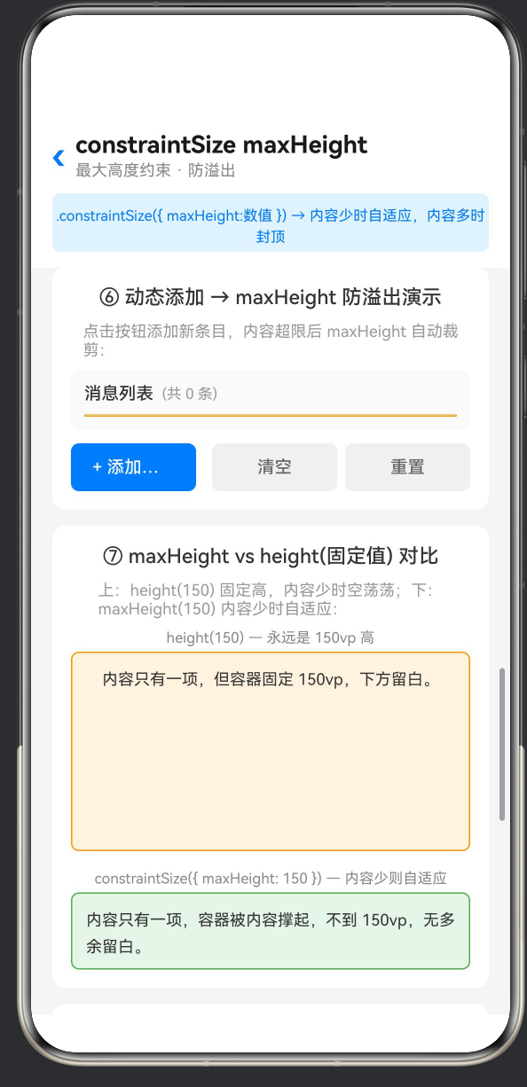
场景六:动态添加内容观察 maxHeight 限制
目的:提供交互式的动态体验——用户点击按钮添加新条目,实时观察 Column 内容逐渐超出 maxHeight 的过程,这是理解「防溢出」概念最直观的方式。
核心代码:
@State dynamicItems: string[] = [
  '第 1 条:鸿蒙操作系统是华为自主研发的分布式操作系统。',
  '第 2 条:ArkTS 是鸿蒙应用开发的推荐编程语言。',
  '第 3 条:Column 是纵向 Flex 布局容器。',
];
private itemCount: number = 3;

// 在 build 中:
Column() {
  // 标题栏
  Row() {
    Text('消息列表')
      .fontSize(13).fontWeight(FontWeight.Medium).fontColor('#333')
    Text('(共 ' + this.dynamicItems.length + ' 条)')
      .fontSize(11).fontColor('#999').margin({ left: 6 })
  }
  .width('100%').margin({ bottom: 8 })

  // List 区域 — 设 maxHeight,超出裁剪
  Column() {
    Column() {
      ForEach(this.dynamicItems, (item: string, index?: number) => {
        Row() {
          Text(String((index ?? 0) + 1))
            .fontSize(11).fontColor('#fff')
            .width(20).height(20).textAlign(TextAlign.Center)
            .lineHeight(20).backgroundColor('#007AFF')
            .borderRadius(10).margin({ right: 8 })
          Text(item)
            .fontSize(13).fontColor('#333')
            .lineHeight(20).layoutWeight(1)
        }
        .width('100%').padding(8)
        .backgroundColor(this.dynamicColors[(index ?? 0) % this.dynamicColors.length])
        .borderRadius(6).margin({ bottom: 6 })
      })
    }
    .width('100%').padding(8)
  }
  .width('100%')
  .constraintSize({ maxHeight: 200 })
  .border({ width: 1, color: '#FF9800' })
  .borderRadius(8)
}

// 操作按钮
Row() {
  Button('+ 添加一条')
    .fontSize(13).fontColor('#fff')
    .backgroundColor('#007AFF').borderRadius(6).height(36)
    .layoutWeight(1).margin({ right: 6 })
    .onClick(() => {
      this.itemCount++;
      const newItem = '第 ' + this.itemCount +
        ' 条:新增加的动态内容,用于测试 maxHeight 防溢出效果。';
      this.dynamicItems = [...this.dynamicItems, newItem];
    })

  Button('清空')
    .fontSize(13).fontColor('#666')
    .backgroundColor('#F0F0F0').borderRadius(6).height(36)
    .layoutWeight(1).margin({ left: 6 })
    .onClick(() => {
      this.itemCount = 0;
      this.dynamicItems = [];
    })

  Button('重置')
    .fontSize(13).fontColor('#666')
    .backgroundColor('#F0F0F0').borderRadius(6).height(36)
    .layoutWeight(1).margin({ left: 6 })
    .onClick(() => {
      this.itemCount = 3;
      this.dynamicItems = [
        '第 1 条:鸿蒙操作系统是华为自主研发的分布式操作系统。',
        '第 2 条:ArkTS 是鸿蒙应用开发的推荐编程语言。',
        '第 3 条:Column 是纵向 Flex 布局容器。',
      ];
    })
}
运行效果:初始状态为 3 条消息,列表区域与橙色边框(maxHeight=200)之间有大量剩余空间。每点击一次「添加一条」,列表新增一个消息项,列表高度逐渐增长。当条目数不足约 7-8 条时,列表高度始终 ≤200vp,所有内容可见;当条目数超过这个阈值后,橙色边框高度不再增长,新增的条目被裁剪,但计数器「共 X 条」仍然如实反映总条目数——用户通过对比「条目数」和「可见条目数」,能明显感知裁剪在起作用。
要点解读:
- 这是本文最核心的交互式演示场景。通过动态添加,「防溢出」不再是抽象概念,而是看得见摸得着的行为。
@State dynamicItems的更新方式[...this.dynamicItems, newItem]利用了数组展开语法创建新数组,驱动 ArkUI 的响应式渲染引擎重新执行 ForEach。- 三个按钮(添加 / 清空 / 重置)覆盖了常见的操作路径,方便反复测试不同数据量下的表现。
- 颜色数组
dynamicColors为每个条目分配不同背景色,不仅美观,也帮助用户区分条目边界,更容易判断哪些条目被裁剪了。
场景七:maxHeight vs height(固定值) 对比
目的:通过上下并排放置两个视觉上可直接对比的区域,直观揭示 height 和 constraintSize({ maxHeight }) 在「内容不足」这个侧面的本质差异。
核心代码:
// 7a — height(150) 固定高度
Column() {
  Text('height(150) — 永远是 150vp 高')
    .fontSize(11).fontColor('#888').margin({ bottom: 4 })

  Column() {
    Text('内容只有一项,但容器固定 150vp,下方留白。')
      .fontSize(12).fontColor('#333').lineHeight(20).padding(8)
  }
  .width('100%')
  .height(150)                    // ★ 固定高度——内容不满也占 150vp
  .backgroundColor('#FFF3E0')
  .borderRadius(6)
  .border({ width: 1, color: '#FF9800' })
}
.width('100%')
.margin({ bottom: 14 })

// 7b — constraintSize maxHeight
Column() {
  Text('constraintSize({ maxHeight: 150 }) — 内容少则自适应')
    .fontSize(11).fontColor('#888').margin({ bottom: 4 })

  Column() {
    Text('内容只有一项,容器被内容撑起,不到 150vp,无多余留白。')
      .fontSize(12).fontColor('#333').lineHeight(20).padding(8)
  }
  .width('100%')
  .constraintSize({ maxHeight: 150 })   // ★ maxHeight——内容不满时仅撑到内容高度
  .backgroundColor('#E8F5E9')
  .borderRadius(6)
  .border({ width: 1, color: '#4CAF50' })
}
.width('100%')
运行效果:上下两个区域都尝试展示一段只有 1 行文本的内容。上方(橙色边框,height(150))被撑大到了 150vp,内容只有顶部一小部分,下方出现大片空白;下方(绿色边框,constraintSize({ maxHeight: 150 }))则只包裹住了文本本身的大小(约 20vp 内边距 + 一行文本 ≈ 50vp),没有多余留白。
要点解读:
- 这是
height和constraintSize maxHeight最本质的区别,一句话概括:「height是必须达到的硬性要求,maxHeight是绝不能超过的软性上限」。 - 在实际 UI 开发中,绝大多数情况下
constraintSize({ maxHeight })比height更合适,因为它不会在内容不足时产生丑陋的留白。 - 什么时候该用
height而不是maxHeight?当 UI 设计稿明确要求某个区域「无论内容多少,高度必须固定」时,例如占位图区域、固定的广告位、进度指示条等。 - 本场景中上下两部分的文本内容故意保持相同,以排除内容差异对视觉判断的干扰。
场景八:三种溢出处理模式对比
目的:在同一个卡片中并排展示三种不同的溢出处理策略,供开发者根据业务场景选择合适的方案。
核心代码:
// ====== 模式 A:Clip(默认),直接裁剪 ======
Column() {
  ForEach(this.sampleItems, (item: string) => {
    Text(item).fontSize(12).fontColor('#333')
      .lineHeight(24).width('100%').padding({ left: 8 })
  })
}
.width('100%')
.constraintSize({ maxHeight: 160 })
.backgroundColor('#FCE4EC')
.borderRadius(6)
.border({ width: 1, color: '#E91E63' })
.padding({ top: 6, bottom: 6 })

// ====== 模式 B:Clip + Scroll,超出可滚动 ======
Column() {
  Scroll() {
    Column() {
      ForEach(this.sampleItems, (item: string) => {
        Text(item).fontSize(12).fontColor('#333')
          .lineHeight(24).width('100%').padding({ left: 8 })
      })
    }
    .width('100%')
  }
  .width('100%')
  .scrollBar(BarState.Auto)
}
.width('100%')
.constraintSize({ maxHeight: 160 })
.backgroundColor('#E3F2FD')
.borderRadius(6)
.border({ width: 1, color: '#1976D2' })
.padding({ top: 6, bottom: 6 })

// ====== 模式 C:maxHeight + "展开全部" 按钮 ======
Column() {
  Text('这是推荐的做法:限制高度 + 按钮让用户选择是否查看全部内容,'
    + '既防溢出又不丢失信息。')
    .fontSize(12).fontColor('#666')
    .lineHeight(20).padding({ left: 8, right: 8, top: 4, bottom: 4 })
}
.width('100%')
.constraintSize({ maxHeight: 160 })
.backgroundColor('#E8F5E9')
.borderRadius(6)
.border({ width: 1, color: '#388E3C' })
.padding({ top: 6, bottom: 6 })

// 展开按钮
Text('▼ 展开全部')
  .fontSize(12).fontColor('#388E3C')
  .width('100%').textAlign(TextAlign.Center)
  .padding({ top: 6, bottom: 4 })
  .onClick(() => {
    // 实际开发中可在这里切换 maxHeight 为更大的值或移除限制
  })
运行效果:三个区域并排展示:
- 模式 A(粉色):内容在第 6~7 行处被直接切断,没有滚动条,没有展开按钮。信息永久丢失。
- 模式 B(蓝色):内容同样在第 6~7 行处可见被截断感,但右侧出现细小的滚动条。用户拖动即可查看完整内容。
- 模式 C(绿色):内容被截断处下方有一个「▼ 展开全部」按钮,用户点击后可触发展开(示例中未实现完整逻辑,仅示意)。
要点解读:
- 三种模式没有绝对的优劣之分,只有是否适合当前业务场景:
- 模式 A(纯裁剪):适合「展示固定数量信息」的卡片预览,如「最近 3 条消息」,即使后端返回了 10 条也只显示前 3 条。
- 模式 B(裁剪 + 滚动):适合信息量可能超限但用户需要主动查看全部的场景,如商品详情页的规格参数区。
- 模式 C(裁剪 + 展开按钮):适合需要用户明确操作才能查看更多内容的场景,如「阅读全文」控件,对隐私或性能敏感的区域。
四、深入理解 constraintSize 机制
4.1 约束传递链
在 ArkUI 布局系统中,尺寸约束是自上而下传递的。当一个父组件设置了 constraintSize({ maxHeight: 200 }),其所有的子孙组件的可用高度都被限制在 200vp 之内。即使某个子组件声明了 .height(300),它也只能在父容器划定的 200vp 空间内布局。
这就是场景四中「子 C 消失」的根本原因——子 C 试图占据 80vp,但父容器的剩余空间为负值(因为子 A 和子 B 已经消耗了空间的绝大部分),布局引擎直接将其裁剪。
理解这个约束传递链对于构建健壮的鸿蒙 UI 至关重要。
4.2 maxHeight 与 Scroll 的嵌套规则
maxHeight + Scroll 的嵌套模式有三个关键规则:
-
Scroll 必须是 maxHeight Column 的直接子组件,或者中间不能有「会主动占用空间」的兄弟组件。如果中间有固定高度的 Header,那 Scroll 的可用空间 = maxHeight - Header 高度。
-
Scroll 必须填满其父 Column 的可用空间,通常通过
.layoutWeight(1)或height('100%')来实现,否则 Scroll 可能只有很小的高度,内部的大量内容仍然不可见。 -
Scroll 内部的子组件不可再设固定高度(如
.height('100%')),否则会与 Scroll 的滚动机制冲突。Scroll 内部的内容高度应该由其子组件的总和自然决定。
4.3 maxHeight 与 alignItems 的交互
Column 的 alignItems 会影响子组件在交叉轴(水平方向)上的对齐方式。常见取值包括 HorizontalAlign.Start(左对齐)、HorizontalAlign.Center(居中)、HorizontalAlign.Stretch(拉伸填充,当未指定子组件宽度时生效)。
当 Column 设置了 constraintSize({ maxHeight }) 时,alignItems 行为不受影响——它仍然控制水平方向的对齐,与高度约束无关。但有一个值得注意的细节:当 Column 被 maxHeight 裁剪时,已渲染的子组件仍然按其 alignItems 设置对齐,被裁剪的子组件则完全不可见。
4.4 与其它约束属性的协同
constraintSize 的四个字段可以组合使用:
.constraintSize({
  minHeight: 100,
  maxHeight: 300,
  minWidth: 200,
  maxWidth: 500,
})
这意味着 Column 的高度在 100~300vp 之间自适应,宽度在 200~500vp 之间自适应。
常见的组合模式:
| 组合 | 效果 | 适用场景 |
|---|---|---|
minHeight: 80, maxHeight: 240 |
至少 80vp,最多 240vp | 动态消息列表预览 |
minHeight: 44 |
至少 44vp,上限无限制 | 按钮/标签的最小尺寸 |
maxHeight: '80%' |
最多占父容器 80% 高度 | 弹窗/抽屉面板 |
minWidth: 160, maxWidth: 320 |
宽度在 160~320vp 之间 | 自适应卡片宽度 |
五、实战建议与注意事项
5.1 选择合适的 maxHeight 值
maxHeight 取值的核心原则是:在最常见的场景下,大多数内容能够完整显示;在极端情况下,内容能被优雅地处理(裁剪或滚动)。
具体建议:
- 以设计稿中该区域的「典型内容高度」为基准,向上浮动 20%~30% 作为
maxHeight。 - 对于文字密集的区域(如评论列表),每一行按 ~28vp 计算,预留 16vp 的内边距。
- 考虑不同字体大小的极端情况:用户可能在系统设置中调整字号,同样内容在更大字号下会占据更多高度。
5.2 避免「过度约束」
不要在一个页面上过度使用 constraintSize。如果每个容器都设置了上下限,布局系统的灵活性会大大降低,也难以调试。建议的做法是:
- 只在「可能存在动态数据且高度需要控制」的关键节点使用,如列表预览区、弹窗面板等。
- 避免在套娃式的嵌套容器中层层都设置约束,这会增加布局计算开销并可能产生意料之外的裁剪。
- 优先使用 Scroll 模式,除非有明确的「裁剪即合理」的业务理由。
5.3 与 List 组件的选择
对于消息列表、评论列表等场景,ArkUI 还提供了 List 组件,它原生支持滚动和懒加载。那么什么时候用 Column + Scroll,什么时候用 List?
| 场景 | 推荐组件 | 原因 |
|---|---|---|
| 少量固定数据(< 50 项) | Column + Scroll | 简单直接,无需配置 LazyForEach |
| 大量动态数据(50+ 项) | List + LazyForEach | 性能更优,支持懒加载和回收 |
| 需要固定高度的预览区 | Column + constraintSize | List 的 maxHeight 行为不同 |
如果核心需求是 「限制高度,超出裁剪或滚动」,Column + Scroll + constraintSize 永远是最可控的选择。
5.4 兼容性提示
constraintSize 在 HarmonyOS NEXT(API 24+)中表现稳定。如果您的应用需要兼容 API 23 或更早版本,请确认目标 API Level 的支持情况。一般而言,constraintSize 从 API 9 开始就已经可用,因此向后兼容性良好。
六、完整代码
以下是本文示例应用的完整 ColumnMaxHeightPage012.ets 文件。将文件放入 HarmonyOS 项目的 entry/src/main/ets/pages/ 目录,并在 Index.ets 中注册路由即可运行。
/**
* ets编号:012
* ==============================
* 布局主题:Column 最大高度约束 —— constraintSize maxHeight 防溢出
*
* 核心概念:
* .constraintSize({ maxHeight: 数值 })
* 限制 Column 的最大可扩展高度,超出部分可通过裁剪或滚动来处理。
*
* 对比记忆:
* - .height(固定值) → 强行固定,内容超出或不足都不调整
* - .constraintSize({ maxHeight }) → 内容少时由内容撑开,内容多时封顶
*
* 适用场景:
* - 聊天输入框上方消息预览区(限制最大高度,超出滚动)
* - 下拉菜单/选择器面板(限制最大展开高度)
* - 动态内容卡片(防止异常数据撑爆布局)
* - 评论区/弹幕展示区(限制高度,超出截断或滚动)
* ==============================
*/
// ────────── 导入 ──────────
import { router } from '@kit.ArkUI';
// ────────── 页面入口 ──────────
@Entry
@Component
struct ColumnMaxHeightPage012 {
// ==================== 状态数据 ====================
/** 动态添加的条目(用于场景⑥ 动态超限演示) */
@State dynamicItems: string[] = [
'第 1 条:鸿蒙操作系统是华为自主研发的分布式操作系统。',
'第 2 条:ArkTS 是鸿蒙应用开发的推荐编程语言。',
'第 3 条:Column 是纵向 Flex 布局容器。',
];
private readonly dynamicColors: string[] = [
'#E3F2FD', '#E8F5E9', '#FFF3E0', '#FCE4EC',
'#F3E5F5', '#E0F2F1', '#FFF8E1', '#EFEBE9',
];
private itemCount: number = 3;
/** 用于场景⑦(对比演示)的列表数据 */
private readonly sampleItems: string[] = [
'① 理解布局容器的工作机制',
'② 掌握 Column 的宽度与高度约束',
'③ 学习 alignItems 对齐方式',
'④ 熟悉 justifyContent 间距分布',
'⑤ 掌握 constraintSize 限制技巧',
'⑥ 理解 Scroll 与 Column 的配合',
'⑦ 实战:构建一个可滚动的消息列表',
];
// ==================== 构建UI ====================
build() {
Column() {
// ════════════════════════════════════════
// 页面标题区
// ════════════════════════════════════════
TitleBar()
// ════════════════════════════════════════
// 可滚动内容区
// ════════════════════════════════════════
Scroll() {
Column() {
// —— 场景1:无限高(基线对照) ——
SceneCard({ title: '① 无 maxHeight → 内容自由撑开' }) {
Column() {
Text('下方 Column 无最大高度限制,内容有多少就撑多高:')
.fontSize(12).fontColor('#999').margin({ bottom: 8 })
Column() {
ForEach(this.sampleItems, (item: string) => {
Text(item).fontSize(13).fontColor('#333')
.lineHeight(28).width('100%')
})
}
.width('100%').padding(12).backgroundColor('#FFFFFF')
.borderRadius(8)
.border({ width: 1, color: '#E0E0E0' })
}
.width('100%')
}
// —— 场景2:固定 maxHeight(裁剪模式) ——
SceneCard({ title: '② maxHeight(180) + 裁剪(overflow: Clip)' }) {
Column() {
Text('maxHeight=180vp,超出部分被直接裁剪(默认 overflow: Clip):')
.fontSize(12).fontColor('#999').margin({ bottom: 8 })
Column() {
ForEach(this.sampleItems, (item: string) => {
Text(item).fontSize(13).fontColor('#333')
.lineHeight(28).width('100%')
})
}
.width('100%').padding(12).backgroundColor('#FFFFFF')
.borderRadius(8)
.constraintSize({ maxHeight: 180 })
.border({ width: 1, color: '#FF6B6B' })
}
.width('100%')
}
// —— 场景3:maxHeight + Scroll(滚动模式) ——
SceneCard({ title: '③ maxHeight(180) + Scroll → 超出可滚动' }) {
Column() {
Text('maxHeight=180vp,超出部分通过 Scroll 滚动查看:')
.fontSize(12).fontColor('#999').margin({ bottom: 8 })
Column() {
Column() {
Scroll() {
Column() {
ForEach(this.sampleItems, (item: string) => {
Text(item).fontSize(13).fontColor('#333')
.lineHeight(28).width('100%')
})
}.width('100%')
}.width('100%').scrollBar(BarState.Auto)
}
.width('100%').padding(12).backgroundColor('#FFFFFF')
.borderRadius(8)
.constraintSize({ maxHeight: 180 })
.border({ width: 1, color: '#4CAF50' })
}.width('100%')
}
}
// —— 场景4:父 Column maxHeight 约束子 Column ——
SceneCard({ title: '④ 父 Column maxHeight 对子 Column 的约束传递' }) {
Column() {
Text('父 Column 设 maxHeight=150,内有 3 个子 Column 各 80vp 高:')
.fontSize(12).fontColor('#999').margin({ bottom: 8 })
Column() {
Column() {
Text('子 A(80vp)').fontSize(13).fontColor('#fff')
.textAlign(TextAlign.Center).width('100%').lineHeight(80)
}.width('100%').height(80).backgroundColor('#FF6B6B')
.borderRadius({ topLeft: 6, topRight: 6 })
Column() {
Text('子 B(80vp)').fontSize(13).fontColor('#fff')
.textAlign(TextAlign.Center).width('100%').lineHeight(80)
}.width('100%').height(80).backgroundColor('#4ECDC4')
Column() {
Text('子 C(80vp)').fontSize(13).fontColor('#fff')
.textAlign(TextAlign.Center).width('100%').lineHeight(80)
}.width('100%').height(80).backgroundColor('#45B7D1')
.borderRadius({ bottomLeft: 6, bottomRight: 6 })
}
.width('100%')
.constraintSize({ maxHeight: 150 })
.border({ width: 2, color: '#E91E63' }).borderRadius(8)
}.width('100%')
}
// —— 场景5:maxHeight 不同取值的比较 ——
SceneCard({ title: '⑤ 不同 maxHeight 取值效果对比' }) {
Column() {
Text('从左到右:无约束 | maxHeight(120) | maxHeight(200):')
.fontSize(12).fontColor('#999').margin({ bottom: 8 })
Row() {
Column() {
Text('无约束').fontSize(11).fontColor('#666')
.textAlign(TextAlign.Center).width('100%').margin({ bottom: 4 })
Column() {
ForEach(this.sampleItems.slice(0, 3), (item: string) => {
Text(item).fontSize(11).fontColor('#333')
.lineHeight(22).width('100%').padding({ left: 4, right: 4 })
})
}.width('100%').padding(6).backgroundColor('#FFF')
.borderRadius(6).border({ width: 1, color: '#E0E0E0' })
}.layoutWeight(1).alignItems(HorizontalAlign.Center).margin({ right: 6 })
Column() {
Text('max=120').fontSize(11).fontColor('#666')
.textAlign(TextAlign.Center).width('100%').margin({ bottom: 4 })
Column() {
ForEach(this.sampleItems.slice(0, 3), (item: string) => {
Text(item).fontSize(11).fontColor('#333')
.lineHeight(22).width('100%').padding({ left: 4, right: 4 })
})
}.width('100%').padding(6).backgroundColor('#FFF')
.borderRadius(6)
.constraintSize({ maxHeight: 120 })
.border({ width: 1, color: '#FF9800' })
}.layoutWeight(1).alignItems(HorizontalAlign.Center)
.margin({ left: 3, right: 3 })
Column() {
Text('max=200').fontSize(11).fontColor('#666')
.textAlign(TextAlign.Center).width('100%').margin({ bottom: 4 })
Column() {
ForEach(this.sampleItems.slice(0, 3), (item: string) => {
Text(item).fontSize(11).fontColor('#333')
.lineHeight(22).width('100%').padding({ left: 4, right: 4 })
})
}.width('100%').padding(6).backgroundColor('#FFF')
.borderRadius(6)
.constraintSize({ maxHeight: 200 })
.border({ width: 1, color: '#4CAF50' })
}.layoutWeight(1).alignItems(HorizontalAlign.Center).margin({ left: 6 })
}.width('100%').alignItems(VerticalAlign.Top)
}.width('100%')
}
// —— 场景6:动态添加内容,观察 maxHeight 限制 ——
SceneCard({ title: '⑥ 动态添加 → maxHeight 防溢出演示' }) {
Column() {
Text('点击按钮添加新条目,内容超限后 maxHeight 自动裁剪:')
.fontSize(12).fontColor('#999').margin({ bottom: 8 })
Column() {
Row() {
Text('消息列表').fontSize(13)
.fontWeight(FontWeight.Medium).fontColor('#333')
Text('(共 ' + this.dynamicItems.length + ' 条)')
.fontSize(11).fontColor('#999').margin({ left: 6 })
}.width('100%').margin({ bottom: 8 })
Column() {
Column() {
ForEach(this.dynamicItems, (item: string, index?: number) => {
Row() {
Text(String((index ?? 0) + 1))
.fontSize(11).fontColor('#fff')
.width(20).height(20).textAlign(TextAlign.Center)
.lineHeight(20).backgroundColor('#007AFF')
.borderRadius(10).margin({ right: 8 })
Text(item).fontSize(13).fontColor('#333')
.lineHeight(20).layoutWeight(1)
}
.width('100%').padding(8)
.backgroundColor(
this.dynamicColors[(index ?? 0) % this.dynamicColors.length]
).borderRadius(6).margin({ bottom: 6 })
})
}.width('100%').padding(8)
}
.width('100%')
.constraintSize({ maxHeight: 200 })
.border({ width: 1, color: '#FF9800' }).borderRadius(8)
}
.width('100%').padding(10).backgroundColor('#FAFAFA')
.borderRadius(8).margin({ bottom: 10 })
Row() {
Button('+ 添加一条').fontSize(13).fontColor('#fff')
.backgroundColor('#007AFF').borderRadius(6).height(36)
.layoutWeight(1).margin({ right: 6 })
.onClick(() => {
this.itemCount++;
const newItem = '第 ' + this.itemCount +
' 条:新增加的动态内容,用于测试 maxHeight 防溢出效果。';
this.dynamicItems = [...this.dynamicItems, newItem];
})
Button('清空').fontSize(13).fontColor('#666')
.backgroundColor('#F0F0F0').borderRadius(6).height(36)
.layoutWeight(1).margin({ left: 6 })
.onClick(() => {
this.itemCount = 0;
this.dynamicItems = [];
})
Button('重置').fontSize(13).fontColor('#666')
.backgroundColor('#F0F0F0').borderRadius(6).height(36)
.layoutWeight(1).margin({ left: 6 })
.onClick(() => {
this.itemCount = 3;
this.dynamicItems = [
'第 1 条:鸿蒙操作系统是华为自主研发的分布式操作系统。',
'第 2 条:ArkTS 是鸿蒙应用开发的推荐编程语言。',
'第 3 条:Column 是纵向 Flex 布局容器。',
];
})
}.width('100%')
}.width('100%')
}
// —— 场景7:maxHeight vs height 固定值 ——
SceneCard({ title: '⑦ maxHeight vs height(固定值) 对比' }) {
Column() {
Text('上:height(150) 固定高,内容少时空荡荡;下:maxHeight(150) 内容少时自适应:')
.fontSize(12).fontColor('#999').margin({ bottom: 8 })
Column() {
Text('height(150) — 永远是 150vp 高')
.fontSize(11).fontColor('#888').margin({ bottom: 4 })
Column() {
Text('内容只有一项,但容器固定 150vp,下方留白。')
.fontSize(12).fontColor('#333').lineHeight(20).padding(8)
}.width('100%').height(150)
.backgroundColor('#FFF3E0').borderRadius(6)
.border({ width: 1, color: '#FF9800' })
}.width('100%').margin({ bottom: 14 })
Column() {
Text('constraintSize({ maxHeight: 150 }) — 内容少则自适应')
.fontSize(11).fontColor('#888').margin({ bottom: 4 })
Column() {
Text('内容只有一项,容器被内容撑起,不到 150vp,无多余留白。')
.fontSize(12).fontColor('#333').lineHeight(20).padding(8)
}.width('100%')
.constraintSize({ maxHeight: 150 })
.backgroundColor('#E8F5E9').borderRadius(6)
.border({ width: 1, color: '#4CAF50' })
}.width('100%')
}.width('100%')
}
// —— 场景8:三种溢出处理模式对比 ——
SceneCard({ title: '⑧ 三种溢出处理模式对比' }) {
Column() {
Text('同样 maxHeight(160),不同 overflow 处理方式:')
.fontSize(12).fontColor('#999').margin({ bottom: 8 })
// 模式A:Clip
Column() {
Row() {
Text('模式A').fontSize(11).fontWeight(FontWeight.Bold).fontColor('#E91E63')
Text(' — Clip(默认),直接裁剪').fontSize(11).fontColor('#999')
}.width('100%').margin({ bottom: 4 })
Column() {
ForEach(this.sampleItems, (item: string) => {
Text(item).fontSize(12).fontColor('#333')
.lineHeight(24).width('100%').padding({ left: 8 })
})
}.width('100%')
.constraintSize({ maxHeight: 160 })
.backgroundColor('#FCE4EC').borderRadius(6)
.border({ width: 1, color: '#E91E63' })
.padding({ top: 6, bottom: 6 })
}.width('100%').margin({ bottom: 12 })
// 模式B:Clip + Scroll
Column() {
Row() {
Text('模式B').fontSize(11).fontWeight(FontWeight.Bold).fontColor('#1976D2')
Text(' — Clip + Scroll,超出可滚动').fontSize(11).fontColor('#999')
}.width('100%').margin({ bottom: 4 })
Column() {
Scroll() {
Column() {
ForEach(this.sampleItems, (item: string) => {
Text(item).fontSize(12).fontColor('#333')
.lineHeight(24).width('100%').padding({ left: 8 })
})
}.width('100%')
}.width('100%').scrollBar(BarState.Auto)
}.width('100%')
.constraintSize({ maxHeight: 160 })
.backgroundColor('#E3F2FD').borderRadius(6)
.border({ width: 1, color: '#1976D2' })
.padding({ top: 6, bottom: 6 })
}.width('100%').margin({ bottom: 12 })
// 模式C:Clip + 展开按钮
Column() {
Row() {
Text('模式C').fontSize(11).fontWeight(FontWeight.Bold).fontColor('#388E3C')
Text(' — maxHeight + "展开全部" 按钮').fontSize(11).fontColor('#999')
}.width('100%').margin({ bottom: 4 })
Column() {
Text('限制高度 + 按钮让用户选择是否查看全部内容,既防溢出又不丢失信息。')
.fontSize(12).fontColor('#666').lineHeight(20)
.padding({ left: 8, right: 8, top: 4, bottom: 4 })
}.width('100%')
.constraintSize({ maxHeight: 160 })
.backgroundColor('#E8F5E9').borderRadius(6)
.border({ width: 1, color: '#388E3C' })
.padding({ top: 6, bottom: 6 })
Text('▼ 展开全部').fontSize(12).fontColor('#388E3C')
.width('100%').textAlign(TextAlign.Center)
.padding({ top: 6, bottom: 4 })
.onClick(() => {})
}.width('100%')
}.width('100%')
}
// —— 底部总结 ——
Divider().height(1).color('#F0F0F0').width('100%')
Text('💡 核心公式:constraintSize({ maxHeight: N }) = 「内容少时自适应,内容多时封顶 N」')
.fontSize(12).fontColor('#999').lineHeight(18)
.textAlign(TextAlign.Center).width('100%').padding(16)
Text('🏆 实战建议:maxHeight + Scroll 嵌套 = 最优雅的防溢出方案')
.fontSize(12).fontColor('#888').lineHeight(18)
.textAlign(TextAlign.Center).width('100%')
.padding({ left: 16, right: 16, bottom: 24 })
}
.width('100%')
.padding({ left: 16, right: 16, top: 8, bottom: 24 })
}
.layoutWeight(1)
.width('100%')
.scrollBar(BarState.Auto)
}
.width('100%')
.height('100%')
.backgroundColor('#F5F5F5')
.alignItems(HorizontalAlign.Center)
}
}
// ════════════════════════════════════════════
// 子组件:页面标题栏
// ════════════════════════════════════════════
@Component
struct TitleBar {
build() {
Column() {
Row() {
Text('‹').fontSize(26).fontColor('#007AFF')
.fontWeight(FontWeight.Bold).margin({ right: 8 })
.onClick(() => { router.back(); })
Column() {
Text('constraintSize maxHeight')
.fontSize(18).fontWeight(FontWeight.Bold).fontColor('#191919')
Text('最大高度约束 · 防溢出')
.fontSize(12).fontColor('#888').margin({ top: 2 })
}
.layoutWeight(1)
.alignItems(HorizontalAlign.Start)
}
.width('100%')
.alignItems(VerticalAlign.Center)
Text('.constraintSize({ maxHeight:数值 }) → 内容少时自适应,内容多时封顶')
.fontSize(11).fontColor('#007AFF').lineHeight(16).width('100%')
.padding({ top: 8, bottom: 4 }).backgroundColor('#E3F2FD')
.borderRadius(6).textAlign(TextAlign.Center).margin({ top: 10 })
}
.width('100%')
.padding({ top: 48, bottom: 12, left: 16, right: 16 })
.backgroundColor('#FFFFFF')
}
}
// ════════════════════════════════════════════
// 通用组件:场景卡片(标题 + 内容插槽)
// ════════════════════════════════════════════
@Component
struct SceneCard {
@Prop title: string = '';
build() {
Column() {
Text(this.title)
.fontSize(15).fontWeight(FontWeight.Medium)
.fontColor('#333').margin({ bottom: 10 })
this.content()
}
.width('100%').padding(14).backgroundColor('#FFFFFF')
.borderRadius(10).margin({ bottom: 12 })
}
@BuilderParam content: () => void = this.emptyBuilder;
@Builder
emptyBuilder() {}
}
七、总结
7.1 核心公式
constraintSize({ maxHeight: N })
= 「内容高度 < N 时:Column = 内容高度(自适应)」
  「内容高度 ≥ N 时:Column = N(封顶,超出裁剪/滚动)」
7.2 五个关键认知
- 弹性约束:
constraintSize不是固定尺寸,而是划定一个「允许范围」,Column 在范围内自由适配。 - 与 height 的本质区别:
height是刚性要求,即使内容少也强占空间;maxHeight是软性上限,内容少时自适应。 - 约束传递:父 Column 的
maxHeight会限制所有后代组件的可用高度,子组件不能「突破」父容器的约束。 - 默认裁剪:超出
maxHeight的内容默认被Clip裁剪,不可见且不可恢复(除非嵌套 Scroll)。 - Scroll 配合:
constraintSize({ maxHeight: N }) + Scroll是实战中最推荐的组合模式,兼顾「布局可控」和「内容完整」。
7.3 应用场景速查
| 场景 | 推荐方案 |
|---|---|
| 聊天消息预览区 | maxHeight + Scroll |
| 下拉菜单/选择器 | maxHeight + Clip |
| 评论列表折叠 | maxHeight + 「展开全部」按钮 |
| 弹窗/抽屉面板 | maxHeight: ‘80%’ + Scroll |
| 动态内容卡片 | maxHeight: 典型高度 × 1.3 + Scroll |
| 固定广告位 | height(固定值)(此时不需要 maxHeight) |
八、结语
constraintSize({ maxHeight }) 是鸿蒙 ArkUI 布局系统中一个简洁但极其强大的工具。它不仅解决了「动态内容溢出」这一高频难题,更重要的是引入了「弹性约束」这一布局理念——不强制,只限制;不自作主张,只划定边界。这种「尊重内容,但守住底线」的设计哲学,恰恰是优秀 UI 框架的体现。
希望本文的 8 个场景化示例能帮助你彻底掌握这个布局技巧。在实际项目中,不妨从你的消息列表或动态面板开始,替换掉那些「勉强能跑但总感觉不太对」的固定高度代码,用 constraintSize 写出更优雅、更健壮的鸿蒙应用。
本文示例代码基于 HarmonyOS NEXT 6.1.1(API 24)编写,如使用其他版本请适当调整。

作为“人工智能6S店”的官方数字引擎,为AI开发者与企业提供一个覆盖软硬件全栈、一站式门户。
更多推荐
 0
0 0
0- 0


 已为社区贡献15条内容

所有评论(0)