
鸿蒙原生ArkTS布局方式之ColumnCenter主轴分布
鸿蒙原生ArkTS布局方式之ColumnCenter主轴分布
一、前言
在鸿蒙 HarmonyOS NEXT 的 ArkUI 框架中,布局是构建用户界面的基石。ArkTS 作为鸿蒙原生应用开发的主力语言,提供了一套声明式、组件化的 UI 构建体系,其中 Column 和 Row 作为最基础的线性布局容器,承担着组织子组件排列方式的核心职责。
本文将以 Column + justifyContent(FlexAlign.Center) 布局方式为切入点,深入剖析其工作原理、适用场景、与其他布局方式的对比以及最佳实践。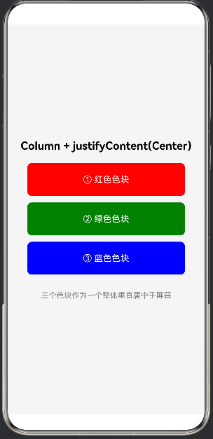
二、ArkTS 布局体系概述
2.1 声明式布局核心思想
ArkTS 采用声明式 UI 范式。开发者只需要描述"UI 应该是什么样的",框架会自动处理"UI 如何变成这样"。布局容器(Column、Row、Stack、Flex、Grid 等)负责决定子组件的排列方式和对齐策略。
2.2 主轴与交叉轴
理解 Column 布局,首先要理解主轴和交叉轴:
容器类型 主轴方向 交叉轴方向
Column 垂直(从上到下) 水平(从左到右)
Row 水平(从左到右) 垂直(从上到下)
Column 的主轴是垂直方向,子组件沿垂直方向依次排列。控制主轴对齐用 justifyContent,控制交叉轴对齐用 alignItems。
2.3 常用布局容器
容器 特点 适用场景
Column 纵向线性排列 列表、表单、信息流
Row 横向线性排列 导航栏、标签栏、按钮组
Stack 层叠排列 头像叠加、卡片徽标
Flex 弹性布局,支持换行 自适应布局、流式标签
Grid 网格布局 宫格导航、图片墙
RelativeContainer 相对定位 精确控制子组件位置
三、Column 容器详解
3.1 基本用法
Column() {
  Text('子组件1')
  Text('子组件2')
  Text('子组件3')
}
.width('100%')
.height('100%')
3.2 justifyContent — 主轴对齐
justifyContent 控制子组件在垂直方向上的排列方式,值定义在 FlexAlign 枚举中:
FlexAlign 值 效果
Start(默认) 从顶部开始排列
Center 整体垂直居中
End 从底部开始排列
SpaceBetween 均匀分布,两端无空隙
SpaceAround 均匀分布,两端有空隙(为中间的一半)
SpaceEvenly 均匀分布,两端空隙相等
3.3 alignItems — 交叉轴对齐
HorizontalAlign 值 效果
Start 靠左对齐
Center(默认) 水平居中
End 靠右对齐
3.4 其他重要属性
width / height:容器宽高,通常设为 ‘100%’。
padding:内边距。
space:子组件间距,通过 Column({ space: 值 }) 设置。
clip:是否裁剪超出内容,默认 true。
constraintSize:尺寸约束,限制最大最小宽高。
3.5 Column 嵌套
Column() {
  Column() {
    Text('标题')
    Text('副标题')
  }
  .alignItems(HorizontalAlign.Center)

  Column() {
    // 内容组件
  }
  .layoutWeight(1)

  Text('确认按钮')
}
.width('100%').height('100%')
四、justifyContent(FlexAlign.Center) 深度解析
4.1 工作原理
当设置 justifyContent(FlexAlign.Center) 时,Column 将所有子组件视为整体块,在整体块高度小于容器高度时,将其垂直居中放置。计算过程:
计算子组件总高度(含间距和内边距)。
计算容器可用高度。
若子组件总高度 ≥ 容器可用高度,退化为顶部对齐。
若子组件总高度 < 容器可用高度,剩余空间均分到整体块上下两侧。
4.2 与 alignItems 协同实现完全居中
Column() {
  Text('完全居中')
}
.width('100%').height('100%')
.justifyContent(FlexAlign.Center)
.alignItems(HorizontalAlign.Center)
此时子组件处于容器的正中心,常用于欢迎页、加载提示、错误页、成功提示。
4.3 子组件数量的影响
单个子组件:完美居中。
多个子组件:整体居中,相对顺序和间距不变。
总高度接近容器高度:居中效果减弱,超过后退化为顶部对齐。
4.4 与 space 组合
Column({ space: 16 }) {
  Text('子组件1')
  Text('子组件2')
  Text('子组件3')
}
.width('100%').height('100%')
.justifyContent(FlexAlign.Center)
子组件间保持 16vp 间距,整体垂直居中。
五、实战代码示例
5.1 登录页面
@Entry
@Component
struct LoginPage {
  build() {
    Column() {
      Text('欢迎登录').fontSize(28).fontWeight(FontWeight.Bold)
        .margin({ bottom: 40 })
      TextInput({ placeholder: '请输入用户名' })
        .width('85%').height(48).backgroundColor('#F5F5F5')
        .borderRadius(8).margin({ bottom: 16 })
      TextInput({ placeholder: '请输入密码' })
        .width('85%').height(48).backgroundColor('#F5F5F5')
        .borderRadius(8).type(InputType.Password)
        .margin({ bottom: 24 })
      Button('登录').width('85%').height(48)
        .backgroundColor(Color.Blue).fontColor(Color.White).borderRadius(8)
    }
    .width('100%').height('100%')
    .justifyContent(FlexAlign.Center)
    .alignItems(HorizontalAlign.Center)
    .backgroundColor(Color.White)
  }
}
登录表单整体居中,用户视线自然聚焦于屏幕中央的操作区域。
5.2 空状态页面
@Entry
@Component
struct EmptyStatePage {
  build() {
    Column() {
      Text('暂无数据').fontSize(20).fontWeight(FontWeight.Medium)
        .margin({ bottom: 12 })
      Text('当前还没有任何内容,快去创建吧')
        .fontSize(14).fontColor('#999999').margin({ bottom: 32 })
      Button('立即创建').width(160).height(44)
        .backgroundColor(Color.Blue).fontColor(Color.White).borderRadius(22)
    }
    .width('100%').height('100%')
    .justifyContent(FlexAlign.Center)
    .alignItems(HorizontalAlign.Center)
    .backgroundColor('#FAFAFA')
  }
}
5.3 加载提示与结果反馈
// 加载提示
@Entry
@Component
struct LoadingPage {
  build() {
    Column() {
      LoadingProgress().width(48).height(48).color(Color.Blue).margin({ bottom: 16 })
      Text('正在加载中...').fontSize(16).fontColor('#666666')
    }
    .width('100%').height('100%')
    .justifyContent(FlexAlign.Center)
    .alignItems(HorizontalAlign.Center)
    .backgroundColor(Color.White)
  }
}
// 结果反馈
@Entry
@Component
struct ResultPage {
  private isSuccess: boolean = true
  build() {
    Column() {
      Text(this.isSuccess ? '✓' : '✗').fontSize(64)
        .fontColor(this.isSuccess ? Color.Green : Color.Red)
        .margin({ bottom: 20 })
      Text(this.isSuccess ? '操作成功' : '操作失败')
        .fontSize(24).fontWeight(FontWeight.Bold).margin({ bottom: 12 })
      Text(this.isSuccess ? '您的操作已成功完成' : '请稍后重试')
        .fontSize(15).fontColor('#999999').margin({ bottom: 40 })
      Button('返回首页').width(200).height(44)
        .backgroundColor(Color.Blue).fontColor(Color.White).borderRadius(22)
    }
    .width('100%').height('100%')
    .justifyContent(FlexAlign.Center)
    .alignItems(HorizontalAlign.Center)
    .backgroundColor(Color.White)
  }
}
六、与其他对齐方式的对比
6.1 Start vs Center
维度 Start Center
位置 顶部 垂直居中
适用场景 信息流、列表 独立卡片、表单、提示
连续信息流用 Start,独立任务用 Center。
6.2 End vs Center
End 将子组件放在容器底部,适合底部导航栏;Center 适合无位置偏倚的居中展示。
6.3 Space 系列 vs Center
分布方式 子组件间隙 两端间隙
SpaceBetween 均匀 无
SpaceAround 均匀 为间隙一半
SpaceEvenly 均匀 等于间隙
Center 不额外增加 均分剩余空间
Center 适合子组件间已有固定间距的场景;Space 系列适合子组件均匀展开。
6.4 决策树
需要垂直居中?
├── 是 → justifyContent(FlexAlign.Center)
│ ├── 需水平居中? → 加 alignItems(HorizontalAlign.Center)
│ └── 否则 → 按需设置 alignItems
│
└── 否 →
├── 顶部排列 → Start(默认)
├── 底部排列 → End
├── 均匀占满 → SpaceBetween / Around / Evenly
└── 精确控制 → Stack / RelativeContainer
七、最佳实践
7.1 避免过度嵌套
Column 嵌套层级建议控制在 3~5 层以内。优先使用 layoutWeight 分配空间,使用 constraintSize 限制容器尺寸。
7.2 合理使用 layoutWeight
Column() {
  Text('头部').layoutWeight(1)
  Text('中间').layoutWeight(2)
  Text('底部').layoutWeight(1)
}
.width('100%').height(400)
7.3 性能注意点
justifyContent(FlexAlign.Center) 本身无额外开销。但子组件总高度频繁变化会导致反复计算居中位置,可能引起布局抖动,建议给容器设置固定高度。
7.4 封装通用居中容器
@Component
struct CenterLayout {
  @BuilderParam content: () => void = this.emptyBuilder
  @Builder emptyBuilder() {}
  build() {
    Column() {
      this.content()
    }
    .width('100%').height('100%')
    .justifyContent(FlexAlign.Center)
    .alignItems(HorizontalAlign.Center)
  }
}
// 使用
CenterLayout() { Text('居中布局').fontSize(20) }
7.5 响应式适配
横竖屏:百分比宽度子组件加 constraintSize({ maxWidth: 400 })。
键盘弹出:监听键盘高度动态调整 padding。
7.6 动画结合
@Entry
@Component
struct AnimatedCenterPage {
  @State isVisible: boolean = false
  aboutToAppear() {
    animateTo({ duration: 500 }, () => { this.isVisible = true })
  }
  build() {
    Column() {
      if (this.isVisible) {
        Text('动画居中展示').fontSize(24).fontWeight(FontWeight.Bold)
          .margin({ bottom: 16 })
          .transition({ type: TransitionType.Insert, opacity: 0, translate: { y: 30 } })
      }
    }
    .width('100%').height('100%')
    .justifyContent(FlexAlign.Center)
    .alignItems(HorizontalAlign.Center)
    .backgroundColor(Color.White)
  }
}
八、常见问题
8.1 子组件未居中
原因:容器高度不足、父容器约束限制、与 layoutWeight 混用。 解决:确保容器高度足够,检查父容器约束,避免混用。
8.2 内容超出边界
使用 Scroll 包装 Column:
Scroll() {
  Column() { /* 子组件 */ }
    .width('100%').justifyContent(FlexAlign.Center)
}
.width('100%').height('100%')
8.3 键盘导致偏移
使用 expandSafeArea 或监听键盘高度动态调整 padding。
8.4 横竖屏适配
使用 breakpointSystem 监控尺寸变化,横屏可切换为 Row 配合 alignItems(VerticalAlign.Center)。
九、Column + Row 组合实现卡片布局
Column() {
  Column() {
    Row() {
      Text('头像').fontSize(20)
      Column() {
        Text('用户名').fontSize(16).fontWeight(FontWeight.Medium)
        Text('在线').fontSize(12).fontColor(Color.Gray)
      }
      .alignItems(HorizontalAlign.Start).margin({ left: 12 })
      Blank()
      Text('关注').fontSize(14).fontColor(Color.Blue)
    }
    .width('100%').alignItems(VerticalAlign.Center).margin({ bottom: 16 })

    Text('这是卡片内容文字,可以展示各种信息。')
      .fontSize(15).fontColor('#333333').lineHeight(22).margin({ bottom: 16 })

    Row() {
      Text('👍 点赞'); Blank()
      Text('💬 评论'); Blank()
      Text('↗ 分享')
    }
    .width('100%').fontSize(14).fontColor('#666666')
  }
  .width('90%').padding(16)
  .backgroundColor(Color.White).borderRadius(12)
  .shadow({ radius: 6, color: '#20000000' })
}
.width('100%').height('100%')
.justifyContent(FlexAlign.Center)
.alignItems(HorizontalAlign.Center)
.backgroundColor('#F0F0F0')
外层 Column 负责卡片整体居中,内层 Column 纵向排列各区域,Row 水平排列元素。
十、总结
Column 主轴为垂直方向,justifyContent 控制垂直对齐。
FlexAlign.Center 将子组件整体垂直居中,适合登录页、空状态、加载提示等。
配合 alignItems(Center) 实现完全居中,是最常用组合。
容器高度须大于子组件总高度,否则居中失效。
合理嵌套 Column 和 Row 可实现丰富布局。
关注适配,注意键盘弹出和横竖屏切换。
附录
A. FlexAlign 枚举
值 说明
Start 起始端对齐(默认)
Center 居中对齐
End 末端对齐
SpaceBetween 均匀分布,两端无空隙
SpaceAround 均匀分布,两端空隙为中间一半
SpaceEvenly 均匀分布,两端空隙相等
B. 常用布局属性
属性 说明 默认值
width / height 容器宽高 自适应
justifyContent 主轴对齐 FlexAlign.Start
alignItems 交叉轴对齐 HorizontalAlign.Center
space 子组件间距 0
padding 内边距 0
layoutWeight 空间权重 0
constraintSize 尺寸约束 无
clip 裁剪超出内容 true
C. 参考资源
鸿蒙开发者官网:https://developer.harmonyos.com/
源码:entry/src/main/ets/pages/ColumnCenter.ets

作为“人工智能6S店”的官方数字引擎,为AI开发者与企业提供一个覆盖软硬件全栈、一站式门户。
更多推荐
 1
1 0
0- 0


 已为社区贡献2条内容

所有评论(0)