
鸿蒙新特性:SideBarContainer 侧边栏导航深度解析
随着 HarmonyOS 向大屏、折叠屏、平板场景扩展,传统的单栏布局已经不够用了。SideBarContainer 是 HarmonyOS NEXT 为多栏布局设计的新组件——左侧可收起/展开的侧边栏 + 右侧内容区域,内置动画、拖拽调整宽度、控制按钮自动管理。本文用它构建一个"知识库浏览器",展示侧边栏导航的完整设计模式。
一、为什么需要 SideBarContainer?
在手机 App 中,我们习惯了"一个页面一个页面地跳"——列表页 → 详情页 → 返回。这种栈式导航在手机上没问题,因为屏幕窄,一次只能看一个页面。
但在平板上横屏时,屏幕宽度超过 800vp,你有足够的空间同时展示左侧菜单和右侧内容。这时候如果还是全屏跳转,用户会感觉"浪费了半边的屏幕"。
SideBarContainer 解决的就是这个问题:双栏布局 + 侧边栏可控。
// SideBarContainer 的核心 API
SideBarContainer(type: SideBarContainerType) {
  // 第一个子组件:侧边栏
  Column() { /* 菜单列表 */ }

  // 第二个子组件:内容区域
  Column() { /* 主体内容 */ }
}
.sideBarWidth(240)      // 侧边栏宽度
.showSideBar(true)      // 控制显隐
.controlButton(...)      // 自动显示/隐藏按钮
.autoHide(true)          // 小屏自动隐藏
.onChange((isOpen) => {  // 展开/收起回调
  console.log('侧边栏:', isOpen ? '展开' : '收起');
})
二、SideBarContainerType 三种模式
| 模式 | 行为 | 适用场景 |
|---|---|---|
Embed |
侧边栏嵌入内容区旁边,展开时内容区自动缩小 | 平板横屏,侧边栏常驻 |
Overlay |
侧边栏覆盖在内容区上方,不影响内容区宽度 | 手机竖屏,侧边栏临时弹出 |
AUTO |
自动选择:宽屏用 Embed,窄屏用 Overlay | 需要自适应不同屏幕尺寸 |
AUTO 是推荐的默认选择——应用在手机上运行时侧边栏覆盖弹出,在平板上运行时侧边栏嵌入显示。一套代码适配多设备。
三、SideBarContainer 的核心属性
sideBarWidth / minSideBarWidth / maxSideBarWidth
SideBarContainer() { ... }
  .sideBarWidth(240)          // 默认宽度 240vp
  .minSideBarWidth(200)        // 最小宽度(用户拖拽下限)
  .maxSideBarWidth(360)        // 最大宽度(用户拖拽上限)
用户可以在 minSideBarWidth 和 maxSideBarWidth 之间拖拽调整侧边栏宽度。这给用户提供了灵活性——有的用户喜欢宽一点的菜单,有的喜欢窄一点的。
showControlButton / controlButton
SideBarContainer() { ... }
  .showControlButton(true)     // 在侧边栏边缘显示控制按钮
  .controlButton({             // 自定义控制按钮样式
    left: 8,                   // 按钮距左侧距离
    top: 120,                  // 按钮距顶部距离
    width: 32,
    height: 32,
    icons: {
      shown: $r('sys.symbol.sidebar_left'),   // 侧边栏展开时的图标
      hidden: $r('sys.symbol.sidebar_right'),  // 侧边栏收起时的图标
    }
  })
controlButton 是一个悬浮在侧边栏边缘的半圆形按钮。当侧边栏隐藏时,它出现在屏幕左边缘,点击可以呼出侧边栏。不需要自己写按钮 + 动画——SideBarContainer 已经内置了。
autoHide
SideBarContainer() { ... }
  .autoHide(true)    // 小屏设备(宽度 < 600vp)自动隐藏侧边栏
在手机上自动隐藏侧边栏,在平板上自动显示。配合 controlButton,用户可以在手机上通过按钮临时呼出侧边栏。
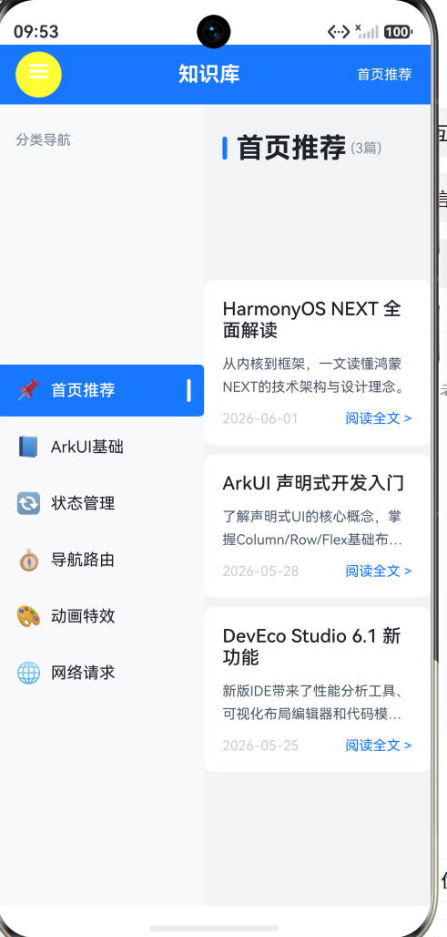
四、Demo:知识库浏览器
本 Demo 用一个手动实现的侧边栏来模拟 SideBarContainer 的核心行为——侧边栏切换、内容联动、动画过渡。
页面结构
SideBarPage (~220行)
├── Header(☰ 切换按钮 + 标题 + 当前分类名)
├── Row
│ ├── 侧边栏 (180vp)
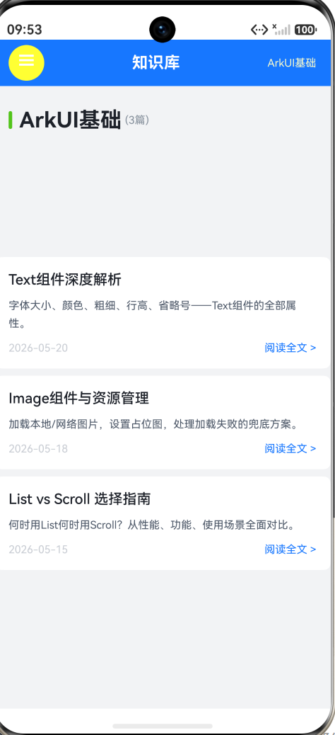
│ │ ├── 分类标题
│ │ └── 6 个分类菜单项(首页/基础/状态/导航/动画/网络)
│ └── 内容区 (弹性宽度)
│ ├── 分类标题栏(彩色装饰条 + 分类名 + 文章数)
│ └── Scroll > 文章卡片 × N
侧边栏的显示/隐藏动画
animation() 属性让宽度变化产生平滑过渡:
Column()  // 侧边栏容器
  .width(this.sidebarOpen ? 180 : 0)
  .height('100%')
  .backgroundColor('#F8F9FA')
  .clip(true)                                       // 隐藏溢出内容
  .animation({ duration: 250, curve: Curve.EaseInOut })  // 250ms 动画
关键点:
width(180 → 0)— 从 180vp 收缩到 0vpclip(true)— 当宽度缩小时,内部文字不会溢出到内容区animation({ duration: 250 })— 250 毫秒的缓动过渡,让收缩看起来像"滑入滑出"
真正的 SideBarContainer 内置了这个动画,不需要手动写 animation()。
分类菜单的选中态
ForEach(CATEGORIES, (cat: Category, index: number) => {
  Row() {
    Text(cat.icon)          // 图标
    Text(cat.name)          // 名称

    if (index === this.selectedIndex) {
      Row()                 // 选中指示条
        .width(3).height(20)
        .borderRadius(2)
        .backgroundColor(Color.White)
    }
  }
  .backgroundColor(index === this.selectedIndex ?
    AppColors.PRIMARY : Color.Transparent)   // 选中:蓝色背景
  .onClick(() => {
    this.selectedIndex = index;
    this.sidebarOpen = false;                // 选中后收起侧边栏
  })
})
三个选中态视觉元素:
- 蓝色背景(
AppColors.PRIMARY) - 文字变白色(
fontColor(Color.White)) - 右侧白色竖条指示器(3vp 宽,20vp 高)
点击分类后的行为:切换内容 + 自动收起侧边栏。这在手机上尤为重要——用户选了分类后,侧边栏应该自动收起来,把屏幕空间还给内容。
内容区的文章卡片
ForEach(CATEGORIES[this.selectedIndex].articles, (article: Article) => {
  Column() {
    Text(article.title)           // 标题(加粗)
    Text(article.summary)         // 摘要(灰色,最多 2 行)
      .maxLines(2)
      .textOverflow({ overflow: TextOverflow.Ellipsis })
    Row() {
      Text(article.date)          // 日期(灰色小字)
      Blank()
      Text('阅读全文 >')          // CTA(蓝色)
    }
  }
  .padding(Spacing.LG)
  .backgroundColor(Color.White)
  .borderRadius(BorderRadius.MD)
  .onClick(() => { /* 弹窗展示详情 */ })
})
卡片结构:
- 标题(
FontSize.MEDIUM+FontWeight.Medium) - 摘要(
FontSize.CAPTION+ 灰色 +maxLines(2)限制高度) - 底部栏:日期在左,CTA 在右(
Blank()实现两端对齐) - 整张卡片可点击,弹窗展示完整内容
数据结构
class Article {
  title: string;    // 标题
  summary: string;  // 摘要
  date: string;     // 日期
}

class Category {
  name: string;      // 分类名
  icon: string;      // emoji 图标
  color: string;     // 装饰色
  articles: Article[]; // 该分类下的文章
}
6 个分类,共 15 篇文章,预置数据。真实应用中,这些数据会从后端 API 拉取。
五、完整代码
import { AppColors, BorderRadius, FontSize, Spacing } from '../common/Constants';
import { promptAction } from '@kit.ArkUI';
class Article {
title: string;
summary: string;
date: string;
constructor(title: string, summary: string, date: string) {
this.title = title;
this.summary = summary;
this.date = date;
}
}
class Category {
name: string;
icon: string;
color: string;
articles: Article[];
constructor(name: string, icon: string, color: string, articles: Article[]) {
this.name = name;
this.icon = icon;
this.color = color;
this.articles = articles;
}
}
const CATEGORIES: Category[] = [
new Category('首页推荐', '📌', '#1677FF', [
new Article('HarmonyOS NEXT 全面解读',
'从内核到框架,一文读懂鸿蒙NEXT的技术架构与设计理念。', '2026-06-01'),
new Article('ArkUI 声明式开发入门',
'了解声明式UI的核心概念,掌握Column/Row/Flex基础布局。', '2026-05-28'),
new Article('DevEco Studio 6.1 新功能',
'新版IDE带来了性能分析工具、可视化布局编辑器和代码模板。', '2026-05-25'),
]),
new Category('ArkUI基础', '📘', '#52C41A', [
new Article('Text组件深度解析',
'字体大小、颜色、粗细、行高、省略号——Text组件全部属性详解。', '2026-05-20'),
new Article('Image组件与资源管理',
'加载本地/网络图片,设置占位图,处理加载失败的兜底方案。', '2026-05-18'),
new Article('List vs Scroll 选择指南',
'何时用List何时用Scroll?从性能、功能、场景全面对比。', '2026-05-15'),
]),
new Category('状态管理', '🔄', '#FAAD14', [
new Article('@State与@Prop的通信模型',
'父子组件数据传递的两种方式:单向同步与双向绑定。', '2026-05-12'),
new Article('@ObservedV2 新特性实战',
'属性级响应式——修改一个boolean不再重建整个列表。', '2026-05-10'),
new Article('全局状态管理方案对比',
'AppStorage、PersistentStorage、LocalStorage的应用场景。', '2026-05-08'),
]),
new Category('导航路由', '🧭', '#FF4D4F', [
new Article('Navigation导航框架入门',
'NavPathStack替代Router——HarmonyOS NEXT的路由新范式。', '2026-05-05'),
new Article('Deep Link 深度链接实现',
'从外部URL唤起App并跳转到指定页面的完整方案。', '2026-05-02'),
]),
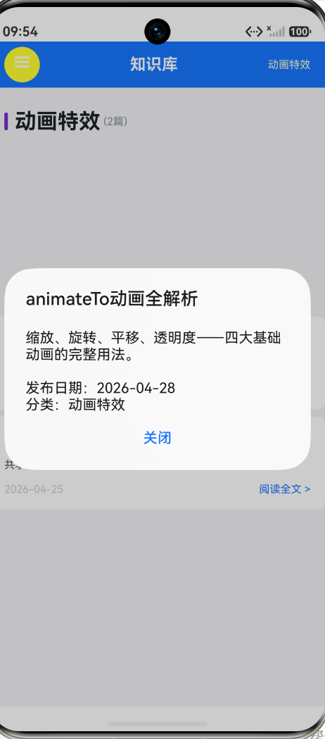
new Category('动画特效', '🎨', '#722ED1', [
new Article('animateTo动画全解析',
'缩放、旋转、平移、透明度——四大基础动画的完整用法。', '2026-04-28'),
new Article('页面转场动画设计',
'共享元素过渡、自定义转场、手势驱动的交互式动画。', '2026-04-25'),
]),
new Category('网络请求', '🌐', '#13C2C2', [
new Article('HTTP请求与拦截器封装',
'使用@kit.NetworkKit发送请求,封装统一错误处理和Token刷新。', '2026-04-22'),
new Article('WebSocket实时通信',
'基于WebSocket的聊天室、股票行情等实时推送场景。', '2026-04-20'),
new Article('文件上传与下载进度',
'大文件分片上传、断点续传、下载进度条展示。', '2026-04-18'),
]),
];
@Entry
@Component
struct SideBarPage {
@State selectedIndex: number = 0;
@State sidebarOpen: boolean = true;
build() {
Column() {
Row() {
Text('☰')
.fontSize(22)
.fontColor(Color.White)
.width(40).height(40)
.borderRadius(20)
.backgroundColor('#FFFFFF33')
.textAlign(TextAlign.Center)
.onClick(() => { this.sidebarOpen = !this.sidebarOpen; })
Text('知识库')
.fontSize(FontSize.TITLE)
.fontWeight(FontWeight.Bold)
.fontColor(Color.White)
.layoutWeight(1)
.textAlign(TextAlign.Center)
Text(CATEGORIES[this.selectedIndex].name)
.fontSize(FontSize.CAPTION)
.fontColor('#FFFFFFCC')
}
.width('100%').height(52)
.backgroundColor(AppColors.PRIMARY)
.padding({ left: Spacing.LG, right: Spacing.LG })
Row() {
Column() {
Text('分类导航')
.fontSize(FontSize.CAPTION)
.fontColor(AppColors.TEXT_TERTIARY)
.fontWeight(FontWeight.Medium)
.width('100%')
.padding({ left: Spacing.LG, top: Spacing.XXL, bottom: Spacing.MD })
Scroll() {
Column() {
ForEach(CATEGORIES, (cat: Category, index: number) => {
Row() {
Text(cat.icon).fontSize(18).margin({ right: Spacing.SM })
Text(cat.name)
.fontSize(FontSize.BODY)
.fontColor(index === this.selectedIndex ? Color.White :
AppColors.TEXT_PRIMARY)
.fontWeight(index === this.selectedIndex ?
FontWeight.Medium : FontWeight.Regular)
.layoutWeight(1)
if (index === this.selectedIndex) {
Row().width(3).height(20).borderRadius(2)
.backgroundColor(Color.White)
}
}
.width('100%')
.padding({ left: Spacing.LG, right: Spacing.MD,
top: Spacing.MD, bottom: Spacing.MD })
.borderRadius(BorderRadius.SM)
.backgroundColor(index === this.selectedIndex ?
AppColors.PRIMARY : Color.Transparent)
.margin({ left: Spacing.SM, right: Spacing.SM, bottom: Spacing.XS })
.onClick(() => {
this.selectedIndex = index;
this.sidebarOpen = false;
})
})
}.width('100%')
}
.layoutWeight(1).scrollBar(BarState.Off).width('100%')
}
.width(this.sidebarOpen ? 180 : 0)
.height('100%')
.backgroundColor('#F8F9FA')
.clip(true)
.animation({ duration: 250, curve: Curve.EaseInOut })
Column() {
Row() {
Row().width(4).height(20).borderRadius(2)
.backgroundColor(CATEGORIES[this.selectedIndex].color)
.margin({ right: Spacing.SM })
Text(CATEGORIES[this.selectedIndex].name)
.fontSize(FontSize.HEADLINE).fontWeight(FontWeight.Bold)
.fontColor(AppColors.TEXT_PRIMARY)
Text(` (${CATEGORIES[this.selectedIndex].articles.length}篇)`)
.fontSize(FontSize.CAPTION).fontColor(AppColors.TEXT_TERTIARY)
}
.width('100%')
.padding({ left: Spacing.LG, top: Spacing.XXL, bottom: Spacing.LG })
Scroll() {
Column() {
ForEach(CATEGORIES[this.selectedIndex].articles,
(article: Article) => {
Column() {
Text(article.title)
.fontSize(FontSize.MEDIUM).fontColor(AppColors.TEXT_PRIMARY)
.fontWeight(FontWeight.Medium)
.width('100%').margin({ bottom: Spacing.SM })
Text(article.summary)
.fontSize(FontSize.CAPTION)
.fontColor(AppColors.TEXT_SECONDARY)
.width('100%').maxLines(2)
.textOverflow({ overflow: TextOverflow.Ellipsis })
.lineHeight(20)
Row() {
Text(article.date)
.fontSize(FontSize.CAPTION)
.fontColor(AppColors.TEXT_DISABLED)
Blank()
Text('阅读全文 >')
.fontSize(FontSize.CAPTION)
.fontColor(AppColors.PRIMARY)
}
.width('100%').margin({ top: Spacing.MD })
}
.width('100%').padding(Spacing.LG)
.backgroundColor(Color.White).borderRadius(BorderRadius.MD)
.margin({ left: Spacing.LG, right: Spacing.LG, bottom: Spacing.SM })
.onClick(() => {
promptAction.showDialog({
title: article.title,
message: article.summary +
'\n\n发布日期:' + article.date +
'\n分类:' + CATEGORIES[this.selectedIndex].name,
buttons: [{ text: '关闭', color: AppColors.PRIMARY }]
});
})
})
}
.width('100%').padding({ bottom: Spacing.XXL })
}
.layoutWeight(1).scrollBar(BarState.Off).width('100%')
}
.layoutWeight(1).height('100%')
.backgroundColor(AppColors.BACKGROUND)
}
.layoutWeight(1).width('100%')
}
.width('100%').height('100%')
}
}
六、常见面试题 / 踩坑点
6.1 SideBarContainer 的两个子组件怎么区分?
SideBarContainer 的第一个子组件是侧边栏,第二个是内容区。顺序不能颠倒——如果把内容放在第一个,侧边栏放在第二个,侧边栏会出现在右边而不是左边。
6.2 如何实现在手机上自动隐藏侧边栏?
三种方式:
autoHide(true)— 让框架根据屏幕宽度自动判断(最简单)- 手动监听
onChange回调 + 在手机上设置showSideBar(false) - 使用
SideBarContainerType.AUTO自动选择模式
6.3 侧边栏的宽度能否随用户拖拽改变?
可以。设置 minSideBarWidth 和 maxSideBarWidth,用户可以在两者之间拖拽调整。不设置这两个属性的话,侧边栏宽度固定为 sideBarWidth,不可拖拽。
6.4 SideBarContainer 会影响页面的路由导航吗?
不影响。SideBarContainer 管理的是同一页面内的双栏布局,和页面间的路由导航(router 或 NavPathStack)是两个独立的系统。可以在 SideBarContainer 的内容区中使用 router.pushUrl 或 NavPathStack.pushPath 进行页面跳转。
七、总结
SideBarContainer 是 HarmonyOS NEXT 面向多设备、多屏幕尺寸的重要布局组件。它的核心价值有三点:
1. 双栏布局的统一抽象。 不再需要手动管理 Row + 动画 + 响应式判断。SideBarContainer 内置了左右栏的布局、动画、拖拽、自适应逻辑,开发者只需要关心两个子组件的内容。
2. 一套代码,多设备适配。 配合 SideBarContainerType.AUTO 和 autoHide(true),应用在手机上侧边栏自动覆盖弹出,在平板上侧边栏自动嵌入显示。不用写 if (isTablet) { ... } else { ... } 的设备判断。
3. 内置控制按钮。 侧边栏隐藏时屏幕边缘自动出现呼出按钮——不需要自己写悬浮按钮 + 动画 + 手势。controlButton 属性提供了开箱即用的控制体验。
SideBarContainer 特别适合以下场景:
- 知识库/文档浏览器(本文 Demo)
- 邮件客户端(左侧文件夹列表 + 右侧邮件内容)
- 聊天应用(左侧会话列表 + 右侧聊天窗口)
- 管理后台(左侧菜单 + 右侧数据面板)
对于手机端应用,即使在竖屏下侧边栏是覆盖模式(而非嵌入模式),SideBarContainer 仍然比全屏跳转更高效——用户可以在不离开当前页面的情况下快速切换分类/文件夹/会话,减少导航的认知负担。

作为“人工智能6S店”的官方数字引擎,为AI开发者与企业提供一个覆盖软硬件全栈、一站式门户。
更多推荐
 3
3 0
0- 0


 已为社区贡献138条内容

所有评论(0)