
鸿蒙 PC 避坑:setPreferredOrientation 横竖屏设置完全无效详解
摘要: 本文分析了开源鸿蒙PC端应用无法通过setPreferredOrientationAPI实现横竖屏切换的问题。在手机/平板端调用该API可正常生效,但在PC/2in1设备上虽返回成功却无实际效果。文中提供了两种测试代码: EntryAbility初始化设置:在应用启动时尝试设置竖屏/横屏,PC端会忽略配置; 页面交互设置:通过按钮触发方向切换,同样无效。 结论:当前鸿蒙PC端暂不支持此AP
欢迎加入开源鸿蒙PC社区:
https://harmonypc.csdn.net/
atomgit仓库地址: https://gitcode.com/gcw_7DJ1SfsY/setPreferredOrientationPCError
前言
在开发鸿蒙应用时,横竖屏切换是一个常见的需求。手机端应用通常需要锁定竖屏或横屏,或者根据内容自动切换方向。然而,当我们将应用部署到 PC 端(2in1 设备)时,会发现一个令人困惑的问题:调用 setPreferredOrientation API 设置横竖屏完全没有任何效果。
本文将详细分析这个问题的原因,并提供正确的解决方案和最佳实践。
问题现象
1. API 调用成功但无效
在 PC 端运行应用时,调用 setPreferredOrientation 设置窗口方向:
// 尝试设置竖屏
mainWindow.setPreferredOrientation(window.Orientation.PORTRAIT, (err: BusinessError) => {
  if (err) {
    hilog.error(DOMAIN, 'testTag', '设置失败: %{public}s', JSON.stringify(err));
  } else {
    hilog.info(DOMAIN, 'testTag', '设置成功 - 但窗口方向没有任何改变!');
  }
});
现象:
- API 调用返回成功(没有错误)
- 但窗口方向完全没有变化
- 无论设置 PORTRAIT、LANDSCAPE 还是其他值,都无效
2. 多种调用方式都无效
尝试了多种调用方式,结果都一样:
// 方式1:通过 window 对象调用
mainWindow.setPreferredOrientation(window.Orientation.PORTRAIT);

// 方式2:使用 Promise 方式
mainWindow.setPreferredOrientation(window.Orientation.LANDSCAPE)
  .then(() => {
    console.info('设置成功');
  })
  .catch((err: BusinessError) => {
    console.error('设置失败', err);
  });

// 方式3:使用 Callback 方式
mainWindow.setPreferredOrientation(window.Orientation.PORTRAIT, (err) => {
  // ...
});
所有方式都是:API 调用成功,但窗口方向不变。
3. 手机端正常,PC端异常
同样的代码,在手机和平板上运行时:
- ✅ 设置竖屏:窗口立即变为竖屏
- ✅ 设置横屏:窗口立即变为横屏
- ✅ 设置自动:跟随设备传感器旋转
但在 PC 端(2in1 设备):
- ❌ 设置竖屏:无任何变化
- ❌ 设置横屏:无任何变化
- ❌ 设置自动:无任何变化
核心代码说明
代码一:EntryAbility 中的初始化设置
在应用启动时尝试设置窗口方向:
import { AbilityConstant, UIAbility, Want } from '@kit.AbilityKit';
import { hilog } from '@kit.PerformanceAnalysisKit';
import { window } from '@kit.ArkUI';
import { BusinessError } from '@kit.BasicServicesKit';

const DOMAIN = 0x0000;

export default class EntryAbility extends UIAbility {
  onWindowStageCreate(windowStage: window.WindowStage): void {
    hilog.info(DOMAIN, 'testTag', 'Ability onWindowStageCreate');

    // 获取主窗口
    windowStage.getMainWindow((err: BusinessError, mainWindow: window.Window) => {
      if (err) {
        hilog.error(DOMAIN, 'testTag', 'Failed to get main window. Cause: %{public}s', JSON.stringify(err));
        return;
      }

      // 尝试设置为竖屏
      hilog.info(DOMAIN, 'testTag', 'Attempting to set orientation to PORTRAIT...');
      mainWindow.setPreferredOrientation(window.Orientation.PORTRAIT, (err: BusinessError) => {
        if (err) {
          hilog.error(DOMAIN, 'testTag', 'setPreferredOrientation failed: %{public}s', JSON.stringify(err));
        } else {
          hilog.info(DOMAIN, 'testTag', 'API called successfully - BUT NO EFFECT ON PC!');
        }
      });

      // 尝试设置为横屏
      hilog.info(DOMAIN, 'testTag', 'Attempting to set orientation to LANDSCAPE...');
      mainWindow.setPreferredOrientation(window.Orientation.LANDSCAPE, (err: BusinessError) => {
        if (err) {
          hilog.error(DOMAIN, 'testTag', 'setPreferredOrientation to LANDSCAPE failed: %{public}s', JSON.stringify(err));
        } else {
          hilog.info(DOMAIN, 'testTag', 'LANDSCAPE orientation set - STILL NO EFFECT ON PC!');
        }
      });
    });

    windowStage.loadContent('pages/Index', (err) => {
      if (err.code) {
        hilog.error(DOMAIN, 'testTag', 'Failed to load the content. Cause: %{public}s', JSON.stringify(err));
        return;
      }
      hilog.info(DOMAIN, 'testTag', 'Succeeded in loading the content.');
    });
  }
}
说明:
- 在
onWindowStageCreate生命周期中获取主窗口 - 尝试设置 PORTRAIT 和 LANDSCAPE 两种方向
- PC 端会忽略这些设置
代码二:页面中的交互式设置
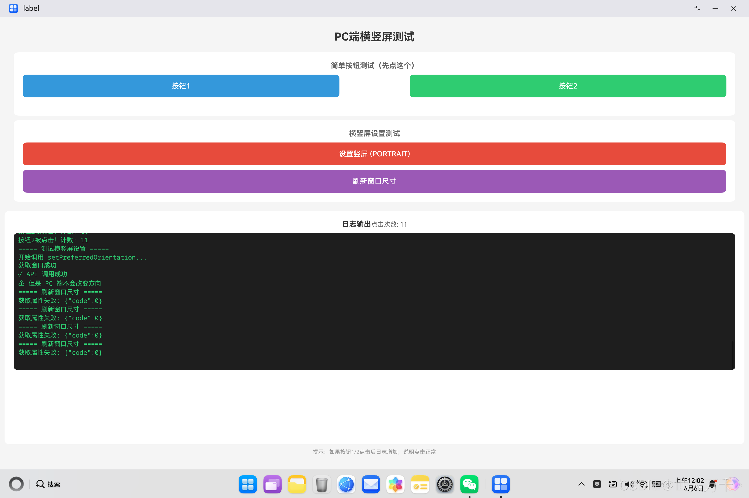
在页面中提供按钮让用户手动切换方向:
import { window } from '@kit.ArkUI';
import { hilog } from '@kit.PerformanceAnalysisKit';
import { BusinessError } from '@kit.BasicServicesKit';
import { common } from '@kit.AbilityKit';

const DOMAIN = 0x0000;

@Entry
@Component
struct Index {
  @State clickCount: number = 0;
  @State logText: string = '点击下方按钮开始测试\n\n';

  addLog(message: string) {
    this.logText += message + '\n';
    hilog.info(DOMAIN, 'testTag', '%{public}s', message);
  }

  testOrientation() {
    this.addLog('===== 测试横竖屏设置 =====');
    this.addLog('开始调用 setPreferredOrientation...');

    try {
      const context = getContext(this) as common.UIAbilityContext;
      window.getLastWindow(context).then((win: window.Window) => {
        this.addLog('获取窗口成功');

        // 尝试设置竖屏
        win.setPreferredOrientation(window.Orientation.PORTRAIT).then(() => {
          this.addLog('✓ API 调用成功');
          this.addLog('⚠ 但是 PC 端不会改变方向');
        }).catch((err: BusinessError) => {
          this.addLog('✗ 调用失败: ' + err.message);
        });

      }).catch((err: BusinessError) => {
        this.addLog('✗ 获取窗口失败: ' + JSON.stringify(err));
      });
    } catch (e) {
      this.addLog('异常: ' + JSON.stringify(e));
    }
  }

  build() {
    Column() {
      Text('PC端横竖屏测试')
        .fontSize(24)
        .fontWeight(FontWeight.Bold)
        .margin({ top: 20, bottom: 20 })

      Button('设置竖屏 (PORTRAIT)')
        .width('80%')
        .height(50)
        .backgroundColor('#e74c3c')
        .onClick(() => {
          this.testOrientation();
        })

      // 日志区域
      Scroll() {
        Text(this.logText)
          .fontSize(14)
          .fontFamily('monospace')
          .fontColor('#2ecc71')
      }
      .width('90%')
      .height(400)
      .backgroundColor('#1e1e1e')
      .padding(10)
      .margin({ top: 20 })
    }
    .width('100%')
    .height('100%')
  }
}
说明:
- 提供交互按钮让用户测试
- 实时显示操作日志
- 可以看到 API 调用的结果
代码三:获取窗口尺寸(验证窗口状态)
通过获取窗口尺寸来验证窗口状态:
// 获取当前窗口尺寸
getCurrentWindowSize() {
  try {
    const context = getContext(this) as common.UIAbilityContext;
    window.getLastWindow(context, (err: BusinessError, win: window.Window) => {
      if (err) {
        this.addLog('获取窗口失败: ' + JSON.stringify(err));
        return;
      }
      win.getProperties((err: BusinessError, props: window.WindowProperties) => {
        if (err) {
          this.addLog('获取属性失败: ' + JSON.stringify(err));
          return;
        }
        // 使用 windowRect 获取窗口尺寸
        const width = props.windowRect.width;
        const height = props.windowRect.height;
        this.addLog(`窗口尺寸: ${width} × ${height}`);

        // 判断当前是横屏还是竖屏
        if (width > height) {
          this.addLog('当前为横屏模式');
        } else {
          this.addLog('当前为竖屏模式');
        }
      });
    });
  } catch (e) {
    this.addLog('获取窗口尺寸异常: ' + JSON.stringify(e));
  }
}
说明:
- 通过
windowRect.width和windowRect.height获取窗口尺寸 - 可以判断当前窗口的宽高比
- 注意:不要使用
props.mode,WindowProperties 上没有这个属性
代码四:设备类型判断
区分设备类型,针对不同设备采用不同策略:
import { deviceInfo } from '@kit.BasicServicesKit';

// 判断设备类型
function checkDeviceType(): string {
  const deviceType = deviceInfo.deviceType;
  hilog.info(DOMAIN, 'testTag', 'Device type: %{public}s', deviceType);

  switch (deviceType) {
    case 'phone':
      return '手机设备';
    case 'tablet':
      return '平板设备';
    case '2in1':
      return 'PC设备(2in1)';
    case 'default':
      return '默认设备(可能是PC)';
    default:
      return '未知设备类型: ' + deviceType;
  }
}

// 根据设备类型应用不同策略
function applyOrientationStrategy(mainWindow: window.Window) {
  const deviceType = deviceInfo.deviceType;

  if (deviceType === 'phone' || deviceType === 'tablet') {
    // 手机/平板:可以设置横竖屏
    hilog.info(DOMAIN, 'testTag', 'Mobile device, setting orientation...');
    mainWindow.setPreferredOrientation(window.Orientation.PORTRAIT);
  } else if (deviceType === '2in1' || deviceType === 'default') {
    // PC 端:不强制设置横竖屏
    hilog.info(DOMAIN, 'testTag', 'PC device, skip orientation setting...');
    // 可以设置窗口大小
    // mainWindow.resize(800, 600);
  }
}
说明:
- 使用
deviceInfo.deviceType获取设备类型 - 手机/平板端可以设置横竖屏
- PC 端跳过横竖屏设置,采用其他策略
问题原因深度分析
1. 设备特性差异
PC 端和移动端在硬件和系统层面存在根本差异:
| 特性维度 | 手机/平板 | PC (2in1) |
|---|---|---|
| 物理传感器 | 配备加速度计、陀螺仪等 | 通常没有或不用于窗口控制 |
| 显示方式 | 全屏应用,独占屏幕 | 窗口化应用,多窗口共存 |
| 方向概念 | 有明确的横竖屏概念 | 窗口方向由用户决定 |
| 系统控制 | 应用可以请求方向 | 系统忽略方向请求 |
| 用户习惯 | 接受应用控制方向 | 习惯自由调整窗口 |
2. PC 端窗口运行机制
在 PC 端,应用以窗口形式运行,而不是像手机那样全屏独占:
┌─────────────────────────────────────┐
│         PC 桌面环境                  │
│  ┌──────────┐  ┌──────────┐        │
│  │ 应用窗口A │  │ 应用窗口B │        │
│  │          │  │          │        │
│  └──────────┘  └──────────┘        │
│                                     │
│  ┌──────────────────────┐          │
│  │    应用窗口C (我们的应用)  │          │
│  │                       │          │
│  └──────────────────────┘          │
└─────────────────────────────────────┘
关键点:
- 窗口独立性:每个窗口都是独立的,用户可以自由拖动、缩放
- 无方向概念:窗口没有"横屏"或"竖屏"的概念,只有宽和高
- 用户控制权:窗口的大小和位置应该由用户控制,而不是应用
- 系统策略:为了保证桌面体验的一致性,系统会忽略应用的方向请求
3. 鸿蒙系统的设计哲学
鸿蒙系统在 PC 端的设计遵循了桌面系统的通用原则:
原则一:用户优先
- 用户对窗口的控制权高于应用
- 应用不应该强制改变窗口的位置、大小或方向
原则二:体验一致
- PC 端应用应该与传统桌面应用体验一致
- 不应该出现窗口突然旋转等异常行为
原则三:多端适配
- 同一套代码在不同设备上应该有不同的表现
- 手机端可以控制方向,PC 端应该自适应
4. API 行为解释
为什么 API 调用返回成功但实际无效?
// API 内部逻辑(推测)
setPreferredOrientation(orientation: Orientation): Promise<void> {
  return new Promise((resolve, reject) => {
    // 检查设备类型
    if (deviceInfo.deviceType === '2in1' || deviceInfo.deviceType === 'default') {
      // PC 设备:静默忽略,返回成功
      // 不抛出错误,因为这不是错误,而是设计行为
      resolve();
      return;
    }

    // 手机/平板设备:实际设置方向
    nativeSetOrientation(orientation);
    resolve();
  });
}
设计理由:
- 不抛出错误,避免开发者需要针对 PC 端做特殊错误处理
- 返回成功表示"请求已接受",但不保证"请求已执行"
- 这是一种优雅降级的设计模式
解决方案
方案一:设备类型判断(推荐)
根据设备类型采用不同策略:
import { deviceInfo } from '@kit.BasicServicesKit';

function setupWindow(mainWindow: window.Window) {
  const deviceType = deviceInfo.deviceType;

  if (deviceType === 'phone' || deviceType === 'tablet') {
    // 移动端:设置固定方向
    mainWindow.setPreferredOrientation(window.Orientation.PORTRAIT);
    hilog.info(DOMAIN, 'testTag', 'Mobile: orientation set to PORTRAIT');
  } else {
    // PC 端:使用响应式布局
    hilog.info(DOMAIN, 'testTag', 'PC: using responsive layout');
    // 不设置方向,让窗口自适应
  }
}
优点:
- 清晰区分不同设备
- 代码逻辑明确
- 易于维护
方案二:响应式布局(PC 端最佳实践)
PC 端应该使用响应式布局,适应各种窗口尺寸:
@Entry
@Component
struct ResponsivePage {
  @State windowWidth: number = 0;
  @State windowHeight: number = 0;

  aboutToAppear() {
    this.updateWindowSize();
  }

  updateWindowSize() {
    const context = getContext(this) as common.UIAbilityContext;
    window.getLastWindow(context).then((win: window.Window) => {
      win.getProperties((err, props) => {
        if (!err) {
          this.windowWidth = props.windowRect.width;
          this.windowHeight = props.windowRect.height;
        }
      });
    });
  }

  build() {
    Column() {
      // 根据窗口宽高比调整布局
      if (this.windowWidth > this.windowHeight * 1.2) {
        // 宽屏:水平布局
        this.buildLandscapeLayout();
      } else {
        // 窄屏:垂直布局
        this.buildPortraitLayout();
      }
    }
    .width('100%')
    .height('100%')
  }

  @Builder
  buildLandscapeLayout() {
    Row() {
      // 左侧内容
      Column() {
        Text('左侧')
      }
      .width('30%')

      // 右侧内容
      Column() {
        Text('右侧')
      }
      .width('70%')
    }
    .width('100%')
    .height('100%')
  }

  @Builder
  buildPortraitLayout() {
    Column() {
      // 上方内容
      Row() {
        Text('上方')
      }
      .height('30%')

      // 下方内容
      Row() {
        Text('下方')
      }
      .height('70%')
    }
    .width('100%')
    .height('100%')
  }
}
优点:
- 完全自适应窗口大小
- 用户体验好
- 符合桌面应用习惯
方案三:配置文件控制
在 module.json5 中配置窗口属性:
{
  "module": {
    "abilities": [
      {
        "name": "EntryAbility",
        "srcEntry": "./ets/entryability/EntryAbility.ets",

        // PC 端窗口配置
        "minWindowWidth": 800,
        "minWindowHeight": 600,
        "maxWindowWidth": 1920,
        "maxWindowHeight": 1080,

        // 支持的窗口模式
        "supportWindowMode": ["fullscreen", "floating"],

        // 注意:orientation 配置在 PC 端也无效
        // "orientation": "portrait"  // 无效
      }
    ]
  }
}
说明:
minWindowWidth/Height:设置最小窗口尺寸,避免 UI 变形maxWindowWidth/Height:设置最大窗口尺寸supportWindowMode:支持全屏和浮动窗口模式orientation:这个配置在 PC 端同样无效
方案四:设置窗口大小(替代方案)
虽然不能设置方向,但可以设置窗口大小:
// 设置窗口为"竖屏"比例(窄高)
function setPortraitSize(mainWindow: window.Window) {
  mainWindow.resize(600, 900, (err: BusinessError) => {
    if (err) {
      hilog.error(DOMAIN, 'testTag', 'Resize failed: %{public}s', JSON.stringify(err));
    } else {
      hilog.info(DOMAIN, 'testTag', 'Window resized to portrait-like size');
    }
  });
}

// 设置窗口为"横屏"比例(宽矮)
function setLandscapeSize(mainWindow: window.Window) {
  mainWindow.resize(1200, 800, (err: BusinessError) => {
    if (err) {
      hilog.error(DOMAIN, 'testTag', 'Resize failed: %{public}s', JSON.stringify(err));
    } else {
      hilog.info(DOMAIN, 'testTag', 'Window resized to landscape-like size');
    }
  });
}
注意:
- 这只是改变窗口大小,不是真正的"横竖屏"
- 用户仍然可以手动调整窗口大小
- 适合需要特定窗口比例的场景
最佳实践总结
1. 开发策略
┌─────────────────────────────────────┐
│        开发策略决策树                │
└─────────────────────────────────────┘
              │
              ▼
    ┌─────────────────┐
    │  判断设备类型    │
    └─────────────────┘
              │
       ┌──────┴──────┐
       ▼             ▼
   手机/平板        PC端
       │             │
       ▼             ▼
  设置横竖屏     响应式布局
       │             │
       ▼             ▼
  固定方向      自适应窗口
2. 代码模板
完整的设备适配代码模板:
import { deviceInfo } from '@kit.BasicServicesKit';
import { window } from '@kit.ArkUI';
import { hilog } from '@kit.PerformanceAnalysisKit';

const DOMAIN = 0x0000;

// 设备类型常量
const DEVICE_PHONE = 'phone';
const DEVICE_TABLET = 'tablet';
const DEVICE_PC_2IN1 = '2in1';
const DEVICE_DEFAULT = 'default';

// 窗口配置策略
class WindowStrategy {
  // 判断是否为移动设备
  static isMobileDevice(): boolean {
    const deviceType = deviceInfo.deviceType;
    return deviceType === DEVICE_PHONE || deviceType === DEVICE_TABLET;
  }

  // 判断是否为 PC 设备
  static isPCDevice(): boolean {
    const deviceType = deviceInfo.deviceType;
    return deviceType === DEVICE_PC_2IN1 || deviceType === DEVICE_DEFAULT;
  }

  // 应用窗口配置
  static apply(mainWindow: window.Window) {
    if (this.isMobileDevice()) {
      this.applyMobileStrategy(mainWindow);
    } else if (this.isPCDevice()) {
      this.applyPCStrategy(mainWindow);
    }
  }

  // 移动端策略
  private static applyMobileStrategy(mainWindow: window.Window) {
    hilog.info(DOMAIN, 'testTag', 'Applying mobile strategy');

    // 设置固定方向(如竖屏)
    mainWindow.setPreferredOrientation(window.Orientation.PORTRAIT)
      .then(() => {
        hilog.info(DOMAIN, 'testTag', 'Mobile: orientation set successfully');
      })
      .catch((err: BusinessError) => {
        hilog.error(DOMAIN, 'testTag', 'Mobile: orientation set failed: %{public}s', err.message);
      });
  }

  // PC 端策略
  private static applyPCStrategy(mainWindow: window.Window) {
    hilog.info(DOMAIN, 'testTag', 'Applying PC strategy');

    // 不设置方向,设置合理的窗口大小
    mainWindow.resize(1024, 768)
      .then(() => {
        hilog.info(DOMAIN, 'testTag', 'PC: window size set successfully');
      })
      .catch((err: BusinessError) => {
        hilog.error(DOMAIN, 'testTag', 'PC: window size set failed: %{public}s', err.message);
      });
  }
}

// 在 Ability 中使用
export default class EntryAbility extends UIAbility {
  onWindowStageCreate(windowStage: window.WindowStage): void {
    windowStage.getMainWindow((err, mainWindow) => {
      if (!err) {
        WindowStrategy.apply(mainWindow);
      }
    });

    windowStage.loadContent('pages/Index');
  }
}
3. 布局适配建议
| 场景 | 手机端 | PC 端 |
|---|---|---|
| 列表页面 | 单列布局 | 多列布局(根据宽度动态调整) |
| 详情页面 | 垂直滚动 | 左右分栏或上下分栏 |
| 表单页面 | 单列表单 | 双列或三列表单 |
| 图片展示 | 单列/双列 | 网格布局(4-6列) |
| 视频播放 | 全屏播放 | 窗口内播放,可调整大小 |
4. 常见错误对照表
| 错误代码 | 错误描述 | 原因 | 解决方案 |
|---|---|---|---|
| 无错误码 | API 调用成功但无效 | PC 端忽略方向设置 | 使用设备类型判断 |
| - | props.mode 不存在 | WindowProperties 没有 mode 属性 | 使用 windowRect 判断宽高 |
| - | AUTO 枚举不存在 | 某些 SDK 版本不支持 | 使用 PORTRAIT/LANDSCAPE |
| - | context.setPreferredOrientation 不存在 | UIAbilityContext 没有此方法 | 通过 window 对象调用 |
实际案例演示
案例:一个需要适配多端的新闻应用
需求:
- 手机端:竖屏显示,列表在上,详情在下
- PC 端:左侧列表,右侧详情,窗口可调整
实现:
@Entry
@Component
struct NewsApp {
  @State windowWidth: number = 0;
  @State windowHeight: number = 0;
  @State selectedNews: News | null = null;
  @State newsList: News[] = [];

  aboutToAppear() {
    // 获取窗口尺寸
    this.updateWindowSize();

    // 加载新闻数据
    this.loadNews();
  }

  updateWindowSize() {
    const context = getContext(this) as common.UIAbilityContext;
    window.getLastWindow(context).then((win: window.Window) => {
      win.getProperties((err, props) => {
        if (!err) {
          this.windowWidth = props.windowRect.width;
          this.windowHeight = props.windowRect.height;
        }
      });
    });
  }

  build() {
    // 根据窗口宽度判断布局
    if (this.windowWidth > 800) {
      // PC 端:左右分栏
      Row() {
        // 左侧:新闻列表
        NewsList({
          newsList: this.newsList,
          onSelected: (news: News) => {
            this.selectedNews = news;
          }
        })
        .width('40%')
        .height('100%')

        // 右侧:新闻详情
        NewsDetail({ news: this.selectedNews })
        .width('60%')
        .height('100%')
      }
      .width('100%')
      .height('100%')
    } else {
      // 手机端:上下布局
      Column() {
        // 新闻列表
        NewsList({
          newsList: this.newsList,
          onSelected: (news: News) => {
            this.selectedNews = news;
          }
        })
        .width('100%')
        .height(this.selectedNews ? '40%' : '100%')

        // 新闻详情(选中后显示)
        if (this.selectedNews) {
          NewsDetail({ news: this.selectedNews })
            .width('100%')
            .height('60%')
        }
      }
      .width('100%')
      .height('100%')
    }
  }
}
效果:
- 手机端:竖屏显示,列表和详情上下排列
- PC 端:窗口较宽时,左右分栏显示
- 窗口调整时,自动切换布局
总结
核心要点
-
PC 端不支持横竖屏设置
setPreferredOrientation在 PC 端被系统忽略- 这是设计行为,不是 bug
-
根本原因
- PC 设备没有方向传感器
- PC 应用以窗口形式运行
- 窗口方向应该由用户控制
-
正确做法
- 使用设备类型判断
- PC 端采用响应式布局
- 设置合理的窗口尺寸限制
-
最佳实践
- 区分移动端和 PC 端
- 移动端:设置固定方向
- PC 端:自适应窗口大小
技术对比
| 技术方案 | 手机端效果 | PC 端效果 | 推荐度 |
|---|---|---|---|
| setPreferredOrientation | ✅ 有效 | ❌ 无效 | ⭐⭐⭐(移动端) |
| 响应式布局 | ✅ 有效 | ✅ 有效 | ⭐⭐⭐⭐⭐(推荐) |
| 设置窗口大小 | ✅ 有效 | ✅ 有效 | ⭐⭐⭐⭐(PC 端) |
| 配置文件 orientation | ✅ 有效 | ❌ 无效 | ⭐⭐(不推荐) |
开发建议
-
永远不要假设 API 在所有平台都有效
- 做好平台适配
- 使用设备类型判断
-
PC 端优先考虑用户体验
- 让用户控制窗口
- 使用响应式布局
- 不要强制改变窗口状态
-
测试覆盖所有目标设备
- 在手机上测试
- 在平板上测试
- 在 PC 上测试
-
文档化平台差异
- 记录哪些 API 在哪些平台有效
- 为后续维护提供参考
参考资料
适用版本:HarmonyOS NEXT API 23+

作为“人工智能6S店”的官方数字引擎,为AI开发者与企业提供一个覆盖软硬件全栈、一站式门户。
更多推荐
 0
0 0
0- 0


 已为社区贡献2条内容

所有评论(0)