
Harmonyos Next之组件状态管理与交互设计
·
文章目录
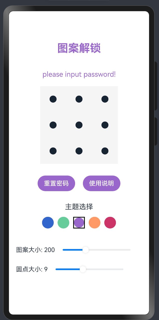
效果演示
1. 引言
在鸿蒙OS应用开发中,良好的状态管理和交互设计是打造高质量用户体验的关键。本教程将深入探讨鸿蒙OS中的状态管理机制、交互设计原则以及最佳实践,帮助开发者构建响应迅速、交互流畅的应用界面。
2. 状态管理基础
2.1 状态类型
鸿蒙OS提供了多种状态装饰器,用于不同场景下的状态管理:
// 组件内部状态
@State message: string = '初始消息';

// 父子组件间传递的状态
@Prop title: string;

// 可双向同步的状态
@Link count: number;

// 应用级全局状态
@StorageLink('theme') theme: string = 'light';

// 仅用于渲染的派生状态
@Computed get displayName(): string {
  return `用户: ${this.firstName} ${this.lastName}`;
}
2.2 状态变更与UI更新
鸿蒙OS采用声明式UI范式,状态变更会自动触发UI更新:
@Component
struct CounterDemo {
  @State count: number = 0;

  build() {
    Column() {
      Text(`当前计数: ${this.count}`)
        .fontSize(20)
        .margin(10)

      Button('增加')
        .onClick(() => {
          this.count++; // 状态更新,UI自动刷新
        })
    }
  }
}
3. 复杂状态管理
3.1 组件生命周期管理
利用组件生命周期钩子函数管理状态初始化和清理:
@Component
struct LifecycleDemo {
  @State data: string = '';
  private timerId: number = -1;

  aboutToAppear() {
    // 组件出现前初始化状态
    this.loadInitialData();

    // 设置定时更新
    this.timerId = setInterval(() => {
      this.updateData();
    }, 1000);
  }

  aboutToDisappear() {
    // 组件销毁前清理资源
    if(this.timerId !== -1) {
      clearInterval(this.timerId);
      this.timerId = -1;
    }
  }

  private loadInitialData() {
    // 初始化数据逻辑
    this.data = '初始数据';
  }

  private updateData() {
    // 更新数据逻辑
    this.data = `更新时间: ${new Date().toLocaleTimeString()}`;
  }

  build() {
    Column() {
      Text(this.data)
        .fontSize(16)
    }
  }
}
3.2 状态隔离与共享
在复杂应用中,合理划分状态的作用域至关重要:
// 局部状态:仅在组件内有效
@State private localState: string = 'local';

// 共享状态:通过AppStorage实现跨组件共享
AppStorage.SetOrCreate('globalTheme', 'dark');

@Component
struct ThemeConsumer {
  @StorageLink('globalTheme') theme: string = 'light';

  build() {
    Column() {
      Text(`当前主题: ${this.theme}`)
        .fontColor(this.theme === 'dark' ? '#FFFFFF' : '#000000')
        .backgroundColor(this.theme === 'dark' ? '#333333' : '#EEEEEE')
    }
  }
}
4. 交互设计原则
4.1 响应式反馈
为用户操作提供及时、明确的反馈:
@Component
struct FeedbackDemo {
  @State isPressed: boolean = false;

  build() {
    Column() {
      Button('点击我')
        .width(120)
        .height(50)
        .backgroundColor(this.isPressed ? '#3366CC' : '#66CCFF')
        .scale({ x: this.isPressed ? 0.9 : 1, y: this.isPressed ? 0.9 : 1 })
        .onTouch((event) => {
          if (event.type === TouchType.Down) {
            this.isPressed = true;
          } else if (event.type === TouchType.Up) {
            this.isPressed = false;
            // 执行点击操作
            this.handleClick();
          }
        })
        .animation({
          duration: 100,
          curve: Curve.EaseInOut
        })
    }
  }

  private handleClick() {
    // 处理点击逻辑
    promptAction.showToast({ message: '按钮已点击' });
  }
}
4.2 状态转换动画
使用动画平滑过渡状态变化,提升用户体验:
@Component
struct AnimatedStateDemo {
  @State expanded: boolean = false;

  build() {
    Column() {
      // 可展开的卡片
      Column() {
        Row() {
          Text('详细信息')
            .fontSize(18)
            .fontWeight(FontWeight.Bold)

          Image(this.expanded ? '/resources/images/arrow_up.png' : '/resources/images/arrow_down.png')
            .width(24)
            .height(24)
            .rotate({ z: 1, angle: this.expanded ? 180 : 0 })
            .animation({
              duration: 300,
              curve: Curve.EaseInOut
            })
        }
        .width('100%')
        .justifyContent(FlexAlign.SpaceBetween)
        .padding(10)
        .onClick(() => {
          this.expanded = !this.expanded;
        })

        if (this.expanded) {
          Text('这里是详细内容,展开后可见。包含了更多关于该项目的信息,可以帮助用户更好地理解。')
            .opacity(this.expanded ? 1 : 0)
            .height(this.expanded ? '100%' : 0)
            .padding(10)
            .animation({
              duration: 300,
              curve: Curve.EaseInOut
            })
        }
      }
      .width('90%')
      .backgroundColor('#F5F5F5')
      .borderRadius(8)
      .margin(10)
    }
  }
}
5. 高级交互模式
5.1 手势识别与处理
鸿蒙OS提供了丰富的手势识别能力:
@Component
struct GestureDemo {
  @State scale: number = 1;
  @State rotation: number = 0;
  @State translateX: number = 0;
  @State translateY: number = 0;

  build() {
    Column() {
      Text('手势演示')
        .fontSize(20)
        .margin({ bottom: 20 })

      Image('/resources/images/sample.png')
        .width(200)
        .height(200)
        .objectFit(ImageFit.Contain)
        .gesture(
          PinchGesture()
            .onActionUpdate((event) => {
              this.scale = event.scale;
            })
        )
        .gesture(
          RotationGesture()
            .onActionUpdate((event) => {
              this.rotation += event.angle;
            })
        )
        .gesture(
          PanGesture()
            .onActionUpdate((event) => {
              this.translateX += event.offsetX;
              this.translateY += event.offsetY;
            })
        )
        .scale({ x: this.scale, y: this.scale })
        .rotate({ z: 1, angle: this.rotation })
        .translate({ x: this.translateX, y: this.translateY })
    }
    .width('100%')
    .height('100%')
    .justifyContent(FlexAlign.Center)
  }
}
5.2 状态机模式
对于复杂的交互流程,可以采用状态机模式管理状态转换:
// 定义状态枚举
enum ProcessState {
  IDLE,
  LOADING,
  SUCCESS,
  ERROR
}

@Component
struct StateMachineDemo {
  @State currentState: ProcessState = ProcessState.IDLE;
  @State message: string = '';

  build() {
    Column() {
      // 根据不同状态显示不同UI
      if (this.currentState === ProcessState.IDLE) {
        Button('开始处理')
          .onClick(() => this.startProcess())
      } else if (this.currentState === ProcessState.LOADING) {
        Column() {
          LoadingProgress()
            .width(50)
            .height(50)
          Text('处理中...')
            .margin({ top: 10 })
        }
      } else if (this.currentState === ProcessState.SUCCESS) {
        Column() {
          Image('/resources/images/success.png')
            .width(50)
            .height(50)
          Text('处理成功')
            .fontColor('#66CC99')
            .margin({ top: 10 })
          Text(this.message)
            .margin({ top: 5 })
          Button('重新开始')
            .margin({ top: 20 })
            .onClick(() => this.reset())
        }
      } else if (this.currentState === ProcessState.ERROR) {
        Column() {
          Image('/resources/images/error.png')
            .width(50)
            .height(50)
          Text('处理失败')
            .fontColor('#CC3366')
            .margin({ top: 10 })
          Text(this.message)
            .margin({ top: 5 })
          Button('重试')
            .margin({ top: 20 })
            .onClick(() => this.retry())
        }
      }
    }
    .width('100%')
    .height('100%')
    .justifyContent(FlexAlign.Center)
  }

  private startProcess() {
    this.currentState = ProcessState.LOADING;

    // 模拟异步处理
    setTimeout(() => {
      // 随机成功或失败
      if (Math.random() > 0.5) {
        this.currentState = ProcessState.SUCCESS;
        this.message = '数据处理完成,结果已保存';
      } else {
        this.currentState = ProcessState.ERROR;
        this.message = '网络连接超时,请检查网络设置';
      }
    }, 2000);
  }

  private reset() {
    this.currentState = ProcessState.IDLE;
    this.message = '';
  }

  private retry() {
    this.startProcess();
  }
}
6. 表单状态管理
6.1 输入验证与反馈
@Component
struct FormDemo {
  @State username: string = '';
  @State password: string = '';
  @State usernameError: string = '';
  @State passwordError: string = '';
  @State isFormValid: boolean = false;

  build() {
    Column() {
      Text('用户注册').fontSize(24).margin({ bottom: 30 })

      // 用户名输入
      TextInput({ placeholder: '请输入用户名' })
        .width('90%')
        .onChange((value) => {
          this.username = value;
          this.validateUsername();
          this.checkFormValidity();
        })

      if (this.usernameError) {
        Text(this.usernameError)
          .fontSize(14)
          .fontColor('#CC3366')
          .width('90%')
          .margin({ top: 5 })
      }

      // 密码输入
      TextInput({ placeholder: '请输入密码' })
        .width('90%')
        .type(InputType.Password)
        .margin({ top: 20 })
        .onChange((value) => {
          this.password = value;
          this.validatePassword();
          this.checkFormValidity();
        })

      if (this.passwordError) {
        Text(this.passwordError)
          .fontSize(14)
          .fontColor('#CC3366')
          .width('90%')
          .margin({ top: 5 })
      }

      // 提交按钮
      Button('注册')
        .width('90%')
        .margin({ top: 30 })
        .enabled(this.isFormValid)
        .backgroundColor(this.isFormValid ? '#3366CC' : '#CCCCCC')
        .onClick(() => this.submitForm())
    }
    .width('100%')
    .padding({ top: 50 })
  }

  private validateUsername() {
    if (this.username.length < 3) {
      this.usernameError = '用户名至少需要3个字符';
    } else if (!/^[a-zA-Z0-9_]+$/.test(this.username)) {
      this.usernameError = '用户名只能包含字母、数字和下划线';
    } else {
      this.usernameError = '';
    }
  }

  private validatePassword() {
    if (this.password.length < 6) {
      this.passwordError = '密码至少需要6个字符';
    } else if (!/[A-Z]/.test(this.password)) {
      this.passwordError = '密码需要包含至少一个大写字母';
    } else if (!/[0-9]/.test(this.password)) {
      this.passwordError = '密码需要包含至少一个数字';
    } else {
      this.passwordError = '';
    }
  }

  private checkFormValidity() {
    this.isFormValid = this.usernameError === '' && this.passwordError === '' &&
                      this.username !== '' && this.password !== '';
  }

  private submitForm() {
    // 表单提交逻辑
    promptAction.showToast({ message: '注册成功!' });
  }
}
7. 多状态协同
7.1 父子组件状态同步
// 子组件
@Component
struct ChildComponent {
  @Link counter: number;

  build() {
    Column() {
      Text(`子组件计数: ${this.counter}`)
        .fontSize(16)
        .margin(10)

      Button('子组件增加')
        .onClick(() => {
          this.counter++;
        })
    }
    .padding(10)
    .backgroundColor('#F0F0F0')
    .borderRadius(8)
  }
}

// 父组件
@Component
struct ParentComponent {
  @State parentCounter: number = 0;

  build() {
    Column() {
      Text(`父组件计数: ${this.parentCounter}`)
        .fontSize(18)
        .fontWeight(FontWeight.Bold)
        .margin(10)

      Button('父组件增加')
        .onClick(() => {
          this.parentCounter++;
        })
        .margin({ bottom: 20 })

      // 子组件与父组件状态双向绑定
      ChildComponent({ counter: $parentCounter })
    }
    .width('100%')
    .padding(20)
  }
}
7.2 复杂组件间通信
对于不在直接父子关系的组件,可以使用AppStorage或自定义事件总线:
// 事件总线实现
class EventBus {
  private static instance: EventBus;
  private listeners: Map<string, Array<(data: any) => void>> = new Map();

  private constructor() {}

  static getInstance(): EventBus {
    if (!EventBus.instance) {
      EventBus.instance = new EventBus();
    }
    return EventBus.instance;
  }

  on(event: string, callback: (data: any) => void) {
    if (!this.listeners.has(event)) {
      this.listeners.set(event, []);
    }
    this.listeners.get(event).push(callback);
  }

  off(event: string, callback: (data: any) => void) {
    if (!this.listeners.has(event)) return;

    const callbacks = this.listeners.get(event);
    const index = callbacks.indexOf(callback);
    if (index !== -1) {
      callbacks.splice(index, 1);
    }
  }

  emit(event: string, data?: any) {
    if (!this.listeners.has(event)) return;

    this.listeners.get(event).forEach(callback => {
      callback(data);
    });
  }
}

// 使用事件总线
@Component
struct ComponentA {
  @State message: string = '';
  private eventBus = EventBus.getInstance();

  aboutToAppear() {
    // 监听事件
    this.eventBus.on('updateMessage', (data) => {
      this.message = data.message;
    });
  }

  aboutToDisappear() {
    // 移除监听
    this.eventBus.off('updateMessage', (data) => {
      this.message = data.message;
    });
  }

  build() {
    Column() {
      Text(`收到消息: ${this.message}`)
        .fontSize(16)
    }
  }
}

@Component
struct ComponentB {
  private eventBus = EventBus.getInstance();

  build() {
    Column() {
      Button('发送消息')
        .onClick(() => {
          // 发送事件
          this.eventBus.emit('updateMessage', { message: '来自B的消息' + new Date().toLocaleTimeString() });
        })
    }
  }
}
8. 性能优化
8.1 避免不必要的状态更新
// 不推荐:频繁更新状态
@Component
struct IneffectiveCounter {
  @State count: number = 0;
  private timer: number = -1;

  aboutToAppear() {
    // 每10毫秒更新一次,导致频繁重渲染
    this.timer = setInterval(() => {
      this.count++;
    }, 10);
  }

  aboutToDisappear() {
    clearInterval(this.timer);
  }

  build() {
    Column() {
      Text(`计数: ${this.count}`)
    }
  }
}

// 推荐:批量更新或使用非状态变量
@Component
struct EffectiveCounter {
  @State displayCount: number = 0;
  private actualCount: number = 0; // 非状态变量,更新不触发重渲染
  private timer: number = -1;
  private updateInterval: number = -1;

  aboutToAppear() {
    // 高频更新实际计数,但不触发重渲染
    this.timer = setInterval(() => {
      this.actualCount++;
    }, 10);

    // 低频更新显示计数,减少重渲染次数
    this.updateInterval = setInterval(() => {
      this.displayCount = this.actualCount;
    }, 100);
  }

  aboutToDisappear() {
    clearInterval(this.timer);
    clearInterval(this.updateInterval);
  }

  build() {
    Column() {
      Text(`计数: ${this.displayCount}`)
    }
  }
}
8.2 懒加载与按需渲染
@Component
struct LazyLoadDemo {
  @State activeTab: number = 0;
  @State isContentLoaded: boolean[] = [false, false, false];

  build() {
    Column() {
      // 选项卡
      Row() {
        ForEach([0, 1, 2], (index) => {
          Text(`选项卡 ${index + 1}`)
            .width('33%')
            .textAlign(TextAlign.Center)
            .padding(10)
            .backgroundColor(this.activeTab === index ? '#3366CC' : '#F5F5F5')
            .fontColor(this.activeTab === index ? '#FFFFFF' : '#333333')
            .onClick(() => {
              this.activeTab = index;
              // 首次切换到该选项卡时加载内容
              if (!this.isContentLoaded[index]) {
                this.loadTabContent(index);
              }
            })
        })
      }
      .width('100%')

      // 内容区域
      if (this.activeTab === 0) {
        this.TabContent(0)
      } else if (this.activeTab === 1) {
        this.TabContent(1)
      } else if (this.activeTab === 2) {
        this.TabContent(2)
      }
    }
  }

  @Builder
  TabContent(index: number) {
    Column() {
      if (!this.isContentLoaded[index]) {
        LoadingProgress().width(50).height(50)
      } else {
        Text(`选项卡 ${index + 1} 的内容已加载`)
          .padding(20)
      }
    }
    .width('100%')
    .height(300)
  }

  private loadTabContent(index: number) {
    // 模拟异步加载内容
    setTimeout(() => {
      this.isContentLoaded[index] = true;
    }, 1500);
  }
}
9. 实战案例:主题切换系统
// 主题定义
class ThemeConstants {
  static readonly LIGHT_THEME = {
    backgroundColor: '#FFFFFF',
    textColor: '#333333',
    primaryColor: '#3366CC',
    secondaryColor: '#66CCFF',
    borderColor: '#EEEEEE'
  };

  static readonly DARK_THEME = {
    backgroundColor: '#333333',
    textColor: '#FFFFFF',
    primaryColor: '#66CCFF',
    secondaryColor: '#3366CC',
    borderColor: '#555555'
  };
}

// 初始化全局主题
AppStorage.SetOrCreate('currentTheme', ThemeConstants.LIGHT_THEME);

// 主题切换组件
@Component
struct ThemeSwitcher {
  @StorageLink('currentTheme') currentTheme: any = ThemeConstants.LIGHT_THEME;
  @State isDarkMode: boolean = false;

  aboutToAppear() {
    // 初始化状态
    this.isDarkMode = this.currentTheme.backgroundColor === ThemeConstants.DARK_THEME.backgroundColor;
  }

  build() {
    Row() {
      Text('深色模式')
        .fontSize(16)
        .fontColor(this.currentTheme.textColor)

      Toggle({ type: ToggleType.Switch, isOn: this.isDarkMode })
        .onChange((isOn) => {
          this.isDarkMode = isOn;
          this.currentTheme = isOn ? ThemeConstants.DARK_THEME : ThemeConstants.LIGHT_THEME;
        })
    }
    .width('100%')
    .justifyContent(FlexAlign.SpaceBetween)
    .padding(10)
  }
}

// 使用主题的组件
@Component
struct ThemedComponent {
  @StorageLink('currentTheme') currentTheme: any = ThemeConstants.LIGHT_THEME;

  build() {
    Column() {
      Text('主题演示')
        .fontSize(24)
        .fontWeight(FontWeight.Bold)
        .fontColor(this.currentTheme.textColor)

      ThemeSwitcher()
        .margin({ top: 20 })

      Button('主按钮')
        .backgroundColor(this.currentTheme.primaryColor)
        .fontColor('#FFFFFF')
        .margin({ top: 20 })

      Button('次按钮')
        .backgroundColor(this.currentTheme.secondaryColor)
        .fontColor('#FFFFFF')
        .margin({ top: 10 })

      Text('这是一段示例文本,展示主题颜色效果。')
        .fontSize(16)
        .fontColor(this.currentTheme.textColor)
        .margin({ top: 20 })
        .padding(10)
        .border({
          width: 1,
          color: this.currentTheme.borderColor,
          radius: 8
        })
    }
    .width('100%')
    .height('100%')
    .backgroundColor(this.currentTheme.backgroundColor)
    .padding(20)
    .animation({
      duration: 300,
      curve: Curve.EaseInOut
    })
  }
}
10. 总结
鸿蒙OS的状态管理和交互设计系统提供了强大而灵活的工具,帮助开发者构建高质量的用户界面。通过本教程,我们探讨了:
- 基础状态管理机制(@State, @Prop, @Link等)
- 复杂状态管理策略(生命周期、状态隔离与共享)
- 交互设计原则(响应式反馈、状态转换动画)
- 高级交互模式(手势识别、状态机模式)
- 表单状态管理(输入验证与反馈)
- 多状态协同(父子组件通信、事件总线)
- 性能优化(避免不必要的状态更新、懒加载)
- 实战案例(主题切换系统)
掌握这些技术和原则,将帮助您打造出响应迅速、交互流畅、用户体验出色的鸿蒙OS应用。

作为“人工智能6S店”的官方数字引擎,为AI开发者与企业提供一个覆盖软硬件全栈、一站式门户。
更多推荐
 20
20 0
0- 0


 已为社区贡献23条内容

所有评论(0)