
鸿蒙Flutter实战:Material 3种子色亮暗双主题系统
Flutter 3.x 开始,Material 3(M3)成为默认设计语言。相比 Material 2,M3 最大的变化之一是动态配色——通过一个"种子色",自动生成整个应用的色调系统,包括主色、次要色、表面色、错误色,以及它们在不同亮度等级下的变体。
前言
Flutter 3.x 开始,Material 3(M3)成为默认设计语言。相比 Material 2,M3 最大的变化之一是动态配色——通过一个"种子色",自动生成整个应用的色调系统,包括主色、次要色、表面色、错误色,以及它们在不同亮度等级下的变体。
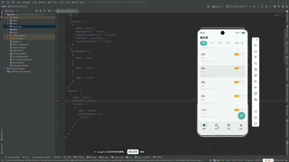
鸿蒙 Flutter 备忘录使用薄荷绿 #4DB6AC 作为种子色,同时支持亮色和暗色双主题,跟随系统设置自动切换。本文拆解这套主题系统的设计和实现。
项目仓库:todo_flutter_harmony
为什么是 ColorScheme.fromSeed
Material 2 时代,开发者需要手动定义 8-12 个颜色值来构建一个完整的主题:
// Material 2 —— 繁琐
ThemeData(
  primaryColor: Color(0xFF4DB6AC),
  primaryColorLight: Color(0xFF80CBC4),
  primaryColorDark: Color(0xFF00897B),
  accentColor: Color(0xFFFF8A65),
  // ... 还要 backgroundColor, surfaceColor, errorColor 等等
)
Material 3 的 ColorScheme.fromSeed 让你只需要一个颜色:
// Material 3 —— 简洁
ThemeData(
  colorScheme: ColorScheme.fromSeed(
    seedColor: const Color(0xFF4DB6AC),
    brightness: Brightness.light,
  ),
)
fromSeed 内部使用基于 HCT(Hue-Chroma-Tone)色彩空间的算法,自动生成 30+ 个色调变体。这个算法由 Google 的 Material Design 团队开发,考虑了人眼对不同色调的敏感度差异,生成的色板在任何组合下都能保持足够的对比度。
App 入口:ThemeMode 和 ThemeData
class App extends StatefulWidget {
State<App> createState() => _AppState();
}
class _AppState extends State<App> {
Widget build(BuildContext context) {
return MaterialApp(
title: '芯捷备忘录',
debugShowCheckedModeBanner: false,
themeMode: ThemeMode.system, // 跟随系统设置
theme: _buildLightTheme(),
darkTheme: _buildDarkTheme(),
home: const HomePage(),
onGenerateRoute: _generateRoute,
);
}
themeMode: ThemeMode.system:应用自动跟随系统的亮/暗模式设置theme:系统为亮色模式时的主题darkTheme:系统为暗色模式时的主题
如果想让用户手动控制(而不是跟随系统),可以换成:
themeMode: ThemeMode.light,   // 始终亮色
themeMode: ThemeMode.dark,    // 始终暗色
亮色主题
ThemeData _buildLightTheme() {
  final colorScheme = ColorScheme.fromSeed(
    seedColor: const Color(0xFF4DB6AC),  // 薄荷绿
    brightness: Brightness.light,
  );

  return ThemeData(
    useMaterial3: true,
    colorScheme: colorScheme,
    appBarTheme: AppBarTheme(
      centerTitle: true,
      backgroundColor: colorScheme.surface,
      foregroundColor: colorScheme.onSurface,
      elevation: 0,
      scrolledUnderElevation: 1,
    ),
    cardTheme: CardTheme(
      elevation: 1.0,
      shadowColor: colorScheme.shadow.withOpacity(0.3),
      shape: RoundedRectangleBorder(
        borderRadius: BorderRadius.circular(16),
      ),
      clipBehavior: Clip.antiAlias,
    ),
    navigationBarTheme: NavigationBarThemeData(
      elevation: 2,
      indicatorColor: colorScheme.primaryContainer,
      surfaceTintColor: colorScheme.surfaceTint,
    ),
    floatingActionButtonTheme: FloatingActionButtonThemeData(
      backgroundColor: colorScheme.primaryContainer,
      foregroundColor: colorScheme.onPrimaryContainer,
      elevation: 4,
    ),
    inputDecorationTheme: InputDecorationTheme(
      border: OutlineInputBorder(
        borderRadius: BorderRadius.circular(12),
      ),
      contentPadding: const EdgeInsets.symmetric(horizontal: 16, vertical: 14),
    ),
    snackBarTheme: SnackBarThemeData(
      behavior: SnackBarBehavior.floating,
      shape: RoundedRectangleBorder(borderRadius: BorderRadius.circular(10)),
    ),
  );
}
暗色主题
ThemeData _buildDarkTheme() {
  final colorScheme = ColorScheme.fromSeed(
    seedColor: const Color(0xFF4DB6AC),
    brightness: Brightness.dark,
  );

  return ThemeData(
    useMaterial3: true,
    colorScheme: colorScheme,
    appBarTheme: AppBarTheme(
      centerTitle: true,
      backgroundColor: colorScheme.surface,
      foregroundColor: colorScheme.onSurface,
      elevation: 0,
      scrolledUnderElevation: 1,
    ),
    cardTheme: CardTheme(
      elevation: 1.0,
      shadowColor: Colors.black.withOpacity(0.3),
      shape: RoundedRectangleBorder(
        borderRadius: BorderRadius.circular(16),
      ),
      clipBehavior: Clip.antiAlias,
    ),
    // ... 其余与亮色主题一致
  );
}
注意暗色主题用 Brightness.dark —— ColorScheme.fromSeed 会基于这个参数自动调整色调的明暗层级。同一个色值 #4DB6AC 在 HCT 色彩空间中的表现会因亮度不同而变化。
在组件中使用 ColorScheme
在具体组件中,通过 Theme.of(context).colorScheme 获取颜色:
class MemoCard extends StatelessWidget {
final Memo memo;
Widget build(BuildContext context) {
final colors = Theme.of(context).colorScheme;
return Card(
color: colors.surface,
child: ListTile(
title: Text(memo.title, style: TextStyle(color: colors.onSurface)),
subtitle: Text(memo.content, style: TextStyle(color: colors.onSurfaceVariant)),
trailing: Icon(
memo.isPinned ? Icons.push_pin : null,
color: colors.primary,
),
),
);
}
}
常用 colorScheme 属性速查:
| 属性 | 用途 |
|---|---|
primary |
主色,用于高亮交互元素 |
onPrimary |
主色上的文字颜色 |
primaryContainer |
主色的容器背景(比主色浅) |
secondary |
次要色 |
surface |
卡片、AppBar 等表面色 |
onSurface |
表面上的文字颜色 |
onSurfaceVariant |
表面上的次要文字(灰色调) |
error |
错误提示色 |
surfaceTint |
表面色调 |
关键规则:color 和 onColor 成对使用。如果背景是 surface,文字就是 onSurface。这个命名约定在 Material 3 的文档中被严格执行。
ColorScheme 的 HCT 色彩空间
ColorScheme.fromSeed 使用 HCT 而非传统的 HSL/RGB 色彩空间。HCT 的三个维度:
- Hue(色相):与 HSL 的色相相同
- Chroma(色度/饱和度):颜色的鲜艳程度
- Tone(亮度):从 0(黑)到 100(白)
HCT 的关键优势是感知均匀度——在 RGB 空间中看起来"亮度一致"的两个颜色,在人眼感知下可能分别偏亮和偏暗。HCT 修正了这个问题,让生成的色调在感知上真正一致。
对开发者来说,这意味着 ColorScheme.fromSeed 生成的色板在所有亮度层级下都具有足够的 WCAG 对比度,无需手动调整。Material 3 的颜色生成算法会自动保证可访问性。
皮肤页面(SkinPage)
应用预留了一个皮肤设置页面,允许用户在亮色/暗色/跟随系统之间手动切换。核心代码:
class SkinPage extends StatelessWidget {
Widget build(BuildContext context) {
final currentMode = context.watch<ThemeProvider>().themeMode;
return Scaffold(
appBar: AppBar(title: const Text('主题设置')),
body: ListView(
children: [
RadioListTile<ThemeMode>(
title: const Text('浅色模式'),
value: ThemeMode.light,
groupValue: currentMode,
onChanged: (mode) => context.read<ThemeProvider>().setThemeMode(mode!),
),
RadioListTile<ThemeMode>(
title: const Text('深色模式'),
value: ThemeMode.dark,
groupValue: currentMode,
onChanged: (mode) => context.read<ThemeProvider>().setThemeMode(mode!),
),
RadioListTile<ThemeMode>(
title: const Text('跟随系统'),
value: ThemeMode.system,
groupValue: currentMode,
onChanged: (mode) => context.read<ThemeProvider>().setThemeMode(mode!),
),
],
),
);
}
}
实现用户手动切换需要将 ThemeMode 提升为一个可持久化的状态:
class ThemeProvider extends ChangeNotifier {
  ThemeMode _themeMode = ThemeMode.system;

  ThemeMode get themeMode => _themeMode;

  Future<void> loadThemeMode() async {
    // 从文件/SharedPreferences 读取用户偏好
    final saved = await _loadFromPrefs('theme_mode');
    if (saved != null) {
      _themeMode = ThemeMode.values[saved as int];
      notifyListeners();
    }
  }

  Future<void> setThemeMode(ThemeMode mode) async {
    _themeMode = mode;
    await _saveToPrefs('theme_mode', mode.index);
    notifyListeners();
  }
}
鸿蒙兼容性
Material 3 的主题系统完全在 Flutter 框架层实现。ColorScheme.fromSeed 的 HCT 算法和 ThemeMode.system 的亮暗检测都在 Flutter 引擎中完成。ThemeMode.system 在鸿蒙上依赖 @ohos/flutter_ohos 引擎向 Flutter 报告系统亮暗模式。
如果鸿蒙设备上的系统亮暗模式检测有问题,可以通过 MediaQuery.platformBrightnessOf(context) 查看引擎返回的实际值,或在 Texture 中手动设置 MediaQuery 的 platformBrightness。
总结
Material 3 种子色主题系统让应用配色从"手动拼凑 12 个色值"简化为"选一个种子色":
ColorScheme.fromSeed(seedColor: Color(0xFF4DB6AC)):一行代码生成 30+ 色调- 亮色 + 暗色两个 ThemeData:
Brightness.light和Brightness.dark控制色调层级 ThemeMode.system:自动跟随系统亮暗设置- HCT 色彩空间保证感知均匀度和无障碍对比度
完整项目代码见:todo_flutter_harmony

作为“人工智能6S店”的官方数字引擎,为AI开发者与企业提供一个覆盖软硬件全栈、一站式门户。
更多推荐


 0
0 0
0- 0


 已为社区贡献50条内容

所有评论(0)