
鸿蒙ArkTs最常用的7大布局+轮番图整理
实例:@Entry @Component struct TabsDemo { build() { Tabs() { TabContent() { Text("首页内容") }.tabBar("首页") TabContent() { Text("我的内容") }.tabBar("我的") } .barPosition(BarPosition.End) // 底部 .width('100%') .he
一,七个布局
1.column垂直布局
实例:@Entry @Component struct ColumnDemo { build() { Column({ space: 10 }) { // space=间距 Text("第一行") Text("第二行") Text("第三行") } .width('100%') .height('100%') .justifyContent(FlexAlign.Center) // 居中 } }
图片: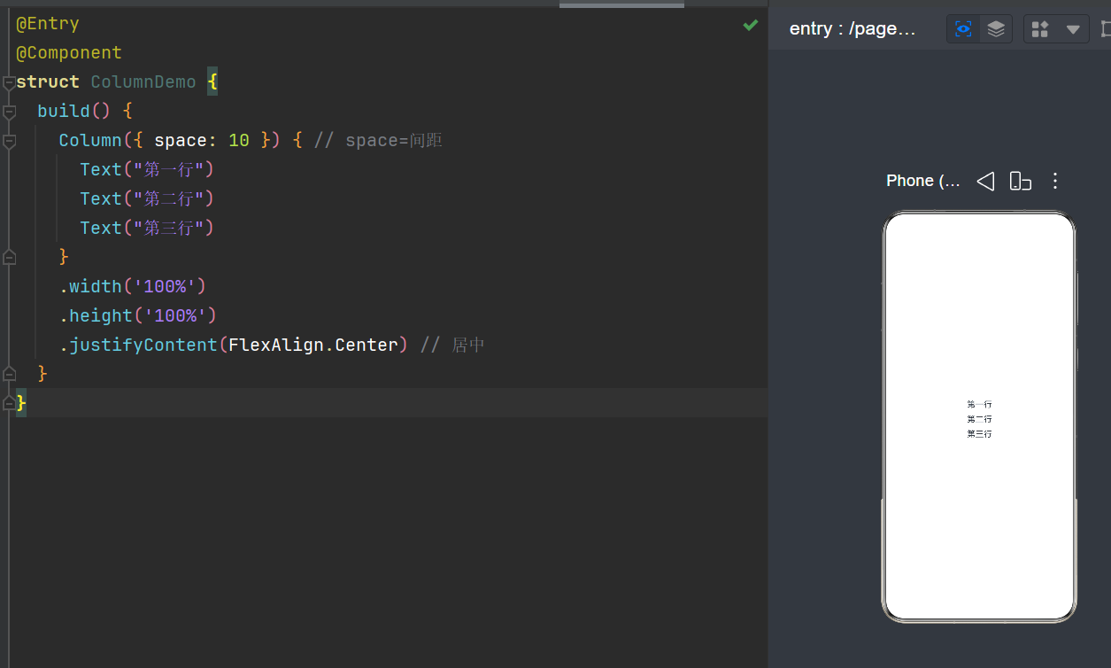
2.Row水平布局
实例:@Entry @Component struct RowDemo { build() { Row({ space: 15 }) { Text("左边") Text("中间") Text("右边") } .width('100%') .height('100%') .justifyContent(FlexAlign.Center) } }
图片: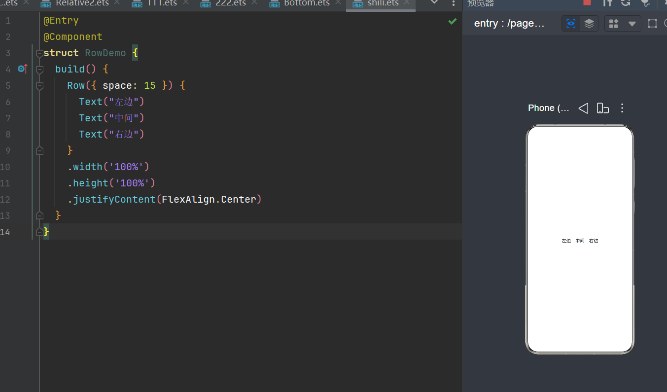
3.Relative Container相对布局
实例:@Entry @Component struct RelativeDemo { build() { RelativeContainer() { Text("我在左上角") .id("a") .alignRules({ top: { anchor: "__container__", align: VerticalAlign.Top }, left: { anchor: "__container__", align: HorizontalAlign.Start } }) Text("我在a下面") .id("b") .alignRules({ top: { anchor: "a", align: VerticalAlign.Bottom } }) } .width('100%') .height('100%') } }
图片: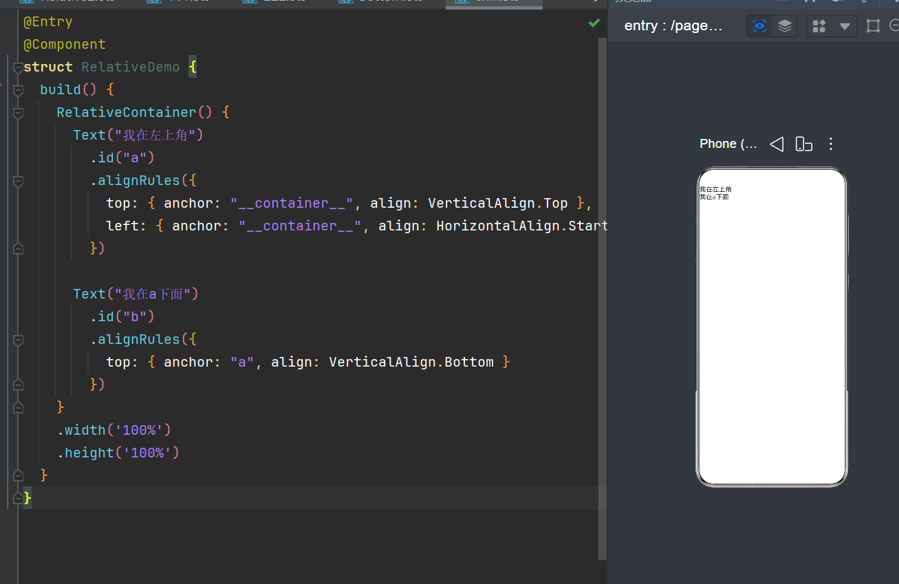
4.Stack 层叠布局
实例:@Entry @Component struct StackDemo { build() { Stack({ alignContent: Alignment.Center }) { Text("底层背景") .width(200) .height(200) .backgroundColor(Color.Gray) Text("上层文字") .fontSize(30) .fontColor(Color.White) } } }
图片: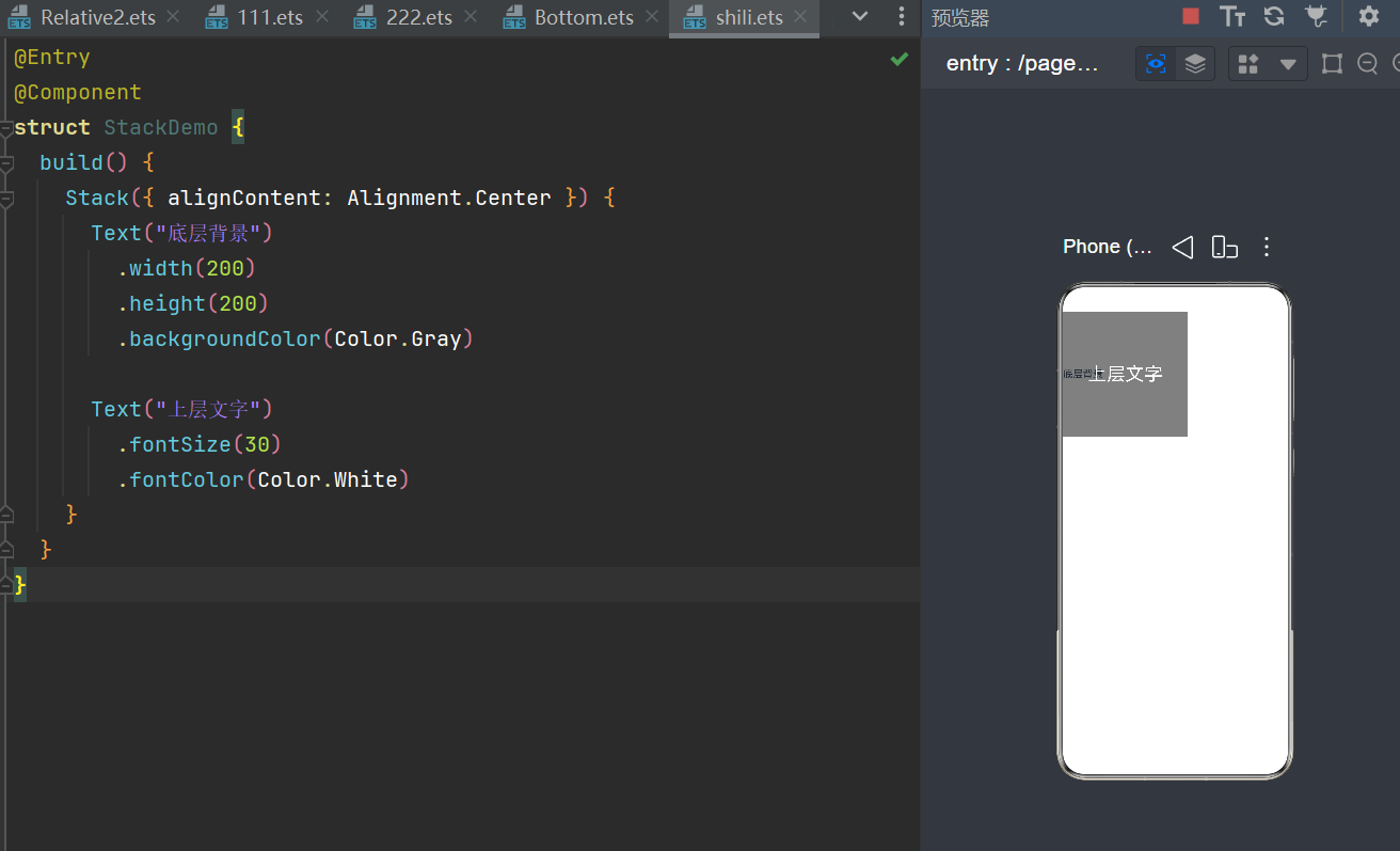
5.Grid网格布局
实例:@Entry @Component struct GridDemo { build() { Grid() { ForEach([1,2,3,4,5,6], (item:number) => { GridItem(){ Text("格子"+item) .width(100) .height(80) .border({width:2}) } }) } .columnsTemplate('1fr 1fr 1fr') // 3列布局 .width('100%') .padding(20) } }
图片: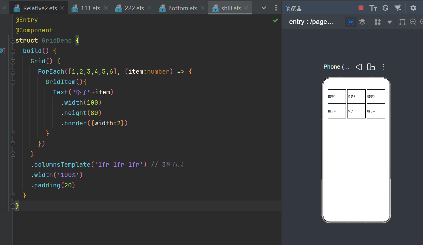
6.List列表布局
实例:@Entry @Component struct ListDemo { build() { List({ space: 10 }) { ListItem() { Text("列表项1") } ListItem() { Text("列表项2") } ListItem() { Text("列表项3") } } .width('100%') .padding(20) } }
图片: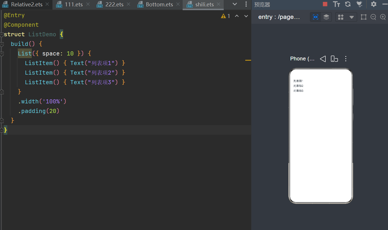
7.Tabs标签页布局
实例:@Entry @Component struct TabsDemo { build() { Tabs() { TabContent() { Text("首页内容") }.tabBar("首页") TabContent() { Text("我的内容") }.tabBar("我的") } .barPosition(BarPosition.End) // 底部 .width('100%') .height('100%') } }
图片: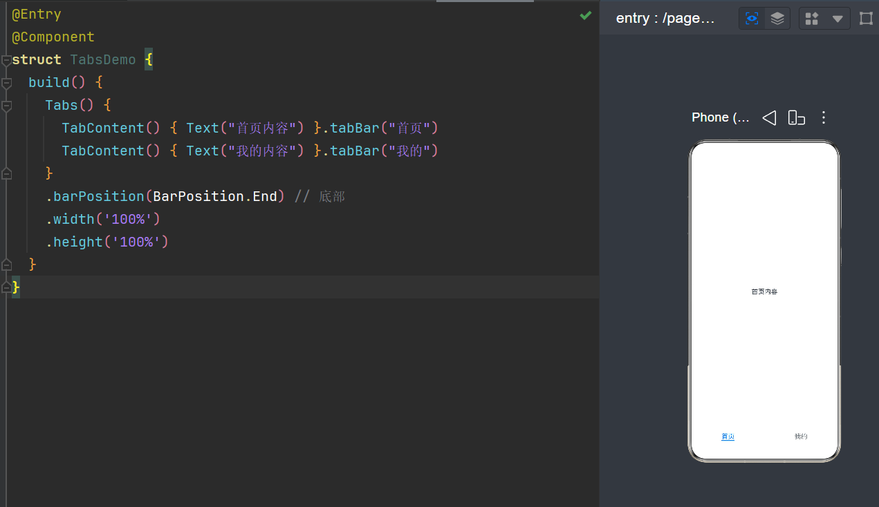
二,轮播图
1.实例:@Entry @Component struct SwiperDemo { build() { Swiper() { Text("第1页").backgroundColor(Color.Red).width('100%').height(200) Text("第2页").backgroundColor(Color.Green).width('100%').height(200) Text("第3页").backgroundColor(Color.Blue).width('100%').height(200) } .indicator(true) // 小圆点 .width('100%') .height(200) } }
2.图片: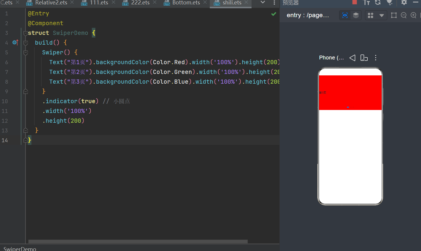
三,综合
实例:
@Entry
@Component
struct TabBaseDemo{
  build() {
    Tabs() {
      TabContent() {
        Text('首页的内容')
          .fontSize(30)
          .backgroundColor(Color.Blue)
          .width('100%')
          .height('100%')
      }
      .tabBar('首页')

      TabContent() {
        Text('推荐的内容')
          .fontSize(30)
          .width('100%')
          .height('100%')
          .backgroundColor(Color.Pink)
      }
      .tabBar('推荐')

      TabContent() {
        Text('发现的内容')
          .fontSize(30)
          .width('100%')
          .height('100%')
          .backgroundColor(Color.Green)
      }
      .tabBar('发现')

      TabContent() {
        Text('我的内容')
          .fontSize(30)
          .width('100%')
          .height('100%')
          .backgroundColor(Color.Yellow)
      }
      .tabBar('我的')
    }
  }
}
图片·: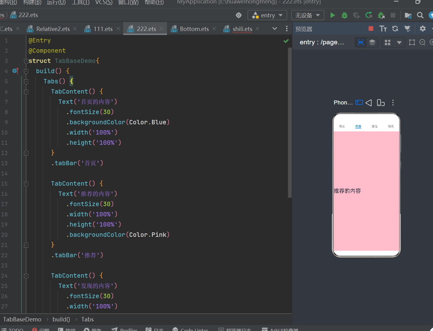

作为“人工智能6S店”的官方数字引擎,为AI开发者与企业提供一个覆盖软硬件全栈、一站式门户。
更多推荐

 0
0 0
0- 0


 已为社区贡献1条内容

所有评论(0)