
鸿蒙Electron框架下鸿蒙PC-我的诗词 - 主题切换系统技术实现详解
文章摘要: 本文详细介绍了「我的诗词」应用主题切换功能的实现方案。采用CSS变量+data属性选择器的技术方案,支持5种主题风格(古典雅致、现代简约、夜间护眼等),具有以下特点: 动态切换:通过CSS变量实现无刷新主题切换,支持平滑过渡动画 变量系统:建立完善的CSS变量命名规范,按功能分组管理颜色、效果等属性 主题设计:每个主题精心调校配色方案,如古典主题采用宣纸色背景+墨色文字 持久化存储:自
欢迎加入开源鸿蒙PC社区:
https://harmonypc.csdn.net/
atomgit仓库地址:https://gitcode.com/feng8403000/wodeshici/tree/main
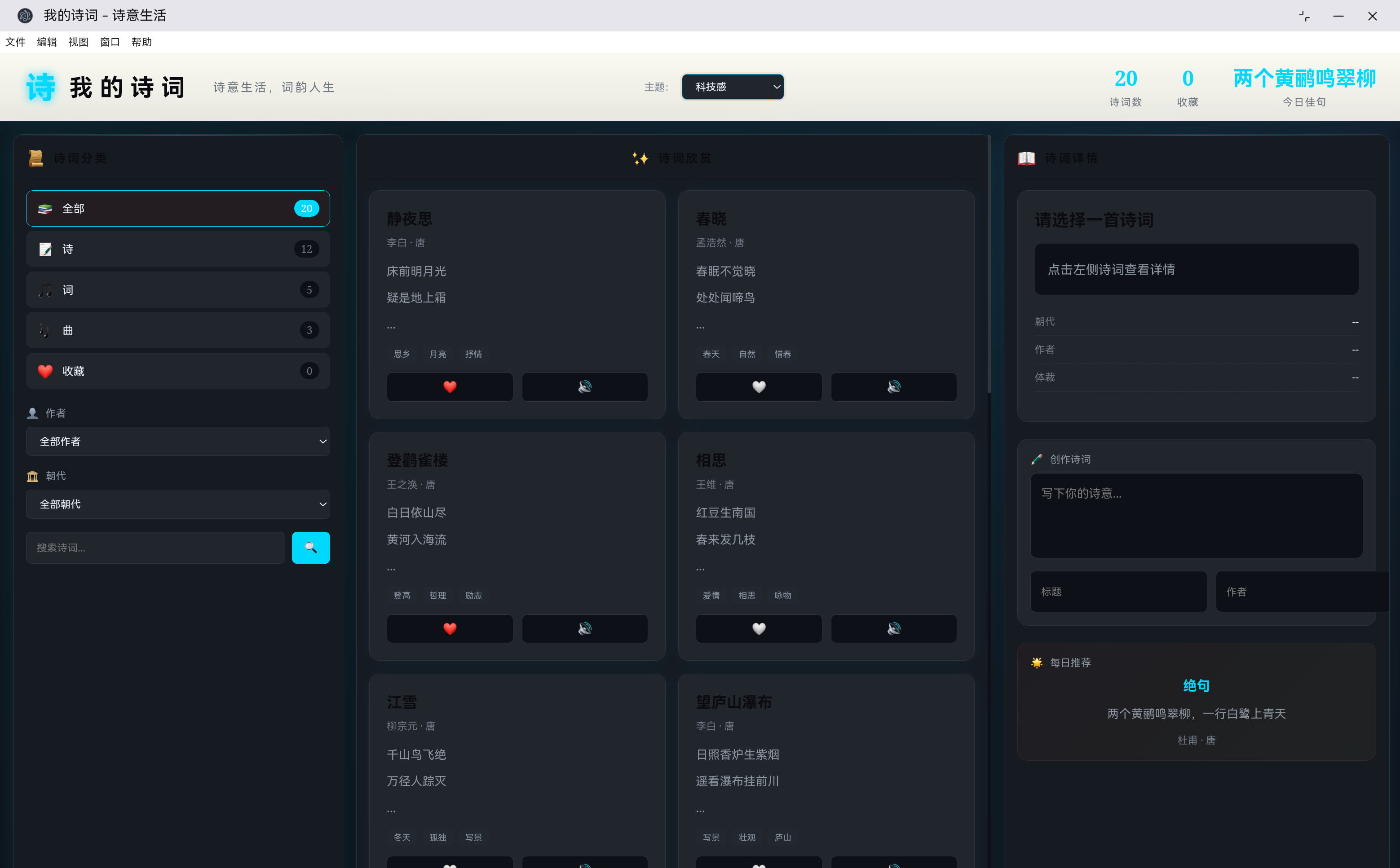
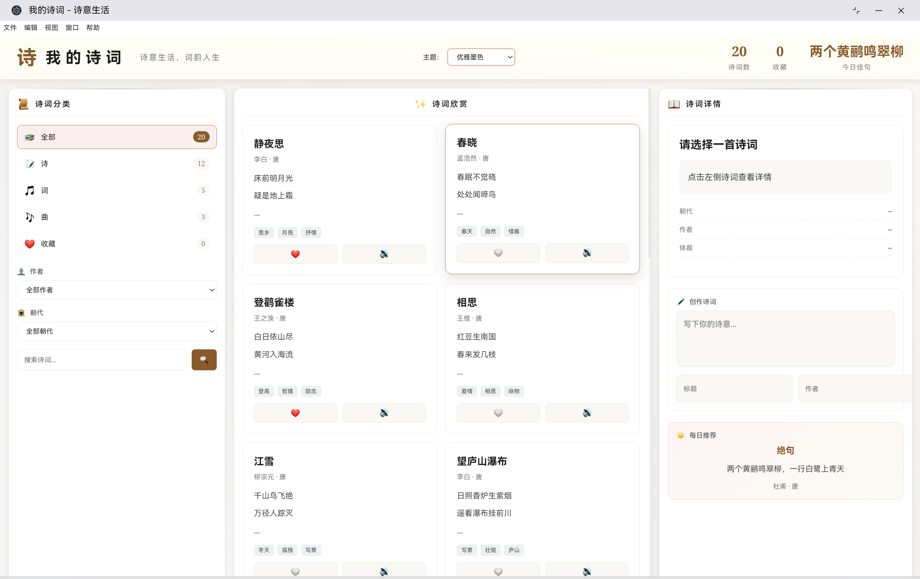
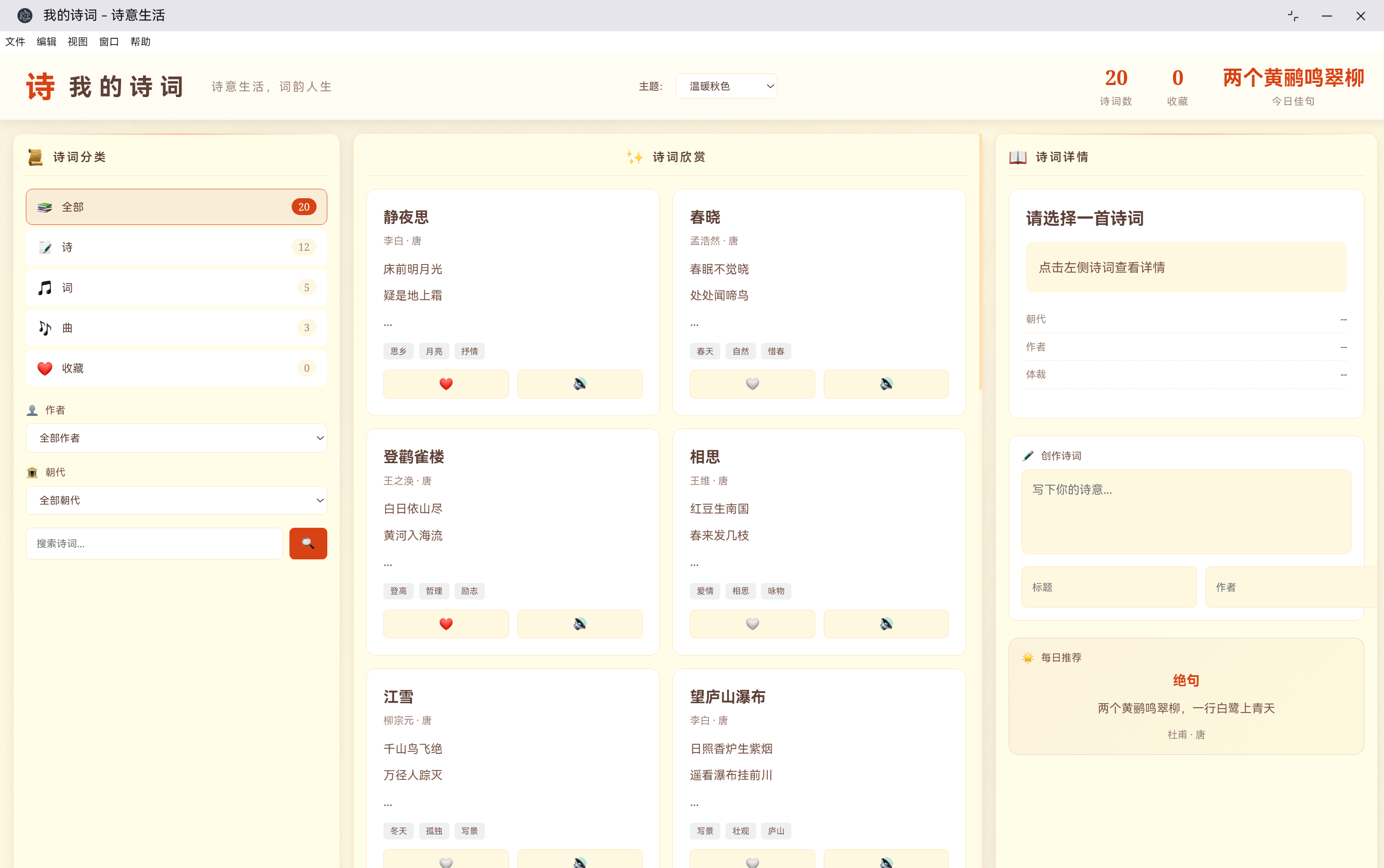
演示效果: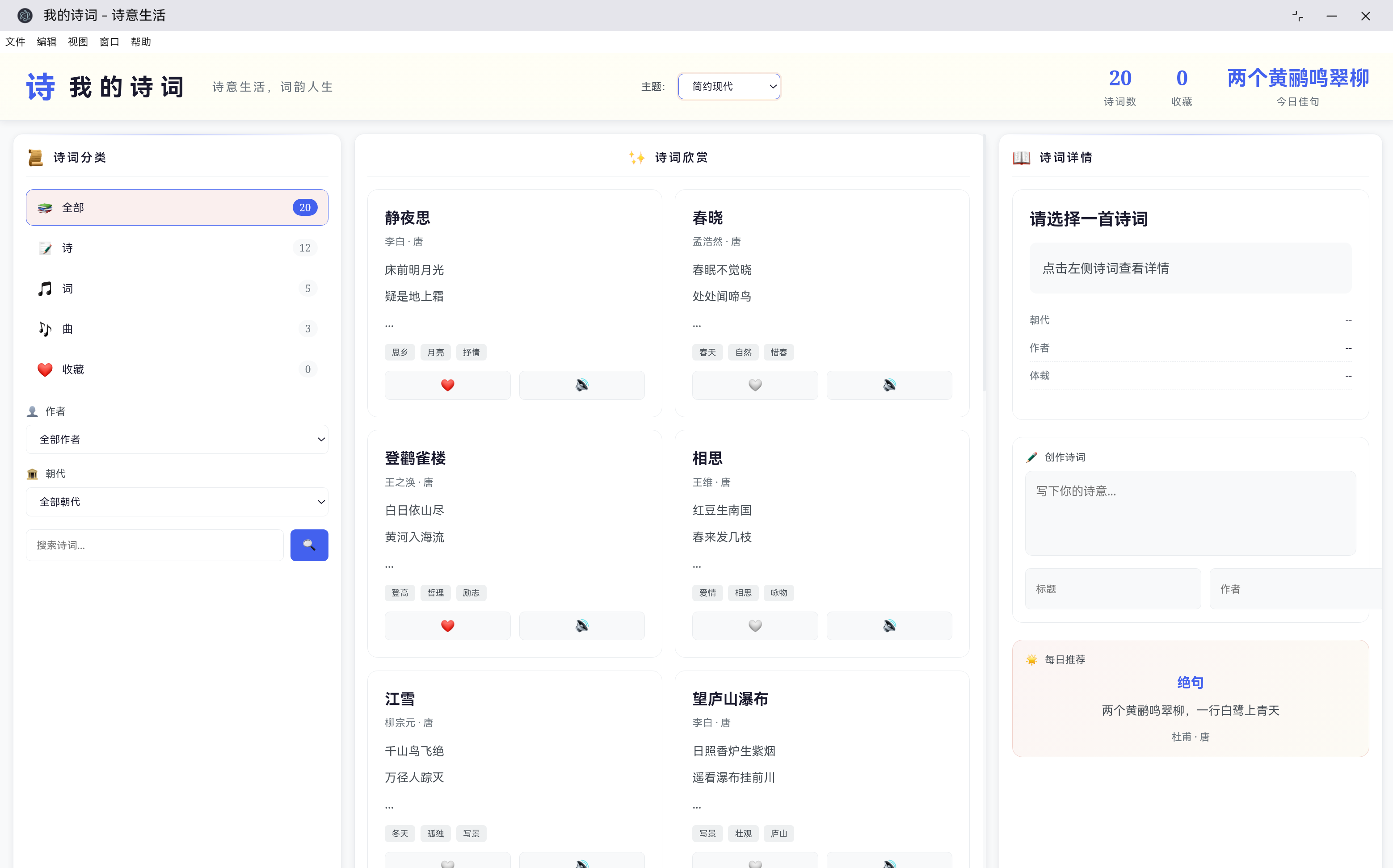
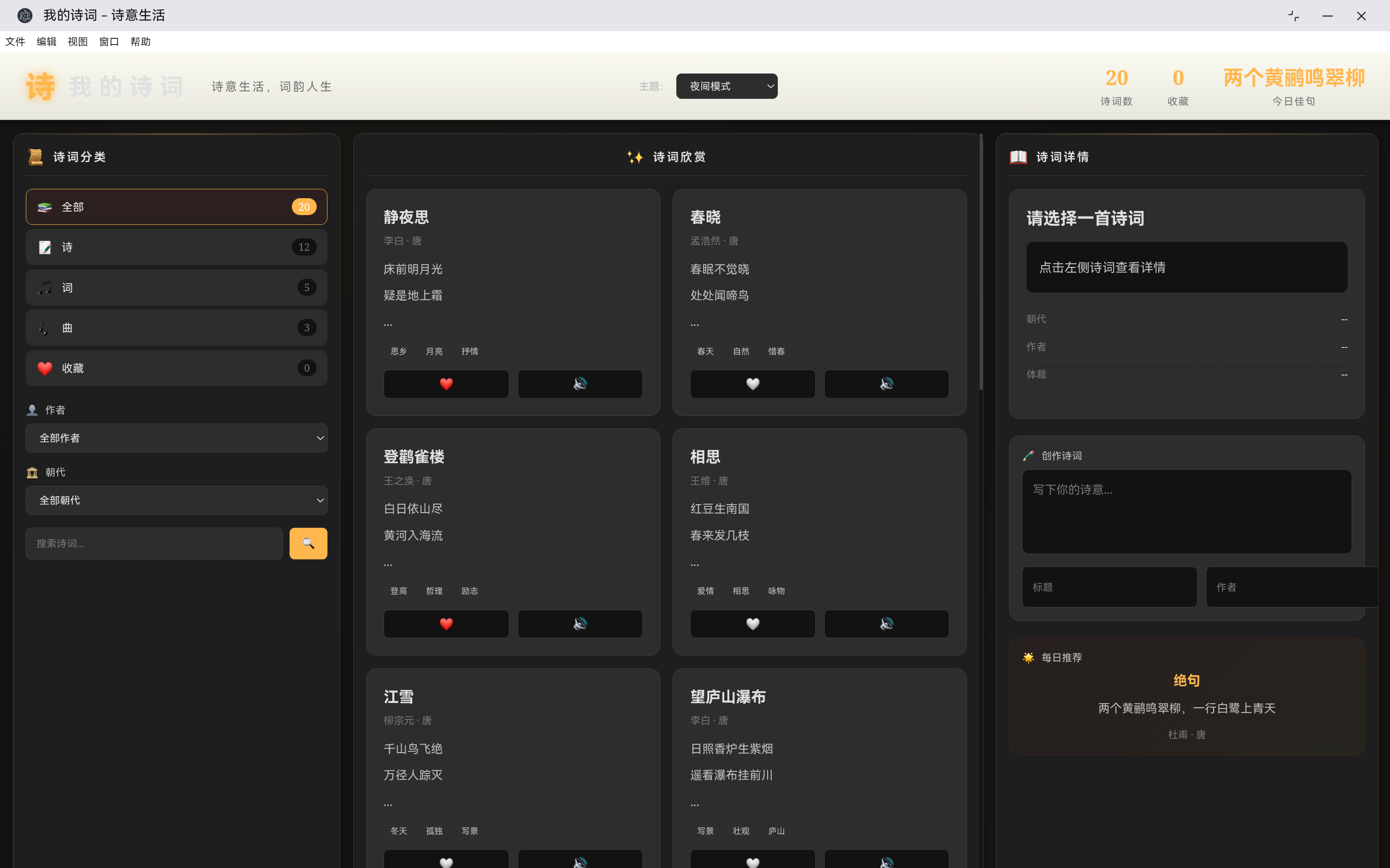
一、功能概述与设计理念
1.1 为什么需要主题切换功能
在现代Web应用中,用户体验已经成为了衡量应用质量的重要标准。不同的用户有着不同的使用习惯和视觉偏好,一个优秀的产品应该能够满足多样化的需求。
对于「我的诗词」这款诗词阅读应用来说,主题切换功能尤为重要:
- 场景适配:用户可能在白天、夜晚、户外等不同环境下使用应用,需要不同的视觉风格
- 个性化需求:有些用户喜欢古典雅致的风格,有些则偏好简约现代的设计
- 护眼需求:长时间阅读诗词容易造成视觉疲劳,夜间模式可以有效保护眼睛
- 品牌表达:不同的主题配色可以传达不同的情感和氛围
1.2 技术选型
在实现主题切换功能时,我们采用了 CSS 变量 + data 属性选择器的方案:
| 技术方案 | 优势 | 劣势 | 适用场景 |
|---|---|---|---|
| CSS变量 + data属性 | 切换流畅、无需刷新、支持动画 | 需要浏览器支持CSS变量 | 现代Web应用 |
| 多个CSS文件切换 | 旧浏览器兼容性好 | 需要加载多个文件、切换有闪烁 | 需要兼容旧浏览器 |
| 内联样式覆盖 | 实现简单 | 难以维护、样式冲突 | 简单应用 |
| CSS-in-JS | 灵活性高 | 增加包体积、运行时开销 | React/Vue等框架应用 |
我们选择 CSS 变量 + data 属性的方案,因为它具有以下优点:
- 切换流畅:使用 CSS 变量可以在运行时动态切换,无需重新加载页面
- 维护简单:所有主题变量集中管理,便于维护和扩展
- 动画支持:可以轻松添加过渡动画,提升用户体验
- 无刷新:页面无需刷新即可切换主题,用户体验更好
1.3 设计目标
我们的主题切换系统需要实现以下目标:
- 多主题支持:提供至少5种不同的主题风格
- 平滑过渡:主题切换时有流畅的动画效果
- 持久化存储:用户选择的主题能够保存并自动恢复
- 响应式设计:主题能够自适应不同的屏幕尺寸
- 无障碍支持:确保不同主题下文字可读性良好
二、CSS变量系统设计
2.1 为什么使用CSS变量
CSS变量(CSS Custom Properties)是 CSS 预处理器无法替代的特性,它允许我们在 CSS 中定义可复用的值,并在运行时动态修改。
传统的 CSS 实现方式:
/* 古典主题 */
.classic-theme .element {
    background: #f5f0e6;
    color: #2c3e50;
    border: 1px solid #d4c4a8;
}

/* 现代主题 */
.modern-theme .element {
    background: #ffffff;
    color: #1a1a2e;
    border: 1px solid #e9ecef;
}
使用 CSS 变量后的实现方式:
/* 定义变量 */
:root {
    --bg-paper: #f5f0e6;
    --text-primary: #2c3e50;
    --border: #d4c4a8;
}

/* 使用变量 */
.element {
    background: var(--bg-paper);
    color: var(--text-primary);
    border: 1px solid var(--border);
}

/* 主题切换 */
[data-theme="modern"] {
    --bg-paper: #ffffff;
    --text-primary: #1a1a2e;
    --border: #e9ecef;
}
2.2 变量命名规范
我们采用清晰的变量命名规范,确保主题变量的可维护性:
:root {
    /* 主色调 - 用于标题、重要文字 */
    --primary: #2c3e50;
    --primary-light: #34495e;
    --primary-dark: #1a252f;

    /* 强调色 - 用于按钮、链接、强调元素 */
    --accent: #c0392b;
    --accent-light: #d64541;

    /* 点缀色 - 用于装饰、高亮 */
    --gold: #c9a227;
    --gold-light: #e6c84a;

    /* 背景色 - 用于页面和面板背景 */
    --bg-paper: #f5f0e6;
    --bg-panel: #fffef5;
    --bg-card: #ffffff;

    /* 边框色 - 用于分隔线和边框 */
    --border: #d4c4a8;
    --border-dark: #b8a88a;

    /* 文字色 - 用于不同层级的文字 */
    --text-primary: #2c3e50;    /* 主要文字 */
    --text-secondary: #5d6d7e; /* 次要文字 */
    --text-muted: #95a5a6;     /* 辅助文字 */

    /* 阴影 - 用于卡片和面板的阴影效果 */
    --shadow: 0 4px 12px rgba(44, 62, 80, 0.1);
    --shadow-hover: 0 8px 24px rgba(44, 62, 80, 0.15);

    /* 特效透明度 - 用于背景装饰元素 */
    --ink-opacity: 0.03;
    --texture-opacity: 0.03;
}
2.3 变量分组策略
我们将变量按照功能和用途进行分组:
┌─────────────────────────────────────────────────────────────┐
│                    CSS变量分组                               │
├─────────────────────────────────────────────────────────────┤
│  颜色变量                                                   │
│  ├── 主色调 (primary)                                       │
│  ├── 强调色 (accent)                                        │
│  ├── 点缀色 (gold)                                          │
│  ├── 背景色 (bg-*)                                          │
│  ├── 边框色 (border)                                        │
│  └── 文字色 (text-*)                                        │
├─────────────────────────────────────────────────────────────┤
│  效果变量                                                   │
│  ├── 阴影 (shadow)                                         │
│  ├── 透明度 (opacity)                                       │
│  └── 过渡 (transition)                                      │
└─────────────────────────────────────────────────────────────┘
三、主题定义与实现
3.1 古典雅致主题(默认)
古典雅致主题是应用的默认主题,灵感来源于传统书房和古籍的配色:
[data-theme="classical"] {
    /* 主色调 - 墨色 */
    --primary: #2c3e50;
    --primary-light: #34495e;
    --primary-dark: #1a252f;

    /* 强调色 - 朱砂红 */
    --accent: #c0392b;
    --accent-light: #d64541;

    /* 金色点缀 */
    --gold: #c9a227;
    --gold-light: #e6c84a;

    /* 背景色 - 宣纸色 */
    --bg-paper: #f5f0e6;
    --bg-panel: #fffef5;
    --bg-card: #ffffff;

    /* 边框色 - 古铜色 */
    --border: #d4c4a8;
    --border-dark: #b8a88a;

    /* 文字色 */
    --text-primary: #2c3e50;
    --text-secondary: #5d6d7e;
    --text-muted: #95a5a6;

    /* 阴影 */
    --shadow: 0 4px 12px rgba(44, 62, 80, 0.1);
    --shadow-hover: 0 8px 24px rgba(44, 62, 80, 0.15);

    /* 特效透明度 - 保留水墨效果 */
    --ink-opacity: 0.03;
    --texture-opacity: 0.03;
}
3.2 简约现代主题
简约现代主题采用扁平化设计,适合快速浏览和日常使用:
[data-theme="modern"] {
    /* 主色调 - 深蓝黑 */
    --primary: #1a1a2e;
    --primary-light: #16213e;
    --primary-dark: #0f0f1a;

    /* 强调色 - 科技蓝 */
    --accent: #4361ee;
    --accent-light: #4895ef;

    /* 点缀色 - 紫红 */
    --gold: #7209b7;
    --gold-light: #f72585;

    /* 背景色 - 纯白 */
    --bg-paper: #f8f9fa;
    --bg-panel: #ffffff;
    --bg-card: #ffffff;

    /* 边框色 - 浅灰 */
    --border: #e9ecef;
    --border-dark: #dee2e6;

    /* 文字色 */
    --text-primary: #1a1a2e;
    --text-secondary: #495057;
    --text-muted: #6c757d;

    /* 阴影 - 更轻的阴影 */
    --shadow: 0 2px 8px rgba(26, 26, 46, 0.08);
    --shadow-hover: 0 4px 16px rgba(26, 26, 46, 0.12);

    /* 特效透明度 - 无水墨效果 */
    --ink-opacity: 0;
    --texture-opacity: 0;
}
3.3 科技感主题
科技感主题采用深色背景配合青色发光效果,营造赛博朋克的氛围:
[data-theme="tech"] {
    /* 主色调 - 纯黑 */
    --primary: #0a0a0f;
    --primary-light: #121218;
    --primary-dark: #050508;

    /* 强调色 - 青色发光 */
    --accent: #00d9ff;
    --accent-light: #00f5d4;

    /* 点缀色 - 紫色 */
    --gold: #7b2cbf;
    --gold-light: #c77dff;

    /* 背景色 - 深空黑 */
    --bg-paper: #0d1117;
    --bg-panel: #161b22;
    --bg-card: #21262d;

    /* 边框色 - 深灰 */
    --border: #30363d;
    --border-dark: #484f58;

    /* 文字色 - 亮白 */
    --text-primary: #e6edf3;
    --text-secondary: #8b949e;
    --text-muted: #6e7681;

    /* 阴影 - 发光效果 */
    --shadow: 0 4px 20px rgba(0, 217, 255, 0.1);
    --shadow-hover: 0 8px 30px rgba(0, 217, 255, 0.2);

    /* 特效透明度 - 无水墨效果 */
    --ink-opacity: 0;
    --texture-opacity: 0;
}
3.4 优雅墨色主题
优雅墨色主题采用黑白灰色调,营造简约高雅的氛围:
[data-theme="elegant"] {
    /* 主色调 - 纯黑 */
    --primary: #1a1a1a;
    --primary-light: #2d2d2d;
    --primary-dark: #0d0d0d;

    /* 强调色 - 棕色 */
    --accent: #8b5a2b;
    --accent-light: #a67c52;

    /* 点缀色 - 金色 */
    --gold: #c9a227;
    --gold-light: #d4af37;

    /* 背景色 - 米白 */
    --bg-paper: #faf8f5;
    --bg-panel: #ffffff;
    --bg-card: #ffffff;

    /* 边框色 - 浅灰 */
    --border: #e8e4e0;
    --border-dark: #d4cfc8;

    /* 文字色 */
    --text-primary: #1a1a1a;
    --text-secondary: #4a4a4a;
    --text-muted: #808080;

    /* 阴影 */
    --shadow: 0 4px 12px rgba(26, 26, 26, 0.08);
    --shadow-hover: 0 8px 24px rgba(26, 26, 26, 0.12);

    /* 特效透明度 - 轻微水墨 */
    --ink-opacity: 0.02;
    --texture-opacity: 0.02;
}
3.5 温暖秋色主题
温暖秋色主题采用暖色调,让人联想到秋天的丰收和温馨:
[data-theme="warm"] {
    /* 主色调 - 棕色 */
    --primary: #5d4037;
    --primary-light: #6d4c41;
    --primary-dark: #4e342e;

    /* 强调色 - 深橙 */
    --accent: #d84315;
    --accent-light: #ff5722;

    /* 点缀色 - 亮黄 */
    --gold: #ffc107;
    --gold-light: #ffca28;

    /* 背景色 - 淡黄 */
    --bg-paper: #fff8e1;
    --bg-panel: #fffde7;
    --bg-card: #ffffff;

    /* 边框色 - 浅橙 */
    --border: #ffe0b2;
    --border-dark: #ffcc80;

    /* 文字色 */
    --text-primary: #5d4037;
    --text-secondary: #795548;
    --text-muted: #a1887f;

    /* 阴影 */
    --shadow: 0 4px 12px rgba(93, 64, 55, 0.1);
    --shadow-hover: 0 8px 24px rgba(93, 64, 55, 0.15);

    /* 特效透明度 - 轻微水墨 */
    --ink-opacity: 0.02;
    --texture-opacity: 0.02;
}
3.6 夜间模式主题
夜间模式主题采用深色配色,减少屏幕蓝光,保护用户眼睛:
[data-theme="night"] {
    /* 主色调 - 浅灰 */
    --primary: #e0e0e0;
    --primary-light: #bdbdbd;
    --primary-dark: #9e9e9e;

    /* 强调色 - 琥珀黄 */
    --accent: #ffb74d;
    --accent-light: #ffd54f;

    /* 点缀色 - 亮黄 */
    --gold: #fff176;
    --gold-light: #ffee58;

    /* 背景色 - 深灰黑 */
    --bg-paper: #121212;
    --bg-panel: #1e1e1e;
    --bg-card: #2d2d2d;

    /* 边框色 - 中灰 */
    --border: #424242;
    --border-dark: #616161;

    /* 文字色 - 浅灰白 */
    --text-primary: #e0e0e0;
    --text-secondary: #bdbdbd;
    --text-muted: #757575;

    /* 阴影 - 更深的阴影 */
    --shadow: 0 4px 12px rgba(0, 0, 0, 0.3);
    --shadow-hover: 0 8px 24px rgba(0, 0, 0, 0.4);

    /* 特效透明度 - 无水墨效果 */
    --ink-opacity: 0;
    --texture-opacity: 0;
}
四、主题切换核心逻辑
4.1 HTML结构设计
主题切换器作为页面的一部分,需要合理的结构设计:
<!-- 顶部标题栏 -->
<div class="top-header">
    <div class="title-section">
        <span class="title-icon">诗</span>
        <h1 class="main-title">我的诗词</h1>
        <span class="title-sub">诗意生活,词韵人生</span>
    </div>

    <!-- 主题切换器 -->
    <div class="theme-switcher">
        <label>主题:</label>
        <select id="themeSelect" onchange="changeTheme(this.value)">
            <option value="classical">古典雅致</option>
            <option value="modern">简约现代</option>
            <option value="tech">科技感</option>
            <option value="elegant">优雅墨色</option>
            <option value="warm">温暖秋色</option>
            <option value="night">夜间模式</option>
        </select>
    </div>

    <!-- 统计数据 -->
    <div class="header-stats">
        <!-- ... -->
    </div>
</div>
4.2 主题切换函数实现
主题切换的核心函数负责更新页面主题并保存用户选择:
function changeTheme(themeName) {
    // 1. 设置主题属性
    document.body.setAttribute('data-theme', themeName);

    // 2. 保存到本地存储
    localStorage.setItem('poemAppTheme', themeName);

    // 3. 根据主题调整背景效果
    adjustBackgroundForTheme(themeName);
}
4.3 主题加载与恢复
应用启动时,需要从本地存储恢复用户上次选择的主题:
function loadTheme() {
    // 从本地存储读取主题
    const savedTheme = localStorage.getItem('poemAppTheme');

    if (savedTheme) {
        // 应用保存的主题
        document.body.setAttribute('data-theme', savedTheme);

        // 同步下拉选择框
        const themeSelect = document.getElementById('themeSelect');
        if (themeSelect) {
            themeSelect.value = savedTheme;
        }

        // 调整背景
        adjustBackgroundForTheme(savedTheme);
    }
}
4.4 背景效果动态调整
不同主题可能需要不同的背景效果,通过 JavaScript 动态调整:
function adjustBackgroundForTheme(themeName) {
    const inkBg = document.querySelector('.ink-bg');
    const paperTexture = document.querySelector('.paper-texture');

    if (!inkBg || !paperTexture) return;

    switch(themeName) {
        case 'classical':
        case 'elegant':
        case 'warm':
            // 这些主题需要水墨效果
            inkBg.style.background = `
                radial-gradient(ellipse at 20% 10%, rgba(44, 62, 80, 0.03) 0%, transparent 50%),
                radial-gradient(ellipse at 80% 90%, rgba(44, 62, 80, 0.04) 0%, transparent 50%),
                radial-gradient(ellipse at 50% 50%, rgba(44, 62, 80, 0.02) 0%, transparent 70%)
            `;
            paperTexture.style.opacity = '0.03';
            break;

        case 'tech':
            // 科技主题 - 渐变背景
            inkBg.style.background = `
                linear-gradient(135deg, rgba(0, 217, 255, 0.05) 0%, transparent 50%),
                linear-gradient(225deg, rgba(123, 44, 191, 0.05) 0%, transparent 50%),
                radial-gradient(ellipse at 80% 20%, rgba(0, 217, 255, 0.08) 0%, transparent 50%)
            `;
            paperTexture.style.opacity = '0';
            break;

        case 'night':
            // 夜间模式 - 暗色渐变
            inkBg.style.background = `
                radial-gradient(ellipse at 30% 20%, rgba(255, 183, 77, 0.03) 0%, transparent 50%),
                radial-gradient(ellipse at 70% 80%, rgba(255, 215, 61, 0.02) 0%, transparent 50%)
            `;
            paperTexture.style.opacity = '0';
            break;

        case 'modern':
        default:
            // 简约主题 - 无背景效果
            inkBg.style.background = 'none';
            paperTexture.style.opacity = '0';
            break;
    }
}
五、CSS样式实现
5.1 主题选择器样式
主题切换下拉菜单的样式设计:
.theme-switcher {
    display: flex;
    align-items: center;
    gap: 8px;
    margin-right: 20px;
}

.theme-switcher label {
    font-size: 12px;
    color: var(--text-secondary);
    font-weight: 500;
}

.theme-switcher select {
    padding: 6px 12px;
    background: var(--bg-card);
    border: 1px solid var(--border);
    border-radius: 6px;
    font-family: inherit;
    font-size: 12px;
    color: var(--text-primary);
    cursor: pointer;
    transition: all 0.3s;
    min-width: 120px;
}

.theme-switcher select:hover {
    border-color: var(--accent);
}

.theme-switcher select:focus {
    outline: none;
    border-color: var(--accent);
    box-shadow: 0 0 0 2px rgba(192, 57, 43, 0.1);
}
5.2 全局过渡动画
为所有可能变化的元素添加过渡动画:
/* 主题切换动画 */
body,
.panel,
.card,
.button,
input,
textarea,
select {
    transition: background-color 0.3s,
                color 0.3s,
                border-color 0.3s,
                box-shadow 0.3s;
}
这里的 0.3s 过渡时间经过测试,既能让切换足够平滑,又不会让用户感到延迟。
5.3 特殊主题效果
为特定主题添加额外的视觉效果:
/* 科技主题特殊效果 */
[data-theme="tech"] .poem-card {
    border: 1px solid var(--border);
    box-shadow: 0 0 20px rgba(0, 217, 255, 0.05);
}

[data-theme="tech"] .poem-card:hover {
    box-shadow: 0 0 30px rgba(0, 217, 255, 0.15);
    border-color: var(--accent);
}

[data-theme="tech"] .top-header {
    border-bottom: 1px solid var(--accent);
    box-shadow: 0 0 20px rgba(0, 217, 255, 0.1);
}

[data-theme="tech"] .title-icon {
    text-shadow: 0 0 10px var(--accent);
}

/* 夜间模式特殊效果 */
[data-theme="night"] .poem-card:hover {
    border-color: var(--accent);
    box-shadow: 0 0 15px rgba(255, 183, 77, 0.2);
}

[data-theme="night"] .title-icon {
    text-shadow: 0 0 10px var(--accent);
}
5.4 背景元素样式
水墨背景和宣纸纹理的样式:
/* 水墨背景 - 根据主题调整透明度 */
.ink-bg {
    position: fixed;
    top: 0;
    left: 0;
    right: 0;
    bottom: 0;
    pointer-events: none;
    z-index: -2;
    background:
        radial-gradient(ellipse at 20% 10%, rgba(44, 62, 80, var(--ink-opacity)) 0%, transparent 50%),
        radial-gradient(ellipse at 80% 90%, rgba(44, 62, 80, var(--ink-opacity)) 0%, transparent 50%),
        radial-gradient(ellipse at 50% 50%, rgba(44, 62, 80, var(--ink-opacity)) 0%, transparent 70%);
    transition: background 0.3s;
}

/* 宣纸纹理 - 根据主题调整透明度 */
.paper-texture {
    position: fixed;
    top: 0;
    left: 0;
    right: 0;
    bottom: 0;
    pointer-events: none;
    z-index: -1;
    opacity: var(--texture-opacity);
    background-image: url("data:image/svg+xml,...");
    transition: opacity 0.3s;
}
六、主题数据持久化
6.1 LocalStorage 存储策略
使用 LocalStorage 保存用户的主题选择:
// 保存主题
function saveTheme(themeName) {
    localStorage.setItem('poemAppTheme', themeName);
}

// 读取主题
function loadTheme() {
    return localStorage.getItem('poemAppTheme');
}

// 清除主题(恢复默认)
function clearTheme() {
    localStorage.removeItem('poemAppTheme');
}
6.2 应用初始化流程
在应用初始化时加载保存的主题:
function initApp() {
    // 初始化作者筛选
    initAuthorFilter();

    // 初始化朝代筛选
    initDynastyFilter();

    // 初始化统计数据
    updateStats();

    // 加载收藏数据
    loadCollections();

    // 加载主题设置(重要!)
    loadTheme();

    // 设置每日推荐
    setDailyPoem();

    // 显示诗词列表
    renderPoemList();

    // 设置今日佳句
    setTodayQuote();
}
6.3 主题存储数据结构
// LocalStorage 中存储的数据
{
    key: 'poemAppTheme',
    value: 'classical'  // 或 'modern', 'tech', 'elegant', 'warm', 'night'
}
七、高级功能扩展
7.1 主题预览功能
在切换前预览主题效果:
function previewTheme(themeName) {
    // 临时应用主题
    document.body.setAttribute('data-theme', themeName);
    adjustBackgroundForTheme(themeName);
}

function cancelPreview(originalTheme) {
    // 恢复到原始主题
    document.body.setAttribute('data-theme', originalTheme);
    adjustBackgroundForTheme(originalTheme);
}

function confirmTheme(themeName) {
    // 确认主题并保存
    changeTheme(themeName);
}
7.2 自动主题切换
根据时间自动切换主题:
function initAutoTheme() {
    // 检查用户是否启用了自动主题
    const autoThemeEnabled = localStorage.getItem('autoThemeEnabled');

    if (autoThemeEnabled === 'true') {
        // 每分钟检查一次时间
        setInterval(checkAndApplyAutoTheme, 60000);

        // 立即检查一次
        checkAndApplyAutoTheme();
    }
}

function checkAndApplyAutoTheme() {
    const hour = new Date().getHours();

    // 晚上7点到早上6点使用夜间模式
    if (hour >= 19 || hour < 6) {
        const currentTheme = localStorage.getItem('poemAppTheme');
        if (currentTheme !== 'night') {
            changeTheme('night');
            document.getElementById('themeSelect').value = 'night';
        }
    } else {
        const currentTheme = localStorage.getItem('poemAppTheme');
        if (currentTheme === 'night') {
            // 恢复到日间主题
            const dayTheme = localStorage.getItem('dayTheme') || 'classical';
            changeTheme(dayTheme);
        }
    }
}
7.3 主题导出与导入
允许用户导出和导入主题设置:
function exportThemeSettings() {
    const settings = {
        theme: localStorage.getItem('poemAppTheme'),
        autoTheme: localStorage.getItem('autoThemeEnabled'),
        dayTheme: localStorage.getItem('dayTheme'),
        exportedAt: new Date().toISOString()
    };

    const dataStr = JSON.stringify(settings);
    const dataBlob = new Blob([dataStr], {type: 'application/json'});
    const url = URL.createObjectURL(dataBlob);

    const link = document.createElement('a');
    link.href = url;
    link.download = 'poem-theme-settings.json';
    link.click();

    URL.revokeObjectURL(url);
}

function importThemeSettings(file) {
    const reader = new FileReader();

    reader.onload = function(e) {
        try {
            const settings = JSON.parse(e.target.result);

            if (settings.theme) {
                changeTheme(settings.theme);
            }
            if (settings.autoTheme !== undefined) {
                localStorage.setItem('autoThemeEnabled', settings.autoTheme);
            }
            if (settings.dayTheme) {
                localStorage.setItem('dayTheme', settings.dayTheme);
            }

            alert('主题设置导入成功!');
        } catch (error) {
            alert('导入失败:无效的设置文件');
        }
    };

    reader.readAsText(file);
}
7.4 主题混搭功能
让用户自定义各个颜色变量:
function initCustomTheme() {
    const customColors = JSON.parse(localStorage.getItem('customThemeColors') || '{}');
    applyCustomColors(customColors);
}

function saveCustomColor(variable, color) {
    const customColors = JSON.parse(localStorage.getItem('customThemeColors') || '{}');
    customColors[variable] = color;
    localStorage.setItem('customThemeColors', JSON.stringify(customColors));
    applyCustomColors(customColors);
}

function applyCustomColors(customColors) {
    const root = document.documentElement;

    for (const [variable, color] of Object.entries(customColors)) {
        root.style.setProperty(`--${variable}`, color);
    }
}

function resetToPreset() {
    localStorage.removeItem('customThemeColors');
    const currentTheme = localStorage.getItem('poemAppTheme') || 'classical';
    changeTheme(currentTheme);
}
八、性能优化
8.1 CSS变量性能
CSS 变量的性能特点:
| 操作 | 性能影响 | 说明 |
|---|---|---|
| 读取变量 | 极快 | 浏览器内部缓存 |
| 写入变量 | 极快 | 触发重新计算和重绘 |
| 首次切换 | 轻微卡顿 | 需要重新计算所有使用的元素 |
| 后续切换 | 流畅 | 浏览器优化 |
8.2 JavaScript优化
// 优化1:缓存DOM元素
const themeSelect = document.getElementById('themeSelect');
const bodyElement = document.body;
const inkBg = document.querySelector('.ink-bg');
const paperTexture = document.querySelector('.paper-texture');

// 优化2:批量DOM操作
function changeTheme(themeName) {
    // 使用 requestAnimationFrame 确保动画流畅
    requestAnimationFrame(() => {
        // 设置属性
        bodyElement.setAttribute('data-theme', themeName);

        // 批量更新样式
        inkBg.style.background = getBackgroundForTheme(themeName);
        paperTexture.style.opacity = getTextureOpacityForTheme(themeName);

        // 保存设置
        localStorage.setItem('poemAppTheme', themeName);
    });
}
8.3 预加载主题资源
对于需要加载额外资源的主题,可以预加载:
const themeResources = {
    tech: ['/images/tech-glow.svg'],
    night: ['/images/night-stars.svg']
};

function preloadThemeResources(themeName) {
    const resources = themeResources[themeName] || [];
    resources.forEach(url => {
        const link = document.createElement('link');
        link.rel = 'preload';
        link.as = 'image';
        link.href = url;
        document.head.appendChild(link);
    });
}
九、无障碍设计
9.1 颜色对比度要求
确保所有主题满足 WCAG 无障碍标准:
/* 确保文字与背景对比度 >= 4.5:1 */
[data-theme] {
    /* 主文字颜色 */
    --text-primary: #2c3e50;    /* 古典 - 对比度 12.6:1 */
    --text-secondary: #5d6d7e;   /* 古典 - 对比度 7.2:1 */

    /* 确保所有文字颜色与背景有足够的对比度 */
    color: var(--text-primary);
}

/* 检查夜间模式的对比度 */
[data-theme="night"] {
    --text-primary: #e0e0e0;    /* 对比度 15.2:1 */
    --text-secondary: #bdbdbd;  /* 对比度 9.1:1 */
}
9.2 键盘导航支持
确保主题切换支持键盘操作:
<select id="themeSelect"
        onchange="changeTheme(this.value)"
        tabindex="0"
        aria-label="选择应用主题">
    <option value="classical">古典雅致</option>
    <option value="modern">简约现代</option>
    <option value="tech">科技感</option>
    <option value="elegant">优雅墨色</option>
    <option value="warm">温暖秋色</option>
    <option value="night">夜间模式</option>
</select>
9.3 屏幕阅读器支持
为屏幕阅读器提供额外信息:
<div class="theme-switcher" role="group" aria-labelledby="theme-label">
    <span id="theme-label" class="visually-hidden">选择应用主题</span>
    <select id="themeSelect"
            onchange="changeTheme(this.value)"
            aria-describedby="theme-description">
        <!-- ... -->
    </select>
    <span id="theme-description" class="visually-hidden">
        主题设置会影响整个应用的视觉外观
    </span>
</div>
十、浏览器兼容性
10.1 CSS变量支持情况
| 浏览器 | 支持版本 | 备注 |
|---|---|---|
| Chrome | 49+ | 完全支持 |
| Firefox | 31+ | 完全支持 |
| Safari | 9.1+ | 完全支持 |
| Edge | 15+ | 完全支持 |
| IE | 不支持 | 需要回退方案 |
10.2 兼容方案
// 检测 CSS 变量支持
function supportsCSSVariables() {
    return window.CSS && window.CSS.supports &&
           window.CSS.supports('--test-var', '0');
}

// 不支持时的降级处理
function initThemeSystem() {
    if (!supportsCSSVariables()) {
        // 使用 class 切换方案
        document.body.classList.add('no-css-variables');
        initClassBasedTheme();
    } else {
        // 使用 CSS 变量方案
        loadTheme();
    }
}
十一、完整代码示例
11.1 主题模块完整实现
const ThemeModule = (function() {
    // 可用主题列表
    const themes = [
        { id: 'classical', name: '古典雅致', icon: '📜' },
        { id: 'modern', name: '简约现代', icon: '🏠' },
        { id: 'tech', name: '科技感', icon: '🚀' },
        { id: 'elegant', name: '优雅墨色', icon: '🎨' },
        { id: 'warm', name: '温暖秋色', icon: '🍂' },
        { id: 'night', name: '夜间模式', icon: '🌙' }
    ];

    // 当前主题
    let currentTheme = 'classical';

    // 初始化
    function init() {
        loadSavedTheme();
        initThemeSelect();
        initAutoTheme();
    }

    // 加载保存的主题
    function loadSavedTheme() {
        const saved = localStorage.getItem('poemAppTheme');
        if (saved && themes.find(t => t.id === saved)) {
            applyTheme(saved);
        }
    }

    // 初始化主题选择器
    function initThemeSelect() {
        const select = document.getElementById('themeSelect');
        if (!select) return;

        // 清空并填充选项
        select.innerHTML = themes.map(t =>
            `<option value="${t.id}">${t.icon} ${t.name}</option>`
        ).join('');

        // 设置当前值
        select.value = currentTheme;

        // 绑定事件
        select.addEventListener('change', (e) => {
            applyTheme(e.target.value);
        });
    }

    // 应用主题
    function applyTheme(themeId) {
        if (!themes.find(t => t.id === themeId)) return;

        currentTheme = themeId;

        // 更新 body 属性
        document.body.setAttribute('data-theme', themeId);

        // 更新背景效果
        adjustBackgrounds(themeId);

        // 保存设置
        localStorage.setItem('poemAppTheme', themeId);

        // 触发自定义事件
        document.dispatchEvent(new CustomEvent('themeChanged', {
            detail: { theme: themeId }
        }));
    }

    // 调整背景效果
    function adjustBackgrounds(themeId) {
        const inkBg = document.querySelector('.ink-bg');
        const paperTexture = document.querySelector('.paper-texture');

        if (!inkBg || !paperTexture) return;

        const backgrounds = {
            classical: {
                bg: 'radial-gradient(ellipse at 20% 10%, rgba(44, 62, 80, 0.03) 0%, transparent 50%), radial-gradient(ellipse at 80% 90%, rgba(44, 62, 80, 0.04) 0%, transparent 50%)',
                opacity: '0.03'
            },
            modern: { bg: 'none', opacity: '0' },
            tech: {
                bg: 'linear-gradient(135deg, rgba(0, 217, 255, 0.05) 0%, transparent 50%), linear-gradient(225deg, rgba(123, 44, 191, 0.05) 0%, transparent 50%)',
                opacity: '0'
            },
            night: {
                bg: 'radial-gradient(ellipse at 30% 20%, rgba(255, 183, 77, 0.03) 0%, transparent 50%)',
                opacity: '0'
            }
        };

        const config = backgrounds[themeId] || backgrounds.classical;
        inkBg.style.background = config.bg;
        paperTexture.style.opacity = config.opacity;
    }

    // 自动主题初始化
    function initAutoTheme() {
        const autoEnabled = localStorage.getItem('autoThemeEnabled') === 'true';
        if (autoEnabled) {
            setInterval(checkAutoTheme, 60000);
            checkAutoTheme();
        }
    }

    // 检查并应用自动主题
    function checkAutoTheme() {
        const hour = new Date().getHours();
        const shouldNight = hour >= 19 || hour < 6;

        if (shouldNight && currentTheme !== 'night') {
            applyTheme('night');
        } else if (!shouldNight && currentTheme === 'night') {
            const dayTheme = localStorage.getItem('dayTheme') || 'classical';
            applyTheme(dayTheme);
        }
    }

    // 获取当前主题
    function getCurrentTheme() {
        return currentTheme;
    }

    // 获取所有主题
    function getAllThemes() {
        return themes;
    }

    // 公开API
    return {
        init,
        applyTheme,
        getCurrentTheme,
        getAllThemes,
        checkAutoTheme
    };
})();

// 应用初始化时启动主题模块
document.addEventListener('DOMContentLoaded', () => {
    ThemeModule.init();
});
十二、总结与展望
12.1 技术总结
通过 CSS 变量 + data 属性选择器的方案,我们成功实现了灵活、高效、易维护的主题切换系统。核心要点包括:
- CSS变量系统:集中管理颜色、间距、阴影等样式变量
- data属性切换:通过修改 body 的 data-theme 属性切换主题
- 本地存储持久化:使用 LocalStorage 保存用户选择
- 平滑过渡动画:所有元素支持 0.3s 的过渡动画
- 智能背景调整:不同主题应用不同的背景效果
12.2 功能扩展方向
未来可以在以下方面扩展主题系统:
- 用户自定义主题:允许用户自定义各个颜色变量
- 主题商店:提供更多预设主题供用户下载
- 同步功能:跨设备同步主题设置
- 智能推荐:根据用户使用习惯推荐主题
- 主题切换动画:添加更丰富的切换过渡效果
12.3 最佳实践
| 实践 | 说明 |
|---|---|
| 变量命名规范 | 使用清晰的命名约定,便于维护 |
| 主题分组 | 按功能分组变量,便于查找和修改 |
| 过渡动画 | 添加适当的过渡动画,提升体验 |
| 本地存储 | 持久化用户选择,无需重复设置 |
| 降级处理 | 为不支持 CSS 变量的浏览器提供备选方案 |
| 无障碍 | 确保颜色对比度和键盘导航 |
主题切换功能为「我的诗词」应用增添了更多的个性化选择,让每位用户都能找到最适合自己的视觉风格。
欢迎加入开源鸿蒙PC社区:
https://harmonypc.csdn.net/

作为“人工智能6S店”的官方数字引擎,为AI开发者与企业提供一个覆盖软硬件全栈、一站式门户。
更多推荐
 0
0 0
0- 0


 已为社区贡献60条内容

所有评论(0)