
04极速划词页面实现-鸿蒙PC端Electron开发
·
欢迎加入开源鸿蒙 PC社区
https://harmonypc.csdn.net/
源码仓库
https://atomgit.com/qq_33247427/englishProject.git
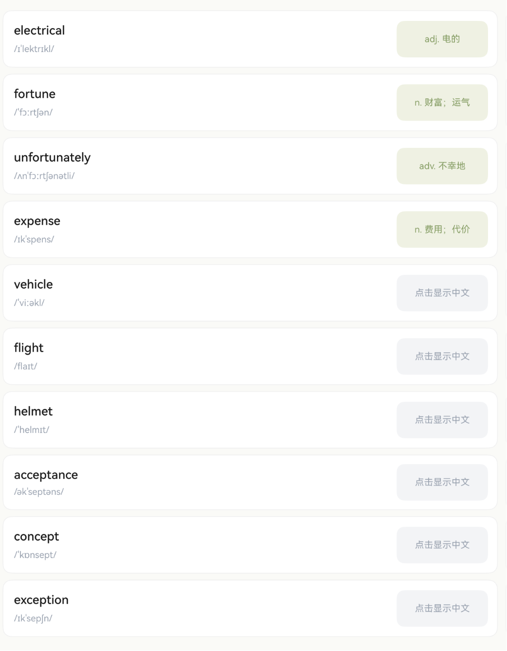
效果截图
第4篇:极速划词页面实现
系列教程导航
| 篇号 | 标题 | 状态 |
|---|---|---|
| 01 | 环境搭建与项目创建 | ✅ |
| 02 | 数据模型与单词仓库 | ✅ |
| 03 | 主入口页面与导航结构 | ✅ |
| 04 | 极速划词页面实现 | 本篇 |
| 05 | 手写画布实现 | 下一篇 |
一、页面整体设计
1.1 布局结构
SpeedVocabPage 采用经典的左右分栏布局,适合平板和鸿蒙 PC 的大屏幕:
┌────────┬──────────────────────────────────────┐
│        │  标题栏:极速划词                      │
│  Tab   ├──────────────────────────────────────┤
│  导航   │                                      │
│        │  ┌──────────┐  ┌──────────┐          │
│ [速]   │  │ apple    │  │ banana   │          │
│ 极速划词│  │    苹果  │  │    香蕉  │          │
│        │  └──────────┘  └──────────┘          │
│ [写]   │  ┌──────────┐  ┌──────────┐          │
│ 默写单词│  │ cherry   │  │ date     │          │
│        │  │  点击显示 │  │  点击显示 │          │
│        │  └──────────┘  └──────────┘          │
└────────┴──────────────────────────────────────┘
1.2 交互设计
- 左侧 Tab 切换「极速划词」和「默写单词」两个功能
- 右侧卡片点击后显示中文释义,再次点击隐藏
- 标题栏显示当前功能名称
二、左侧 Tab 导航栏
2.1 Tab 导航实现
@State selectedNavIndex: number = 0; // 0=极速划词 1=默写单词

@Builder
NavSidebar() {
  Column() {
    // 极速划词 Tab
    Column({ space: 8 }) {
      Column() {
        Text('速')
          .fontSize(22)
          .fontWeight(FontWeight.Bold)
          .fontColor(this.selectedNavIndex === 0 ? '#6F7F52' : '#9CA3AF')
      }
      .width(56)
      .height(56)
      .borderRadius(6)
      .backgroundColor(this.selectedNavIndex === 0 ? '#EEF1E4' : '#F3F4F6')
      .justifyContent(FlexAlign.Center)
      .alignItems(HorizontalAlign.Center)

      Text('极速划词')
        .fontSize(13)
        .fontColor(this.selectedNavIndex === 0 ? '#6F7F52' : '#9CA3AF')
        .fontWeight(this.selectedNavIndex === 0 ? FontWeight.Medium : FontWeight.Normal)
    }
    .width('100%')
    .padding({ top: 20, bottom: 20 })
    .alignItems(HorizontalAlign.Center)
    .onClick(() => { this.selectedNavIndex = 0; })

    // 默写单词 Tab(结构类似,省略)
    // ...
  }
  .width(96)
  .height('100%')
  .backgroundColor('#FFFFFF')
  .padding({ top: 16 })
  .alignItems(HorizontalAlign.Center)
  .justifyContent(FlexAlign.Start)
  .border({ width: { right: 1 }, color: '#EBEBEB' })
}
2.2 Tab 设计要点
| 属性 | 选中态 | 未选中态 |
|---|---|---|
| 图标背景色 | #EEF1E4(浅绿) | #F3F4F6(浅灰) |
| 文字颜色 | #6F7F52(深绿) | #9CA3AF(灰色) |
| 文字粗细 | Medium | Normal |
| 圆角 | 6px | 6px |
| 图标尺寸 | 56×56 | 56×56 |
关键设计决策:
- 未选中也有背景色(浅灰),而不是透明,让用户知道这是可点击的区域
- 圆角 6px 而不是大圆角,保持方正感,适合工具类应用
- Tab 宽度 96px,在平板上不会太窄也不会太宽
2.3 Tab 切换内容区
build() {
  Row() {
    this.NavSidebar()

    // 根据 Tab 索引切换内容
    if (this.selectedNavIndex === 0) {
      this.SpeedVocabContent()
    } else {
      this.DictationContent()
    }
  }
  .width('100%')
  .height('100%')
  .backgroundColor('#FAFAF7')
}
使用 if/else 条件渲染而不是 Tabs 组件,因为我们的两个内容区结构差异很大,条件渲染更灵活。
三、单词卡片组件
3.1 卡片布局
每张卡片分为左右两部分:
- 左侧:单词 + 音标
- 右侧:点击区域(显示释义或"点击显示中文")
@Builder
WordCard(word: VocabularyWord) {
  Row({ space: 0 }) {
    // 左侧:单词信息
    Column({ space: 6 }) {
      Text(word.english)
        .fontSize(16)
        .fontWeight(FontWeight.Medium)
        .fontColor('#1A1A1A')
      Text(word.phonetic)
        .fontSize(12)
        .fontColor('#9CA3AF')
    }
    .alignItems(HorizontalAlign.Start)
    .layoutWeight(1)
    .padding({ left: 14, top: 16, bottom: 16 })

    // 右侧:释义显示区
    Column() {
      if (this.isRevealed(word.id)) {
        Text(word.meaning)
          .fontSize(12)
          .fontColor('#8B9D6B')
          .textAlign(TextAlign.Center)
          .padding({ left: 6, right: 6 })
          .maxLines(2)
          .textOverflow({ overflow: TextOverflow.Ellipsis })
      } else {
        Text('点击显示中文')
          .fontSize(12)
          .fontColor('#9CA3AF')
          .textAlign(TextAlign.Center)
      }
    }
    .width(120)
    .height(48)
    .backgroundColor(this.isRevealed(word.id) ? '#EEF1E4' : '#F3F4F6')
    .borderRadius(10)
    .justifyContent(FlexAlign.Center)
    .margin({ right: 12, top: 10, bottom: 10 })
    .onClick(() => { this.toggleReveal(word.id); })
  }
  .layoutWeight(1)
  .backgroundColor('#FFFFFF')
  .borderRadius(12)
  .border({ width: 1, color: '#F0F0F0' })
}
3.2 显示/隐藏状态管理
@State revealedWordIds: string[] = [];

isRevealed(wordId: string): boolean {
  return this.revealedWordIds.indexOf(wordId) >= 0;
}

toggleReveal(wordId: string) {
  const idx = this.revealedWordIds.indexOf(wordId);
  if (idx >= 0) {
    // 已显示 → 隐藏(创建新数组)
    const arr = this.revealedWordIds.slice();
    arr.splice(idx, 1);
    this.revealedWordIds = arr;
  } else {
    // 未显示 → 显示(创建新数组)
    this.revealedWordIds = [...this.revealedWordIds, wordId];
  }
}
为什么不用 Set?ArkTS 的 @State 对 Set 的变化检测支持不完善,用数组更可靠。
四、两列网格布局
4.1 数据分行
ArkUI 没有原生的 Grid 组件适合这种场景(每行两个不等高卡片),我们手动将数据分成行:
interface WordRow {
  left: VocabularyWord;
  right: VocabularyWord | null;
}

getWordRows(): WordRow[] {
  const filtered = this.getFilteredWords();
  const rows: WordRow[] = [];
  for (let i = 0; i < filtered.length; i += 2) {
    rows.push({
      left: filtered[i],
      right: i + 1 < filtered.length ? filtered[i + 1] : null
    });
  }
  return rows;
}
4.2 渲染两列
List({ space: 8 }) {
  ForEach(this.getWordRows(), (row: WordRow) => {
    ListItem() {
      Row({ space: 10 }) {
        this.WordCard(row.left)
        if (row.right !== null) {
          this.WordCard(row.right)
        } else {
          // 奇数个单词时,右侧放空占位
          Row().layoutWeight(1)
        }
      }
      .width('100%')
    }
  })
}
.layoutWeight(1)
.width('100%')
.padding({ left: 16, right: 16, top: 12, bottom: 20 })
.scrollBar(BarState.Off)
.edgeEffect(EdgeEffect.Spring)
4.3 为什么不用 WaterFlow 或 Grid?
Grid:需要固定行列数和尺寸,不够灵活WaterFlow:适合瀑布流(不等高),但我们的卡片等高List+ 手动分行:最简单直接,完全可控
五、顶部标题栏
5.1 简洁标题
Row({ space: 0 }) {
  Text('极速划词')
    .fontSize(18)
    .fontWeight(FontWeight.Bold)
    .fontColor('#1A1A1A')
}
.width('100%')
.height(52)
.margin({ top: 16 })
.padding({ left: 20, right: 20 })
.backgroundColor('#FAFAF7')
.alignItems(VerticalAlign.Center)
设计原则:
- 标题字体 18px Bold,和默写单词页面保持一致
margin({ top: 16 })让标题不贴顶,有呼吸感- 背景色
#FAFAF7和页面背景融为一体
六、完整状态管理
6.1 页面状态一览
@Entry
@Component
struct SpeedVocabPage {
  private repository: SpeedWordRepository = new SpeedWordRepository();

  // 公共状态
  @State selectedNavIndex: number = 0;
  @State selectedDate: string = '3/12';
  private readonly dates: string[] = ['3/07', '3/08', '3/09', '3/10', '3/11', '3/12'];

  // 极速划词状态
  @State words: VocabularyWord[] = [];
  @State revealedWordIds: string[] = [];

  // 默写单词状态(下一篇详解)
  @State currentIndex: number = 0;
  @State currentWord: VocabularyWord | null = null;
  // ...

  aboutToAppear() {
    this.words = this.repository.getWordsByDate(this.selectedDate);
  }
}
6.2 状态分类原则
| 类型 | 装饰器 | 示例 |
|---|---|---|
| UI 需要响应的数据 | @State |
words、selectedNavIndex |
| 不变的配置 | private / private readonly |
repository、dates |
| 临时计算值 | 方法返回 | getWordRows()、getFilteredWords() |
七、响应式布局考虑
7.1 适配不同屏幕
本应用面向鸿蒙 PC 和平板,屏幕宽度通常在 1024px ~ 2560px 之间。当前的两列布局在这个范围内表现良好:
- 1024px 宽:每列卡片约 400px,足够显示
- 2560px 宽:每列卡片约 1100px,内容不会拉伸变形(因为用了
layoutWeight)
7.2 如果需要适配手机
可以根据屏幕宽度动态调整列数:
// 获取屏幕宽度
import { display } from '@kit.ArkUI';

aboutToAppear() {
  const screenWidth = display.getDefaultDisplaySync().width;
  this.columnCount = screenWidth > 600 ? 2 : 1;
}
但本项目 deviceTypes 设为 ["2in1", "tablet"],不需要适配手机。
八、本篇小结
通过本篇教程,我们完成了:
- 实现了左右分栏布局(Tab 导航 + 内容区)
- 创建了 Tab 导航栏(选中/未选中双态样式)
- 实现了单词卡片组件(点击显示/隐藏释义)
- 掌握了两列网格的手动分行技巧
- 理解了 @State 数组变更的正确方式
- 学习了条件渲染切换内容区
下一篇预告
第 5 篇:手写画布实现 — 我们将使用 Canvas 组件实现流畅的手写输入,解决画笔卡顿问题,并实现三层 Stack 结构(白底 + 水印 + 画布)。

作为“人工智能6S店”的官方数字引擎,为AI开发者与企业提供一个覆盖软硬件全栈、一站式门户。
更多推荐

 0
0 0
0- 0


 已为社区贡献11条内容

所有评论(0)