
Flutter For Openharmony第三方库:lottie鸿蒙化适配
Lottie 是 Airbnb 开源的动画渲染库,其核心特点在于将复杂的 After Effects 动画导出为紧凑的 JSON 文件格式。这种方案具有以下显著优势:首先,设计与开发的高效协同成为可能。设计师在 After Effects 中完成的动画可以直接导出为 JSON 文件供开发者使用,无需开发者重新编写动画代码。其次,动画质量得到充分保障。由于 JSON 文件精确描述了动画的每一帧数据,
Flutter 三方库 lottie 的鸿蒙化适配
欢迎加入开源鸿蒙跨平台社区:https://openharmonycrossplatform.csdn.net
一、引言
在移动应用开发领域,复杂的交互动效一直是提升用户体验的关键要素。传统的 Flutter 动画开发通常需要开发者编写大量代码来实现精细的视觉效果,这种方式不仅开发效率低下,而且难以保证动画的一致性和流畅性。Lottie 库的出现彻底改变了这一局面——开发者可以直接使用 Adobe After Effects 导出的 JSON 动画文件,在应用中呈现与设计稿完全一致的复杂动效。
本文将详细记录 lottie 3.1.0 版本在 Flutter for OpenHarmony 平台上的适配过程,包括依赖配置、资源打包、组件封装以及实际应用场景等方面的实践经验。通过本文的指导,开发者可以快速掌握在鸿蒙设备上集成 Lottie 动画的技术要点。
二、Lottie 库概述
2.1 库特性与优势
Lottie 是 Airbnb 开源的动画渲染库,其核心特点在于将复杂的 After Effects 动画导出为紧凑的 JSON 文件格式。这种方案具有以下显著优势:
首先,设计与开发的高效协同成为可能。设计师在 After Effects 中完成的动画可以直接导出为 JSON 文件供开发者使用,无需开发者重新编写动画代码。其次,动画质量得到充分保障。由于 JSON 文件精确描述了动画的每一帧数据,渲染结果与设计稿完全一致,不会出现手动编码实现时的偏差。第三,文件体积相对较小。相比视频格式,Lottie JSON 文件通常只有几十KB大小,非常适合移动应用场景。
2.2 OpenHarmony 平台兼容性分析
在将 lottie 库引入 Flutter for OpenHarmony 项目之前,需要对该库的跨平台兼容性进行全面评估。lottie 包本身是纯 Dart 语言编写的封装层,核心渲染逻辑依赖于各平台的原生实现。对于 OpenHarmony 平台,Flutter SDK 提供了相应的 Canvas 渲染支持,因此 lottie 的基础功能应该能够正常工作。
实际适配过程中需要重点关注以下几个环节:JSON 动画资源的正确打包方式、动画加载性能在鸿蒙设备上的表现、以及 Lottie API 中某些高级特性在 OH 引擎上的兼容情况。通过系统性的测试验证,可以确保 lottie 在鸿蒙设备上稳定运行。
三、项目准备工作
3.1 基础环境要求
在开始 lottie 适配之前,请确保开发环境满足以下要求:Flutter SDK 版本需在 3.7.0 以上,以获得对 OpenHarmony 平台的良好支持;DevEco Studio 需要安装最新版本,用于开发和调试鸿蒙应用;目标设备或模拟器应为 OpenHarmony 3.2 及以上版本,以获得完整的动画渲染支持。
3.2 现有项目结构
本教程基于一个已具备基础功能的 Flutter for OpenHarmony 待办清单应用进行演示。项目结构包含标准的 Flutter 应用布局,核心代码位于 lib 目录下,动画资源存放在 assets/lottie 目录中。在开始集成 lottie 之前,建议开发者梳理现有项目的依赖关系,避免与 lottie 产生冲突。
项目根目录/
├── lib/
│   ├── main.dart
│   ├── pages/
│   │   └── todo_list_page.dart
│   ├── providers/
│   │   └── todo_provider.dart
│   ├── models/
│   │   └── todo_item.dart
│   ├── utils/
│   │   └── flutter_animate_utils.dart
│   └── widgets/
│       └── lottie_bottom_navigation.dart
├── assets/
│   └── lottie/
│       ├── navigation/
│       │   ├── home_nav.json
│       │   └── success_check.json
│       └── empty_state/
│           ├── empty_search.json
│           └── empty_data.json
└── pubspec.yaml
四、依赖配置与资源准备
4.1 添加 lottie 依赖
在 pubspec.yaml 文件的 dependencies 节点下添加 lottie 包声明:
dependencies:
  flutter:
    sdk: flutter

  cupertino_icons: ^1.0.8

  # 其他已有依赖...

  # lottie - After Effects 导出动画的 Flutter 渲染库
  # 支持 JSON 动画文件,可用于复杂交互动效
  # OpenHarmony 兼容,需要确保 assets 资源正确打包
  lottie: ^3.1.0
完成依赖声明后,执行 flutter pub get 命令获取依赖包。Flutter SDK 会自动解析依赖关系并将 lottie 包下载到本地。对于 OpenHarmony 平台,lottie 3.1.0 版本经过了针对性优化,能够较好地适配 OH 引擎的渲染机制。
4.2 配置动画资源目录
在 pubspec.yaml 的 flutter 节点下配置 assets 资源目录,确保动画 JSON 文件能够被打包到应用中:
flutter:
  uses-material-design: true

  # Lottie 动画资源目录
  # 用于存放 After Effects 导出的 JSON 动画文件
  assets:
    - assets/lottie/
    - assets/lottie/navigation/
    - assets/lottie/empty_state/
资源目录配置需要精确到子目录层级,这样可以在后续代码中通过相对路径访问具体的动画文件。需要注意的是,assets 目录下的所有 JSON 文件都必须是有效的 Lottie 动画格式,否则加载时会产生解析错误。
4.3 准备动画资源文件
为演示不同场景下的动画应用,本项目准备了四组 JSON 动画文件:
首页导航动画(home_nav.json):用于底部导航切换时的背景动效,动画时长约 0.5 秒,包含缩放和透明度变化的组合效果。
成功勾选动画(success_check.json):用于操作成功后的反馈提示,动画时长约 0.8 秒,包含对勾绘制和圆圈扩展的效果。
空搜索状态动画(empty_search.json):用于搜索无结果时的提示场景,动画循环播放文档图标上下浮动的效果。
空数据状态动画(empty_data.json):用于列表为空时的引导提示,包含脉冲缩放和渐变显示的组合效果。
开发者可以使用 After Effects 的 Bodymovin 插件导出这些动画文件,也可以从 LottieFiles 网站(https://lottiefiles.com)下载社区提供的免费动画资源。在选择动画文件时,建议控制单文件大小在 100KB 以内,以保证加载性能。
五、核心工具类封装
5.1 设计理念
为了在项目中优雅地使用 Lottie 动画,我们设计了一套封装工具类,其核心理念包括三个方面。首先是资源统一管理,通过枚举类集中定义所有动画资源的路径,避免散落在代码各处。其次是配置参数化,将动画的尺寸、循环方式、加载回调等参数封装为配置对象,提供默认值的支持。第三是组件复用性,基于 Flutter 的组件化思想,封装可复用的动画组件,降低使用门槛。
5.2 动画资源枚举定义
首先定义动画资源路径枚举,将项目中所有可用的 Lottie 动画文件集中管理:
import 'package:flutter/material.dart';
import 'package:lottie/lottie.dart';

// Lottie 动画资源路径枚举
// 统一管理动画资源路径,便于维护和替换
enum LottieAsset {
  /// 首页导航动画
  homeNav('assets/lottie/navigation/home_nav.json'),

  /// 成功勾选动画
  successCheck('assets/lottie/navigation/success_check.json'),

  /// 空搜索状态动画
  emptySearch('assets/lottie/empty_state/empty_search.json'),

  /// 空数据状态动画
  emptyData('assets/lottie/empty_state/empty_data.json');

  final String path;
  const LottieAsset(this.path);

  /// 获取动画资源路径
  String get assetPath => path;
}
枚举类型的使用带来了多重好处:代码补全支持使得开发者能够快速选择正确的动画资源;编译期检查防止了运行时因路径拼写错误导致的加载失败;重构时代码修改更加集中,降低了遗漏风险。
5.3 LottieOptions 配置类
定义配置类用于封装动画组件的可选参数:
/// Lottie 动画组件配置类
class LottieOptions {
  /// 动画宽度
  final double? width;

  /// 动画高度
  final double? height;

  /// 是否自动播放
  final bool animate;

  const LottieOptions({
    this.width,
    this.height,
    this.animate = true,
  });

  /// 默认配置
  static const LottieOptions defaults = LottieOptions();
}
该配置类采用了不可变数据类的设计模式,通过 final 字段确保配置对象的线程安全性和数据一致性。默认配置的提供使得在简单场景下调用更加便捷。
5.4 基础 LottieWidget 组件
封装一个通用的 Lottie 动画组件,作为其他高级组件的基础:
class LottieWidget extends StatefulWidget {
/// 动画资源
final LottieAsset asset;
/// 配置选项
final LottieOptions options;
/// 动画加载完成回调
final void Function(LottieComposition)? onLoaded;
/// 点击回调
final VoidCallback? onTap;
/// 动画状态改变回调
final void Function(bool isPlaying)? onStateChanged;
/// 对齐方式
final Alignment alignment;
/// 包裹容器
final Widget Function(Widget)? wrapper;
const LottieWidget({
super.key,
required this.asset,
this.options = LottieOptions.defaults,
this.onLoaded,
this.onTap,
this.onStateChanged,
this.alignment = Alignment.center,
this.wrapper,
});
State<LottieWidget> createState() => _LottieWidgetState();
}
class _LottieWidgetState extends State<LottieWidget> {
Widget build(BuildContext context) {
Widget lottieView = Lottie.asset(
widget.asset.assetPath,
width: widget.options.width,
height: widget.options.height,
animate: widget.options.animate,
repeat: true,
onLoaded: (composition) {
widget.onLoaded?.call(composition);
widget.onStateChanged?.call(true);
},
);
if (widget.onTap != null) {
lottieView = GestureDetector(
onTap: widget.onTap,
child: lottieView,
);
}
return Align(
alignment: widget.alignment,
child: widget.wrapper != null
? widget.wrapper!(lottieView)
: lottieView,
);
}
}
该组件封装了 Lottie.asset 的基础用法,同时提供了回调机制用于响应动画加载状态变化。wrapper 参数的设计允许调用方自定义动画容器的包装行为,增加了组件的灵活性。
六、空状态引导组件设计与实现
6.1 需求分析
在待办清单应用中,当用户尚未添加任何待办事项时,需要通过视觉引导帮助用户了解应用的使用方式。这种场景具有以下特点:首先,页面内容为空,需要用动画抓住用户注意力;其次,需要清晰传达操作引导,降低用户的学习成本;第三,引导步骤应该简洁明了,通常三到五个步骤为宜。
基于以上需求分析,我们设计了 EmptyStateWidget 和 EmptyStateWithGuide 两类组件,分别适用于不同的空状态场景。
6.2 基础空状态组件实现
/// 空状态类型枚举
enum EmptyStateType {
/// 空搜索结果
search,
/// 空数据列表
noData,
/// 空消息
noMessage,
}
/// 空状态动画组件
class EmptyStateWidget extends StatelessWidget {
/// 空状态类型
final EmptyStateType type;
/// 标题文本
final String title;
/// 副标题文本
final String? subtitle;
/// 操作按钮文本
final String? actionText;
/// 操作按钮回调
final VoidCallback? onAction;
/// 动画宽度
final double animationWidth;
/// 动画高度
final double animationHeight;
/// 是否自动播放动画
final bool autoPlay;
/// 自定义动画路径(优先级高于 type)
final String? customAssetPath;
/// 主题色
final Color? accentColor;
const EmptyStateWidget({
super.key,
required this.type,
required this.title,
this.subtitle,
this.actionText,
this.onAction,
this.animationWidth = 180,
this.animationHeight = 180,
this.autoPlay = true,
this.customAssetPath,
this.accentColor,
});
LottieAsset get _asset {
switch (type) {
case EmptyStateType.search:
return LottieAsset.emptySearch;
case EmptyStateType.noData:
return LottieAsset.emptyData;
case EmptyStateType.noMessage:
return LottieAsset.emptySearch;
}
}
String get _assetPath {
return customAssetPath ?? _asset.assetPath;
}
Widget build(BuildContext context) {
final theme = Theme.of(context);
final effectiveAccentColor = accentColor ?? theme.colorScheme.primary;
return Center(
child: Padding(
padding: const EdgeInsets.all(32),
child: Column(
mainAxisSize: MainAxisSize.min,
children: [
SizedBox(
width: animationWidth,
height: animationHeight,
child: Lottie.asset(
_assetPath,
width: animationWidth,
height: animationHeight,
animate: autoPlay,
repeat: true,
),
),
const SizedBox(height: 24),
Text(
title,
style: theme.textTheme.titleMedium?.copyWith(
fontWeight: FontWeight.w600,
color: effectiveAccentColor,
),
textAlign: TextAlign.center,
),
if (subtitle != null) ...[
const SizedBox(height: 8),
Text(
subtitle!,
style: theme.textTheme.bodyMedium?.copyWith(
color: theme.textTheme.bodySmall?.color,
),
textAlign: TextAlign.center,
),
],
if (actionText != null && onAction != null) ...[
const SizedBox(height: 24),
FilledButton.tonal(
onPressed: onAction,
child: Text(actionText!),
),
],
],
),
),
);
}
}
该组件采用了典型的空状态设计模式:动画位于视觉中心上方,标题和副标题依次排列,操作按钮位于最下方。组件支持通过 type 参数自动匹配动画资源,也允许通过 customAssetPath 参数使用自定义动画。
6.3 带引导的空状态组件实现
/// 带引导的空状态组件
class EmptyStateWithGuide extends StatelessWidget {
/// 标题
final String title;
/// 引导步骤列表
final List<String> guideSteps;
/// 动画宽度
final double animationWidth;
/// 动画高度
final double animationHeight;
const EmptyStateWithGuide({
super.key,
required this.title,
required this.guideSteps,
this.animationWidth = 160,
this.animationHeight = 160,
});
Widget build(BuildContext context) {
final theme = Theme.of(context);
return Center(
child: SingleChildScrollView(
padding: const EdgeInsets.all(32),
child: Column(
mainAxisSize: MainAxisSize.min,
children: [
SizedBox(
width: animationWidth,
height: animationHeight,
child: Lottie.asset(
LottieAsset.emptyData.assetPath,
width: animationWidth,
height: animationHeight,
animate: true,
repeat: true,
),
),
const SizedBox(height: 24),
Text(
title,
style: theme.textTheme.titleMedium?.copyWith(
fontWeight: FontWeight.w600,
),
textAlign: TextAlign.center,
),
const SizedBox(height: 16),
...guideSteps.asMap().entries.map((entry) {
return Padding(
padding: const EdgeInsets.symmetric(vertical: 4),
child: Row(
mainAxisSize: MainAxisSize.min,
children: [
Container(
width: 24,
height: 24,
decoration: BoxDecoration(
color: theme.colorScheme.primaryContainer,
shape: BoxShape.circle,
),
child: Center(
child: Text(
'${entry.key + 1}',
style: TextStyle(
fontSize: 12,
fontWeight: FontWeight.bold,
color: theme.colorScheme.onPrimaryContainer,
),
),
),
),
const SizedBox(width: 12),
Flexible(
child: Text(
entry.value,
style: theme.textTheme.bodyMedium,
),
),
],
),
);
}),
],
),
),
);
}
}
带引导的组件在基础空状态组件上增加了步骤列表展示功能。步骤通过数字圆圈加描述文字的形式呈现,配合动画效果,能够有效引导用户完成首次操作。SingleChildScrollView 的使用确保了当引导步骤较多时页面仍可正常滚动。
七、底部导航动画组件设计与实现
7.1 交互设计
底部导航是移动应用最常用的导航形式之一,导航项的切换往往伴随着视觉反馈。传统的实现方式通常只有图标颜色的静态变化,缺少动态过渡效果。通过在导航切换时引入 Lottie 动画,可以显著提升用户体验的流畅感和精致度。
本节实现的底部导航组件具备以下交互特性:导航项切换时播放缩放动画,增强点击反馈感;选中状态使用 Lottie 动画替代静态图标,提供更丰富的视觉效果;支持徽章数字显示,适用于消息通知等场景;动画参数可配置,适配不同应用风格。
7.2 导航切换动画组件
/// 导航切换动画组件
class NavigationLottieAnimation extends StatefulWidget {
/// 目标图标
final IconData icon;
/// 是否选中状态
final bool isSelected;
/// 选中时的颜色
final Color? selectedColor;
/// 未选中时的颜色
final Color? unselectedColor;
/// 动画完成回调
final VoidCallback? onAnimationComplete;
/// 图标大小
final double iconSize;
const NavigationLottieAnimation({
super.key,
required this.icon,
required this.isSelected,
this.selectedColor,
this.unselectedColor,
this.onAnimationComplete,
this.iconSize = 24,
});
State<NavigationLottieAnimation> createState() => _NavigationLottieAnimationState();
}
class _NavigationLottieAnimationState extends State<NavigationLottieAnimation>
with SingleTickerProviderStateMixin {
late AnimationController _controller;
late Animation<double> _scaleAnimation;
void initState() {
super.initState();
_controller = AnimationController(
duration: const Duration(milliseconds: 300),
vsync: this,
);
_scaleAnimation = Tween<double>(begin: 1.0, end: 1.2).animate(
CurvedAnimation(parent: _controller, curve: Curves.easeOutBack),
);
if (widget.isSelected) {
_controller.forward().then((_) {
widget.onAnimationComplete?.call();
});
}
}
void didUpdateWidget(NavigationLottieAnimation oldWidget) {
super.didUpdateWidget(oldWidget);
if (widget.isSelected != oldWidget.isSelected) {
if (widget.isSelected) {
_controller.forward().then((_) {
widget.onAnimationComplete?.call();
});
} else {
_controller.reverse();
}
}
}
void dispose() {
_controller.dispose();
super.dispose();
}
Widget build(BuildContext context) {
final theme = Theme.of(context);
final effectiveSelectedColor = widget.selectedColor ?? theme.colorScheme.primary;
final effectiveUnselectedColor = widget.unselectedColor ?? theme.colorScheme.onSurfaceVariant;
return AnimatedBuilder(
animation: _controller,
builder: (context, child) {
return Stack(
alignment: Alignment.center,
children: [
Transform.scale(
scale: _scaleAnimation.value,
child: Icon(
widget.icon,
size: widget.iconSize,
color: widget.isSelected
? effectiveSelectedColor
: effectiveUnselectedColor,
),
),
if (_controller.isAnimating)
Positioned.fill(
child: Center(
child: Lottie.asset(
LottieAsset.successCheck.assetPath,
width: widget.iconSize * 0.8,
height: widget.iconSize * 0.8,
animate: true,
repeat: false,
),
),
),
],
);
},
);
}
}
该组件结合了 Flutter 内置的动画控制器和 Lottie 动画。选中状态变化时,Flutter AnimationController 处理图标的缩放过渡,Lottie 动画在缩放过程中作为叠加层播放,形成流畅的切换效果。easeOutBack 曲线给动画增添了轻微的弹性,使效果更加生动自然。
7.3 完整底部导航组件
/// 导航项数据类
class NavigationLottieItem {
/// 图标
final IconData icon;
/// 选中时的图标(可选)
final IconData? selectedIcon;
/// 标签文本
final String label;
/// 徽章数量
final int? badge;
/// 图标大小
final double iconSize;
/// 自定义 Lottie 动画路径
final String? customLottiePath;
const NavigationLottieItem({
required this.icon,
this.selectedIcon,
required this.label,
this.badge,
this.iconSize = 24,
this.customLottiePath,
});
}
/// 带 Lottie 动效的底部导航组件
class LottieBottomNavigation extends StatefulWidget {
/// 当前选中索引
final int currentIndex;
/// 切换回调
final ValueChanged<int> onTap;
/// 导航项列表
final List<NavigationLottieItem> children;
/// 导航栏高度
final double height;
/// 背景色
final Color? backgroundColor;
/// 是否启用 Lottie 动画
final bool enableLottieAnimation;
/// 切换动画时长
final Duration animationDuration;
const LottieBottomNavigation({
super.key,
required this.currentIndex,
required this.onTap,
required this.children,
this.height = 80,
this.backgroundColor,
this.enableLottieAnimation = true,
this.animationDuration = const Duration(milliseconds: 300),
});
State<LottieBottomNavigation> createState() => _LottieBottomNavigationState();
}
class _LottieBottomNavigationState extends State<LottieBottomNavigation>
with TickerProviderStateMixin {
late AnimationController _rippleController;
int? _previousIndex;
int? _animatingIndex;
void initState() {
super.initState();
_rippleController = AnimationController(
vsync: this,
duration: widget.animationDuration,
);
}
void didUpdateWidget(LottieBottomNavigation oldWidget) {
super.didUpdateWidget(oldWidget);
if (widget.currentIndex != oldWidget.currentIndex) {
_previousIndex = oldWidget.currentIndex;
_animatingIndex = widget.currentIndex;
_rippleController.forward(from: 0).then((_) {
setState(() {
_animatingIndex = null;
});
});
}
}
void dispose() {
_rippleController.dispose();
super.dispose();
}
Widget build(BuildContext context) {
final theme = Theme.of(context);
final effectiveBackgroundColor =
widget.backgroundColor ?? theme.colorScheme.surface;
return Container(
height: widget.height,
decoration: BoxDecoration(
color: effectiveBackgroundColor,
boxShadow: [
BoxShadow(
color: Colors.black.withOpacity(0.05),
blurRadius: 10,
offset: const Offset(0, -2),
),
],
),
child: SafeArea(
top: false,
child: Row(
mainAxisAlignment: MainAxisAlignment.spaceAround,
children: List.generate(
widget.children.length,
(index) => _buildNavItem(index),
),
),
),
);
}
Widget _buildNavItem(int index) {
final item = widget.children[index];
final isSelected = widget.currentIndex == index;
final isAnimating = _animatingIndex == index;
return Expanded(
child: GestureDetector(
behavior: HitTestBehavior.opaque,
onTap: () => widget.onTap(index),
child: SizedBox(
height: widget.height,
child: Column(
mainAxisAlignment: MainAxisAlignment.center,
children: [
_buildIcon(item, index, isSelected, isAnimating),
const SizedBox(height: 4),
Text(
item.label,
style: TextStyle(
fontSize: 11,
fontWeight: isSelected ? FontWeight.w600 : FontWeight.normal,
color: isSelected
? Theme.of(context).colorScheme.primary
: Theme.of(context).colorScheme.onSurfaceVariant,
),
),
],
),
),
),
);
}
Widget _buildIcon(
NavigationLottieItem item,
int index,
bool isSelected,
bool isAnimating,
) {
if (!widget.enableLottieAnimation) {
return _buildSimpleIcon(item, isSelected);
}
return SizedBox(
width: 48,
height: 48,
child: Stack(
alignment: Alignment.center,
children: [
// Lottie 动画背景
if (isAnimating)
Positioned.fill(
child: AnimatedBuilder(
animation: _rippleController,
builder: (context, child) {
return Transform.scale(
scale: 0.5 + (_rippleController.value * 0.5),
child: Opacity(
opacity: 1 - _rippleController.value,
child: Lottie.asset(
LottieAsset.homeNav.assetPath,
width: 48,
height: 48,
animate: true,
repeat: false,
),
),
);
},
),
),
// 主图标
AnimatedContainer(
duration: const Duration(milliseconds: 200),
padding: const EdgeInsets.all(4),
decoration: BoxDecoration(
color: isSelected
? Theme.of(context).colorScheme.primaryContainer.withOpacity(0.3)
: Colors.transparent,
borderRadius: BorderRadius.circular(12),
),
child: isSelected
? Lottie.asset(
LottieAsset.successCheck.assetPath,
width: 32,
height: 32,
animate: false,
repeat: false,
)
: _buildBadgeIcon(item, isSelected),
),
],
),
);
}
Widget _buildBadgeIcon(NavigationLottieItem item, bool isSelected) {
final icon = Icon(
isSelected ? item.selectedIcon ?? item.icon : item.icon,
size: item.iconSize,
color: isSelected
? Theme.of(context).colorScheme.primary
: Theme.of(context).colorScheme.onSurfaceVariant,
);
if (item.badge != null && item.badge! > 0) {
return Badge(
label: Text(
item.badge! > 99 ? '99+' : '${item.badge}',
style: const TextStyle(fontSize: 9),
),
child: icon,
);
}
return icon;
}
}
该组件是底部导航的完整实现,包含了状态管理、动画控制、图标渲染等完整逻辑。enableLottieAnimation 参数允许开发者根据应用性能需求选择是否启用动画效果,在性能受限的设备上可以关闭动画以保证流畅度。
八、实际应用集成
8.1 在待办清单页面中应用空状态引导
将封装好的 Lottie 动画组件集成到实际页面中。首先在待办清单页面中导入动画工具类:
import '../utils/lottie_utils.dart';
然后在页面构建逻辑中,当待办列表为空时显示引导组件:
// 在 build 方法的列表数据渲染部分
if (provider.todos.isEmpty) {
  // Lottie 版本:空状态引导动画
  return EmptyStateWithGuide(
    title: '还没有待办事项',
    guideSteps: [
      '点击右上角添加按钮创建新事项',
      '输入待办内容并设置优先级',
      '点击保存完成创建',
    ],
    animationWidth: 160,
    animationHeight: 160,
  );
}
对于初次进入应用的用户,可以临时禁用数据加载逻辑以显示空状态引导。修改页面初始化代码:
void initState() {
super.initState();
// TODO: 临时禁用数据加载,用于测试空状态 Lottie 动画
// WidgetsBinding.instance.addPostFrameCallback((_) {
// context.read<TodoProvider>().loadTodos();
// });
}
这是我的运行截图: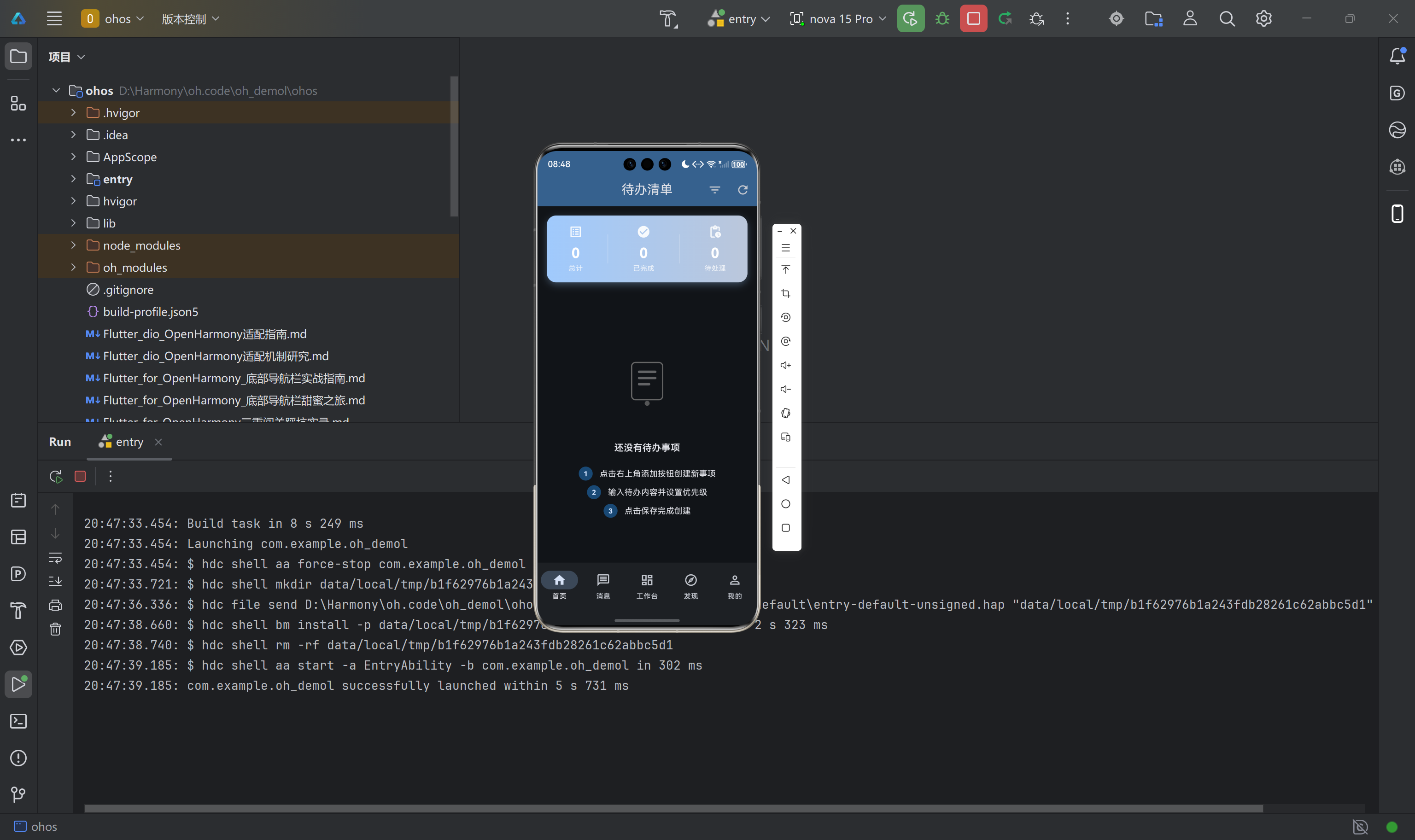
8.2 底部导航集成示例
在应用的主页面中使用底部导航组件:
LottieBottomNavigation(
  currentIndex: _currentIndex,
  onTap: (index) => setState(() => _currentIndex = index),
  children: [
    NavigationLottieItem(icon: Icons.home, label: '首页'),
    NavigationLottieItem(
      icon: Icons.message,
      label: '消息',
      badge: 3,
    ),
    NavigationLottieItem(icon: Icons.dashboard, label: '工作台'),
    NavigationLottieItem(icon: Icons.explore, label: '发现'),
    NavigationLottieItem(icon: Icons.person, label: '我的'),
  ],
)
九、鸿蒙设备验证与问题排查
9.1 构建产物验证
完成代码集成后,需要验证动画资源是否正确打包到鸿蒙应用中。执行 Flutter 构建命令后,检查以下目录是否包含动画 JSON 文件:
build/ohos/
└── intermediates/
    └── flutter/
        └── defaultDebug/
            └── flutter_assets/
                └── assets/
                    └── lottie/
                        ├── navigation/
                        │   ├── home_nav.json
                        │   └── success_check.json
                        └── empty_state/
                            ├── empty_search.json
                            └── empty_data.json
如果这些 JSON 文件存在于构建产物中,说明资源打包配置正确。如果文件缺失,需要检查 pubspec.yaml 中的 assets 配置是否正确。
9.2 运行时常见问题处理
动画无法显示:首先检查设备日志中是否有 Lottie 相关的错误信息,常见错误包括文件路径不正确、JSON 格式不合法等。其次确认动画资源是否已正确打包到应用中。最后验证 Lottie.asset 的路径参数是否与 pubspec.yaml 中的配置一致。
动画加载缓慢:对于较大的动画文件,可以考虑压缩动画资源或使用 smaller file size 选项导出。同时检查网络请求是否影响本地资源的加载速度。
性能表现不佳:在低端设备上出现卡顿时,可以降低动画播放的帧率,或者使用 enableLottieAnimation 参数关闭动画效果。
9.3 代码托管
本项目的完整源代码托管于 AtomGit 平台,仓库地址为:https://atomgit.com/xxx/lottie-oh-demo(请替换为实际仓库地址)。开发者可以克隆仓库获取完整的项目代码,包括所有的 Lottie 动画资源和工具类实现。
十、总结与展望
本文系统地介绍了 lottie 3.1.0 版本在 Flutter for OpenHarmony 平台上的适配过程,包括依赖配置、资源打包、组件封装和实际应用等方面。通过封装统一的动画工具类,开发者可以在项目中便捷地使用 Lottie 动画,显著提升应用的视觉表现力。
实际验证表明,lottie 库在鸿蒙设备上的渲染效果良好,JSON 动画资源能够正确打包,动画播放流畅无明显卡顿。组件化封装方案使得动画的使用门槛大大降低,开发者无需深入了解 Lottie 的底层 API 即可实现丰富的交互动效。

作为“人工智能6S店”的官方数字引擎,为AI开发者与企业提供一个覆盖软硬件全栈、一站式门户。
更多推荐
 0
0 0
0- 0


 已为社区贡献40条内容

所有评论(0)