
鸿蒙自定义弹出框Popup
鸿蒙Popup
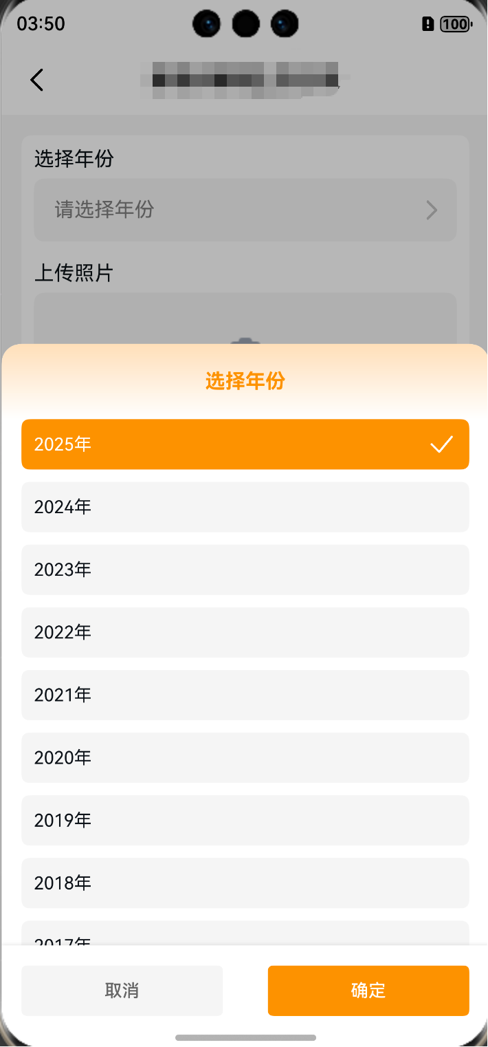
首先先看一下效果
然后下面是代码封装的逻辑
export interface PopupItem {
  code: number | string
  name: string
}

@CustomDialog
export struct GlobalPopup {
  controller: CustomDialogController
  @State selectedItem?: PopupItem | null = null
  private items?: PopupItem[] = []
  private title: string = '选择'
  private onConfirm?: (selectedItem: PopupItem) => void
  private onCancel?: () => void

  build() {
    Row() {
      Column() {
        // 标题
        Column() {
          Row() {
            Text(this.title)
              .fontWeight(FontWeight.Bold)
              .fontColor('#EE9723')
          }
          .alignItems(VerticalAlign.Center)
          .justifyContent(FlexAlign.Center)
          .height('60vp')
        }
        .width('100%')
        .height('60vp')
        .linearGradient({
          colors: [['#FAE0BD', 0], ['#FFFFFF', 1]],
          angle: 180
        })
        .borderRadius({ topLeft: 16, topRight: 16 })

        // 内容滚动列表 - 自适应高度但有最大限制
        Scroll(){
          Column(){
            ForEach(this.items, (item: PopupItem, index: number) => {
              Row(){
                Text(item.name)
                  .fontColor(item.code == this.selectedItem?.code ? '#FFFFFF' : $r('app.color.black_color'))
                  .fontSize(14)
                if (item.code == this.selectedItem?.code) {
                  Image($r('app.media.check'))
                    .width(24)
                    .height(24)
                }
              }
              .justifyContent(FlexAlign.SpaceBetween)
              .alignItems(VerticalAlign.Center)
              .width('100%')
              .padding({
                left: 10,
                right: 10
              })
              .height(40)
              .margin({
                bottom: 10
              })
              .borderRadius(6)
              .backgroundColor(item.code == this.selectedItem?.code ? '#EE9723' : $r('app.color.gray_color'))
              .onClick(() => {
                this.selectedItem = {
                  code: item.code,
                  name: item.name
                }
              })
            })
          }
          .padding({
            bottom: 20
          })
          .margin({
            left: 16,
            right: 16,
            bottom: 20
          })
          .backgroundColor($r('app.color.white_color'))
        }
        .width('100%')
        // 关键修改:使用constraintSize限制最大高度,让内容自适应
        .constraintSize({
          maxHeight: '50%'  // 设置滚动区域最大高度为屏幕的50%
        })

        // 底部操作按钮 - 固定高度
        Row() {
          Button('取消')
            .fontSize(14)
            .type(ButtonType.Normal)
            .fontColor('#666')
            .backgroundColor('#F5F5F5')
            .borderRadius(4)
            .width('45%')
            .height(40)
            .onClick(() => {
              this.onCancel?.()
              this.controller.close()
            })

          Button('确定')
            .fontSize(14)
            .type(ButtonType.Normal)
            .fontColor('#FFFFFF')
            .backgroundColor('#EE9723')
            .borderRadius(4)
            .width('45%')
            .height(40)
            .onClick(() => {
              if (this.selectedItem) {
                this.onConfirm?.(this.selectedItem)
              }
              this.controller.close()
            })
        }
        .width('100%')
        .justifyContent(FlexAlign.SpaceBetween)
        .padding({
          top: 16,
          bottom: 26,
          left: 16,
          right: 16
        })
        .backgroundColor('#FFFFFF')
        .shadow({
          radius: 8,
          color: 'rgba(0,0,0,0.1)',
          offsetX: 0,
          offsetY: -2
        })
      }
      .width('100%')
      // 关键修改:移除固定高度,使用constraintSize限制最大高度
      .constraintSize({
        maxHeight: '70%'  // 整个弹窗最大高度为屏幕的70%
      })
      .backgroundColor($r('app.color.white_color'))
      .borderRadius(16)
    }
    .width('100%')
    .height('100%')
    .backgroundColor('rgba(0,0,0,0.1)')
    .justifyContent(FlexAlign.End)
    .alignItems(VerticalAlign.Bottom)
  }
}
定义了一个通用的全局弹窗组件 GlobalPopup,它基于装饰器 @CustomDialog 创建,目的是提供一个可以在应用中随时调用的选择弹窗。整个组件的功能围绕“展示一组选项,并让用户选择其中一项,最后通过确定或取消按钮返回结果”展开。
首先,代码定义了一个接口 PopupItem,它包含 code 和 name 两个字段,用来描述每个选项的唯一标识和显示名称。这为组件提供了标准化的数据结构,使调用方可以传入任意的数据集,只要符合该接口,就能在弹窗中展示。
在 GlobalPopup 结构体中,内部维护了几个关键状态和属性:
-
controller:弹窗的控制器,负责打开和关闭弹窗。 -
selectedItem:当前用户选择的条目,使用@State修饰,确保其变更后 UI 会自动刷新。 -
items:候选项列表,默认为空数组。 -
title:弹窗标题,默认值为“选择”。 -
onConfirm和onCancel:回调函数,用来在点击按钮时通知外部调用者用户的操作结果。
在 build() 方法中,整个 UI 布局通过声明式方式构建:
-
标题区域:
使用Row和Column组合,标题文字居中显示,颜色为#EE9723,并在背景上应用了一个自上而下的渐变色(由浅米色到白色)。标题区域还设置了顶部圆角,既美观又与弹窗整体样式保持一致。 -
内容滚动区:
使用Scroll包裹一个Column,内部通过ForEach遍历items数组,渲染每一个选项。每个选项用Row显示,左边是文字,右边在被选中时会显示一个勾选图标。-
选中项的背景色为橙色(
#EE9723),文字为白色;未选中项则是灰色背景,黑色文字。 -
点击某个选项时,会更新
selectedItem的值。
此部分特别设置了.constraintSize({ maxHeight: '50%' }),确保列表不会无限撑大,而是最多占据屏幕一半的高度,避免内容过多时影响体验。
-
-
底部操作按钮:
固定高度的Row,左右分别放置“取消”和“确定”按钮。-
“取消”按钮是浅灰色,点击后触发
onCancel回调并关闭弹窗。 -
“确定”按钮为主题橙色,点击时若有选择项,则调用
onConfirm回调传出该项,然后关闭弹窗。
按钮区域还设置了阴影和内边距,让视觉层级更加突出。
-
-
整体弹窗容器:
外层Row将内容吸附到底部(justifyContent(FlexAlign.End)),并用半透明黑色背景模拟遮罩层,确保弹窗突出显示。整个容器还设置了最大高度为屏幕的 70%,这样即便内容很多,也不会超出合理范围。
从整体设计上看,这个组件的亮点在于:
-
使用了
constraintSize来控制高度自适应,既能在内容较少时紧凑显示,又能在内容过多时限制弹窗的尺寸,保证用户体验。 -
样式方面统一使用橙色作为主题色,配合灰色与白色,既有层次感,又能清晰地引导用户注意力。
-
逻辑上解耦良好:调用者只需要传入
items和onConfirm/onCancel回调,就能完成业务,不需要关心内部渲染细节。
综上,实现了一个高度通用且美观的全局选择弹窗,适合在各种需要用户选择的场景下复用,例如选择支付方式、地址、标签等。它不仅解决了基本的交互需求,还通过高度可配置和良好的用户体验设计,展现了组件化开发的优势。
使用示例
// 定义候选项
const items: PopupItem[] = [
  { code: 1, name: '支付宝' },
  { code: 2, name: '微信支付' },
  { code: 3, name: '银行卡' },
]

// 打开弹窗
CustomDialog.show<GlobalPopup>({
  builder: GlobalPopup,  // 指定弹窗组件
  params: {
    title: '请选择支付方式',    // 修改标题
    items: items,            // 传入选项
    onConfirm: (selectedItem: PopupItem) => {
      console.log('用户选择了:', selectedItem)
      // 这里可以执行后续逻辑,例如调用支付接口
    },
    onCancel: () => {
      console.log('用户点击了取消')
    }
  }
})
解释说明
-
准备数据
首先构建一个items数组,每个元素符合PopupItem接口,包含code和name。这里以支付方式为例,列出了支付宝、微信支付和银行卡。 -
调用弹窗
使用CustomDialog.show<GlobalPopup>()打开我们之前写的GlobalPopup弹窗组件。 -
参数传递
-
title:自定义弹窗标题。 -
items:传入候选项列表,组件会自动渲染成可选择的列表。 -
onConfirm:确定按钮的回调,能拿到用户选中的条目。 -
onCancel:取消按钮的回调。
-
-
效果
打开后,弹窗会显示一个带标题和滚动列表的界面,用户可以点击选项高亮,最后点击“确定”时返回选中项。

作为“人工智能6S店”的官方数字引擎,为AI开发者与企业提供一个覆盖软硬件全栈、一站式门户。
更多推荐


 1
1 0
0- 0


 已为社区贡献1条内容

所有评论(0)