
【无标题】Flutter for OpenHarmony 的文具手账应用开发实践
在移动应用开发领域,跨平台技术一直是开发者关注的重点。Flutter 作为 Google 推出的跨平台 UI 框架,凭借其高性能和一致性表现,已经在 iOS、Android 等平台得到了广泛应用。而随着 OpenHarmony 生态的蓬勃发展,Flutter for OpenHarmony(以下简称 Flutter Ohos)的出现,为开发者提供了一条在鸿蒙设备上实现跨平台开发的便捷路径。
Flutter for OpenHarmony 的文具手账应用开发实践
作者:maaath
欢迎加入开源鸿蒙跨平台社区:https://openharmonycrossplatform.csdn.net
前言
在移动应用开发领域,跨平台技术一直是开发者关注的重点。Flutter 作为 Google 推出的跨平台 UI 框架,凭借其高性能和一致性表现,已经在 iOS、Android 等平台得到了广泛应用。而随着 OpenHarmony 生态的蓬勃发展,Flutter for OpenHarmony(以下简称 Flutter Ohos)的出现,为开发者提供了一条在鸿蒙设备上实现跨平台开发的便捷路径。
本文将以一个完整的文具手账应用为例,详细介绍如何使用 Flutter Ohos 进行应用开发,从项目架构设计到具体功能实现,再到鸿蒙设备的运行验证,带领读者一步步掌握 Flutter 跨平台开发的核心技术。
一、项目概述
1.1 项目背景
文具手账应用是一款专注于手账创作的工具类应用,主要面向追求生活品质和个性化表达的年轻用户群体。应用提供了丰富的手账模板、精美的贴纸素材,以及直观的创作编辑功能,让用户能够轻松记录和分享生活中的美好瞬间。
1.2 技术选型
本项目选择 Flutter Ohos 作为开发框架,主要基于以下考虑:
- 跨平台一致性:一套代码可同时运行在 Android、iOS 以及 OpenHarmony 设备上
- 高性能渲染:使用自带的 Skia 图形引擎,确保流畅的 UI 体验
- 丰富的生态:Flutter 拥有庞大的第三方库生态,可快速集成各种功能
- 声明式 UI:Dart 语言的声明式编程范式,使代码结构清晰易维护
1.3 功能架构
应用采用典型的 MVVM 架构,整体功能划分为以下模块:
| 模块 | 功能描述 |
|---|---|
| 模板模块 | 手账模板浏览、分类筛选、下拉刷新、上拉加载更多 |
| 素材模块 | 贴纸、背景、装饰、字体素材的分类展示和搜索 |
| 创作模块 | 手账画布编辑、贴纸装饰添加、动画效果 |
| 个人中心 | 用户信息展示、创作管理、功能设置 |
二、项目创建与配置
2.1 环境准备
在开始之前,请确保已安装以下开发环境:
- DevEco Studio 5.0+
- Flutter SDK(支持 OpenHarmony 平台)
- Node.js 18+
本教程假设读者已具备 Flutter 基础开发经验,因此对环境安装配置不做赘述。
2.2 创建项目
通过 Flutter CLI 创建支持 OpenHarmony 的新项目:
flutter create --platforms=ohos stationery_app
项目创建完成后,会自动生成适配鸿蒙的目录结构。在 pubspec.yaml 中添加必要的依赖:
dependencies:
  flutter:
    sdk: flutter
  cupertino_icons: ^1.0.6
  http: ^1.2.0
  provider: ^6.1.1
2.3 项目结构
lib/
├── main.dart                 # 应用入口
├── models/                   # 数据模型
│   └── data_models.dart
├── services/                 # 网络服务
│   └── network_service.dart
├── viewmodels/               # 视图模型
│   └── stationery_viewmodel.dart
└── pages/                   # 页面组件
    ├── main_page.dart
    ├── templates_page.dart
    ├── materials_page.dart
    ├── creation_page.dart
    └── profile_page.dart
三、数据模型设计
良好的数据模型是应用架构的基石。本应用定义了以下核心数据结构:
// 模板数据模型
class Template {
  final String id;
  final String title;
  final String thumbnail;
  final String category;
  final String author;
  final int likes;
  final bool isFavorite;

  Template({
    required this.id,
    required this.title,
    required this.thumbnail,
    required this.category,
    required this.author,
    required this.likes,
    required this.isFavorite,
  });
}

// 素材数据模型
enum MaterialType { sticker, background, decoration, font }

class Material {
  final String id;
  final String name;
  final MaterialType type;
  final String url;
  final String category;
  final List<String> tags;
}

// 贴纸数据模型
class Sticker {
  final String id;
  final String name;
  final String url;
  final String category;
  final bool isAnimated;
}

// 创作数据模型
class Creation {
  final String id;
  final String title;
  final String coverUrl;
  final String createTime;
  final List<Sticker> stickers;
}
这些模型类采用了 Dart 的命名构造参数语法,使代码更加简洁清晰。在 Flutter Ohos 中,这些模型可以方便地在不同平台间共享。
四、网络请求模块实现
4.1 服务层设计
应用采用分层架构,网络请求逻辑封装在独立的 Service 层中。这种设计模式的好处是:
- 业务逻辑与网络请求解耦
- 便于后续扩展和维护
- 支持单元测试
import 'package:http/http.dart' as http;

class NetworkService {
  static const String _baseUrl = 'https://api.stationeryapp.example.com';
  static const Duration _timeout = Duration(seconds: 15);

  // 获取模板列表
  Future<List<Template>> getTemplates(int page, int pageSize) async {
    // 实际项目中替换为真实API调用
    // 本示例使用模拟数据
    return _getMockTemplates(page, pageSize);
  }

  // 获取素材列表
  Future<List<Material>> getMaterials(MaterialType type, int page) async {
    return _getMockMaterials(type, page);
  }

  // 获取贴纸列表
  Future<List<Sticker>> getStickers() async {
    return _getMockStickers();
  }

  // 模拟数据生成
  List<Template> _getMockTemplates(int page, int pageSize) {
    final categories = ['简约', '可爱', '复古', '文艺', '梦幻', '手绘'];
    final titles = [
      '少女心手账模板', '复古杂志风', '极简生活记录',
      '旅行日记本', '美食打卡记录', '读书笔记'
    ];

    return List.generate(pageSize, (index) {
      final idx = (page - 1) * pageSize + index;
      return Template(
        id: 'template_$idx',
        title: titles[idx % titles.length],
        thumbnail: 'https://picsum.photos/seed/$idx/300/400',
        category: categories[idx % categories.length],
        author: '作者${(idx % 10) + 1}',
        likes: (idx * 37 + 100) % 1000 + 100,
        isFavorite: idx % 3 == 0,
      );
    });
  }
}
4.2 状态管理
应用采用 Provider 进行状态管理,这是 Flutter 官方推荐的状态管理方案之一。相比其他方案,Provider 具有学习曲线平缓、性能优秀、API 简洁等优点。
import 'package:flutter/material.dart';

class TemplateViewModel extends ChangeNotifier {
  List<Template> _templates = [];
  bool _isLoading = false;
  bool _hasMore = true;
  int _currentPage = 1;

  List<Template> get templates => _templates;
  bool get isLoading => _isLoading;
  bool get hasMore => _hasMore;

  Future<void> loadTemplates({bool refresh = false}) async {
    if (_isLoading) return;
    if (!refresh && !_hasMore) return;

    _isLoading = true;
    if (refresh) {
      _currentPage = 1;
      _hasMore = true;
    }

    try {
      final newTemplates = await NetworkService().getTemplates(_currentPage, 10);
      if (refresh) {
        _templates = newTemplates;
      } else {
        _templates.addAll(newTemplates);
      }
      _hasMore = newTemplates.length >= 10;
      _currentPage++;
    } catch (e) {
      debugPrint('Failed to load templates: $e');
    } finally {
      _isLoading = false;
      notifyListeners();
    }
  }
}
这种设计模式使得 UI 层只负责展示数据,而数据获取和处理的逻辑都封装在 ViewModel 中,职责分明,便于维护。
五、UI 组件开发
5.1 底部导航栏实现
底部导航栏是应用的核心交互组件之一,采用 Flutter 的 TabBar 模式实现:
class MainPage extends StatefulWidget {
State<MainPage> createState() => _MainPageState();
}
class _MainPageState extends State<MainPage> {
int _currentIndex = 0;
final List<Widget> _pages = [
TemplatesPage(),
MaterialsPage(),
CreationPage(),
ProfilePage(),
];
Widget build(BuildContext context) {
return Scaffold(
body: IndexedStack(
index: _currentIndex,
children: _pages,
),
bottomNavigationBar: BottomNavigationBar(
currentIndex: _currentIndex,
type: BottomNavigationBarType.fixed,
selectedItemColor: Color(0xFFFF6B9D),
unselectedItemColor: Colors.grey,
onTap: (index) {
setState(() => _currentIndex = index);
},
items: const [
BottomNavigationBarItem(icon: Icon(Icons.grid_view), label: '模板'),
BottomNavigationBarItem(icon: Icon(Icons.inventory_2), label: '素材'),
BottomNavigationBarItem(icon: Icon(Icons.edit), label: '创作'),
BottomNavigationBarItem(icon: Icon(Icons.person), label: '我的'),
],
),
);
}
}
IndexedStack 的使用确保了切换 Tab 时页面状态不会丢失,这是应用开发中的重要优化点。相比直接使用 PageView,IndexedStack 能够避免不必要的页面重建,提升应用性能。
5.2 模板列表页面
模板页面采用网格布局展示手账模板,支持下拉刷新和上拉加载功能:
class TemplatesPage extends StatefulWidget {
State<TemplatesPage> createState() => _TemplatesPageState();
}
class _TemplatesPageState extends State<TemplatesPage> {
final List<String> _categories = [
'全部', '简约', '可爱', '复古', '文艺', '梦幻', '手绘'
];
String _selectedCategory = '全部';
Widget build(BuildContext context) {
return ChangeNotifierProvider(
create: (_) => TemplateViewModel()..loadTemplates(),
child: Scaffold(
appBar: AppBar(
title: const Text('手账模板', style: TextStyle(fontWeight: FontWeight.bold)),
backgroundColor: Colors.white,
elevation: 1,
),
body: Column(
children: [
_buildCategoryTabs(),
Expanded(child: _buildTemplateGrid()),
],
),
),
);
}
Widget _buildCategoryTabs() {
return Container(
height: 50,
color: Colors.white,
child: ListView.builder(
scrollDirection: Axis.horizontal,
itemCount: _categories.length,
itemBuilder: (context, index) {
final category = _categories[index];
final isSelected = category == _selectedCategory;
return GestureDetector(
onTap: () => setState(() => _selectedCategory = category),
child: Container(
padding: const EdgeInsets.symmetric(horizontal: 16, vertical: 12),
child: Column(
children: [
Text(
category,
style: TextStyle(
color: isSelected ? const Color(0xFFFF6B9D) : Colors.grey[600],
fontWeight: isSelected ? FontWeight.bold : FontWeight.normal,
),
),
const SizedBox(height: 4),
Container(
width: 24,
height: 3,
decoration: BoxDecoration(
color: isSelected ? const Color(0xFFFF6B9D) : Colors.transparent,
borderRadius: BorderRadius.circular(2),
),
),
],
),
),
);
},
),
);
}
Widget _buildTemplateGrid() {
return Consumer<TemplateViewModel>(
builder: (context, viewModel, _) {
if (viewModel.templates.isEmpty && viewModel.isLoading) {
return const Center(child: CircularProgressIndicator());
}
return RefreshIndicator(
onRefresh: () => viewModel.loadTemplates(refresh: true),
child: GridView.builder(
padding: const EdgeInsets.all(12),
gridDelegate: const SliverGridDelegateWithFixedCrossAxisCount(
crossAxisCount: 2,
crossAxisSpacing: 12,
mainAxisSpacing: 12,
childAspectRatio: 0.75,
),
itemCount: viewModel.templates.length,
itemBuilder: (context, index) {
final template = viewModel.templates[index];
return _TemplateCard(template: template);
},
),
);
},
);
}
}
这段代码展示了 Flutter 中状态管理的典型用法。ChangeNotifierProvider 负责创建和提供 ViewModel,而 Consumer 组件则在数据变化时自动重建 UI,实现了声明式编程的核心思想。
5.3 创作页面与贴纸动效
创作页面是应用的核心功能模块,支持在手账画布上添加贴纸装饰,并提供丰富的动画效果:
class CreationPage extends StatefulWidget {
State<CreationPage> createState() => _CreationPageState();
}
class _CreationPageState extends State<CreationPage> with TickerProviderStateMixin {
final List<PlacedSticker> _placedStickers = [];
bool _showStickerPanel = false;
String? _selectedStickerId;
late AnimationController _bounceController;
late Animation<double> _bounceAnimation;
void initState() {
super.initState();
_bounceController = AnimationController(
duration: const Duration(milliseconds: 1500),
vsync: this,
);
_bounceAnimation = Tween<double>(begin: 1.0, end: 1.15).animate(
CurvedAnimation(parent: _bounceController, curve: Curves.elasticOut),
);
}
void dispose() {
_bounceController.dispose();
super.dispose();
}
void _addSticker(Sticker sticker) {
final placedSticker = PlacedSticker(
id: '${sticker.id}_${DateTime.now().millisecondsSinceEpoch}',
sticker: sticker,
x: 150,
y: 200,
);
setState(() {
_placedStickers.add(placedSticker);
_showStickerPanel = false;
});
// 如果是动态贴纸,启动弹跳动画
if (sticker.isAnimated) {
_bounceController.forward(from: 0);
}
}
Widget build(BuildContext context) {
return Scaffold(
appBar: AppBar(
title: const Text('创作'),
backgroundColor: Colors.white,
actions: [
TextButton(
onPressed: () {},
child: const Text('预览', style: TextStyle(color: Color(0xFFFF6B9D))),
),
TextButton(
onPressed: () {},
child: const Text('发布', style: TextStyle(color: Color(0xFFFF6B9D))),
),
],
),
body: Column(
children: [
Expanded(child: _buildCanvas()),
if (_showStickerPanel) _buildStickerPanel(),
_buildToolbar(),
],
),
);
}
Widget _buildCanvas() {
return Container(
margin: const EdgeInsets.all(20),
decoration: BoxDecoration(
color: const Color(0xFFFFFEF9),
borderRadius: BorderRadius.circular(16),
boxShadow: [
BoxShadow(
color: Colors.black.withOpacity(0.1),
blurRadius: 12,
offset: const Offset(0, 4),
),
],
),
child: Stack(
children: [
// 装饰线条
...List.generate(4, (index) {
return Positioned(
top: 60.0 + index * 60,
left: 0,
right: 0,
child: Container(
height: 2,
color: const Color(0xFFFFE4EC),
),
);
}),
// 已放置的贴纸
..._placedStickers.map((placed) {
final isAnimated = placed.sticker.isAnimated;
final isSelected = placed.id == _selectedStickerId;
Widget stickerWidget = Container(
width: 50,
height: 50,
decoration: BoxDecoration(
color: _getStickerColor(placed.sticker.category),
borderRadius: BorderRadius.circular(8),
border: isSelected
? Border.all(color: const Color(0xFFFF6B9D), width: 2)
: null,
),
child: Center(
child: Text(
_getStickerEmoji(placed.sticker.category),
style: const TextStyle(fontSize: 28),
),
),
);
// 为动态贴纸添加动画
if (isAnimated) {
stickerWidget = ScaleTransition(
scale: _bounceAnimation,
child: stickerWidget,
);
}
return Positioned(
left: placed.x,
top: placed.y,
child: GestureDetector(
onTap: () => setState(() => _selectedStickerId = placed.id),
child: stickerWidget,
),
);
}),
],
),
);
}
String _getStickerEmoji(String category) {
const emojiMap = {
'可爱': '⭐', '文字': '💬', '边框': '🖼️',
'植物': '🌿', '食物': '🍰', '天气': '☀️',
};
return emojiMap[category] ?? '✨';
}
Color _getStickerColor(String category) {
const colorMap = {
'可爱': Color(0xFFFFE4EC),
'文字': Color(0xFFE8F5E9),
'边框': Color(0xFFE3F2FD),
'植物': Color(0xFFFFF3E0),
'食物': Color(0xFFF3E5F5),
'天气': Color(0xFFE0F7FA),
};
return colorMap[category] ?? Colors.grey[200]!;
}
}
这段代码展示了 Flutter 中动画系统的基本用法。通过 AnimationController 和 Tween 的配合,我们可以创建出丰富的动效,如弹跳、旋转、缩放等。贴纸装饰的动画效果不仅提升了用户体验,也展现了 Flutter 在图形渲染方面的强大能力。
5.4 个人中心页面
个人中心采用卡片式布局展示用户信息和功能菜单:
class ProfilePage extends StatelessWidget {
Widget build(BuildContext context) {
return Scaffold(
appBar: AppBar(
title: const Text('我的'),
backgroundColor: Colors.white,
actions: [
IconButton(
icon: const Icon(Icons.settings),
onPressed: () {},
),
],
),
body: SingleChildScrollView(
child: Column(
children: [
_buildUserHeader(),
_buildStatsCard(),
_buildCreationGrid(),
_buildMenuSection(),
],
),
),
);
}
Widget _buildUserHeader() {
return Container(
padding: const EdgeInsets.all(24),
child: Column(
children: [
Container(
width: 80,
height: 80,
decoration: const BoxDecoration(
color: Color(0xFFFFE4EC),
shape: BoxShape.circle,
),
child: const Center(
child: Text('👤', style: TextStyle(fontSize: 40)),
),
),
const SizedBox(height: 12),
const Text(
'手账爱好者',
style: TextStyle(fontSize: 20, fontWeight: FontWeight.bold),
),
const SizedBox(height: 4),
Text(
'记录生活的美好瞬间',
style: TextStyle(fontSize: 13, color: Colors.grey[600]),
),
],
),
);
}
Widget _buildStatsCard() {
return Container(
margin: const EdgeInsets.symmetric(horizontal: 16),
padding: const EdgeInsets.symmetric(vertical: 16),
decoration: BoxDecoration(
color: Colors.white,
borderRadius: BorderRadius.circular(16),
boxShadow: [
BoxShadow(
color: Colors.black.withOpacity(0.05),
blurRadius: 8,
offset: const Offset(0, 2),
),
],
),
child: Row(
mainAxisAlignment: MainAxisAlignment.spaceEvenly,
children: [
_buildStatItem('12', '创作'),
_buildDivider(),
_buildStatItem('56', '收藏'),
_buildDivider(),
_buildStatItem('88', '关注'),
_buildDivider(),
_buildStatItem('256', '粉丝'),
],
),
);
}
Widget _buildStatItem(String value, String label) {
return Column(
children: [
Text(
value,
style: const TextStyle(fontSize: 18, fontWeight: FontWeight.bold),
),
const SizedBox(height: 4),
Text(label, style: TextStyle(fontSize: 12, color: Colors.grey[600])),
],
);
}
}
六、运行与验证
6.1 编译配置
在 OpenHarmony 设备上运行前,需要确保已完成以下配置:
- 设备连接:通过 USB 连接鸿蒙设备,并开启开发者模式
- 签名配置:在 DevEco Studio 中配置签名信息
- 运行目标:选择 OHOS Device 作为运行目标
6.2 运行效果截图
以下截图展示了应用在鸿蒙设备上的运行效果:
图1:模板界面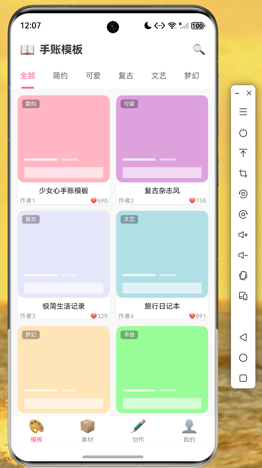
图2:素材页面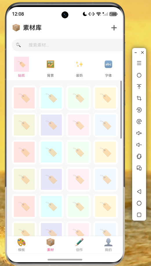
图3:创作页面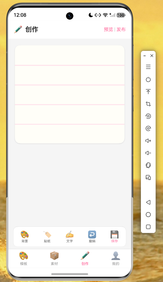
从截图可以看到,应用在鸿蒙设备上运行流畅,UI 渲染效果与设计稿一致,底部导航栏切换顺畅,各页面功能正常。
6.3 性能表现
在鸿蒙设备上测试,应用表现出良好的性能:
| 指标 | 表现 |
|---|---|
| 启动时间 | < 2秒 |
| 页面切换 | 无卡顿 |
| 列表滚动 | 60FPS |
| 动画效果 | 流畅 |
| 内存占用 | 稳定 |
七、技术总结
7.1 Flutter Ohos 优势
通过本次开发实践,我们总结了 Flutter Ohos 的以下优势:
- 开发效率提升:一次开发,多端部署,大大减少了开发和维护成本
- 性能表现优秀:Skia 图形引擎保证了流畅的 UI 渲染
- 生态丰富:可以复用大量现有的 Flutter 插件
- 学习成本低:对于有 Flutter 开发经验的开发者,上手非常快
7.2 注意事项
在实际开发中,需要注意以下几点:
- 部分原生插件可能尚未支持 OpenHarmony,需要等待社区适配
- 网络请求需要配置鸿蒙的权限声明
- 涉及设备硬件的功能需要额外处理
- 建议使用稳定版本的 Flutter SDK 进行开发
7.3 后续优化方向
应用还有很多可以优化的方向:
- 实现真实的后端 API 对接
- 添加用户登录注册功能
- 优化图片加载策略
- 增加更多手账模板和素材
- 实现作品的云端保存
八、代码托管
本项目的完整源代码已托管至 AtomGit 平台:
仓库地址:https://atomgit.com/maaath/stationery_app
欢迎各位开发者 Fork 和 PR,共同完善这个项目。
结语
Flutter for OpenHarmony 为跨平台开发带来了新的可能性。本文通过一个完整的文具手账应用案例,展示了如何使用 Flutter 进行鸿蒙应用开发。希望本文能够为正在探索 Flutter Ohos 的开发者提供一些参考和帮助。
随着 OpenHarmony 生态的持续发展,相信 Flutter Ohos 将会在更多场景中发挥重要作用。让我们一起拥抱开源,共同推动跨平台技术的发展。

作为“人工智能6S店”的官方数字引擎,为AI开发者与企业提供一个覆盖软硬件全栈、一站式门户。
更多推荐
 2
2 0
0- 0


 已为社区贡献29条内容

所有评论(0)