
【flutter for open harmony】第三方库Flutter 鸿蒙版 渐变进度条 实战指南(适配 1.0.0)✨
本文介绍了在Flutter鸿蒙应用中实现渐变色进度条的方法。通过LinearGradient和FractionallySizedBox组件,结合Stack布局,构建了具有渐变效果和阴影的进度条。文章详细讲解了核心实现代码,包括颜色渐变设置、百分比宽度控制和层叠显示等关键技术点,并提供了实际应用场景和优化建议。该方案可用于下载进度、任务完成度等场景,具有美观的视觉效果和良好的交互体验。
【flutter for open harmony】第三方库Flutter 鸿蒙版 渐变进度条 实战指南(适配 1.0.0)✨
Flutter 三方库 cached_network_image 的鸿蒙化适配与实战指南
欢迎加入开源鸿蒙跨平台社区: https://openharmonycrossplatform.csdn.net
本文详细介绍如何在Flutter鸿蒙应用中实现渐变色进度条组件。
一、前言
渐变进度条是一种美观的进度展示方式,通过渐变色增强视觉效果。广泛应用于下载进度、任务完成度等场景。
二、效果展示
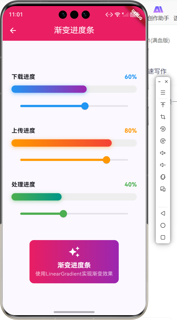
2.1 功能特性
| 功能 | 描述 |
|---|---|
| 渐变色效果 | 进度条使用渐变色 |
| 自定义颜色 | 支持自定义渐变色 |
| 动态更新 | 进度实时更新 |
| 阴影效果 | 添加发光阴影 |
三、项目背景与目标
3.1 项目背景
渐变进度条能够提升应用的视觉效果,使进度展示更加美观。
3.2 项目目标
- 实现渐变色进度条
- 支持自定义颜色
- 添加阴影效果
- 实时更新进度
四、技术架构设计
4.1 架构概述
渐变进度条基于LinearGradient和FractionallySizedBox实现,通过Stack叠加背景和进度。
4.2 技术原理
Stack -> 背景容器 + FractionallySizedBox(渐变) -> 渐变进度条
核心组件:
- LinearGradient:线性渐变
- FractionallySizedBox:百分比尺寸
- Stack:层叠布局
五、详细实现
5.1 Flutter端实现
import 'package:flutter/material.dart';
class GradientProgressPage extends StatefulWidget {
const GradientProgressPage({super.key});
State<GradientProgressPage> createState() => _GradientProgressPageState();
}
class _GradientProgressPageState extends State<GradientProgressPage> {
double _progress = 0.6;
Widget build(BuildContext context) {
return Scaffold(
appBar: AppBar(title: const Text('渐变进度条')),
body: Padding(
padding: const EdgeInsets.all(24),
child: Column(
mainAxisAlignment: MainAxisAlignment.center,
children: [
Text('进度: ${(_progress * 100).toStringAsFixed(0)}%'),
const SizedBox(height: 16),
Stack(
children: [
Container(
height: 20,
decoration: BoxDecoration(
color: Colors.grey[200],
borderRadius: BorderRadius.circular(10),
),
),
FractionallySizedBox(
widthFactor: _progress,
child: Container(
height: 20,
decoration: BoxDecoration(
gradient: const LinearGradient(
colors: [Colors.blue, Colors.purple],
),
borderRadius: BorderRadius.circular(10),
boxShadow: [
BoxShadow(
color: Colors.blue.withOpacity(0.5),
blurRadius: 8,
),
],
),
),
),
],
),
Slider(
value: _progress,
onChanged: (value) => setState(() => _progress = value),
),
],
),
),
);
}
}
5.2 核心功能解析
LinearGradient渐变
LinearGradient(
  colors: [Colors.blue, Colors.purple],
)
LinearGradient创建线性渐变,colors设置渐变颜色数组。
FractionallySizedBox
FractionallySizedBox(
  widthFactor: _progress,
  child: Container(...),
)
FractionallySizedBox根据父容器宽度的百分比设置子组件宽度。
Stack层叠
Stack(
  children: [
    Container(...),  // 背景
    FractionallySizedBox(...),  // 进度
  ],
)
Stack将背景和进度条叠加显示。
BoxShadow阴影
BoxShadow(
  color: Colors.blue.withOpacity(0.5),
  blurRadius: 8,
)
BoxShadow为进度条添加发光阴影效果。
六、实际应用场景
6.1 下载进度
文件下载进度展示。
6.2 任务完成度
任务完成百分比展示。
6.3 学习进度
课程学习进度展示。
七、优化建议
7.1 性能优化
- 使用RepaintBoundary隔离重绘
- 避免频繁的setState
- 缓存渐变对象
7.2 功能扩展
- 添加动画效果
- 支持多段渐变
- 添加进度文字
- 支持圆角配置
八、常见问题与解决方案
8.1 问题1:进度条宽度不正确
问题: 进度条宽度超出或不足。
解决方案: 确保FractionallySizedBox在Stack中正确使用。
Stack(
  children: [
    Container(...),  // 背景
    FractionallySizedBox(
      widthFactor: _progress,  // 0.0 - 1.0
      child: Container(...),
    ),
  ],
)
8.2 问题2:渐变方向错误
问题: 渐变方向不符合预期。
解决方案: 设置LinearGradient的begin和end参数。
LinearGradient(
  begin: Alignment.centerLeft,
  end: Alignment.centerRight,
  colors: [Colors.blue, Colors.purple],
)
九、总结
本文详细介绍了Flutter鸿蒙应用中渐变进度条的实现方法。通过LinearGradient和FractionallySizedBox实现了美观的渐变色进度条效果。
十、参考资料
- Flutter官方文档:https://flutter.dev
- HarmonyOS开发者文档:https://developer.harmonyos.com

作为“人工智能6S店”的官方数字引擎,为AI开发者与企业提供一个覆盖软硬件全栈、一站式门户。
更多推荐
 0
0 0
0- 0


 已为社区贡献48条内容

所有评论(0)