
【flutter for open harmony】第三方库Flutter 鸿蒙版 顶部标签页 实战指南(适配 1.0.0)✨
顶部标签页是常见的页面切换方式,通过TabBar和TabBarView配合使用,实现标签页的切换效果。广泛应用于新闻分类、功能模块切换等场景。顶部标签页基于TabBar和TabBarView实现,使用TabController控制标签切换。本文详细介绍了Flutter鸿蒙应用中TabBar顶部标签页的实现方法。通过TabController控制标签切换,支持点击和滑动切换。该组件广泛应用于内容分类
【flutter for open harmony】第三方库Flutter 鸿蒙版 顶部标签页 实战指南(适配 1.0.0)✨
Flutter 三方库 cached_network_image 的鸿蒙化适配与实战指南
欢迎加入开源鸿蒙跨平台社区: https://openharmonycrossplatform.csdn.net
本文详细介绍如何在Flutter鸿蒙应用中实现TabBar顶部标签页切换组件。
一、前言
顶部标签页是常见的页面切换方式,通过TabBar和TabBarView配合使用,实现标签页的切换效果。广泛应用于新闻分类、功能模块切换等场景。
二、效果展示
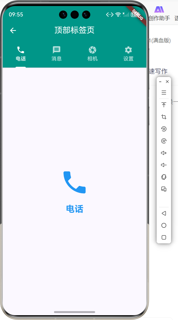
2.1 功能特性
| 功能 | 描述 |
|---|---|
| 标签切换 | 点击标签切换内容 |
| 滑动切换 | 左右滑动切换页面 |
| 图标标签 | 支持图标和文字 |
| 指示器 | 当前标签下划线指示 |
三、项目背景与目标
3.1 项目背景
顶部标签页是内容分类展示的常见方式,用户可以通过点击或滑动切换不同的内容视图。
3.2 项目目标
- 实现标签页切换
- 支持滑动切换
- 提供图标和文字标签
- 实现指示器样式
四、技术架构设计
4.1 架构概述
顶部标签页基于TabBar和TabBarView实现,使用TabController控制标签切换。
4.2 技术原理
TabController -> TabBar -> TabBarView -> 页面切换
核心组件:
- TabBar:标签栏组件
- TabBarView:标签内容视图
- TabController:标签控制器
五、详细实现
5.1 Flutter端实现
import 'package:flutter/material.dart';
class TopTabPage extends StatefulWidget {
const TopTabPage({super.key});
State<TopTabPage> createState() => _TopTabPageState();
}
class _TopTabPageState extends State<TopTabPage> with SingleTickerProviderStateMixin {
late TabController _tabController;
void initState() {
super.initState();
_tabController = TabController(length: 4, vsync: this);
}
void dispose() {
_tabController.dispose();
super.dispose();
}
Widget build(BuildContext context) {
return Scaffold(
appBar: AppBar(
title: const Text('顶部标签页'),
centerTitle: true,
backgroundColor: Colors.teal,
foregroundColor: Colors.white,
bottom: TabBar(
controller: _tabController,
indicatorColor: Colors.white,
labelColor: Colors.white,
unselectedLabelColor: Colors.white70,
tabs: const [
Tab(icon: Icon(Icons.phone), text: '电话'),
Tab(icon: Icon(Icons.message), text: '消息'),
Tab(icon: Icon(Icons.camera), text: '相机'),
Tab(icon: Icon(Icons.settings), text: '设置'),
],
),
),
body: TabBarView(
controller: _tabController,
children: const [
_TabContent(icon: Icons.phone, color: Colors.blue, title: '电话'),
_TabContent(icon: Icons.message, color: Colors.green, title: '消息'),
_TabContent(icon: Icons.camera, color: Colors.orange, title: '相机'),
_TabContent(icon: Icons.settings, color: Colors.purple, title: '设置'),
],
),
);
}
}
5.2 核心功能解析
TabController初始化
_tabController = TabController(length: 4, vsync: this);
TabController需要指定标签数量和vsync参数。
TabBar配置
TabBar(
  controller: _tabController,
  indicatorColor: Colors.white,
  labelColor: Colors.white,
  tabs: [...],
)
TabBar配置标签样式和指示器颜色。
TabBarView内容
TabBarView(
  controller: _tabController,
  children: [...],
)
TabBarView显示对应标签的内容页面。
Tab组件
Tab(icon: Icon(Icons.phone), text: '电话')
Tab组件定义每个标签的图标和文字。
六、实际应用场景
6.1 新闻分类
新闻应用中不同分类的内容切换。
6.2 聊天应用
聊天应用的消息、通讯录、发现等模块切换。
6.3 商品分类
电商应用中商品分类的切换展示。
七、优化建议
7.1 性能优化
- 使用AutomaticKeepAliveClientMixin保持页面状态
- 设置TabBarView的cacheExtent
- 避免在Tab中加载大量数据
7.2 功能扩展
- 添加可滚动标签
- 支持自定义指示器
- 添加标签动画效果
- 支持动态添加标签
八、常见问题与解决方案
8.1 问题1:标签页状态丢失
问题: 切换标签后页面状态重置。
解决方案: 使用AutomaticKeepAliveClientMixin。
class _TabPageState extends State<_TabPage> with AutomaticKeepAliveClientMixin {
bool get wantKeepAlive => true;
}
8.2 问题2:TabController未释放
问题: 页面退出后TabController未释放。
解决方案: 在dispose中释放控制器。
void dispose() {
_tabController.dispose();
super.dispose();
}
九、总结
本文详细介绍了Flutter鸿蒙应用中TabBar顶部标签页的实现方法。通过TabController控制标签切换,支持点击和滑动切换。该组件广泛应用于内容分类展示。
十、参考资料
- Flutter官方文档:https://flutter.dev
- HarmonyOS开发者文档:https://developer.harmonyos.com
- Material Design指南:https://material.io/components/tabs

作为“人工智能6S店”的官方数字引擎,为AI开发者与企业提供一个覆盖软硬件全栈、一站式门户。
更多推荐
 0
0 0
0- 0


 已为社区贡献3条内容

所有评论(0)