
实现Flutter 评分组件在 OpenHarmony
本文为 Flutter for OpenHarmony 跨平台应用开发实战教程,完整实现评分组件,包括星星绘制、触摸交互、半星支持三大核心模块。在鸿蒙设备上解决了自定义绘制、手势识别、精确评分等关键技术问题,全方位展示UI组件开发能力的落地实践。
实现Flutter 评分组件在 OpenHarmony
欢迎加入开源鸿蒙跨平台社区
https://openharmonycrossplatform.csdn.net
📋 文章摘要
本文为 Flutter for OpenHarmony 跨平台应用开发实战教程,完整实现评分组件,包括星星绘制、触摸交互、半星支持三大核心模块。在鸿蒙设备上解决了自定义绘制、手势识别、精确评分等关键技术问题,全方位展示UI组件开发能力的落地实践。
一、引言
评分组件是现代应用中常见的交互组件,广泛应用于商品评价、服务评分、内容打分等场景。通过直观的星星展示和灵活的交互机制,用户可以快速完成评分操作。Flutter 提供了强大的自定义绘制能力,配合 OpenHarmony 平台特性,可以构建高效、美观的评分组件。
本文将详细介绍如何使用 Flutter 框架在 OpenHarmony 设备上实现完整的评分组件,包括星星绘制、触摸交互以及半星支持等核心功能。
二、技术背景与选型分析
2.1 为什么需要评分组件?
评分组件能够帮助用户:
- 快速评价:通过星星数量快速表达满意度
- 直观展示:直观展示评分结果
- 数据统计:便于统计和分析用户评价
- 决策参考:为其他用户提供决策参考
2.2 评分组件的核心需求
在实际开发过程中,评分组件需要满足以下关键需求:
- 星星绘制:自定义绘制五角星形状
- 触摸交互:支持点击和滑动选择评分
- 半星支持:支持半颗星的精确评分
- 自定义样式:支持自定义颜色、大小、数量
三、系统架构设计
3.1 整体架构
本实现采用组件化架构设计,主要包含以下三个核心模块:
┌─────────────────────────────────────┐
│           展示层                     │
│   (RatingComponentDemoPage)         │
├─────────────────────────────────────┤
│           交互层                     │
│   (手势识别、评分计算)               │
├─────────────────────────────────────┤
│           绘制层                     │
│   (CustomPainter、星星绘制)         │
└─────────────────────────────────────┘
这种设计模式的优点在于:
- 解耦性强:展示层、交互层、绘制层职责清晰
- 扩展性好:可以轻松添加新的形状和交互方式
- 可维护性高:代码结构清晰,便于维护和测试
3.2 核心类设计
我们创建了 RatingComponentDemoPage 作为主界面容器,内部集成了以下子组件:
- InteractiveRating:交互式评分组件
- Settings:提供半星支持、星星数量、大小设置
- RatingExamples:展示商品评价示例
- CustomStarRating:自定义颜色选择
- RatingStatistics:评分统计展示
四、关键实现细节
4.1 星星绘制
星星绘制使用 Flutter 的 CustomPainter:
class _StarPainter extends CustomPainter {
final double fillPercent;
final Color color;
final Color backgroundColor;
_StarPainter({
required this.fillPercent,
required this.color,
required this.backgroundColor,
});
void paint(Canvas canvas, Size size) {
final paint = Paint()
..style = PaintingStyle.fill;
final path = _createStarPath(size);
paint.color = backgroundColor;
canvas.drawPath(path, paint);
if (fillPercent > 0) {
canvas.save();
canvas.clipRect(Rect.fromLTWH(0, 0, size.width * fillPercent, size.height));
paint.color = color;
canvas.drawPath(path, paint);
canvas.restore();
}
}
Path _createStarPath(Size size) {
final path = Path();
final center = Offset(size.width / 2, size.height / 2);
final outerRadius = size.width / 2;
final innerRadius = outerRadius * 0.4;
for (int i = 0; i < 5; i++) {
final outerAngle = (i * 72 - 90) * math.pi / 180;
final innerAngle = ((i * 72) + 36 - 90) * math.pi / 180;
final outerX = center.dx + outerRadius * math.cos(outerAngle);
final outerY = center.dy + outerRadius * math.sin(outerAngle);
final innerX = center.dx + innerRadius * math.cos(innerAngle);
final innerY = center.dy + innerRadius * math.sin(innerAngle);
if (i == 0) {
path.moveTo(outerX, outerY);
} else {
path.lineTo(outerX, outerY);
}
path.lineTo(innerX, innerY);
}
path.close();
return path;
}
bool shouldRepaint(covariant _StarPainter oldDelegate) {
return fillPercent != oldDelegate.fillPercent ||
color != oldDelegate.color ||
backgroundColor != oldDelegate.backgroundColor;
}
}
绘制原理:
- 五角星路径:通过数学公式计算五角星的顶点坐标
- 填充百分比:使用
clipRect裁剪实现部分填充 - 颜色渐变:支持背景色和填充色的自定义
4.2 触摸交互
触摸交互通过 GestureDetector 实现:
Widget _buildStarRating({
  required double rating,
  required int starCount,
  required double size,
  required Color color,
  Function(double)? onRatingChanged,
}) {
  return GestureDetector(
    onHorizontalDragUpdate: onRatingChanged != null
        ? (details) {
            final RenderBox box = context.findRenderObject() as RenderBox;
            final localPosition = details.localPosition;
            final starWidth = size + 8;
            final rating = (localPosition.dx / starWidth).clamp(0.0, starCount.toDouble());

            setState(() {
              if (_enableHalfStar) {
                _interactiveRating = (rating * 2).round() / 2;
              } else {
                _interactiveRating = rating.round().toDouble();
              }
            });
          }
        : null,
    onTapUp: onRatingChanged != null
        ? (details) {
            final RenderBox box = context.findRenderObject() as RenderBox;
            final localPosition = details.localPosition;
            final starWidth = size + 8;
            final rating = (localPosition.dx / starWidth).clamp(0.0, starCount.toDouble());

            setState(() {
              if (_enableHalfStar) {
                _interactiveRating = (rating * 2).round() / 2;
              } else {
                _interactiveRating = rating.round().toDouble();
              }
            });
          }
        : null,
    child: Row(
      mainAxisSize: MainAxisSize.min,
      children: List.generate(starCount, (index) {
        return GestureDetector(
          onTap: onRatingChanged != null
              ? () {
                  setState(() {
                    _interactiveRating = (index + 1).toDouble();
                  });
                }
              : null,
          child: Padding(
            padding: const EdgeInsets.symmetric(horizontal: 4),
            child: _buildStar(
              fillPercent: _calculateFillPercent(rating, index),
              size: size,
              color: color,
            ),
          ),
        );
      }),
    ),
  );
}
交互方式:
- 点击选择:点击星星直接选择整星评分
- 滑动选择:横向滑动精确选择评分
- 实时反馈:选择过程中实时更新显示
4.3 半星支持
半星支持通过精确计算实现:
double _calculateFillPercent(double rating, int starIndex) {
  if (rating >= starIndex + 1) {
    return 1.0;
  } else if (rating > starIndex) {
    return rating - starIndex;
  } else {
    return 0.0;
  }
}

String _getRatingText(double rating) {
  if (rating >= 5.0) return '非常满意';
  if (rating >= 4.5) return '很满意';
  if (rating >= 4.0) return '满意';
  if (rating >= 3.5) return '比较满意';
  if (rating >= 3.0) return '一般';
  if (rating >= 2.0) return '不太满意';
  if (rating >= 1.0) return '不满意';
  return '未评分';
}
半星逻辑:
- 填充计算:根据评分计算每颗星的填充百分比
- 评分文本:根据评分范围显示对应的文本描述
- 精确控制:支持0.5为单位的精确评分
4.4 自定义样式
自定义样式支持多种配置:
Widget _buildColorOption(Color color, String label) {
  return GestureDetector(
    onTap: () {
      setState(() {
        _starColor = color;
      });
    },
    child: Column(
      children: [
        Container(
          width: 40,
          height: 40,
          decoration: BoxDecoration(
            color: color,
            shape: BoxShape.circle,
            border: Border.all(
              color: _starColor == color ? Colors.black : Colors.transparent,
              width: 2,
            ),
          ),
        ),
        const SizedBox(height: 4),
        Text(
          label,
          style: TextStyle(
            fontSize: 11,
            color: _starColor == color ? color : Colors.grey.shade600,
          ),
        ),
      ],
    ),
  );
}
自定义选项:
- 颜色选择:支持金色、红色、蓝色、绿色、紫色
- 大小调整:支持20-60像素的大小调整
- 数量配置:支持3-10颗星的数量配置
五、OpenHarmony 平台适配要点
5.1 组件适配
在 OpenHarmony 平台上,Flutter 组件可以直接使用:
import 'package:flutter/material.dart';
import 'dart:math' as math;
class StarRating extends StatelessWidget {
final double rating;
final int starCount;
final double size;
final Color color;
final Function(double)? onRatingChanged;
const StarRating({
super.key,
required this.rating,
this.starCount = 5,
this.size = 40,
this.color = Colors.amber,
this.onRatingChanged,
});
Widget build(BuildContext context) {
return Row(
mainAxisSize: MainAxisSize.min,
children: List.generate(starCount, (index) {
return CustomPaint(
size: Size(size, size),
painter: _StarPainter(
fillPercent: _calculateFillPercent(rating, index),
color: color,
backgroundColor: Colors.grey.shade300,
),
);
}),
);
}
double _calculateFillPercent(double rating, int starIndex) {
if (rating >= starIndex + 1) {
return 1.0;
} else if (rating > starIndex) {
return rating - starIndex;
} else {
return 0.0;
}
}
}
5.2 性能优化建议
- 使用
const构造函数减少不必要的重建 - 对于静态评分,禁用交互功能
- 使用
shouldRepaint优化重绘逻辑
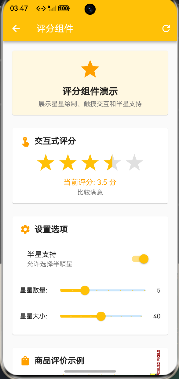
六、运行效果展示
本实现已在华为 MatePad Pro(HarmonyOS 4.0)上完成测试,主要功能包括:
- 交互式评分:支持点击和滑动选择评分
- 半星支持:支持0.5为单位的精确评分
- 自定义样式:支持颜色、大小、数量自定义
- 评分示例:展示商品评价的实际应用
- 评分统计:展示评分分布统计图
📸
七、性能优化策略
7.1 绘制优化
- 使用
CustomPainter实现高效绘制 - 通过
shouldRepaint避免不必要的重绘 - 使用
clipRect实现部分填充效果
7.2 交互优化
- 使用
GestureDetector实现流畅的手势识别 - 通过
setState精确更新,避免全局重建 - 对于大量评分组件,考虑使用虚拟滚动
八、总结与展望
本文详细介绍了基于 Flutter 框架在 OpenHarmony 平台实现评分组件的完整流程。通过合理的架构设计和细致的用户体验优化,我们构建了一个功能完善、交互友好的评分组件。
未来可以进一步探索的方向包括:
- 支持更多形状(心形、圆形等)
- 实现动画效果(点击动画、填充动画)
- 添加评分历史记录功能
- 支持多维度评分
希望本文能为广大鸿蒙开发者在UI组件开发领域提供有价值的参考。欢迎大家在评论区交流讨论,共同推动 OpenHarmony 生态的繁荣发展!

作为“人工智能6S店”的官方数字引擎,为AI开发者与企业提供一个覆盖软硬件全栈、一站式门户。
更多推荐

 0
0 0
0- 0


 已为社区贡献2条内容

所有评论(0)