
【flutter for open harmony】第三方库Flutter 鸿蒙版 进度条展示 实战指南(适配 1.0.0)✨
进度条是UI中常见的组件,用于显示任务完成度、加载状态等。本文将带领大家使用Flutter开发一个进度条展示应用。本文详细介绍了Flutter鸿蒙进度条展示的实现,包括线性进度条、圆形进度条等核心技术。通过本实例,掌握了ProgressIndicator的使用方法。
·
【flutter for open harmony】第三方库Flutter 鸿蒙版 进度条展示 实战指南(适配 1.0.0)✨
Flutter实战:进度条展示可视化
Flutter 三方库 cached_network_image 的鸿蒙化适配与实战指南
欢迎加入开源鸿蒙跨平台社区: https://openharmonycrossplatform.csdn.net
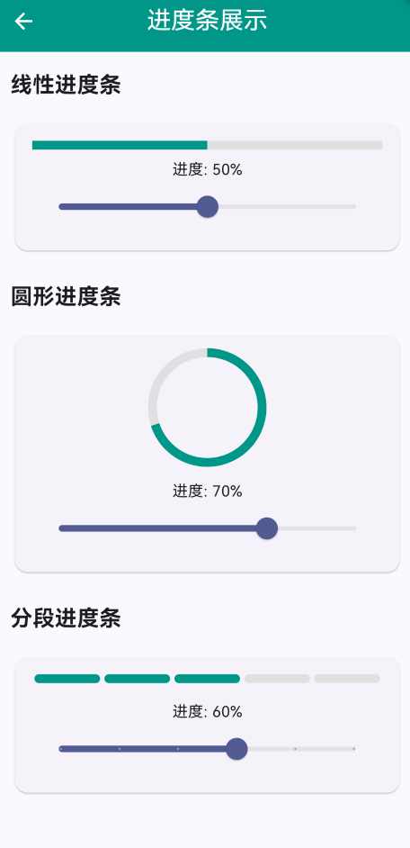
本文详细介绍如何在Flutter鸿蒙应用中实现进度条展示功能,支持多种进度条样式。
一、前言
进度条是UI中常见的组件,用于显示任务完成度、加载状态等。本文将带领大家使用Flutter开发一个进度条展示应用。
二、效果展示
2.1 功能特性
| 功能 | 描述 |
|---|---|
| 线性进度条 | 水平进度条显示 |
| 圆形进度条 | 环形进度条显示 |
| 分段进度条 | 分段式进度显示 |
| 可调节进度 | 支持滑块调节 |
三、项目背景与目标
3.1 项目背景
在应用开发中,进度条是反馈用户操作状态的重要组件。
3.2 项目目标
- 实现多种进度条样式
- 支持动态调节
- 提供美观的UI界面
四、技术架构设计
4.1 核心技术
- LinearProgressIndicator: 线性进度条
- CircularProgressIndicator: 圆形进度条
- Slider: 进度调节
4.2 实现原理
通过Slider控制进度值,使用不同的ProgressIndicator组件显示进度。
五、详细实现
5.1 Flutter端实现
import 'package:flutter/material.dart';
class ProgressBarPage extends StatefulWidget {
const ProgressBarPage({super.key});
State<ProgressBarPage> createState() => _ProgressBarPageState();
}
class _ProgressBarPageState extends State<ProgressBarPage> {
double _linearProgress = 0.5;
double _circularProgress = 0.7;
double _segmentedProgress = 0.6;
Widget build(BuildContext context) {
return Scaffold(
appBar: AppBar(
title: const Text('进度条展示'),
centerTitle: true,
backgroundColor: Colors.teal,
foregroundColor: Colors.white,
),
body: SingleChildScrollView(
padding: const EdgeInsets.all(16),
child: Column(
crossAxisAlignment: CrossAxisAlignment.start,
children: [
const Text('线性进度条', style: TextStyle(fontSize: 20, fontWeight: FontWeight.bold)),
const SizedBox(height: 16),
Card(
child: Padding(
padding: const EdgeInsets.all(16),
child: Column(
children: [
LinearProgressIndicator(
  value: _linearProgress,
  backgroundColor: Colors.grey[300],
  valueColor: const AlwaysStoppedAnimation(Colors.teal),
  minHeight: 8,
),
const SizedBox(height: 8),
Text('进度: ${(_linearProgress * 100).toInt()}%'),
Slider(
value: _linearProgress,
onChanged: (value) {
setState(() {
_linearProgress = value;
});
},
),
],
),
),
),
const SizedBox(height: 24),
const Text('圆形进度条', style: TextStyle(fontSize: 20, fontWeight: FontWeight.bold)),
const SizedBox(height: 16),
Card(
child: Padding(
padding: const EdgeInsets.all(16),
child: Column(
children: [
SizedBox(
width: 100,
height: 100,
child: CircularProgressIndicator(
value: _circularProgress,
backgroundColor: Colors.grey[300],
valueColor: const AlwaysStoppedAnimation(Colors.teal),
strokeWidth: 8,
),
),
const SizedBox(height: 16),
Text('进度: ${(_circularProgress * 100).toInt()}%'),
Slider(
value: _circularProgress,
onChanged: (value) {
setState(() {
_circularProgress = value;
});
},
),
],
),
),
),
],
),
),
);
}
}
5.2 UI界面实现
UI采用Material Design 3风格,每种进度条都有独立的卡片展示。
六、核心功能解析
6.1 线性进度条
使用LinearProgressIndicator:
LinearProgressIndicator(
value: _linearProgress,
backgroundColor: Colors.grey[300],
valueColor: const AlwaysStoppedAnimation(Colors.teal),
minHeight: 8,
)
6.2 圆形进度条
使用CircularProgressIndicator:
CircularProgressIndicator(
  value: _circularProgress,
  backgroundColor: Colors.grey[300],
  valueColor: const AlwaysStoppedAnimation(Colors.teal),
  strokeWidth: 8,
)
七、实际应用场景
- 文件下载:显示下载进度
- 任务完成度:显示任务完成百分比
- 学习进度:显示学习进度
八、优化建议
- 动画效果:添加进度变化动画
- 自定义样式:支持自定义颜色和形状
- 进度保存:保存进度状态
九、常见问题与解决方案
9.1 进度值范围
问题:进度值超出范围
解决方案:确保进度值在0-1之间
9.2 进度更新
问题:进度更新不及时
解决方案:使用setState更新UI
十、总结
本文详细介绍了Flutter鸿蒙进度条展示的实现,包括线性进度条、圆形进度条等核心技术。通过本实例,掌握了ProgressIndicator的使用方法。
十一、参考资料

作为“人工智能6S店”的官方数字引擎,为AI开发者与企业提供一个覆盖软硬件全栈、一站式门户。
更多推荐


 0
0 0
0- 0


 已为社区贡献4条内容

所有评论(0)