
【flutter for open harmony】第三方库Flutter 鸿蒙版 加载动画 实战指南(适配 1.0.0)✨
加载动画是应用中常见的状态提示,用于告知用户正在加载数据。本文将带领大家使用Flutter开发一个加载动画展示应用。问题:如何自定义加载动画颜色解决方案:使用valueColor参数本文详细介绍了Flutter鸿蒙加载动画的实现,包括圆形加载、线性加载等核心技术。通过本实例,掌握了ProgressIndicator的使用方法。
·
【flutter for open harmony】第三方库Flutter 鸿蒙版 加载动画 实战指南(适配 1.0.0)✨
Flutter实战:加载动画样式展示
Flutter 三方库 cached_network_image 的鸿蒙化适配与实战指南
欢迎加入开源鸿蒙跨平台社区: https://openharmonycrossplatform.csdn.net
本文详细介绍如何在Flutter鸿蒙应用中实现加载动画功能,展示各种加载动画样式。
一、前言
加载动画是应用中常见的状态提示,用于告知用户正在加载数据。本文将带领大家使用Flutter开发一个加载动画展示应用。
二、效果展示
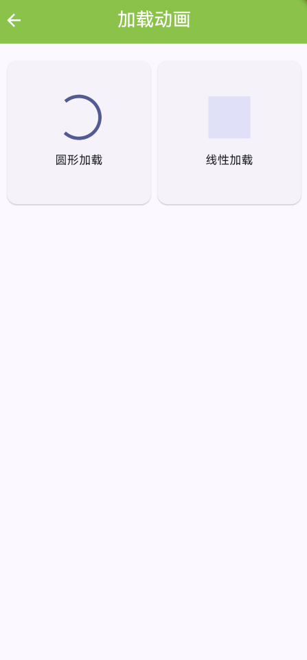
2.1 功能特性
| 功能 | 描述 |
|---|---|
| 圆形加载 | 圆形进度加载动画 |
| 线性加载 | 线性进度加载动画 |
| 自定义样式 | 支持自定义颜色和大小 |
| 多种样式 | 展示多种加载动画样式 |
三、项目背景与目标
3.1 项目背景
在数据加载过程中,加载动画能提升用户体验。
3.2 项目目标
- 展示多种加载动画样式
- 支持自定义样式
- 提供美观的UI界面
四、技术架构设计
4.1 核心技术
- CircularProgressIndicator: 圆形进度
- LinearProgressIndicator: 线性进度
- AnimationController: 动画控制
4.2 实现原理
使用ProgressIndicator组件显示加载动画,支持自定义样式。
五、详细实现
5.1 Flutter端实现
import 'package:flutter/material.dart';
class LoadingAnimationPage extends StatelessWidget {
const LoadingAnimationPage({super.key});
Widget build(BuildContext context) {
return Scaffold(
appBar: AppBar(
title: const Text('加载动画'),
centerTitle: true,
backgroundColor: Colors.lightGreen,
foregroundColor: Colors.white,
),
body: GridView.count(
padding: const EdgeInsets.all(16),
crossAxisCount: 2,
children: const [
_LoadingItem(title: '圆形加载', child: CircularProgressIndicator()),
_LoadingItem(title: '线性加载', child: LinearProgressIndicator()),
],
),
);
}
}
class _LoadingItem extends StatelessWidget {
final String title;
final Widget child;
const _LoadingItem({required this.title, required this.child});
Widget build(BuildContext context) {
return Card(
child: Column(
mainAxisAlignment: MainAxisAlignment.center,
children: [
SizedBox(width: 50, height: 50, child: child),
const SizedBox(height: 16),
Text(title),
],
),
);
}
}
5.2 UI界面实现
UI采用Material Design 3风格,使用网格展示不同的加载动画。
六、核心功能解析
6.1 圆形加载
使用CircularProgressIndicator:
CircularProgressIndicator(
  backgroundColor: Colors.grey[300],
  valueColor: const AlwaysStoppedAnimation(Colors.lightGreen),
)
6.2 线性加载
使用LinearProgressIndicator:
LinearProgressIndicator(
  backgroundColor: Colors.grey[300],
  valueColor: const AlwaysStoppedAnimation(Colors.lightGreen),
)
七、实际应用场景
- 数据加载:显示数据加载状态
- 网络请求:显示网络请求状态
- 页面等待:显示页面加载状态
八、优化建议
- 骨架屏:添加骨架屏加载效果
- 自定义动画:支持自定义加载动画
- 动画速度:支持调整动画速度
九、常见问题与解决方案
9.1 颜色自定义
问题:如何自定义加载动画颜色
解决方案:使用valueColor参数
9.2 大小调整
问题:如何调整加载动画大小
解决方案:使用SizedBox包裹组件
十、总结
本文详细介绍了Flutter鸿蒙加载动画的实现,包括圆形加载、线性加载等核心技术。通过本实例,掌握了ProgressIndicator的使用方法。
十一、参考资料

作为“人工智能6S店”的官方数字引擎,为AI开发者与企业提供一个覆盖软硬件全栈、一站式门户。
更多推荐
 0
0 0
0- 0


 已为社区贡献2条内容

所有评论(0)